Wisteria
Sherwin-Williams' honestly-purple lavender, reviewed straight: the daylight where it glows, the flat gray it turns into after dark, and what to pick instead.

Jessica has spec'd whites and neutrals for more than 300 rooms and keeps a sample wall of painted drawdowns in her studio. Every color review is checked against real reader rooms in the comments and re-tested when a formula changes. About the testing process →
- 1Gothic Purple24
- 2Hazy Lilac29
- 3Wisteria48
- 4French Lilac56
- 5Lavender Mist63
The Fast Verdict
Wisteria is one of the rare purples that doesn't hedge — in real daylight it reads as unmistakable, grown-up lavender, not a shy tint on a neutral base. Named for the cascading flowering vine, it carries a cool blue-violet undertone with a soft gray cast folded in, which is exactly what keeps it from turning candy-colored. The tradeoff is honesty about light: give it a bright room and it commits fully to purple; put it in a dim, north-facing room and the gray cast takes over and the violet mostly disappears.
Bedrooms and nurseries that want real, visible purple · living rooms and hallways with good daylight · anyone who tried a paler lilac and watched it wash out · layering with warm whites and light wood
Your room is dim, north-facing, or lit mostly by cool LEDs · your floors or trim are honey oak or another yellow-warm wood · you actually want the color to read as soft gray · you want zero repaint-hesitation from future buyers
- Genuinely reads as purple, not a wishy-washy tint that could pass for gray on the chip
- Cool, calming and restful — works for adult bedrooms and kids' rooms alike
- LRV 48 mid-tone holds its color without washing out or going dark
- Pairs beautifully with warm whites and light wood, which soften the cool undertone
- Sits in a well-built SW purple lineup, so stepping lighter or deeper is one easy swap away
- Reads flatter and grayer in dim, cool or north-facing light — the top complaint in real reviews
- Fights honey oak and other yellow-warm wood or trim
- Next to a stark cool-white trim it desaturates toward gray by contrast
- Purple still carries more repaint-hesitation for resale-minded buyers than a neutral
What Color Is Wisteria, Really?
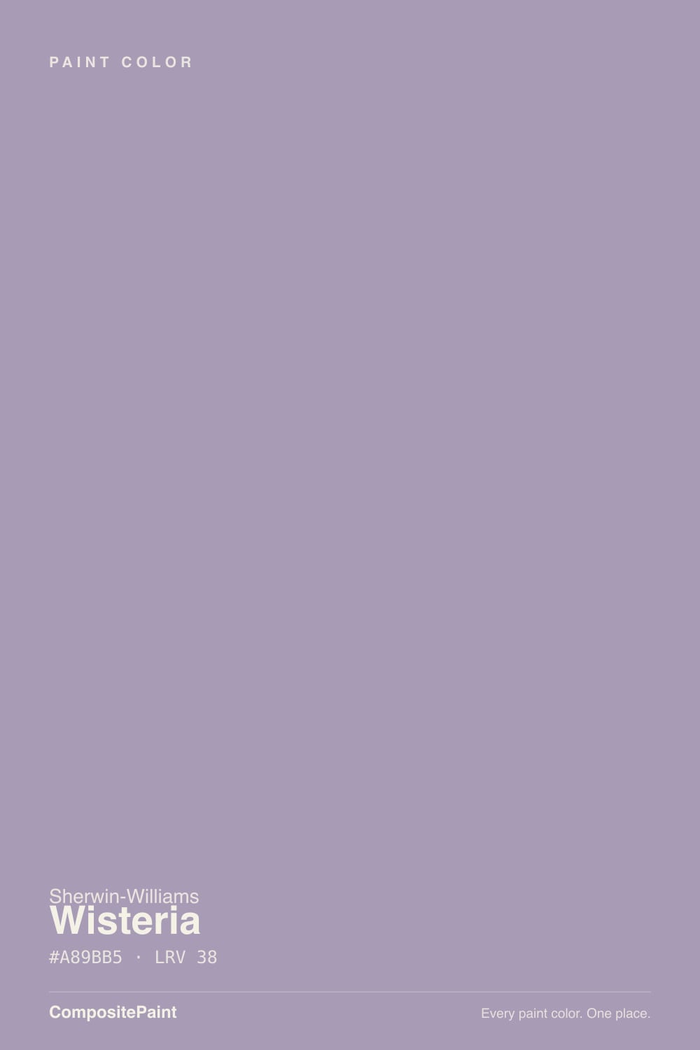
Wisteria is one of the few purples in the Sherwin-Williams deck that does not apologize for being purple. Named for the cascading lavender vine, it sits in SW's Popular Purples lineup alongside paler siblings like Wallflower, Elation and Silver Peony — and next to those, Wisteria reads noticeably more saturated and more clearly violet, not just a whisper of tint on a neutral base. The masstone leans cool and blue-violet with a soft gray cast folded in, which is what keeps it from tipping into candy-lilac or costume-purple territory. It is a real lavender, dialed down just enough to live on a wall.
At LRV 48 it sits solidly mid-tone — noticeably deeper than the pastel lilacs in the same collection (Wallflower at 64, French Lilac at 56, Lavender Mist at 63), and that extra depth is exactly why it holds its color instead of washing out the moment the light changes. Pale lilacs can drift toward near-white in a bright room; Wisteria's depth means the purple stays visible in daylight without needing a shaded room to look intentional. It is not a deep, drenched violet like Mystical Grape — this is a color for people who want purple to be part of the room, not the whole argument.
Undertone in one line: cool blue-violet with a gray cast — never warm, never pink. Owner reviews split almost evenly between calling it lavender-purple and calling it a soft gray, and that split is the color being honest about how light-dependent it is: bright, even daylight pulls the violet forward, while flat, filtered or cool-toned light lets the gray win. If your sample looks flatly gray with no purple at all, that is weak or cool light doing the work, not a bad batch of paint.
Where It Shines
Give it real daylight — south or bright east light especially — and Wisteria reads as unmistakable, grown-up lavender: cool, calming, and clearly a color decision rather than an accident. It is at its best layered with warm whites (Alabaster, Pure White, White Dove) and light wood, which keep the room from turning cold while the lavender does its job. Bedrooms are its natural home, but it earns real use in nurseries, hallways and living rooms too — anywhere a room wants visible color without going loud.
Where It Fails
Almost every disappointed review of Wisteria follows one of three scripts, and each one is visible before the first coat goes on. None of them are the paint failing — they are the color being exactly as light-dependent and cool as its formula promises.
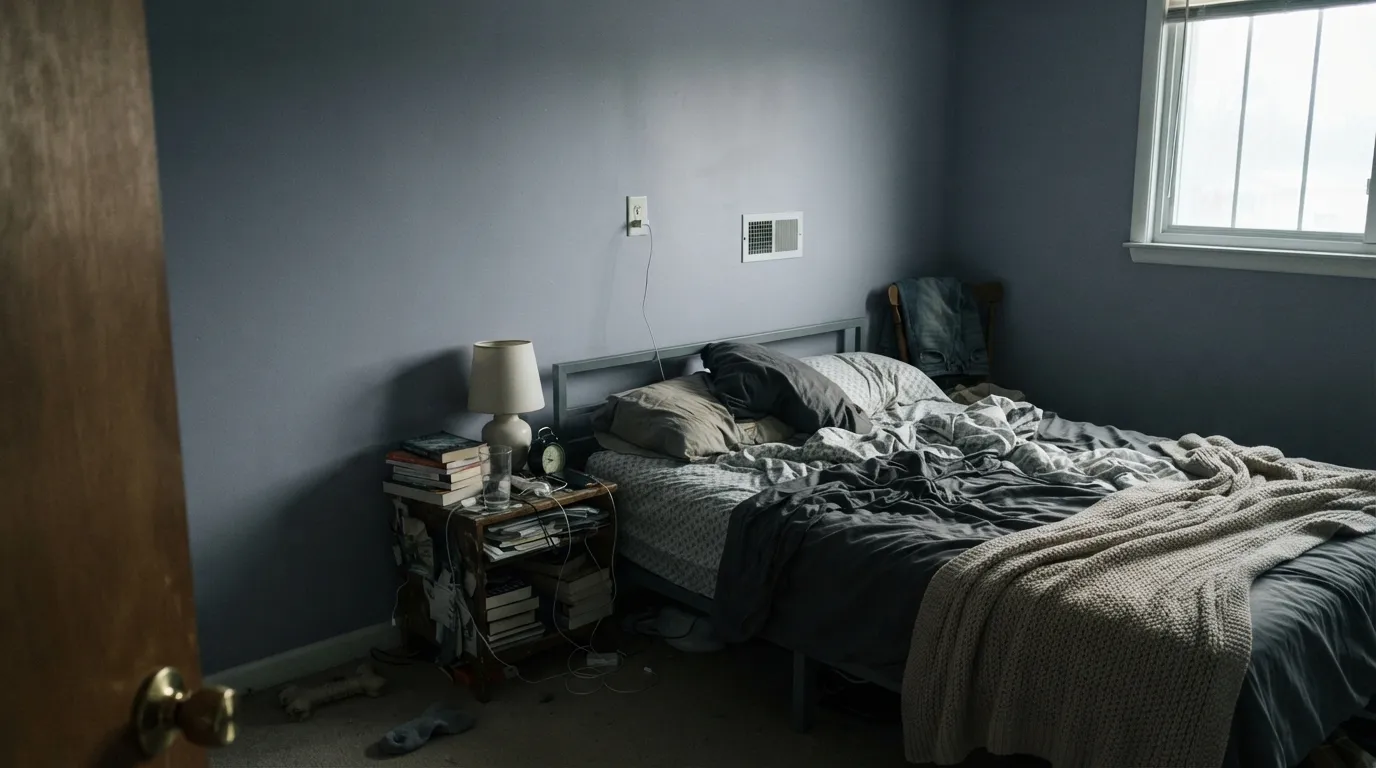
This is the single most common complaint: "it looks more gray than purple." Cool, filtered daylight has almost no warmth to bring out the violet, so the gray cast wins and the wall reads like a flat blue-gray instead of lavender. If your room runs dim and cool, sample it there first — or add warm lamps and accept a grayer daytime read.
Yellow-orange sits opposite violet on the color wheel, so golden oak floors or honey-toned trim fight Wisteria on both sides — the wood looks more orange, the wall looks more purple, and neither one wins. Light oak, walnut or gray-washed floors are much easier partners.
A bright cool white pulls the same direction as dim light: it desaturates Wisteria toward gray by contrast. Warm-leaning whites like Alabaster or White Dove keep the lavender reading as color instead of getting bleached out next to it.
Room by Room
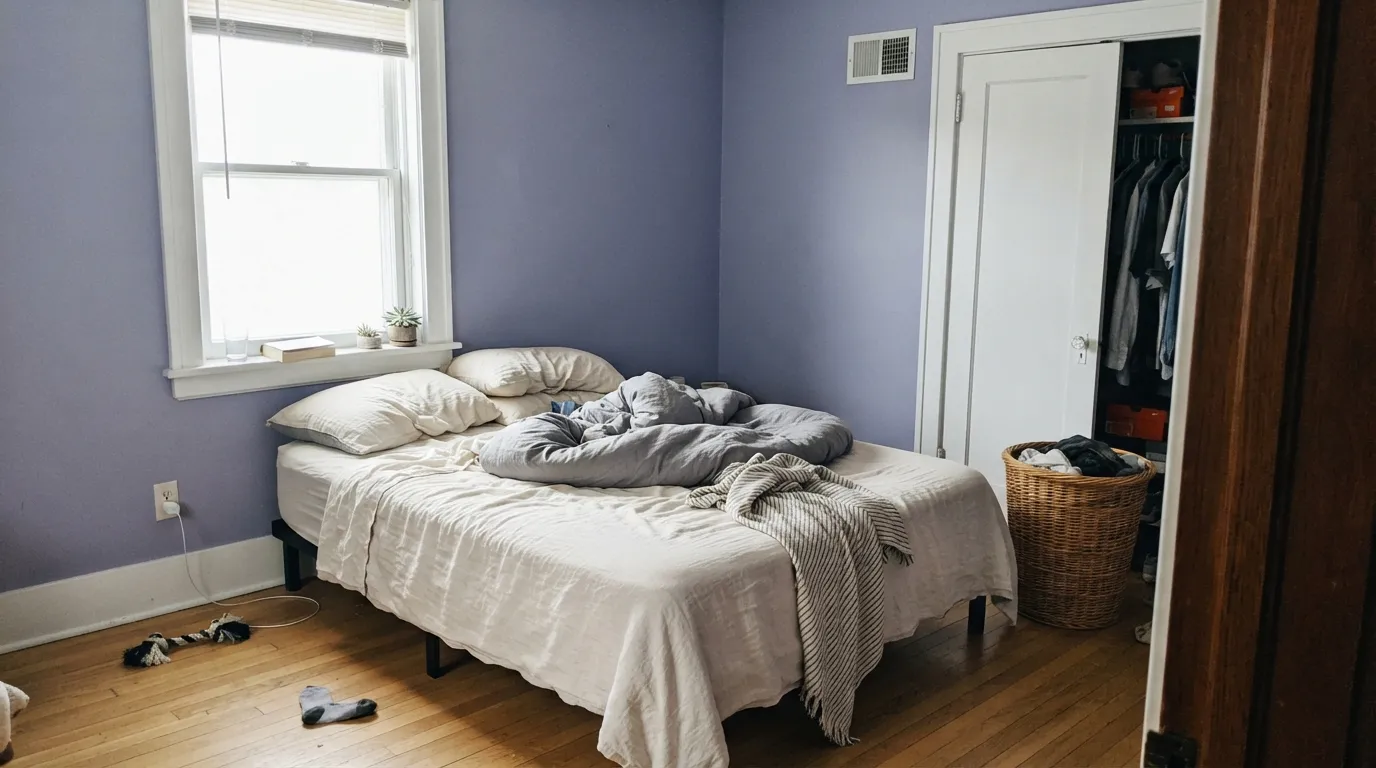
Restful and cool without going cold, especially with cream linens and White Dove trim. Eggshell hides texture and keeps the color soft; matte works too if the walls are in good shape.
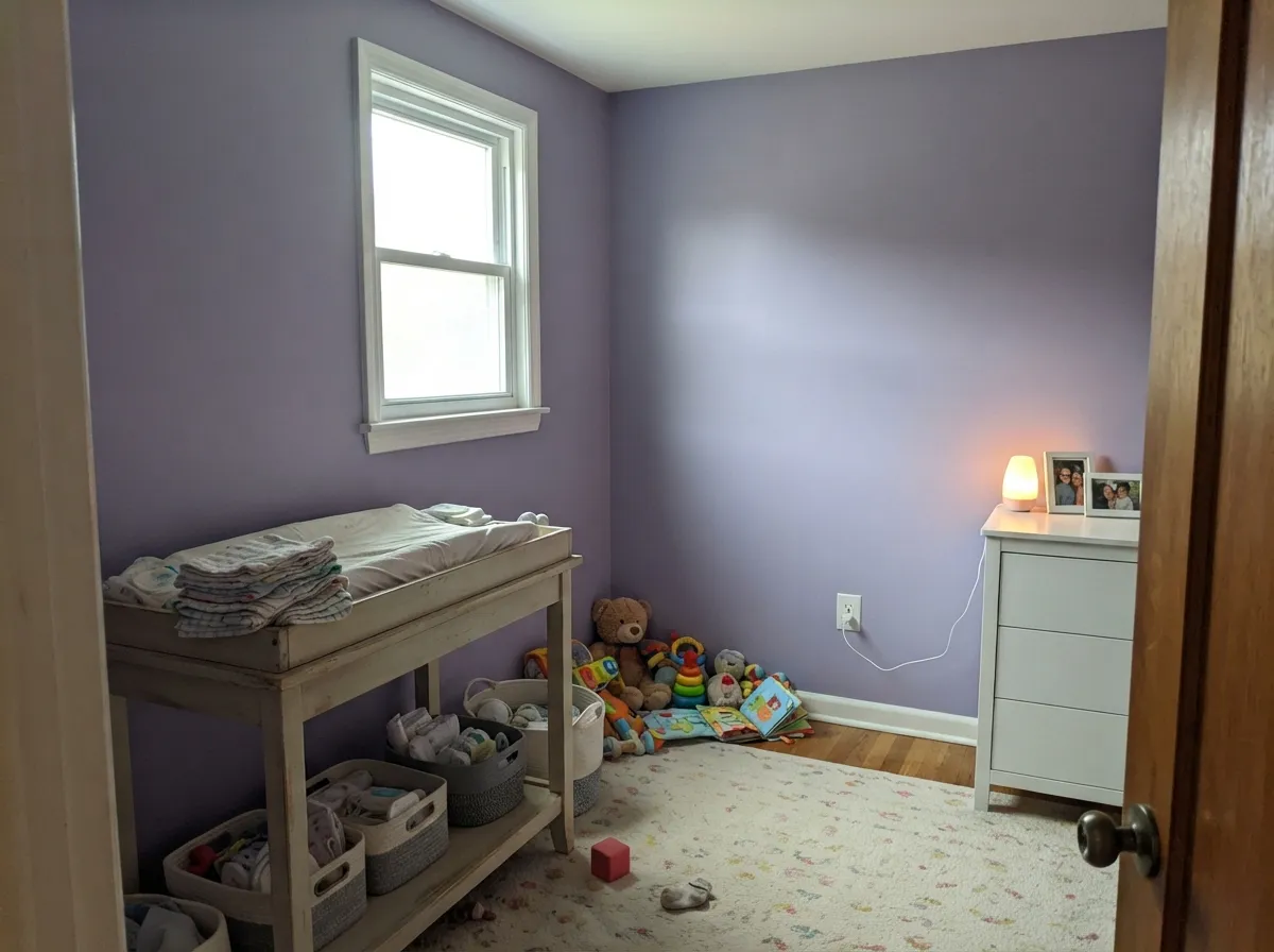
Gentle enough for a gender-neutral nursery, playful enough for a kid's room, and the gray cast keeps it from reading babyish. Satin holds up to wipe-downs and handprints near the door.
Beautiful when the room gets real sun; pair with warm whites and light wood. In a dim, north-facing living room it drifts toward flat gray and loses the point of choosing purple at all.
With white or warm-veined marble and brass fixtures it feels custom and calm. Cool blue-gray tile pushes it further toward gray and the two start to fight instead of coordinate.
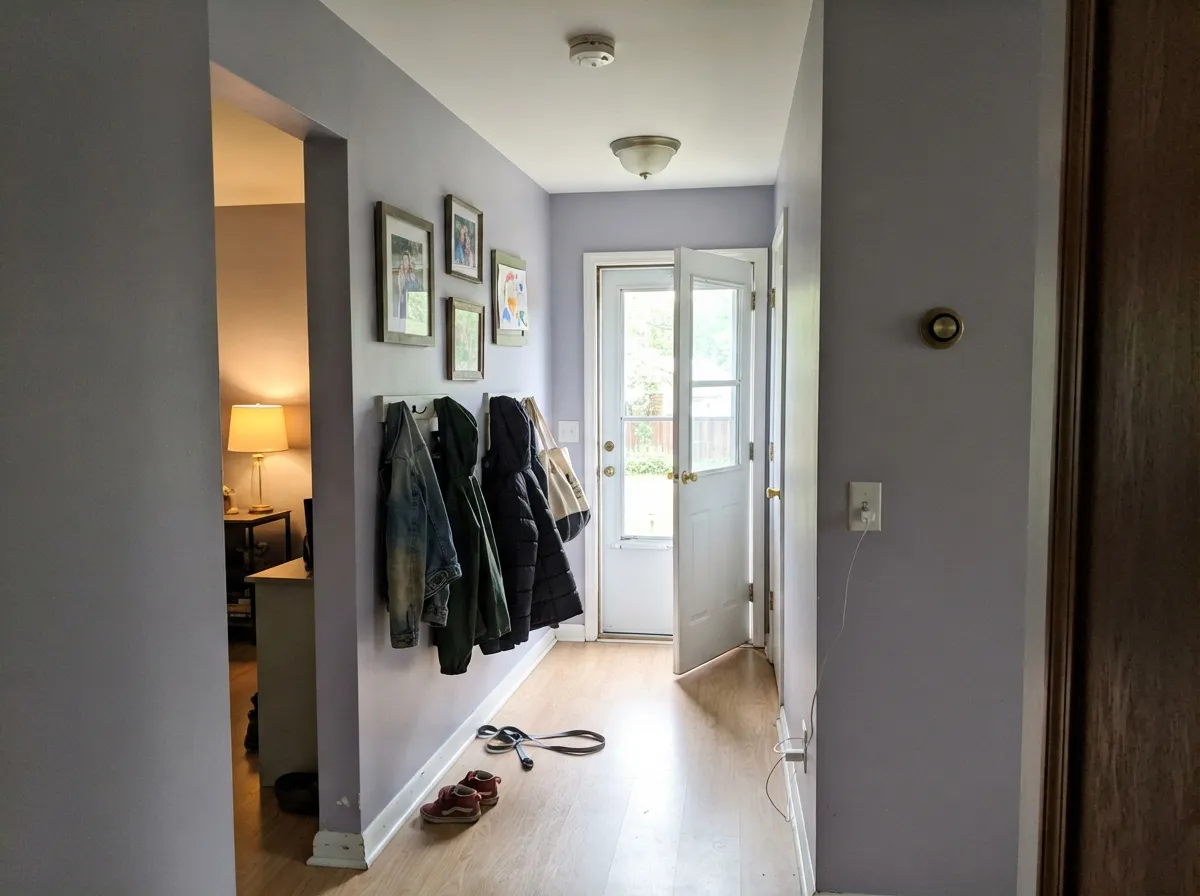
Carries between rooms without shouting, but a windowless interior hallway is the riskiest spot in the house for this color — without daylight reaching it, expect gray more than lavender.
Full sun and weathering tend to gray pale purples down over time, and it is a rare street that wants a lavender house. Reserve it for a sheltered, shaded feature — a porch ceiling or a side door — rather than the whole facade.
Your Light Is the Risk
Full, even daylight is where the violet is unmistakable — clearly lavender-purple, not gray. Sample it in this light before you buy.
Cool, filtered light drains the color toward flat blue-gray — the single most common regret with this paint. Test it in your actual room on a cloudy day.
Warmer and more lavender at the sun hours, cooler and grayer once direct light passes. The shift is real but gentle, not a different color.
2700K lamps warm it slightly and keep the purple readable at night; cool white LEDs push it back toward gray — swap the bulbs before you swap the paint.
Most complaints about Wisteria are a light mismatch. Upload a photo of your actual room and see it on your walls — then ask for the same wall in north light or evening lamps before you buy a single sample.
Need It From Another Brand?
Any paint counter can custom-tint Sherwin-Williams SW 6822 directly. If you would rather stay in one brand's own deck, these are the closest stock matches, measured as ΔE2000. Under 2 is a difference you will not see on the wall.
| Brand | Closest color | ΔE | LRV | |
|---|---|---|---|---|
| Behr | Silverberry670F-4 · Behr | 3.7 | 47 | Color page → |
| Benjamin Moore | Blue Orchid2069-50 · Benjamin Moore | 4.8 | 50 | Color page → |
| Valspar | Beloved8001-47C · Valspar | 4.7 | 48 | Color page → |
| PPG / Glidden | Purple EssencePPG1176-4 · PPG / Glidden | 4.3 | 47 | Color page → |
| Glidden | Empress Lilac90BB 47/149 · Glidden | 1.7 | 47 | Color page → |
| Dutch Boy | Violet Daze142-4DB · Dutch Boy | 4.3 | 49 | Color page → |
Similar Sherwin-Williams Colors
The nearest shades to Wisteria within Sherwin-Williams's own range, ranked by perceptual color distance — useful when you want the same look a touch lighter, darker, or warmer.
WCAG 2.1: AA is 4.5 : 1 for normal text, 3 : 1 for large text, AAA is 7 : 1.
Wisteria vs the Colors You're Also Considering
Every Wisteria sample board has the same rivals on it. The numbers show the real lightness gap — then it comes down to which risk you would rather live with.
Pick this for the lighter version that commits to purple outright, where Sleepy Hollow hedges toward gray.
Benjamin Moore 1454 · LRV 28Sleepy HollowPick this if you want it deeper and grayer, closer to a neutral — Sleepy Hollow reads as a moody almost-gray that only flashes violet.
Pick this for the lighter, airier lavender that still reads purple, not blue, in daylight.
Sherwin-Williams SW 6824 · LRV 16Forget-Me-NotPick this for a darker, more clearly blue-leaning periwinkle with real depth.
Pick this when you actually want the color to show up — Wallflower can read as a plain off-white in weak light.
Sherwin-Williams SW 6281 · LRV 64WallflowerPick this if even Wisteria feels like too much commitment — Wallflower is the palest, safest purple in the SW popular-purples lineup.
Wisteria Coordinating Colors
The rule for coordinating with Wisteria is simple: stay warm on the whites, stay light on the wood, and keep cool blue-gray stone at arm's length. Warm-leaning whites keep the lavender reading as color instead of getting bleached toward gray next to it, and a single dark, near-black note gives the pale-cool palette somewhere to land.
The Wisteria Vine, and Why This One Stayed a Real Purple
Wisteria takes its name straight from the flowering vine, not a marketing metaphor — the cascading lavender-purple blooms are the actual reference point, which is part of why Sherwin-Williams kept the color genuinely violet instead of grading it down into a barely-there neutral like some of its Popular Purples siblings. Wallflower, Elation and Silver Peony all sit lighter and safer in the same collection; Wisteria is the one in the lineup willing to look like a color choice from across the room.
Purple spent years as the family everyone skipped past on the fan deck while gray and greige ran the market. It never disappeared from Sherwin-Williams' collections, and as moodier, more decorated interiors have come back into style, colors like Wisteria are getting picked on purpose again rather than talked out of at the paint counter.
Wisteria With Wood Tones and Floors
Light oak, whitewashed oak, walnut and gray-washed floors are all easy company for Wisteria — none of them push back against the cool undertone, so the lavender stays lavender. Gray or black-stained floors go even quieter and let the purple carry more of the room's personality.
Golden honey oak is the one floor that genuinely fights this paint. Yellow-orange sits directly across the color wheel from violet, so a warm oak floor under Wisteria walls pulls both toward their opposite extreme — the floor looks more orange, the wall looks more purple. A large rug helps soften the clash; refinishing the floor a shade cooler solves it outright.
Metals split the same way lighting does: brushed nickel, chrome and matte black read cool and coordinate cleanly, while unlacquered brass adds just enough warmth to keep the room from feeling cold without fighting the undertone.
Three Ready Palettes Built on Wisteria
A color is never alone on the wall. These are complete combinations in the 60-30-10 pattern, with the reason each one holds together. Every one opens in the visualizer.
Layering two depths of the same family reads deliberate instead of themed. White Dove keeps the warmth in the room, and the deeper Mystical Grape accent gives the eye one place to land without turning the whole room dark.
Try this palette in your roomPure White keeps trim crisp and wipeable, and Agreeable Gray on the closet or built-ins gives the room a second calm neutral so the lavender doesn't have to carry the whole scheme as the child grows out of a themed nursery.
Try this palette in your roomAlabaster's warmth keeps Wisteria from sliding toward gray along a low-light hallway, and one Iron Ore door supplies the single dark, deliberate note the pale-cool palette needs.
Try this palette in your roomWisteria FAQ
Is wisteria purple or gray?
Purple — but a cool, grayed-down one, and how much of each you see depends entirely on light. In bright daylight it is unmistakably lavender-purple; in dim or north-facing light the gray cast takes over and it can look like a plain soft gray. Both are the same paint, just different rooms.
Is Wisteria good for a nursery?
Yes. It is soft enough to work as a gender-neutral nursery color and the gray cast keeps it from reading sugary or babyish. Use satin so it wipes clean, and pair with a warm white like Pure White or Alabaster on the trim.
What trim white goes with Wisteria walls?
A warm-leaning white — Alabaster, Pure White or White Dove. A stark, cool-toned white pulls the same direction as weak light and makes the lavender look washed out and grayer than it is.
Does Wisteria work in a north-facing room?
It is the riskiest exposure for this color. North light is cool and filtered, and it drains the violet out, leaving a flat blue-gray. If the room is genuinely dim, sample it there first, add warm lamps, or choose a deeper purple like Sleepy Hollow that reads intentional even in muted light.
Wisteria or Sleepy Hollow — which purple should I pick?
Wisteria is lighter and reads as clear lavender-purple; Sleepy Hollow is deeper and grayer, closer to a moody neutral that only flashes violet under warm lamps. Pick Wisteria if you want the color to be obvious. Pick Sleepy Hollow if you want purple that most guests will assume is just a sophisticated gray.
Does Wisteria work with oak floors?
It depends on the oak. Light oak, whitewashed or gray-washed floors and walnut are easy partners. Honey-toned golden oak is the real conflict: yellow-orange is violet's complement, so the floor reads more orange and the walls read more purple, and the fight goes both ways.
Have you painted with Wisteria?
Rate it — one tap helps the next reader decide.
Ask a Question