Windy Blue
One of Sherwin-Williams' quietest blue-grays, reviewed honestly: the light that keeps it blue, the light that turns it plain gray, and what to pick instead.

Jessica has spec'd whites and neutrals for more than 300 rooms and keeps a sample wall of painted drawdowns in her studio. Every color review is checked against real reader rooms in the comments and re-tested when a formula changes. About the testing process →
The Fast Verdict
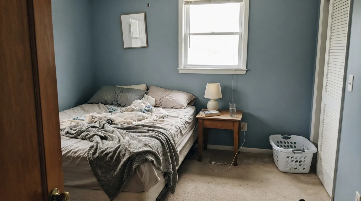
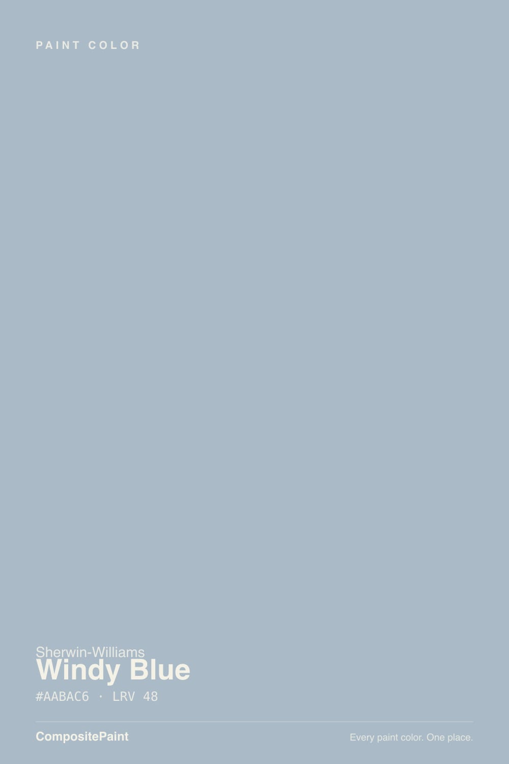
Windy Blue is Sherwin-Williams' quietest blue — split so evenly between blue and gray that Sherwin-Williams' own site files it under Blue, yet plenty of buyers swear the sample chip looked gray. At LRV 48 it sits in the honest middle: pale enough to feel soft, saturated enough to hold real color instead of washing out. Give it north light or a warm bulb and it settles into a gentle powder blue; put it under fluorescent or cool LED light and it goes almost purely gray. Nobody wrote a magazine feature about it and it never had a Color of the Year moment — it just quietly works, in a bedroom, a bathroom, or a whole coastal exterior, for people who want blue without picking a loud one.
Bedrooms and nurseries · bathrooms · coastal or pool-adjacent exteriors · a quiet whole-house blue-gray you don't have to defend to guests
You want a true saturated sky blue · the room only gets cool white or fluorescent light · you're painting a space that needs to feel alert, like a home office · your trim is already a warm cream white
- Genuinely useful whole-house color — walls, trim, cabinets, and exterior siding all work
- Mid LRV (48) holds real color without washing out in a small room
- Reads calm and coastal, not cold, once there is any warm light in the room
- Quiet enough that it won't date itself the way a trendier saturated blue will
- A real deck regular — never discontinued, never repositioned, just reliably there
- Turns flat silvery gray under fluorescent or cool LED bulbs and strong south/east daylight
- Fights a warm cream trim white — needs a cooler, cleaner white to match
- Too sleepy-calm for rooms that need energy, like a home office
- Almost no design-press coverage — you are mostly on your own for real-room references
What Color Is Windy Blue, Really?
A pale, desaturated blue-gray — RGB 170/186/198, right in the middle where blue and gray argue over who owns the wall. Sherwin-Williams built it on the same strip as Upward (SW 6239), one step lighter and less saturated; the two are close enough that some painters keep both fan decks in the truck and pick on-site depending on the room's light. Windy Blue never had a marketing campaign or a Color of the Year moment — it is a deck regular, the kind of color a designer specs quietly and nobody asks a follow-up question about, because it doesn't misbehave.
At LRV 48 it sits in the honest middle of the scale — closer to a true mid-tone than a wash. It reads noticeably lighter and airier than a strip-mate like Upward (LRV 39, one step deeper and more visibly blue), but it is nowhere near a near-white; put it next to a bright trim white like Extra White (LRV 86) and Windy Blue is unmistakably a color, not an off-white with a tint. That middle LRV is why it holds real color on the wall without the extra coats a deeper blue-gray demands, and why it never reads washed out even in a small room.
Undertone in one line: gray first, blue arriving only when the light lets it. Sherwin-Williams files Windy Blue under its own Blue family, but the gray is strong enough that plenty of buyers swear they picked a gray by mistake — cool white or fluorescent bulbs and bright south or east daylight push the gray forward until the color reads almost neutral; north light and warm 2700K bulbs pull the blue back out. If your sample looks flatly gray, that is the light doing its job, not a bad batch.
Where It Shines
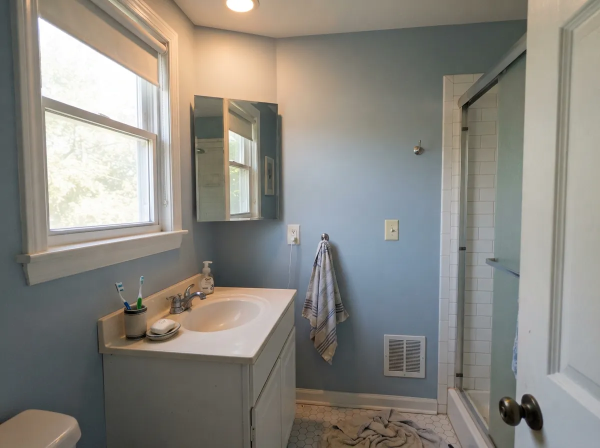
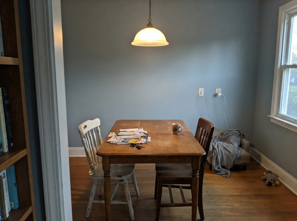
Give it a room that isn't fighting for maximum daylight and it turns into one of the more useful blues in the deck. Paint bloggers who have actually lived with it call it a genuinely versatile color — bedrooms, nurseries, bathrooms, even a full exterior near a pool, where the dusty blue reads coastal instead of chalky. It photographs best with warm light somewhere in the frame: a brass fixture, a wood floor, one lamp left on.
Where It Fails
Almost every letdown story with Windy Blue comes down to one of three predictable mismatches, and all three show up before the second coat dries. None of them are the paint's fault — but if your room matches one, sample it big before you commit.
Windy Blue is desaturated on purpose, and under bright south or east daylight with ordinary white or fluorescent bulbs, the color reads almost purely silvery gray — buyers who pictured a clear nursery-mural blue call it "not blue at all." If you want unmistakable blue, step one shade down the strip to Upward, or look at Santorini Blue for something that stays more clearly Aegean-blue in daylight.
A creamy, warm-toned trim white fights this color's cool base — the wall and the trim argue instead of agreeing, and the room can read slightly muddy where the two meet. Skip the warm whites and trim it in something cleaner and cooler, like Extra White, so the temperatures finally match.
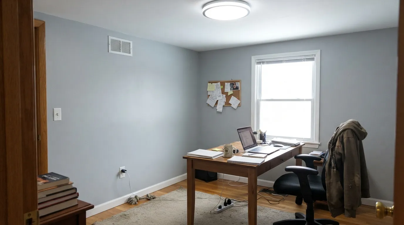
This is a genuinely calming, borderline sleepy color — great for a bedroom, a poor match for a home office or a homework nook where you want energy, not dusk. Save it for the rooms where calm is the whole point, not the rooms where you need to stay sharp.
Room by Room
Calm, gender-neutral, and forgiving under a warm lamp at night — this is the room Windy Blue was built for. Eggshell on the walls, warm 2700K bulbs on the nightstand.
Holds up well against white tile and chrome or brass fixtures alike, and the mid LRV keeps a small bathroom from feeling like a closet. Satin finish for the humidity.
Full sun reads it soft and coastal rather than chalky, and it is genuinely good on a shingled or coastal-style house or anywhere near water. Pair with a clean white trim, not a cream one.
Under a warm pendant and a wood table it settles into soft blue instead of gray. Skip the overhead fluorescent — it is the fastest way to flatten this color.
In an open-plan room it needs a warm anchor — a wood floor, a leather chair, brass hardware — or it can feel chilly without one. Sample it next to your actual furniture before committing to the whole room.
Too calming for a room that is supposed to keep you working. Save Windy Blue for the rooms where drowsy is a feature, not a bug.
Your Light Is the Risk
Northern daylight is the fairest test: the blue and the gray balance evenly, with no fluorescent push and no yellow flush. The truest read of the chip.
Bright south or east sun paired with white or fluorescent bulbs pushes Windy Blue hard toward flat silvery gray. If you wanted a clear blue, this combination is the disappointment.
It leans grayer at high midday sun and softens back toward blue in the lower-angle morning and evening light — a gentle drift, not a dramatic one.
Warm 2700K bulbs bring the powder-blue forward and cozy it up; cool white LEDs flatten it back toward gray. The bulb matters almost as much as the paint here.
Most complaints about Windy Blue are a light mismatch. Upload a photo of your actual room and see it on your walls — then ask for the same wall in north light or evening lamps before you buy a single sample.
Need It From Another Brand?
Any paint counter can custom-tint Sherwin-Williams SW 6240 directly. If you would rather stay in one brand's own deck, these are the closest stock matches, measured as ΔE2000. Under 2 is a difference you will not see on the wall.
| Brand | Closest color | ΔE | LRV | |
|---|---|---|---|---|
| Behr | Hazy SkiesPPU14-12 · Behr | 1.1 | 48 | Color page → |
| Benjamin Moore | November Skies2128-50 · Benjamin Moore | 1.5 | 48 | Color page → |
| Valspar | Glacier Mist4005-3B · Valspar | 1.3 | 47.7 | Color page → |
| PPG / Glidden | Heavenly BluePPG1159-3 · PPG / Glidden | 2.7 | 48 | Color page → |
| Glidden | Silver Night Blue10BB 47/077 · Glidden | 3.5 | 47 | Color page → |
| Dutch Boy | Taboo Blue340-3DB · Dutch Boy | 3.2 | 47 | Color page → |
Similar Sherwin-Williams Colors
The nearest shades to Windy Blue within Sherwin-Williams's own range, ranked by perceptual color distance — useful when you want the same look a touch lighter, darker, or warmer.
WCAG 2.1: AA is 4.5 : 1 for normal text, 3 : 1 for large text, AAA is 7 : 1.
Windy Blue vs the Colors You're Also Considering
Every Windy Blue sample board has the same rivals on it. The numbers show the real lightness gap — then it comes down to which risk you would rather live with.
Pick this for the lighter, quieter version that holds its color without demanding a dark-room commitment.
Sherwin-Williams SW 6239 · LRV 39UpwardPick this if you want more blue and more depth in the same family — Upward is one step darker and more saturated.
Pick this when you want the blue to actually announce itself instead of hiding behind "gray."
Sherwin-Williams SW 9138 · LRV 43StardewPick this if you want the more neutral version people keep mistaking for a plain gray.
Within the brand, French Moire (SW 9056) at #9FBBC3 and LRV 47 is the more green-blue option and reads closer to a soft teal. Lakeside (SW 9683) at LRV 47 and Jubilee (SW 6248) at LRV 45 both trade blue for gray, and Mineral (SW 9637) at LRV 46 goes furthest toward plain gray.
Across brands, Ocean's Side (HGSW 3356) from HGTV Home by Sherwin-Williams shares the hex #AABAC6 and LRV 48 at deltaE 0. Overcast Sky (DE5821) from Dunn-Edwards is a deltaE 0.71 match by color but is published at LRV 43. Hazy Skies (PPU14-12) from Behr at deltaE 1.08, Glacier Mist (4005-3B) from Valspar at 1.32, and November Skies (2128-50) from Benjamin Moore at 1.49 are all visually identical in normal room light.
Parma Gray (No. 27) from Farrow & Ball at deltaE 2.07 and LRV 50 and Heavenly Blue (PPG1159-3) at 2.68 are very close but worth sampling first. Underdog (BD-UD) from Backdrop at LRV 41 and deltaE 3.46 and Silver Night Blue (10BB 47/077) from Glidden at 3.48 are close but visibly different side by side.
Windy Blue Coordinating Colors
The rule for coordinating with Windy Blue: keep whites and grays on the cool side, and bring warmth in through wood, brass, or one deliberately warm accent color rather than through the trim. It pairs cleanly with its own family — deeper blue-grays for a monochromatic layer — and takes a near-black accent well. These are the partners that keep showing up in rooms that work:
A Deck Regular, Not a Headline Color
Windy Blue has never had a Color of the Year moment, never anchored a viral Pinterest kitchen, and doesn't come up in the same breath as Sea Salt or Rainwashed when people talk about Sherwin-Williams' famous blue-greens. Search for it and you'll find one or two thorough paint-blog reviews and not much else — no wall of Reddit threads, no HGTV cameo.
That is not a knock. It sits quietly in the SW deck next to Upward (SW 6239) as one of the brand's honest workhorse blue-grays — the kind of color a painter or designer specs because it behaves, not because a client saw it on a magazine cover. If you want a blue that won't make a statement about itself, that quietness is exactly the point.
Windy Blue With Wood Tones and Metals
Warm wood is what keeps this color from feeling cold: oak, walnut, and butcher block all supply the warmth the paint doesn't bring on its own, and unlacquered brass reads especially good against the dusty blue-gray. Cooler, gray-washed wood doubles down on the gray side instead of balancing it — fine if that's the look you want, worth a sample first if it isn't.
Metals split cleanly by temperature: brass and warm bronze soften the color, chrome and brushed nickel keep it crisp and slightly cooler, and matte black (Iron Ore, Tricorn Black) gives it the one grounding dark note a pale blue-gray room usually needs.
Three Ready Palettes Built on Windy Blue
A color is never alone on the wall. These are complete combinations in the 60-30-10 pattern, with the reason each one holds together. Every one opens in the visualizer.
Extra White keeps the trim cool enough to match Windy Blue's temperature instead of fighting it, and one Naval accent — a headboard wall, a door — gives the room the single dark note that makes a pale blue-gray look intentional instead of undecided.
Try this palette in your roomIn an open floor plan Windy Blue needs a warm neighbor or it drifts chilly — Shiitake's warm tan-brown base is exactly that anchor, and Extra White keeps the trim in the same cool family as the blue-gray instead of creaming things up.
Try this palette in your roomA near-black vanity gives the pale blue-gray one grounding note in a small room, and Extra White keeps the trim and grout cool enough to match instead of creaming things up. Works with chrome or brushed nickel fixtures either way.
Try this palette in your roomWindy Blue FAQ
Is Windy Blue more blue or more gray?
Gray first in most rooms, even though Sherwin-Williams lists it under its own Blue family — the gray base is strong enough that most people who see it on the wall call it a gray-blue, not a blue. In north light or under a warm 2700K bulb, the blue comes forward and it reads like a soft powder blue; under fluorescent light or bright south or east sun, it settles back toward silvery gray. Both are the same paint being accurate about the room it's in.
Is it a good nursery color?
Yes, and it's one of the more common uses for it — calm, gender-neutral, and forgiving under the warm night-light most nurseries end up with. It won't feel babyish by the time the crib comes down.
What is the difference between Windy Blue and Upward?
They share a strip: Windy Blue (SW 6240) is the lighter, softer one at LRV 48, and Upward (SW 6239) is one step down at LRV 39 with more visible blue. If your room gets good light, either works; in a dimmer room, Windy Blue holds up better without going murky.
Does Windy Blue work on exteriors?
Yes — it is a genuinely good exterior blue-gray, especially on a shingled or coastal-style house or anywhere near a pool. Trim it in a clean, cool white rather than a warm cream one, or the two will visibly clash in full sun.
What trim white goes with Windy Blue?
A cool, clean white like Extra White, not a warm cream white. This color's undertone is cool; a warm trim fights it and can leave the wall looking slightly muddy by comparison.
Is Windy Blue good for a whole house?
It can be — it is genuinely versatile on walls, trim, cabinets, and exterior siding — but only if you accept that it will read differently room to room depending on each room's light and bulbs. Sample it in every exposure before committing to the whole house; don't assume the north-room sample tells you what the south room will do.
Have you painted with Windy Blue?
Rate it — one tap helps the next reader decide.
Ask a Question