Santorini Blue
The blue-gray everyone puts on a kitchen island, reviewed honestly: the light that keeps it blue, the light that turns it flat gray, and what to pick instead.

Jessica has spec'd whites and neutrals for more than 300 rooms and keeps a sample wall of painted drawdowns in her studio. Every color review is checked against real reader rooms in the comments and re-tested when a formula changes. About the testing process →
- 1Kendall Charcoal15
- 2Retreat21
- 3Santorini Blue45
- 4Upward57
- 5Sea Salt63
The Fast Verdict
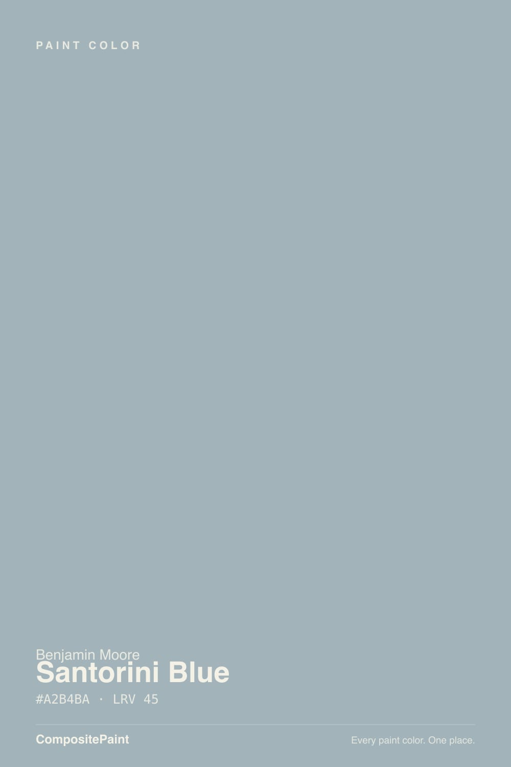
Santorini Blue is a muted, medium-depth blue-gray with a soft green whisper underneath — the color people mean when they say "not gray, not navy, just blue enough." In a room with real daylight it holds a clear, dusty blue identity all day. Take the daylight away and it quietly becomes a different, grayer color. That is not a flaw so much as the whole personality: this is a chameleon in the same family as Stardew and Boothbay Gray, and it rewards exactly the rooms those two do.
Kitchen islands and cabinets · front doors and exteriors against white or cedar siding · home offices that want calm without going cold · south- or east-facing rooms with real daylight
You want a color that looks the same in every light · your room is north-facing and dim all day · you were hoping for a bold, saturated "Aegean" blue · your floors are strongly orange honey oak
- A genuine blue-gray, not a gray pretending to be blue — holds its color in real daylight
- Mid-tone LRV 45 reads as a real color choice without going heavy
- Kitchen islands, front doors and cabinets all look considered, not trendy
- Pairs easily with white oak, walnut, brass and stainless
- A favorite on design blogs and Pinterest for exactly this island-and-door look
- North-facing rooms with no direct sun: it goes flat, muddy gray
- Not the bold, saturated "Aegean" blue the name suggests — it is dusty and quiet
- Cool LEDs push it toward slate and concrete at night
- Strongly orange honey-oak floors fight the blue instead of complementing it
What Color Is Santorini Blue, Really?
A blue-gray with a soft green cast underneath — sophisticated and dusty rather than bright or saturated, despite a name that promises whitewashed Greek villages and deep sea water. What you actually get on the wall is quieter: a medium-toned, grayed-down blue that reads calm and collected instead of dramatic. It belongs to the same chameleon family as Sherwin-Williams Stardew and Benjamin Moore's own Boothbay Gray and Beach Glass — colors built to shift with the room rather than hold one fixed identity.
At LRV 45 it sits squarely in the mid-tone range: deep enough to read as a real color choice, light enough not to swallow a room. Set it beside Stardew (SW 9138, LRV 43) — the two hexes are nearly identical on paper — and the difference shows up in cool light: Stardew leans further into slate and concrete, while Santorini Blue holds onto more of its blue identity even when the room goes gray. Beside Boothbay Gray (LRV 36), Santorini Blue is the lighter, more confidently blue sibling; Boothbay slides toward true gray more of the time.
Undertone in one line: blue first, with green surfacing in strong afternoon light and the color deepening toward evening. If your sample reads flat gray with barely a hint of blue, that is north light or cool LEDs doing it — the same paint, just starved of the daylight it needs to show its color.
Where It Shines
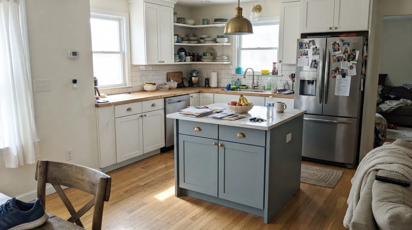
Give it south or east daylight and it is exactly the calm, collected blue reviewers keep reaching for. Kitchen islands are its signature job: against white perimeter cabinets, stainless appliances and brass hardware it adds personality without shouting, which is why it shows up island after island on design blogs and Pinterest boards. Front doors are its second home — set against white siding, pale stucco or weathered cedar shingles, it reads tailored and a little historic. In a home office it does something specific and useful: professional enough for video calls, calm enough not to fight your focus.
Where It Fails
Almost every disappointed review of Santorini Blue traces back to one of three predictable situations, and none of them are the paint's fault. If your room matches one of these, sampling a bigger swatch will only confirm the problem, not solve it.
Cool, indirect north light strips the warmth and green out of Santorini Blue and leaves the gray base exposed — reviewers describe it going flat, muddy, or icy. The color did not change; the light feeding it did. Test a large sample on the actual wall before committing, and lean on warm lamps if you paint it anyway.
The name evokes deep Aegean water; the paint is dusty and restrained. If you were picturing a statement navy or a vivid coastal blue, Santorini Blue will read too quiet and too gray. For real blue commitment, go deeper and more saturated with Van Deusen Blue instead.
Blue and orange sit opposite each other on the color wheel, so warm honey-oak floors and orange-stained trim exaggerate both sides at once: the floor reads more orange, the walls read cooler and grayer. Pale or white oak, walnut and gray-washed floors are all safe; a heavily orange floor is the one genuine mismatch.
Room by Room
On an island under white perimeter cabinets it is the single most common use, and for good reason: white countertops, stainless appliances and brass pulls all flatter it. Satin cabinet enamel for durability around handles and edges.
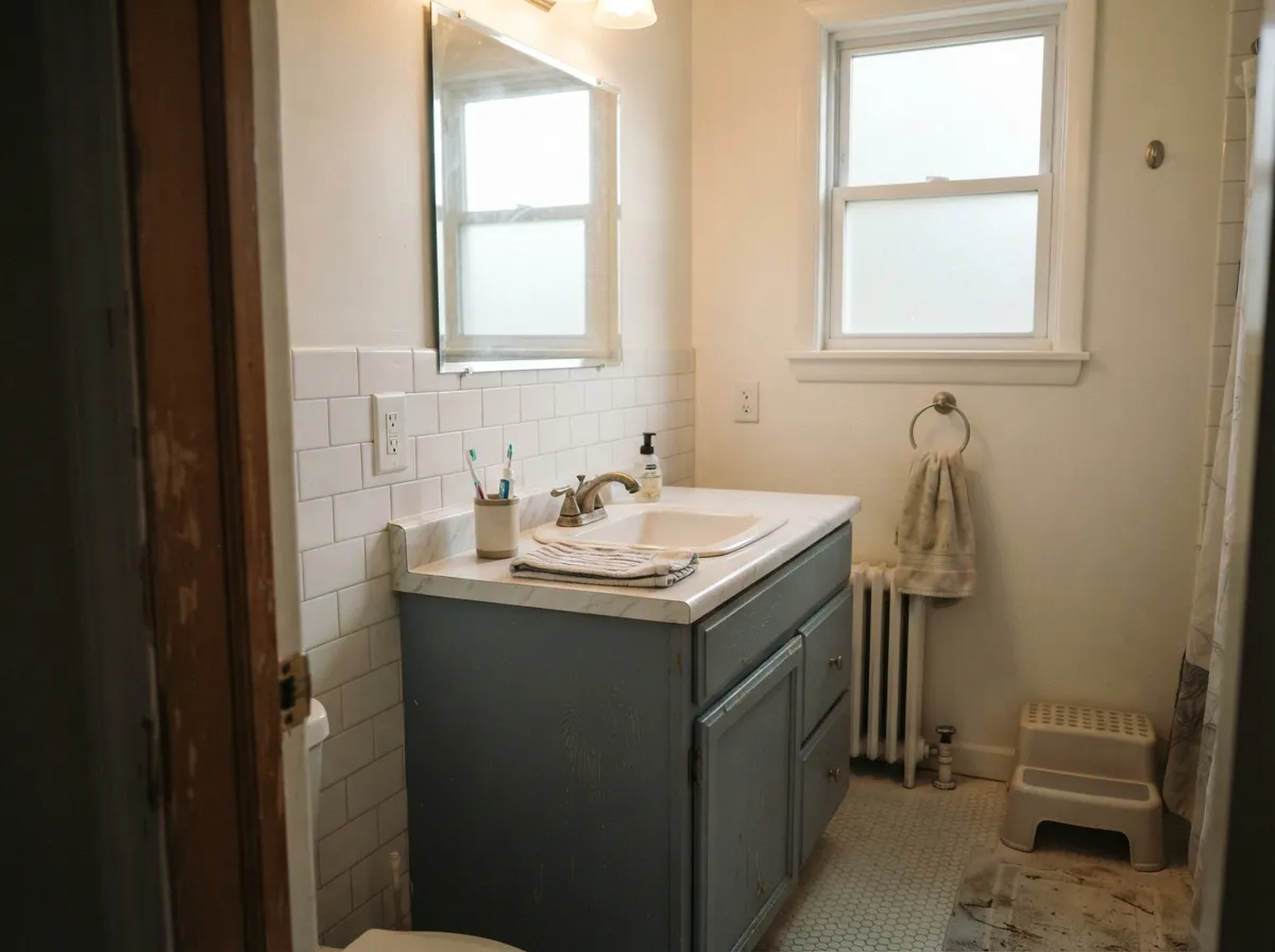
A Santorini Blue vanity under white tile and brass fixtures reads like a small design decision that changes the whole room. Works best with a window nearby; in a fully interior, windowless bath it can read gray under standard vanity lighting.
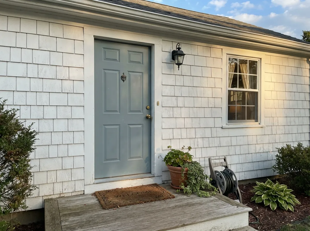
Against white siding, pale stucco or weathered cedar shingles it reads tailored and a little historic rather than trendy. Full outdoor daylight is exactly the light this color wants, which makes exteriors one of its safest applications.
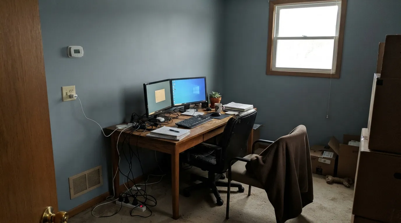
Reviewers specifically praise it on video calls: professional-looking on camera, calming in person, without the flatness a pure gray office wall can have. Works best with a window in the room, not purely overhead LEDs.
As an accent wall or on built-ins it gives a collected, intentional backdrop for wood furniture and art. In a bright south or east room it stays blue all day; in a dim or north-facing living room, expect it to read closer to gray.
Calm and cocooning with any real daylight; in a north-facing bedroom it needs warm 2700K lamps at night to avoid reading cold. Not the first pick for a bedroom that only gets weak, indirect light.
Your Light Is the Risk
Real, direct daylight keeps it a clear, calm blue all day — the light this color was built for.
Cool indirect light strips the blue out and leaves a flat, muddy gray. Test a big sample before committing.
A soft green undertone can surface in strong afternoon sun, then the color deepens and reads richer toward evening.
2700K warm bulbs deepen it and keep the blue cozy. Cool LEDs pull it toward slate and concrete — swap bulbs before repainting.
Most complaints about Santorini Blue are a light mismatch. Upload a photo of your actual room and see it on your walls — then ask for the same wall in north light or evening lamps before you buy a single sample.
Need It From Another Brand?
Any paint counter can custom-tint Benjamin Moore 1634 directly. If you would rather stay in one brand's own deck, these are the closest stock matches, measured as ΔE2000. Under 2 is a difference you will not see on the wall.
| Brand | Closest color | ΔE | LRV | |
|---|---|---|---|---|
| Sherwin-Williams | Dockside BlueSW 7601 · Sherwin-Williams | 1.4 | 43 | Color page → |
| Behr | Porch CeilingPPF-27 · Behr | 1.1 | 44 | Color page → |
| Valspar | Cat's Meow8004-38C · Valspar | 1.4 | 44 | Color page → |
| PPG / Glidden | Blue By YouPPG1035-3 · PPG / Glidden | 2.4 | 44 | Color page → |
| Glidden | Special DeliveryPPG1037-3 · Glidden | 1.8 | 43 | Color page → |
| Dutch Boy | Stonewash Blue432-3DB · Dutch Boy | 1.4 | 44 | Color page → |
Similar Benjamin Moore Colors
The nearest shades to Santorini Blue within Benjamin Moore's own range, ranked by perceptual color distance — useful when you want the same look a touch lighter, darker, or warmer.
WCAG 2.1: AA is 4.5 : 1 for normal text, 3 : 1 for large text, AAA is 7 : 1.
Santorini Blue vs the Colors You're Also Considering
Every Santorini Blue sample board has the same rivals on it. The numbers show the real lightness gap — then it comes down to which risk you would rather live with.
Pick this when you want the color to still read as blue on a cloudy day, not just on the chip.
Sherwin-Williams SW 9138 · LRV 43StardewPick this if you want it to lean further into slate and concrete — Stardew reads grayer in the same light Santorini Blue stays bluer in.
Pick this for the lighter, more confidently blue member of the family.
Benjamin Moore HC-165 · LRV 36Boothbay GrayPick this for a deeper, more consistently gray version of the same chameleon family.
Buxton Blue HC-149 at hex #9DB6BA and LRV 45 is the nearest neighbor in the line. Same lightness, slightly more green, which makes it read a shade more like sea glass. Colorado Gray 2136-50 at #9EB5B8 and LRV 44 is nearly the same weight with a hair more gray. Celtic Blue ES-31 at #A9B5BC and LRV 45 is the most neutral of the group, so pick it if Santorini Blue feels a touch too colored.
Across brands there is a genuine match. Backdrop Underdog BD-UD at #A4B5BB has a deltaE of 0.5, which is a true match rather than an approximation. Behr Porch Ceiling PPF-27 at deltaE 1.15 and Sherwin-Williams Dockside Blue SW 7601 at 1.4 are visually identical in normal room light. Further out, Kompozit Cystern 0511 at deltaE 4.57 and Rodda Patina CA190 at 4.35 are close but visibly different side by side.
Santorini Blue Coordinating Colors
The rule for coordinating with Santorini Blue: clean or warm whites for trim, and either a deeper true gray-blue or a soft near-black for contrast. It sits comfortably next to its own chameleon cousins, so layering a lighter or darker blue-gray nearby reads intentional rather than mismatched. These are the partners that show up again and again:
Why This Chameleon Blue Keeps Showing Up on Kitchen Islands
Santorini Blue is not a Color of the Year and has no famous designer moment attached to its name — it is a steady, quietly popular seller that has built its following the slow way, one island and one front door at a time, across design blogs and Pinterest boards. That honesty is worth stating plainly: if you came looking for a headline color story, this is not it.
What it has instead is a well-earned reputation among a specific family of chameleon blue-grays — Stardew, Boothbay Gray, Beach Glass — colors that trade a fixed identity for the ability to read differently in every room they land in. Santorini Blue is the family member that holds onto its blue most stubbornly, which is exactly why it keeps getting picked for the one surface in a house that gets looked at directly and often: the island, the door, the vanity.
Santorini Blue With Wood Tones and Floors
White oak — pale, natural, or lightly gray-washed — is the easiest floor partner: it keeps the whole room feeling coastal and calm without any undertone fight. Walnut works nearly as well, adding a warmer, more traditional counterweight to the cool blue. Gray-washed and driftwood-toned floors are safe across the board.
The one floor that argues with it is strongly orange honey oak. Blue and orange are opposites on the color wheel, so a warm, orange-leaning floor pulls the blue in this paint toward looking cooler and grayer, while the paint pushes the floor toward looking more orange in return — neither side wins. If a golden floor is staying put, a large area rug between it and the painted surface does most of the work; otherwise, this is the one honest reason to look at a warmer color instead.
Three Ready Palettes Built on Santorini Blue
A color is never alone on the wall. These are complete combinations in the 60-30-10 pattern, with the reason each one holds together. Every one opens in the visualizer.
White Dove keeps the perimeter soft and warm so the island carries all the color; Kendall Charcoal adds one dark, grounding note without competing with the blue. Brass hardware and stainless appliances complete the look this pairing is built for.
Try this palette in your roomSwiss Coffee keeps a small bathroom feeling airy while the vanity carries the color; Chantilly Lace on the trim gives the crisp white edge the blue needs to read fresh rather than heavy. Brass fixtures and white tile finish the look.
Try this palette in your roomA true white siding lets the door read as the single considered color choice instead of competing with it; Wrought Iron on shutters and fixtures adds the one dark note the scheme needs. Full outdoor daylight is exactly the light Santorini Blue wants.
Try this palette in your roomSantorini Blue FAQ
Is Santorini Blue more blue or more gray?
Blue, in any room with real daylight — but it is a genuine chameleon. In a dim or north-facing room it can read as gray, and that is the single most common surprise reported by people who bought it. Test a large sample on your actual wall before committing.
Is it good for kitchen cabinets or an island?
It is one of the most popular uses for this color. Against white perimeter cabinets, stainless appliances and brass hardware it reads considered rather than trendy. Use a satin, urethane-fortified cabinet enamel for durability.
Will it look gray in a north-facing room?
Likely, at least part of the day. North light is cool and indirect, and it strips the blue and green out of this color, leaving the gray base exposed. If your room is north-facing and dim, sample big before you commit — or add warm lamps and accept the gray.
What trim color goes with Santorini Blue?
A clean white keeps it feeling fresh: Chantilly Lace for a crisp, modern edge, White Dove or Swiss Coffee for something softer. Avoid pairing it with a much warmer, more yellow trim white — the contrast can push the blue toward looking cooler and grayer than intended.
Does it work on a front door or exterior?
Yes — this is one of its strongest applications. Against white siding, pale stucco or weathered cedar shingles it reads tailored and a little historic. Full outdoor daylight is exactly the light this color needs, which makes exteriors more forgiving than a dim interior room.
How many coats does it take?
Two coats over a similar or lighter existing color. Going over a dark or saturated wall, use a tinted primer first — otherwise plan on a third finish coat to get full, even coverage.
Have you painted with Santorini Blue?
Rate it — one tap helps the next reader decide.
Ask a Question