French Toile
A cool blue-gray that's practically a twin of two site-favorite chameleons, reviewed honestly: what makes it glow, what makes it go flat, and why almost nobody has heard of it.

Jessica has spec'd whites and neutrals for more than 300 rooms and keeps a sample wall of painted drawdowns in her studio. Every color review is checked against real reader rooms in the comments and re-tested when a formula changes. About the testing process →
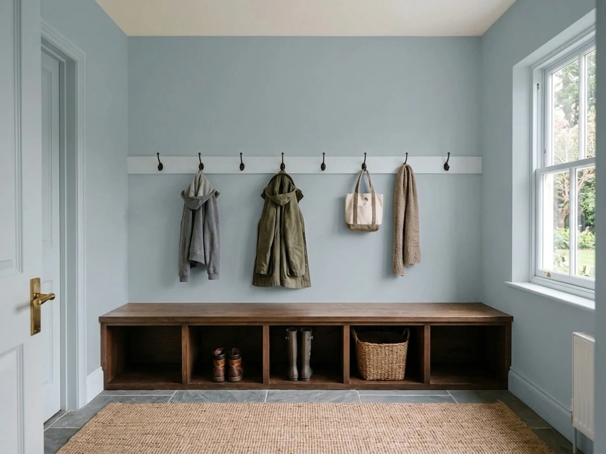
- 1Kendall Charcoal15
- 2Retreat21
- 3French Toile43
- 4Upward57
- 5Sea Salt63
The Fast Verdict
French Toile is what you'd get if you split the difference between Sherwin-Williams Stardew and Benjamin Moore's own Boothbay Gray: the same cool, blue-leaning-green undertone, the same mid-40s LRV, the same slate calm in good light. It behaves exactly like its two better-known cousins — glows in daylight, goes flat without it — it just never got the marketing push, so almost no one has painted a room with it and posted the photos.
Bathrooms and vanities with real daylight · kitchen islands next to white or cream cabinets · a front door or shutters on a light-colored exterior · anyone who likes the Stardew or Boothbay Gray look but wants a color their neighbor hasn't already used
Your room is genuinely dim or north-facing with no supplemental light · your floors and trim run golden honey-oak · you want a color you can search and see five hundred real rooms of first · you were actually hoping for a true, personality-free gray
- A genuine blue-gray, not a gray pretending to be blue or the reverse
- Mid-tone LRV 43 holds its color without reading heavy
- Reads custom in photos because almost nobody else has painted with it
- Flatters white cabinets, brass, and pale or painted wood
- Behaves like two well-reviewed blue-grays (Stardew, Boothbay Gray) with a real track record
- Goes flat and heavy grey in dim or north-facing rooms
- Fights honey oak floors and brassy-gold trim
- Disappoints buyers who actually wanted a true, personality-free gray
- No brand marketing behind it, so real-room reference photos are scarce
What Color Is French Toile, Really?
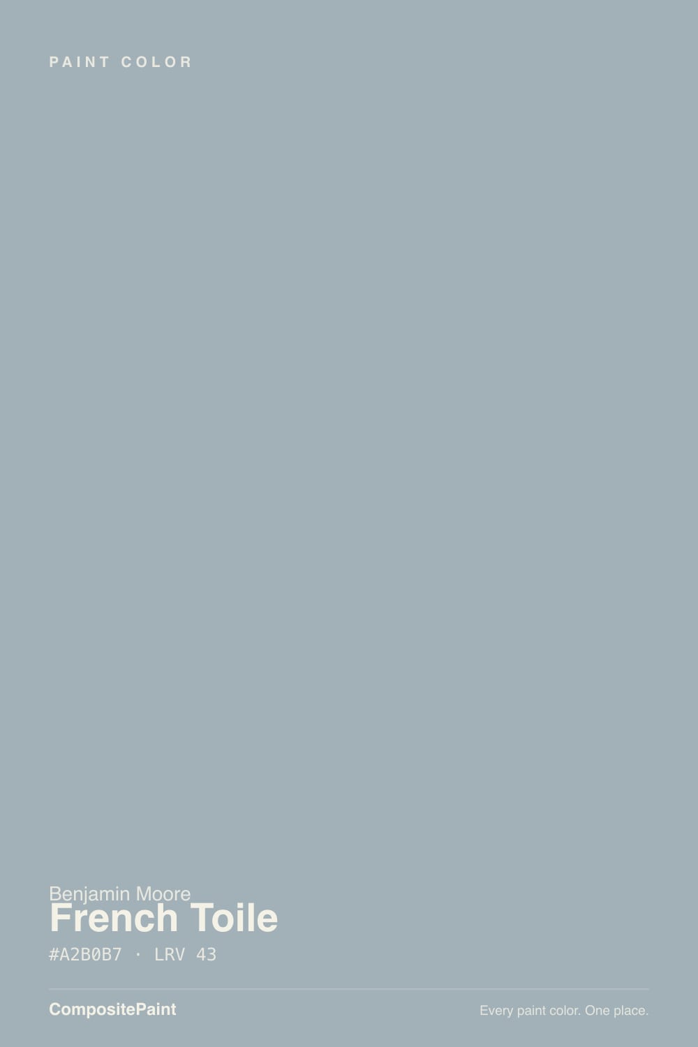
Line French Toile's numbers up against the two blue-grays this site rates highest in the family — Sherwin-Williams Stardew and Benjamin Moore's own Boothbay Gray — and they're almost suspiciously close: the same blue-lean-green undertone, LRV within a few points of each other, the same slate-blue read once it's on a wall. Benjamin Moore built it the way it builds most of its cool neutrals — a grey base with a controlled shot of blue and just enough green held in reserve so it never tips into a true "blue" paint. Glance at it and it reads gray; look for more than a second and the blue-gray shows itself.
At LRV 43 it's a genuine mid-tone — not light enough to bounce a dim room back to life, not dark enough to read moody sitting alone on a chip. That middle position is exactly why colors in this hex neighborhood have become go-to bathroom and cabinet picks: enough depth to look deliberate, enough reflectance to still read calm instead of heavy. Give it real daylight and it settles into a quiet, expensive-looking slate. Take the daylight away and, like every color this close in hex, it goes flatter and greyer than the chip promised.
Undertone in one line: blue leaning green, never warm. The name is the one honest clue Benjamin Moore left on the label — "toile" is the French decorative-fabric print, the blue-on-cream pastoral scenes on old curtains and upholstery — and French Toile reads like that fabric's blue thread pulled out and grayed down for a wall. If your sample looks warm or beige anywhere in the room, that's a warm bulb or a warm neighbor color doing the work, not this paint.
Where It Shines
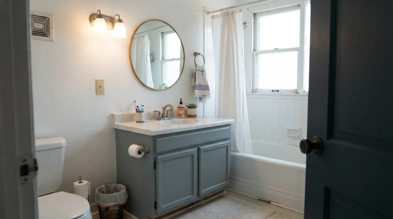
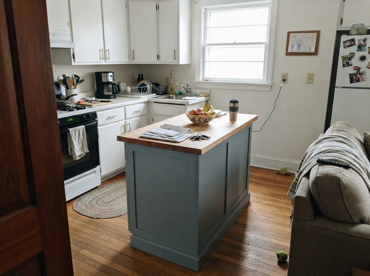
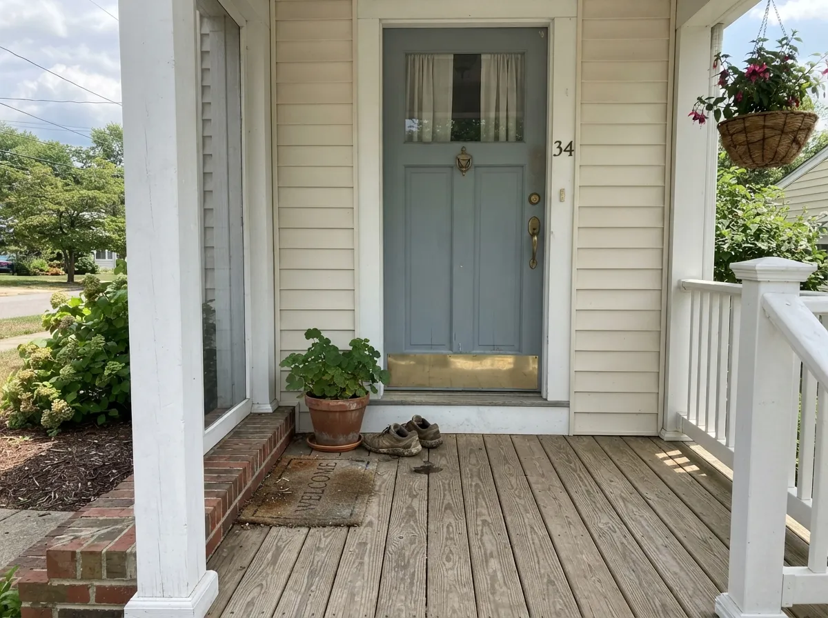
Put it where its two more famous cousins already earn their keep and it performs identically: a bathroom vanity under a real window, a kitchen island next to white cabinets, a front door on a pale exterior. It photographs as a proper designer blue-gray — the kind stylists reach for when plain gray feels flat and full blue feels too loud — and because almost nobody searches for it by name, a French Toile room reads custom instead of Pinterest-familiar.
Where It Fails
Because French Toile shares its undertone and LRV almost exactly with Stardew and Boothbay Gray, it also shares their failure modes — the same three predictable stories, just under a name too obscure for most buyers to have been warned about first.
Cool blue-grays lose warmth and gain grey the moment daylight drops, and this one is no exception. In flat north light, or any room running short on window, French Toile slides toward a flat, slightly heavy grey that reads more concrete than slate. Test the actual wall, not the chip, before committing a whole room.
Blue and orange sit opposite each other on the wheel, so golden oak floors or brassy-yellow trim fight the color instead of complementing it — the floor looks more orange, the wall looks colder. Pale oak, walnut, and painted white trim are the safe partners; save the honey oak for a warmer neutral.
Shoppers who grab the chip expecting a plain gray are the most common disappointed buyers of every color this close in hex. On four walls the blue-green shows up clearly, especially next to anything warm in the room. If the goal is gray with zero personality, this was never going to be the color.
Room by Room
A daylit bathroom is where this whole hex family performs best. On a vanity under a window, with a marble or quartz top and brass or matte-black hardware, it reads calm and considered rather than cold. Satin for the vanity, eggshell if the walls carry the color too.
On an island next to White Dove or plain white perimeter cabinets it's genuinely striking without dating a whole kitchen. Painting every wall the same blue-gray is a bigger bet — do it only with real daylight and a light-toned floor.
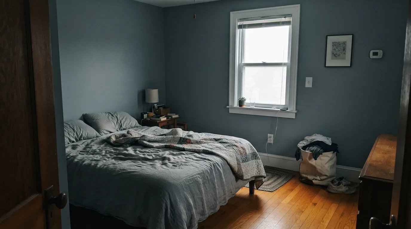
A calm, grown-up bedroom color when the room gets sun. In a north-facing bedroom with no lamps it can slide toward flat and a little cold — add 2700K bulbs or step up in LRV if the room stays dim.
Small utility rooms take a mid-tone cool color well, and French Toile hides scuffs and hand marks better than a pale gray does. Semi-gloss or satin for durability near cabinets and the wash sink.
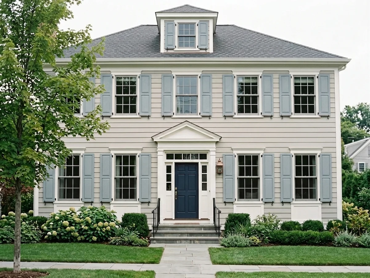
On a light-colored house — white, cream, or pale grey siding — a French Toile front door or shutters reads intentional and a little unusual, since almost nobody else on the block will have used it. Full sun reads it a touch brighter and bluer than indoors.
Walnut desks, black metal shelving, and cool-toned floors all suit it. A room full of honey oak built-ins is the one combination to avoid; the same complement clash from the fails section applies here too.
Your Light Is the Risk
Full, even daylight — a bathroom window, an east-facing kitchen — keeps it a calm, true slate-blue-gray. This is the light every color in this hex family wants.
Cool grey daylight strips out even more of the warmth it started with, and the color slides toward a flat, heavy grey with a cold cast. Sample a north room before committing.
Bluer and crisper at the sun hours, quieter and greyer once direct light passes. The shift is gentle, not a new color.
Warm 2700K bulbs pull it toward a soft green-gray at night; cool LEDs push it colder and flatter. Warm bulbs are the better match for this undertone.
Most complaints about French Toile are a light mismatch. Upload a photo of your actual room and see it on your walls — then ask for the same wall in north light or evening lamps before you buy a single sample.
Need It From Another Brand?
Any paint counter can custom-tint Benjamin Moore CSP-595 directly. If you would rather stay in one brand's own deck, these are the closest stock matches, measured as ΔE2000. Under 2 is a difference you will not see on the wall.
| Brand | Closest color | ΔE | LRV | |
|---|---|---|---|---|
| Sherwin-Williams | Dockside BlueSW 7601 · Sherwin-Williams | 1.9 | 43 | Color page → |
| Behr | Porch CeilingPPF-27 · Behr | 1.1 | 44 | Color page → |
| Valspar | Hibernate8004-41C · Valspar | 0.9 | 43 | Color page → |
| PPG / Glidden | How Handsome1040-4 · PPG / Glidden | 1.6 | 41 | Color page → |
| Glidden | Shaded Brook30BG 42/049 · Glidden | 1.5 | 42 | Color page → |
| Dutch Boy | Fogged In433-3DB · Dutch Boy | 1.1 | 41 | Color page → |
Similar Benjamin Moore Colors
The nearest shades to French Toile within Benjamin Moore's own range, ranked by perceptual color distance — useful when you want the same look a touch lighter, darker, or warmer.
WCAG 2.1: AA is 4.5 : 1 for normal text, 3 : 1 for large text, AAA is 7 : 1.
French Toile vs the Colors You're Also Considering
Every French Toile sample board has the same rivals on it. The numbers show the real lightness gap — then it comes down to which risk you would rather live with.
Pick this if you want the Benjamin Moore version at almost the identical hex and LRV.
Sherwin-Williams SW 9138 · LRV 43StardewPick this if your painter works in Sherwin-Williams — the undertone and depth are close enough to call twins.
Pick this for a slightly lighter, airier read of the same blue-gray.
Benjamin Moore HC-165 · LRV 36Boothbay GrayPick this for a touch more depth and a name enough people already know to find real room photos of.
Pick this for the quieter, more gray-leaning version of the same family.
Sherwin-Williams SW 6239 · LRV 39UpwardPick this if you want the undertone pushed further toward an obvious blue.
Pick this for the cool, blue-leaning direction a greige like Revere Pewter can't give you.
Benjamin Moore HC-172 · LRV 56Revere PewterPick this if the room actually wants warmth — Revere Pewter is a greige, not a blue-gray, and it plays with honey oak instead of fighting it.
Inside the Benjamin Moore deck, Beneath the Clouds 2131-50 (#A1B0B4, LRV 42) and Solitude AF-545 (#A3AEB4, LRV 42) are the closest calls. Both are a hair grayer and less blue than French Toile at #A2B0B7. Slate Blue 1648 and Early Morning CC-818 share the same LRV of 43 but at #9BB1BB carry more visible blue, so choose those if French Toile looks too gray on your board.
Across brands the matches are unusually tight. C2 Argyle C2-751 at deltaE 0.5 and Valspar Hibernate 8004-41C at deltaE 0.95 are the same color for practical purposes. Dutch Boy Fogged In 433-3DB (1.14), Glidden Shaded Brook 30BG 42/049 (1.47), and PPG Glidden How Handsome 1040-4 (1.58) are visually identical in normal room light. Sherwin-Williams Dockside Blue SW 7601 (1.85) and Behr Intercoastal Gray MQ5-23 (1.9) land in the same band. Farrow and Ball Kittiwake No. 307 at deltaE 3.42 and LRV 40 is close but visibly different side by side, a little darker and more clearly blue.
French Toile Coordinating Colors
The rule for coordinating with French Toile is the same rule that governs every color in its hex family: stay cool, stay light-forward, and keep golden undertones away from it. It pairs cleanly with crisp and warm whites alike, loves brass and matte black hardware, and sits comfortably next to deeper cool neutrals and true navy. These are the partners that keep it looking deliberate rather than accidental:
The Blue-Gray Nobody Searches For
Every blue-gray review on this site keeps circling back to the same handful of names — Stardew, Boothbay Gray, Upward — because those are the colors with enough sample-and-post volume behind them to talk about with confidence. French Toile sits in almost the exact same spot on the color wheel, at almost the exact same LRV, and behaves the same way in the same light. What it doesn't have is the search volume: far fewer blogs have photographed it, far fewer forum threads mention it by name.
That's worth knowing both ways. If you want a well-documented color with hundreds of real rooms to check against your own light before you buy, French Toile is not that color yet — Stardew or Boothbay Gray will get you there faster. If you like the idea of a color that performs the same but that almost nobody else on your street has used, that thin paper trail is the whole appeal.
French Toile With Wood Tones and Floors
Pale white oak, walnut, and gray-washed floors are the safe, flattering matches — cool or neutral wood keeps the blue-gray reading calm instead of pushing it toward either extreme. Matte black and unlacquered brass hardware both work well against it; brass reads a touch cooler next to this color than it does against a warm white, which some rooms want and some don't.
The one wood to leave out is honey oak. It's the same complement clash covered in the fails section: yellow-orange wood pushed against blue-green paint makes both sides look worse, not better. If the honey oak floor is staying put, choose a warm greige like Revere Pewter instead and save French Toile for a room where the flooring already runs cool or neutral.
Three Ready Palettes Built on French Toile
A color is never alone on the wall. These are complete combinations in the 60-30-10 pattern, with the reason each one holds together. Every one opens in the visualizer.
Chantilly Lace's cool, crisp white matches French Toile's own cool lean instead of fighting it the way a warm white would; Kendall Charcoal on the mirror frame gives the room one grounding dark note without adding a second undertone to argue with.
Try this palette in your roomWhite Dove's warm cream keeps the kitchen from turning cold no matter how blue the island reads; Wrought Iron adds one true dark note that photographs well against brass hardware.
Try this palette in your roomA no-opinion white siding lets French Toile's blue-gray read clearly instead of competing with a stronger wall color; Chelsea Gray shutters stay in the same cool-neutral family, so the whole facade reads considered instead of mismatched.
Try this palette in your roomFrench Toile FAQ
Is French Toile blue or gray?
Blue leaning gray, with a whisper of green. It's close enough to Sherwin-Williams Stardew and Benjamin Moore Boothbay Gray in undertone and LRV that most people would call all three the same color family — gray at a glance, unmistakably blue-gray up close.
What's the real difference between French Toile and Stardew or Boothbay Gray?
On the wall, very little — the hex and LRV are close enough that the three read almost the same in the same room and light. The practical difference is brand and paper trail: Stardew and Boothbay Gray are established enough that a search turns up hundreds of real rooms; French Toile does the same job with almost no online reference photos.
Does it work with honey oak floors?
No, and this is the color's most predictable regret. Blue and orange are complements, so golden oak amplifies the blue in the walls while the walls amplify the orange in the floor. Pale oak, walnut, or a painted floor all work; honey oak does not.
What trim color goes with French Toile walls?
A cool, crisp white like Chantilly Lace matches its temperature and keeps the look clean. If the room needs softening, a warm white like White Dove works too — the slight warm-cool contrast reads intentional rather than clashing.
Is it good for a bathroom?
It's arguably the best room for it. Bathrooms tend to have a window and hard, reflective surfaces that bounce the daylight around, which is exactly the condition this color needs to stay calm rather than flat. Pair it with brass or matte black hardware and a light countertop.
Why haven't I heard of this color before?
Nothing wrong with the paint — it's a marketing gap, not a performance one. French Toile sits on almost the same undertone and LRV as two colors that already have a strong track record on this site and elsewhere; it simply never got the same design-blog attention, so there are far fewer real rooms to point to before you buy a sample.
Have you painted with French Toile?
Rate it — one tap helps the next reader decide.
Ask a Question