Forget-Me-Not
The periwinkle Sherwin-Williams files under purple and half the internet calls blue — reviewed honestly, including the light that turns it to gray slate.

Jessica has spec'd whites and neutrals for more than 300 rooms and keeps a sample wall of painted drawdowns in her studio. Every color review is checked against real reader rooms in the comments and re-tested when a formula changes. About the testing process →
- 1Nocturne Shade5
- 2Ripe Berry10
- 3Forget-Me-Not16
- 4Gothic Purple24
- 5Hazy Lilac29
The Fast Verdict
Forget-Me-Not is a muted blue-violet — real periwinkle, not lilac. Sherwin-Williams files it in the purple family, but its hue sits at the blue end of violet and the saturation is low, so in cool light plenty of people read it as a dusty denim blue. At LRV 16 it is a mid-deep color, not the airy spring shade the name suggests: it will darken a room, and it needs daylight or good lamps to stay a color instead of a gray. Give it that light and it is one of the most interesting bedroom colors in the SW deck.
Bedrooms with real daylight · teen and tween rooms that shouldn't look babyish · powder rooms and bathroom vanities · accent and headboard walls · anyone who wants purple without the candy
You are picturing a pale lilac · the room is north-facing and lampless · your finishes are sage green or olive · honey oak floors and orange-toned trim · you need every guest to agree on what color it is
- Real periwinkle — violet without the candy or the sweetness
- Deep enough (LRV 16) to hold its color in bright rooms instead of washing out
- Solves the teen-room problem: purple that doesn't read as a nursery
- Small doses look custom — vanities, built-ins, one headboard wall
- Low saturation makes it far easier to live with than a true violet
- Not the pale lilac the name suggests — LRV 16 darkens a room
- Reads blue to a lot of people, so nobody agrees on what color it is
- Dim north rooms drain it to a flat gray-lavender
- Fights sage-green finishes, olive carpet and honey oak floors
What Color Is Forget-Me-Not, Really?
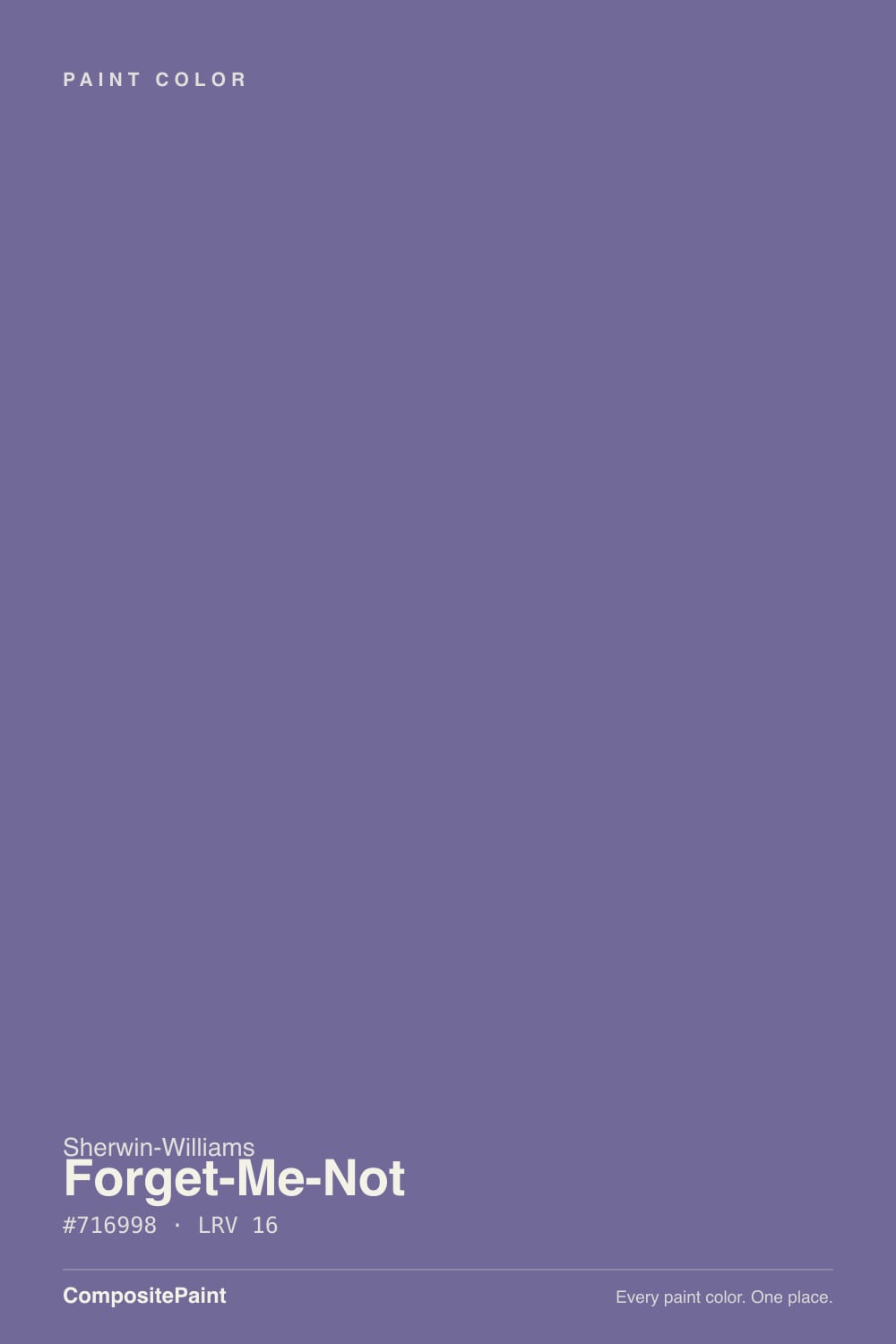
A grayed blue-violet. The hue lands right around 250 degrees — the blue side of violet, which is exactly where periwinkle lives — and the saturation is only about 19 percent, so it is muted rather than bright. That combination is the whole personality: enough violet to be unmistakably not-gray, enough gray to keep it out of Easter-egg territory. Its closest cross-brand relatives are named the same way the eye sees it: RAL calls its match Blue Lilac, Pantone calls its match Veronica.
At LRV 16 this is a genuinely mid-deep color, and that is the number most buyers skip past. A 16 absorbs far more light than it returns — the same range as a mid-depth navy or a dark sage. On four walls it makes a room quieter and smaller-feeling, which is a feature in a bedroom and a problem in a dim hallway. Expect the painted wall to read at least a step deeper than the chip, because a small chip is surrounded by white paper and a wall is surrounded by itself.
Undertone in one line: violet first, blue second, gray third — no red anywhere. That missing red is why it never turns mauve or pink the way a grayed red-violet does. When people say it looks cold, that is the honest reading: this is a cool color with nothing warm underneath it, and the room has to supply the warmth.
Where It Shines
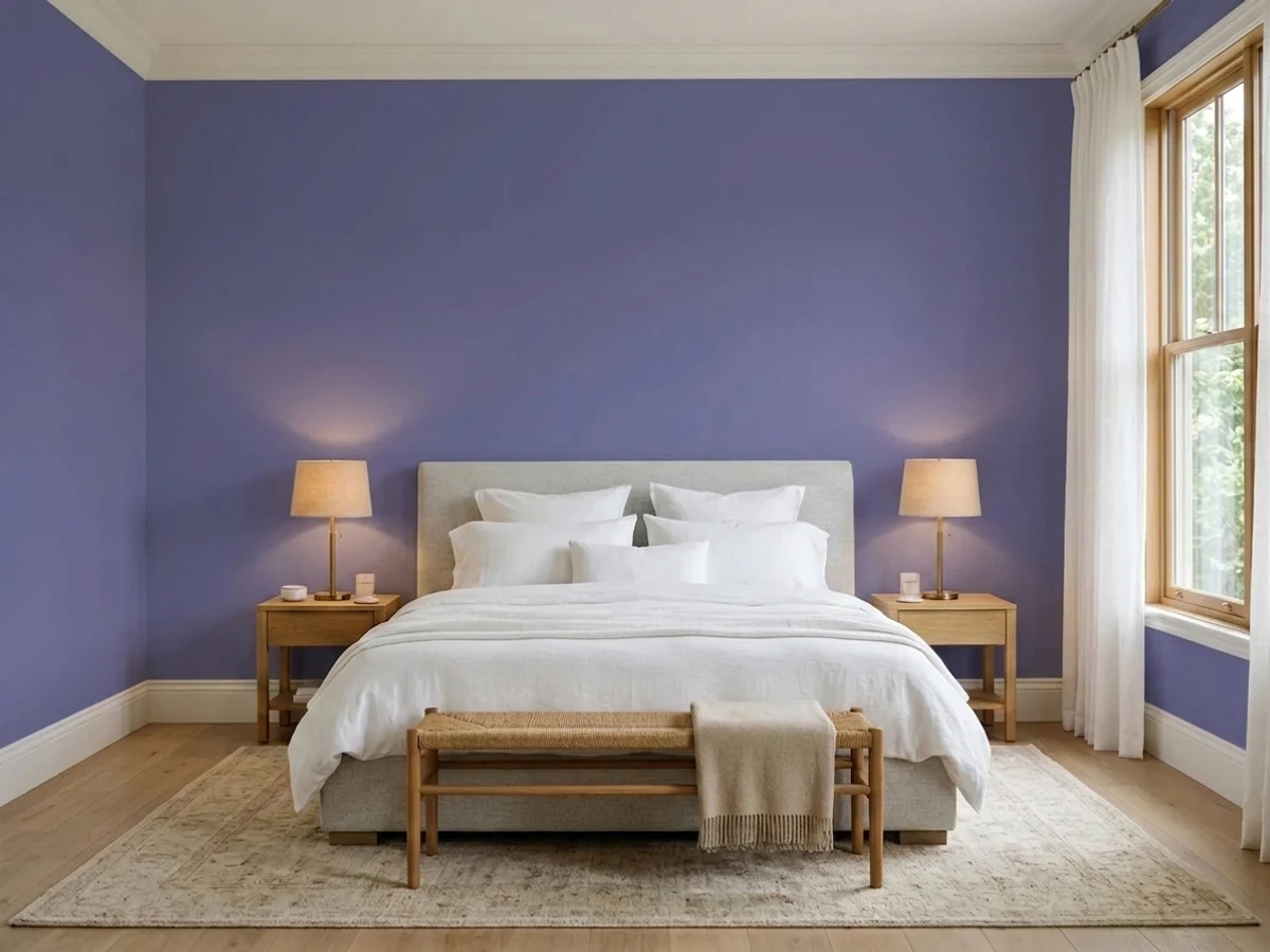
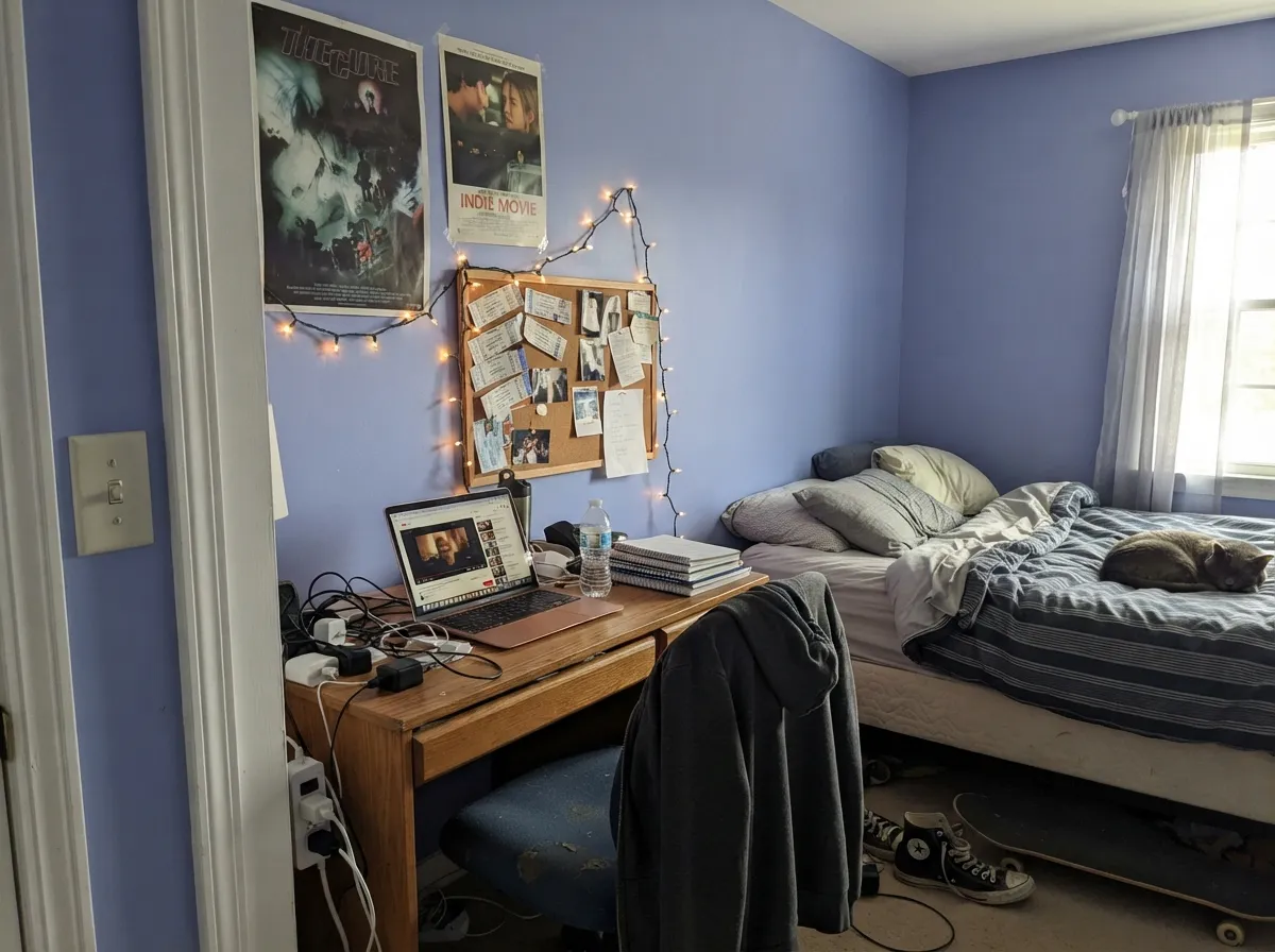
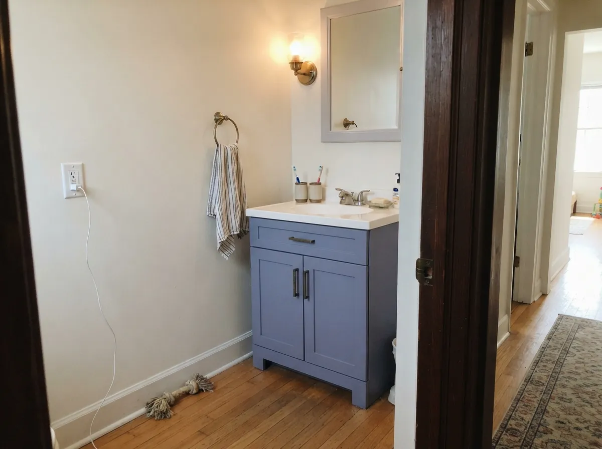
This color earns its keep in rooms with real daylight and a reason to feel calm. A bedroom with a decent window is its home: the violet stays legible, the gray keeps it restful, and white bedding makes it look considered instead of dated. It is also one of the better answers to the teen-room problem — old enough not to read as a nursery, soft enough that nobody has to repaint in two years. And it is excellent in small doses: a bathroom vanity, a run of built-ins, one headboard wall. Give it crisp white trim, warm wood, and either brass or matte black, and it reads like a color someone chose on purpose.
Where It Fails
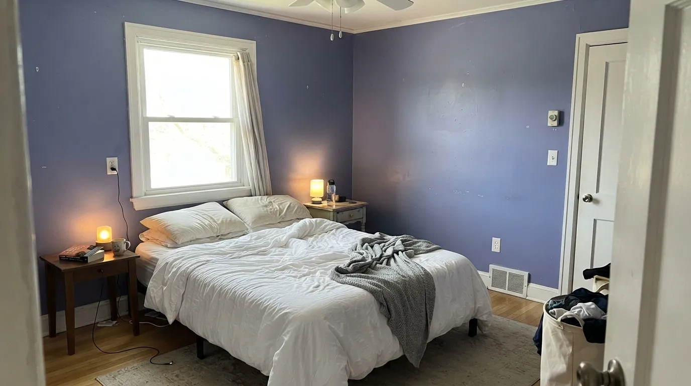
The complaints about this color are remarkably consistent, and every one of them is predictable before you open the can. Two of the three are expectation problems rather than paint problems — which does not make the disappointment less real, but does mean a large sample board on the actual wall settles it in a weekend.
The name and the little chip both suggest spring flowers. LRV 16 does not. This is a mid-deep color that will visibly darken the room, and in a small bedroom with one window it reads moody, not airy. If the picture in your head is pale and floaty, you want something in the 55–65 LRV range instead — French Lilac at LRV 56 is much closer to what most people mean by lilac.
Sherwin-Williams files Forget-Me-Not under purple. Its hue sits at the blue edge of violet, and the saturation is low enough that cool light reads it as dusty denim. Online descriptions split down the middle for exactly this reason — some call it a soft blue, some a muted purple, and both are looking at the same paint. If you need a color that everyone agrees is purple, this is not it; go deeper and redder.
The direct complement of this hue is a moss green, which cuts both ways: an olive pillow or a green plant makes the violet pop on purpose, but existing sage-green tile, olive carpet or a green-gray adjoining room turns the whole thing into an argument. Golden honey oak floors and orange-stained trim are the other fight — the yellow pushes the walls toward a dingier grape. Walnut, pale white oak and gray-washed floors are all fine.
Room by Room
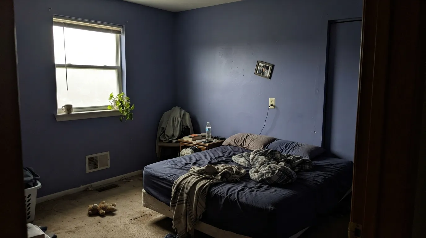
This is where it belongs, as long as the room has a real window. Matte finish, white bedding, warm wood nightstands, and the violet stays soft and grown-up instead of dark and heavy. The condition is light: in a bedroom that only ever sees lamplight, budget for good lamps or pick something lighter.
It solves the exact problem parents have with this age: purple that is not a cartoon, calm enough for homework, moody enough that a fourteen-year-old will actually agree to it. Eggshell wears better than matte here. Pair with white trim and let the posters supply the color.
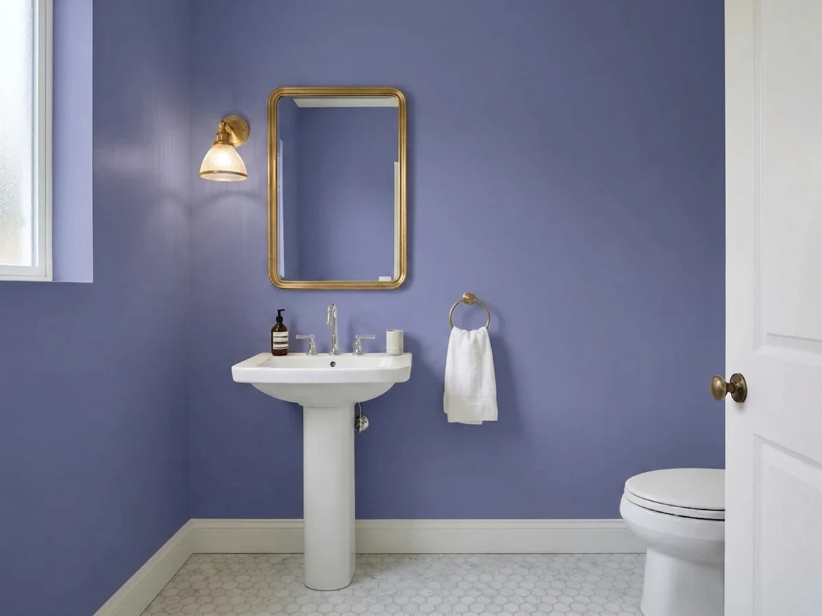
Sherwin-Williams lists it for bathroom vanities, and that is where it looks most expensive: satin Forget-Me-Not on a vanity under a white counter with brass or brushed nickel pulls. Drenching a windowless powder room in all four walls also works — small rooms take deep color well, and a mirror plus a good sconce carries the light.
A cool violet-blue is genuinely good for a room you concentrate in: quiet, non-distracting, and it photographs well behind you on video calls. It needs a window or a bright task lamp, because at LRV 16 a dim office just goes dark. Excellent on built-in shelving with white walls if you don't want the full commitment.
On a run of lower cabinets or an island under white uppers it is unusual and looks custom. Full kitchen walls in a 16 LRV color is a lot of dark in a room where you need to see what you are chopping, and it clashes with anything golden in the counters. Satin cabinet enamel is non-negotiable.
Full sun flattens the violet and pulls it toward a gray-slate blue, so from the curb it mostly reads as an odd blue rather than the color you picked. The narrow exception is a shaded front door on a white or pale-gray house, where the dusty periwinkle looks deliberate. Do not use it on a whole exterior body expecting purple.
Your Light Is the Risk
Strong natural light is what makes the violet legible instead of gray. In a south-facing bedroom at midday it reads as a clear, dusty periwinkle — this is the version worth buying the paint for.
Cold, flat northern light strips out what little saturation the color has and leaves a gray-lavender that owners describe as slate or wet concrete. In a north room with no lamps on, the color you paid for is simply not there.
East light in the morning is the bluest read of the day — closest to denim. As the sun swings west the warmer late-afternoon light pushes it back toward violet, and for an hour around golden hour it looks noticeably plummier. Sample and check it at both ends.
Your bulb temperature decides the argument. 2700K warm bulbs cancel the blue and pull it toward a soft grape — cozier, a little muddier. 4000K and cooler LEDs bring the blue forward and it reads denim-slate at night. Neither is wrong; pick the one you want and buy all the bulbs to match.
Most complaints about Forget-Me-Not are a light mismatch. Upload a photo of your actual room and see it on your walls — then ask for the same wall in north light or evening lamps before you buy a single sample.
Need It From Another Brand?
Any paint counter can custom-tint Sherwin-Williams SW 6824 directly. If you would rather stay in one brand's own deck, these are the closest stock matches, measured as ΔE2000. Under 2 is a difference you will not see on the wall.
| Brand | Closest color | ΔE | LRV | |
|---|---|---|---|---|
| Behr | Peruvian Violet660F-6 · Behr | 3.2 | 16 | Color page → |
| PPG / Glidden | Purple GrapesPPG1175-6 · PPG / Glidden | 2.0 | 16 | Color page → |
| Glidden | Purple GrapesPPG1175-6 · Glidden | 1.7 | 16 | Color page → |
| HGTV Home by Sherwin-Williams | Violet ObsessionHGSW 1412 · HGTV Home by Sherwin-Williams | 0.0 | 16 | Color page → |
| Dunn-Edwards | SentimentalDEFD02 · Dunn-Edwards | 2.9 | 17 | Color page → |
| Diamond Vogel | Purple Spire1249 · Diamond Vogel | 4.2 | 19 | Color page → |
Similar Sherwin-Williams Colors
The nearest shades to Forget-Me-Not within Sherwin-Williams's own range, ranked by perceptual color distance — useful when you want the same look a touch lighter, darker, or warmer.
WCAG 2.1: AA is 4.5 : 1 for normal text, 3 : 1 for large text, AAA is 7 : 1.
Forget-Me-Not vs the Colors You're Also Considering
Every Forget-Me-Not sample board has the same rivals on it. The numbers show the real lightness gap — then it comes down to which risk you would rather live with.
Pick this when you want the violet to actually show. At almost identical depth, Forget-Me-Not carries more purple and less navy.
Benjamin Moore 825 · LRV 17Blue NovaPick this if you want the same depth to land clearly on the blue side — it is the Color of the Year version of this idea, and far more people will call it blue.
Pick this when you want the color to have real weight and to still be visible after dark.
Benjamin Moore 1403 · LRV 56French LilacPick this if what you actually pictured was lilac — at LRV 56 it keeps a room light and airy the way Forget-Me-Not never will.
Pick this when you want purple that stays cool and never flirts with mauve or pink.
Benjamin Moore 1454 · LRV 28Sleepy HollowPick this for warm-blooded purple — it has a drop of red that turns it rosy under lamps, and at LRV 28 it is lighter and gentler.
Pick this when the violet is the point, not a surprise, and you need to keep more light in the room.
Sherwin-Williams SW 7602 · LRV 8Indigo BatikPick this if you want a navy that only flashes violet under lamplight rather than wearing it all day — and you want the extra depth of LRV 8.
Forget-Me-Not Coordinating Colors
The rule for coordinating with Forget-Me-Not: clean low-yellow whites, cool grays that share its blue lean, and one near-black to anchor it. Keep creamy and golden whites away — they turn the violet dingy — and treat green as a deliberate accent rather than a neighboring wall color. These are the partners that hold up:
Why Nobody Can Agree Whether Forget-Me-Not Is Blue
Search this color and you will find one page calling it a delicate soft blue and the next calling it a muted purple, sometimes in the same paragraph. They are not contradicting each other by accident. The hue sits near 250 degrees — the boundary zone where violet hands off to blue — and the saturation is under 20 percent, which means there is not enough color intensity to force the eye either way. Your brain fills in the rest from whatever else is in the room.
That is why cross-brand matching services land on names from both sides: the closest RAL shade is called Blue Lilac, the closest Pantone is Veronica, and Sherwin-Williams itself shelves it under purple. It is also why the disagreement will follow the paint into your house. In an east-facing bedroom at 8am, guests will call it blue. Under warm lamps at nine at night, the same wall gets called purple.
The practical takeaway is not to fight it. Decide which read you want and stack the deck: cool LEDs, white bedding and gray-blue textiles push it to periwinkle-denim; 2700K bulbs, warm wood and cream push it to soft grape. Trying to get it to sit exactly in the middle is the one thing that will not work.
Forget-Me-Not With Wood Tones, Floors and Metals
Floors decide more than paint does here. Walnut and espresso are excellent — the dark red-brown gives the cool violet something to lean on. Pale white oak and gray-washed floors are the safest and give the room a quiet Scandinavian read. Cream or pale gray carpet is fine. Honey oak and orange-stained trim are the honest no: the golden yellow drags the walls toward a dingier grape, and no extra coat fixes it. A large rug is the compromise if the floor is staying.
Green is the interesting case. A moss or olive green is the direct complement of this hue, which makes it a genuinely striking accent — one olive velvet cushion or a big plant makes the violet look intentional and rich. The same relationship works against you at wall scale: existing sage-green tile, an olive carpet or a green-gray room opening off this one turns into visual noise. Accent yes, adjoining wall no.
Metals split cleanly. Brass and antique gold warm the color and give it the expensive look, which is why the vanity treatment works so well. Brushed nickel, chrome and matte black all keep it cool and modern. Oil-rubbed bronze is the only one that tends to look muddy against it.
Three Ready Palettes Built on Forget-Me-Not
A color is never alone on the wall. These are complete combinations in the 60-30-10 pattern, with the reason each one holds together. Every one opens in the visualizer.
Pure White is the right trim answer here because it is clean without being icy — a creamy white like Dover White would go visibly yellow against this much violet. Alpaca is the clever part: it is a greige with a violet streak of its own, so the room next door feels related instead of like a color change.
Try this palette in your roomA cool-leaning scheme that stays deliberate: Snowbound keeps the little room bright at LRV 83, the vanity carries all the color, and Iron Ore at LRV 6 gives one near-black note so it reads designed rather than accidental. Brass hardware is the one warm thing in the room, and it is enough.
Try this palette in your roomStardew at LRV 43 keeps the room bright while sharing the same cool, blue-leaning family, so the built-ins read as a deeper version of the walls rather than a separate decision. Extra White is the sharpest trim white in the SW deck, which is exactly what a low-contrast cool scheme needs to stay crisp.
Try this palette in your roomForget-Me-Not FAQ
Is Forget-Me-Not blue or purple?
Officially purple — Sherwin-Williams files it in the purple family — but it sits at the blue edge of violet, so in cool daylight or under cool LEDs a lot of people read it as a dusty denim blue. Warm lamplight pushes it back toward grape. If you need a color everyone will agree is purple, pick something deeper and redder; if periwinkle is what you want, this is exactly it.
What trim white goes with Forget-Me-Not?
A clean white with very little yellow. Pure White is the easy default, Snowbound if you want a slightly cooler edge, Extra White if you want the crispest possible line. Avoid the creamy whites — Dover White and Creamy both read distinctly yellow next to this much violet, which makes the walls look dingy rather than soft.
Is Forget-Me-Not too dark for a bedroom?
It depends entirely on the window. At LRV 16 it is a mid-deep color, so in a bedroom with a decent window it reads calm and enveloping, and in a small room with one north window it reads dark. Sample a large board on the wall you will actually paint and look at it at 8am, 4pm and after dark before you commit.
Will Forget-Me-Not work in a north-facing room?
It is the riskiest exposure for this color. Cold northern light strips out the little saturation it has and leaves a flat gray-lavender that most people describe as slate. If the room is north-facing you need real lamp light to bring the violet back, and you should test with the bulbs you actually own — 2700K bulbs help, cool LEDs make it worse.
Can I use it on a bathroom vanity or kitchen cabinets?
Yes, and this is where it looks best value for money. Sherwin-Williams lists it for both bathroom vanities and kitchen cabinets, and a satin vanity in this color under a white counter reads custom. Use a urethane-fortified cabinet enamel, not wall paint. A full kitchen of it is a much bigger bet — keep it to an island or the lowers.
What does LRV 16 actually mean here?
It means the paint reflects about 16 percent of the light that hits it — roughly the same territory as a mid-depth navy or a dark sage, and far darker than most people assume from the chip. Practically: the room will feel smaller and quieter, you will want more lamps than you think, and the color will hold its identity in bright light instead of washing out.
Have you painted with Forget-Me-Not?
Rate it — one tap helps the next reader decide.
Ask a Question