Indigo Batik
A deep grayed indigo-navy reviewed honestly: the denim-blue daylight read, the violet it grows at night, and the rooms where LRV 8 goes too dark.

Jessica has spec'd whites and neutrals for more than 300 rooms and keeps a sample wall of painted drawdowns in her studio. Every color review is checked against real reader rooms in the comments and re-tested when a formula changes. About the testing process →
- 1Anchors Aweigh3
- 2Indigo Batik8
- 3Waterloo13
- 4Charcoal Blue19
The Fast Verdict
Indigo Batik is a navy with a real personality shift built in: crisp, tailored denim-blue by daylight, then a quiet violet creeps into it under warm bulbs at night. It never had a Color of the Year moment and nobody is putting it on a highlight reel — it is a genuinely good, slightly underrated deep blue that does its best work on cabinets, islands, and front doors, and asks for real light everywhere else.
Kitchen islands and cabinets · front doors · bedrooms and dens with a lamp or two · anyone who wants a navy with more nuance than a flat black-blue
You want a color that reads exactly the same day and night · your room has no window and no supplemental light · you're pairing it with warm cream trim · you specifically don't want any purple in your navy
- A navy with real dimension — crisp denim-blue by day, soft violet by lamp light
- Deep enough (LRV 8) to anchor an island or a front door without going flat black
- Reads considered and current, not like a default off-the-shelf navy
- Genuinely good on cabinets, islands, and exterior doors with real light
- Pairs cleanly with brass, warm wood, and a crisp cool-white trim
- Goes near-black and loses its blue entirely in a room with no real light
- The violet flush under warm bulbs surprises buyers who wanted a flat navy
- Needs two to three coats for even coverage at this depth
- Warm cream trim makes it read muddy — the trim choice is not optional
What Color Is Indigo Batik, Really?
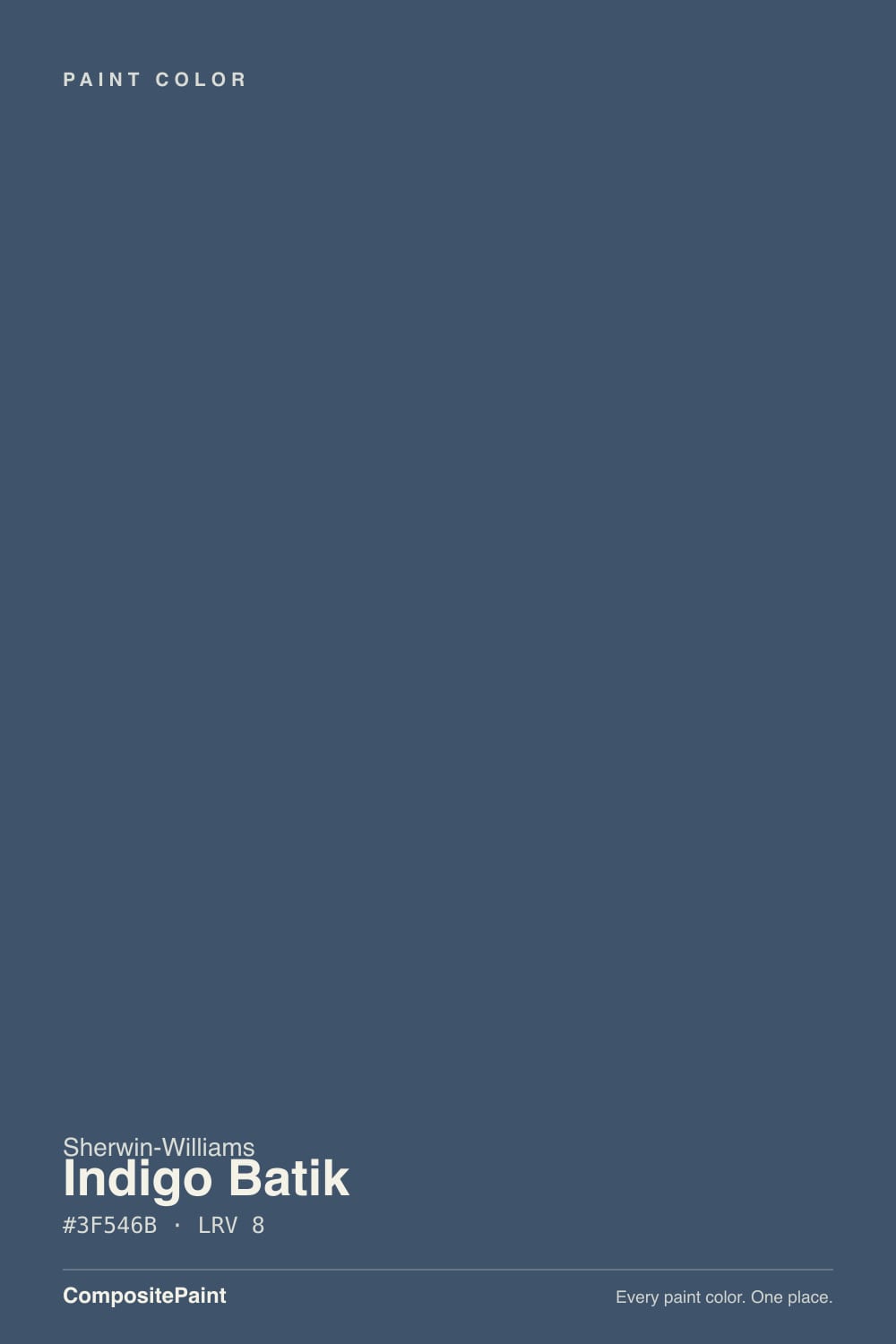
A blue-gray navy with a gray base heavy enough to keep it from ever reading loud, and a cool lean that turns distinctly violet the moment warm light hits it. That is the whole character of the color: in flat daylight it is a clean, denim-like navy-blue, tailored and a little worn-in; switch on a 2700K lamp at night and the red in the warm bulb pulls a soft plum-violet out of the blue. Neither read is wrong — it is the same undertone behaving honestly under two different lights, and it is the single most-mentioned trait in every writeup of this color.
At LRV 8 it sits in true near-black territory — one point lighter than Sherwin-Williams' own Naval (LRV 4) and two lighter than Benjamin Moore Hale Navy (LRV 6), but still deep enough that a room with poor light will read the color as almost no color at all: just a dark wall. That is the trade every navy this deep makes, and Indigo Batik does not get a pass on it. Give it a window or real fixtures and the blue stays legible; starve it of light and it goes flat and cave-like.
Undertone in one line: blue-gray by day, violet by lamp light, never green, never truly black. If your sample reads purple in the store under fluorescent tubes, that is a preview of what your evening lamps will do — not a defect.
Where It Shines
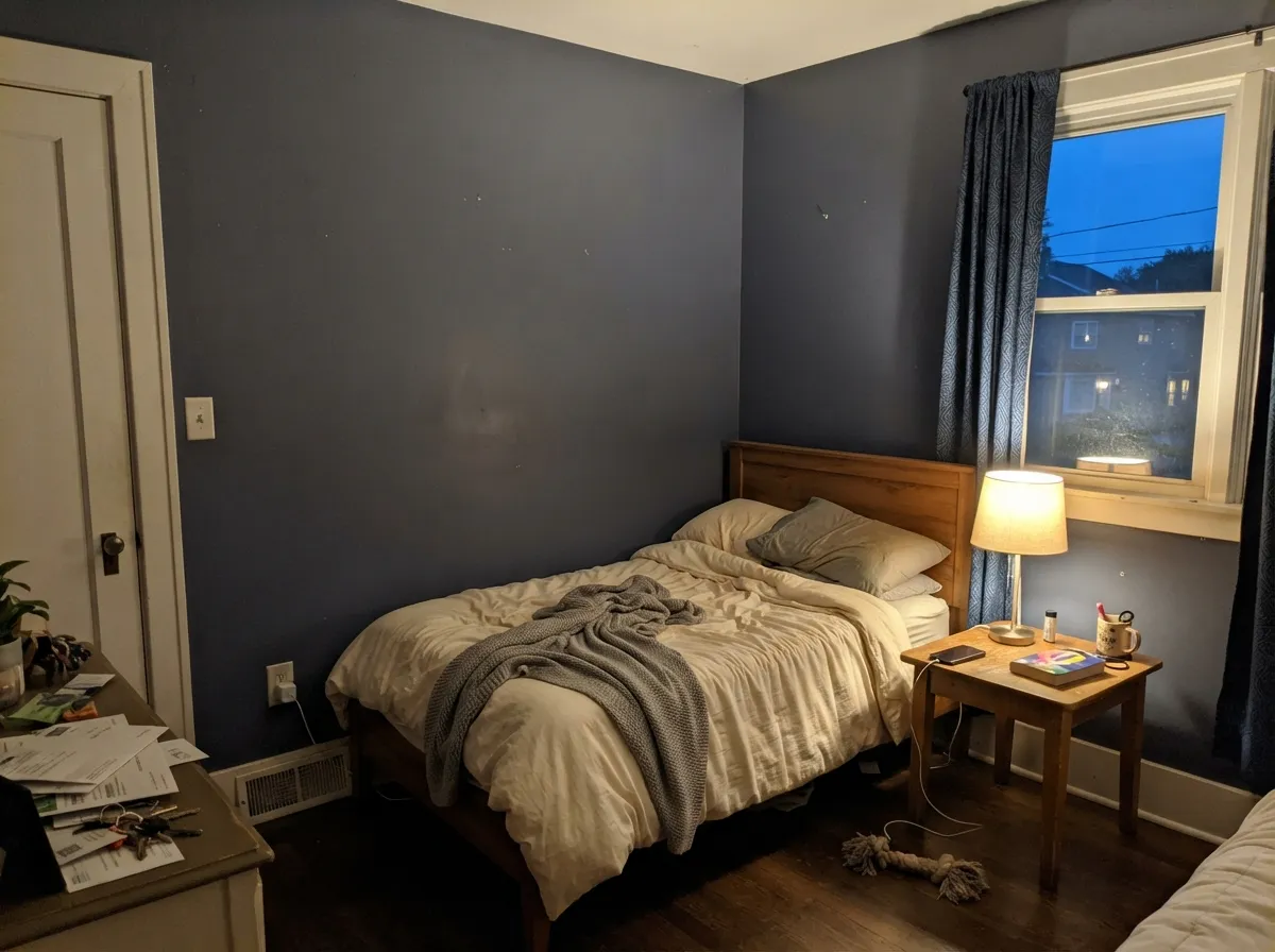
It earns its keep in the rooms built to be seen with real light: a kitchen island under can lights, a front door in full sun, a bedroom with a nightstand lamp doing the work after dark. In those settings the color reads expensive and considered rather than simply dark — the small violet flush at night is a feature people notice and like once they know to expect it, not a flaw to hide. Give it brass or warm wood and a crisp white trim, and it looks like a paint chip somebody actually thought about, not a default navy off the shelf.
Where It Fails
Every real complaint about Indigo Batik traces back to one of three setups, and each one is predictable before the first coat goes on. None of them are the paint failing — they are the paint being an honest LRV 8 blue-gray in a situation that needed something else.
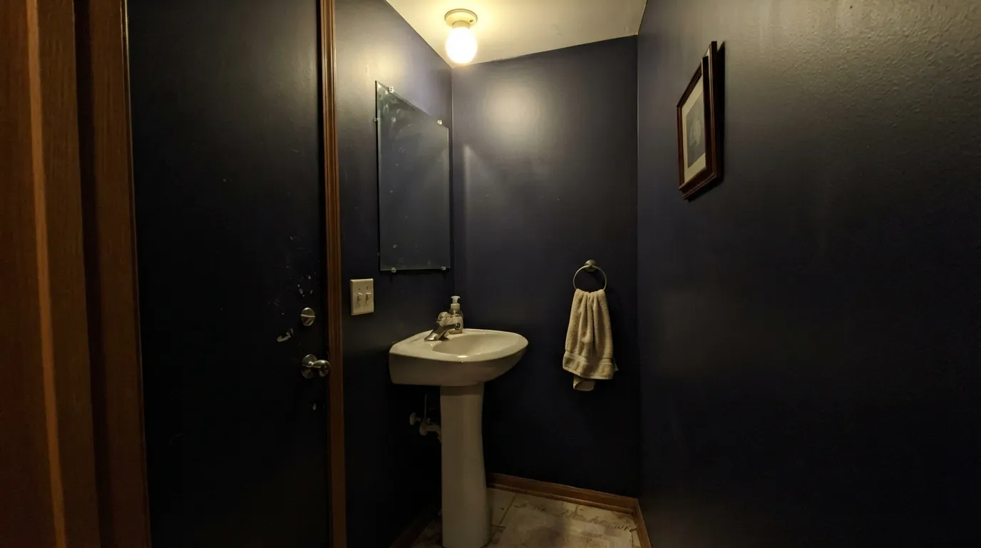
At LRV 8, this color depends on light to stay legible as blue. A windowless powder room or a bedroom corner with one weak overhead fixture reads the wall as flat near-black, not navy — readers call it "just looks like a dark hole." Add a lamp or accept the near-black; there is no third option at this depth.
The violet flush under warm bulbs is not occasional — it happens most evenings, in most homes, under most lamps. If pure, unchanging navy-black is the goal, this is the wrong chip; SW Naval stays inky under any light and never drifts violet.
Pair this cool blue-gray with a warm ivory or cream trim and the two undertones fight — the trim looks yellowed, the blue looks muddy. A clean, cool-leaning white trim reads correct; a warm cream trim is the single most common styling mistake with this color.
Room by Room
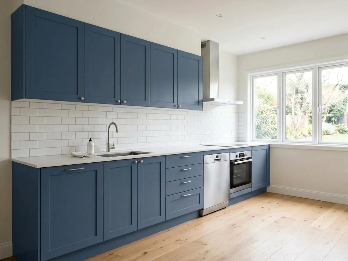
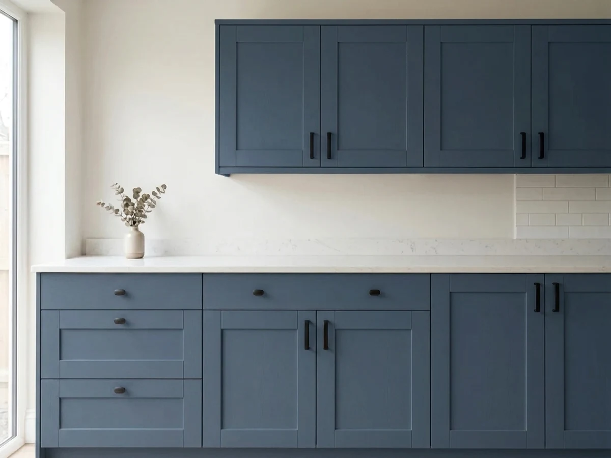
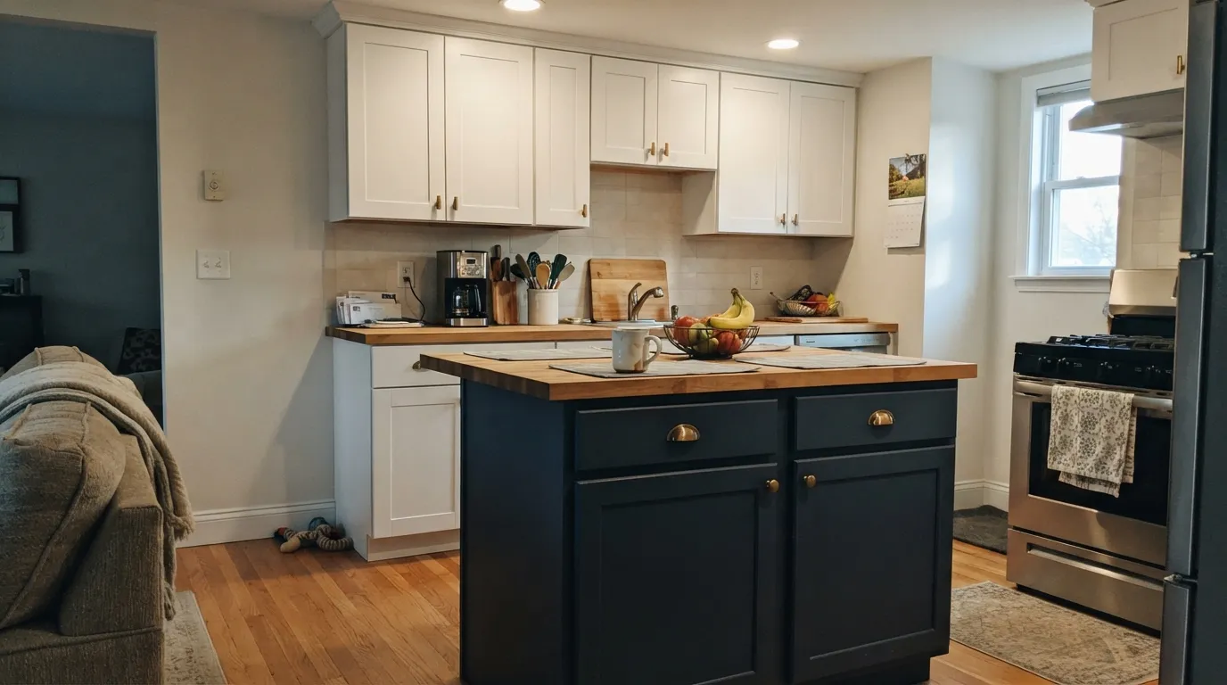
Under real kitchen lighting, brass or matte-black pulls, and a white countertop, this is a genuinely great island color — deep enough to anchor the room without going black. Satin cabinet enamel, and budget for two to three coats at this depth.
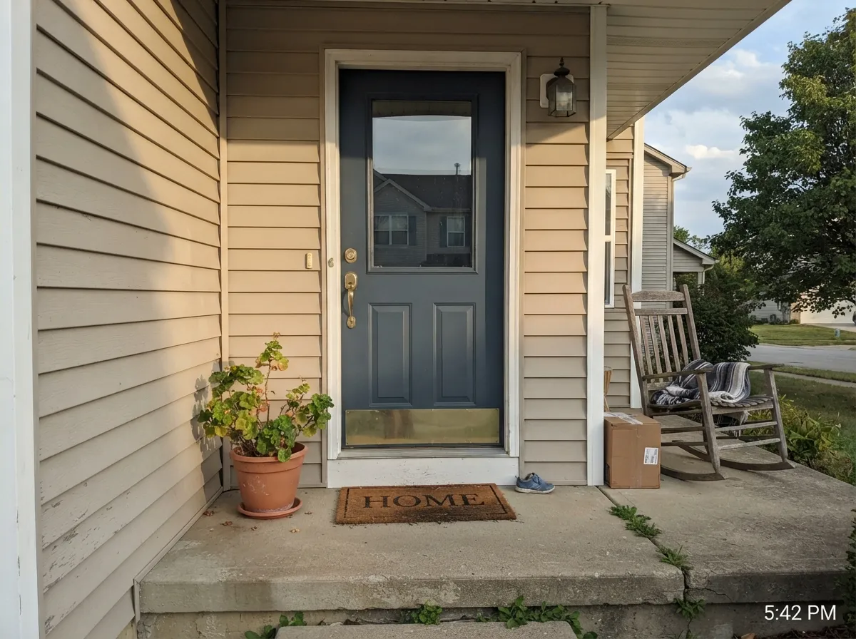
A shaded, dim porch will read it near-black; a door that gets afternoon light shows real denim-blue with a rich, tailored look next to a crisp white or warm-neutral body color. Exterior semi-gloss.
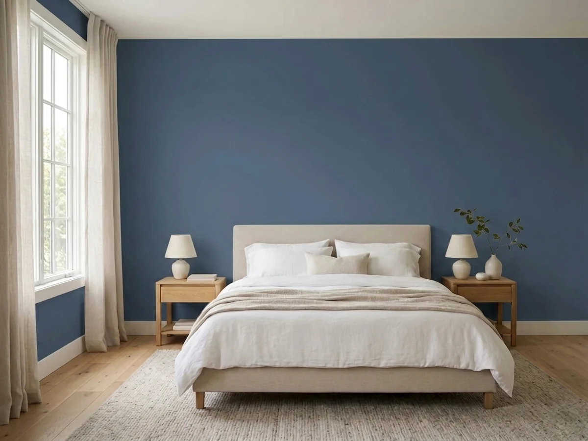
The violet-at-night behavior is a plus here, not a problem — it makes the room feel deliberately dim and cozy under a 2700K bedside lamp. Skip it if the room is windowless and relies on one overhead fixture.
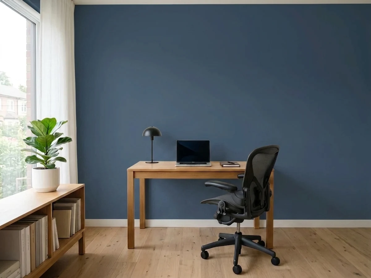
Low afternoon light and evening lamp use are exactly the conditions this color is built for. Walnut shelving, leather, and brass desk lamps are its natural company; eggshell for durability where a desk chair scuffs the wall.
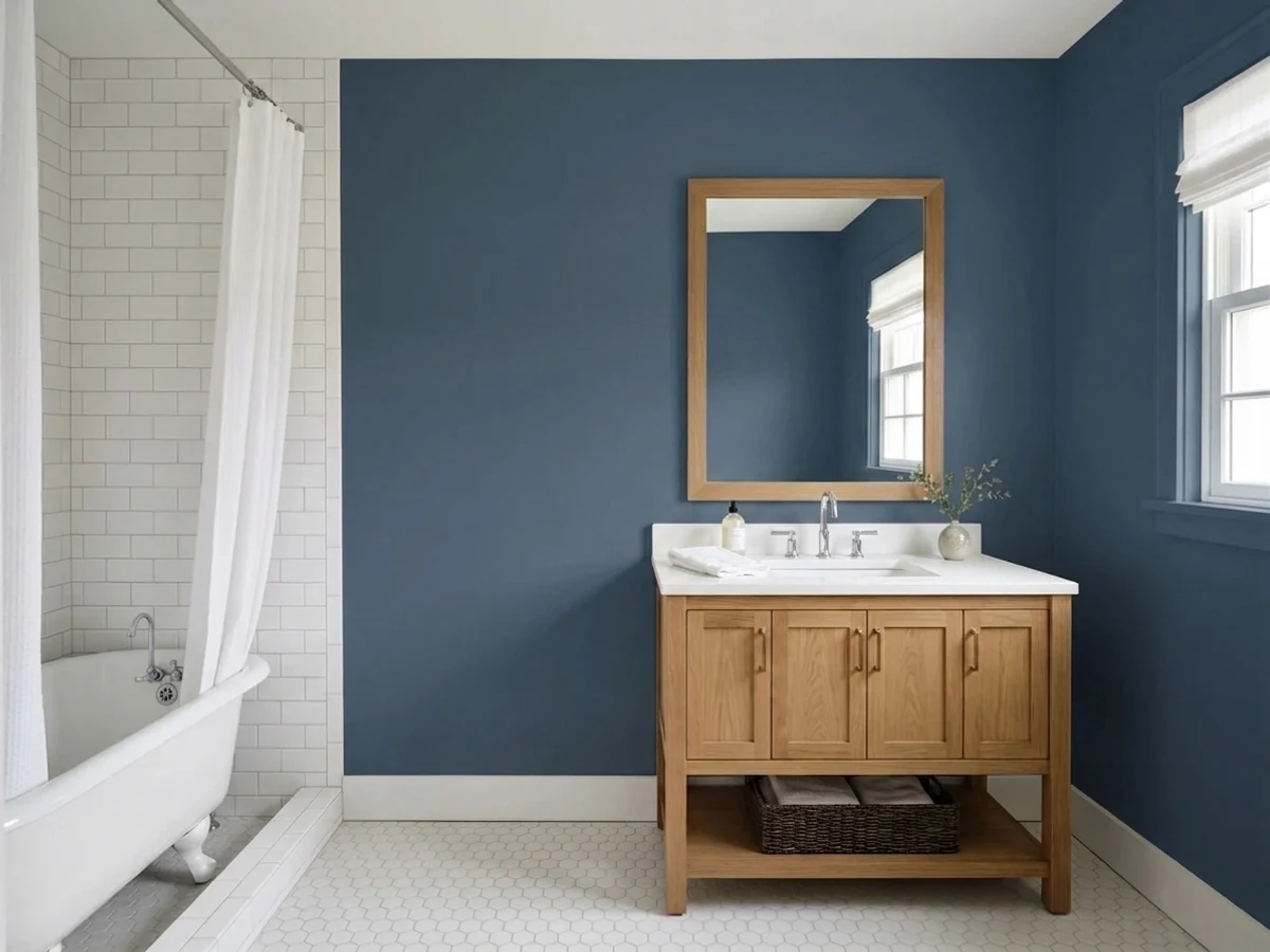
A windowless powder room needs strong vanity lights or the color simply disappears into near-black. With good light and a white or brass vanity it is a genuinely striking small-room choice.
One accent wall in a room with daylight works well and stays legibly blue rather than reading as a black hole. A full room of four walls is a bigger bet — make sure the room actually gets sun before committing all four.
Your Light Is the Risk
The clearest, most honest read: a tailored, denim-like navy-blue with the gray base showing, not the violet.
At LRV 8 the color needs light to stay legible. Without a window or real fixtures it reads as plain near-black, not navy.
Crisper and cooler in morning light, then noticeably deeper and more saturated by west afternoon sun.
2700K warm bulbs pull a soft violet out of the blue. Cool LEDs hold it closer to a flat blue-black instead.
Most complaints about Indigo Batik are a light mismatch. Upload a photo of your actual room and see it on your walls — then ask for the same wall in north light or evening lamps before you buy a single sample.
Need It From Another Brand?
Any paint counter can custom-tint Sherwin-Williams SW 7602 directly. If you would rather stay in one brand's own deck, these are the closest stock matches, measured as ΔE2000. Under 2 is a difference you will not see on the wall.
| Brand | Closest color | ΔE | LRV | |
|---|---|---|---|---|
| Behr | InkedM510-7 · Behr | 1.2 | 8 | Color page → |
| Benjamin Moore | Hudson Bay1680 · Benjamin Moore | 0.8 | 8 | Color page → |
| Valspar | Midnight Shadow4004-4C · Valspar | 0.9 | 7.9 | Color page → |
| PPG / Glidden | AdmiraltyPPG1042-7 · PPG / Glidden | 1.7 | 7 | Color page → |
| Glidden | AdmiraltyPPG1042-7 · Glidden | 1.7 | 7 | Color page → |
| Dutch Boy | Midnight Bliss338-6DB · Dutch Boy | 0.0 | 8 | Color page → |
Similar Sherwin-Williams Colors
The nearest shades to Indigo Batik within Sherwin-Williams's own range, ranked by perceptual color distance — useful when you want the same look a touch lighter, darker, or warmer.
WCAG 2.1: AA is 4.5 : 1 for normal text, 3 : 1 for large text, AAA is 7 : 1.
Indigo Batik vs the Colors You're Also Considering
Every Indigo Batik sample board has the same rivals on it. The numbers show the real lightness gap — then it comes down to which risk you would rather live with.
Pick this for the daylight denim read and the deliberate violet turn at night — Naval never does either.
Sherwin-Williams SW 6244 · LRV 4NavalPick this if you want a true black-navy with zero violet flicker, ever — Naval stays inky under any light.
Side-by-side comparison →Pick this for a navy with more nuance and less "default paint chip" uniformity.
Benjamin Moore HC-154 · LRV 6Hale NavyPick this for the most-tested, safest deep navy in the country — no violet surprises, in any room.
Pick this for real depth — Van Deusen Blue is a step lighter and reads more casual, less jewel-box.
Benjamin Moore HC-156 · LRV 11Van Deusen BluePick this for a true, clearly-blue navy that never drifts near-black or violet — the easier pick for a dimmer room.
Pick this if your room already runs dim — committing to near-black on purpose beats a lighter blue that goes muddy in the same low light.
Sherwin-Williams SW 9141 · LRV 13WaterlooPick this for the same slate-blue mood a shade lighter — though it also wants a bright room, just less insistently.
Naval (SW 6244), LRV 4, is the most famous nearby color and the key contrast. Naval is darker and reads as a truer, more classic navy, while Indigo Batik is a step lighter and grayer. If you want unmistakable navy drama, choose Naval. If you want a softer, more slate-like blue that stays approachable, Indigo Batik is the pick.
Endless Sea (SW 9150), LRV 9, is close in depth but shifts slightly toward teal, so it feels a little cooler and greener next to Indigo Batik's more balanced blue. Choose Endless Sea if you want a hint of ocean; choose Indigo Batik for a cleaner navy read.
Dignified (SW 6538), LRV 7, runs a touch more purple-blue and just as dark. It is a good match if you like a slight violet cast, whereas Indigo Batik stays grayer and more neutral in its blue.
Indigo Batik Coordinating Colors
The rule for coordinating with Indigo Batik: keep whites and neutrals on the cool-to-neutral side, and let warmth come from materials — brass, walnut, leather — rather than from the trim paint. A warm cream trim is the one pairing mistake that shows up again and again.
An Honestly Quiet Color
Indigo Batik has not been a Color of the Year and it does not have a famous viral room behind it — it is one of Sherwin-Williams' large stock of deep blues that simply does its job well without a marketing push. That is worth saying plainly, because a color this good deserves to be picked for what it actually does, not for a headline it never had.
What it does have is a genuinely distinctive trait most flat navies lack: the daylight-to-lamplight shift from denim-blue to soft violet. That is the kind of detail a paint store clerk or a design blog rarely mentions, and it is the single most useful thing to know before you buy a gallon — because it changes how the color reads in your house every single evening, on purpose.
Indigo Batik With Wood Tones and Metals
Warm materials are what make this cool blue feel finished rather than cold. Walnut, butcher block, and aged leather all sit comfortably against it, and unlacquered brass or antique bronze hardware picks up the same warm note the paint itself doesn't carry — the classic dark-cabinet-warm-metal formula works especially well here.
Cooler materials need more care. Polished chrome and stainless steel read colder still next to it, which some kitchens want and others don't; if the rest of the room already leans cool and modern, that reinforcement is fine, but a room that also has cool gray stone can end up feeling chilly overall. A butcher-block counter or a warm white countertop is the easier partner than a cool gray quartz.
Three Ready Palettes Built on Indigo Batik
A color is never alone on the wall. These are complete combinations in the 60-30-10 pattern, with the reason each one holds together. Every one opens in the visualizer.
A crisp, cool-neutral trim keeps the blue reading clean instead of muddy — the mistake a warm cream trim makes. One warm surface (the closet doors) stops an all-cool room from feeling sterile, and gives the eye a place to rest.
Try this palette in your roomA warm-white kitchen keeps the room bright enough that the island reads as a deliberate deep accent, not a light-eating hole. Extra White on the window trim — the sharpest white in the SW deck — frames the daylight the island depends on.
Try this palette in your roomA warm greige body keeps the exterior from feeling cold, crisp white trim frames the entry, and the door carries the one saturated note — this is the pairing that makes a shaded porch door still read as a deliberate color, not a dark smudge.
Try this palette in your roomIndigo Batik FAQ
Is Indigo Batik navy blue or purple?
Navy first — a blue-gray navy at LRV 8. It genuinely shifts violet under warm evening bulbs, which surprises buyers who expected a flat, unchanging navy. In daylight it reads as denim-blue, not purple.
What trim white goes with Indigo Batik?
A clean, cool-leaning white — Sherwin-Williams Pure White or Extra White. A warm cream or ivory trim fights the cool undertone and makes the blue look muddy instead of crisp; that mismatch is the most common styling mistake with this color.
Is it good for kitchen cabinets or an island?
Yes — it is one of this color's best jobs. On an island or lower cabinets under real kitchen lighting, with brass or matte-black hardware and a lighter countertop, it reads deep and considered rather than heavy. Use a satin, urethane-fortified cabinet enamel and plan on two to three coats.
Will it look too dark in a room with little natural light?
Yes, and this is the honest weak point of the color. At LRV 8 it needs a window or real fixtures to read as blue at all; without them it goes flat near-black. If your room is genuinely dim and has no lamp plan, this is not the right chip.
Does it work on a front door?
Very well, if the door gets real daylight — full sun or bright indirect light shows the denim-blue clearly and pairs nicely with a warm-neutral or white body color. A deeply shaded, north-facing porch will read the door as close to black.
How many coats does it need?
Plan on two to three over a lighter existing color, more if you're covering a bright wall in one step. Like any color this deep, an even, streak-free finish takes patience — don't rush the second coat.
Have you painted with Indigo Batik?
Rate it — one tap helps the next reader decide.
Ask a Question