Sea Serpent
The dark blue-green Sherwin-Williams quietly files as a neutral, reviewed honestly: the light that turns it teal, the light that turns it black, and what to pick instead.

Jessica has spec'd whites and neutrals for more than 300 rooms and keeps a sample wall of painted drawdowns in her studio. Every color review is checked against real reader rooms in the comments and re-tested when a formula changes. About the testing process →
- 1Nightlife2
- 2Sea Serpent7
- 3Waterloo13
- 4Charcoal Blue19
The Fast Verdict
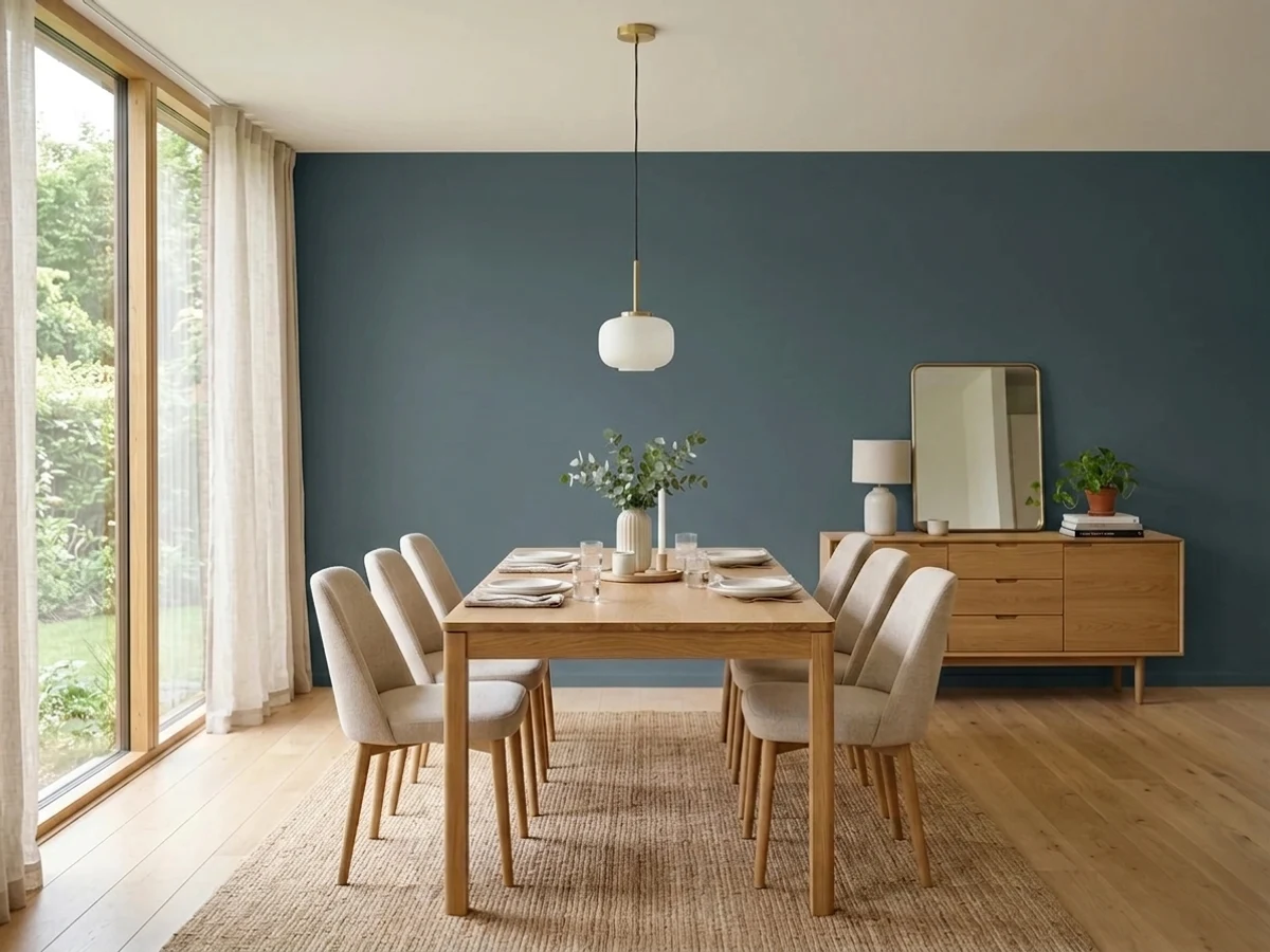
Sea Serpent is a navy that never fully commits to being navy. Built on a gray base with a real green undercurrent, it splits the difference between blue and teal — and Sherwin-Williams itself catalogs it as a neutral, not a blue or a green. Under a warm lamp it turns deep sea-glass; under flat north daylight it flattens toward plain near-black. It is not famous and it is not a trend color — it is a working dark color that behaves, provided you give it real light or a real lamp.
Dining rooms and home offices used mostly after dark · kitchen islands under white perimeter cabinets · small windowless powder rooms · anyone who wants a "neutral" dark that still reads as color
You want unambiguous, no-question-about-it navy blue · your room is small, north-facing, and lamp-free · you're picturing a bold, saturated jewel-tone teal · you're painting one large open-plan room end to end with no white to break it up
- A navy-teal split down the middle — reads as real color, not just "dark", once real light hits it
- Its own gray undertone makes it easier to build a whole-room palette around than a saturated jewel-tone teal would be
- Handsome across a wide range of wood, from pale pine to dark walnut
- At LRV 7, hides scuffs and fingerprints the way only a true dark color can
- Small, windowless rooms (powder baths, closets) are its safest, lowest-risk use
- Goes flat, featureless near-black in a dim, lamp-free north room
- Needs a gray-tinted primer and two full coats — skip that and expect blotchy coverage
- Too muted and gray for anyone picturing a bold, saturated jewel-tone teal
- Less brand recognition than Naval or Hale Navy, so it's harder to pre-visualize from a chip alone
What Color Is Sea Serpent, Really?
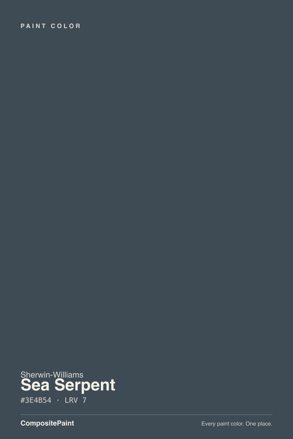
Sea Serpent is a deep blue-green built on a gray base — the RGB values sit almost exactly between navy and teal, and the gray is what keeps it from tipping hard into either camp. Sherwin-Williams actually files it in its Neutrals collection, which surprises people who assume "neutral" means beige or gray. At LRV 7 it is genuinely dark, in the same near-black bracket as Iron Ore and Naval, but there is real color doing work underneath even in low light.
The undertone reveals itself with the light source. Warm lamplight and afternoon sun pull the green forward and the wall reads like deep sea glass, or the color of water near a rocky shoreline; cool north daylight or an overcast sky flattens it toward a plain, featureless navy-black. That range is the whole personality of the color — it behaves less like one fixed shade and more like a color that reports back on what kind of light your room actually gets.
Undertone in one line: blue-green with a gray anchor — never purple, never brown. If your sample reads flat black, that is the light, not a bad can; if it reads distinctly teal, that is warm bulbs or afternoon sun doing exactly what this paint is built to do.
Where It Shines
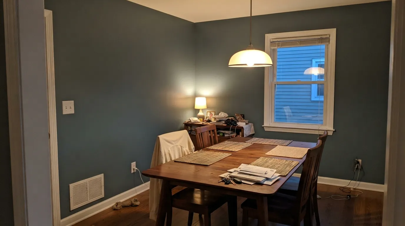
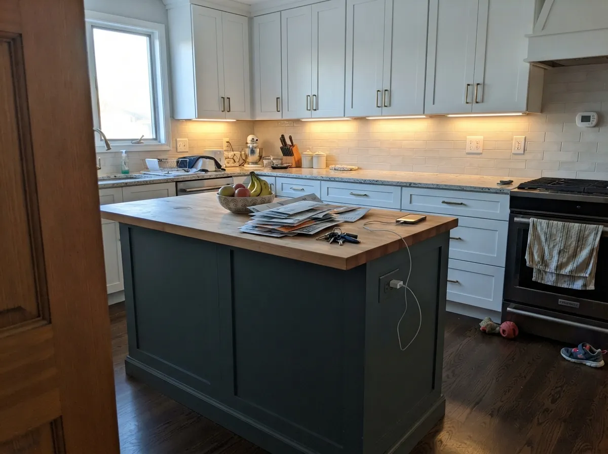
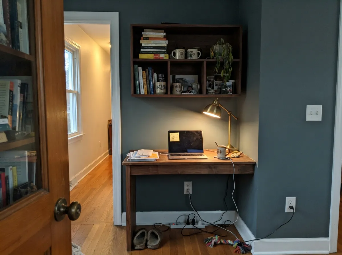
Give it a warm lamp and something to bounce light against — brass, walnut, cream — and Sea Serpent stops reading as "a dark color" and starts reading as a specific, considered choice. It earns its keep in rooms used after the sun goes down: dining rooms, home offices, reading nooks. On a kitchen island under white perimeter cabinets it becomes the one saturated note in an otherwise quiet room, which is exactly the job most people hire a dark accent color to do.
Where It Fails
Almost every disappointed review of Sea Serpent traces back to one of three situations, and all three are predictable before the first coat goes on. None of them are the paint failing — they're a mismatch between the room and what a dark, light-dependent neutral actually needs.
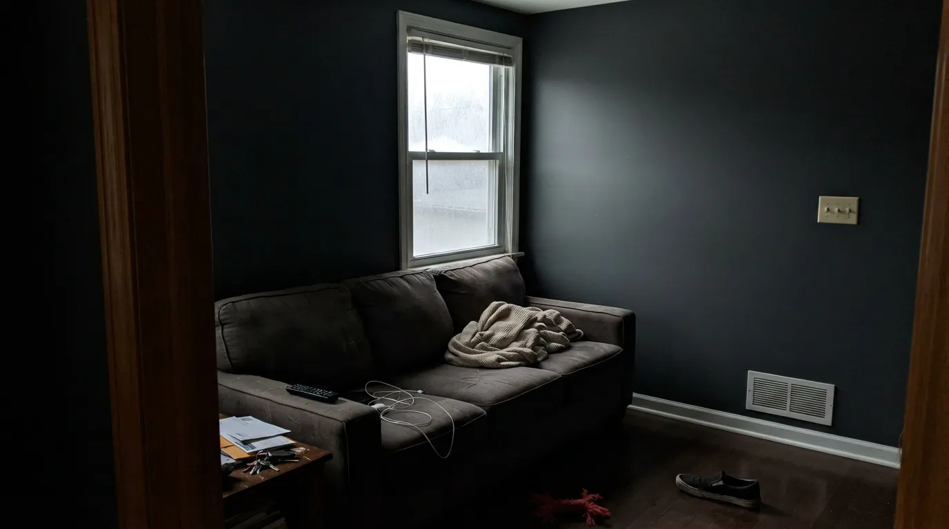
Without warm light to draw out the green, Sea Serpent collapses into a flat, featureless near-black. It stops reading as a considered color choice and starts reading like a room nobody finished painting. If the room gets no south or west sun and you're not adding real lamps, pick something with more light reflectance instead.
At LRV 7 this is a dark, saturated color usually going over a light wall. Roll it straight over standard white primer and expect blotchy, translucent-looking patches and a third coat you didn't budget for. A gray-tinted primer and two real finish coats is the actual process here, not an optional upgrade.
This is a grayed-down neutral, not a bright Tiffany-box teal — that grayness is the entire reason Sherwin-Williams files it as a neutral in the first place. Buyers picturing a loud blue-green statement wall are often surprised at how quiet and shadow-like it reads in person. If you want the louder version, look at a higher-LRV saturated teal, not this one.
Room by Room
Evening use is where this color earns its name. Under a warm chandelier or sconces the green comes forward and the walls go moody without going dead; white or cream trim keeps the contrast crisp instead of murky.
A professional backdrop for video calls and a genuinely calming one to actually work in, provided the room has a window or a good lamp. Walnut shelving and brass reading lights are its natural company here.
As a full kitchen it swallows light fast; as an island under white perimeter cabinets it's a reliable designer move that photographs well and doesn't fight most countertop materials. Satin or semi-gloss for a surface that gets touched constantly.
Cocoon-like at night under warm bulbs; can feel like a cave in the morning if the room is small, north-facing, and has no other light source. Pair with crisp white or cream bedding, not beige.
Small, windowless rooms are exactly where a color this dark stops being risky — there's no daylight around to disappoint you, only whichever lamp you choose. Drenching all four walls plus the ceiling is the classic execution.
Some painters use it for a front door or shutters against a lighter-colored house, where the depth reads as intentional rather than heavy. A full exterior in this color is a bigger, less-tested bet than any interior use above — sample it against the actual siding, since the sun side and shade side of a house will read noticeably different in it.
Your Light Is the Risk
2700K bulbs pull the green forward and the wall reads like deep sea glass, not a black hole. This is the light the color was built for.
No direct sun means nothing warms the color up — it collapses into a plain, featureless near-black with none of its blue-green complexity.
Cooler and more blue in the morning, noticeably greener as afternoon light warms up. The shift is real — sample it at both times before deciding.
Warm bulbs keep the teal alive after dark; 4000K-plus "daylight" LEDs flatten it back toward gray-black. Check your bulbs before blaming the paint.
Most complaints about Sea Serpent are a light mismatch. Upload a photo of your actual room and see it on your walls — then ask for the same wall in north light or evening lamps before you buy a single sample.
Need It From Another Brand?
Any paint counter can custom-tint Sherwin-Williams SW 7615 directly. If you would rather stay in one brand's own deck, these are the closest stock matches, measured as ΔE2000. Under 2 is a difference you will not see on the wall.
| Brand | Closest color | ΔE | LRV | |
|---|---|---|---|---|
| Behr | Dark NightPPF-58 · Behr | 2.3 | 7 | Color page → |
| Benjamin Moore | Blue Note2129-30 · Benjamin Moore | 0.9 | 9 | Color page → |
| Valspar | Night View4007-4C · Valspar | 0.4 | 6.6 | Color page → |
| PPG / Glidden | Black ForestPPG1012-7 · PPG / Glidden | 2.9 | 7 | Color page → |
| Glidden | CavalryPPG1041-7 · Glidden | 2.9 | 7 | Color page → |
| Dutch Boy | Navigation432-7DB · Dutch Boy | 0.0 | 7 | Color page → |
Similar Sherwin-Williams Colors
The nearest shades to Sea Serpent within Sherwin-Williams's own range, ranked by perceptual color distance — useful when you want the same look a touch lighter, darker, or warmer.
WCAG 2.1: AA is 4.5 : 1 for normal text, 3 : 1 for large text, AAA is 7 : 1.
Sea Serpent vs the Colors You're Also Considering
Every Sea Serpent sample board has the same rivals on it. The numbers show the real lightness gap — then it comes down to which risk you would rather live with.
Pick this for a color that changes with the room instead of staying flatly blue — the green in Sea Serpent is the whole point.
Sherwin-Williams SW 6244 · LRV 4NavalPick this if you want a navy that reads unmistakably blue, no green, no gray-out — Naval is deeper and doesn't apologize for it.
Pick this if Hale Navy's straightforward blue feels too expected — Sea Serpent has more going on once real light hits it.
Benjamin Moore HC-154 · LRV 6Hale NavyPick this if you want the safest, most-tested navy in any deck — Hale Navy has more real-room track record behind it than almost any dark color.
Pick this for the clearer marine identity — Sea Serpent still reads as color after dark; Rock Bottom leans closer to true black.
Sherwin-Williams SW 7062 · LRV 7Rock BottomPick this for the same near-black depth with a warmer, greener cast and no blue at all — Rock Bottom turns green in full sun where Sea Serpent turns teal.
Pick this if you're already committed to Sherwin-Williams, or specifically want the extra green Sea Serpent's formula carries.
Benjamin Moore HC-155 · LRV 7Newburyport BluePick this if your painter works in Benjamin Moore and you want the closest same-depth navy in that deck.
Sea Mariner SW 9640 at LRV 7 is the closest neighbor in the line. Its hex #434A54 is a touch lighter and leans slightly more purple, where the #3E4B54 of Sea Serpent holds a little more green in the blue. Tarragon SW 9660 at LRV 7 is close as well but a step greener again.
Cyberspace SW 7076 at LRV 6 drops most of the blue and reads as a straight dark charcoal, which is the safer pick if you want near-black without a color story. Seaworthy SW 7620 at LRV 7 goes the other way and is clearly the more blue of the two.
Across brands, Dutch Boy Navigation 432-7DB matches at deltaE 0, the same color in another line. Valspar Night View 4007-4C, Farrow and Ball Hague Blue No. 30, Behr Orion Gray N510-6, and Benjamin Moore Blue Note 2129-30 all sit under deltaE 1. Glidden Cavalry PPG1041-7 at deltaE 2.86 is very close but worth sampling first, and Annie Sloan Aubusson Blue at deltaE 4.41 is close but visibly different side by side.
Sea Serpent Coordinating Colors
The rule for coordinating with Sea Serpent: soft warm whites over stark cool ones, and let the color's own gray anchor do the work of tying a room together. It sits comfortably between the navy and teal families, which makes it one of the easier deep colors to build a whole-house palette around. These are the partners that keep showing up in rooms that work:
Filed as a Neutral, Reads Like the Ocean
Sea Serpent has no Color of the Year plaque and no viral renovation behind it — Sherwin-Williams quietly built it into a working color, not a headline one, and placed it in the Neutrals collection alongside grays and greiges most people would never mistake for a blue-green. That filing is not a marketing accident: the gray anchor in the undertone is exactly what lets it sit next to warm woods and cool metals without the drama a saturated teal would bring.
That is the honest trade this color makes. It will never be the color a magazine spread is built around, but it is also never going to fight the rest of a room the way a punchier teal or a colder navy can. If you want a dark accent that behaves like a considered neutral instead of a bold statement, that quiet reputation is the actual selling point — not a flaw to work around.
Sea Serpent With Wood Tones and Metals
Wood is where Sea Serpent's gray grounding pays off: pale pine, honey oak, deep walnut, dark chestnut — all of them work, which is unusual for a color this saturated. Most navies and teals pick a side, flattering warm oak or cool ash but not both, and end up fighting the other one. Sea Serpent's undertone is split evenly enough between blue and green that it doesn't lean hard against either.
Metals are just as forgiving. Brass and bronze warm it up and read expensive against the green side of the undertone; brushed nickel and blackened iron cool it down and lean into the blue side. The one place to be careful is high-polish chrome in a very bright room — the shine can make the paint look flatter by comparison, the same way it does next to any matte dark color.
Three Ready Palettes Built on Sea Serpent
A color is never alone on the wall. These are complete combinations in the 60-30-10 pattern, with the reason each one holds together. Every one opens in the visualizer.
Alabaster's warmth keeps the room from going cold and cave-like against Sea Serpent's cool base, and Urbane Bronze on the door pulls the same warm-dark register without competing for attention — brass fixtures and a walnut table finish the look.
Try this palette in your roomKeeping the perimeter Pure White lets the island carry all the color and all the visual weight; Iron Ore on the pantry door borrows the black side of Sea Serpent's undertone so the two dark notes agree instead of competing to be the accent.
Try this palette in your roomOne-color drenching removes the edges that make a small room feel like a box, and Evergreen Fog and Pashmina step the depth down gradually on the way out, so Sea Serpent reads as a deliberate destination rather than a jarring switch the moment you leave the room.
Try this palette in your roomSea Serpent FAQ
Is Sea Serpent blue or green?
Both, deliberately. It's a blue-green built on a gray base, and Sherwin-Williams actually files it in its Neutrals collection rather than Blue or Green. In warm light the green comes forward; in cool light it reads closer to plain navy.
How dark is Sea Serpent, really?
LRV 7 — genuinely dark, in the same near-black bracket as Sherwin-Williams Iron Ore (LRV 6) and just a shade lighter than Naval (LRV 4). Expect it to read almost black in a dim room and clearly blue-green in a bright one.
Will it work in a room with no natural light?
Only with warm lamps doing the work daylight would otherwise do. In a genuinely dark, lamp-free room it goes flat and featureless — a small, windowless powder room where you control every light fixture is actually a safer bet than a dim living room with one weak window.
What white trim goes with Sea Serpent?
A soft warm white like Alabaster or Pure White, not a stark cool white. Sea Serpent already carries enough cool gray on its own, and a harsh bright white can make the wall look muddy by comparison instead of contrasting cleanly.
Can I use it on a kitchen island?
Yes — it's one of its most reliable jobs. Keep the perimeter cabinets a crisp white and let the island carry the color; satin or semi-gloss for a surface that gets touched constantly.
Does it need a special primer or extra coats?
Plan on a gray-tinted primer and two full finish coats. Going straight over a white wall with a single coat is the most common reason people report streaky, uneven coverage on a color this dark.
Have you painted with Sea Serpent?
Rate it — one tap helps the next reader decide.
Ask a Question