Newburyport Blue
Benjamin Moore's Historical Collection navy, reviewed honestly: how it actually compares to Hale Navy, the light where it goes near-black, and where it really shines.

Jessica has spec'd whites and neutrals for more than 300 rooms and keeps a sample wall of painted drawdowns in her studio. Every color review is checked against real reader rooms in the comments and re-tested when a formula changes. About the testing process →
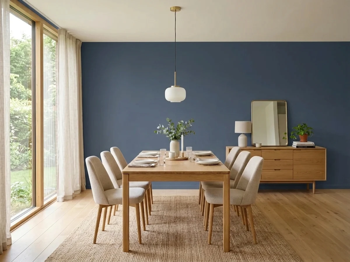
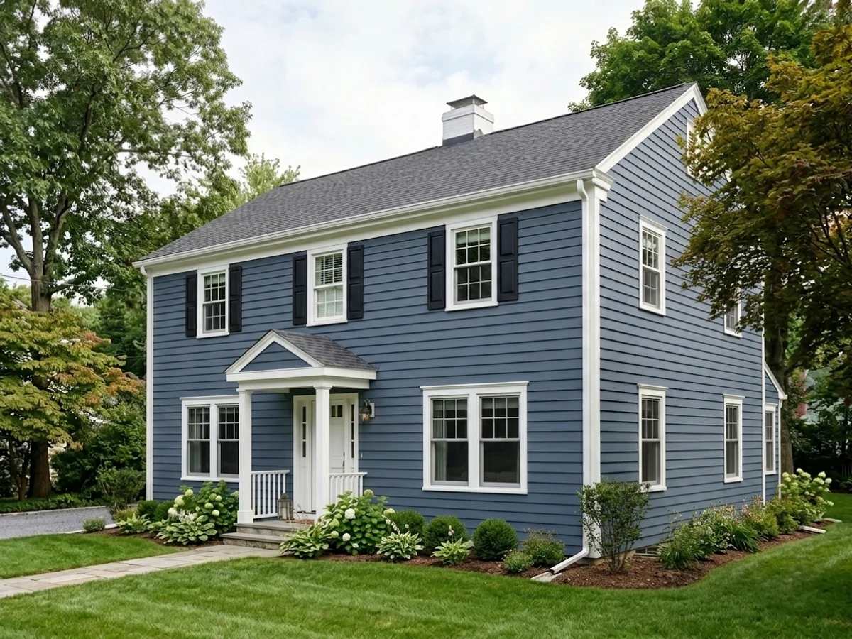
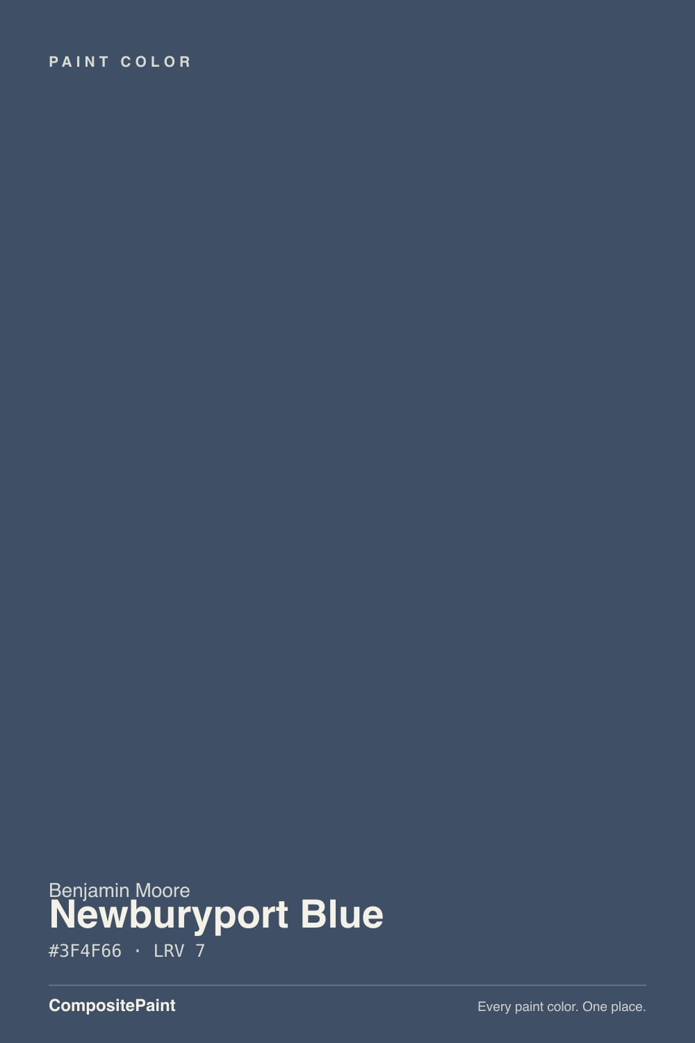
- 1Naval4
- 2Newburyport Blue9
- 3Smoky Blue15
- 4Wolf Gray21
The Fast Verdict
Newburyport Blue is one of three navies Benjamin Moore fans cross-shop constantly — Naval, Hale Navy, and this one — and it is the brightest, bluest member of the trio, not the grayest. Named for the old shipbuilding port on the Massachusetts coast and filed in BM's Historical Collection, it carries a touch of warmth and green under the navy that Hale Navy's cooler grey base doesn't have, and it holds a visibly blue read further into shade and evening than Hale Navy does before either color starts sliding toward black. At LRV 7 it is still genuine near-black paint — light decides everything — but it is the more forgiving near-black of the two.
Kitchen islands and cabinets · front doors you want to photograph as blue, not black · colonial and coastal exteriors · home offices and libraries with lamp light · anyone who sampled Hale Navy and found it too grey
You want the truest, inkiest navy in any light — that's SW Naval · you specifically want Hale Navy's cooler, greyer read · your room stays shaded all day with no lamps · you're pairing it directly next to Hale Navy and expecting a match
- Holds a visibly blue read further into shade and evening light than Hale Navy
- Deep enough (LRV 7) to hide scuffs and fingerprints on an island or door
- Historical Collection pedigree suits colonial and coastal exteriors without looking trendy
- Photographs as unmistakably navy rather than collapsing into black on camera
- Pairs cleanly with warm wood and brass without the grey-vs-warm fight some navies pick
- Often confused with Hale Navy while shopping, then reads warmer and bluer than expected once it's up
- Still goes essentially black in shade, covered porches, or north rooms with no lamps
- Clashes when placed directly beside Hale Navy or another grey-leaning navy — the two don't actually match
- Deep base coat: budget a tinted primer and two finish coats over any lighter color
What Color Is Newburyport Blue, Really?
A deep navy with a warm, faintly green undercurrent — and that undercurrent is what separates it from its more famous stablemates. Benjamin Moore built Newburyport Blue as part of its Historical Collection, named for the old shipbuilding port on the Massachusetts North Shore, and side-by-side color analysis backs up what a lot of buyers notice on the wall: it leans a touch warmer and greener than Hale Navy (HC-154), which sits closer to the neutral center of the wheel and reads distinctly greyer. Against Sherwin-Williams Naval (SW 6244), the deepest and most saturated of the three, Newburyport is the softer, lighter one. It occupies the middle — not as inky as Naval, more clearly blue than Hale Navy.
At LRV 7 this is genuine near-black paint, essentially tied with Hale Navy (6) and Wrought Iron (6) for depth. The practical difference shows up in dim conditions: independent color comparisons and real kitchen-island photos consistently show Newburyport holding a visible blue further into shade and evening light before it starts reading as plain dark charcoal, while Hale Navy grays out sooner. Neither color escapes the physics of a chip this dark — both go essentially black with no direct light at all — but Newburyport gives up its color more slowly.
Undertone in one line: navy blue with warmth and a whisper of green, never the cooler blue-grey of Hale Navy. If your sample reads almost black, that is the room's light level, not a defect — this is one of the deepest chips in the BM deck and it is supposed to behave differently at a sunlit window than in a shaded corner.
Where It Shines
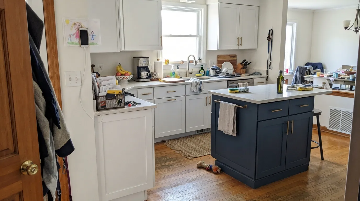
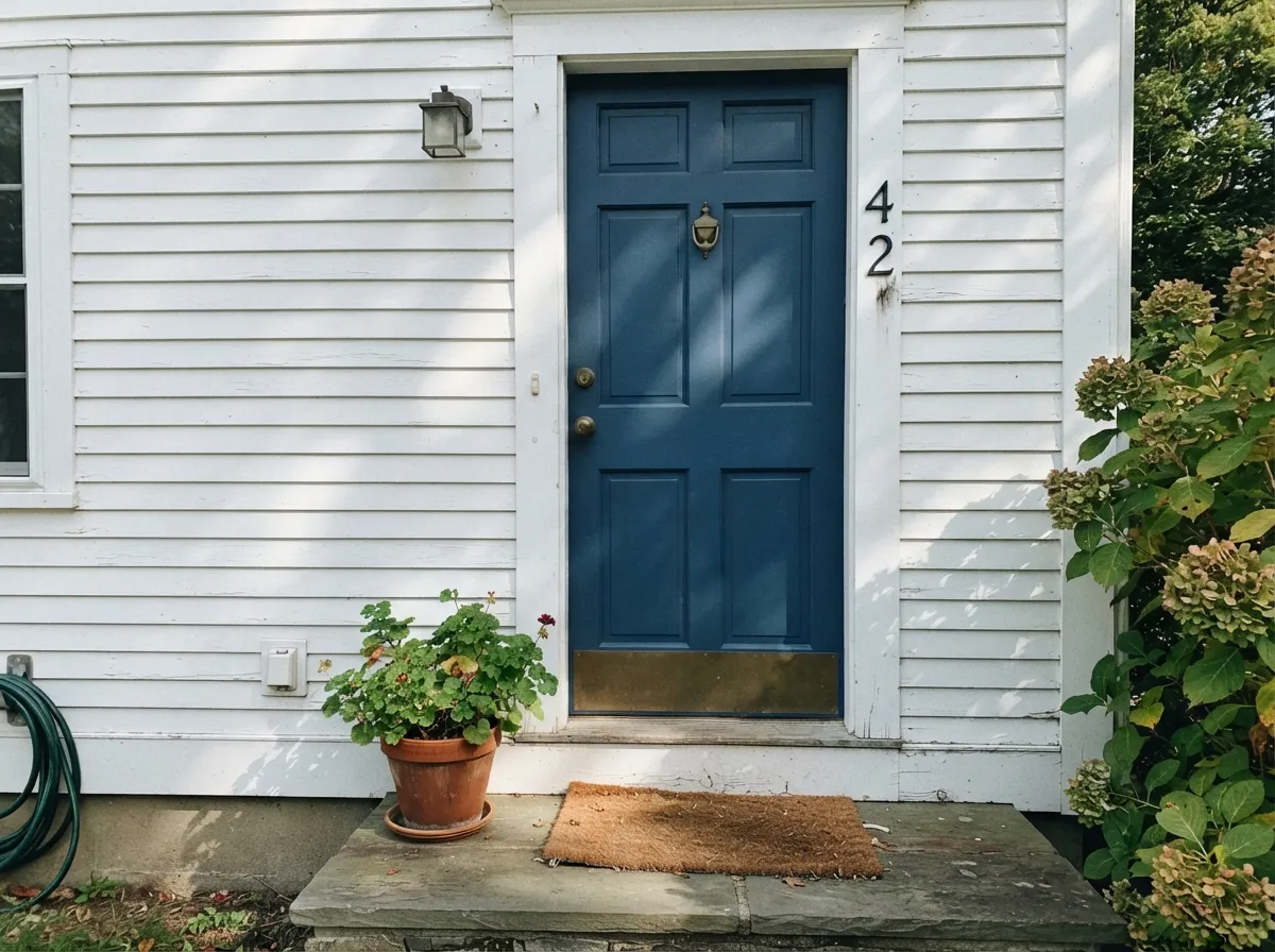
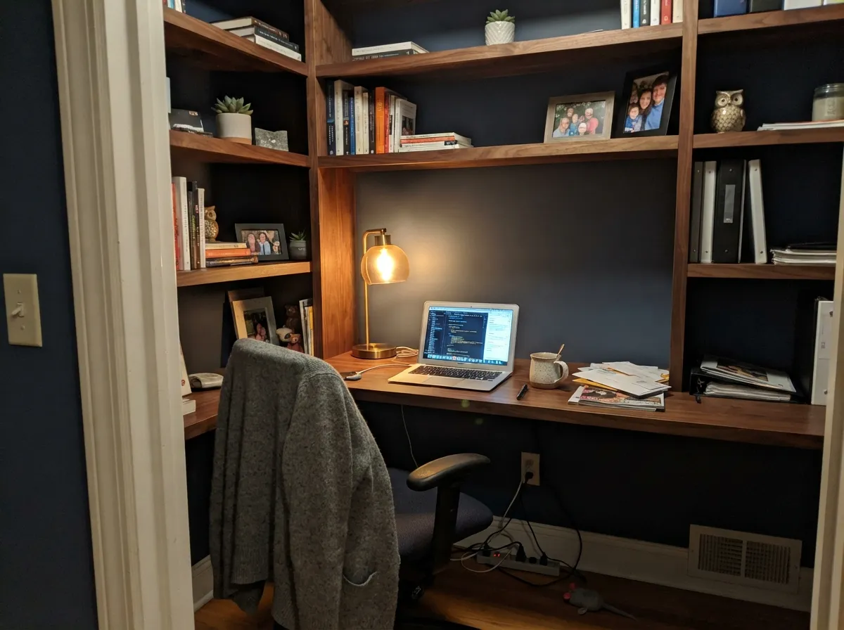
This is a kitchen-island color first and a front-door color close behind. Under real daylight — a window over the sink, an overhead fixture doing actual work — it reads a clean, confident navy against white or cream perimeter cabinets, and it keeps that blue read longer through the day than Hale Navy does in the same kitchen. Front doors are its other classic job: on a white or cedar-shingled New England exterior it photographs as unmistakably blue rather than the near-black some navies collapse into on camera. Give it brass hardware, walnut trim and a warm lamp nearby indoors, and it looks deliberate, not dark.
Where It Fails
Almost every disappointed review of Newburyport Blue comes down to one of three mismatches, and all three are avoidable before the first coat goes on. None of them are the paint failing — they are either a shopping mix-up with its more famous cousin or a near-black color asked to do a job it was never suited for.
These two get mixed up constantly online, and they are not interchangeable — Newburyport reads noticeably more blue and a little warmer than Hale Navy's cooler grey base. If the whole point was Hale Navy's moody, coordinate-with-anything grey-navy, this chip will look brighter and bluer than you planned. Swatch both on the actual wall before you order gallons.
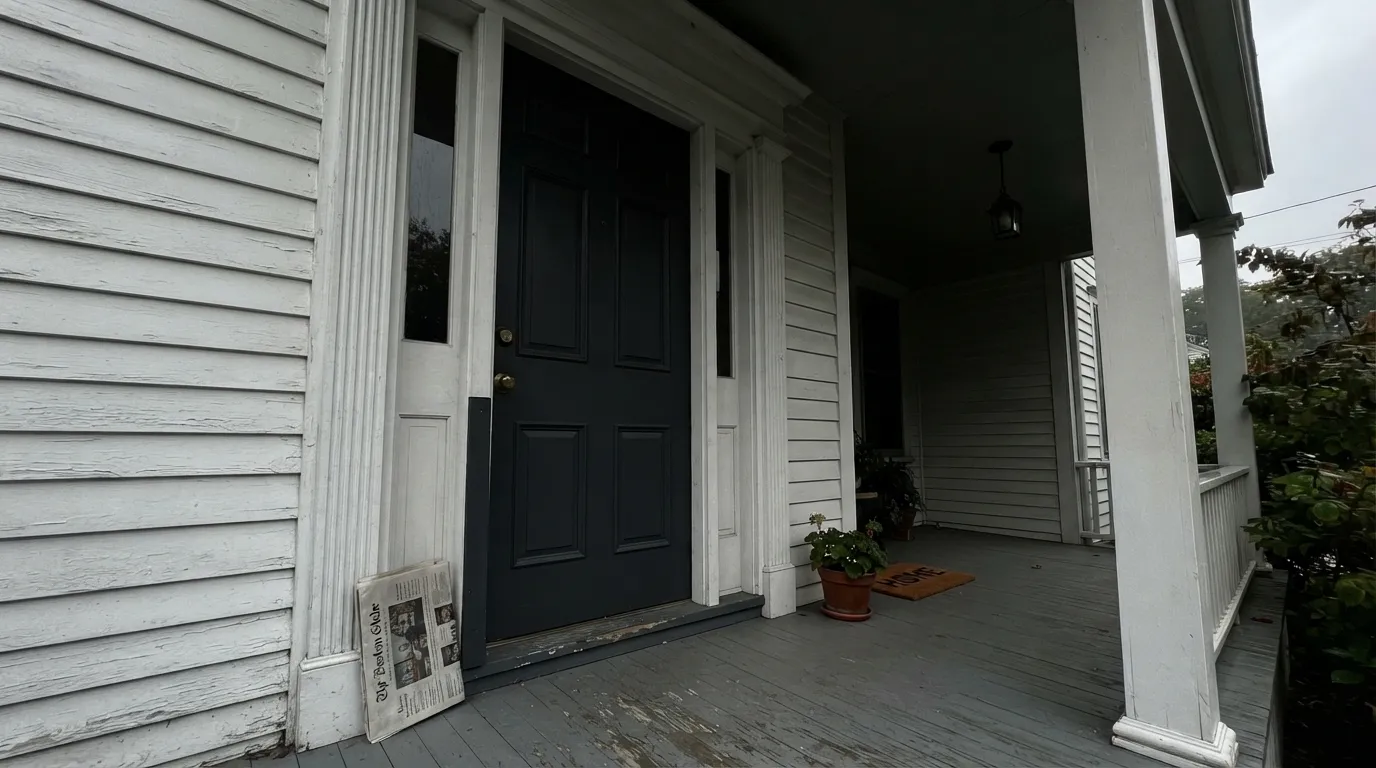
At LRV 7 there is almost nothing to reflect. A north-facing office, a covered front porch, or any room without direct daylight or a lamp on will still read this as plain dark charcoal — it holds its blue longer than Hale Navy does, but it is not immune to the physics. If the room stays dim all day, treat it like a black, not a blue.
An island in one and a door or trim in the other looks like a mismatch, not a coordinated pair — the warm-green lean of Newburyport and the cooler grey lean of Hale Navy read as two different colors when they sit side by side, even though both are called "navy." Pick one Historical Collection navy and stay with it across a project.
Room by Room
Deep enough to hide fingerprints and daily scuffs, blue enough that guests read it as a color choice rather than a default black. Satin or semi-gloss cabinet enamel; give the island real overhead light or it reads dark by evening.
The classic New England match: white siding or bleached cedar shingles, this on the door, brass or black hardware. It photographs as blue more reliably than a grayer navy would — a shaded, deep-covered entry is the one situation where it still reads nearly black, so sample it at the actual door.
Built-ins or all four walls both work in a room used mostly at night. Pair with walnut shelving and a warm 2700K reading lamp; skip it if the room's only light is a cool overhead LED.
Small rooms take near-black color well, and Newburyport Blue with a brass sconce and a marble-top vanity reads custom without repainting the whole house. Semi-gloss or satin for durability.
Handsome for evening dinners under warm bulbs; flatter and less blue at breakfast unless the room has strong morning light. Add a dimmer before you add the second coat.
Works as a cocoon-dark accent wall for someone who wants that, but a whole bedroom this deep with no lamps and thin curtains is the complaint waiting to happen. Test with the lights you'll actually use at 9pm, not the paint chip in daylight.
Your Light Is the Risk
Direct sun or a big south window is where it reads most clearly blue — a step brighter and more legible than Hale Navy in the same window.
A covered porch or a room with no real daylight still reads this as plain dark charcoal. It holds its blue longer than Hale Navy, but a chip this deep needs light to show color at all.
A cloudy day flattens it toward a dark, faintly green-grey; the moment the sun breaks through, the blue comes back within minutes. Same wall, two moods.
2700K lamps keep the blue readable after dark longer than they do on Hale Navy. Cool white LEDs still push it toward flat dark — swap the bulb before you blame the paint.
Most complaints about Newburyport Blue are a light mismatch. Upload a photo of your actual room and see it on your walls — then ask for the same wall in north light or evening lamps before you buy a single sample.
Need It From Another Brand?
Any paint counter can custom-tint Benjamin Moore HC-155 directly. If you would rather stay in one brand's own deck, these are the closest stock matches, measured as ΔE2000. Under 2 is a difference you will not see on the wall.
| Brand | Closest color | ΔE | LRV | |
|---|---|---|---|---|
| Sherwin-Williams | Mineral GraySW 2740 · Sherwin-Williams | 3.9 | 9 | Color page → |
| Behr | Distant Thunder760F-6 · Behr | 1.6 | 9 | Color page → |
| Valspar | Mountain River4005-6C · Valspar | 2.9 | 9 | Color page → |
| PPG / Glidden | Soothing SapphirePPG10-09 · PPG / Glidden | 3.3 | 9 | Color page → |
| Glidden | Soothing SapphirePPG10-09 · Glidden | 3.9 | 9 | Color page → |
| Dutch Boy | Alaskan Night337-6DB · Dutch Boy | 3.7 | 9 | Color page → |
Similar Benjamin Moore Colors
The nearest shades to Newburyport Blue within Benjamin Moore's own range, ranked by perceptual color distance — useful when you want the same look a touch lighter, darker, or warmer.
WCAG 2.1: AA is 4.5 : 1 for normal text, 3 : 1 for large text, AAA is 7 : 1.
Newburyport Blue vs the Colors You're Also Considering
Every Newburyport Blue sample board has the same rivals on it. The numbers show the real lightness gap — then it comes down to which risk you would rather live with.
Pick this for the brighter, warmer-leaning blue that stays legible as navy longer into shade or evening.
Benjamin Moore HC-154 · LRV 6Hale NavyPick this if you want the greyer, cooler navy that reads as a true coordinate-with-anything neutral.
Side-by-side comparison →Pick this for a lighter, more forgiving navy with a touch of warmth instead of Naval's cool, inky depth.
Sherwin-Williams SW 6244 · LRV 4NavalPick this if you want the truest, most saturated ink-navy — it holds its blue in any light without softening.
Hale Navy HC-154 is the comparison people ask about most. At LRV 6 it is marginally darker, and its hex of #495264 carries less blue and more gray than Newburyport Blue's #3F4F66. In practice Hale Navy reads as a soft, slightly dusty navy that behaves like a very dark neutral, while Newburyport Blue holds more visible blue thanks to its 24 percent saturation. If you want navy that still reads navy in flat light, Newburyport Blue is the stronger pick; if you want something closer to a blue-charcoal, Hale Navy is easier to live with.
Across brands, Dunn-Edwards Luna Pier DE5888 at deltaE 1.52, PPG and Glidden Admiralty PPG1042-7 at deltaE 1.62, and Behr Midnight Mosaic HDC-SM14-7 at deltaE 1.78 are visually identical in normal room light. Sherwin-Williams Indigo Batik SW 7602 at deltaE 2.48 and Diamond Vogel Star-Studded 0620 at deltaE 2.26 are very close, so sample first. Farrow and Ball Serge No. 9919 at deltaE 4.05 is close but visibly different side by side.
Newburyport Blue Coordinating Colors
The rule with Newburyport Blue is simple because it behaves like a neutral once it's deep enough: pair it with warm or crisp whites for contrast, and layer in charcoals or greiges rather than fighting it with a second bold color. It rarely needs a loud partner — the near-black depth already supplies the drama.
Newburyport Blue vs. Hale Navy: Which Historical Navy Is Which
These two get confused constantly, and the confusion is understandable — both come out of Benjamin Moore's Historical Collection, both sit at nearly the same near-black depth (LRV 7 vs. 6), and both get called "navy" in the same breath online. But they lean in opposite directions. Hale Navy became the breakout star of the 2010s navy-kitchen-island trend by sitting closer to a true grey-navy — a color so neutral it coordinates with almost anything, at the cost of graying out toward black sooner in dim rooms.
Newburyport Blue is the older name of the two, and it carries more warmth and a touch of green instead of grey. Side-by-side comparisons and real kitchen photos consistently show it holding a clearer blue further into shade and evening light before either color collapses toward black. If you swatched Hale Navy from a photo and expected exactly this, or vice versa, that surprise is the single most common complaint about both colors — always test the actual chip, not a screen.
Newburyport Blue With Wood Tones and Metals
As a near-neutral navy, it gets along with almost any wood: oak, walnut, white oak, and even honey-toned floors all sit comfortably next to it because the color reads more deep-blue than saturated up close, and its warm lean keeps it from fighting golden wood the way a truly cool-toned blue can.
Metals do more of the personality work here than usual. Unlacquered or antique brass warms the whole pairing and is the classic kitchen-island choice; matte black and aged pewter double down on the moody, historic read; polished chrome and bright nickel are the finishes most likely to look cold against it, since they push against the color's warm undertone rather than working with it.
Three Ready Palettes Built on Newburyport Blue
A color is never alone on the wall. These are complete combinations in the 60-30-10 pattern, with the reason each one holds together. Every one opens in the visualizer.
A warm white perimeter is what keeps the island reading blue instead of black — the whole kitchen needs real light for this to work. Wrought Iron on fixtures adds one more dark note without competing for the room's only blue.
Try this palette in your roomThe colonial-coastal standard: creamy white body, deep blue door, charcoal shutters one shade lighter so the door still reads as the darkest, most deliberate note on the facade.
Try this palette in your roomLayering two depths of near-neutral dark keeps a small room enveloping instead of cave-like, and only works with a warm trim white and a lamp doing real work after sunset — the exact conditions this color needs everywhere.
Try this palette in your roomNewburyport Blue FAQ
Is Newburyport Blue warm or cool?
It leans slightly warm for a navy, with a whisper of green under the blue — cooler than a true warm color, but warmer and greener than Hale Navy's greyer base. Under 2700K lamps it stays readable as blue longer than Hale Navy does; under cool LEDs both drift toward flat dark.
Is it navy or is it basically black?
Navy, with real depth. At LRV 7 it sits in near-black territory, and without direct light it does read dark — but color comparisons and real kitchen photos show it holding a visible blue further into shade than Hale Navy before it collapses toward black.
What's the difference between Newburyport Blue and Hale Navy?
Same Historical Collection family and nearly the same near-black depth, but they lean different directions: Hale Navy sits closer to a true grey-navy and greys out sooner in low light, while Newburyport carries more warmth and a touch of green and holds its blue read longer. People shopping by memory or a screenshot often expect one and get the other — swatch both before you commit.
Is it good for a kitchen island?
Yes — one of its classic jobs, and it arguably does it better than Hale Navy since it keeps reading as blue rather than black through more of the day. Make sure the island gets real overhead light, or any near-black navy will look dark by evening.
Does it work as a front door color?
Very well, especially on white or cream colonial and coastal-style homes — it's one of BM's classic historic door colors and photographs as blue more reliably than a grayer navy would. A shaded, deep-covered entry is the one situation where it still reads nearly black.
What trim white pairs best?
A creamy warm white like White Dove keeps the whole scheme soft and lets the navy's warmth show. For higher contrast — trim, doors, front porches — a crisp white like Chantilly Lace works too, since a color this deep holds its own against either temperature of white.
Have you painted with Newburyport Blue?
Rate it — one tap helps the next reader decide.
Ask a Question