Newburg Green
The Historical Collection teal that undersells itself on the fan deck, reviewed honestly: where it blooms, where it swallows a room, and what to pick instead.

Jessica has spec'd whites and neutrals for more than 300 rooms and keeps a sample wall of painted drawdowns in her studio. Every color review is checked against real reader rooms in the comments and re-tested when a formula changes. About the testing process →
- 1Salamander6
- 2Newburg Green11
- 3Adirondack Blue22
- 4Van Courtland Blue31
The Fast Verdict
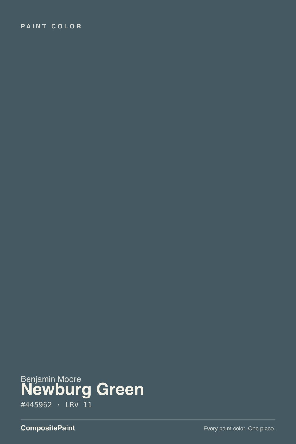
Newburg Green is a deep, blue-leaning teal with a hush of gray over it — closer to a dark peacock than a garden green, and dark enough (LRV 11) that the little paint chip looks almost black in your hand. On an actual door, island or vanity, real light wakes the color up and it reads unmistakably teal, not navy and not forest green. It has never chased a Color of the Year moment; it just quietly sits in Benjamin Moore's Historical Collection while designers keep painting front doors with it.
Front doors and shutters · kitchen islands under white perimeter cabinets · brick exteriors · powder rooms and bathroom vanities
You want a true grass green, not a blue-green · your only room for it has one small window or none · you're set on painting all four walls instead of one surface · you refuse to sample bigger than the fan-deck chip
- A genuine teal with real depth — reads distinct from every navy and every forest green
- Small commitments (door, island, vanity, shutters) look custom and expensive
- Holds its color in real light instead of flattening to gray
- Historical Collection pedigree — not chasing a trend it will outlive
- Pairs unusually well with red brick and warm wood
- The fan-deck chip looks almost black and misrepresents the finished color
- LRV 11 makes a windowless or cool-LED room feel smaller, not richer
- A full room of walls without strong daylight reads as a cave, not a jewel box
- More commitment and sampling effort than a mid-tone greige
What Color Is Newburg Green, Really?
Newburg Green lives in Benjamin Moore's Historical Collection, the deck built from documented colors off real historic landmarks rather than a marketing campaign, and that pedigree shows in how it behaves: it is not a color built to win a trend cycle. It is a genuine blue-green with a gray hush laid over both halves, which keeps it from reading as either a candy-bright teal or a flat navy. Designers reach for it on front doors and kitchen islands the way they reach for a good navy — reliably, without needing a viral room to justify it.
At LRV 11 it is a legitimately dark color, and that creates a real, well-documented problem before you ever open the can: on the tiny fan-deck chip, with nothing bigger to compare it against, Newburg Green looks almost black. Rolled across a door or a full accent wall in real light, the teal blooms and the color is unmistakably alive — greener in warm light, bluer in cool light — but it never gets as pale or as forgiving as a color with double its LRV. Treat the chip as a rough sketch, not the final answer, and sample big before you commit a whole surface to it.
Undertone in one line: teal — blue-green first, with a gray cast keeping it out of peacock-bright territory, and never sliding all the way to a true grass green or a true navy. If a corner of your room reads flat black instead of teal, that is the light failing the color, not the color changing character.
Where It Shines
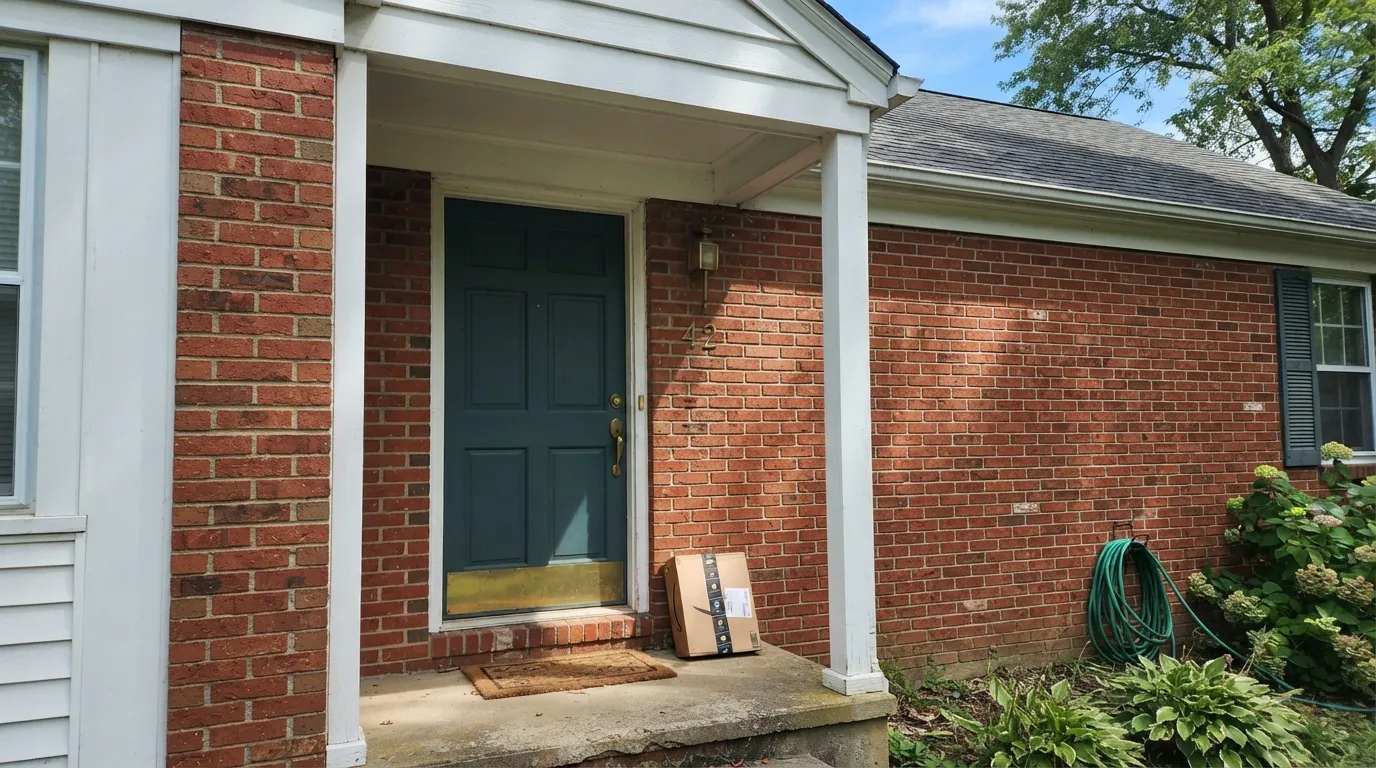
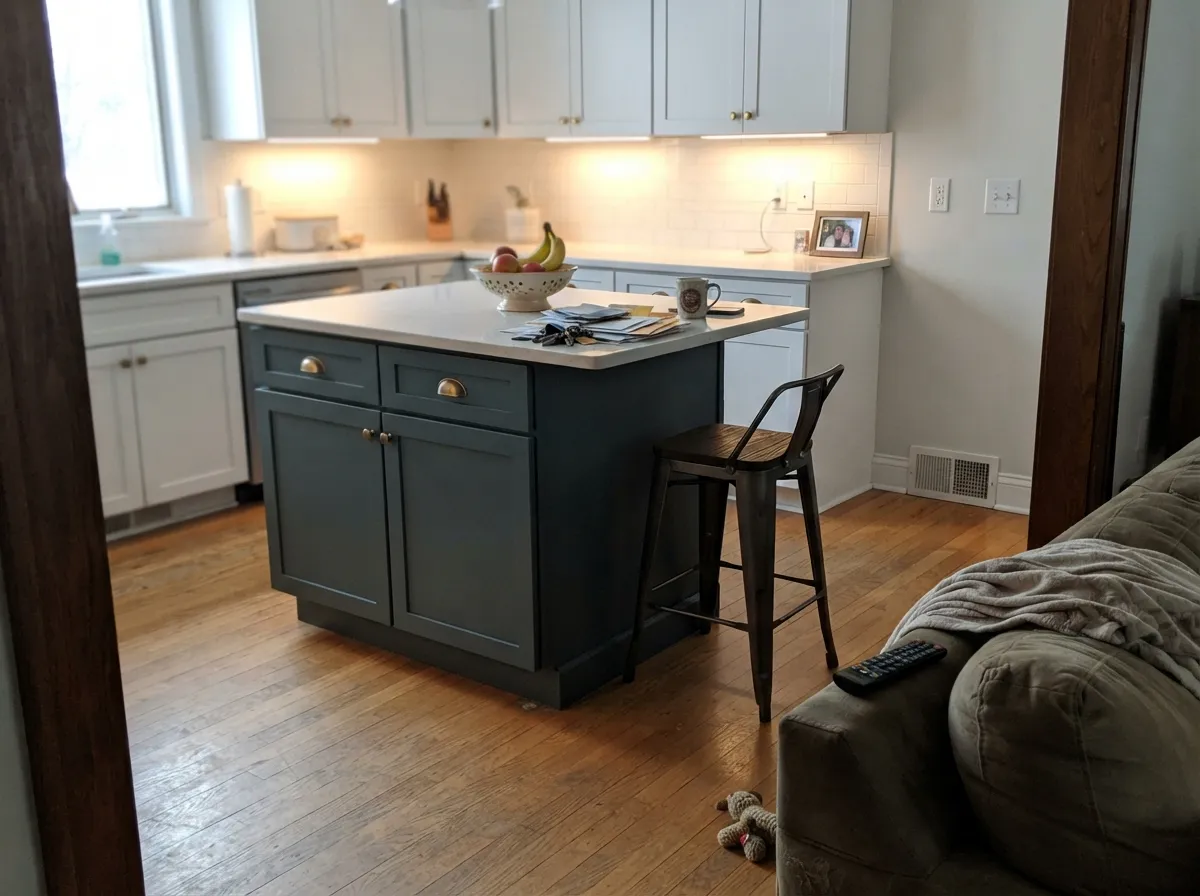
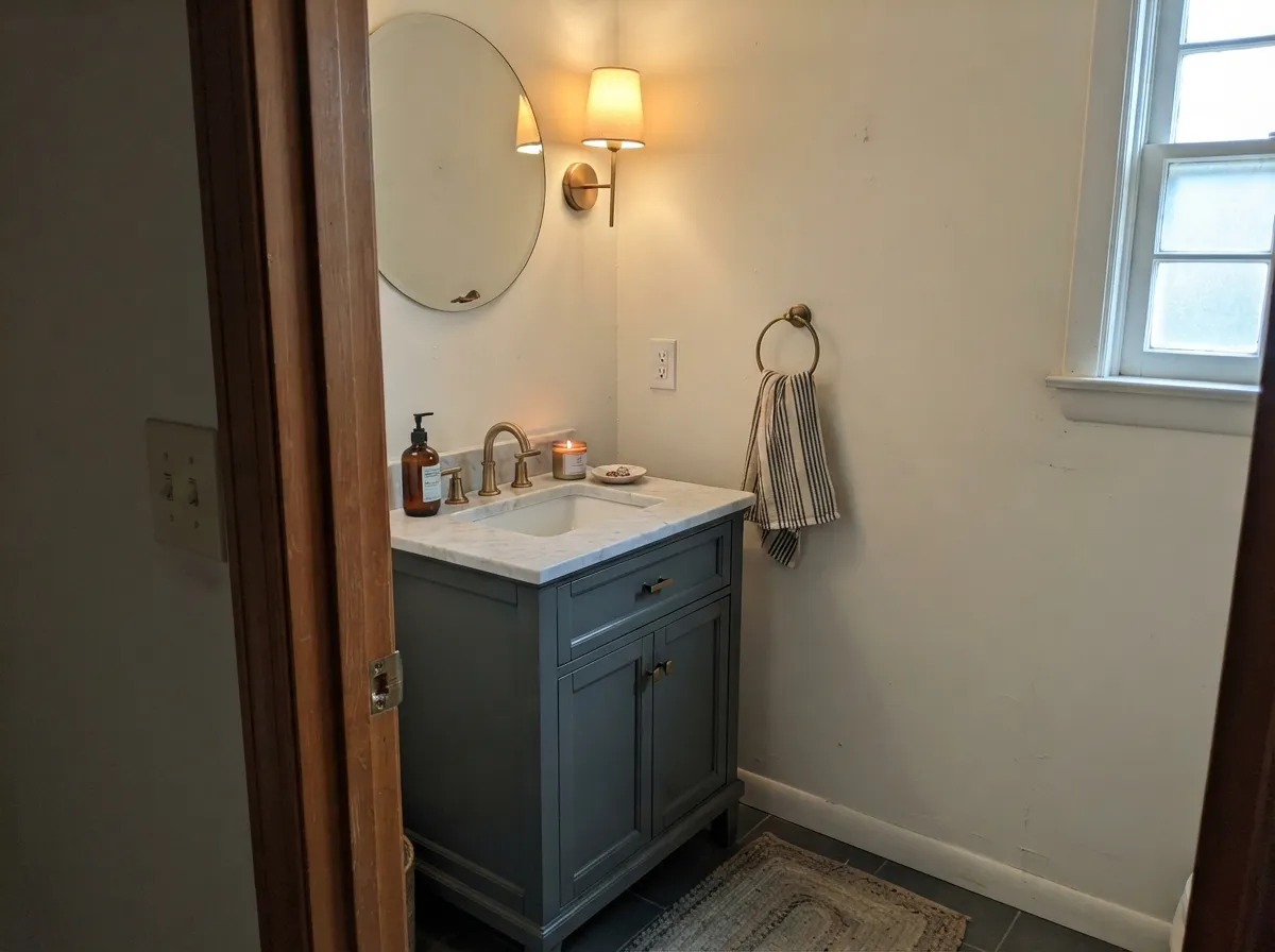
This is a small-commitment jewel tone, and it is at its best exactly where a small commitment lives: a front door, a kitchen island against white perimeter cabinets, a powder-room vanity, a run of exterior shutters. Give it brass hardware, oak floors or a red brick facade and it looks custom without the whole-room risk. On a door in real daylight it reads deep and specific — the color guests ask about — instead of the near-black it looks like on the sample chip.
Where It Fails
Almost every disappointed review of Newburg Green traces back to one of three habits, and all three are avoidable before the first coat goes on. The paint is not misbehaving in any of them — it is a dark, saturated color being exactly as dark and saturated as its LRV says.
At LRV 11 the color already absorbs most of the light that hits it; take away the window or the warm bulb and there is nothing left to wake the teal up. This is the room behind the most common one-line complaint — "beautiful color but too dark for me" — and it is not the paint's fault. Save Newburg Green for a surface with real or warm-lamp light, or pick a lighter teal for a dark room.
This color was built for doors, islands, vanities and trim — a bold, contained gesture. Painted on every wall of a small room it stops reading as a jewel tone and starts reading as a cave, especially without a big window to push light back at it. Use it as the accent it was designed to be, or reserve full-room coverage for a large room with strong daylight.
The chip is genuinely misleading at this depth — it looks nearly black, which either scares buyers off a color they'd love or, worse, gets ordered sight-unseen by someone expecting near-black and surprised by how visibly teal it turns on the wall. Buy the largest sample size and look at it on the actual surface, in the actual light, before committing a gallon.
Room by Room
Semi-gloss or high-gloss (Benjamin Moore's ADVANCE alkyd enamel is built for exactly this) against warm white or cream siding is the pairing that shows up in project after project. Full sun reads it crisp and deep; shade keeps it moodier but still clearly teal, never black.
Painted on an island under white perimeter cabinets, it earns its keep as the room's one deliberate color decision. Brass hardware and oak floors are its natural company; satin cabinet enamel wipes clean where hands land.
Cool teal against warm red brick is a genuinely good, well-documented pairing — the two temperatures balance each other. Works on shutters, gables and trim without needing to cover the whole facade.
A single vanity in Newburg Green under a marble top with brass fixtures reads expensive on a small budget. Small rooms take deep color well, and a powder room usually has enough fixture and mirror light to keep it lively rather than swallowed.
In a bright room with a real window it can be a genuinely striking backdrop for leather and walnut. In a dim or north-facing room it is the riskiest bet on this list — sample a large board first, and plan on warm lamps at night regardless.
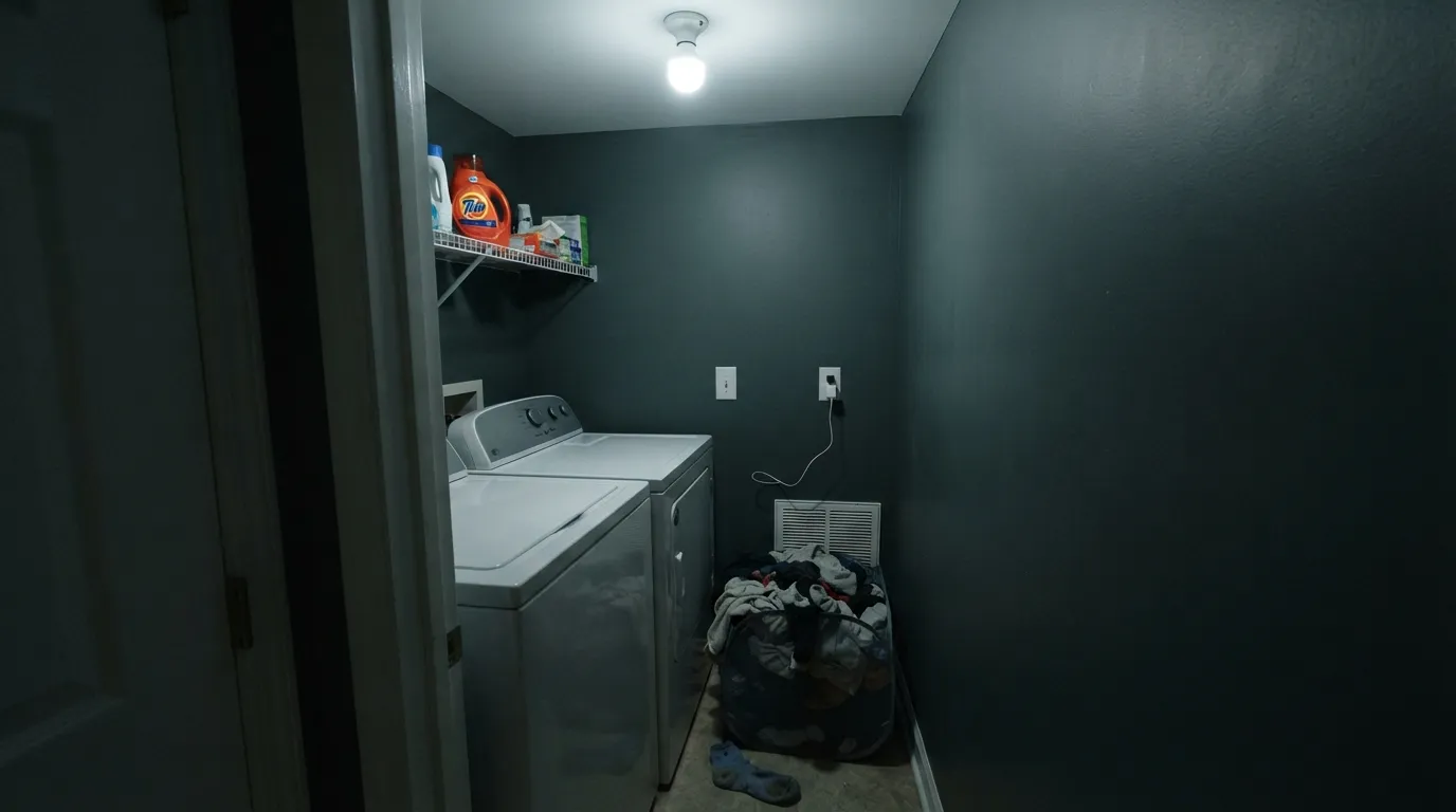
Laundry rooms, interior powder rooms with no window, closets: without a light source to bounce off it, LRV 11 reads as near-black and the room feels smaller, not richer. Pick a lighter color here and save Newburg Green for a surface that gets real light.
Your Light Is the Risk
A door or window wall with real daylight but no harsh direct sun is where the teal reads most true — deep, blue-green, alive. This is the light to sample it in.
Take away warm light and LRV 11 has nothing left to work with; the color flattens toward near-black and the room feels smaller. The source of most disappointed reviews.
Bluer and cooler at midday, greener and warmer as the sun lowers toward the horizon. A front door will visibly change character over the course of a day.
2700K lamps keep the green side warm and alive after dark. Cool white LEDs push it toward a flat, cold peacock — swap the bulb before you blame the paint.
Most complaints about Newburg Green are a light mismatch. Upload a photo of your actual room and see it on your walls — then ask for the same wall in north light or evening lamps before you buy a single sample.
Need It From Another Brand?
Any paint counter can custom-tint Benjamin Moore HC-158 directly. If you would rather stay in one brand's own deck, these are the closest stock matches, measured as ΔE2000. Under 2 is a difference you will not see on the wall.
| Brand | Closest color | ΔE | LRV | |
|---|---|---|---|---|
| Sherwin-Williams | Still WaterSW 6223 · Sherwin-Williams | 4.0 | 10 | Color page → |
| Behr | Midnight In The TropicsS480-7 · Behr | 1.0 | 9 | Color page → |
| Valspar | Midnight TealM334 · Valspar | 3.6 | 9.2 | Color page → |
| PPG / Glidden | OceaniaPPG10-01 · PPG / Glidden | 1.3 | 10 | Color page → |
| Glidden | OceaniaPPG10-01 · Glidden | 1.1 | 9 | Color page → |
| Dutch Boy | Tailored Blue431-6DB · Dutch Boy | 1.8 | 8 | Color page → |
Similar Benjamin Moore Colors
The nearest shades to Newburg Green within Benjamin Moore's own range, ranked by perceptual color distance — useful when you want the same look a touch lighter, darker, or warmer.
WCAG 2.1: AA is 4.5 : 1 for normal text, 3 : 1 for large text, AAA is 7 : 1.
Newburg Green vs the Colors You're Also Considering
Every Newburg Green sample board has the same rivals on it. The numbers show the real lightness gap — then it comes down to which risk you would rather live with.
Pick this when you want visible green in the mix, not just blue — Newburg Green is the teal, Van Deusen Blue is the quiet navy-adjacent one.
Benjamin Moore HC-156 · LRV 11Van Deusen BluePick this if you want the blue side of this family without the green — Van Deusen Blue is Newburg's cooler, more restrained cousin at the same LRV.
Pick this for a color that still reads distinctly teal in low light instead of flattening all the way to black.
Benjamin Moore PM-22 · LRV 4Essex GreenPick this if you want a true dark green with no blue in it — Essex Green skips the teal entirely and reads almost black indoors.
Pick this for the deep, moody jewel-box version — Peacock Blue is Newburg's daylight-friendly cousin, not nearly as dramatic.
Benjamin Moore 2049-40 · LRV 35Peacock BluePick this for the same teal family at a livable daytime depth — LRV 35 instead of 11, safe for a full wall in an ordinary room.
New Providence Navy 1651 is the closest call in the line, sharing the same #445962 hex and LRV 11. If you like Newburg Green but the word green worries you, that is the same paint under a different name. Vanderberg Blue 721 and Yorktowne Green HC-133 both sit at #465A5D and LRV 11, a hair greener and slightly lighter in feel. Newburyport Blue HC-155 is the clearly bluer alternative in the family.
Across brands, Rodda Lagoon Lullaby R078 at deltaE 0.62 is effectively the same color. Glidden Oceania PPG10-01 at deltaE 1.08 and Hirshfield's Saxon Blue H0052 at deltaE 1.49 are visually identical in normal room light. Behr Graphic Charcoal N500-6 at deltaE 2.04 and Dunn-Edwards Good Night! DET598 at deltaE 2.03 are very close, so sample first. Sherwin-Williams Still Water SW 6223 at deltaE 3.99 and Farrow and Ball Stiffkey Blue No. 281 at deltaE 4.79 are close but visibly different side by side.
Newburg Green Coordinating Colors
The rule for coordinating with Newburg Green is simple: keep the partners warm and let the teal be the only cool note in the room. Warm whites, warm charcoals and warm wood all frame it; cold, blue-white trim just competes with it. These are the partners that keep showing up in real projects:
A Quiet Historical Collection Color, Not a Trend Chaser
Newburg Green has never had a Color of the Year moment and it isn't chasing one. It sits in Benjamin Moore's Historical Collection, a deck built from documented colors pulled off real historic buildings rather than assembled for a marketing push, and it has quietly done the same job for decades: a dependable, distinctive teal for a door or an island, painted by homeowners who found it in a design photo, not a viral post.
That honest obscurity is a feature, not a gap. It means Newburg Green is unlikely to feel dated the way a trend color can — it was never new, so it can't go out of style the way a moment-driven pick does. If you want proof it works, look at how often it turns up as the one deliberate color choice in an otherwise neutral kitchen or facade, doing its job without asking for credit.
Newburg Green With Wood Tones and Metal
Warm wood is this color's best friend: oak floors, a walnut table, a butcher-block counter all sit comfortably next to the teal because their warmth balances its cool. It also plays well with red brick and warm stone for the same reason — heat against cool reads as intentional, not accidental.
Metals are the easy part of the decision. Unlacquered brass and aged bronze are the classic match on hardware and lighting, and matte black holds its own too. Polished chrome and stainless are the one metal that can feel slightly cold next to it — not a dealbreaker, just worth a look with the actual fixture before you commit.
Three Ready Palettes Built on Newburg Green
A color is never alone on the wall. These are complete combinations in the 60-30-10 pattern, with the reason each one holds together. Every one opens in the visualizer.
A warm white body keeps the house feeling classic, not trendy; the charcoal shutters and the teal door supply the only two dark notes, so the facade reads deliberate instead of busy.
Try this palette in your roomCloud White's warmth keeps the perimeter cabinets from looking clinical next to the teal; Pale Oak on the walls stays quiet enough that the island remains the one thing in the room doing color.
Try this palette in your roomCool teal against warm red brick is the pairing that shows up again and again in real projects; the soft white trim keeps the roofline crisp, and the near-black railings ground the palette without adding a third competing color.
Try this palette in your roomNewburg Green FAQ
Is Newburg Green actually green or blue?
Both — it is a genuine teal, a blue-green with a gray hush over it, closer to a dark peacock blue than to a garden or forest green. It leans slightly bluer in cool daylight and slightly greener under warm lamps, but it never becomes a true navy or a true grass green.
Why does it look almost black on the paint chip?
At LRV 11 it is genuinely dark, and a tiny fan-deck chip has nothing beside it to show the color against — the eye reads it as near-black. Rolled across a door, island or vanity in real light, the teal is unmistakable. Always sample bigger than the chip before committing.
Is it good for a whole room, or just an accent?
It was built for accents — doors, islands, vanities, shutters — and that is where it consistently succeeds. A full room of walls works only with strong, reliable daylight; in a dim or windowless room it reads as a cave rather than a jewel box, which is the single most common regret with this color.
What white goes with a Newburg Green front door?
A warm white keeps the classic look: White Dove or Cloud White on siding and trim. A stark, cool white will fight the teal's warmth rather than frame it.
Does Newburg Green work with red brick?
Yes — it is one of the more reliable pairings for a brick exterior. The brick's warm red and the paint's cool blue-green balance each other, which is why it shows up so often on shutters, doors and trim against brick facades.
What sheen should I use on a front door?
Semi-gloss or high-gloss. Benjamin Moore's ADVANCE alkyd enamel is built for doors, trim and cabinetry and holds up to weather and daily hand contact far better than a flat or eggshell finish would.
Have you painted with Newburg Green?
Rate it — one tap helps the next reader decide.
Ask a Question