Adirondack Blue
Behr's dusty slate-blue teal, reviewed honestly: the kitchen islands and front doors it was built for, the whole-small-room mistake, and the one Home Depot aisle where it also becomes a garage floor.

Jessica has spec'd whites and neutrals for more than 300 rooms and keeps a sample wall of painted drawdowns in her studio. Every color review is checked against real reader rooms in the comments and re-tested when a formula changes. About the testing process →
- 1Salamander6
- 2Hidden Gem14
- 3Adirondack Blue22
- 4Van Courtland Blue31
- 5Wythe Blue48
The Fast Verdict
Adirondack Blue is a dusty, blue-leaning slate teal that Behr sells almost everywhere in the store — cabinet-and-trim enamel, exterior masonry paint, even a one-part epoxy for garage floors. It has never been a Color of the Year and no design blog treats it as a headline color. What it has instead is a genuinely useful medium depth: dark enough to look intentional on an island or a front door, light enough that it doesn't swallow a small room the way a true navy would. Buy it for what it is — a dependable workhorse blue — and it delivers exactly that.
Kitchen islands under white or cream cabinets · front doors on light-colored coastal or cottage exteriors · powder rooms and vanities · garage floors, literally · trim and shutters that need a calm, cool accent
You want a famous, trend-driven color with a story to tell · your whole main bedroom or a large windowless bath is the target · your floors are honey oak or golden-beige tile · you're matching door, siding, and floor paint by name alone instead of a real chip
- Dependable medium-depth blue that hides wear on cabinets and islands
- Genuinely spans interior enamel, exterior masonry, and garage-floor epoxy formulas
- Reads calm and welcoming on coastal and cottage-style front doors
- Cool but not cold — enough gray to avoid a candy-teal or icy look
- Pairs cleanly with white, cream, brass, and black without a lot of fuss
- Reads noticeably darker and grayer in windowless or shaded rooms
- Fights honey oak floors and warm beige tile
- No real fame or trend story — it is a workhorse, not a headline color
- Different Behr product lines (enamel vs. epoxy vs. masonry) don't always match exactly
What Color Is Adirondack Blue, Really?
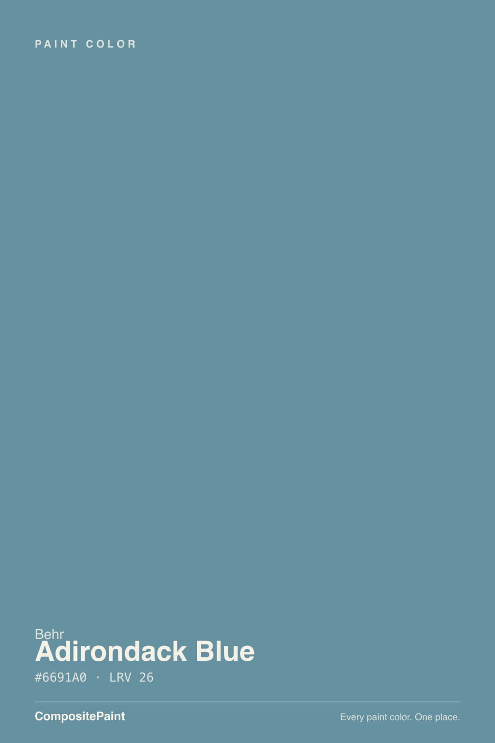
A dusty medium blue with a slate-teal lean — more blue than green, more gray than saturated. Our deck files it in the teal family, but on the wall it reads closer to a muted, grayed-down blue than the aqua-leaning teals people usually picture; there is no turquoise flash and no obvious green cast. It is a color built to be dependable rather than dramatic, and Behr treats it that way: instead of anchoring one flagship kitchen or one designer collaboration, Adirondack Blue shows up across the catalog as a cabinet-and-trim enamel, an exterior masonry and stucco paint, and even a self-priming one-part epoxy formulated for concrete garage floors. That is an unusual spread for a single paint chip, and it is the real story here — not fame, just breadth.
At LRV 22 it sits at a genuine medium depth: light enough to read as a color rather than a near-black, dark enough to hold its own on an island or a door without looking washed out. In direct daylight against white or cream neighbors it reads as a clean, stable slate blue. Pushed into a shaded corner, a windowless bath, or under cool artificial light, it sinks noticeably darker and grayer, closer to a soft navy than the chip suggests. That is normal behavior for a medium-depth cool color, but it is the number one thing to plan for before committing a whole small room to it.
Undertone in one line: cool blue-gray with just enough gray to keep it from reading bright or candy-teal. If your sample looks flatly gray with no blue left in it, that is cool LED light or a shaded corner talking, not a defect in the paint; if it looks a shade greener than expected, compare it directly against Behr's own Aegean Blue before assuming your can is off — the two sit close enough in the deck that mixing them up at the store is an easy mistake.
Where It Shines
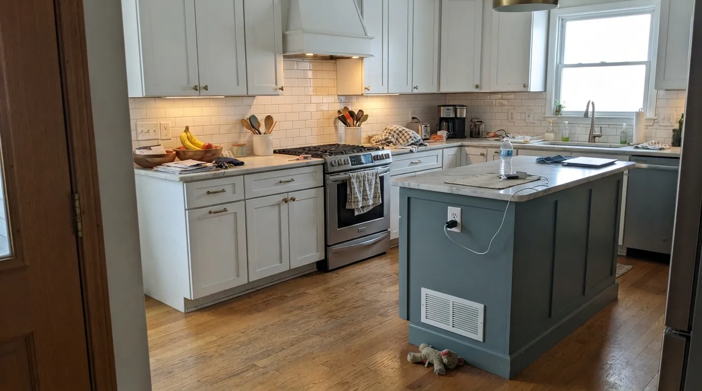
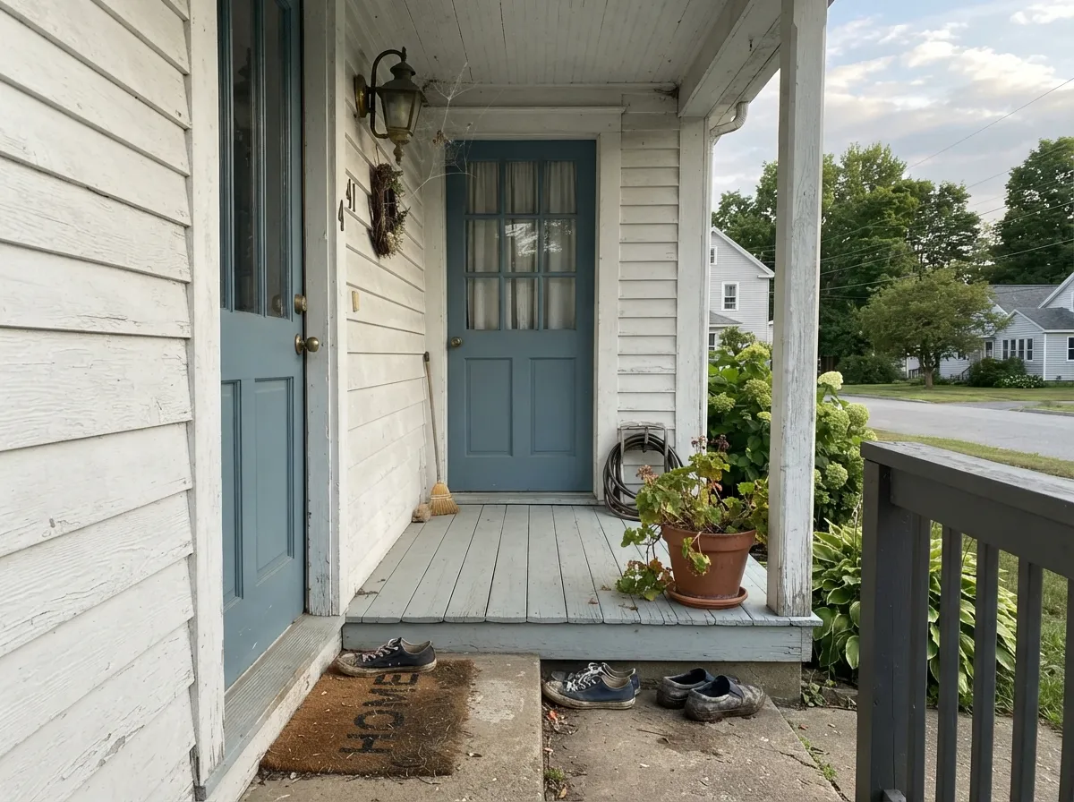
This is a color built for one piece of a room rather than four walls of one. Its best-known job is the kitchen island under white shaker cabinets — Behr's own styled kitchens pair it exactly that way, with marble or butcher-block counters and brass hardware doing the rest. Its second home is the front door: on a white, cream, or light gray coastal or cottage exterior, a semi-gloss Adirondack Blue door reads calm and welcoming without the heaviness of a true navy. And because Behr sells the same color as an exterior masonry paint and even a garage-floor epoxy, it is one of the few colors in this deck that can genuinely run from your front door to your driveway without a single color-matching guess.
Where It Fails
Almost every regret story with Adirondack Blue traces back to one of three predictable situations. None of them are the paint's fault — they are what happens when a medium-depth cool color meets the wrong room, the wrong floor, or the wrong assumption about how Behr's product line works.
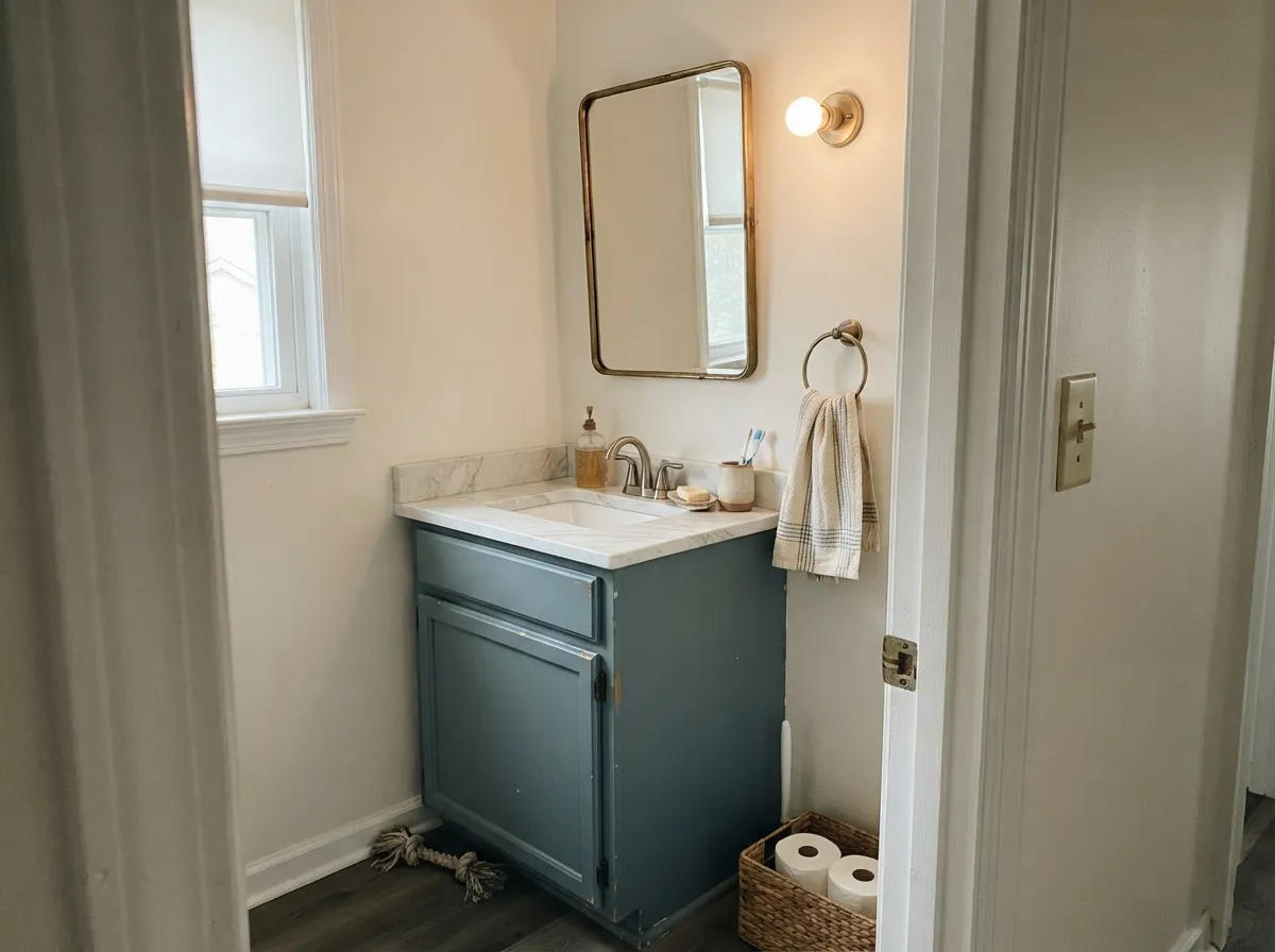
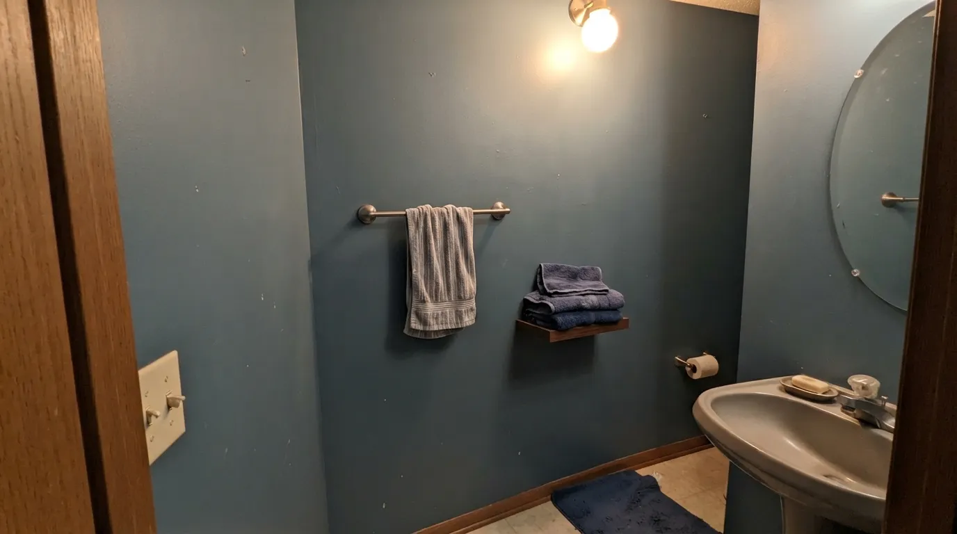
It reads calm and confident as an accent — a beadboard panel, a vanity, one wall — but readers who commit an entire small, low-light bathroom or a windowless powder room to it report it going darker and heavier than the chip promised. At LRV 22 it holds real color across four walls; without a window or a strong overhead light, that color drifts toward navy. Keep it to a vanity or a wall with a window, and let a lighter neutral carry the rest of the room.
Blue and orange sit opposite each other on the color wheel, and golden oak floors, orange-toned trim, and warm beige tile are all, functionally, orange. Next to them Adirondack Blue looks flatter and grayer while the floor looks more orange than it did before — both sides lose. It is genuinely happy next to walnut, espresso, white oak, or gray-washed floors; it is not happy next to honey oak.
Behr sells this exact color name as a cabinet-and-trim enamel, an exterior masonry and stucco paint, and a self-priming one-part epoxy for garage floors — three different resins built for three different jobs, and epoxy pigments do not always render a color identically to acrylic enamel. If you are matching a front door to a garage floor or a door to the siding, bring a real chip of each specific product to compare side by side. Do not assume the can label alone guarantees a match.
Room by Room
White or cream perimeter cabinets, Adirondack Blue on the island, brass or matte-black hardware. The depth hides daily wear — knuckle marks, grease splashes — better than a pale color would. Satin or semi-gloss cabinet enamel.
On a light-colored coastal or cottage-style exterior it reads deliberate and calm rather than heavy. Semi-gloss exterior enamel; pairs cleanly with white or cream siding and black or bronze hardware.
A vanity, a beadboard panel, or one wall with real daylight is the sweet spot. A full windowless powder room in this color reads darker than expected — see the fails section.
Behr sells this same color as a self-priming one-part epoxy for concrete. It is one of the few colors in the deck that genuinely spans from front door to garage slab without a separate color decision.
Works as a single accent wall against a warm or true neutral like Agreeable Gray. Needs real daylight or a lamp nearby; a north-facing accent wall with no other light source will read flat and gray by evening.
Not the color's best job. At full-room scale in average bedroom light it can feel heavier and cooler than the chip suggested. If you love the color, use it on an accent wall or headboard nook and keep the rest of the room in a lighter neutral.
Your Light Is the Risk
Against white or cream neighbors in real sun it reads as a clean, stable slate blue — the color it was designed to be.
Without daylight it sinks toward a flat, heavy blue-gray closer to navy than the chip. Test it in the actual room, not just the sample aisle.
Cooler and grayer in flat morning light, a shade more blue and alive as afternoon sun angles in. Most people like the shift.
Warm 2700K bulbs deepen it toward a moody slate-navy at night. Cool white LEDs keep it crisper and grayer — closer to its daytime look.
Most complaints about Adirondack Blue are a light mismatch. Upload a photo of your actual room and see it on your walls — then ask for the same wall in north light or evening lamps before you buy a single sample.
Need It From Another Brand?
Any paint counter can custom-tint Behr N480-5 directly. If you would rather stay in one brand's own deck, these are the closest stock matches, measured as ΔE2000. Under 2 is a difference you will not see on the wall.
| Brand | Closest color | ΔE | LRV | |
|---|---|---|---|---|
| Sherwin-Williams | Storm CloudSW 6249 · Sherwin-Williams | 2.7 | 23 | Color page → |
| Benjamin Moore | Bachelor Blue1629 · Benjamin Moore | 2.8 | 22 | Color page → |
| PPG / Glidden | Garrison GrayPPG1039-5 · PPG / Glidden | 3.6 | 23 | Color page → |
| Glidden | Slate Ridge70BG 23/065 · Glidden | 1.6 | 23 | Color page → |
| Dutch Boy | Felted Blue430-5DB · Dutch Boy | 2.9 | 23 | Color page → |
| HGTV Home by Sherwin-Williams | Storm CloudHGSW 3363 · HGTV Home by Sherwin-Williams | 2.7 | 23 | Color page → |
Similar Behr Colors
The nearest shades to Adirondack Blue within Behr's own range, ranked by perceptual color distance — useful when you want the same look a touch lighter, darker, or warmer.
WCAG 2.1: AA is 4.5 : 1 for normal text, 3 : 1 for large text, AAA is 7 : 1.
Adirondack Blue vs the Colors You're Also Considering
Every Adirondack Blue sample board has the same rivals on it. The numbers show the real lightness gap — then it comes down to which risk you would rather live with.
Pick this for the quieter, more slate-gray read — Adirondack Blue leans more toward true blue and less toward green.
Behr BXC-36 · LRV 25Aegean BluePick this if you want more blue-green saturation at almost the same depth — same Behr deck, a half-step more teal and a little brighter.
Pick this for a lighter, more livable medium blue that still works on cabinets and trim without going near-black.
Sherwin-Williams SW 6244 · LRV 4NavalPick this for an unmistakable navy statement door or island — Naval reads navy even from across the street, not gray-blue.
Pick this when you want blue you can actually live with in daylight — Van Deusen reads near-black in a dim room.
Benjamin Moore HC-156 · LRV 11Van Deusen BluePick this for a true navy with more depth and drama than Adirondack Blue, but still softer than a full-black navy like Hale Navy.
Pick this for a color you can actually see across the room — Rainwashed is nearly twice as light and reads far more neutral than blue.
Sherwin-Williams SW 6211 · LRV 47RainwashedPick this for a much lighter, greener, whole-room-safe alternative — though it leans more neutral-gray on the wall than the chip suggests.
Inside Behr's own deck the differences are small. Skipper 570F-5 (#6593A9, LRV 26) is the closest neighbor and reads a touch more blue. French Court PPU14-04 (#698EA3, LRV 25) is slightly darker and grayer. Blue Clay T15-16 (#6B9194, LRV 26) drops most of the blue and behaves like a soft teal-green instead.
Across brands, Secret Cove SW 9058 from Sherwin-Williams (#68909D, LRV 25) has a deltaE of 0.86 against Adirondack Blue, which is a true match, and Splendor Blue HGSW 2343 measures the same. Yard Blue No. G12 from Farrow & Ball (LRV 25, deltaE 2.38) and Salt Box Blue DET562 from Dunn-Edwards (LRV 26, deltaE 2.67) are very close, but sample first. Sea Reflections 1664 from Benjamin Moore is a little lighter at LRV 28 with deltaE 2.99, also worth a sample. Palace Intrigue P107 from Valspar (LRV 25.4, deltaE 3.56) and Baritone PPG1149-5 (LRV 25, deltaE 3.63) are close but visibly different side by side, both leaning grayer.
Adirondack Blue Coordinating Colors
The rule for coordinating with Adirondack Blue: warm, soft whites over stark cool ones, and near-black or warm-neutral accents over anything golden. It pairs cleanly with cream, brass, and matte black, and it holds its own next to true and warm neutrals alike. These are the partners that keep showing up in real rooms with this color:
One Color, Three Different Paints
Most colors in this deck live on one shelf. Adirondack Blue lives on three: a cabinet-and-trim semi-gloss enamel for interiors, a masonry, stucco, and brick exterior paint for siding and accent walls, and — genuinely unusual for a decor color — a self-priming one-part epoxy built for concrete garage floors. No design blog put this color on a trend list and no celebrity kitchen made it famous. Its reputation, such as it is, comes from Home Depot shelves: it's the practical choice when someone wants the same calm slate blue to show up on a door, a wall, and a floor without hunting for three separate matches.
That spread is also the honest caveat. Enamel, masonry paint, and epoxy are built on different resins, and pigments do not always render identically across them. If a project depends on an exact match between, say, a garage floor and a front door, buy a small sample of each specific product and compare them side by side in the actual light before committing to the full job.
Adirondack Blue With Wood Tones and Floors
Cooler, darker woods are this color's best company: walnut, espresso, and dark-stained oak all let the slate blue read calm and deliberate instead of cold. Pale white oak and gray-washed floors are safe too, and give the room a quieter, more coastal cast.
Golden honey oak is the one real mismatch. Blue and orange sit opposite each other on the color wheel, so a warm honey floor pulls the walls colder and grayer while the floor itself starts to look more orange than usual — neither side benefits. If the honey floor isn't going anywhere, keep this color to a single door, island, or accent rather than a full room, and let brass or warm lighting do the bridging instead.
Three Ready Palettes Built on Adirondack Blue
A color is never alone on the wall. These are complete combinations in the 60-30-10 pattern, with the reason each one holds together. Every one opens in the visualizer.
This mirrors Behr's own styled kitchens: a warm white perimeter keeps the room bright, the island carries the only real color, and Kendall Charcoal on the fixtures and hardware keeps the blue from floating alone against so much white.
Try this palette in your roomA classic white-body coastal look: the near-black shutters keep the door from reading soft or pastel, and because Behr sells this color across its interior enamel and exterior masonry lines, the door, trim, and any stucco accents can come from the same paint chip.
Try this palette in your roomA small room with a window takes the full slate blue confidently. Swiss Coffee trim keeps the edges soft instead of stark, and Revere Pewter on a vanity or tile bridges the blue to a warm neutral so the room doesn't tip cold.
Try this palette in your roomAdirondack Blue FAQ
Is Adirondack Blue more blue or more teal?
More blue. It sits in our teal family grouping because of its blue-green depth range, but on the wall it reads as a dusty, grayed-down blue rather than an aqua or turquoise teal — there is no green flash. If you want a color with more visible green in it, compare Behr's own Aegean Blue side by side before deciding.
Does it work on kitchen cabinets and islands?
Yes — it is one of its best jobs. Behr's own styled kitchens pair it as an island color under white shaker cabinets with marble or butcher-block counters and brass hardware, and the medium depth hides everyday wear better than a pale color would. Use a satin or semi-gloss cabinet enamel.
Can I really put it on a garage floor?
Yes. Home Depot lists Adirondack Blue as a self-priming one-part epoxy formulated for concrete and garage floors, in addition to the interior cabinet enamel and the exterior masonry/stucco/brick paint. It is a genuinely different product with a different resin, so bring a real chip of the specific formula you're buying rather than assuming they'll match by name alone.
Will it look too dark in a small bathroom?
It can, if the bathroom has no window. Homeowners who love it on a vanity or a beadboard accent report it going noticeably darker and heavier once it covers all four walls of a small, low-light bath. Use it on a vanity or one wall with real daylight, and keep the rest of the room in a lighter neutral if the room is small and dim.
What white trim goes with Adirondack Blue?
A soft, slightly warm white — White Dove, Swiss Coffee, or Behr's own Whisper White — keeps the pairing calm. A stark, cool white trim can make the blue look colder and grayer by contrast than it actually is.
Does it work on exteriors — siding, shutters, front doors?
Yes. It's a popular front-door color on light-colored coastal and cottage-style exteriors, and Behr sells a dedicated masonry, stucco, and brick exterior formula in the same color for siding or accent walls. Pair it with a white or cream body and black or bronze hardware for the classic look.
Have you painted with Adirondack Blue?
Rate it — one tap helps the next reader decide.
Ask a Question