Aegean Blue
Behr's saturated teal-blue reviewed honestly: the light where it turns Mediterranean, the light where it just goes flat, and why it isn't the famous Aegean.

Jessica has spec'd whites and neutrals for more than 300 rooms and keeps a sample wall of painted drawdowns in her studio. Every color review is checked against real reader rooms in the comments and re-tested when a formula changes. About the testing process →
- 1Salamander6
- 2Hidden Gem14
- 3Aegean Blue25
- 4Van Courtland Blue31
- 5Wythe Blue48
The Fast Verdict
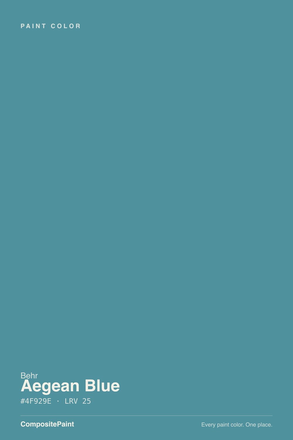
Aegean Blue is a real color doing real work without a trend behind it: a medium-deep teal that leans more blue than green, saturated enough to read as a statement, dark enough (LRV 25) to hold that saturation instead of washing out pastel. It has none of the cultural momentum of Benjamin Moore's Aegean Teal — different brand, different color, easy to confuse by name alone — but on a front door, a powder room, or a kitchen island it does exactly what a good teal-blue should: read like the sea instead of a swimming pool.
Front doors and shutters · powder rooms and small baths · kitchen islands · anyone who wants a real teal-blue, not a barely-there hint of one
You actually want a true navy with zero green · your room is north-facing with no warm light source · you want a pale spa color, not a statement · you're pairing it with cool gray stone or chrome fixtures
- A genuinely saturated, real teal-blue — not a barely-there hint of one
- Holds its color in strong light instead of washing out pastel
- Reads coastal and finished on a front door with almost no styling
- Small drenched rooms (powder baths, one island) look intentional and custom
- A quietly competent color that doesn't need a trend story to earn its place
- The green undertone rules it out for anyone who actually wants a flat navy
- Flattens to muddy gray-teal fast in cool, dim, north-facing light
- Too saturated for a full room with no white or cream relief anywhere
- Easy to confuse by name with Benjamin Moore's more famous Aegean Teal — a different color entirely
What Color Is Aegean Blue, Really?
Aegean Blue sits on the blue side of the teal family: more blue than green once you look past the name, which is a fair description of how Behr treats it in its own deck — most brands chasing the same hue range call these colors "teal," but Behr called this one "Blue." We file it under teal on this site because that's the closest cross-brand family bucket, but Behr's instinct is defensible: on the wall it reads as a saturated, slightly green-shadowed blue, not a grassy or aqua teal.
At LRV 25 it's a genuine mid-depth color — deep enough to hold its saturation in strong light instead of bleaching toward pastel, light enough that it still needs real daylight to look like anything more than a dark, indistinct blue-gray. In full sun, especially outdoors, it reads bright and unmistakably blue-green, closer to the water-color the name promises. Indoors under average daylight it settles into a calmer, more restrained slate-teal — still clearly a color, just a quieter one.
Undertone in one line: blue first, a real but modest amount of green underneath — enough to separate it from a true navy or a flat royal blue, not enough to tip it into grassy or aqua territory. If your sample looks gray and lifeless, your light is cool and there isn't much of it; if it looks nearly turquoise, that's strong direct sun exaggerating the saturation. Both are the same paint being honest about the light it's in.
Where It Shines
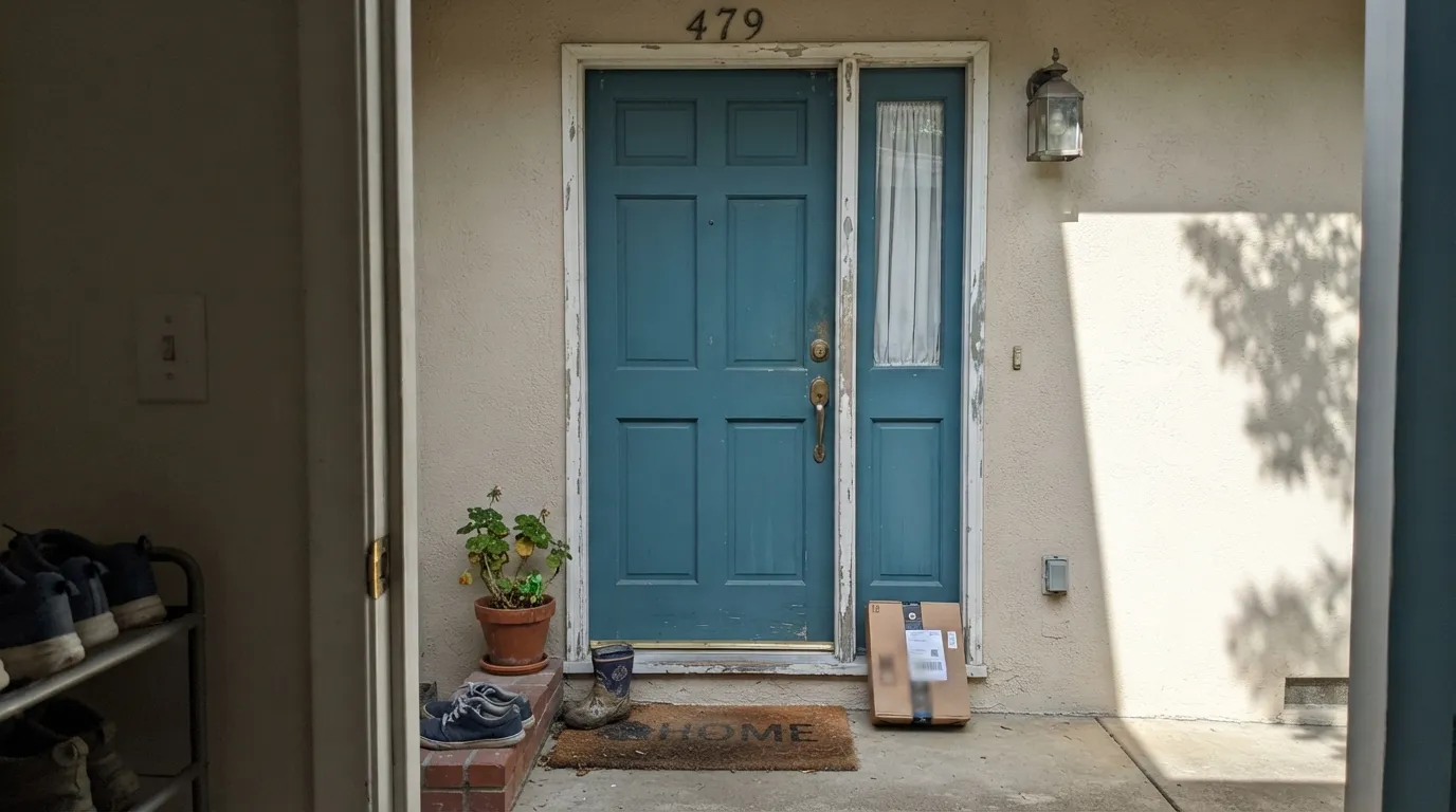
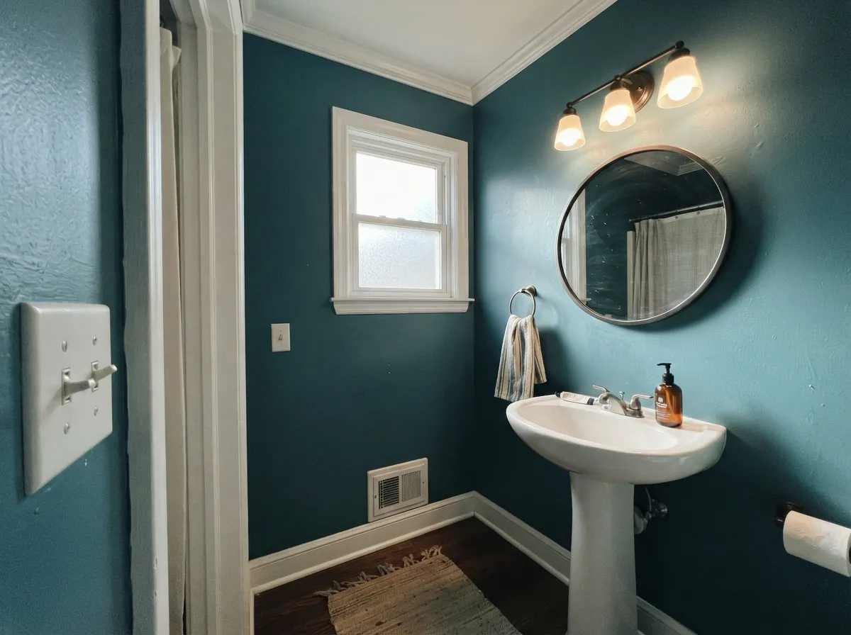
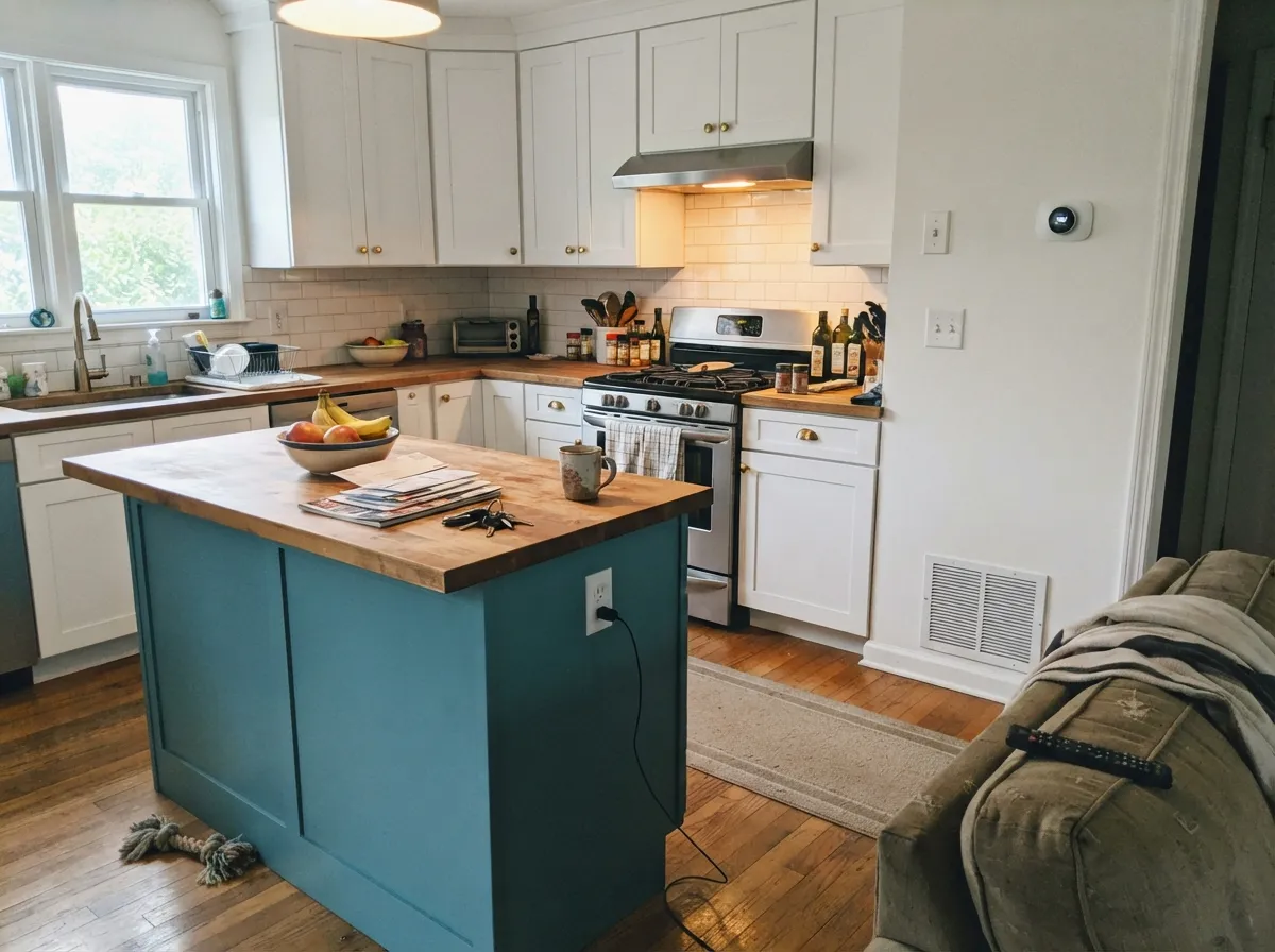
This is a color built for a focused job, not a whole house, and it's genuinely good at that job. On an exterior door in real sun it reads crisp and coastal against a light-colored house — brass hardware and a natural fiber mat finish the look without any styling effort. Indoors, its saturation is an asset in small, contained rooms: a powder room drenched floor to ceiling, or one kitchen island under white perimeter cabinets, where the depth reads intentional and expensive instead of overwhelming.
Where It Fails
Almost every disappointing story with Aegean Blue comes down to one of three predictable mismatches, and none of them are the paint's fault. If your situation matches one of these, this is not your color — no amount of extra coats fixes it.
Cold, low daylight drains the saturation that makes this color work, leaving a flat, slightly muddy gray-teal instead of the clear blue-green it shows in real light. The color didn't fail; the light did. Add warm 2700K bulbs, or skip a full room of it and use it as an accent that gets some real daylight.
Aegean Blue carries a real green undertone in most light, and buyers picturing a flat, no-green navy for a front door end up with something that reads more coastal than nautical. If zero green is non-negotiable, Van Deusen Blue is the color you actually want.
Because it's a genuinely saturated color, a full small room in Aegean Blue with no white trim, ceiling, or crisp partner nearby can tip from "considered accent" into "swimming pool." Give it a real white or cream break somewhere in the room so the eye gets a rest.
Room by Room
Full sun and a light-colored house make it read genuinely coastal, not dark. Semi-gloss, brass or matte-black hardware, and it needs almost no other design decisions to look finished.
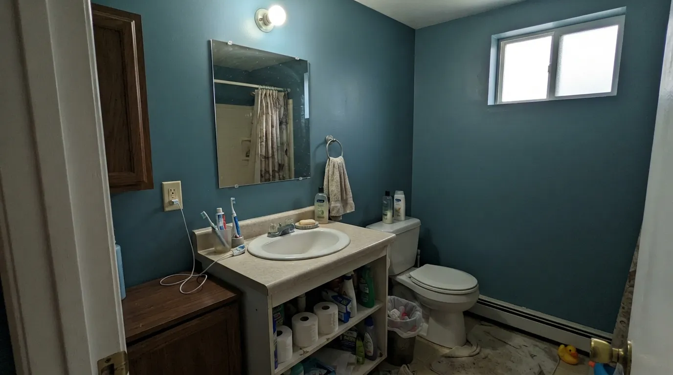
Small rooms absorb a saturated color well because there's less wall for the eye to get tired of. All four walls plus a crisp white ceiling and trim is the move; brass fixtures and a stone or marble top complete it.
One island in Aegean Blue under white perimeter cabinets and a warm wood or butcher-block counter reads deliberate, not busy. Satin urethane-fortified cabinet enamel; brass or unlacquered hardware over chrome.
Behind a headboard with warm lamps at night it turns rich and calm; in a north-facing room with cool LEDs it can feel cold rather than cozy. Test the actual wall before committing a full room.
Cool gray or blue-gray tile pulls it toward muddy and gray; warm white tile, wood-look plank, or a cream stone counter keep it reading clearly blue-green instead.
As full siding it's a big, saturated commitment that reads differently on every elevation depending on sun exposure. It earns its keep far more reliably as a door or shutter accent against a lighter body than as the main color.
Your Light Is the Risk
The color it was built for: clean, saturated, unmistakably blue-green. This is the light to sample it in before buying.
Desaturates fast into a flat, slightly muddy gray-teal. If this is your room's normal light, test big before committing a full wall.
Warms and softens at the sun hours, more blue-gray and quiet the rest of the day. The shift is real but gentle, not a different color.
2700K warm bulbs keep the green undertone in check and the color reads rich. Cool white LEDs pull it toward flat and gray — swap the bulb before you swap the paint.
Most complaints about Aegean Blue are a light mismatch. Upload a photo of your actual room and see it on your walls — then ask for the same wall in north light or evening lamps before you buy a single sample.
Need It From Another Brand?
Any paint counter can custom-tint Behr BXC-36 directly. If you would rather stay in one brand's own deck, these are the closest stock matches, measured as ΔE2000. Under 2 is a difference you will not see on the wall.
| Brand | Closest color | ΔE | LRV | |
|---|---|---|---|---|
| Sherwin-Williams | Manitou BlueSW 6501 · Sherwin-Williams | 3.2 | 25 | Color page → |
| Benjamin Moore | Rendezvous Bay726 · Benjamin Moore | 0.9 | 26 | Color page → |
| Valspar | My SkiffV104-4 · Valspar | 2.8 | 25.8 | Color page → |
| PPG / Glidden | Acapulco CliffsPPG1150-5 · PPG / Glidden | 2.7 | 28 | Color page → |
| Glidden | Dark Westwind Blue30BG 24/224 · Glidden | 2.8 | 24 | Color page → |
| Dutch Boy | Bay Harbor Blue234-6DB · Dutch Boy | 3.3 | 23 | Color page → |
Similar Behr Colors
The nearest shades to Aegean Blue within Behr's own range, ranked by perceptual color distance — useful when you want the same look a touch lighter, darker, or warmer.
WCAG 2.1: AA is 4.5 : 1 for normal text, 3 : 1 for large text, AAA is 7 : 1.
Aegean Blue vs the Colors You're Also Considering
Every Aegean Blue sample board has the same rivals on it. The numbers show the real lightness gap — then it comes down to which risk you would rather live with.
Pick this when you want real depth and a color that reads as a statement, not a whisper.
Benjamin Moore HC-144 · LRV 53Palladian BluePick this for a paler, gentler spa version of the same blue-green family — go here if Aegean Blue feels too saturated for you.
Pick this for more blue and more saturation — Hidden Gem leans green-gray where Aegean Blue stays clearly blue.
Behr N430-6A · LRV 14Hidden GemPick this for a darker, grayer, more muted green-blue from the same Behr deck — more shadow, less blue.
Inside the Behr deck, Blueprint S470-5 is the closest thing to a twin at #50939D and the same LRV 25. Cabana Blue HDC-AC-23A at LRV 25 is a step grayer and softer, and Wipeout 540D-6 at LRV 26 is more saturated and clearly brighter. Blue Fir aside, the practical choice is between Aegean Blue and the grayer Vintage Teal MQ6-33 at LRV 26 if you want less color on the wall.
Across brands, Benjamin Moore Rendezvous Bay 726 at LRV 26 has a deltaE of 0.91, close enough to be the same color for practical purposes. Sherwin-Williams Manitou Blue SW 6501 at LRV 25 comes in at deltaE 3.23, very close but worth sampling first. Valspar My Skiff V104-4 at LRV 25.8 and PPG Acapulco Cliffs PPG1150-5 at LRV 28 sit at deltaE 2.82 and 2.71, also very close but not identical. Diamond Vogel Blue Bliss 0675 at deltaE 4.95 is close but visibly different side by side.
Aegean Blue Coordinating Colors
The rule for coordinating with Aegean Blue is simple: keep the whites crisp rather than buttery, and let a near-black or warm neutral do the grounding work. It pairs cleanly with brass and unlacquered hardware, holds up next to true black trim, and needs a genuinely warm beige — not a yellow one — if it's sharing a room with a wall color. These are the partners that keep showing up in rooms that work:
Not to Be Confused With Benjamin Moore's Aegean Teal
"Aegean" is doing a lot of work in paint decks right now, and it's worth being precise about which one you're buying. Benjamin Moore's Aegean Teal (2136-40) was named a Color of the Year and became one of the more recognizable soft teals in recent design coverage — a paler, quieter, more grayed-down green-blue built to read as an easy neutral-adjacent color. Behr's Aegean Blue is a different animal entirely: deeper, more saturated, and leaning blue rather than green, with no comparable trend moment behind the name.
That's not a knock on Behr's color — it's simply a more honest, workhorse teal-blue that does a specific job well (doors, powder rooms, one bold cabinet run) without ever getting the magazine coverage its Benjamin Moore near-namesake did. If you searched for "Aegean" hoping for the famous 2021 color, make sure you know which brand's chip is in your hand before you buy the gallon.
Aegean Blue With Wood Tones and Metals
Walnut, espresso, and driftwood-gray floors are the safest, best-looking partners — their cool-to-neutral undertone doesn't fight the color's own green-blue lean. Pale, unstained white oak is fine too. The floor that needs a real sample first is strongly golden honey oak: its orange cast sits close to Aegean Blue's opposite on the color wheel, and heavy exposure to both in one room can push the wood toward muddy orange and the wall toward flat gray-teal.
Metals are more forgiving. Unlacquered brass and antique bronze are the classic warm counterpoint and the pairing this color was basically made for; matte black works too, for a more modern read. Polished chrome and cool stainless are the one combination to watch — two cool, reflective surfaces together can tip the whole room cold instead of coastal.
Three Ready Palettes Built on Aegean Blue
A color is never alone on the wall. These are complete combinations in the 60-30-10 pattern, with the reason each one holds together. Every one opens in the visualizer.
A light body throws all the saturation onto one door, so the teal-blue reads as a deliberate accent instead of competing with the house. Iron Ore shutters add one near-black note that keeps the palette from feeling like a pastel beach cottage.
Try this palette in your roomDrenching a small room lets the color hold its saturation without a large wall going muddy in weaker light. The crisp Chantilly Lace trim keeps the room feeling bright and finished; Wrought Iron on the mirror frame gives it one sharp, grounding line.
Try this palette in your roomWhite perimeter cabinets and a warm beige wall let the island carry the only loud color decision in the room. Brass or unlacquered pulls on the island tie the teal-blue to the same warm-metal language that makes it work everywhere else.
Try this palette in your roomAegean Blue FAQ
Is Aegean Blue more blue or more green?
More blue. There's a real green undertone underneath, which is what keeps it from reading as a flat navy, but it never tips into grassy or aqua territory the way some "teal" colors do. Behr's own choice to call it "Blue" rather than "Teal" is a fair read of how it actually looks on a wall.
Is this the same as Benjamin Moore's Aegean Teal?
No — different brand, different formula, different color, and it's an easy mix-up because the names are so close. Benjamin Moore's Aegean Teal is a paler, quieter, more grayed-down teal that was named a Color of the Year; Behr's Aegean Blue is a deeper, more saturated blue-leaning teal with no comparable trend history behind it. Don't buy one expecting the other.
What trim white goes with Aegean Blue?
A clean, fairly crisp white — Polar Bear or Chantilly Lace territory — keeps the color reading sharp and coastal. A very warm, buttery white can pull the undertone toward muddy rather than crisp, so lean cooler-neutral on the trim, not warmer.
Does it work on a front door?
Yes — this is arguably its best job. Full sun and a light-colored house let it read genuinely coastal, and it needs almost no other styling to look finished. A north-facing, shaded door will read noticeably flatter, so sample it on the actual door before committing.
Will it clash with honey oak or golden wood?
There's real tension, though less than with a purple like violet-family colors. Blue-green and orange sit close to opposite on the color wheel, so strongly orange honey oak floors or trim can push each other toward muddy. Walnut, espresso, or pale white oak are safer partners; with golden oak, keep a lot of white in the room to separate them.
How many coats does it need?
Plan on two coats minimum over a similar mid-tone color, and prime first if you're going from white or a pale color straight to this depth of saturation — skipping the primer usually means a third finish coat, which costs more than the primer would have.
Have you painted with Aegean Blue?
Rate it — one tap helps the next reader decide.
Ask a Question