Wythe Blue
Benjamin Moore's 2012 Color of the Year, reviewed honestly: the light that turns it green, the light that turns it blue-gray, and where it just works.

Jessica has spec'd whites and neutrals for more than 300 rooms and keeps a sample wall of painted drawdowns in her studio. Every color review is checked against real reader rooms in the comments and re-tested when a formula changes. About the testing process →
- 1Adirondack Blue22
- 2Van Courtland Blue31
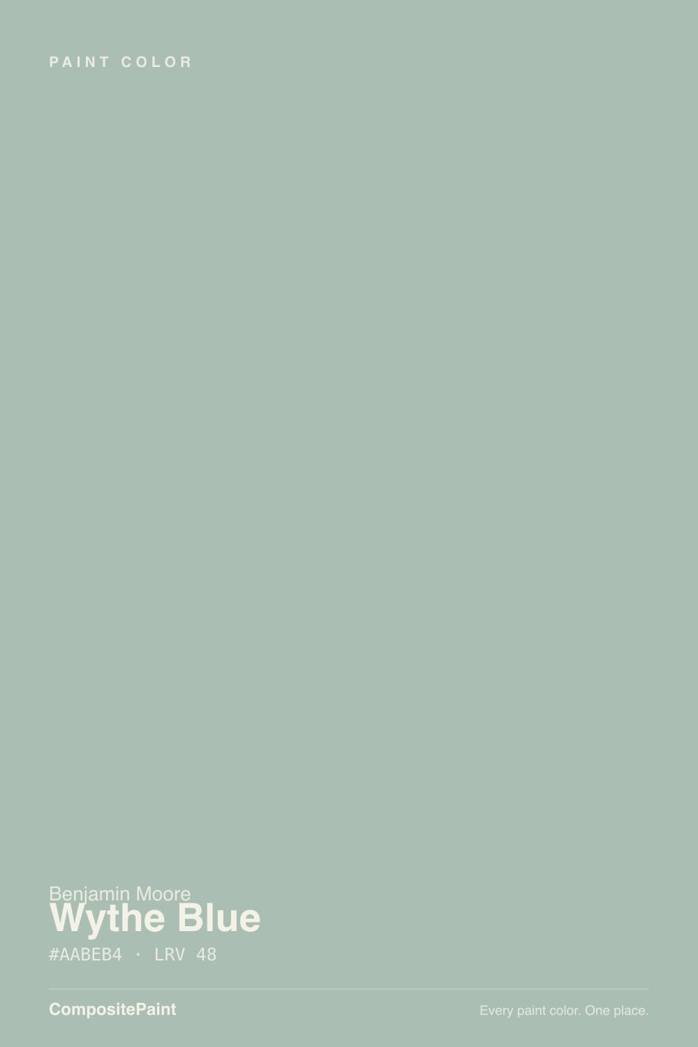
- 3Wythe Blue48
- 4Ocean Boulevard53
- 5Refresh59
The Fast Verdict
Wythe Blue has been in Benjamin Moore's Historic Color collection since 1976, and it earned Color of the Year honors in 2012 as an "easy, genteel blue-green with a subtle gray cast." It is one of the most-used front-door and kitchen-island colors in the deck, and it earns that reputation honestly. The one thing to know before you buy a gallon: it does not hold still. Warm daylight nudges it toward sage green, cool daylight pulls it back toward blue-gray, and the same paint can read like two different colors in two different rooms of the same house.
Front doors and shutters · kitchen islands and cabinets · coastal or farmhouse rooms with real daylight · anyone who wants blue-green without committing to a loud teal
You need the exact same color to read identically in every room · your room is dim, north-facing, and lit only by cool LEDs · you specifically want blue, not green, and can't sample first · you want a color that never shifts through the day
- A genuine, well-behaved blue-green with real depth (LRV 48)
- Officially a Color of the Year (2012) with 50 years in Benjamin Moore's Historic Color collection — proven, not a fad
- One of the most popular front-door and kitchen-island colors in the deck
- Reads sophisticated with black hardware, brass, or aged wood — never candy-teal
- The chameleon shift is a feature on a single surface, not just a risk on four walls
- Not one fixed color — swings from sage-green to blue-gray depending on the light
- Goes flat and cold in dim north rooms lit only by cool LEDs
- Full exterior sun can wash it toward a minty pastel some buyers don't expect
- Anyone hoping for a pure, stable blue is often surprised by how green it reads
What Color Is Wythe Blue, Really?
A genuine blue-green with a gray base, not a blue with a hint of green or a green with a hint of blue — it sits in the middle and stays there. Benjamin Moore introduced it in 1976 as part of the Historic Color collection and named it Color of the Year in 2012, describing it as an easy, genteel blue-green with a subtle gray cast. That description still holds: it is calm enough to read almost neutral from across a room, and specific enough that it never disappears the way a true gray would.
At LRV 48 it sits at the exact middle of the deck — not a pale wash, not a deep saturated teal. That middle depth is what makes the chameleon behavior so noticeable: a paler blue-green would just look faded in bad light, and a darker one would just look moody, but Wythe Blue at LRV 48 has enough color to actually shift character. Warm south or west daylight pushes it toward sage green; cool north daylight and cool LED bulbs pull it back toward a soft blue-gray. Our own deck files it under "teal," and depending on the room, either half of that label can be the one you notice.
Undertone in one line: blue-green with a gray base, never warm, never fully settled. If your sample reads flat and cold, that is north light or cool bulbs doing it; if it reads distinctly minty or sage, that is warm sun. Both are the same paint being honest about the room, not a bad batch.
Where It Shines
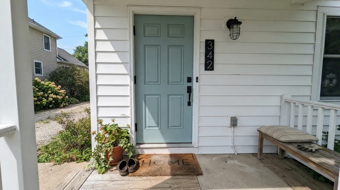
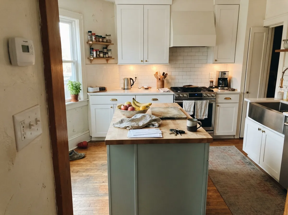
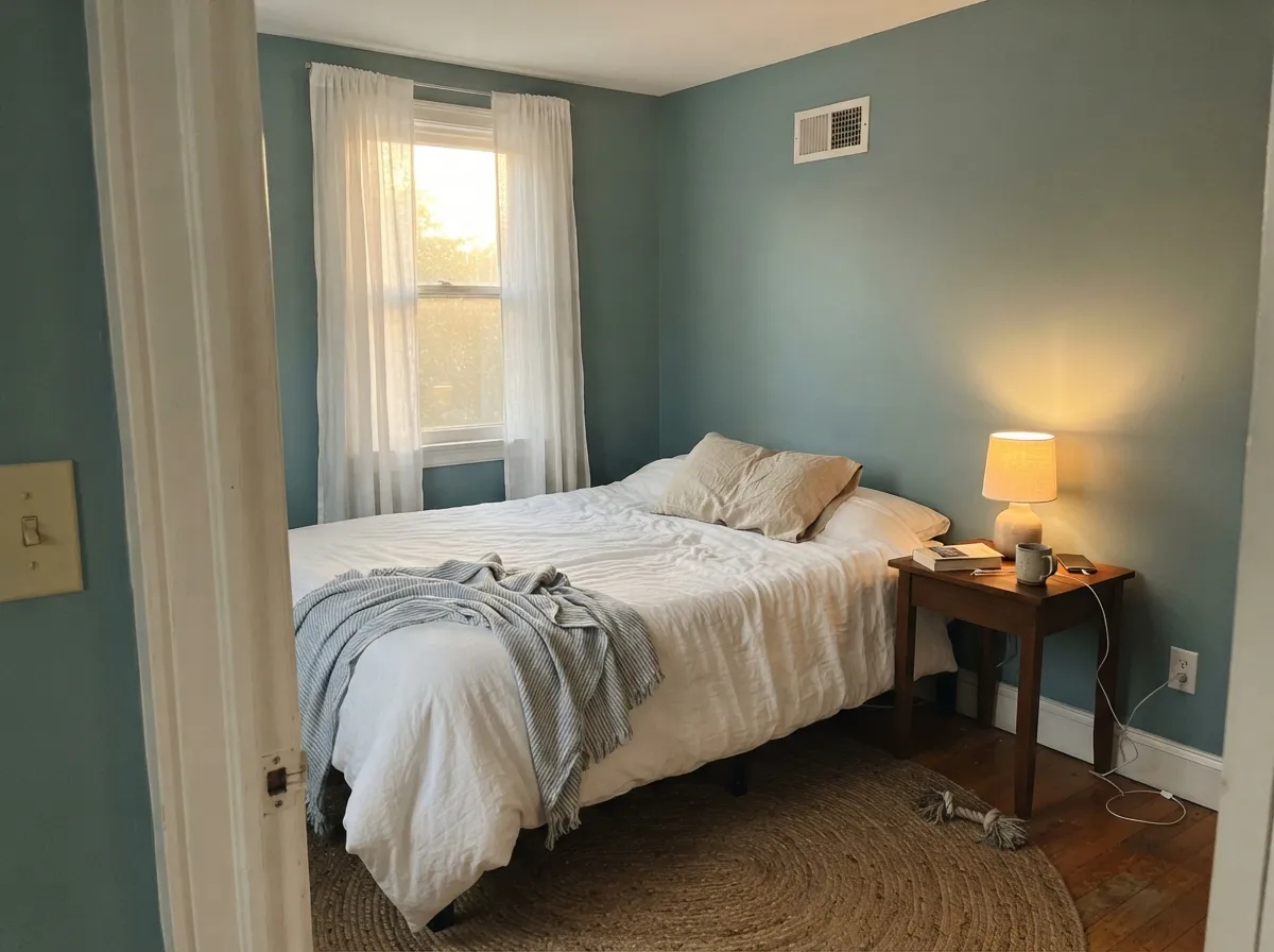
This is a color built for one high-visibility surface, not a whole open floor plan, and in that role it is close to unbeatable. On a front door under most daylight it reads a confident, sophisticated blue-green that photographs well and ages well — decades of use back that up. On a kitchen island or a run of cabinets, the same quality that makes it hard to name (blue? green? gray?) is exactly what makes it not compete with counters, backsplash, or floor. Give it black hardware, aged brass, or a weathered wood tone and it looks deliberate rather than trendy.
Where It Fails
Almost every regret story about Wythe Blue comes from one of three predictable situations, and none of them are the paint's fault. If your room or your plan matches one of these, sampling bigger will only confirm the problem, not fix it.
Wythe Blue swings between blue-gray and sage green depending on the room's light. That is fine on a single front door or a single island, but if you are painting an open-plan space that gets morning north light in one corner and afternoon west sun in another, expect the wall to look like two different colors — because, in a real sense, it is.
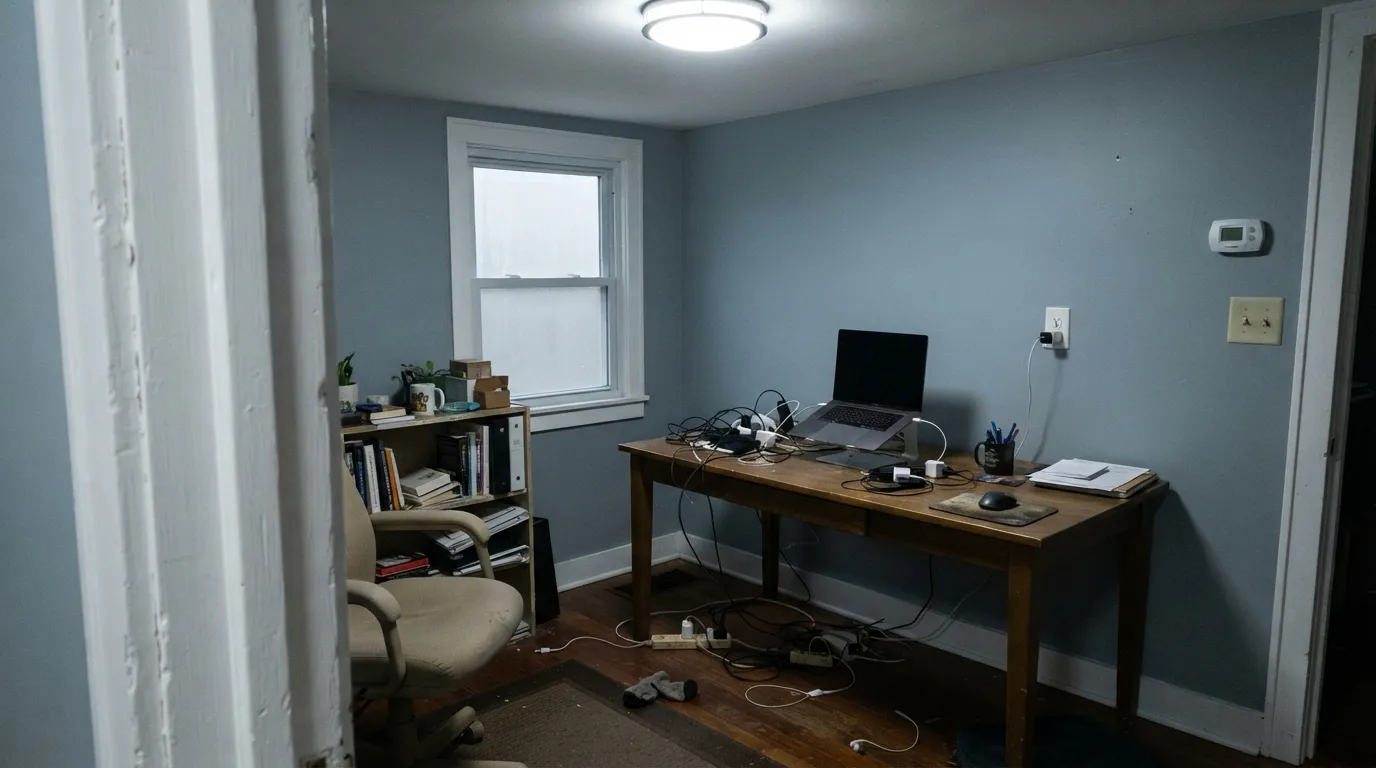
Take away the warm light and the green disappears with it, leaving a flat, slightly cold blue-gray that reads more drab than genteel. The fix is cheap: warm 2700K bulbs bring back the color the paint chip promised. Skip the lamps and this is not your room for it.
On a south-facing door or a sunny exterior wall, strong direct sun can wash Wythe Blue toward a minty pastel that reads more playful-beachy than the sophisticated historic teal most buyers picture. Sample the actual door or wall in your own sun, not just the chip on the store rack, before committing a whole exterior.
Room by Room
Under most daylight it reads a confident, grown-up blue-green that has been a farmhouse and coastal favorite for years. Full midday sun can wash it minty; black or dark bronze hardware anchors it and keeps that from reading too soft. Semi-gloss for durability and wipe-down.
Under mixed daylight and task lighting it settles into the color nobody can quite name, which is exactly why it works as an island or a run of lower cabinets against a neutral wall. Satin urethane-fortified cabinet enamel; it hides fingerprints better than a bright white would.
In a south- or west-facing bedroom it goes soft, sage-tinged and calming — genuinely restful. In a north-facing bedroom without warm lamps it can go flat and cold; add 2700K bulbs before you decide the color is wrong for you.
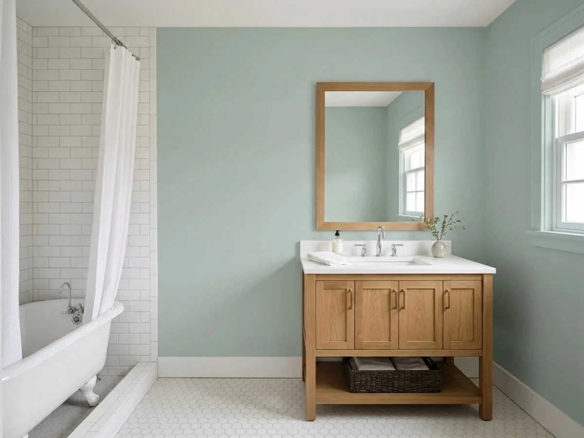
Brass or warm-toned fixtures keep it feeling spa-like rather than clinical. Against stark white or cool gray tile it can lean colder than expected — a warm-toned tile or wood vanity top is the safer bet.
Beautiful as an accent wall or a closed room with one consistent light source. Riskier as a whole open-plan main floor, where the color will visibly change character from the north end of the room to the south end.
It shines on doors, shutters and trim. Painting an entire facade risks the full-sun mint-wash described above; most owners who love it as siding pair it with a lot of white trim to break up the exposure and keep it from washing out on the sunniest wall.
Your Light Is the Risk
No direct sun, no dim corner — this is the light where it holds the balanced blue-green-gray read that won it Color of the Year. Sample it here first.
Warmth and green both drain out, leaving a flat, slightly cold blue-gray. The color did not fail; the light did.
Direct warm sun pushes it toward sage green — on an exterior, sometimes distinctly minty. Most people love the lift; sample the actual door or wall if pastel isn't the goal.
2700K bulbs deepen it into a smoky, cozy blue-green at night. Cool LEDs flatten it back toward gray — swap the bulb before you second-guess the paint.
Most complaints about Wythe Blue are a light mismatch. Upload a photo of your actual room and see it on your walls — then ask for the same wall in north light or evening lamps before you buy a single sample.
Need It From Another Brand?
Any paint counter can custom-tint Benjamin Moore HC-143 directly. If you would rather stay in one brand's own deck, these are the closest stock matches, measured as ΔE2000. Under 2 is a difference you will not see on the wall.
| Brand | Closest color | ΔE | LRV | |
|---|---|---|---|---|
| Sherwin-Williams | Fresh EucalyptusSW 9658 · Sherwin-Williams | 2.1 | 48 | Color page → |
| Behr | Urban PuttyBNC-06 · Behr | 1.4 | 50 | Color page → |
| Valspar | Bog Fog8003-34D · Valspar | 3.3 | 48 | Color page → |
| PPG / Glidden | Blue WillowPPG1145-4 · PPG / Glidden | 3.8 | 47 | Color page → |
| Glidden | Green Smoke50GY 48/075 · Glidden | 4.1 | 48 | Color page → |
| Dutch Boy | Rainwash331-3DB · Dutch Boy | 2.3 | 48 | Color page → |
Similar Benjamin Moore Colors
The nearest shades to Wythe Blue within Benjamin Moore's own range, ranked by perceptual color distance — useful when you want the same look a touch lighter, darker, or warmer.
WCAG 2.1: AA is 4.5 : 1 for normal text, 3 : 1 for large text, AAA is 7 : 1.
Wythe Blue vs the Colors You're Also Considering
Every Wythe Blue sample board has the same rivals on it. The numbers show the real lightness gap — then it comes down to which risk you would rather live with.
Pick this for more depth and a real chance at reading blue, not just green.
Benjamin Moore HC-144 · LRV 53Palladian BluePick this for the lighter, more consistently green spa color — the best-behaved spa color in the BM deck, with less of Wythe Blue's blue-gray swing.
Side-by-side comparison →Pick this for the Benjamin Moore original with the Color of the Year pedigree behind it.
Sherwin-Williams SW 6211 · LRV 47RainwashedPick this if your painter works in Sherwin-Williams — a nearly identical watery green-blue at the same depth.
Palladian Blue HC-144 is the comparison people ask about most. At #B5CFCB and LRV 53 it is five points lighter and noticeably cleaner and bluer than Wythe Blue at #AABEB4 and LRV 48. Palladian Blue looks fresher and airier; Wythe Blue is deeper, grayer, and more clearly green. In a small or north-facing room the extra lightness of Palladian Blue gives more back.
Within the deck, Catalina Blue 703 shares the exact hex and LRV, while Rhine River 689 (#A4BBB6, LRV 47) and Appalachian Trail 633 (#A1BEAF, LRV 47) are greener, and Wedgewood Gray HC-146 (#ACBFBD, LRV 50) is bluer and lighter.
Across brands, Farrow and Ball Green Blue No. 84 at deltaE 0.8 is effectively the same color. Dunn-Edwards Rainsong DET541 (1.32), Behr Urban Putty BNC-06 (1.38), and Magnolia Home Texas Summer JG-64 (1.42) are visually identical in normal room light. Sherwin-Williams Fresh Eucalyptus SW 9658 (2.06) is very close, so sample first. Glidden Green Smoke 50GY 48/075 (4.13) is close but visibly different side by side, reading greener and grayer.
Wythe Blue Coordinating Colors
The rule for coordinating with Wythe Blue: keep whites warm, keep dark accents true black or near-black, and let it stay the one color in the room with any real hue. It flatters brass, black hardware and weathered wood, and it doesn't need a second bold color competing for attention. These are the partners that show up again and again:
A 2012 Color of the Year That's Older Than the Award
Wythe Blue is not a trend color pretending to have history — it has actual history. Benjamin Moore introduced it in 1976 as part of the Historic Color collection, and the company named it Color of the Year in 2012, describing it as an easy, genteel blue-green with a subtle gray cast. That is a long résumé for a color the farmhouse-and-coastal wave rediscovered years later, mostly as a front-door blue-green that reads calmer than a true teal and warmer than a true blue-gray.
The reason it keeps getting picked for one high-visibility surface — a door, an island, a powder room — rather than a whole house is the chameleon behavior covered above. Committing one room, in one consistent light, to Wythe Blue is a safe bet backed by decades of use. Committing an open floor plan that swings from north light in one corner to south light in another is where the reputation actually gets tested.
Wythe Blue With Wood Tones and Metals
Black and dark bronze hardware are the classic partner — on a front door, black hinges and house numbers keep the blue-green from reading too soft, the same trick that makes it a farmhouse-exterior favorite. Aged or unlacquered brass is nearly as common and reads slightly warmer against it.
Wood tones split along the same lines as the undertone. Weathered gray wood, driftwood and pale white oak sit easily next to it, since they share the same low-saturation, gray-based family. Strong honey-orange oak is the pairing to sample first: orange sits near Wythe Blue's complement on the color wheel, so a very golden floor can push the wall toward looking colder and greener than it does on its own. It is not the hard clash a saturated color would produce, but it is worth a big sample against the actual floor before committing a whole room.
Three Ready Palettes Built on Wythe Blue
A color is never alone on the wall. These are complete combinations in the 60-30-10 pattern, with the reason each one holds together. Every one opens in the visualizer.
White Dove keeps the house body soft and warm so the door reads as the one deliberate color choice. Wrought Iron shutters and black hardware are the classic anchor that stop the blue-green from reading too soft, especially in full sun.
Try this palette in your roomAlabaster keeps the room bright without competing with the island's shifting undertone. Hale Navy supplies one true dark note so the palette doesn't ask two blues to agree with each other on the same wall.
Try this palette in your roomSwiss Coffee's warmth keeps the vanity from tipping cold the way stark white or cool tile would. Kendall Charcoal grounds the palette the way black or brass hardware would, without adding a second competing color.
Try this palette in your roomWythe Blue FAQ
Is Wythe Blue more blue or more green?
Genuinely both, depending on the light. Warm south or west daylight pulls it toward sage green; cool north daylight or cool LED bulbs pull it back toward blue-gray. There is no single fixed answer — that shift is the color's defining feature, for better or worse.
Does Wythe Blue work in a north-facing room?
It can, but expect a cooler, grayer read than the paint chip shows, especially without warm lamps. Add 2700K bulbs and it stays pleasant; leave it under cool LEDs with little daylight and it can go flat and drab.
What's the best front door pairing for Wythe Blue?
Black or dark bronze hardware and hinges, and a light warm-white body like White Dove or Swiss Coffee. The dark hardware keeps the blue-green from reading too soft, especially once full sun starts pushing it toward mint.
Is Wythe Blue good for kitchen islands and cabinets?
Yes — it's one of the most popular island colors in the BM deck for exactly this reason: it reads sophisticated without committing to a loud teal, and it doesn't fight warm wood, brass, or most stone. Use a satin urethane-fortified cabinet enamel.
Is Wythe Blue dated, or still a safe bet?
It has been in Benjamin Moore's Historic Color collection since 1976 and was Color of the Year in 2012 — it predates the farmhouse and coastal trends that made it popular again, and it isn't tied to any single design moment. As a door or an island, it has more staying power than most trend colors.
What trim white goes with Wythe Blue?
A soft warm white — White Dove or Swiss Coffee — keeps the pairing calm. A stark, cold bright white can make the blue-green look slightly dingy by comparison, the same mismatch that trips up most warm neutrals.
Have you painted with Wythe Blue?
Rate it — one tap helps the next reader decide.
Ask a Question