Benjamin Moore Palladian BluevsBenjamin Moore Wythe Blue
Why this comparison: BM’s two historic spa blues; Wythe Blue is deeper and greener. Palladian Blue and Wythe Blue are close but distinct (ΔE 5.39). Visible difference on the wall, especially in flat daylight.

Built from our full reviews of both colors — same measured data, same real-room photos. About the testing process →
The Numbers
Palladian Blue is meaningfully lighter (LRV 60 vs 48). On a wall, Palladian Blue reads light, airy; Wythe Blue reads mid-tone.
What Each Color Really Is
A muted blue-green that sits right on the fence between the two families. Most "soft blue" paints are blue with a touch of gray, and they stay blue. Palladian Blue is built differently: there is enough green in the base that in warm light it steps across the line and reads like pale sea glass, then steps back to soft aqua when the light cools. Designers call this a chameleon and they mean it kindly, but it is also the single reason people are surprised by it. The chip in the store is lit by cool white fluorescents, which is the lighting that makes it look bluest.
At LRV 60 it reflects a little over half the light that hits it, so it is a light color with real body. That matters more than it sounds. Put it next to Sherwin-Williams Sea Salt at LRV 63 and Palladian Blue is visibly a step deeper and clearly more colored — Sea Salt looks like a tinted neutral, Palladian Blue looks like a decision. It is light enough to keep a small windowless bathroom feeling open, but it will never wash out to almost-white in a sunny room the way the lighter spa colors do.
A genuine blue-green with a gray base, not a blue with a hint of green or a green with a hint of blue — it sits in the middle and stays there. Benjamin Moore introduced it in 1976 as part of the Historic Color collection and named it Color of the Year in 2012, describing it as an easy, genteel blue-green with a subtle gray cast. That description still holds: it is calm enough to read almost neutral from across a room, and specific enough that it never disappears the way a true gray would.
At LRV 48 it sits at the exact middle of the deck — not a pale wash, not a deep saturated teal. That middle depth is what makes the chameleon behavior so noticeable: a paler blue-green would just look faded in bad light, and a darker one would just look moody, but Wythe Blue at LRV 48 has enough color to actually shift character. Warm south or west daylight pushes it toward sage green; cool north daylight and cool LED bulbs pull it back toward a soft blue-gray. Our own deck files it under "teal," and depending on the room, either half of that label can be the one you notice.
Specs Side by Side
| Spec | Palladian Blue | Wythe Blue |
|---|---|---|
| Brand | Benjamin Moore | Benjamin Moore |
| SKU | HC-144 | HC-143 |
| Hex | #C1D1C9 | #AABEB4 |
| RGB | 193, 209, 201 | 170, 190, 180 |
| LRV | 60 | 48 |
| Undertone | green / cool | green / cool |
| Family | Gray | Teal |
How Light Changes Them
Cool daylight keeps the blue visible and mutes it slightly. This is where it looks most like the chip.
Warm afternoon sun pushes the green forward — it reads sea glass, not aqua. Sample here first.
2700K lamps: softer, greener, cozier. 4000K LEDs: cold gray-blue. Change bulbs, not paint.
Enough color saturation to stay a color under artificial light instead of collapsing to gray.
No direct sun, no dim corner — this is the light where it holds the balanced blue-green-gray read that won it Color of the Year. Sample it here first.
Warmth and green both drain out, leaving a flat, slightly cold blue-gray. The color did not fail; the light did.
Direct warm sun pushes it toward sage green — on an exterior, sometimes distinctly minty. Most people love the lift; sample the actual door or wall if pastel isn't the goal.
2700K bulbs deepen it into a smoky, cozy blue-green at night. Cool LEDs flatten it back toward gray — swap the bulb before you second-guess the paint.
Both Colors in Real Rooms
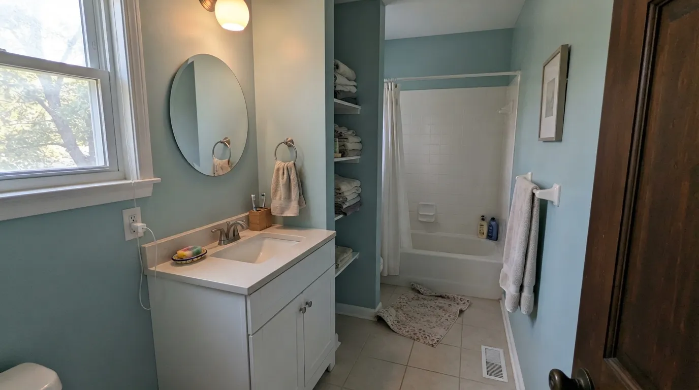
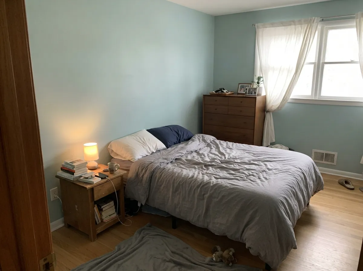
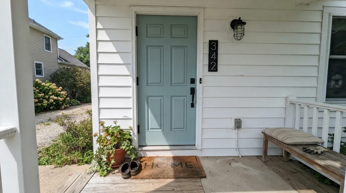
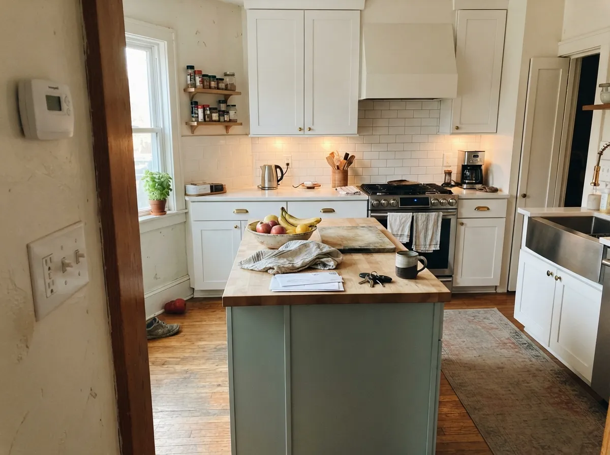
Photos from our full reviews — the same rooms and captions, so you can judge each color where it actually lives, not on a chip.
When to Pick Which
Bathrooms and bedrooms with real daylight · vanities and cabinets against white counters · coastal and cottage houses · anyone who wants color that still reads calm
Your trim and cabinets are cream or almond · you want a color that reads clearly blue every hour · your bathroom has no window and cool LED bulbs · your tile is warm tan or beige travertine
Front doors and shutters · kitchen islands and cabinets · coastal or farmhouse rooms with real daylight · anyone who wants blue-green without committing to a loud teal
You need the exact same color to read identically in every room · your room is dim, north-facing, and lit only by cool LEDs · you specifically want blue, not green, and can't sample first · you want a color that never shifts through the day
No comparison page can see your light. Upload one photo of your room and try both colors on the same walls, seconds apart.
Palladian Blue vs Wythe Blue FAQ
Which is lighter, Palladian Blue or Wythe Blue?
Palladian Blue is lighter: LRV 60 vs 48. Palladian Blue is meaningfully lighter (LRV 60 vs 48). On a wall, Palladian Blue reads light, airy; Wythe Blue reads mid-tone.
Which is warmer, Palladian Blue or Wythe Blue?
They share the same undertone family — both read green / cool. The difference between them is lightness and depth, not temperature.
How similar are Palladian Blue and Wythe Blue?
Palladian Blue and Wythe Blue are close but distinct (ΔE 5.39). Visible difference on the wall, especially in flat daylight. The only reliable test is seeing both in your own room and light — a side-by-side on a screen or chip flattens the difference.
Can I use Palladian Blue and Wythe Blue together in one house?
Yes, in separate rooms. They are close enough to feel related but different enough to notice, so give each its own room and connect them with a shared trim white. Avoid putting them on adjoining walls.
Ask a Question