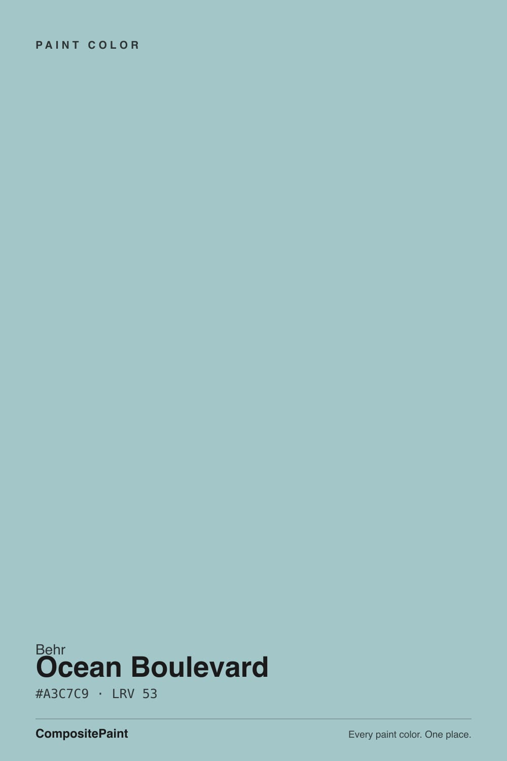
Ocean Boulevard
The grayed light aqua people sample for coastal baths, reviewed honestly: the light where it stays sea-glass, the pairing that turns it pool-blue, and what to pick instead.

Jessica has spec'd whites and neutrals for more than 300 rooms and keeps a sample wall of painted drawdowns in her studio. Every color review is checked against real reader rooms in the comments and re-tested when a formula changes. About the testing process →
- 1Van Courtland Blue31
- 2Wythe Blue48
- 3Ocean Boulevard53
- 4Refresh59
- 5Meander Blue66
The Fast Verdict
Ocean Boulevard is the light aqua that already had the saturation turned down: a cool blue-green at LRV 53 with enough gray that a coastal bath reads sea-glass instead of motel pool. Behr files PPU13-10 in the green family; Home Depot tags the same code Turquoise / Aqua; on a wall it is teal. The chip looks paler and more gray than four walls will. It is a bathroom and beach-bedroom color, not a living-room neutral, and it is not the unmuted turquoise on Pinterest.
Coastal bathrooms with white tile · beach-house bedrooms · powder rooms · laundry rooms · anyone who wants light aqua with enough gray to skip the pool look
You actually want gray · honey-oak floors and cream trim · a dim north living room · you wanted unmuted turquoise · you need a resale-safe whole-house greige
- Grayed light aqua that stays sea-glass instead of motel-pool
- Bathroom and beach-bedroom classic against white tile and crisp trim
- LRV 53 has presence without closing a small room in
- Sits on the PPU13 card with Offshore Mist, so stepping paler is easy
- Cool enough for chrome and nickel, soft enough for linen and pale oak
- Fights honey oak, cream trim, and golden builder beige
- Not gray — and not the unmuted turquoise the name can hint at
- Dim north light strips the cyan and leaves a dingy gray-green
- Too much color for an open main floor or a resale-safe whole house
What Color Is Ocean Boulevard, Really?
A light aqua with a cool blue-green undertone and a real gray cast — teal, not baby-blue, not sage. Most colors people pin as coastal water are either a pale spa wash (Palladian Blue territory) or a full-chroma turquoise with no gray in it at all. Ocean Boulevard sits between those two: enough cyan to look like water in real daylight, enough gray that a whole bathroom does not turn into a swim club. Hue sits around 183°, right on the cyan line, and chroma stays modest. That is why a Minneapolis painter called it a medium, breezy sky blue whose grey undertone keeps it from seeming juvenile, and why buyers hoping for a clear pool tile feel shortchanged.
At LRV 53 it is a true light, not a wash and not a mid-tone. That number is the review. It sits a step under Offshore Mist (LRV 66) on the same PPU13 card, almost level with Wythe Blue (LRV 48) and Beach Glass (LRV 50), and a clear step under the spa greens people confuse it with — Rainwashed at LRV 59, Palladian Blue at LRV 60, Sherwin-Williams Sea Salt at LRV 63. Polar Bear (LRV 94) and Ultra Pure White (LRV 97) will read as the trim, not as cousins. High enough to keep a bath or a bedroom from closing in, low enough that you still see color on a cloudy afternoon. Plan for the wall to look a step more aqua than the chip next to a south window, and a step grayer than the chip in ordinary indoor light. Sample at noon and at 7pm on the actual wall.
Undertone in one line: cool blue-green first, gray second — never purple, never a true gray, never a loud turquoise. If your sample looks like dingy gray-green, the room is too dim or the bulbs are warm and weak. If it looks like clear pool water, that is generous daylight with nothing gray in the room to keep it honest. If it looks mint, that is west sun or honey oak doing the work. All three versions are the same paint being honest about the light.
Where It Shines
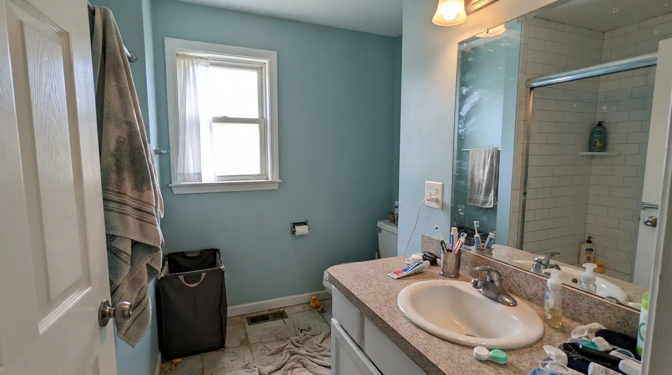
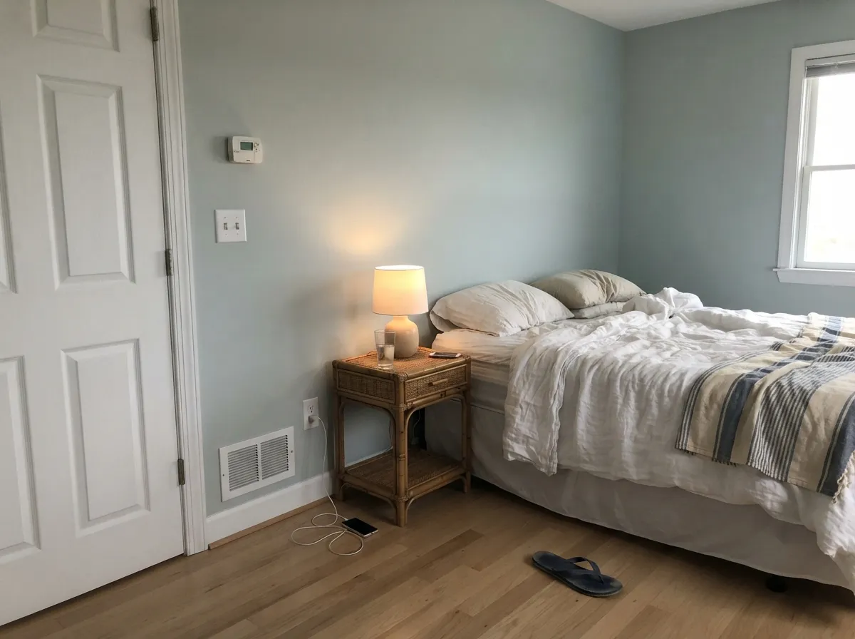
This color is built for rooms that already have water in the brief. Give it white tile, a crisp white trim, and real daylight and it does the bathroom job light aquas get hired for: coastal, slightly watery, not a theme and not a pool. Its second home is the beach-house bedroom — linen, pale oak, rattan, Polar Bear on the woodwork — where LRV 53 is deep enough to feel like a decision and light enough to stay restful. A powder room or a laundry is the small-commitment version of the same idea.
Where It Fails
Almost every miss with a grayed light aqua follows one of three scripts, and all three are visible on the chip if you know where to look. None of them are the paint's fault — but if your room matches one, this is not your teal, and a bigger sample will only confirm it.
Yellow-orange sits across the wheel from this blue-green. Honey-oak floors, builder-beige carpet, and a creamy off-white (Behr Swiss Coffee, White Dove, anything peach-warm) all push the wall cooler and more aqua while the wood goes hotter. Both sides lose. Pale white oak, weathered gray wood, and a crisp white — Polar Bear, Ultra Pure White, or Whipped Cream — are the company it was mixed for. Cream does not soften this color. It makes it look like a pool.
The chip sits in the middle and disappoints both camps. Buyers who thought Ocean meant a blue-gray fog get unmistakable aqua the minute sun hits the wall. Buyers picturing unmuted pool tile get a grayed light teal and call it dull. If you want gray that only flashes blue, that is Sleepy Blue. If you want the paler fog on the same Behr card, that is Offshore Mist. If you want playroom cyan, this is not it. This one is water with gray in it, on purpose.
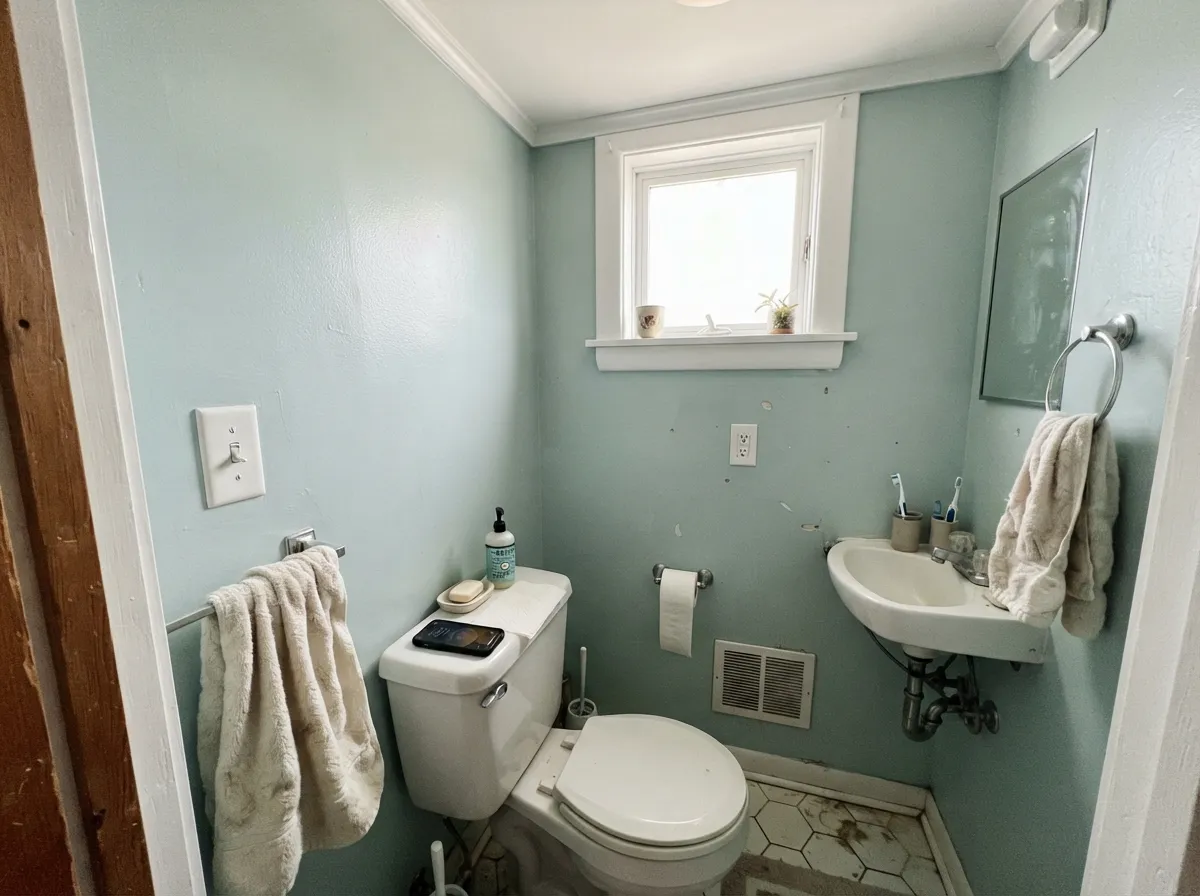
The sea-glass read is a daylight effect. Cool, low north light strips the cyan and leaves a flat, slightly dingy gray-green — wet concrete, not coastal water. At LRV 53 there is bounce, but not enough to rescue a dark room with no lamps. Add a real window or warm lamps in volume, or pick a paler coastal (Offshore Mist, LRV 66) that still has some light left in it.
Room by Room
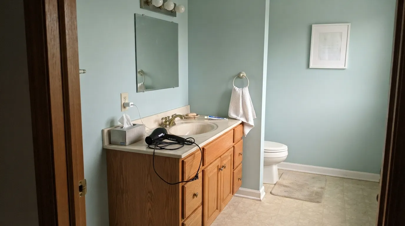
White subway, chrome or brushed nickel, a south or east window: this is the combination that makes the grayed aqua look intentional instead of leftover. Satin on the walls for steam. Cool gray tile is fine; cream tile argues. Sample above the actual tile before you commit — the undertone gets picked up by whatever sits next to it.
In a bright bedroom with linen, rattan, and pale oak it is a calm coastal wall, sea-glass rather than themed. In a dim suburban bedroom with beige carpet it goes gray-green and slightly tired. Eggshell, 2700K–3000K lamps at night, crisp white trim. Skip it if the only window faces north and you will not add lamps.
Small rooms take light color well because you never see a long wall of it. Drench the four walls, keep the ceiling Ultra Pure White, and the little room reads considered instead of leftover. Satin on the walls; a Peaceful Blue or Hale Navy vanity is the grown-up extra if you want depth.
A laundry can take a color a living room cannot. Ocean Boulevard hides splash better than a pale gray, still reads clean against white machines, and makes the room feel finished. A sunroom with real glass is the outdoor version of the same brief — daylight keeps the gray in play. Satin in the laundry, eggshell in the sunroom, Polar Bear on the trim.
On an island or a hutch under Polar Bear walls it is genuinely charming, coastal without being cute. A full kitchen of aqua cabinets is a bold bet, and a losing one over honey-oak floors. White shaker boxes with these walls can work if the stone is cool. Satin cabinet enamel either way.
From across an open plan this is clearly a color, not a backdrop, and it does not negotiate with greige kitchens or tan carpet. The seam looks like two houses. Full-sun siding washes it toward icy aqua from the curb; a light teal front door is a beach-house move, not a suburban one. The exception is a porch ceiling — haint-blue territory without the saturated turquoise. Flat or eggshell overhead, with white trim.
Your Light Is the Risk
Generous daylight pulls a grayed sea-glass aqua — watery, coastal, not a pool. This is the light the color was mixed for. Sample here first.
Cool gray daylight strips the cyan and leaves a flat, slightly dingy gray-green. Fine if you half-wanted gray; disappointing if you wanted water.
Low warm sun wakes the green side for an hour and the walls go slightly mint-aqua. Most coastal rooms like the shift; if green is your dealbreaker, test at 6pm before committing.
2700K bulbs mute the blue and pull a quieter green-gray — the night version most bedrooms want. Cool 4000K LEDs ice it toward pool-water. Swap the bulbs before you blame the paint.
Most complaints about Ocean Boulevard are a light mismatch. Upload a photo of your actual room and see it on your walls — then ask for the same wall in north light or evening lamps before you buy a single sample.
Need It From Another Brand?
Any paint counter can custom-tint Behr PPU13-10 directly. If you would rather stay in one brand's own deck, these are the closest stock matches, measured as ΔE2000. Under 2 is a difference you will not see on the wall.
| Brand | Closest color | ΔE | LRV | |
|---|---|---|---|---|
| Sherwin-Williams | RaindropSW 6485 · Sherwin-Williams | 1.6 | 52 | Color page → |
| Benjamin Moore | Paradiso717 · Benjamin Moore | 3.1 | 51 | Color page → |
| Valspar | Favorite SweaterP028 · Valspar | 2.1 | 52.8 | Color page → |
| Glidden | CopenhagenPPG1137-4 · Glidden | 4.8 | 54 | Color page → |
| Dutch Boy | Patina'd232-3DB · Dutch Boy | 4.0 | 52 | Color page → |
| HGTV Home by Sherwin-Williams | Breezy AquaHGSW 1335 · HGTV Home by Sherwin-Williams | 3.6 | 54 | Color page → |
Similar Behr Colors
The nearest shades to Ocean Boulevard within Behr's own range, ranked by perceptual color distance — useful when you want the same look a touch lighter, darker, or warmer.
WCAG 2.1: AA is 4.5 : 1 for normal text, 3 : 1 for large text, AAA is 7 : 1.
Ocean Boulevard vs the Colors You're Also Considering
Every Ocean Boulevard sample board has the same rivals on it. The numbers show the real lightness gap — then it comes down to which risk you would rather live with.
Pick this when you want the aqua to stay aqua, not drift into sage-gray.
Sherwin-Williams SW 6211 · LRV 59RainwashedPick this if you want the coastal green-blue that never quite settles on one color — greener, grayer, a hair lighter.
Pick this when you want a clearer teal, not a spa green that only flashes blue.
Benjamin Moore HC-144 · LRV 60Palladian BluePick this for the best-behaved spa color in the BM deck — if you accept the green.
Blue Bell HDC-SP16-08 at LRV 52 with hex #A0C7C6 is the nearest Behr neighbor and reads a shade greener. Shaved Ice N490-3 at LRV 53 with hex #A7C7CD is the bluer option, better in a room where you want the color to feel crisper. Shadow Blue N480-3 at LRV 55 is lighter and slightly softer, a good ceiling partner above Ocean Boulevard walls.
Across brands, Farrow and Ball Blue Ground No. 210 at LRV 52 measures a deltaE of 1.41 and Sherwin-Williams Raindrop SW 6485 at LRV 52 measures 1.6. Both are visually identical in normal room light. Valspar Favorite Sweater P028 at LRV 52.8 sits at 2.12 and Rust-Oleum Serenity Blue 285139 at LRV 57 at 2.24, so both are very close but worth sampling first.
Benjamin Moore Paradiso 717 at LRV 51 measures 3.06 and reads slightly grayer and deeper. HGTV Home by Sherwin-Williams Breezy Aqua HGSW 1335 at LRV 54 comes in at 3.63 and is noticeably bluer, close but visibly different side by side.
Ocean Boulevard Coordinating Colors
The rule for coordinating with Ocean Boulevard: stay cool and crisp, and keep yellow at arm's length. It wants a clean white, a paler or deeper coastal from the same neighborhood, and one navy or near-black so the light teal has an edge. Cream, honey oak, and warm greige neighbors all pull the aqua forward until the room looks like a pool house. These are the partners that keep showing up in rooms that work:
Green on the Chip, Aqua on the Wall
Ocean Boulevard is not a household-name coastal the way Sea Salt, Palladian Blue, or Wythe Blue is. Behr files PPU13-10 in the green family. Home Depot sells the same code as Turquoise / Aqua. Our deck files it as teal. Hue 183° sits on the cyan line, so the filing fight is the color: it will not pick blue or green, and the gray is what keeps either side from winning. A painter roundup out of Minneapolis called it a medium, breezy sky blue whose grey undertone stops it looking juvenile — that is the honest job description.
The public resume is short, and that is the point. HGTV once listed it as a similar shade to try next to Sherwin-Williams Rain Drop for bedrooms. Pinterest uses it in baths and the occasional beach-house door. It was never Color of the Year, and it does not have a TV-set or viral-room resume worth repeating. It sits on the same PPU13 card as Offshore Mist, the paler fog-blue; if you like this neighborhood and want less color, step up the card. If the coastal moment passes, a grayed aqua at LRV 53 still reads as a color, not a greige — more of a repaint risk than Agreeable Gray, much less than a true turquoise.
Ocean Boulevard With Wood Tones and Floors
This decision gets made at the floor, not the paint store. Pale white oak, whitewashed pine, weathered gray wood, and walnut all sit at the right temperature — the cool wall meets a cool or red-brown floor and the aqua stays sea-glass. Gray-washed LVP is fine. White tile is the bathroom default. Rattan and unbleached linen belong.
The honest no is golden: honey oak, orange builder stain, yellow-beige carpet. Yellow-orange sits across the wheel from this blue-green, so each side exaggerates the other — the floor reads more orange, the walls read more pool, and no amount of coats fixes geometry. If the golden floor is staying, put a large rug between it and this paint, or choose a warm greige and skip the fight.
Metals are easy if you stay out of yellow-brass overload: brushed nickel, chrome, polished nickel, and matte black all belong. A little unlacquered brass is fine as bath hardware; a whole kitchen of orange brass next to this wall will push the aqua the same way honey oak does.
Three Ready Palettes Built on Ocean Boulevard
A color is never alone on the wall. These are complete combinations in the 60-30-10 pattern, with the reason each one holds together. Every one opens in the visualizer.
White tile, grayed aqua, and one navy note is the bathroom this color was mixed for. Polar Bear is Behr's dependable everyday white on the woodwork — not a creamy White Dove stand-in — so the walls stay sea-glass instead of dingy. Hale Navy is the safest navy as long as the bath has a window; chrome or nickel hardware finishes it.
Try this palette in your roomA crisp optical white on the casings keeps the aqua honest; a chameleon-black door gives the pale teal an edge so the bedroom does not float. Ultra Pure White is unbeatable on trim here — a warm white would push the walls toward pool. Linen, pale oak, and 2700K lamps do the rest.
Try this palette in your roomTwo coastal depths instead of one flat wash: Ocean Boulevard on the field, Beach Glass — the blue-green-gray chameleon every spa bathroom asks for by name — on the box. Whipped Cream is a genuinely solid near-white on the woodwork, cooler than cream, so the little room stays watery instead of yellow.
Try this palette in your roomOcean Boulevard FAQ
Is Ocean Boulevard blue or green?
Both, on purpose. Hue sits around 183°, on the cyan line, so neither side wins outright. Behr files PPU13-10 in the green family; Home Depot tags it Turquoise / Aqua; on four walls it is a grayed teal. Beside a true blue it looks green. Beside a sage it looks blue. Cool north light pulls it gray-green; south light pulls it aqua. If you need a color that has already picked a side, this is not it.
What trim white goes with Ocean Boulevard?
A crisp, cool-leaning white — Polar Bear or Ultra Pure White in the Behr deck, Whipped Cream if you want a slightly softer near-white, Chantilly Lace if you are already in Benjamin Moore. Creamy off-whites (Behr Swiss Coffee, White Dove) make the walls look cooler and slightly pool-like. Semi-gloss on the trim, eggshell or satin on the walls.
Is it good for a bathroom?
It is the best room for it. White tile, a real window, and chrome or nickel make the grayed aqua look intentional. Use satin for steam, keep the ceiling Ultra Pure White so LRV 53 does not close a small bath in, and sample above the actual tile. Cream tile and honey-oak vanities are the clash.
Does Ocean Boulevard work with oak floors?
Depends on the oak. Pale white oak, weathered gray wood, and walnut are the right temperature. Honey oak and orange builder stain are the clash: the floor goes hotter, the wall goes more aqua, and no extra coat fixes complementary colors. A large rug is a bandage. If the golden floor is staying, pick a warmer color.
Will it look like a pool?
Not if the gray has something to work with. Against white tile, pale oak, and a crisp white, it reads sea-glass. Against cream trim, honey oak, and an all-white bath with no other gray in the room, the aqua comes forward and the pool read shows up — that is a pairing mistake, not a bad mix. If unmuted turquoise is what you actually want, this color will feel dull. If gray is what you actually want, it will feel like water.
How is it different from Sherwin-Williams Sea Salt?
Same coastal neighborhood, different hue and depth. Sea Salt (SW 6204, LRV 63) is a green-gray that is beautiful when the light agrees with it. Ocean Boulevard is cooler, more clearly aqua, and a full ten LRV points deeper. Palladian Blue (HC-144, LRV 60) is the spa green version of the same idea. If a saved bathroom photo is one of those, buy that formula. Do not hope PPU13-10 is a cheaper version. It is a different paint.
Have you painted with Ocean Boulevard?
Rate it — one tap helps the next reader decide.
Ask a Question