Offshore Mist
Behr's pale fog-blue, reviewed honestly: the rooms where it stays coastal, the light that turns it baby blue, and why the chip is not the gray it pretends to be.

Jessica has spec'd whites and neutrals for more than 300 rooms and keeps a sample wall of painted drawdowns in her studio. Every color review is checked against real reader rooms in the comments and re-tested when a formula changes. About the testing process →
- 1Stardew43
- 2Palladian Blue60
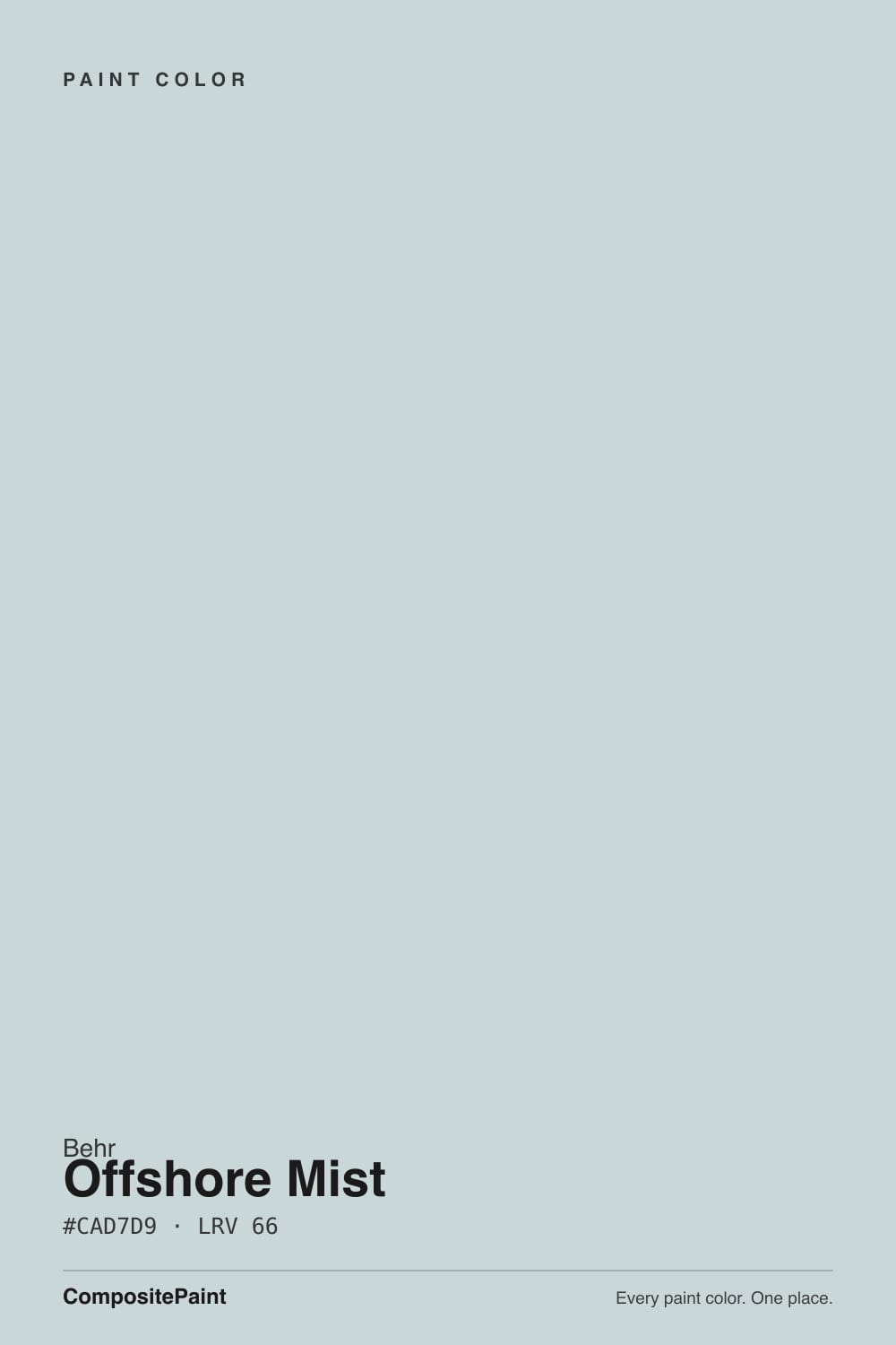
- 3Offshore Mist66
- 4Drizzle71
- 5Spring Thaw83
The Fast Verdict
Offshore Mist is a light blue-gray that never quite commits to gray. At LRV 66 it stays airy, with a cool aqua whisper from the yellow-green undertone Behr puts on the chip — fog over water, not a painted sky. Soft daylight is its home; north light and cool LEDs push it toward nursery baby blue. Owners who wanted gray get a sky. Owners who wanted a quiet coastal wall get a very good one, as long as the wood and the white stay cool.
Bedrooms and bathrooms · coastal kitchens with white cabinets · laundry and powder rooms · porch ceilings · anyone who wants a pale fog-blue, not a true gray
You actually want gray · honey-oak floors or cream trim · a dim north room if baby blue is a dealbreaker · you need a resale-safe greige for the whole house
- Airy LRV 66 — coastal color that still keeps a room open
- Aqua whisper reads fog, not cartoon blue, in the right light
- Bedrooms, baths, and laundry rooms feel finished with one decision
- Pairs cleanly with Polar Bear, Ultra Pure White, and Whipped Cream
- Soft enough for four walls, not only an accent
- Not gray — buyers expecting gray see sky by the second wall
- Fights honey oak, cream trim, and golden builder beige
- North light and cool LEDs push it toward nursery baby blue
- Too specific a hue for a resale-safe whole-house greige
What Color Is Offshore Mist, Really?
A pale blue-gray with a cool aqua whisper — blue first, gray second, and the yellow on the chip is not cream. Behr files PPU13-16 in the blue family, and that is the useful fact: this is not a greige that flashes blue. The yellow-green in the mix is what turns the blue into seafoam instead of icy sky, which is why people on the wall call it hints of blue, gray, and green in the same breath. On a chip it can pass for a light gray. Spread over four walls it is clearly a quiet coastal color, the kind Home Depot reviewers describe as a light sky blue after the second coat.
At LRV 66 it sits on the light-gray rung next to Gray Owl (LRV 65), a step above Tradewind (LRV 61) and Sherwin-Williams Sea Salt (LRV 63), and a clear step under any real white. Polar Bear (LRV 94) and Ultra Pure White (LRV 97) will read as the trim, not as cousins. That depth is the useful part: high enough to keep a bedroom or a bath from closing in, low enough that you still see color on a cloudy afternoon. It is not a white, and it will not bounce like one. Plan for the wall to look a hair bluer than the chip in cool light and a hair more seafoam than the chip in warm sun.
Undertone in one line: cool aqua first, gray second — the yellow is seafoam, never beige. If your sample reads baby blue, the light is cold. If it reads mint or robin's egg, that is south sun waking the yellow-green. If it reads foggy gray, the lamps are warm and the sun has left. All three are the same paint being honest about the room.
Where It Shines
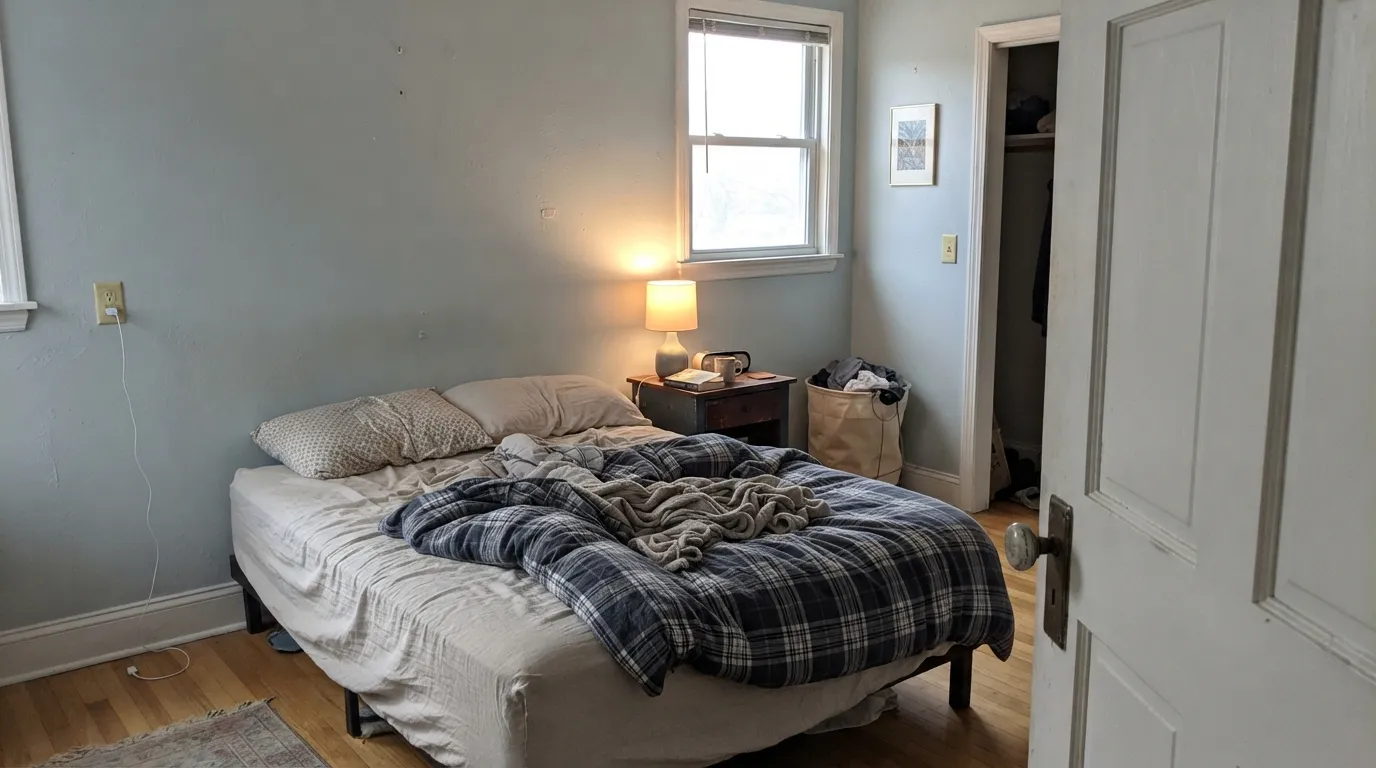
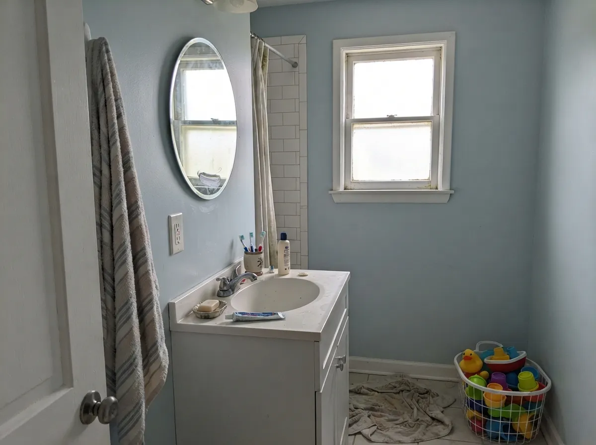
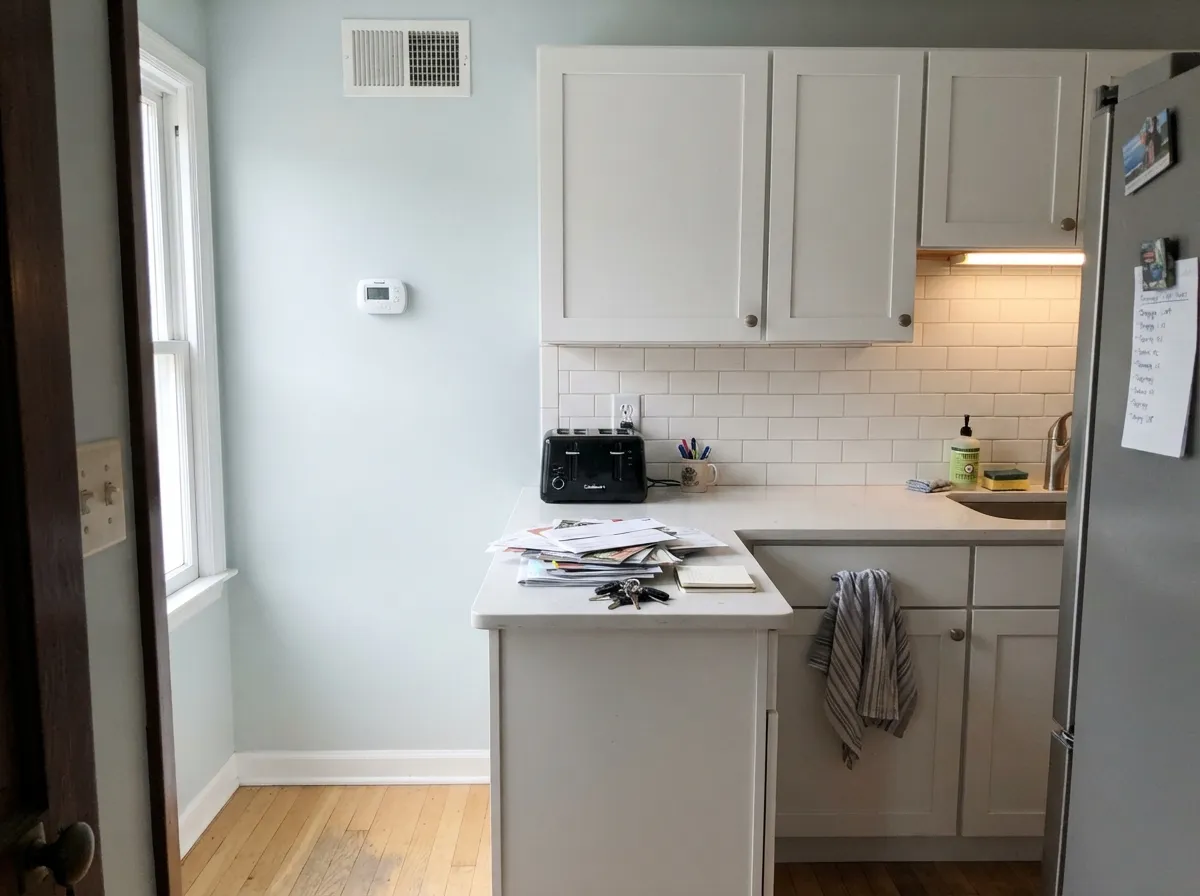
Give it soft daylight, a crisp white, and wood that is not golden, and it does the coastal job without a theme. Bedrooms are the room Behr hired it for — pale, restful, slightly watery — and bathrooms with white tile are a close second. A kitchen with white shaker boxes and cool quartz is a real-house use, not a catalog one. The aqua stays a whisper instead of a statement, which is the whole point of a fog color: you notice the calm before you can name the hue.
Where It Fails
Almost every regret story about a pale aqua-gray follows one of three scripts, and all three are visible on the chip if you know where to look. None of them are a bad mix — but if your room matches one, this is not your color, and a bigger sample will only confirm it.
On the chip it passes for a light gray with a hint of blue. On four walls the aqua is unmistakable — depth multiplies undertone. If your goal is gray with a little personality, this is too much personality; look at Gray Owl and let it merely change its mind. Offshore Mist lives in the blue family, and the wall will say so.
Yellow-orange sits across the wheel from this blue-green. Honey-oak floors, builder-beige carpet, and a creamy off-white (Behr Swiss Coffee, White Dove, anything peach-warm) all push the wall cooler and more aqua while the wood goes hotter. Both sides lose. Pale white oak, walnut, gray-washed floors, and a crisp white — Polar Bear, Ultra Pure White, or Whipped Cream — are the company it was mixed for.
Cool, gray daylight strips the yellow-green and leaves a thin baby blue — the nursery read people did not sample for. Cool 4000K bulbs do the same after dark. The color did not fail; the light did. Soft east or filtered south daylight, and 2700K–3000K lamps, are part of this paint job. If the room faces north and you refuse warmer bulbs, pick a true gray.
Room by Room
Pale, restful, slightly watery without looking themed. Eggshell, crisp white trim, linen and pale oak. East morning light is the flattering version; a west bedroom needs a 5pm sample so you see the seafoam shift. Under 2700K lamps at night it drops toward foggy gray and sleeps well.
White tile, chrome or brushed nickel, a real window: this is the combination that makes the aqua whisper look intentional. Satin on the walls for steam. Cool gray tile is fine; cream tile argues. Small baths bounce the color onto itself and can intensify the aqua — sample a big board on two walls before you drench.
A Houzz kitchen ran it on the field behind white shaker boxes and cool quartz, which is the right brief. Satin on any painted cabinets in Polar Bear or Ultra Pure White; eggshell on the walls. Skip it over honey-oak boxes you are not painting, and do not park a creamy upper next to these walls.
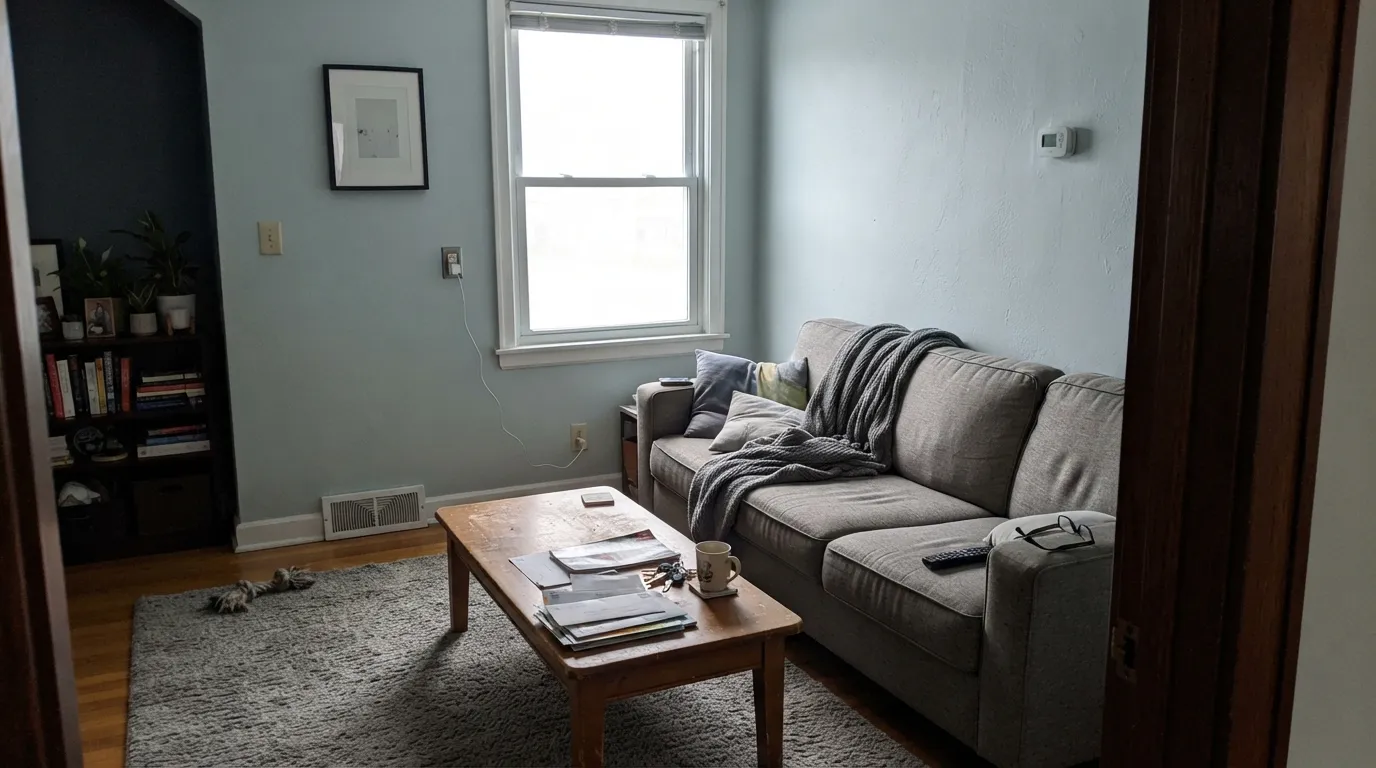
A bright living room with pale oak, a gray-blue sofa, and no beige carpet is a calm coastal backdrop. An open plan next to a greige kitchen is riskier — the seam looks like two houses. Eggshell; same-family trim white in semi-gloss so a warmer white never makes the walls look dingy by comparison.
Utility rooms and tiny baths are where LRV 66 earns its keep: enough color to feel considered, enough bounce to keep a windowless laundry from going cave. Satin on laundry cabinets and powder walls. Keep the ceiling Ultra Pure White so the plane stays bright.
A pale blue-gray at this depth is a classic porch-ceiling color — haint-blue territory without the saturated turquoise. Flat or eggshell overhead, with white trim. Full-sun siding is a different job: the yellow-green can flash seafoam from the curb and the color washes toward icy gray-blue. Leave the exterior field to a true house gray or a deeper coastal, and keep this one on the underside of the roof.
Your Light Is the Risk
Even morning light keeps the aqua a whisper and the gray in play — fog over water, not a painted sky. This is the exposure the color was mixed for.
Cool gray daylight strips the yellow-green and leaves a thin baby blue. Fine if you half-wanted blue; disappointing if you wanted fog.
Midday south sun wakes the yellow and the walls go slightly seafoam. West light does the same for an hour at golden hour, then the gray returns as the sun drops. Sample at noon and at 6pm.
2700K bulbs pull the gray-fog forward and calm the aqua — the night version most bedrooms want. Cool 4000K LEDs sharpen it into nursery blue. Swap the bulbs before you blame the paint.
Most complaints about Offshore Mist are a light mismatch. Upload a photo of your actual room and see it on your walls — then ask for the same wall in north light or evening lamps before you buy a single sample.
Need It From Another Brand?
Any paint counter can custom-tint Behr PPU13-16 directly. If you would rather stay in one brand's own deck, these are the closest stock matches, measured as ΔE2000. Under 2 is a difference you will not see on the wall.
| Brand | Closest color | ΔE | LRV | |
|---|---|---|---|---|
| Sherwin-Williams | Little Boy BluSW 9054 · Sherwin-Williams | 1.4 | 67 | Color page → |
| Benjamin Moore | Windy Sky1639 · Benjamin Moore | 1.4 | 66 | Color page → |
| Valspar | Breath of GreenM335 · Valspar | 2.6 | 66.9 | Color page → |
| PPG / Glidden | Thunder BayPPG1144-2 · PPG / Glidden | 1.6 | 67 | Color page → |
| Glidden | Simply Blue30BG 64/054 · Glidden | 1.3 | 64 | Color page → |
| Dutch Boy | Salty Air335-1DB · Dutch Boy | 1.8 | 68 | Color page → |
Similar Behr Colors
The nearest shades to Offshore Mist within Behr's own range, ranked by perceptual color distance — useful when you want the same look a touch lighter, darker, or warmer.
WCAG 2.1: AA is 4.5 : 1 for normal text, 3 : 1 for large text, AAA is 7 : 1.
Offshore Mist vs the Colors You're Also Considering
Every Offshore Mist sample board has the same rivals on it. The numbers show the real lightness gap — then it comes down to which risk you would rather live with.
Pick this when you want the airier, slightly more blue Home Depot version with more bounce (LRV 66 vs 61).
Sherwin-Williams SW 6218 · LRV 61TradewindPick this if you want the better-known coastal blue-green, a hair deeper, that goes quiet in rooms without real light.
Pick this when you want the cooler, more clearly blue coastal, not the sage-leaning Sea Salt everyone already sampled.
Sherwin-Williams SW 6204 · LRV 63Sea SaltPick this for the famous spa green-gray — beautiful when the light agrees with it, greener and less sky-blue than this chip.
Within Behr, Sky Light View (MQ3-53) at hex #C8D7DD and LRV 66 is the closest neighbor and reads a touch bluer. Polar Frost (PPU14-17A) at #CCD5DA and LRV 65 is slightly grayer, and Gentle Rain (790E-2) at #CBD5D2 and LRV 65 trades some blue for green.
Across brands, Kompozit and Hirshfield's both list Polished Cotton (0629) at #C7D4D7 with a deltaE of 0.86, which is a true match. Glidden Simply Blue (30BG 64/054) at 1.28, Benjamin Moore Windy Sky (1639) at LRV 66 and 1.38, and Sherwin-Williams Little Boy Blu (SW 9054) at LRV 67 and 1.44 are all visually identical in normal room light.
Farrow and Ball Borrowed Light (No. 235) at 1.8 is the same idea a little lighter at LRV 69. Valspar Breath of Green (M335) at 2.57 and Dunn-Edwards Veiled Spotlight (DE6324) at 2.97 are very close but worth sampling, and Magnolia Home Dark Moon (JG-74) at 4.11 is visibly different, reading grayer and deeper at LRV 62.
Offshore Mist Coordinating Colors
The rule for coordinating with Offshore Mist: stay cool and crisp, and keep yellow at arm's length. It wants a clean white, a deeper coastal from the same neighborhood, and one near-black so the pale color has an edge. Cream, honey oak, and warm greige neighbors all pull the aqua forward until the room looks accidentally blue. These are the partners that keep showing up in rooms that work:
April 2024: A Color of the Month, Not a Color of the Year
Offshore Mist is not a household-name coastal the way Sea Salt or Palladian Blue is. What it does have is a documented Behr moment: April 2024 Color of the Month. The brand showed it on bedroom walls with Ultra Pure White trim and a Cracked Pepper door, and again with Whipped Cream on the woodwork. That is the pairing to steal — not because a blog said so, because the company already ran the experiment in public.
It was never Color of the Year, and it does not have a TV-set or viral-room resume worth repeating. Treat the Color of the Month as a useful sample board, not a trend forecast. The color earns the gallons in bedrooms and baths because it is pale, watery, and quiet, not because a calendar page told anyone to buy it. If the coastal moment passes, a foggy blue-gray at LRV 66 ages closer to a light neutral than a saturated aqua does — still more of a repaint risk than Agreeable Gray, much less than a true turquoise.
Offshore Mist With Wood Tones and Floors
This decision gets made at the floor, not the paint store. Pale white oak, whitewashed pine, weathered gray wood, and walnut all sit at the right temperature — the cool wall meets a cool or red-brown floor and the aqua stays a whisper. Gray-washed LVP is fine. White tile is the bathroom default.
The honest no is golden: honey oak, orange builder stain, yellow-beige carpet. Yellow-orange sits across the wheel from this blue-green, so each side exaggerates the other — the floor reads more orange, the walls read more aqua, and no amount of coats fixes geometry. If the golden floor is staying, put a large rug between it and this paint, or choose a warm greige and skip the fight.
Metals are easy if you stay out of yellow-brass overload: brushed nickel, chrome, polished nickel, and matte black all belong. A little unlacquered brass is fine as hardware; a whole kitchen of orange brass next to this wall will push the aqua the same way honey oak does.
Three Ready Palettes Built on Offshore Mist
A color is never alone on the wall. These are complete combinations in the 60-30-10 pattern, with the reason each one holds together. Every one opens in the visualizer.
This is the pairing Behr already ran when it named Offshore Mist a Color of the Month: fog-blue walls, a crisp optical white on the woodwork, and one near-black door so the pale color has an edge. Ultra Pure White is unbeatable on trim here — a creamy white would make the walls look dingier and bluer.
Try this palette in your roomWhipped Cream is the cooler near-white Behr itself sat next to this chip — a solid trim white that does not add cream. Beach Glass steps down into the blue-green-gray every spa bath already asks for, so the room layers two coastal depths instead of one flat wash.
Try this palette in your roomPolar Bear is Behr's dependable everyday white on the boxes — not a creamy White Dove stand-in — so the wall can stay fog-blue without looking dingy around the doors. Ocean Boulevard is the deeper cousin on the same PPU13 card, enough teal to ground an island without leaving the coastal family.
Try this palette in your roomOffshore Mist FAQ
Is Offshore Mist blue or gray?
Blue — quietly, but unmistakably once it is on four walls. In warm evening light it can pass for a foggy gray, and in soft east daylight the aqua stays a whisper, but nobody who wanted a true gray will call this one gray. Behr files it in the blue family. If gray is the goal, look at Gray Owl.
What trim white goes with Offshore Mist?
A crisp, cool-leaning white — Ultra Pure White or Polar Bear in the Behr deck, Whipped Cream if you want a slightly softer near-white, Chantilly Lace if you are already in Benjamin Moore. Creamy off-whites (Behr Swiss Coffee, White Dove) make the walls look cooler and slightly dingy. Semi-gloss on the trim, eggshell or satin on the walls.
Is it good for a bedroom?
It is the best room for it. Pale enough to stay restful, watery enough to feel like a decision. Use eggshell, keep the bulbs at 2700K–3000K, and pair with linen and pale oak rather than beige. A north-facing bedroom is the one to sample hard — that is where it goes baby blue.
Does Offshore Mist work with oak floors?
Depends on the oak. Pale white oak, weathered gray wood, and walnut are the right temperature. Honey oak and orange builder stain are the clash: the floor goes hotter, the wall goes more aqua, and no extra coat fixes complementary colors. A large rug is a bandage. If the golden floor is staying, pick a warmer color.
How is it different from Sherwin-Williams Sea Salt?
Same coastal neighborhood, different hue. Sea Salt (SW 6204, LRV 63) is a green-gray that is beautiful when the light agrees with it. Offshore Mist is cooler and more clearly blue, a hair lighter, and it will not give you the sage flash Sea Salt is famous for. If a saved bathroom photo is the Sherwin-Williams color, buy that formula. Do not hope PPU13-16 is a cheaper version. It is a different paint.
Will it look baby blue in a north-facing room?
It can. Cool north daylight strips the yellow-green and leaves a thin sky-blue, especially on four walls with no lamps. Warm the bulbs to 2700K–3000K and sample a big board on the actual north wall at noon and at night before you commit. If baby blue is the dealbreaker, this is the wrong exposure for this color.
Have you painted with Offshore Mist?
Rate it — one tap helps the next reader decide.
Ask a Question