Tradewind
Sherwin-Williams' coastal blue-green-gray, reviewed honestly: the light where it glows, the light where it goes flat gray, and why it's suddenly showing up on kitchen cabinets, not just walls.

Jessica has spec'd whites and neutrals for more than 300 rooms and keeps a sample wall of painted drawdowns in her studio. Every color review is checked against real reader rooms in the comments and re-tested when a formula changes. About the testing process →
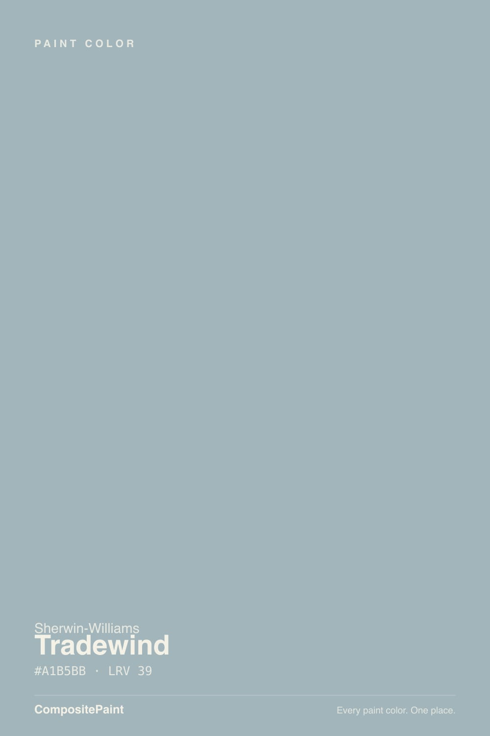
- 1Stardew43
- 2Smoke56
- 3Tradewind61
- 4Wickham Gray68
- 5Spring Thaw83
The Fast Verdict
Tradewind is Sherwin-Williams' go-to coastal blue-green-gray: light enough (LRV 61) to keep a room feeling open, colored enough to read as a deliberate choice rather than a safe neutral. It's genuinely popular right now on kitchen islands and bathroom vanities, not just walls. Give it real daylight and crisp white trim and it looks exactly like the coastal-house photos; put it in a dim north room and it goes quiet and gray.
Spa-style bathrooms and powder rooms · kitchen cabinets and islands with white or light-greige perimeters · bedrooms and sunrooms with real daylight · anyone who wants a coastal color that still reads calm, not bold
Your room is north-facing and dim without lamps · you actually want a true, colorless gray · your trim is staying a soft ivory instead of a crisp white · you want a color nobody will ever notice
- A genuine coastal blue-green-gray, not another beige or greige
- Light enough (LRV 61) to keep bathrooms and kitchens feeling open
- Crisp white trim (Pure White, Extra White) sharpens it and keeps the green in check
- Quiet enough for whole-room use without feeling like a bold accent commitment
- A genuinely current cabinet color, not just a wall color
- North light drains it to a flat, muted gray-blue — its single biggest complaint
- South and west daylight can pull the green forward more than buyers expect
- Not a true gray — buyers hoping for a "safe neutral" get more color than planned
- Needs crisp white trim; a warm ivory trim mutes the blue-green and reads dingy
What Color Is Tradewind, Really?
A light, cool-leaning blue with a gray undertone and a genuine touch of green — Sherwin-Williams files it in the blue family, but it reads as a proper blue-green-gray on the wall, not a plain gray with a hint of color. That mix is the whole reason it has become a favorite coastal and spa shade: it's muted enough to sit quietly in a room, but it never fully disappears into neutral the way a true gray would.
At LRV 61 it's a genuinely light color — next to a bright white trim like Pure White or Extra White it clearly shows its own body instead of vanishing, but it never reads deep or moody. That's the useful part: on four walls it stays airy and spacious rather than closing a small room in, which is exactly why it keeps showing up in bathrooms and powder rooms. It has also picked up a second life recently as a cabinet color — cabinet shops spec it by name for islands and vanities, paired with white or light-greige perimeter cabinetry.
Undertone in one line: blue first, with a gray base and a real touch of green that comes forward in warm daylight. If your sample looks flat and gray instead of coastal, that's cool north light doing its usual thing to this color family — not a bad can of paint.
Where It Shines
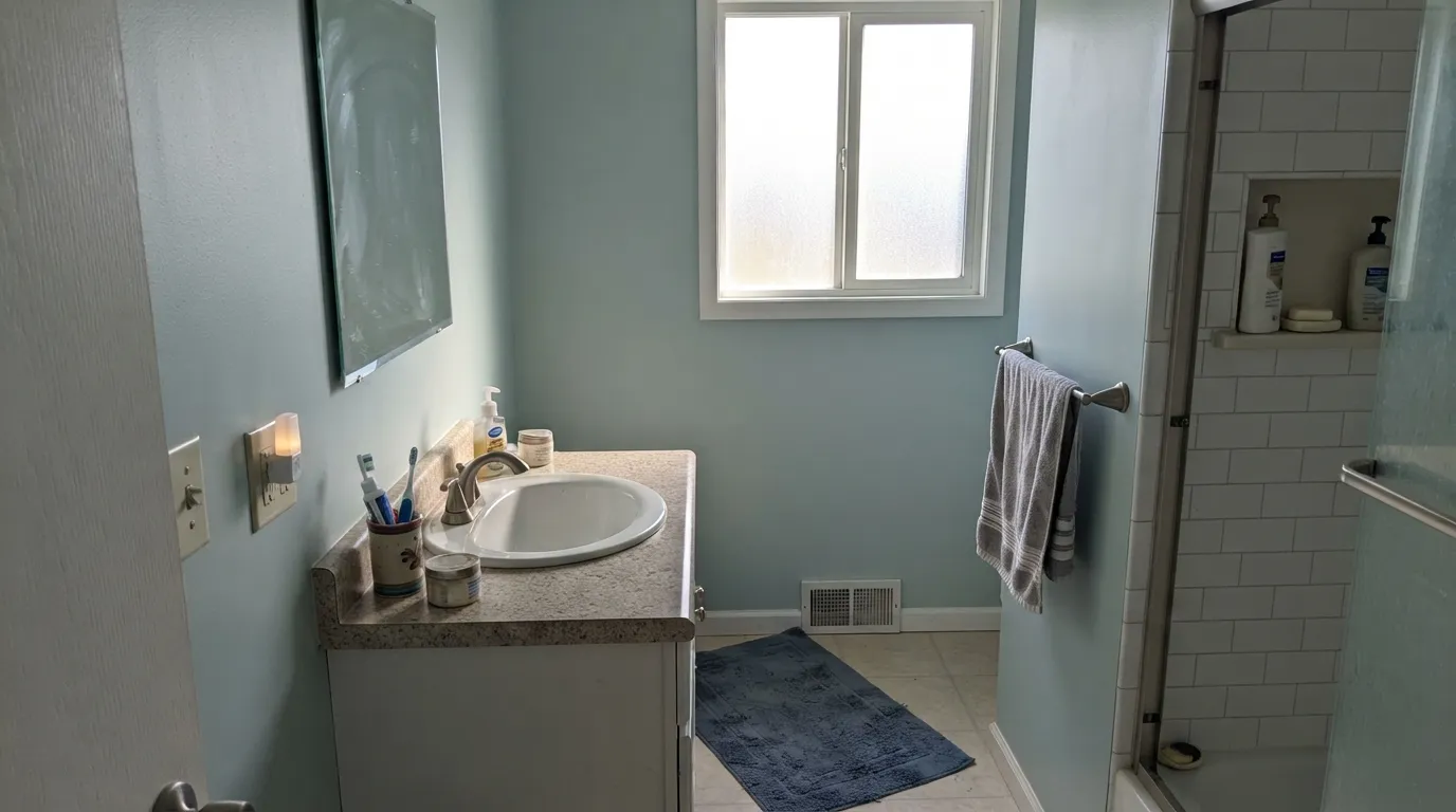
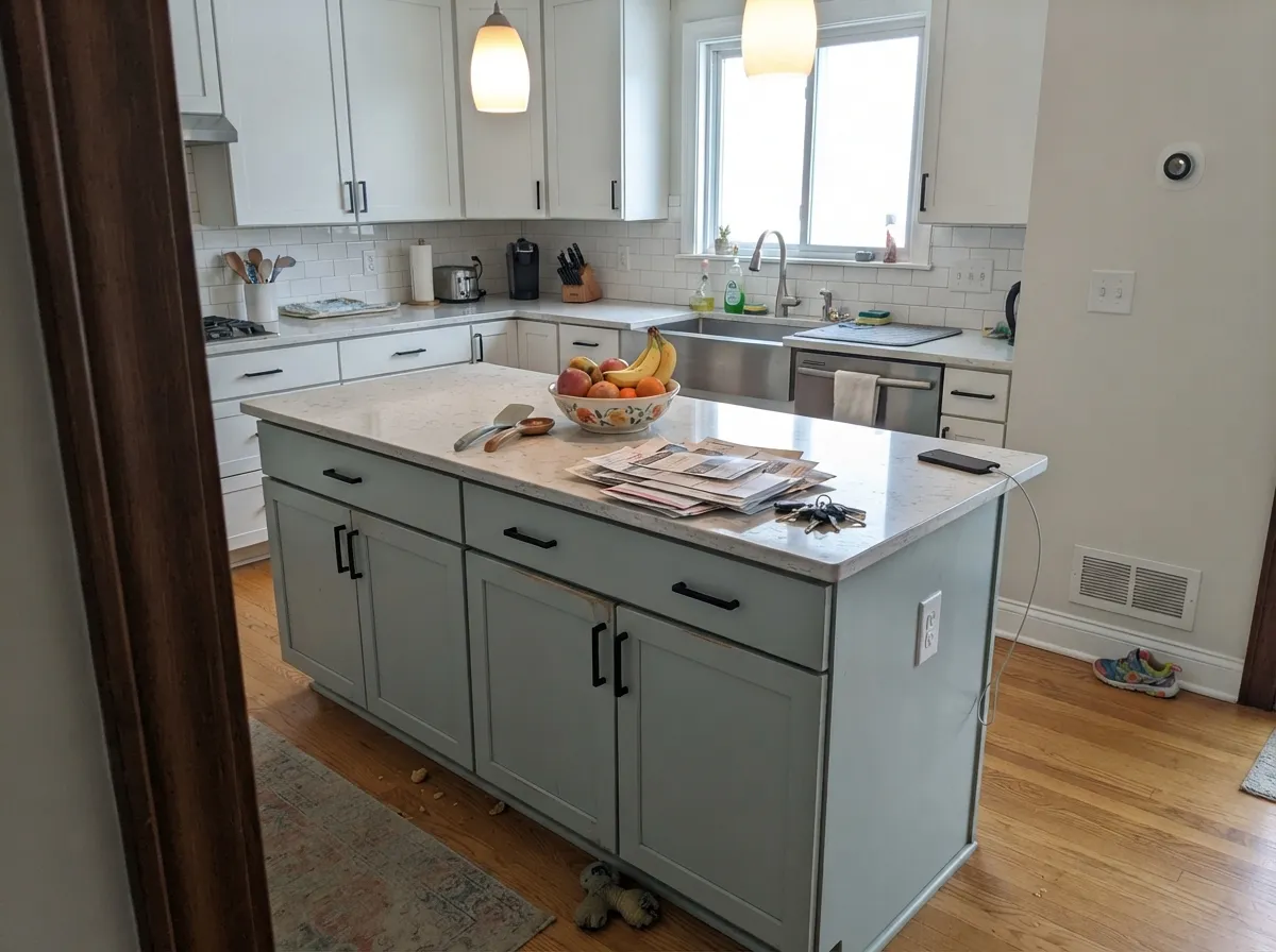
Give it real daylight and crisp white trim and it is close to unbeatable in the rooms it was made for. Bathrooms and powder rooms are its home base — pair it with white subway tile and brushed nickel and it reads exactly like the coastal-house photos it gets compared to. Kitchens are its newer specialty: on an island or a run of lower cabinets, next to white or light-greige perimeter cabinets and black or nickel hardware, it looks like a real design decision rather than a paint-chip gamble.
Where It Fails
Almost every disappointment with Tradewind traces back to one of three predictable situations, and none of them are the paint being defective — they're the same three things every blue-green-gray runs into.
Tradewind gets filed as a "gray" in a lot of color tools and mood boards, but there is real color in it — a blue-green that shows up the moment it's on four walls instead of one chip. If a true, colorless neutral is what you actually want, this reads more coastal than that. Don't buy it hoping the color will settle down; it won't.
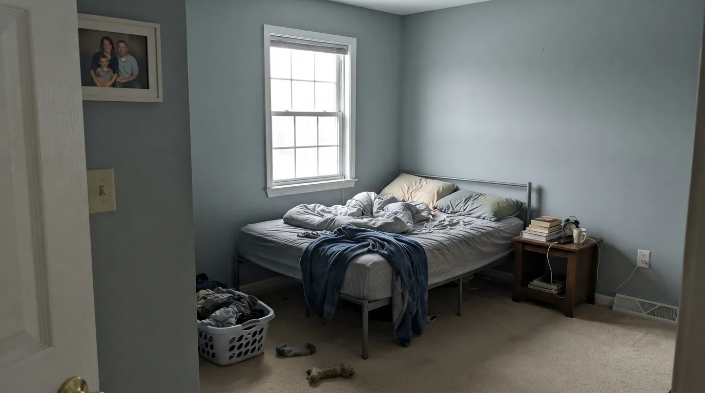
Cool north daylight drains Tradewind toward a flat, muted gray-blue and mutes the green that gives it its coastal character — reviewers researching this color consistently flag north exposure as the light where it goes quiet. It isn't a defect; it's what cool, diffuse light does to every blue-green. Add warm lamps or pick a different room.
Sherwin-Williams' own pairing guidance for this color calls for a bright white trim — Pure White or Extra White — specifically because a crisp white is what keeps the blue-green looking clean rather than tired. A soft ivory trim pulls the opposite direction and can leave the wall looking muddier than the chip promised.
Room by Room
The single most-recommended room for this color, and it earns the reputation: white subway tile and brushed nickel is the classic pairing, and the light value (LRV 61) keeps a small bathroom feeling open instead of closed-in. Eggshell for wipeability.
It has a real following as a cabinet color right now — island or lower cabinets in Tradewind, white or light-greige perimeter cabinets, black or brushed-nickel hardware. On walls alone it works too, especially with white or light stone counters. Satin on cabinets, eggshell on walls.
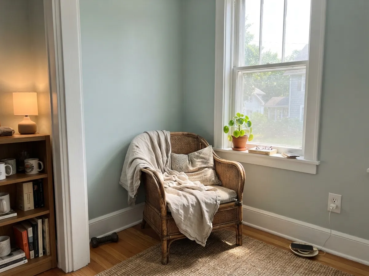
A calm, coastal-retreat feel in a room that gets real daylight during the day. Skip it in a north-facing bedroom with no lamps — that's the exact light where this color goes flat and loses its blue-green identity.
Small rooms are the cheap way to test a color this specific. A powder room in Tradewind with crisp white trim and nickel fixtures reads intentional and finished without betting a whole floor plan on it.
A room built around daylight is exactly the light this color needs to read as sold: crisp, clean and coastal. It's a much safer bet here than in a room that only gets indirect or shaded light.
Laundry rooms are usually small, often windowless, and lean on overhead lighting the same way powder rooms do — a low-risk place to commit to a color with this much personality. White cabinetry and nickel or black hardware carry the same coastal-utility look.
Your Light Is the Risk
In a well-lit room with real daylight, Tradewind reads exactly as sold: a crisp, clean coastal blue-green-gray, light and airy. This is the light that sells the sample chip.
Cool, diffuse north daylight drains the color toward a flat, muted gray-blue — the most common disappointment with this shade. Test a large sample before committing a north room to it.
Warm, yellow-tinted south and especially west sun pulls the green forward, more noticeably late in the day — by evening the wall can lean greener than it looked at noon.
2700K warm bulbs push it toward a muted sage-blue at night; cool white LEDs keep it truer to blue but can feel sterile in a small bathroom. Warm bulbs are the friendlier choice for a spa feel.
Most complaints about Tradewind are a light mismatch. Upload a photo of your actual room and see it on your walls — then ask for the same wall in north light or evening lamps before you buy a single sample.
Need It From Another Brand?
Any paint counter can custom-tint Sherwin-Williams SW 6218 directly. If you would rather stay in one brand's own deck, these are the closest stock matches, measured as ΔE2000. Under 2 is a difference you will not see on the wall.
| Brand | Closest color | ΔE | LRV | |
|---|---|---|---|---|
| Behr | Foggy MornPPF-17 · Behr | 3.0 | 62 | Color page → |
| Benjamin Moore | Brittany Blue1633 · Benjamin Moore | 1.1 | 61 | Color page → |
| Valspar | Lark WingM308 · Valspar | 1.5 | 60.8 | Color page → |
| PPG / Glidden | Babbling BrookPPG1144-3 · PPG / Glidden | 1.8 | 59 | Color page → |
| Glidden | Babbling BrookPPG1144-3 · Glidden | 2.0 | 60 | Color page → |
| Dutch Boy | Rochester Gray429-2DB · Dutch Boy | 0.0 | 61 | Color page → |
Similar Sherwin-Williams Colors
The nearest shades to Tradewind within Sherwin-Williams's own range, ranked by perceptual color distance — useful when you want the same look a touch lighter, darker, or warmer.
WCAG 2.1: AA is 4.5 : 1 for normal text, 3 : 1 for large text, AAA is 7 : 1.
Tradewind vs the Colors You're Also Considering
Every Tradewind sample board has the same rivals on it. The numbers show the real lightness gap — then it comes down to which risk you would rather live with.
Pick this if you want the color that reads unmistakably blue-green, not just green.
Sherwin-Williams SW 6211 · LRV 59RainwashedPick this if you want the greener, waterier cousin — Rainwashed reads more sea-glass, less blue.
Pick this for more blue and less green — Tradewind commits to the coastal-blue side that Sea Salt only hints at.
Sherwin-Williams SW 6204 · LRV 63Sea SaltPick this for SW's most famous coastal neutral — greener and warmer than Tradewind, and the shade everyone already knows by name.
Tradewind is the deepest of its close cousins, with an LRV of 39, so it carries more color on the wall than the lighter blues it is often compared to.
Languid Blue (SW 6226) at LRV 46 is noticeably lighter and reads bluer and airier; choose it when you want a more clearly blue room or need to keep a low-light space brighter. Tradewind is the better pick when you want more depth and a stronger blue-green presence.
Stardew (SW 9138), LRV 43, is a grayer, more muted take with less of the blue-green pull, so it feels safer and more neutral, while Tradewind commits more to color. Dockside Blue (SW 7601), LRV 43, sits between them, slightly lighter than Tradewind with a similar coastal cast. If you love the color but the room feels a touch dark, stepping up to Dockside Blue or Languid Blue keeps the mood while adding light.
Tradewind Coordinating Colors
The rule for coordinating with Tradewind is simple: keep the whites crisp, not creamy, and let the darks be navy or black-gray rather than brown. A soft ivory trim mutes the blue-green until it looks tired; a bright white sharpens it right back to coastal. These are the partners that keep showing up in rooms that work:
Tradewind's Coastal-Cabinet Moment
Tradewind's biggest fanbase right now isn't wall painters — it's kitchen remodelers. Cabinet shops list it by name as a go-to shaker-style color for islands and vanities, paired with white or light-greige perimeter cabinetry and black or brushed-nickel hardware. That's a real, current use pattern showing up on cabinet-paint spec sheets, not just a mood-board suggestion.
The same logic that makes it work on cabinets — a light, clean coastal color set against crisp white — is also why it does well on a single piece of furniture or one small room rather than four walls of an open floor plan. An island, a vanity, a powder room or a laundry room gives Tradewind's blue-green just enough real estate to register as a deliberate color choice without asking an entire home to commit to it.
Tradewind With Wood Tones and Floors
Cool, pale finishes are Tradewind's best friends: whitewashed oak, driftwood-gray floors, rattan and light cane furniture all sit comfortably next to it because nothing is competing for warmth. This is the classic coastal-house floor pairing, and it's exactly why the color reads "beach house" instead of just "blue."
Warm honey-oak or deep walnut floors are the pairing to sample first. Tradewind's gray-green undertone doesn't clash with warm wood the way a truer, colder blue would, but it doesn't especially flatter it either — the two sit at a slight temperature distance from each other. If the floor is warm and you love this paint anyway, lean on a warmer white trim like Alabaster rather than a stark one to bridge the gap.
Three Ready Palettes Built on Tradewind
A color is never alone on the wall. These are complete combinations in the 60-30-10 pattern, with the reason each one holds together. Every one opens in the visualizer.
Pure White keeps the trim crisp enough to control the green undertone, and one small navy note — a mirror frame or fixture finish — gives the spa palette a single confident dark without crowding a small room.
Try this palette in your roomAlabaster's warmth keeps the kitchen from feeling cold next to a cool blue-green, and black hardware in Iron Ore sharpens the cabinets instead of letting them blur into the walls.
Try this palette in your roomDebonair is a deeper cousin in the same blue-gray family, so the accent wall reads as another layer of the same color story rather than a separate decorating decision — and it keeps the room from going one-note.
Try this palette in your roomTradewind FAQ
Is Tradewind blue or green?
Both, but blue comes first. It's a blue with a gray undertone and a real touch of green — in warm south and west light the green becomes more visible, and in cool north light it reads more gray-blue. It never fully commits to either side, which is exactly what makes it read "coastal" instead of just "blue" or just "green."
What's the best light for Tradewind?
Bright, real daylight. A room that gets good natural light all day shows the color exactly as it's sold on the sample — clean, light, coastal. A dim north-facing room with no lamps is the one situation to sample carefully first.
Does Tradewind work on kitchen cabinets?
Yes — it's become a genuinely popular cabinet color, not just a wall color. It shows up by name on cabinet-shop spec sheets for islands and vanities, usually paired with white or light-greige perimeter cabinets and black or brushed-nickel hardware.
What trim white goes with Tradewind?
A bright white — Sherwin-Williams' own guidance points to Pure White or Extra White, which keep the crisp contrast that brings out the color's coastal character. Alabaster works if you want a slightly warmer, softer trim instead of a stark one.
Is Tradewind good for a small bathroom?
It's arguably the best room for it. LRV 61 keeps a small bathroom feeling light rather than closed-in, and the classic pairing — white subway tile, brushed nickel — is exactly what most reviewers recommend for it.
Will Tradewind look dull in a north-facing room?
Likely, yes. Cool north daylight is consistently the light where this color goes flat and muted, losing the blue-green character that makes it interesting. If the room is north-facing and dim, sample a large piece first, plan on warm lamps, or consider a different room for it.
Have you painted with Tradewind?
Rate it — one tap helps the next reader decide.
Ask a Question