Debonair
A blue-gray with almost no track record online, reviewed honestly: where it turns quietly sophisticated, the exact light where it goes flat, and what to pick instead.

Jessica has spec'd whites and neutrals for more than 300 rooms and keeps a sample wall of painted drawdowns in her studio. Every color review is checked against real reader rooms in the comments and re-tested when a formula changes. About the testing process →
- 1Black Fox7
- 2Pewter Green12
- 3Debonair34
- 4Stardew43
- 5Sea Salt63
The Fast Verdict
Debonair is a real blue-gray, not a gray wearing a blue name — gray does most of the talking, but there is a true cool-blue current underneath that keeps it from reading like every other greige on the market. Give it daylight or a warm lamp and it looks calm and a little expensive; leave it in a dim north room and it goes flat and cold fast. It has almost no reputation online, good or bad — which turns out to be the honest story: a solid, capable color that never got famous.
Powder rooms and bathrooms with real daylight · kitchen islands and cabinets under white uppers · bedrooms that get south or east light · anyone who wants a blue-gray without the internet's opinion already formed
Your room is dim or north-facing with no lamps · you run cool white LEDs everywhere with nothing warm to balance them · you want proof from a hundred Reddit threads before you commit · you need the wall to feel warm, not calm
- A genuine blue-gray, not a greige wearing a blue label — real color shows up in daylight
- Deep enough (LRV 34) to hold its color instead of washing out
- Versatile across cabinets, walls, trim, and exterior siding or shutters
- Reads calm and a little sophisticated without the generic-greige sameness
- Almost no bad-review track record — an honest unknown, not a warning sign
- Needs real daylight or a warm lamp to avoid going flat and bland
- North-facing dim rooms risk an outright icy, cold read
- Barely documented online — you are mostly testing it yourself, not leaning on crowd experience
- Loses its blue fast under cool white LEDs and reads plain gray
What Color Is Debonair, Really?
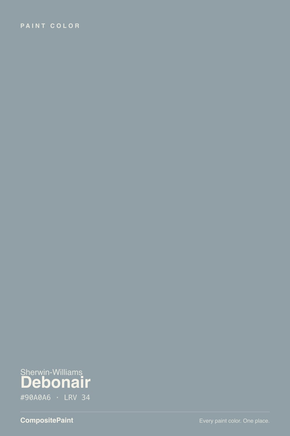
A muted blue-gray, filed by Sherwin-Williams under its blue paint colors, where the gray base does most of the work and the blue shows up as an undertone rather than a headline. It sits in a run of consecutive SW color-numbers — Stardew (SW 9138, LRV 43) is one step lighter, Waterloo (SW 9141) sits two steps darker — so Debonair is the mid-depth member of a coordinated blue-gray ladder rather than a one-off. That family structure is a good sign: SW built it to sit next to siblings, not to stand alone and carry a whole room by itself.
At the deck LRV of 34 it is a genuine mid-tone, deep enough to hold real color on a wall instead of thinning out to a pale wash. That depth is also why it needs real light to read well — a paler blue-gray can coast on a little daylight, but a mid-tone one needs enough light hitting it to show the blue at all. In good light it reads calm and a little sophisticated; starve it of light and the personality goes with it.
Undertone in one line: blue-gray, gray in front, blue underneath, cool overall — never warm, never teal or navy. A couple of paint-blog write-ups mention a faint green flicker under specific artificial light, but that shows up rarely enough that it should not change how you plan the room; the blue-gray read is the one to trust.
Where It Shines
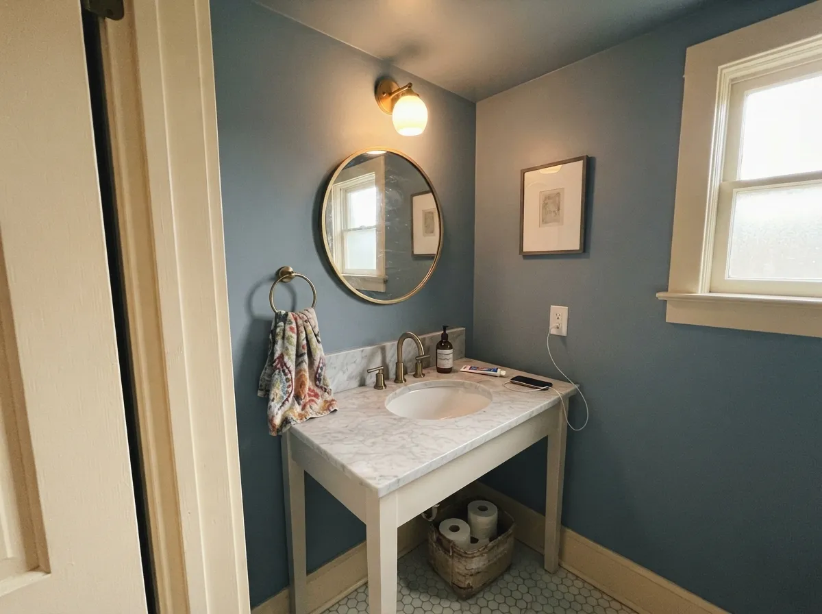
The one real project write-up we could verify — a powder bathroom repainted in Debonair — called it "spot-on from the get-go": airy and almost ethereal in daylight, deepening into something moodier and more intense once the sun leaves the room, without ever tipping into a mistake. That is the pattern to expect. Give it south or east daylight, or a warm 2700K lamp after dark, and pair it with cream trim, brass, or warm wood, and it earns the calm-and-a-little-expensive read designers reach for in small, statement rooms.
Where It Fails
Debonair does not have a long list of documented regrets — it simply is not talked about enough for one to exist yet. What the write-ups that do cover it agree on comes down to three predictable light and pairing traps.
This is a mid-depth color that needs real light to show its blue at all. Every source that covers it says some version of the same thing: not enough daylight and it goes bland; a dim north room risks an outright icy, cold read. If the room is genuinely dark and lamp-free, this is not the color to gamble on.
Debonair is already a cool color. Pair it with cool white trim, cool gray floors, and chrome fixtures, and nothing in the room pushes back — it can read sterile, almost clinical, instead of calm. It needs one warm thing in the room: brass hardware, a cream trim white, or real wood.
Warm bulbs bring the blue forward and let the color read rich; cool LEDs do the opposite, flattening it toward a plain, slightly cold gray with the personality drained out. If the fixtures are already cool-toned 4000K-plus bulbs, swap them before you blame the paint.
Room by Room
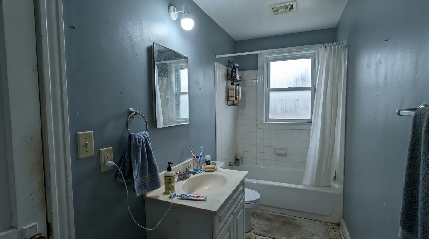
The one detailed real-project account of this color is a powder bath, and it is a strong one: walls and ceiling both in Debonair, airy in daylight, moodier and more intense once the light drops, no adjustments needed. Small rooms take mid-depth color well, and a powder room rarely goes long without a light on.
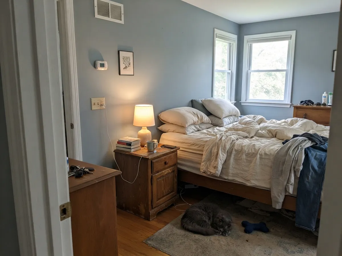
South or east daylight keeps it calm and restful; under a 2700K lamp at night it deepens further without going cold. In a north-facing bedroom with limited daylight, plan on warm bedding and lamps doing real work, or step to a lighter sibling.
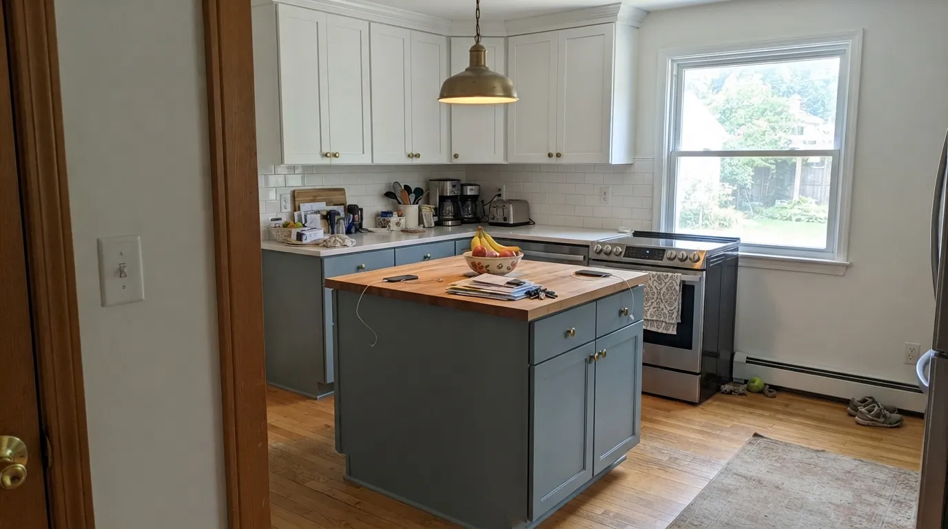
Under white or cream upper cabinets, with brass or aged-brass hardware, a Debonair island or full lower run reads modern without feeling cold. It is a strong two-tone-kitchen color; a whole kitchen in it, with no warm wood or cream anywhere, risks the sterile trap.
Quiet, confident backdrop with neutral or warm furniture and good daylight. In an open floor plan it has to negotiate with whatever the kitchen and hallway wear — give it one warm material nearby (a wood floor, a leather chair) so the room doesn't go all-cool.
A calm color for a focus room, but only where daylight or a decent lamp actually reaches the desk. A windowless or north-facing home office is exactly the dim-room trap this color falls into.
At LRV 34 it does not wash out in full sun the way a pale color would, and it works as siding, shutters, or a front-door accent against white or cream trim. Full outdoor light is the most forgiving light this color gets — it is indoors, in dim rooms, where it struggles.
Your Light Is the Risk
The blue comes forward and the color reads open and lightly sophisticated, especially in the morning hours. Its best, most honest light.
Without enough light hitting it, this mid-tone blue-gray goes bland and can read distinctly icy and cold. Test big and test in the actual room.
Cooler and more clearly blue in the morning; richer and deeper as afternoon and evening light warms up. West-facing rooms get the biggest late-day shift.
2700K warm bulbs pull the blue forward and deepen it nicely. Cool 4000K-plus LEDs flatten it toward a plain, slightly cold gray.
Most complaints about Debonair are a light mismatch. Upload a photo of your actual room and see it on your walls — then ask for the same wall in north light or evening lamps before you buy a single sample.
Need It From Another Brand?
Any paint counter can custom-tint Sherwin-Williams SW 9139 directly. If you would rather stay in one brand's own deck, these are the closest stock matches, measured as ΔE2000. Under 2 is a difference you will not see on the wall.
| Brand | Closest color | ΔE | LRV | |
|---|---|---|---|---|
| Behr | Dusty DenimN480-4A · Behr | 1.4 | 34 | Color page → |
| Benjamin Moore | CoastlineAF-570 · Benjamin Moore | 3.6 | 34 | Color page → |
| Valspar | Silver Fox4008-3C · Valspar | 2.5 | 33.8 | Color page → |
| PPG / Glidden | SymmetryPPG1037-4 · PPG / Glidden | 1.0 | 34 | Color page → |
| Glidden | SymmetryPPG1037-4 · Glidden | 0.5 | 34 | Color page → |
| Dutch Boy | Rustic Blue430-4DB · Dutch Boy | 1.1 | 35 | Color page → |
Similar Sherwin-Williams Colors
The nearest shades to Debonair within Sherwin-Williams's own range, ranked by perceptual color distance — useful when you want the same look a touch lighter, darker, or warmer.
WCAG 2.1: AA is 4.5 : 1 for normal text, 3 : 1 for large text, AAA is 7 : 1.
Debonair vs the Colors You're Also Considering
Every Debonair sample board has the same rivals on it. The numbers show the real lightness gap — then it comes down to which risk you would rather live with.
Pick this for the deeper, more confidently blue read; Stardew leans closer to plain gray in flat light.
Sherwin-Williams SW 9138 · LRV 43StardewPick this if you want the same family lighter and airier — Stardew is Debonair's next-door cousin, a full LRV lighter.
Pick this for actual color; Agreeable Gray has almost no blue left in it at all.
Sherwin-Williams SW 7029 · LRV 60Agreeable GrayPick this if blue feels like too much commitment — this warm greige is the safe, everyone-already-knows-it alternative.
Let it Rain SW 9152 at LRV 34 is the same depth but grayer, with a hex of #979FA5 against Debonair's #90A0A6. It holds more red, so it reads as a gray with a blue hint rather than a muted blue. Choose it if Debonair looks like too much color.
Delft SW 9134 at LRV 33 pushes toward green at #8B9FA0, while Daphne SW 9151 at LRV 32 goes the other way toward violet-blue at #899CAA. Powder Blue SW 2863 at LRV 35 and Favorite Jeans SW 9147 at LRV 35 are both clearly bluer and less gray, which makes them read as actual blue on a wall.
Across brands, Glidden Symmetry PPG1037-4 at LRV 34 is a deltaE of 0.5 away, effectively the same color. Behr Dusty Denim N480-4A at LRV 34 is 1.44 away, visually identical in normal room light. Farrow and Ball Sardine No. CB8 at LRV 35 is 2.34 away, very close but worth sampling first. Benjamin Moore Coastline AF-570 at LRV 34 is 3.58 away, close but visibly different side by side.
Debonair Coordinating Colors
The rule with Debonair is the same as with most cool colors: give it something warm to lean on. It pairs best with warm off-whites, brass, and warm wood — and it needs at least one warm material in the room to keep from reading sterile. These are the partners that keep it grounded:
A Coordinated Family, Not a Famous Color
Debonair's honest story is not about fame — it never had a Color of the Year moment, a viral room, or a designer-blog obsession the way its own deck-mates like Agreeable Gray or Sea Salt did. What it has instead is a place in a small, coordinated run of Sherwin-Williams blue-gray SKUs: Stardew (SW 9138) sits one step lighter, Waterloo (SW 9141) sits two steps darker, and Debonair holds the middle. It was built to work as part of a family, which is exactly what the one detailed real-project review of it — a powder bathroom that came out 'spot-on from the get-go' — suggests it does well.
That obscurity cuts both ways for a buyer. There is no crowd of Reddit and Houzz threads to warn you off a bad pairing, but there is also no viral hype pushing the price of the sample up or the color out of style in two years. If you want a genuinely under-the-radar cool color instead of the fifth Agreeable Gray kitchen on your street, this is a legitimate, quietly capable pick — you are just testing it on your own walls rather than leaning on a hundred strangers' photos first.
Debonair With Wood Tones and Metals
Warm wood is what keeps this color from feeling cold. Oak, walnut, and butcher block all give it something to play off of, and the contrast between the cool blue-gray and the warm wood grain is a big part of why it works so well on a kitchen island or bathroom vanity. Gray-washed or cool-toned floors are the one flooring choice that needs a warm rug or textile nearby — two cool elements in the same room stack the sterile risk this color already carries.
Metals follow the same logic: brass and aged bronze warm the room up and are the pairing every real-project write-up of this color reaches for. Polished chrome and stainless steel are the only finishes that lean the wrong way — fine in a genuinely modern, all-cool kitchen, but they will not soften Debonair the way brass does.
Three Ready Palettes Built on Debonair
A color is never alone on the wall. These are complete combinations in the 60-30-10 pattern, with the reason each one holds together. Every one opens in the visualizer.
Alabaster keeps the room bright and warm enough to offset the island's cool blue-gray, and Iron Ore on one door gives the kitchen a single dark anchor so the palette reads intentional. Brass hardware is what pulls the whole thing together.
Try this palette in your roomThis is the combination the documented real project used: a small room fully drenched in Debonair, a warm cream trim instead of a stark white, and one near-black frame to give the eye a place to land. Brass fixtures and a marble top finish it.
Try this palette in your roomPure White trim keeps the room from tipping all-cool, and warm bronze furniture pieces give the eye something with real depth to rest on. Under a 2700K lamp the whole room reads restful rather than clinical.
Try this palette in your roomDebonair FAQ
Is Debonair blue or gray?
Both, but gray does most of the talking. On the wall it reads first as a muted gray, with a genuine cool-blue current underneath that shows up more clearly in daylight and less in dim, artificial light. It never turns navy or teal — the blue stays quiet.
Does Debonair work in a room with no natural light?
Not well. It is a mid-depth color that needs real light to show its blue; without it, the write-ups that cover this color describe it going bland, and a dim north room risks an outright icy read. If your room has no real daylight and you won't add warm lamps, pick a lighter, warmer color instead.
What trim goes with Debonair?
A warm white, not a stark cool one — Alabaster or White Duck rather than a blue-white trim, which would push the whole room cold. Brass or aged-brass hardware does the same warming job on cabinets and fixtures.
Is Debonair a popular color?
Honestly, no — not compared to its Sherwin-Williams neighbors. It has very little written about it online, no famous project or Color of the Year moment behind it. That is not a red flag; it is a genuinely capable blue-gray that simply never got picked up by the trend cycle.
Can I use Debonair on kitchen cabinets?
Yes — it works well on an island or full lower cabinets under white or cream upper cabinets, especially with brass hardware. Use a satin urethane-fortified cabinet enamel rather than standard wall paint for durability.
How does Debonair compare to Stardew?
They're siblings — Stardew (SW 9138) sits one SKU over and one full LRV point lighter and airier. Pick Stardew for a lighter, easier whole-house blue-gray; pick Debonair when you want the deeper, more confidently blue version.
Have you painted with Debonair?
Rate it — one tap helps the next reader decide.
Ask a Question