Powder Blue
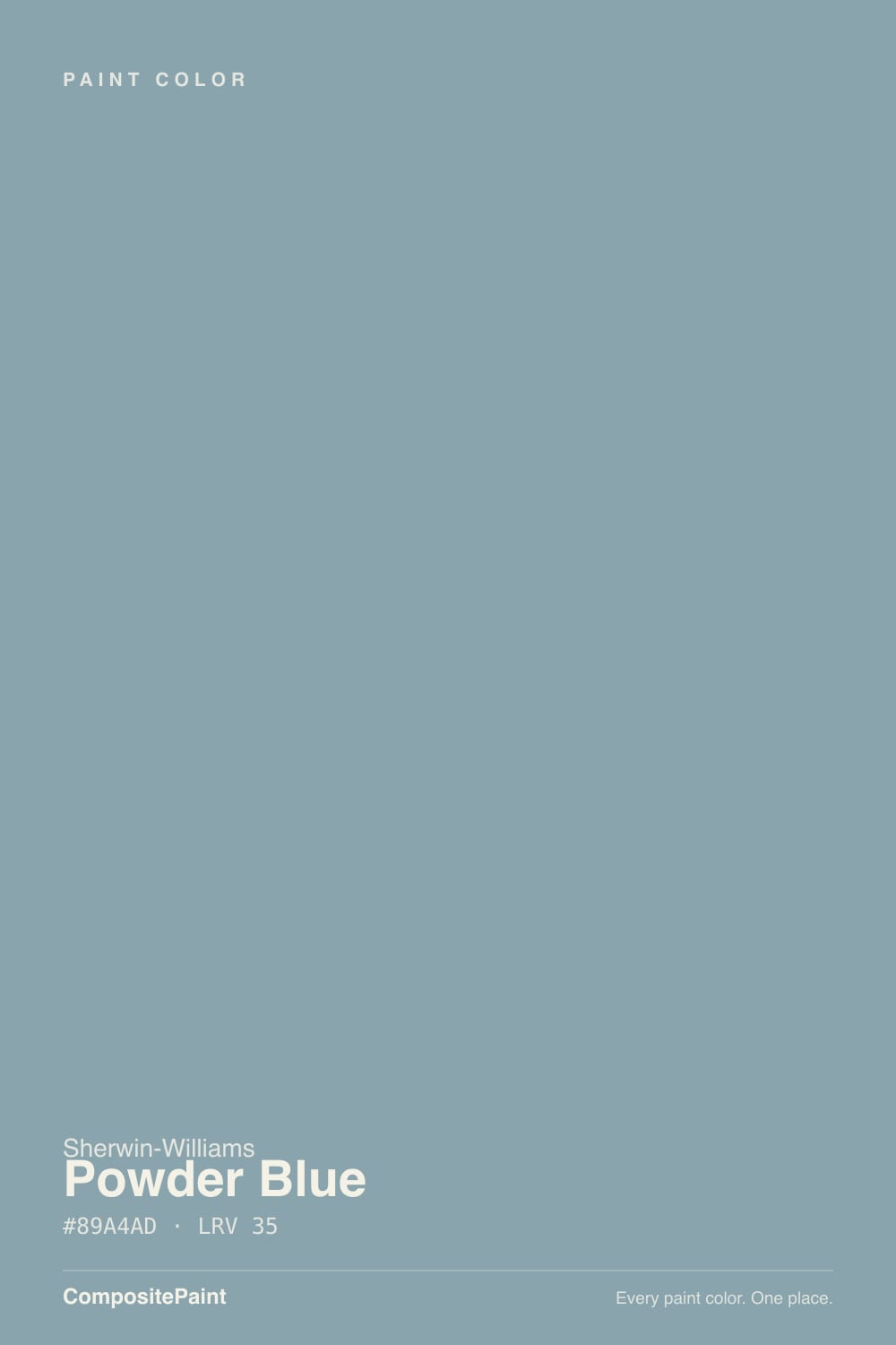
SW 2863 · #89A4AD · LRV 35 — cool blue-green tone, mid-tone — versatile but shifts visibly with light.
- 1Salamander6
- 2Hidden Gem14
- 3Powder Blue35
- 4Wythe Blue48
- 5Ocean Boulevard53
What Color Is Powder Blue, Really?
Powder Blue SW 2863 is not the pastel its name suggests. Its hex value #89A4AD is a mid-tone dusty blue with a green tilt, sitting at hue 195 with about 18 percent saturation. An LRV of 35 places it in the middle of the scale, so it holds enough depth to read as a real color on a wall rather than a pale wash. Weathered denim or sea glass seen through fog is closer to the truth than anything nursery related.
People pick it when they want a blue that behaves. The gray in it keeps it from going bright or childish, and the slight green keeps it from turning icy. That combination is easy to live with on full walls, on cabinetry, and on shutters, and it suits coastal houses and older homes where a saturated blue would look too new.
The catch is the name itself. Buyers expecting a pale baby blue are often surprised by how much weight LRV 35 carries once it is on four walls, particularly in a room without much daylight. It also moves: under cool light the green side comes forward and it can read almost gray-teal. Paint a large board and check it on more than one wall before you decide.
The undertone is a cool blue-green. The hue sits at 195 degrees, which is past pure blue and heading toward teal, with saturation around 18 percent. That means there is a clear gray component, so this is a muted blue rather than a clean one.
Where the green shows depends on the company it keeps. Next to a true navy or a clean sky blue, Powder Blue looks gray and slightly green. Next to a green or a sage, the blue side sharpens and it reads cooler and more definite. Against warm woods, terracotta, or brass it looks like a proper blue and settles down.
The useful test is holding a sample beside any existing blue in the house, plus your countertop or tile. Cool gray quartz will pull the green forward; warm oak and brass will pull it back toward blue.
Best Rooms and Uses for Powder Blue
This is a full-room color for spaces where you want calm with some substance. Bedrooms, bathrooms, home offices, and dining rooms all suit it, and it is a strong choice for a study or a library where a deeper feel is welcome. In a small north-facing room it can feel cool, so bring in wood, brass, or a warm rug to balance it.
Cabinetry is one of its best uses. At LRV 35 it gives kitchen or laundry cabinets real color while keeping the room lighter than a navy would, and it looks natural against white counters and unlacquered brass. Bathroom vanities take it well for the same reason.
Outside it works as a shutter, porch ceiling, or front door color, and as a body color on coastal homes. Keep trim in a separate white so the blue reads as a deliberate choice.
How Lighting Changes Powder Blue
An LRV of 35 means Powder Blue reflects a moderate amount of light, so it will darken a room a little rather than open it up. Light source decides which half of the color you see.
North-facing rooms get cool, even daylight that reinforces the blue-green and makes it read deeper, grayer, and slightly teal. That can look calm and considered, or cold if the room has no warm materials in it. South-facing rooms flood it with warm light, which lifts the color and makes it look softer and more clearly blue. East rooms are crisp and cool in the morning; west rooms stay muted until the late sun warms them.
Bulbs push it hard because the saturation is low. Warm 2700K lamps soften the blue and can make it look grayer at night. Cooler 3500K to 4000K bulbs sharpen the blue-green. Check the sample after dark before you commit.
Most complaints about Powder Blue are a light mismatch. Upload a photo of your actual room and see it on your walls — then ask for the same wall in north light or evening lamps before you buy a single sample.
Need It From Another Brand?
Any paint counter can custom-tint Sherwin-Williams SW 2863 directly. If you would rather stay in one brand's own deck, these are the closest stock matches, measured as ΔE2000. Under 2 is a difference you will not see on the wall.
| Brand | Closest color | ΔE | LRV | |
|---|---|---|---|---|
| Behr | Raging Sea750F-4 · Behr | 1.8 | 35 | Color page → |
| Benjamin Moore | Dusty CornflowerCSP-605 · Benjamin Moore | 1.0 | 36 | Color page → |
| Valspar | Silver Fox4008-3C · Valspar | 2.3 | 33.8 | Color page → |
| PPG / Glidden | Symphony Of BluePPG1035-4 · PPG / Glidden | 2.0 | 33 | Color page → |
| Glidden | Hazy Seacliff Teal30BG 37/110 · Glidden | 1.4 | 37 | Color page → |
| Dutch Boy | Seabrook338-4DB · Dutch Boy | 4.7 | 35 | Color page → |
Similar Sherwin-Williams Colors
The nearest shades to Powder Blue within Sherwin-Williams's own range, ranked by perceptual color distance — useful when you want the same look a touch lighter, darker, or warmer.
WCAG 2.1: AA is 4.5 : 1 for normal text, 3 : 1 for large text, AAA is 7 : 1.
Powder Blue vs Similar Colors
Favorite Jeans SW 9147 shares the same LRV of 35 with hex #8AA3B1, so it is nearly interchangeable with a hair more blue. Baby Blue Eyes SW 9070 at LRV 34 and #83A2B4 is a touch deeper and clearly bluer, the pick if you want less green. Delft SW 9134 at LRV 33 and #8B9FA0 drops most of the blue and lands closer to a gray-green.
Across brands the field is crowded. Benjamin Moore Dusty Cornflower CSP-605 at LRV 36 measures a color difference of 0.99, effectively the same color on a wall. Behr Raging Sea 750F-4 at LRV 35 measures 1.79 and Glidden Hazy Seacliff Teal 30BG 37/110 at LRV 37 measures 1.43, both visually identical in normal room light. Valspar Silver Fox 4008-3C at LRV 33.8 measures 2.34, very close but sample it first. Dutch Boy Seabrook 338-4DB at LRV 35 measures 4.71, close but visibly different side by side.
Colors That Go With Powder Blue
White trim is the obvious partner, and a soft warm white keeps the cool blue from feeling clinical. Natural oak, teak, and rattan all warm it up, and brass or aged bronze hardware does more for it than chrome, which doubles down on the cool.
For related wall colors, its own neighbors give you a range without a clash. Favorite Jeans SW 9147 at LRV 35 sits at the same brightness with a slightly bluer cast. Adrift SW 7608 at LRV 37 and Aquitaine SW 9057 at LRV 38 are both a little lighter, useful for a connected room or a ceiling. Delft SW 9134 at LRV 33 pulls further toward green-gray for a quieter, earthier partner, and Debonair SW 9139 at LRV 34 is the grayest of the group.
For contrast, a deep charcoal or a warm sand tone both work, and unfinished wood remains the easiest accent of all.
Coordinated palette
Generated by hue-rotating #89A4AD in HSL space. Pair Powder Blue with one accent and one neutral — the swatches below are starting points, not final picks.
Powder Blue FAQ
Is Powder Blue actually a light pastel blue?
No, and the name misleads people. Powder Blue has an LRV of 35, which is a mid-tone, and its hex is #89A4AD. On a wall it reads as a dusty, grayed blue with real depth, not a pale nursery blue. If you want a genuinely pale blue, this is not the color.
Is Powder Blue warm or cool?
It is cool. The undertone is blue-green, sitting at hue 195 with about 18 percent saturation, so there is a clear gray softening the color but no warmth underneath it. Pairing it with wood, brass, or warm whites is the usual way people keep a room from feeling chilly.
What LRV is Powder Blue?
Powder Blue has an LRV of 35. On the 0 to 100 scale that is a middle value, so the color absorbs more light than it reflects and gives walls noticeable presence. It will make a room feel slightly deeper and more enclosed rather than brighter.
Does Powder Blue work in a north-facing room?
It works, but the cool light emphasizes the blue-green side and makes it read deeper and slightly teal. That can be exactly the effect you want in a study or bedroom. If the room already feels cold, add warm materials such as oak, brass, or a warm rug rather than switching to a different blue.
What white trim goes with Powder Blue?
A soft warm white is the safer choice, because it takes the chill off a cool blue-green and keeps the contrast from looking harsh. A stark blue-based white will make the walls read cooler and more clinical. Test both against the actual wall color, since at LRV 35 the difference in trim is easy to see.
Is Powder Blue good for kitchen cabinets?
Yes. At LRV 35 it gives cabinets real color without the weight of a navy, so a full run stays lighter and the room does not close in. It pairs naturally with white counters, warm wood, and brass or bronze hardware, and it works equally well on an island or a bathroom vanity.
Have you painted with Powder Blue?
Rate it — one tap helps the next reader decide.
Ask a Question