Smoke
The quiet blue-gray everyone calls spa-like, reviewed honestly: the rooms where it stays beautiful, the light that turns it cold, and what to paint instead.

Jessica has spec'd whites and neutrals for more than 300 rooms and keeps a sample wall of painted drawdowns in her studio. Every color review is checked against real reader rooms in the comments and re-tested when a formula changes. About the testing process →
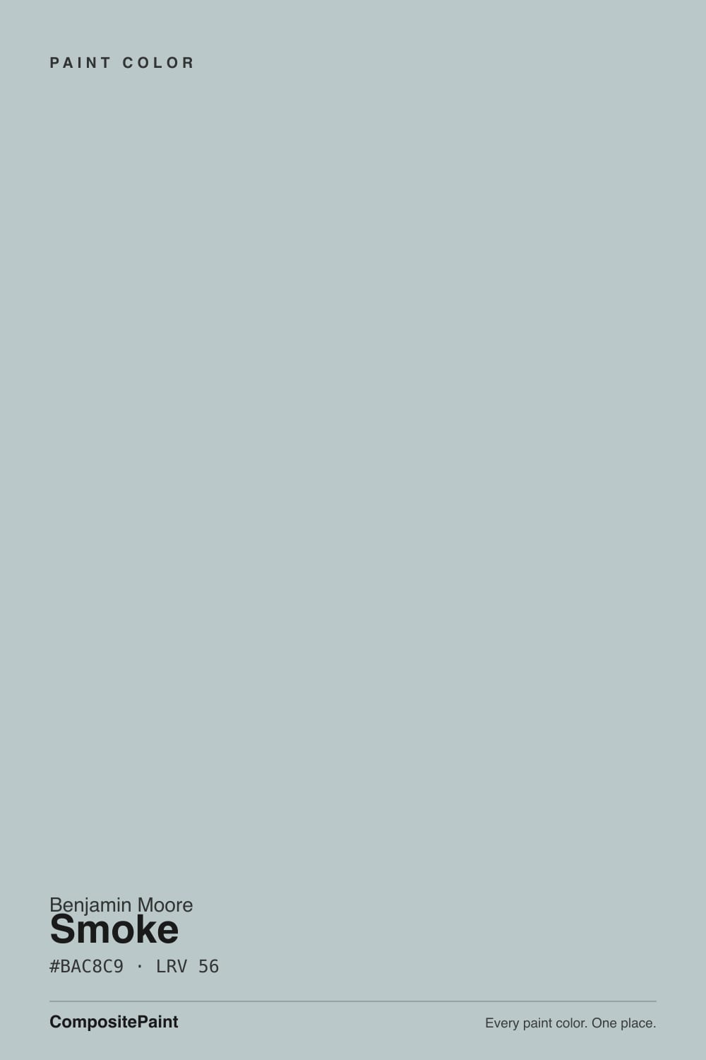
- 1Stardew43
- 2Quietude48
- 3Smoke56
- 4Sea Salt63
- 5Wickham Gray68
The Fast Verdict
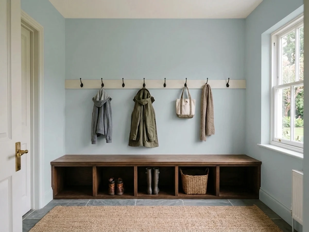
Smoke is the blue-gray that behaves like a neutral until the light says otherwise. In a south- or west-facing room it settles into a soft sea-glass gray that almost nobody dislikes. In a dim north room it turns genuinely cold and slightly violet, and under warm 2700K lamps at night most of the blue drains away and leaves plain gray. It is a very good color with one condition attached: sample it on the actual wall, in the actual light, before you buy a gallon.
Bathrooms with white tile and chrome · south- or west-facing bedrooms · painted vanities and laundry cabinets · coastal-style siding and porch ceilings
Your room faces north and stays dim · your floors are orange oak or espresso · you want an obviously blue room · the space is only used at night under warm bulbs
- Reads as a neutral in most light while still showing real color
- LRV 56 keeps a room open — you can use it on all four walls
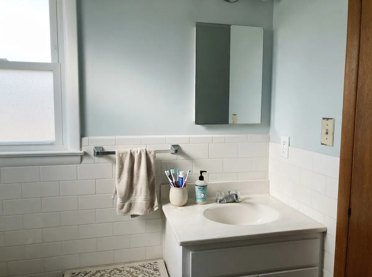
- Perfect against white tile, chrome and nickel in bathrooms
- Soft on painted vanities, laundry cabinets, and porch ceilings
- Almost every big brand has a near-identical match if your painter switches
- Goes cold and slightly violet in dim north light
- Warm 2700K bulbs drain most of the blue out at night
- Fights orange oak, cherry, and espresso floors
- Flat and matte sheens can look chalky on a large wall
What Color Is Smoke, Really?
A pale blue-gray whose hue sits at 184 degrees — the exact seam between blue and green — with saturation of only 12 percent. That low saturation is the whole personality. There is real color in there, but not enough for the eye to commit, so half the people who see it say "soft blue" and the other half say "gray," and both are right. On a two-inch chip the gray wins. On four walls it always reads bluer than the chip promised, because large surfaces make any color look more saturated.
At LRV 56 it gives back a bit more light than it takes in, so a room stays open. Put it next to Revere Pewter HC-172 (LRV 55) and the two bounce back almost exactly the same amount of light — same brightness, opposite temperature. That is the useful comparison: Smoke is not a dark color, and the rooms where people call it "heavy" are rooms where it went cold, not rooms where it went dark.
Undertone in one line: cool blue with a drop of green — never purple on paper, but cold north light can push it there in practice. If your sample looks violet-gray on an overcast morning, that is the light, and it will look like that every overcast morning.
Where It Shines
Give it white tile, chrome, and daylight coming from the warm side of the house, and Smoke does exactly what people hope for — clean, calm, and clearly a color without ever shouting. Bathrooms and bedrooms are its home turf, and painted cabinets are the sleeper use almost nobody considers until they see one.
Where It Fails
Nobody complains about how Smoke covers or wears. The complaints are all the same shape: the color on the wall stopped being the color on the chip. Three situations cause nearly all of them, and every one is predictable before you open the can.
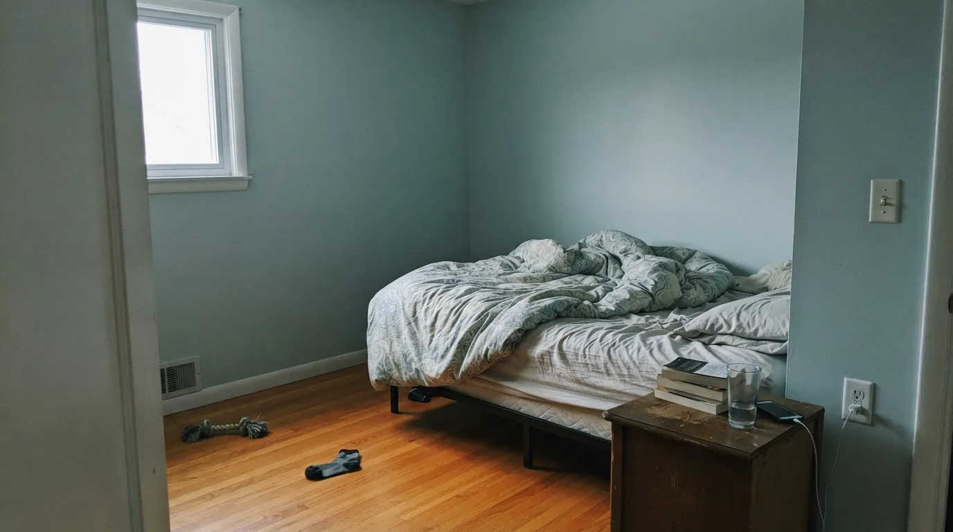
North light is cool and flat, and it feeds the blue-green base until the room feels chilly. In the dimmest north rooms it also drifts slightly violet-gray, which is what people mean when they say it looks "depressing." If the room is north and dim, paint a warm neutral instead — Edgecomb Gray HC-173.
Smoke is cold, and warm builder oak, red oak, and cherry are the opposite. Side by side, the floor looks more orange and the wall looks more clinical. Dark espresso floors make it worse — the room reads heavy and dim. With warm wood, go greener and softer: Quiet Moments 1563.
At 2700K the lamps put yellow light on a color that is only 12 percent saturated, and the blue simply leaves. People who chose Smoke for a blue bedroom often see a plain gray after dark. If the blue is the point, pick a color that holds it: Yarmouth Blue HC-150.
Room by Room
The blue-green reads clean against white tile, white fixtures, and chrome or polished nickel. Satin or eggshell for the moisture. Trim in Chantilly Lace OC-65 keeps it crisp; White Dove OC-17 softens it if the room feels sterile.
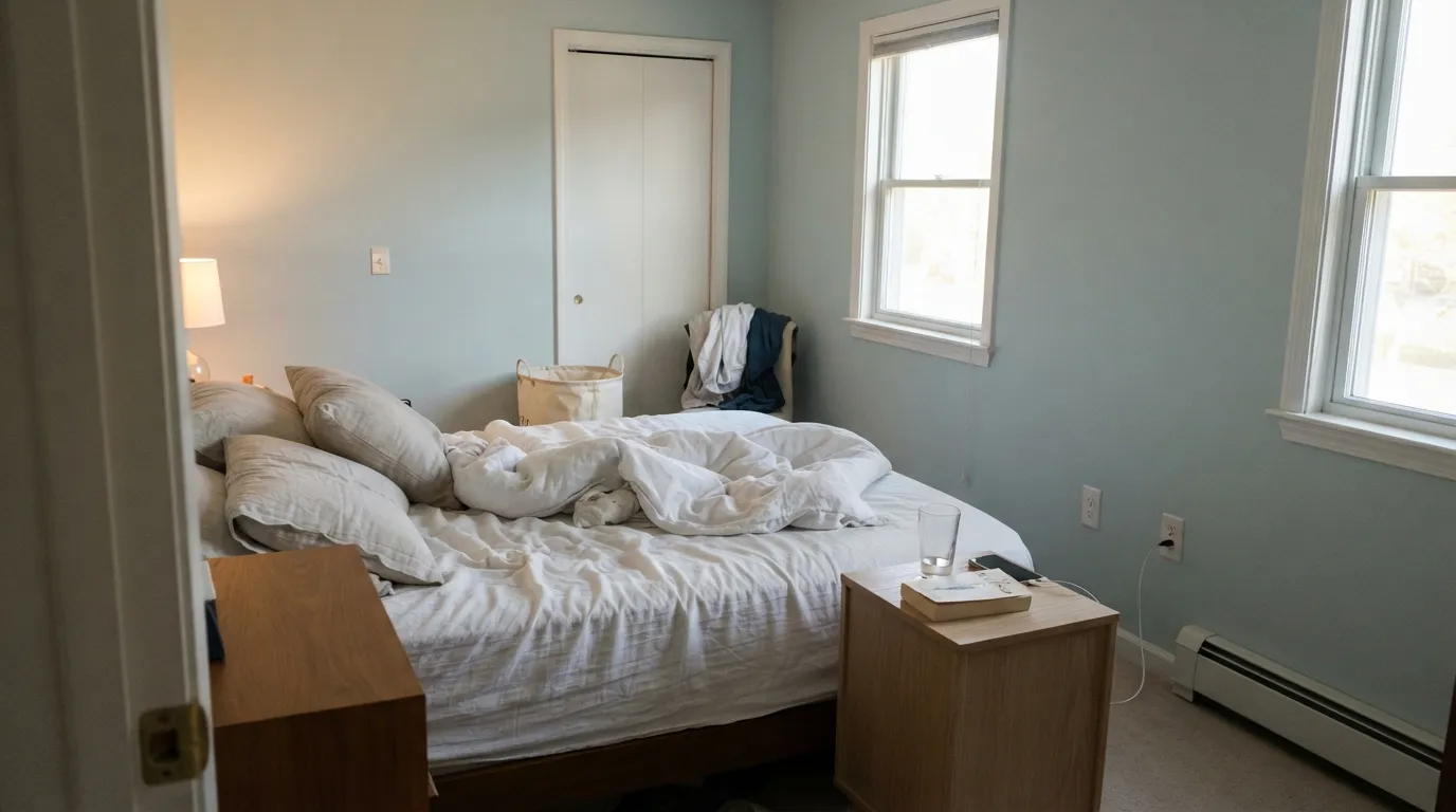
In south or west rooms it is genuinely restful, and at LRV 56 the room never closes in. Eggshell on the walls. Add a warm counterweight — linen, oak, a Pashmina AF-100 accent wall — or the room can feel cool at night.
Cool light with low saturation is easy on the eyes for long screen hours, and it photographs well on video calls. Eggshell. Bulbs around 3500-4000K keep the color honest while you work.
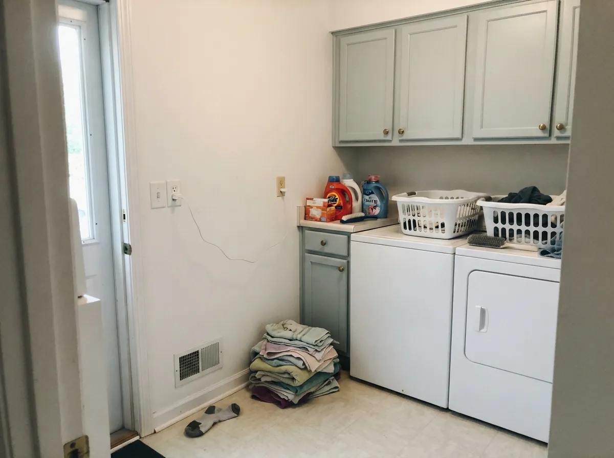
On a cabinet run it is soft rather than bold, which is exactly right for a small utility room. Satin, in a urethane-fortified cabinet paint. Chantilly Lace OC-65 on the walls above keeps the whole room from graying out.
It suits white or gray quartz, marble-look surfaces, and chrome or brass hardware. It fights honey oak, maple, and warm granite with tan flecks. If the counters are warm, this is the wrong wall color.
Full sun washes it lighter and paler, so expect less color outside than in. It sits well with gray stone, white trim, and Wrought Iron 2124-10 shutters; against red or orange brick it looks washed out. Porch ceilings in Smoke are a quiet nod to haint blue.
Your Light Is the Risk
Warm sun mutes the blue into a soft sea-glass gray. Its most flattering room.
Cool daylight strengthens the blue-green and can tip it violet-gray. Test first.
2700K lamps pull the blue out and leave plain gray. Try 3000-3500K bulbs.
At 4000K and above the blue snaps back hard and can read almost synthetic.
Most complaints about Smoke are a light mismatch. Upload a photo of your actual room and see it on your walls — then ask for the same wall in north light or evening lamps before you buy a single sample.
Need It From Another Brand?
Any paint counter can custom-tint Benjamin Moore 2122-40 directly. If you would rather stay in one brand's own deck, these are the closest stock matches, measured as ΔE2000. Under 2 is a difference you will not see on the wall.
| Brand | Closest color | ΔE | LRV | |
|---|---|---|---|---|
| Sherwin-Williams | Sleepy BlueSW 6225 · Sherwin-Williams | 1.2 | 58 | Color page → |
| Behr | Dusted BlueN470-2A · Behr | 0.4 | 56 | Color page → |
| Valspar | Degas Blue8004-35B · Valspar | 0.4 | 56 | Color page → |
| PPG / Glidden | Misty SurfPPG1034-4 · PPG / Glidden | 2.1 | 55 | Color page → |
| Glidden | Silver Blue Sea30BG 56/045 · Glidden | 2.7 | 56 | Color page → |
| Dutch Boy | Silvered Blue433-2DB · Dutch Boy | 3.0 | 55 | Color page → |
Similar Benjamin Moore Colors
The nearest shades to Smoke within Benjamin Moore's own range, ranked by perceptual color distance — useful when you want the same look a touch lighter, darker, or warmer.
WCAG 2.1: AA is 4.5 : 1 for normal text, 3 : 1 for large text, AAA is 7 : 1.
Smoke vs the Colors You're Also Considering
Every Smoke sample board has the same rivals on it. The numbers show the real lightness gap — then it comes down to which risk you would rather live with.
Pick this if you want the blue to stay quiet and behave like a gray.
Benjamin Moore HC-150 · LRV 39Yarmouth BluePick this if you want guests to actually call the room blue.
Pick this for the calmer version that survives a change of bulbs.
Benjamin Moore 2123-40 · LRV 55Gossamer BluePick this when the room needs a clearer, fresher blue-green.
Inside Benjamin Moore, Gossamer Blue 2123-40 at #B3C8C8 and LRV 55 is the bluer, slightly more saturated version, better if you want the color to be obvious. Yarmouth Blue HC-150 at #B5C8C9 and LRV 55 also reads bluer than Smoke. Silver Lake 1598 at #C0C6C5 and LRV 55 is the near-neutral gray of the group, and Seersucker Suit CSP-580 at #C3C7C5 and LRV 56 is greyer still with almost no blue left. Wales Gray 1585 at LRV 54 leans green, while Gentle Gray 1626 at LRV 57 is the lightest and coolest.
Across brands, Valspar Degas Blue 8004-35B at deltaE 0.39 and Behr Dusted Blue N470-2A at 0.4 are the same color for practical purposes. Sherwin-Williams Sleepy Blue SW 6225 at deltaE 1.23 and C2 Harmonic C2-976 at 1.44 are visually identical in normal room light. PPG Misty Surf PPG1034-4 at 2.06 and Dutch Boy Silvered Blue 433-2DB at 2.96 are very close, so sample first. Magnolia Home Loft JG-83 at 4.19 and Farrow and Ball Middle Ground No. 209 at 4.79 are close but visibly different side by side.
Smoke Coordinating Colors
Smoke is cool and low in saturation, which means it needs partners that do one of two jobs: keep it clean, or warm it up. Crisp whites keep it clean. Warm neutrals and one deep anchor keep it from feeling like a cold room. What it does not want is another washed-out cool gray beside it — two quiet cool colors together read as indecision.
These are the partners that come up again and again in real Smoke rooms:
Smoke on Cabinets and Vanities
This is the use that surprises people. On four walls Smoke can wander with the light, but on a cabinet run it is contained by whatever surrounds it — countertop, backsplash, wall color — and that stability is a gift. A Smoke vanity under a white wall stays a soft blue-gray from morning to night, because the white around it keeps giving the eye a reference point.
Bathroom vanities, laundry cabinets, mudroom lockers, and butler's pantries all take it well. Hardware decides the mood: chrome and polished nickel keep it crisp and coastal, unlacquered brass or aged bronze warms it into something older and softer. Use a satin urethane-fortified cabinet enamel, prime bare or previously stained wood, and let each coat cure properly before rehanging doors.
Smoke With Wood Tones and Warm Materials
This is where most Smoke regret starts, and it has nothing to do with the paint. Cool colors and warm woods sit on opposite sides of the color wheel, so each one makes the other look more extreme. Put Smoke over orange-toned builder oak and the floor turns more orange while the wall turns more clinical. Cherry and red oak do the same thing. Dark espresso floors do something different but no better — the contrast is so heavy that the room reads dim even though the walls are reflecting plenty of light.
What it loves: white oak, pale ash, gray-washed floors, rattan, linen, pale stone, and honed soapstone. Those materials are either cool or neutral enough to meet Smoke halfway.
If you are stuck with warm floors and still want this family of color, do not force it — step toward the green side of the wheel, where Quiet Moments 1563 and Wales Gray 1585 live. They keep the calm and get along with wood far better than Smoke does.
Three Ready Palettes Built on Smoke
A color is never alone on the wall. These are complete combinations in the 60-30-10 pattern, with the reason each one holds together. Every one opens in the visualizer.
Smoke holds the 60 percent, and the crisp white keeps its blue-green looking clean rather than dusty. The navy vanity is the single dark anchor the room needs; since all three are cool, let brass or matte black hardware supply the warmth.
Try this palette in your roomAlabaster's soft warmth stops the room from feeling clinical and makes the blue-green in the wall read clearer by contrast. Pashmina is the warm 10 percent that keeps the whole scheme from going cold after dark.
Try this palette in your roomSun pales Smoke down outside, so it needs a warm white beside it to stay a color instead of a haze. Wrought Iron gives the facade its dark frame and makes the blue-green read deliberate from the street.
Try this palette in your roomSmoke FAQ
Will Smoke look baby blue on my walls?
In a bright south- or west-facing room, it can get close — full sun burns off the gray and leaves a pale, pastel blue. In average light and in north rooms it stays clearly gray-blue. Paint a two-foot sample and look at it at noon, not at 6 p.m.
Does Smoke work on kitchen or bathroom cabinets?
Yes, and it is one of its best uses. On a vanity or a laundry run it reads soft and painted rather than bold, and it looks right with chrome, nickel, or unlacquered brass. Use a satin urethane-fortified cabinet paint and prime bare wood properly.
Smoke or Woodlawn Blue?
Woodlawn Blue HC-147 is lighter and clearly greener — it reads like a soft sea-green in most rooms. Smoke is grayer and cooler, and it behaves more like a neutral. Choose Woodlawn Blue if you want the room to feel colored, Smoke if you want it to feel calm.
What flooring goes with Smoke?
White oak, pale gray-washed wood, light LVP, and pale stone are the easy wins. Orange-toned builder oak, red oak, and cherry fight it, and dark espresso makes the room feel heavy. If your floor is warm, hold the sample flat against it before deciding.
What sheen should I use?
Eggshell on walls, satin in bathrooms and on cabinets, semi-gloss on trim. Skip flat and matte on large walls — at this lightness they can look chalky. Note that higher sheens read a touch darker and cooler because they bounce more of the room's light back at you.
Is Smoke good for exterior shutters and a front door?
It works, but understand what you get: on a small area in full sun it pales out and looks soft, not punchy. Against a white or off-white house it is pretty and quiet. If you want the shutters to actually stand out from the street, go two or three steps darker with something like Van Deusen Blue HC-156.
Have you painted with Smoke?
Rate it — one tap helps the next reader decide.
Ask a Question