Drizzle
The foggy blue-gray Behr sells for calm rooms, reviewed honestly: where it stays a true quiet gray, the exact light that flips it toward lavender, and what to pick instead.

Jessica has spec'd whites and neutrals for more than 300 rooms and keeps a sample wall of painted drawdowns in her studio. Every color review is checked against real reader rooms in the comments and re-tested when a formula changes. About the testing process →
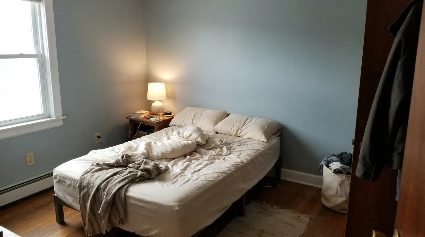
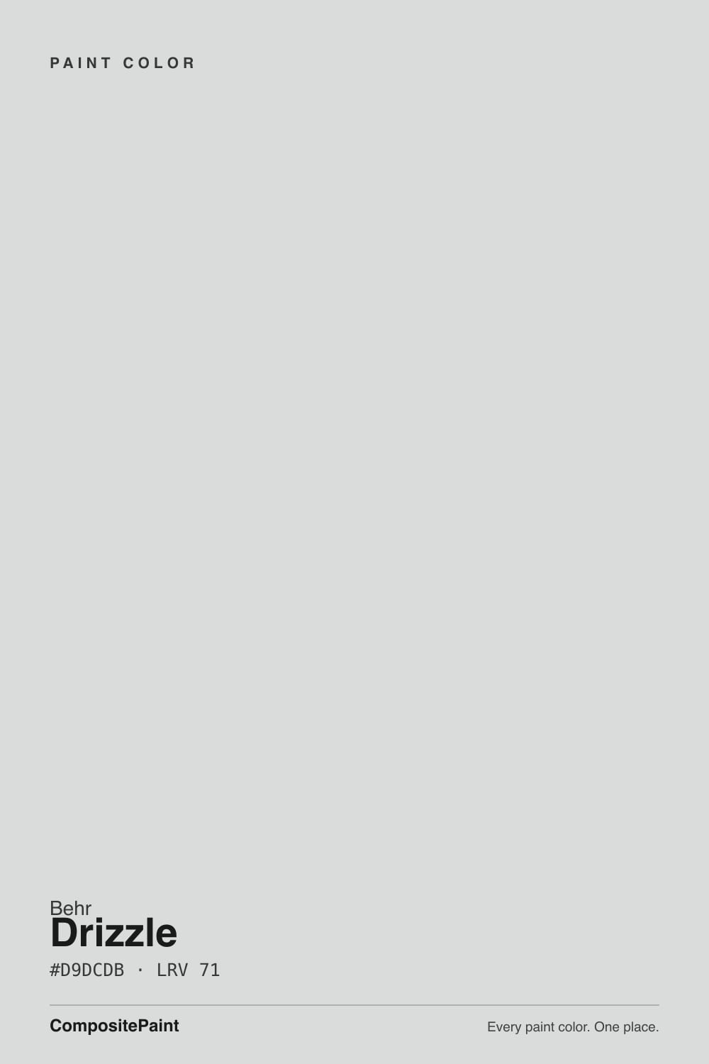
- 1Stardew43
- 2Sea Salt63
- 3Drizzle71
- 4Spring Thaw83
The Fast Verdict
Drizzle is Behr's answer to "just a calm, misty gray" — a very light, low-chroma gray with a faint blue-green cast that Behr itself files under its Gray family. It reads exactly like its name in the right light: a foggy morning with a light sprinkle in the air. Give it real daylight and it stays a quiet, believable neutral; take the daylight away and the cool base can drift toward a pale lavender that surprised more than one buyer who wanted plain gray.
Bedrooms and bathrooms that want calm, not drama · rooms with real south or west daylight · exteriors — Behr sells it in the Marquee line · pairing with brass, walnut, and soft blue-green accents
You want a warm greige, not a cool gray · your room is north-facing and dim · you're set on zero purple, zero blue-green — ever · your floors and trim lean heavily honey-gold
- A genuinely calm, low-drama light gray with no yellow undertone to fight
- LRV 71 keeps rooms bright without going stark white
- Real exterior use in Behr's Marquee line, not just an interior guess
- Flatters brass, walnut, and blue-green accents without a fight
- Good at lightening a dim room while staying a believable neutral
- Cool, dim, or LED-lit rooms can pull it toward a visible lavender flash
- No warmth of its own — clashes with honey-oak floors and gold-beige trim
- Not a documented cabinet color the way some Behr grays are
- Buyers expecting a flat, zero-undertone gray are the most common disappointed reviewers
What Color Is Drizzle, Really?
A very light, low-chroma cool gray with a faint blue-green cast — Behr's own listing puts it in the Gray family with a misty, blue-leaning undertone, and that description matches the deck's own hex closely (RGB 217/220/219, barely a shade off pure gray). It is not a greige: there is no yellow or brown underneath it pulling it warm. What is underneath is a whisper of blue-green, which is exactly what makes it feel foggy and quiet rather than stark.
At LRV 71 it is genuinely light and reflects most of the light that hits it, but it still holds enough body to read as "gray," not "white." One Home Depot reviewer described it as "the perfect color of a foggy gray fall morning when there's a light sprinkle in the air" — a description that happens to double as free marketing copy for the name. Another reviewer used it in a dark entryway specifically to lighten the space, and called it, in their words, the "lightest shade of lavender" they owned — which is the honest tell: in dim or cool-leaning light, this gray can visibly lean violet.
Undertone in one line: cool, blue-green first, with a lavender flash waiting in low or cool light. If your sample looks purple on the wall, that is not a defect — it is the same undertone every pale cool gray in this family carries, just showing itself more plainly than it does in bright daylight.
Where It Shines
Give it real daylight and it is a genuinely calm, dependable light gray — the kind of color a bedroom or bathroom asks for when the goal is quiet rather than a statement. It sits comfortably next to brass, walnut, and soft blue-green tile without fighting any of them, and because Behr sells it across both the interior Premium Plus line and the exterior Marquee line, it is one of the few colors in this family with a documented, honest exterior use rather than a guess.
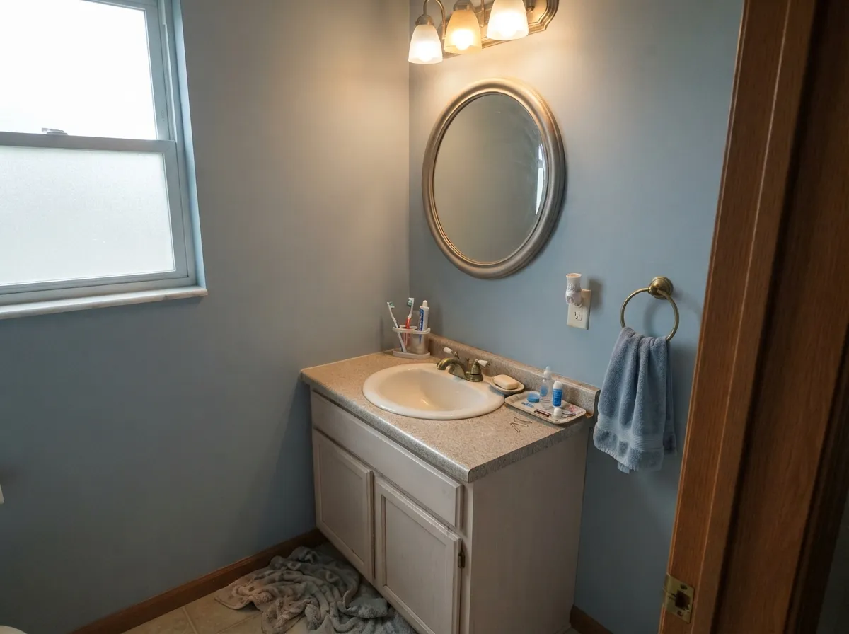
Where It Fails
Almost every regret story with Drizzle traces back to one of three situations, and none of them are the paint's fault — they are the color meeting the wrong light or the wrong floor.
On the chip it can pass for a no-undertone neutral. On four walls, especially in cooler or dimmer light, the blue-green base shows a lavender flash — the exact thing one owner described as "the lightest shade of lavender." If you need zero color drift, a truer gray like BM Collingwood is the safer bet.
Cool light amplifies the blue-green base instead of softening it, and without warm bulbs to counter it the wall can read flat, chilly, and slightly purple rather than the calm fog the name promises. Sample it under your actual bulbs before committing a whole room.
Because Drizzle carries no warmth of its own, a room full of yellow-gold wood or beige carpet can make the gray look washed-out and slightly cold by contrast rather than blending with it. It needs neutral or cool-leaning wood — walnut, gray-washed oak, white oak — to feel intentional.
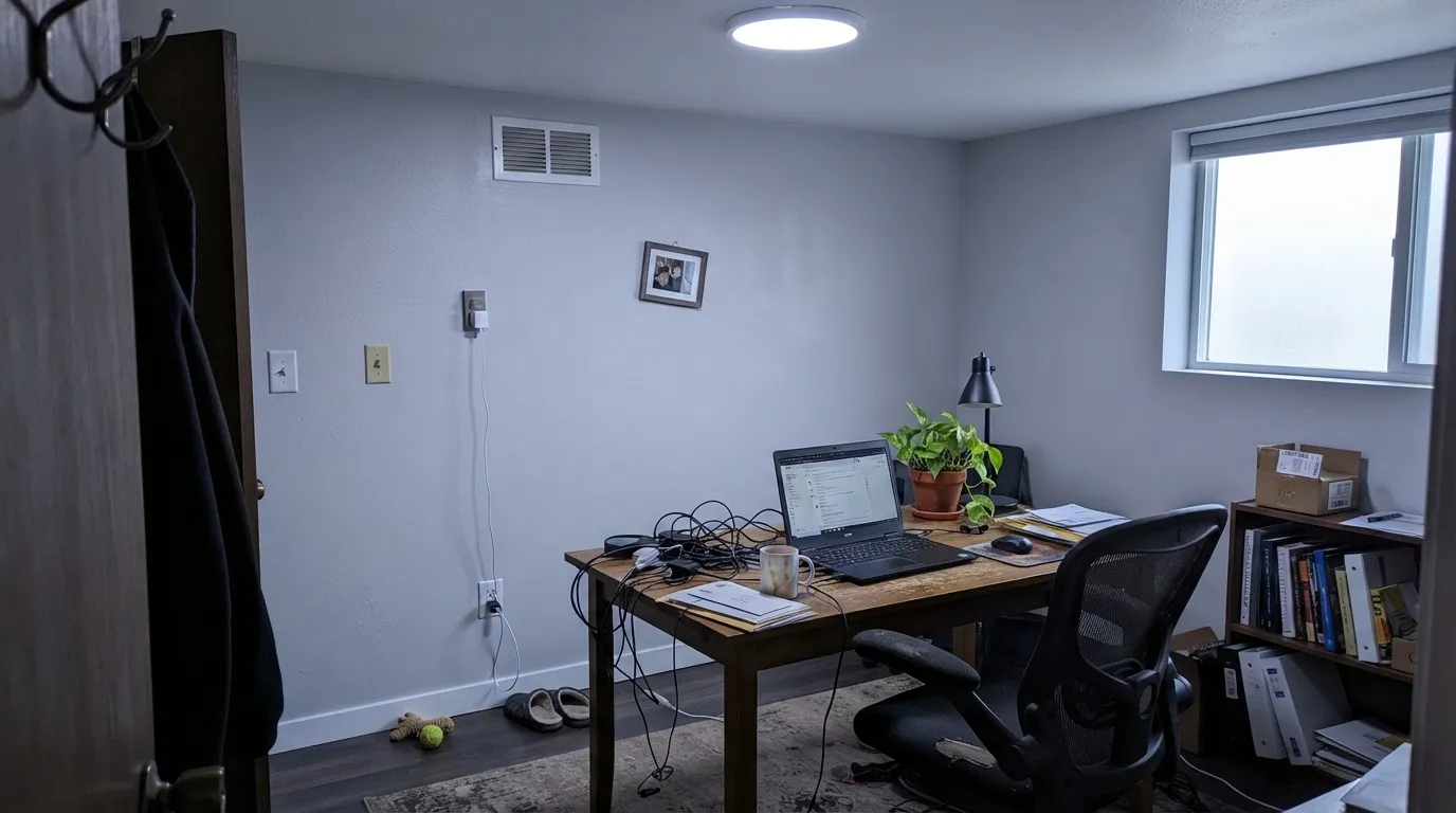
Room by Room
Calm and foggy in daylight, and with warm lamps at night it settles rather than chills. Eggshell on the walls, White Dove or another warm white on trim to keep the edges soft.
The blue-green whisper pairs naturally with spa greens and marble-look tile, and at LRV 71 it hides less light than a darker gray would in a room that's usually small and short on windows. Satin finish for the moisture.
A believable quiet neutral when the room gets south or west sun. In a shaded or north-facing living room, expect the cool base to show more and consider warmer bulbs from the start.
It is not the deck's obvious cabinet color — there is no documented Behr cabinet push for it — but on an island or a small run of cabinets against butcher block and brass it can work. A full kitchen of it over honey-oak floors is the risky version.
One real owner used it for exactly this: an entryway too dark for a stronger color. It brightened the space, though the same owner noted the lavender lean — go in expecting a hint of that, not a flat gray.
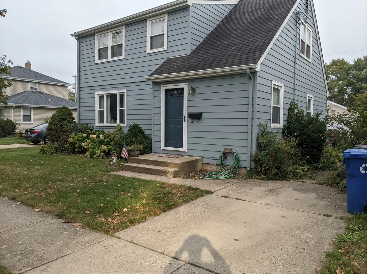
Behr sells Drizzle in its Marquee exterior line, so this is not a stretch application. In full sun it reads brighter and slightly cooler than indoors; pair with a crisp white trim and a dark door for contrast, or a dark gray-black like Wrought Iron for a modern, quiet facade.
Your Light Is the Risk
Full, real daylight keeps it a calm, believable gray with just the faint blue-green whisper the name promises — no lavender drift.
Cool, indirect light amplifies the blue-green base instead of softening it, and the wall can visibly lean lavender. Test under your real bulbs first.
Foggy and quiet at midday, it can go a touch cooler and flatter as the light drops toward evening — plan warm lamps for after dark.
2700K warm bulbs keep it grounded and gray. Cool white LEDs are the single biggest cause of the lavender complaints — swap the bulb before you swap the paint.
Most complaints about Drizzle are a light mismatch. Upload a photo of your actual room and see it on your walls — then ask for the same wall in north light or evening lamps before you buy a single sample.
Need It From Another Brand?
Any paint counter can custom-tint Behr PPU26-14 directly. If you would rather stay in one brand's own deck, these are the closest stock matches, measured as ΔE2000. Under 2 is a difference you will not see on the wall.
| Brand | Closest color | ΔE | LRV | |
|---|---|---|---|---|
| Sherwin-Williams | Spatial WhiteSW 6259 · Sherwin-Williams | 2.0 | 72 | Color page → |
| Benjamin Moore | Gray Cloud2126-60 · Benjamin Moore | 1.6 | 70 | Color page → |
| Valspar | Tsunami Sky7004-4 · Valspar | 0.6 | 70.2 | Color page → |
| PPG / Glidden | Thin IcePPG1001-3 · PPG / Glidden | 0.2 | 70 | Color page → |
| Glidden | Thin IcePPG1001-3 · Glidden | 0.0 | 71 | Color page → |
| Dutch Boy | Vapor438-1DB · Dutch Boy | 1.5 | 71 | Color page → |
Similar Behr Colors
The nearest shades to Drizzle within Behr's own range, ranked by perceptual color distance — useful when you want the same look a touch lighter, darker, or warmer.
WCAG 2.1: AA is 4.5 : 1 for normal text, 3 : 1 for large text, AAA is 7 : 1.
Drizzle vs the Colors You're Also Considering
Every Drizzle sample board has the same rivals on it. The numbers show the real lightness gap — then it comes down to which risk you would rather live with.
Pick this if you specifically want Behr's blue-green lean rather than SW's slightly different quiet gray base.
Sherwin-Williams SW 7646 · LRV 69First StarPick this if your painter works in Sherwin-Williams — it carries the same quiet, low-drama gray character with its own flash risk to watch for.
Pick this for the lighter LRV and the softer, mistier read Collingwood doesn't quite have.
Benjamin Moore 859 · LRV 62CollingwoodPick this if you want a truer gray that refuses to drift toward greige or lavender in any light.
Behr Silver Charm PPL-65 shares the exact hex #D9DCDB and LRV 71, so it is the same color under a different name. Behr White Lie MQ3-55, hex #DCDCDB at LRV 72, is marginally lighter and more neutral, and Behr Billowing Clouds HDC-CT-16, hex #D7DCDF at LRV 71, is the coolest of the group with a clearer blue lean. Behr White City N140-1 at LRV 70, hex #DADADA, is the flat gray with no lean at all.
Across brands, Glidden Thin Ice PPG1001-3 at deltaE 0 is an exact match, and Valspar Tsunami Sky 7004-4 at deltaE 0.55 is effectively the same color. Benjamin Moore Gray Cloud 2126-60 at LRV 70 and deltaE 1.64 is visually identical in normal room light, as is Farrow and Ball Blackened No. 2011 at deltaE 1.5.
Sherwin-Williams Spatial White SW 6259 at LRV 72 and deltaE 2.03 is very close but worth sampling first, since it reads a touch warmer.
Drizzle Coordinating Colors
The rule for coordinating with Drizzle is simple: keep everything either warm-white or cool-neutral, and let the blue-green whisper do the accent work rather than fighting it with gold. These are the partners that keep it reading calm instead of accidental:
Drizzle on Exteriors
Unlike a lot of pale interior grays that only get an exterior use by guesswork, Drizzle has a real one: Behr sells it in the Marquee exterior paint and primer line. That matters because it means the color has been formulated and tested for sun, weathering, and full outdoor light, not just extrapolated from an interior chip.
Outside, expect it to read a shade brighter and cooler than it does on an indoor wall — full sun washes every pale gray lighter. Pair it with a clean white trim for a classic, crisp look, or a near-black like Wrought Iron or Behr's own Cracked Pepper on the door and shutters for a quieter, more modern facade. Because it carries no warmth of its own, it sits more comfortably next to gray or black roofing than next to warm terracotta or red brick.
Drizzle With Wood Tones and Floors
This decision gets made at the floor, not the paint store. Walnut, espresso, and gray-washed or pale white oak all sit comfortably next to Drizzle — none of them fight the cool blue-green base, and the contrast reads deliberate rather than cold.
The honest no is anything gold: honey oak floors, orange-toned trim, or warm beige carpet. Because Drizzle has no yellow or brown warmth of its own to meet them halfway, the gray tends to look slightly washed-out and the wood tends to look slightly more orange by contrast. If the golden floor is staying, a warmer greige will do more for the room than Drizzle will.
Three Ready Palettes Built on Drizzle
A color is never alone on the wall. These are complete combinations in the 60-30-10 pattern, with the reason each one holds together. Every one opens in the visualizer.
A warm trim white keeps Drizzle from tipping cold, and one navy accent wall gives the room a single grounded dark note instead of leaving the whole space in the same cool register.
Try this palette in your roomDrizzle's blue-green whisper is exactly the undertone Beach Glass amplifies, so a vanity or tile in that deeper blue-green reads deliberate instead of accidental. Crisp trim keeps the small room from feeling foggy in the wrong way.
Try this palette in your roomBehr already sells Drizzle for exteriors in the Marquee line, and this is the same brand's own trim white and near-black door paired against it — crisp, modern, and none of the three colors are a guess about how they'd behave together outdoors.
Try this palette in your roomDrizzle FAQ
Is Behr Drizzle gray or does it look purple?
It is a true light gray with a faint blue-green undertone, not a purple by design. But in cool or dim light — especially under cool LED bulbs — the base can visibly flash lavender, which is the single most common surprise owners report. In real daylight with warm bulbs at night, it reads gray.
What LRV is Behr Drizzle?
71 — a genuinely light color that reflects most of the light hitting it, one notch below a near-white like Behr's own Polar Bear (LRV 86) but clearly lighter than a mid-tone gray.
Is Drizzle the same as Behr's Light Drizzle?
No — they are two different colors that only share part of a name. Drizzle is PPU26-14, this review's color. Light Drizzle is a separate Behr color, N480-1, sold in the cabinet-and-trim enamel line. Double-check the code before you buy.
Can I use Drizzle on a house exterior?
Yes — Behr sells it in the Marquee exterior line, so this is a documented use, not a guess. In full sun it reads a touch brighter and cooler than it does indoors. A crisp white or near-black trim gives it the cleanest contrast.
What trim color goes with Drizzle walls?
A warm white like White Dove or Swiss Coffee keeps the pairing from reading cold on both sides. A crisp, cooler white like Extra White also works and reads more modern — just expect slightly less warmth softening the gray.
Does Drizzle work with honey oak floors?
Not comfortably. Drizzle carries no warmth of its own, so gold-toned wood or beige carpet tends to make the gray look washed-out rather than blended. It pairs far better with walnut, gray-washed floors, or pale white oak.
Have you painted with Drizzle?
Rate it — one tap helps the next reader decide.
Ask a Question