Collingwood
Benjamin Moore's best-selling "true gray" reviewed honestly: why designers keep specifying it, the one trim mistake that ruins it, and what to pick instead.

Jessica has spec'd whites and neutrals for more than 300 rooms and keeps a sample wall of painted drawdowns in her studio. Every color review is checked against real reader rooms in the comments and re-tested when a formula changes. About the testing process →
- 1Mindful Gray48
- 2Revere Pewter55
- 3Collingwood62
- 4Pale Oak69
- 5Shoji White74
The Fast Verdict
Collingwood is the gray you get when a designer is tired of greiges that quietly turn beige on you. It carries a whisper of violet instead of the usual yellow, which is exactly why it holds its gray identity through more lighting conditions than almost anything else in the BM deck. It is not a Color of the Year, it has no viral moment — it is just the neutral that keeps showing up in real houses because it rarely goes wrong.
Whole-house walls with crisp white trim · living rooms and bedrooms that want real gray, not greige · kitchen cabinets with wood and brass · buyers who tested five greiges and wanted the one with no drama
You're pairing it with cream or ivory trim · your room is south-facing and blasted with midday sun · you want a color with a strong, single warm or cool identity · you need real depth for a moody accent wall
- A genuinely rare "true gray" that resists flipping to greige as the light changes
- Best-selling and dependable — the review corpus has remarkably few real complaints
- Works with both crisp white trim and stained wood, not just one or the other
- LRV 62 keeps rooms bright without reading stark or clinical
- Flexible companion palette: whites, blacks, blues, and muted pinks all sit comfortably next to it
- The violet whisper can flash faintly pink, lilac, or even minty depending on the specific room's reflected light — no two houses show the exact same version
- Cream or ivory trim genuinely clashes with it — has to be crisp white or wood, nothing in between
- A very bright, south-facing room can wash it out and flatten the depth
- Sold under two different codes (OC-28 and 859) for the same paint, which can trip up an order or a touch-up match
What Color Is Collingwood, Really?
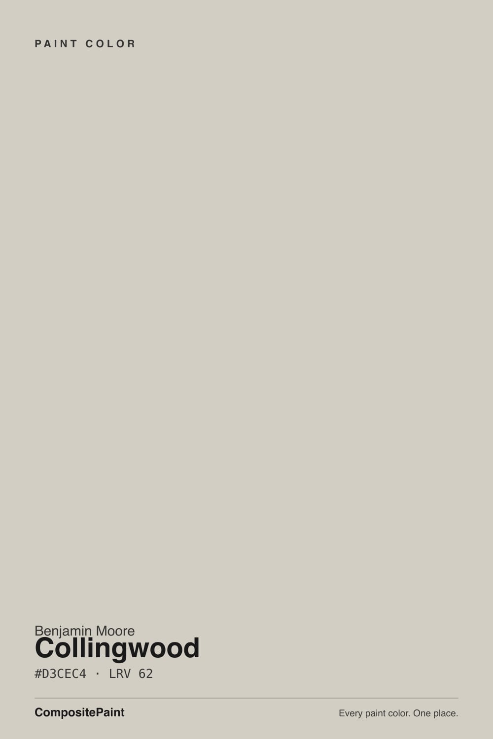
A soft, balanced gray with a whisper of violet — and that whisper is the entire reason people love it. Most "gray" paints are secretly greige, built on a warm yellow-brown base that drifts toward beige the moment the light turns warm (Revere Pewter and Edgecomb Gray both do this). Collingwood's undertone runs the other direction, toward a barely-there purple, which keeps it reading as gray rather than tan across a wider range of light than its warm-based cousins. Designers describe it as one of the few "true" non-undertoned grays in the deck, even though technically it has one — it is just quiet enough that almost nobody names it on sight.
At LRV 62 it sits in the sweet spot: light enough to keep a room from feeling closed in, with enough body to read as an actual color rather than an off-white. It is sold today as 859 and was previously catalogued as OC-28 — same formula, same chip, just an old code you will still see on older blog posts and Pinterest boards. If a paint store's system only recognizes one of the two, ask them to look up the other.
Undertone in one line: gray first, a whisper of violet second — the kind of undertone that shows up as a mood rather than a color. If your wall looks distinctly lilac or pink, that is your light or your trim doing it, not a bad batch.
Where It Shines
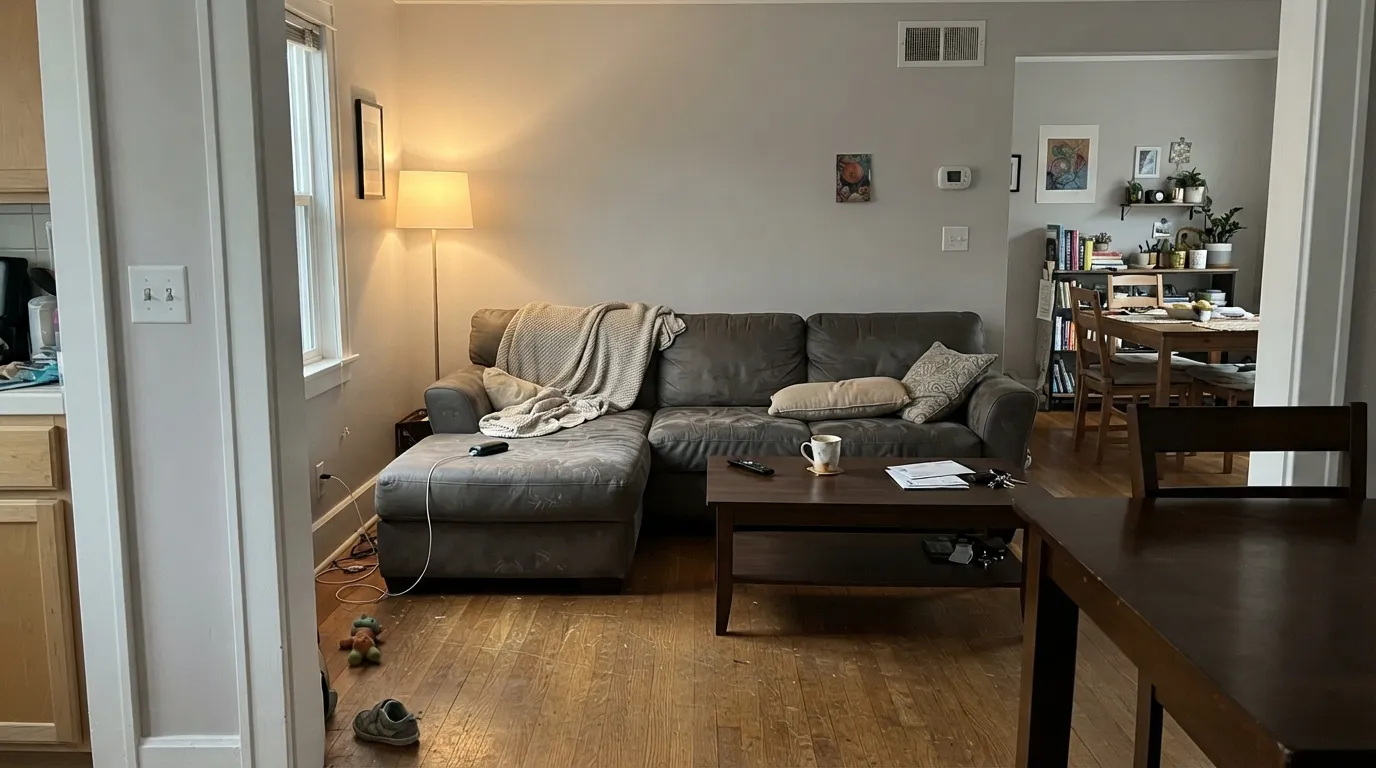
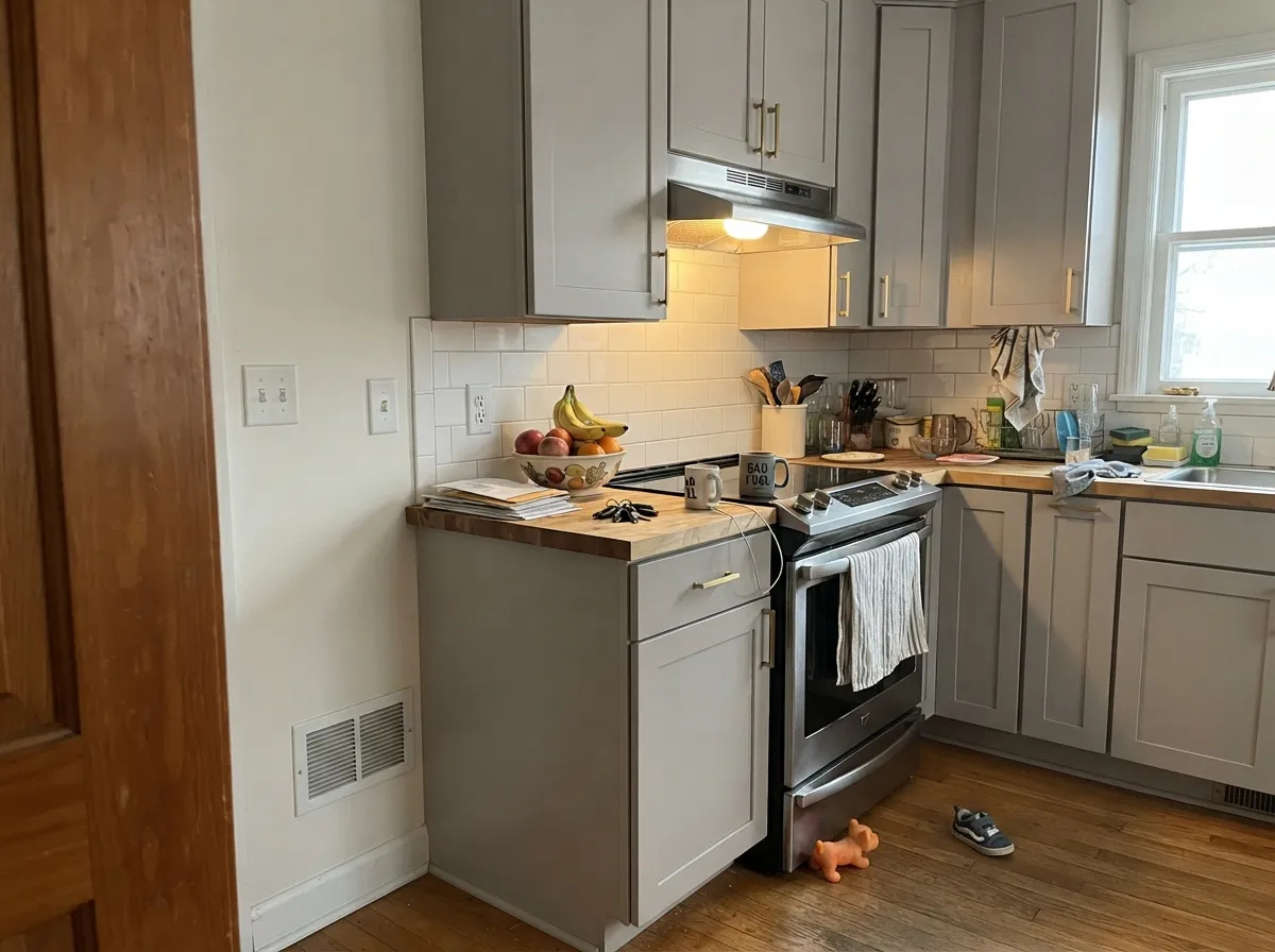
Give it real, indirect daylight and white trim and it is close to foolproof. Multiple designers who have specified it for years report the same thing: unlike Revere Pewter or Edgecomb Gray, it does not flip from gray to greige as the light changes through the day — it just stays a calm, soft gray. That stability is why it works as a whole-house color running from an open-concept living room into a hallway into a bedroom without ever looking like three different paints. On kitchen cabinets in satin, paired with butcher block or brass, it reads current without chasing a trend that will date the room in five years.
Where It Fails
Collingwood has fewer documented complaints than almost any color this popular, which makes the real failure patterns worth taking seriously — they are specific, not generic.
This is the one mistake reviewers call out by name: pair Collingwood's true-gray whisper of violet against warm cream or ivory woodwork and the two undertones fight — one designer flatly calls the combination "a hot mess." Use a crisp white (Chantilly Lace, Simply White) or go the other way with stained wood trim; skip anything in between.
At LRV 62 it already sits on the lighter side, and strong midday sun can wash out the little depth it has, leaving walls that look pale and flat instead of a considered gray. Rooms with heavy south exposure should sample a large board at noon before committing to four walls.
Warm 2700K bulbs keep the violet whisper reading as a soft, settled gray. Swap in cool white LEDs with no daylight backup and the same wall can look flat and slightly cold after dark — a bulb problem, not a paint problem, and the cheapest fix in this review.
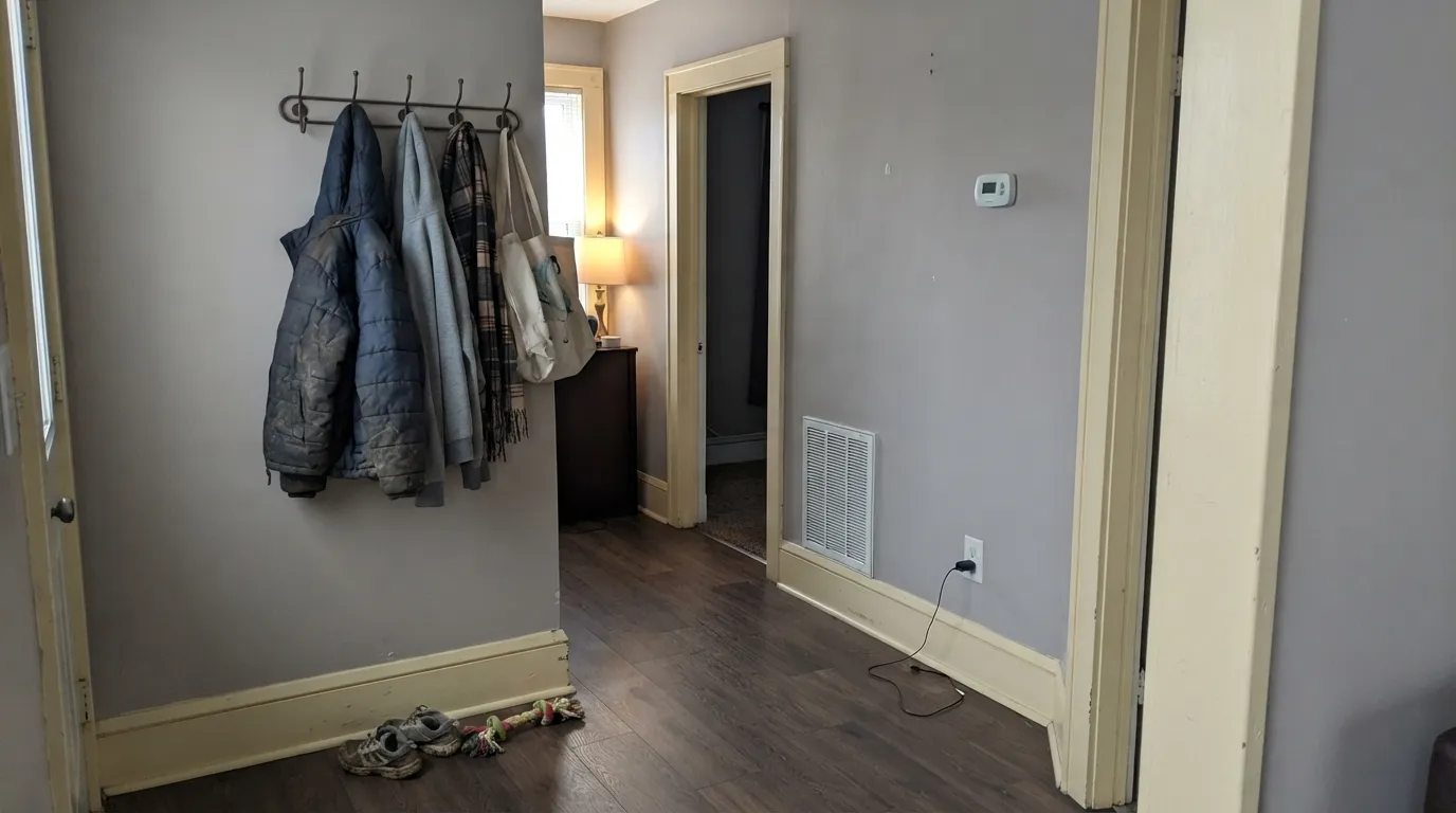
Room by Room
The daily-driver use case. With white trim and any real daylight it is a calm, grown-up backdrop that does not compete with furniture or art. Eggshell finish.
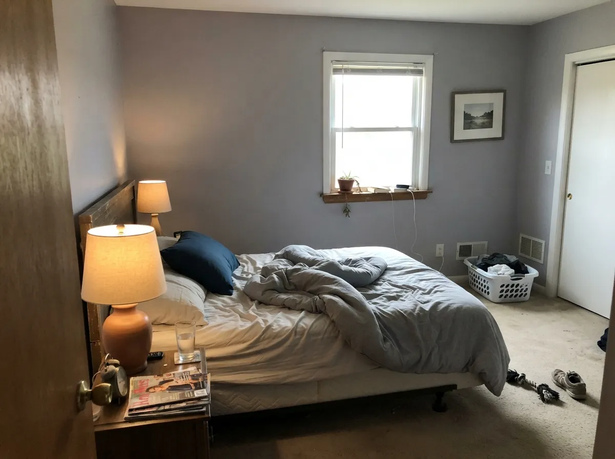
Quiet and restful without going cold. Pairs especially well with blue accents — bedding, a headboard wall, ceramics — which read as an intentional cool note against the violet whisper instead of a clash.
Satin Collingwood cabinets against a warm white wall, with brass or black hardware, is a combination designers reach for on purpose. It coordinates with maple, cherry, oak and most stained woods without a fight.
Plays well with white or warm-veined marble and most tile. Cool blue-gray tile can pull it slightly toward flat; a large sample next to your actual tile settles it fast.
It shows up on exteriors less often than on interiors, but the same logic holds outdoors: with white trim it reads as a clean, current gray rather than the beige-drift you get from warmer neutrals in full sun. Not the deck's headline exterior color, just a safe one.
This is where it earns its reputation: run it from room to room with consistent white trim and it holds its identity better than most whole-house neutrals, warm or cool.
Your Light Is the Risk
Strong but not direct light is where it reads most like the chip: a calm, balanced true gray, no obvious warm or cool lean.
Direct, strong light washes out the little depth LRV 62 has to give, and the wall can look pale and flat rather than gray. Sample at noon first.
Owners report it flashing faintly violet, pink, or even minty at different hours as the reflected light changes — genuine chameleon behavior, not a flaw, just something to expect.
2700K lamps keep it a settled, soft gray after dark. Cool white LEDs with no daylight backup can flatten it slightly — swap the bulb before you second-guess the paint.
Most complaints about Collingwood are a light mismatch. Upload a photo of your actual room and see it on your walls — then ask for the same wall in north light or evening lamps before you buy a single sample.
Need It From Another Brand?
Any paint counter can custom-tint Benjamin Moore 859 directly. If you would rather stay in one brand's own deck, these are the closest stock matches, measured as ΔE2000. Under 2 is a difference you will not see on the wall.
| Brand | Closest color | ΔE | LRV | |
|---|---|---|---|---|
| Sherwin-Williams | Gossamer VeilSW 9165 · Sherwin-Williams | 0.0 | 62 | Color page → |
| Behr | Granite DustMQ3-06 · Behr | 2.0 | 63 | Color page → |
| Valspar | Secluded BeachV146-1 · Valspar | 1.6 | 62.4 | Color page → |
| PPG / Glidden | River RockPPG18-02 · PPG / Glidden | 3.5 | 62 | Color page → |
| Glidden | WhiskersPPG1025-3 · Glidden | 0.5 | 61 | Color page → |
| Dutch Boy | Shimmering Silver406-2DB · Dutch Boy | 1.8 | 61 | Color page → |
Similar Benjamin Moore Colors
The nearest shades to Collingwood within Benjamin Moore's own range, ranked by perceptual color distance — useful when you want the same look a touch lighter, darker, or warmer.
WCAG 2.1: AA is 4.5 : 1 for normal text, 3 : 1 for large text, AAA is 7 : 1.
Collingwood vs the Colors You're Also Considering
Every Collingwood sample board has the same rivals on it. The numbers show the real lightness gap — then it comes down to which risk you would rather live with.
Pick this for the lighter, slightly warmer read that holds its balance across more rooms.
Sherwin-Williams SW 7015 · LRV 58Repose GrayPick this if you want it a touch cooler and darker — closer to a plain true gray with less of the violet whisper.
Pick this if you want a neutral that stays gray instead of drifting toward beige as the light shifts.
Benjamin Moore HC-172 · LRV 56Revere PewterPick this if you actually want it to lean warmer and greige — the classic move from gray toward taupe.
Sherwin-Williams Gossamer Veil SW 9165 is the headline comparison. It shares the same hex of #D3CEC4 and the same LRV of 62, and the calculated deltaE is 0. For practical purposes these are the same color from two companies, so the choice comes down to where you buy paint. Benjamin Moore sells through independent dealers rather than a national chain, which is simply a difference in where you pick up the can.
Glidden Whiskers PPG1025-3 at #D1CCC2 and LRV 61 is a deltaE of 0.48, and Behr Toasty Gray N320-2 at #D2CCC3 and LRV 61 is 0.91. Both are effectively the same color on a wall. Dunn-Edwards Miner's Dust DEC786 matches closely on hex at deltaE 0.47 but is listed at LRV 58, so it will read slightly deeper in a dim room.
Farther out, Farrow and Ball Shaded White No. 201 at LRV 63 is a deltaE of 2.10, very close but worth sampling first, since it carries a touch more yellow. PPG River Rock PPG18-02 at deltaE 3.48 is close but visibly different side by side, reading pinker.
Collingwood Coordinating Colors
The rule for coordinating with Collingwood is simple: crisp whites, near-blacks, and blues all sit comfortably next to it, while cream and ivory are the one pairing to avoid. These are the partners that keep showing up in rooms that work:
Why Collingwood Has Almost No Bad Reviews
Collingwood is not a Color of the Year, it has no viral TV-show moment, and no single celebrity designer claims it. What it has instead is an unusually clean track record: across years of designer write-ups and color-review sites, the complaints that dog most popular grays — flipping greige in the afternoon, reading blue-gray in a north room, going dingy under cheap bulbs — mostly do not show up here. One long-time specifier put it plainly: after years of using it, she has never heard a client complain about seeing purple in their room, even though the undertone is technically there.
That is the honest story: Collingwood earned its best-seller status the boring way, by consistently doing what the chip promises. If you are looking for a color with a dramatic reveal, this is not it. If you are looking for the neutral that will not make you regret the choice in six months, this is one of the safer bets in the entire Benjamin Moore deck.
Collingwood With Wood Tones and Floors
Because Collingwood's undertone is violet rather than the usual warm yellow-brown, it does not compete with wood the way a lot of "warm gray" paints do. Maple, cherry, natural oak, walnut and most stained trim all coordinate with it comfortably — there is no single wood tone it is documented to fight, which is unusual for a gray this popular.
The practical takeaway: unlike beiges and warm greiges, which need their wood tone to match their own warmth, Collingwood's job is mostly to stay out of the way, and it does. If your floors already work with a plain gray, they will work with this one.
Three Ready Palettes Built on Collingwood
A color is never alone on the wall. These are complete combinations in the 60-30-10 pattern, with the reason each one holds together. Every one opens in the visualizer.
Crisp white trim is what keeps Collingwood honestly gray instead of sliding toward the cream-trim clash reviewers warn about. The charcoal door supplies one dark, grounding note without fighting the wall's whisper of violet.
Try this palette in your roomA warm white wall keeps the kitchen bright while the gray cabinets stay genuinely gray rather than sliding into greige next to wood counters and brass. The near-black accent grounds the palette without adding a second competing undertone.
Try this palette in your roomCollingwood's whisper of violet makes blue read as a deliberate cool accent instead of a clash, which is why designers list blue among its best companions. Crisp white trim keeps the room from feeling murky.
Try this palette in your roomCollingwood FAQ
Is Collingwood warm or cool?
Neither, on purpose — that is the whole appeal. It carries a whisper of violet rather than the usual warm yellow-brown base most "grays" hide, which is why it holds a true-gray identity through more lighting conditions than warmer neutrals like Revere Pewter or Edgecomb Gray.
Is Collingwood the same as OC-28?
Yes. OC-28 is the older Benjamin Moore code for the exact same paint now sold as 859 — same formula, same chip. You will still see OC-28 on older blog posts and Pinterest boards; if your paint store's system only pulls up one code, ask them to search the other.
What trim goes with Collingwood?
Crisp white — Chantilly Lace or Simply White — or stained wood trim. Cream or ivory trim is the one documented mistake: the warm trim and the gray's violet whisper argue with each other and the wall can look dingy by comparison.
Does it work in a north-facing or low-light room?
Reasonably well — it is more forgiving of dim, indirect light than it is of harsh direct sun. It can read a touch flat under cool LEDs with no daylight backup; warm 2700K bulbs fix that instantly.
Collingwood or Repose Gray — which should I pick?
Repose Gray (SW 7015, LRV 58) runs a touch cooler and darker, closer to a plain true gray. Collingwood (LRV 62) is lighter and holds its balance across more rooms without one color reading obviously "grayer" than the other. Either is a safe, low-drama choice; pick based on the depth you want.
Can I use it on kitchen cabinets?
Yes, and it is one of its most-loved uses. Satin Collingwood cabinets coordinate with maple, cherry, oak and most stained wood, and read current without the strong warm or cool identity that dates a kitchen fast.
Have you painted with Collingwood?
Rate it — one tap helps the next reader decide.
Ask a Question