Abalone
Benjamin Moore's quietest warm gray, reviewed honestly: the mauve undertone almost nobody talks about, where it shows, and what to pick instead.

Jessica has spec'd whites and neutrals for more than 300 rooms and keeps a sample wall of painted drawdowns in her studio. Every color review is checked against real reader rooms in the comments and re-tested when a formula changes. About the testing process →
- 1Mindful Gray48
- 2Revere Pewter55
- 3Abalone62
- 4Pale Oak69
- 5Shoji White74
The Fast Verdict
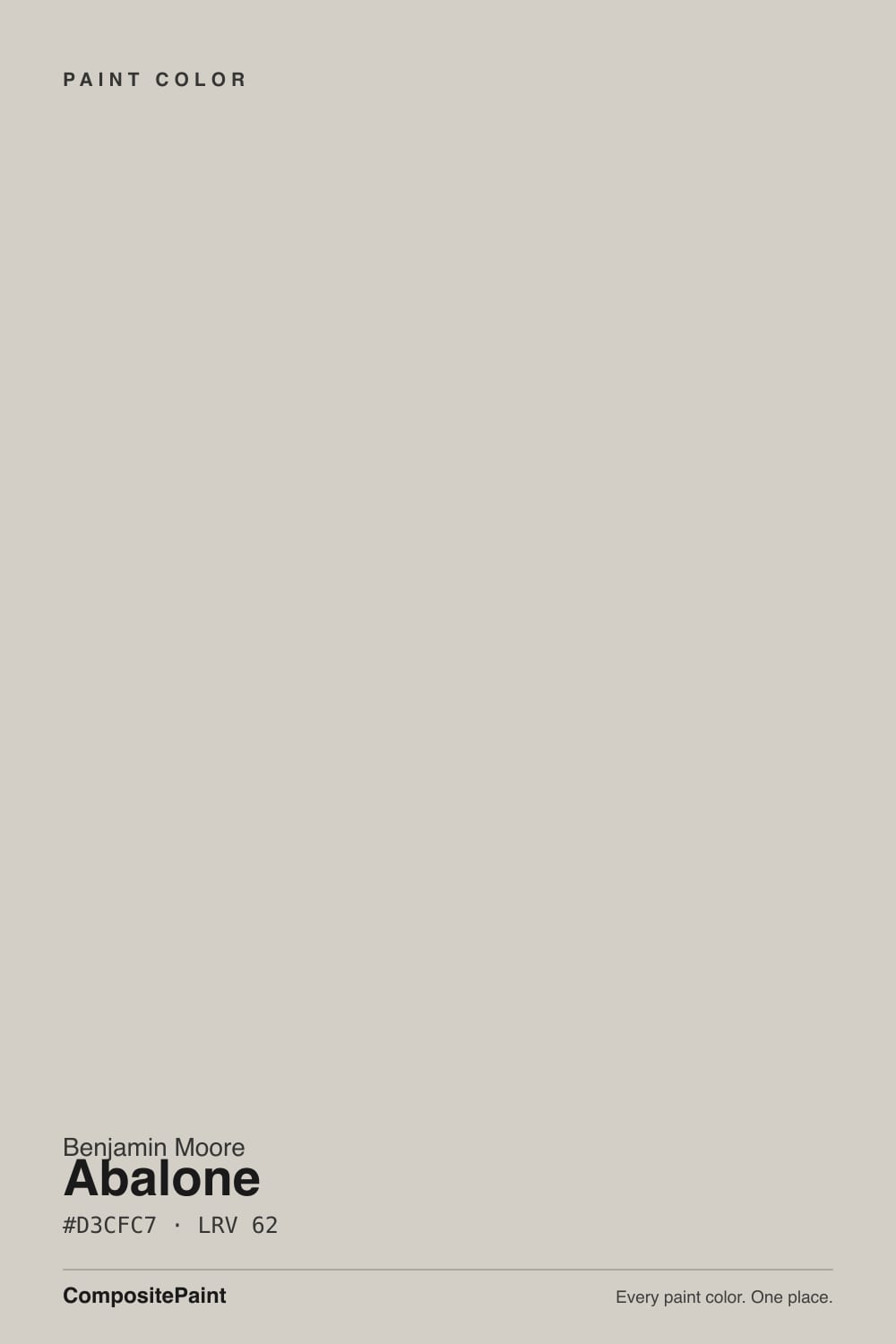
Abalone never had a Color of the Year moment, and it probably never will — it is Benjamin Moore's quiet warm gray, sitting one shade lighter than Revere Pewter with a whisper of mauve-violet where Revere Pewter goes straight taupe. At LRV 62 it holds enough body to read as a real color, not a beige-adjacent nothing, and the violet only shows itself in certain light. That is the whole review: an honest, dependable neutral with one undertone worth testing before you commit a whole house to it.
Whole-house neutrals in rooms with real daylight · red oak, cherry, or walnut floors · dining rooms and bedrooms under warm lamps · anyone who wants more warmth than Collingwood without going full taupe
Your room is dim and north-facing all day · your floors are honey-gold oak · you want a flat, zero-undertone gray · you're chasing a famous, Pinterest-viral color
- A genuine in-between: grayer than a beige, warmer than a true gray
- Holds its color at LRV 62 without washing out
- Flatters red oak, cherry, and walnut wood tones
- Turns softly taupe-mauve under warm evening lamps
- A quieter, less-hyped alternative to Revere Pewter and Edgecomb Gray
- Goes flat and slightly lavender in dim, north-facing rooms
- Clashes with golden honey-oak floors
- The violet can read dusty next to cool white trim or cool stone
- No real online track record — you're mostly sampling on your own
What Color Is Abalone, Really?
A warm, muted gray built on a soft beige base with a whisper of violet-mauve mixed in — not enough to call it purple, but enough that it never reads as a flat, characterless gray. Benjamin Moore doesn't market Abalone the way it markets Revere Pewter or Edgecomb Gray; it has no Color of the Year plaque and no celebrity design-blog moment attached to it. What it has instead is a genuinely useful in-between: gray enough to feel current, warm enough that a north-facing room doesn't turn it cold and sad.
At LRV 62 it sits right beside Collingwood (also LRV 62) on the shelf, and putting them side by side is the fastest way to understand what Abalone actually is. Collingwood is Benjamin Moore's true gray — it fights to stay neutral no matter the light. Abalone gives up that fight on purpose: the violet-mauve base comes forward in warm afternoon light and recedes in cool morning light, so the same wall can read gray at 9am and faintly taupe-mauve at 5pm. That movement is either the whole appeal or the whole problem, depending on whether you wanted a color that shifts.
Undertone in one line: warm gray with a mauve-violet base, never green, never straight beige. If your sample reads flat and a little cold, that's north light doing its job; if it reads pink or dusty-taupe, that's south or west sun bringing the violet forward. Neither reading is wrong — both are the same paint being honest about the room it's in.
Where It Shines
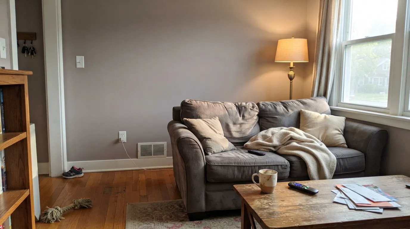
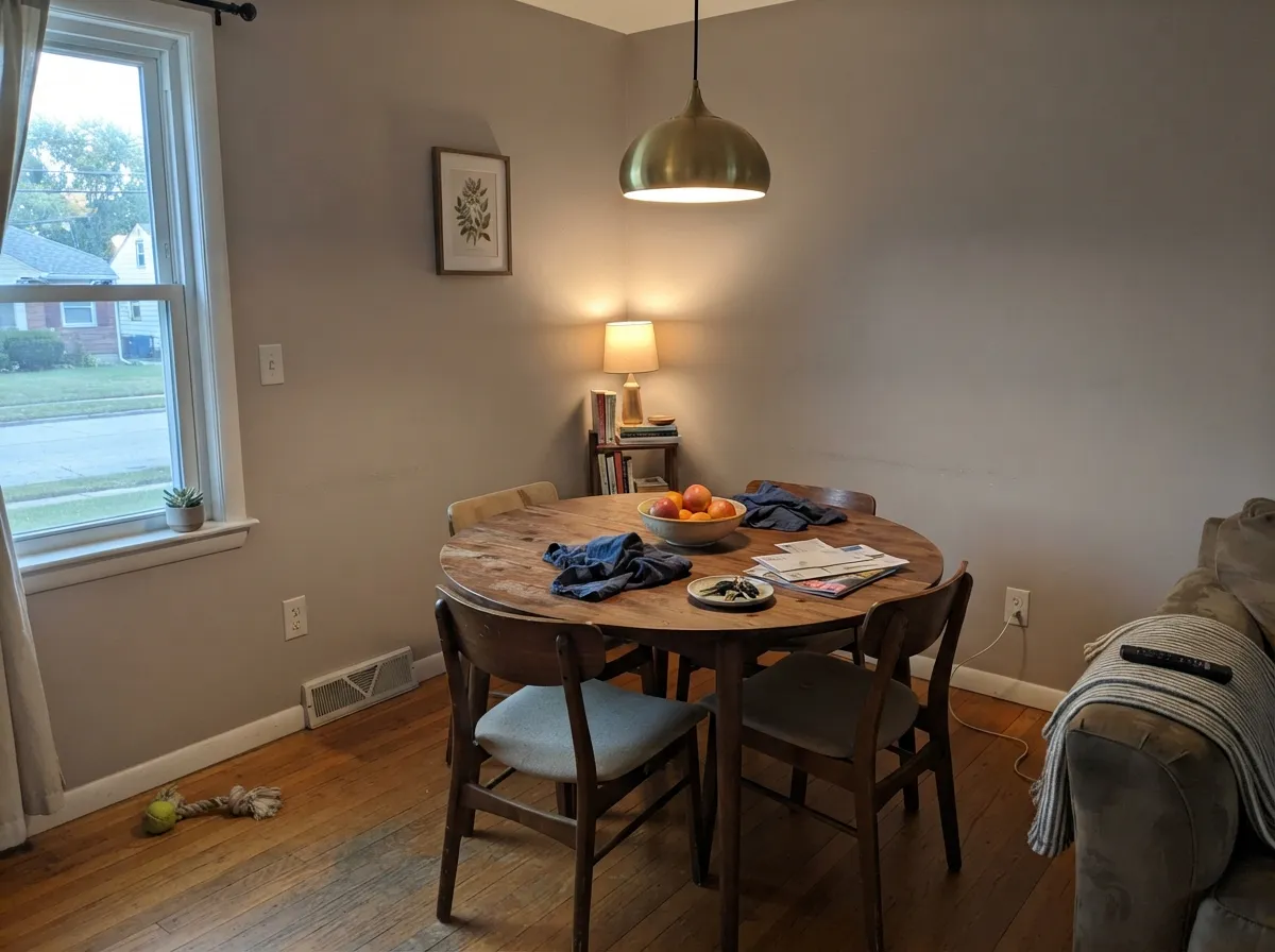
Give it real daylight — south or west exposure, or a room that gets a few warm lamp hours at night — and Abalone earns its keep as a genuine warm neutral, not a beige stand-in. It is at its best next to red oak, cherry, and walnut floors, where the wood's red undertone and the paint's mauve lean actually agree with each other instead of fighting. It also does well as the quiet backdrop in a dining room or bedroom that leans on brass and warm lamp light rather than cool overhead LEDs.
Where It Fails
Almost every regret story with a color like Abalone follows the same three scripts, and all three are avoidable before the first coat goes on. None of them are the paint's fault — but if your room matches one, this is not your neutral, and a bigger sample will only confirm it.
Cool north light strips out the little warmth Abalone has and leaves a flat, slightly lavender-gray that can read dingy on an overcast day. It isn't a bad color in that room — it's the wrong color for that room. Go warmer (Revere Pewter or Edgecomb Gray) or plan on real evening lamp light.
Honey oak leans yellow-orange, which sits opposite violet on the color wheel. Put Abalone's mauve undertone next to it and each side pulls against the other — the floor can read more orange, the wall a touch more pink than the chip promised. Walnut, cherry, or a large warm rug settle the argument.
Cool white trim or a blue-gray countertop exaggerates the violet instead of balancing it, and the wall can start to look dusty rather than warm. Pair Abalone with a warm white — Oxford White or White Dove — and warm-veined stone, not a cold one.
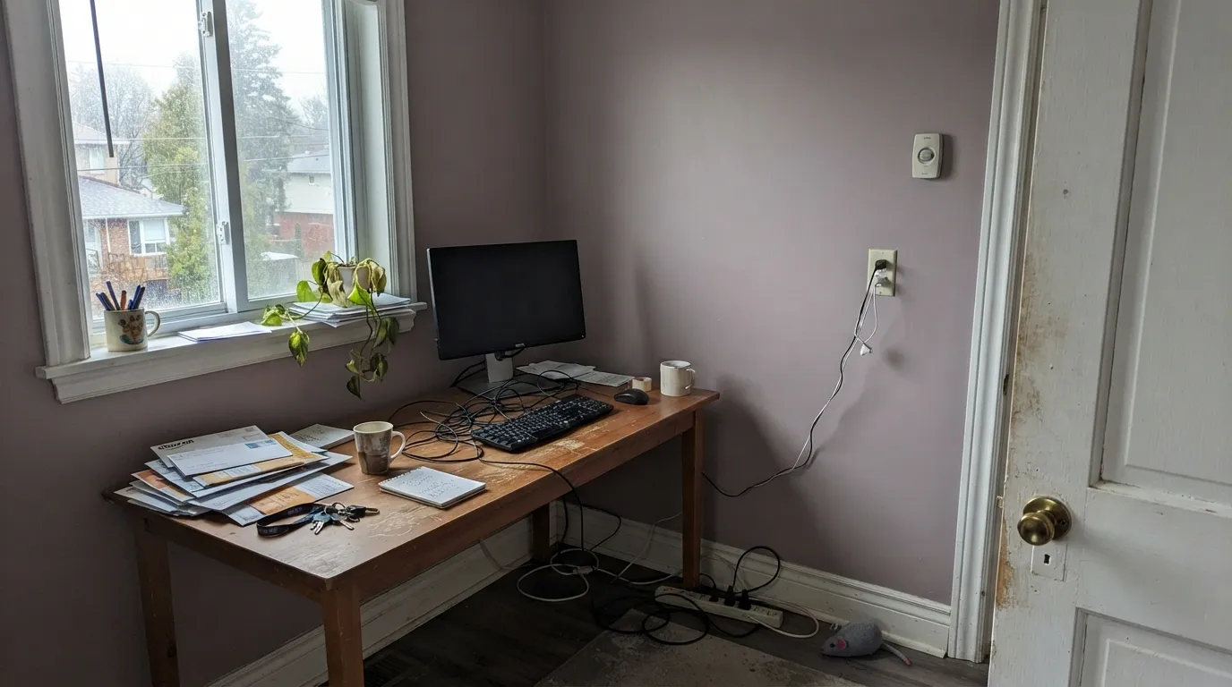
Room by Room
With any real daylight it reads as a calm, current gray-neutral that flatters wood furniture without going cold. Eggshell on the walls, and keep the trim warm rather than stark.
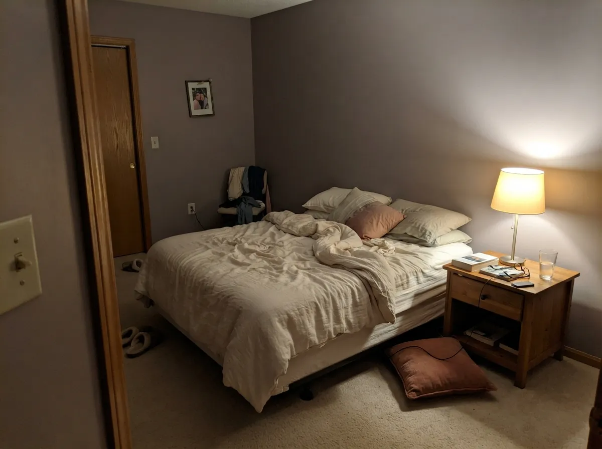
Warm 2700K lamp light brings the mauve forward at night, so the room settles into a soft, dusty calm. If the room is north-facing and lamp-free, it can read flat by day.
On cabinets it pairs naturally with brass hardware, butcher block, and red-toned wood; over honey oak floors it needs a warmer greige instead.
With warm-veined marble or quartz and brass fixtures it reads quietly elegant; with cool blue-gray stone the violet clashes rather than complements.
Abalone works best carrying the walls. For trim, a dedicated white like Oxford White or White Dove reads cleaner than running Abalone itself at semi-gloss.
Benjamin Moore doesn't spotlight this as an exterior color and there's no established outdoor track record to lean on. Full sun will likely push the violet forward more than it does indoors — sample a large board outside before committing a whole facade.
Your Light Is the Risk
Real sun brings the mauve-violet forward without tipping the wall pink — this is the light that shows what Abalone actually is.
Cool, gray daylight strips the warmth and leaves a flat, slightly lavender-gray. Sample here first if this is your exposure.
Cooler and grayer in the morning, warmer and faintly taupe by late afternoon — the same wall genuinely reads two ways in one day.
2700K bulbs pull the mauve forward and the room turns soft and dusty. Cool LEDs flatten it back toward plain gray.
Most complaints about Abalone are a light mismatch. Upload a photo of your actual room and see it on your walls — then ask for the same wall in north light or evening lamps before you buy a single sample.
Need It From Another Brand?
Any paint counter can custom-tint Benjamin Moore 2108-60 directly. If you would rather stay in one brand's own deck, these are the closest stock matches, measured as ΔE2000. Under 2 is a difference you will not see on the wall.
| Brand | Closest color | ΔE | LRV | |
|---|---|---|---|---|
| Sherwin-Williams | Skipping RocksSW 9551 · Sherwin-Williams | 1.5 | 63 | Color page → |
| Behr | Polar FoxHDC-NT-17G · Behr | 1.0 | 63 | Color page → |
| Valspar | Moon Shot8005-2B · Valspar | 0.5 | 63 | Color page → |
| PPG / Glidden | ElusionPPG1005-2 · PPG / Glidden | 2.4 | 62 | Color page → |
| Glidden | Natural Silver Wool70YY 63/045 · Glidden | 0.7 | 63 | Color page → |
| Dutch Boy | Silvered Fog439-1DB · Dutch Boy | 1.0 | 62 | Color page → |
Similar Benjamin Moore Colors
The nearest shades to Abalone within Benjamin Moore's own range, ranked by perceptual color distance — useful when you want the same look a touch lighter, darker, or warmer.
WCAG 2.1: AA is 4.5 : 1 for normal text, 3 : 1 for large text, AAA is 7 : 1.
Abalone vs the Colors You're Also Considering
Every Abalone sample board has the same rivals on it. The numbers show the real lightness gap — then it comes down to which risk you would rather live with.
Pick this for a little more warmth without leaving the gray family.
Benjamin Moore 859 · LRV 62CollingwoodPick this if you want the true, no-violet gray Abalone is a step away from.
Pick this for the lighter, quieter version of the same undertone.
Sherwin-Williams SW 7022 · LRV 57AlpacaPick this if your painter works in Sherwin-Williams and you want the same violet streak, one step deeper.
Inside Benjamin Moore, the choice is really between Abalone and Collingwood 859 at LRV 62, which is the same lightness with slightly more yellow. Barren Plain 2111-60 is the cooler alternative at the same LRV. All three are so close that the deciding factor is usually the room's light, not the chip.
Across brands the matches are tight. Valspar Moon Shot 8005-2B, hex #D4CFC7 at LRV 63, measures a delta E of 0.52 and Glidden Natural Silver Wool 70YY 63/045 sits at 0.74; both are the same color in practice. Behr Polar Fox HDC-NT-17G, hex #D2D0C9 at LRV 63, at 1.01 and Sherwin-Williams Skipping Rocks SW 9551, hex #D1D0C9 at LRV 63, at 1.48 are visually identical in normal room light.
PPG Elusion PPG1005-2 at 2.44 and Clare Flatiron PNT100-LT-17 at 2.53 are very close, sample first. Farrow and Ball Blanc de Chine No. 9814, hex #CDD1C7, is 4.24 away and reads greener, close but visibly different side by side.
Abalone Coordinating Colors
The rule for coordinating with Abalone: stay warm and avoid cool blue-grays, which fight the mauve instead of complementing it. It layers naturally with other warm neutrals from lighter to darker, and with near-blacks that don't lean cool. These are the partners that make the most sense next to it:
Abalone in Benjamin Moore's Greige Lineup
Benjamin Moore doesn't push Abalone the way it pushes Revere Pewter — there's no anniversary campaign, no celebrity kitchen photo attached to this SKU. It sits in the catalog as one option among a crowded shelf of warm neutrals, and the honest read is that it earns its place on merit rather than marketing. At LRV 62 it's lighter than Revere Pewter (56) and close in depth to Collingwood (62) and Edgecomb Gray (63) — the real difference from those two is undertone, not depth.
What sets Abalone apart in that lineup is the violet-mauve base instead of a straight tan or beige one. That makes it the color to reach for when Revere Pewter feels too brown and Collingwood feels too flat-gray — a genuine middle position, not a marketing repackaging of a color you already know.
Abalone With Wood Tones and Floors
Red oak, cherry, and walnut are the floors that make Abalone look intentional rather than accidental — their red-brown undertone meets the paint's mauve lean halfway, and the room reads coordinated without anyone having planned it that hard.
Honey-gold oak is the one floor to test carefully. Its yellow-orange base sits opposite violet on the color wheel, so the two can amplify each other rather than settle — expect the floor to look slightly more orange and the wall a touch more pink than either does alone. A large warm rug, or trading the floor pairing for cherry or walnut furniture instead, keeps the two speaking the same language.
Three Ready Palettes Built on Abalone
A color is never alone on the wall. These are complete combinations in the 60-30-10 pattern, with the reason each one holds together. Every one opens in the visualizer.
Oxford White is warm enough not to fight Abalone's mauve lean the way a stark white would, and Revere Pewter one step deeper gives the scheme a grounding note from the same warm-neutral family — no undertone jump between them.
Try this palette in your roomRed oak floors and brass hardware are the pairing Abalone was made for — the wood's red undertone and the paint's mauve lean agree instead of arguing. Kendall Charcoal on the island supplies the one dark note the room needs without introducing a cool undertone.
Try this palette in your roomWhite Dove keeps the trim warm instead of stark, and Sleepy Hollow — a deeper cousin in the same violet-gray family — gives one accent wall real depth without a clashing undertone. Under evening lamps, both go soft and dusty together.
Try this palette in your roomAbalone FAQ
Is Abalone warm or cool?
Warm-leaning, with a mauve-violet base rather than beige or true gray. In cool north light it can read close to a flat gray; under real daylight or warm lamps the violet comes forward and it reads distinctly warmer. It never goes as cold as a blue-gray, and never goes as warm as Revere Pewter.
Is Abalone the same as Revere Pewter?
No — related, but not the same. Revere Pewter (LRV 56) is deeper and reads more taupe-beige; Abalone (LRV 62) is lighter and grayer, with the warmth coming from violet-mauve instead of straight tan. If your Revere Pewter sample felt too brown, Abalone is the cooler, lighter step over.
How is Abalone different from Collingwood?
Collingwood shares the same LRV 62 but stays a true, committed gray in almost any light. Abalone gives up some of that neutrality on purpose — its violet base shows through in warm daylight where Collingwood stays put. Pick Collingwood if you want zero undertone drama; pick Abalone if you want a little warmth in the mix.
Does Abalone work with honey oak floors?
Not well. Honey oak leans yellow-orange, the direct complement of violet, so the two amplify each other instead of settling down — the floor can look more orange, the wall a touch more pink. Walnut, cherry, or a large warm rug are the safer partners.
What trim white goes with Abalone?
A warm white, not a stark one. Oxford White or White Dove keep the wall reading warm and current; a cool, blue-based white can make the mauve look dusty rather than intentional.
Is Abalone a popular or trending color?
Not especially — it has no Color of the Year history and no viral design-blog moment, and it sits quietly in Benjamin Moore's catalog next to more famous names like Revere Pewter. That obscurity isn't a red flag; it's a genuinely useful, dependable warm gray that simply never got the marketing push its neighbors did.
Have you painted with Abalone?
Rate it — one tap helps the next reader decide.
Ask a Question