Sea Salt
The Benjamin Moore color everyone orders by mistake, reviewed honestly: it is a warm greige, not the spa green — here is where it works and where it goes drab.

Jessica has spec'd whites and neutrals for more than 300 rooms and keeps a sample wall of painted drawdowns in her studio. Every color review is checked against real reader rooms in the comments and re-tested when a formula changes. About the testing process →
- 1Light French Gray53
- 2Accessible Beige58
- 3Sea Salt63
- 4Pale Oak69
- 5Shoji White74
The Fast Verdict
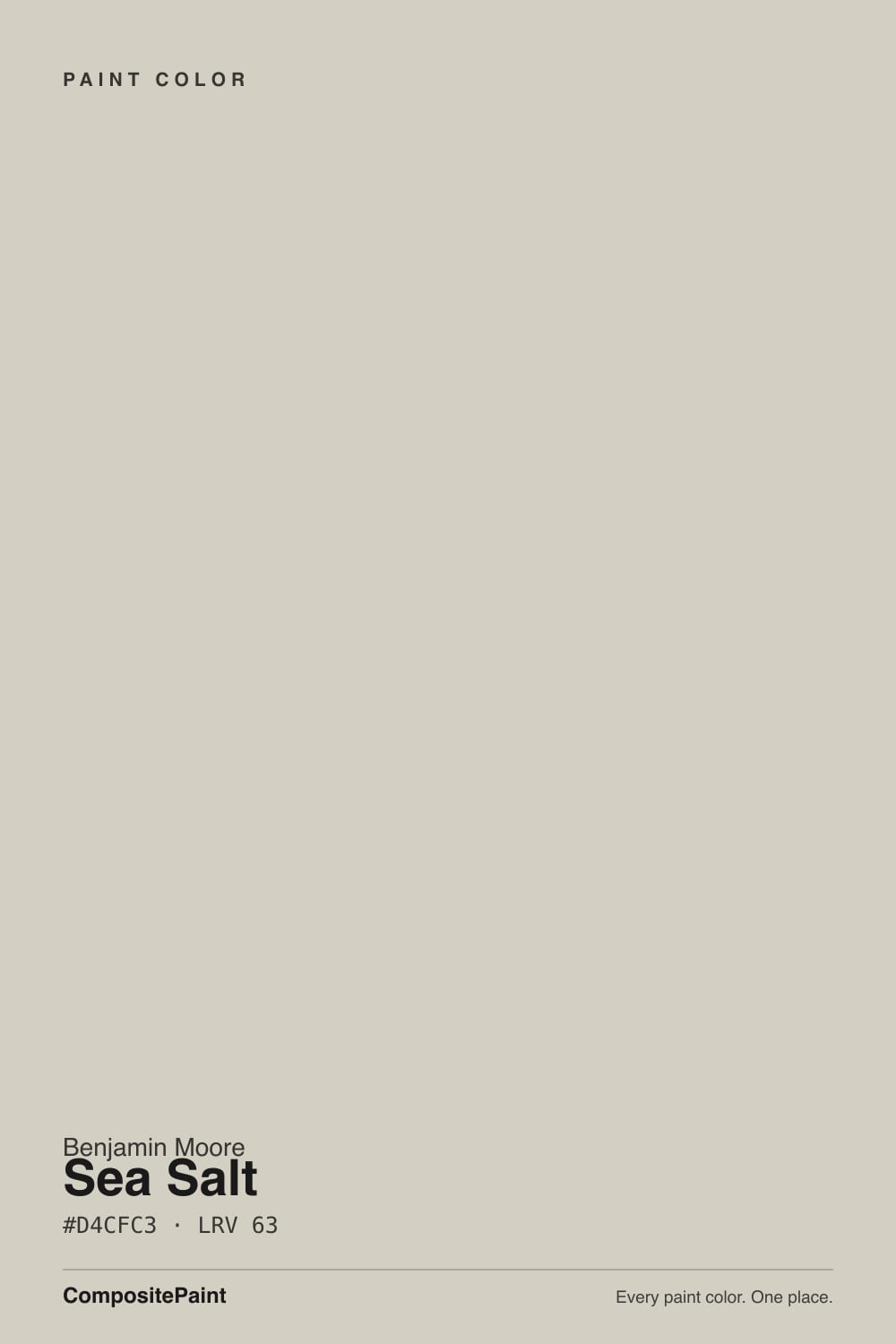
Start with the thing that trips up most people: Benjamin Moore Sea Salt is a soft warm greige, not the pale green-blue that the name suggests. As a greige it is genuinely good — light at LRV 63, warm enough to stay friendly, quiet enough to run a whole floor.
The catch is that it belongs to Benjamin Moore's Color Stories line, which is built with more tints than a normal neutral, so it shifts more than average from room to room. Give it daylight or lamps and it is lovely; leave it in a dim corner and it turns muddy khaki.
Whole-floor walls with real daylight · bedrooms and baths that need calm, not color · mudroom, laundry and vanity cabinets · rooms full of oak, jute and brass
You actually want the coastal green people mean by "Sea Salt" · your room is dim and the lamps stay off · you need it outside — Benjamin Moore lists it interior only · you want a color that reads identical in every room
- Light at LRV 63 but still clearly a color, not an off-white
- Warm without any yellow flash in afternoon sun
- Runs a whole floor without shifting room to room
- Flatters oak, jute, brass and matte black in the same room
- Soft enough that scuffs and touch-ups barely show
- The name promises a green it is not — constant ordering mistakes
- Goes drab and slightly khaki in dim, lamp-free rooms
- So low in pigment that a warm floor turns it plain gray
- Interior only — Benjamin Moore sells no exterior version
What Color Is Sea Salt, Really?
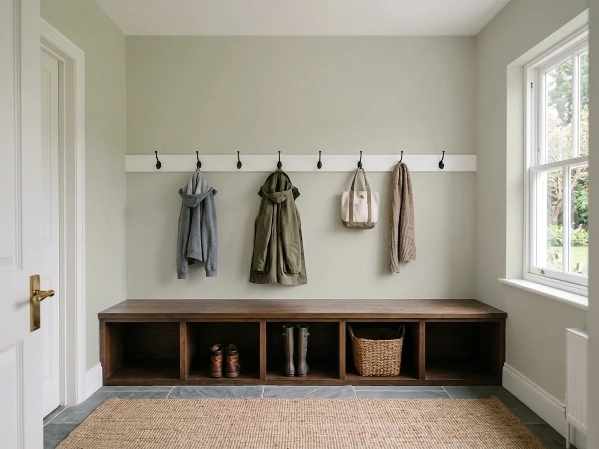
It is not green. That sentence has to come first, because most people saying "Sea Salt" mean Sherwin-Williams SW 6204, a cool muted green with blue in it. Benjamin Moore's Sea Salt CSP-95 is a different animal entirely: a light warm greige, hex #D4CFC3, sitting at hue 42 with only 17 percent saturation. That is a tan-gray with the warmth turned almost all the way down. On a wall it reads soft, sandy and slightly weathered — the color of an old linen napkin, not of sea glass. People do sometimes call it khaki or say they see green in it, and that is real, but it comes from the low saturation and from what is next to it, not from green pigment.
At LRV 63 it is a light color that still counts as a color. For scale, Sherwin-Williams Agreeable Gray sits at 60 and Benjamin Moore Revere Pewter at 55 — Sea Salt is a clear step lighter and airier than either, closer in weight to Edgecomb Gray HC-173. That extra lightness is why it holds up in rooms with small windows where Revere Pewter would go heavy. One thing to know about the mix: CSP-95 is a Color Stories color, and Benjamin Moore builds that line for what they call an accentuated response to light. In plain words, more tints go into the can, and the color changes more through the day than an ordinary neutral does. That is the charm and the risk in one sentence.
Undertone in one line: mildly warm, tan-leaning, with no yellow punch and no real green — but so low in pigment that whatever sits beside it wins the argument.
Where It Shines
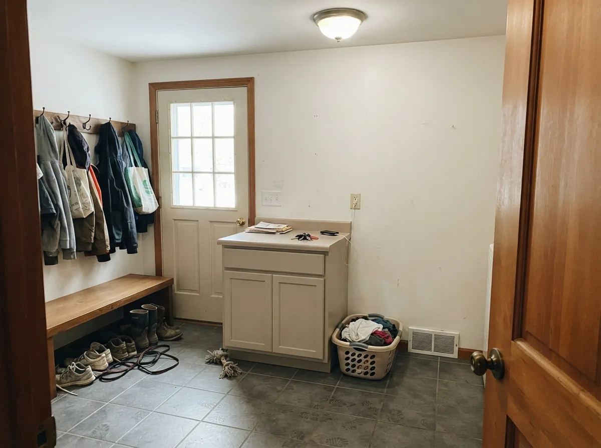
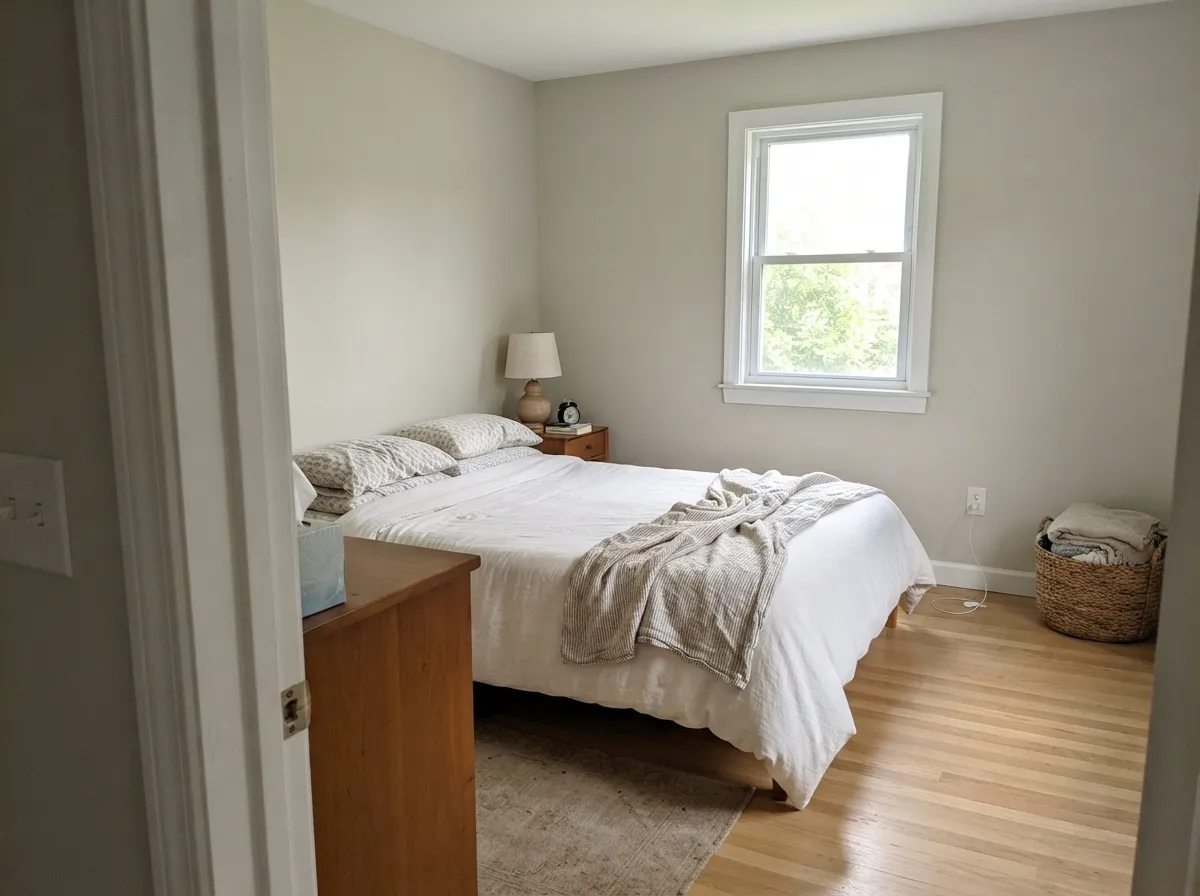
It is at its best doing quiet background work in rooms that get real light. Whole main floors, bedrooms, bathrooms with warm stone, and small painted cabinets are where it earns its keep — anywhere you want the walls to feel considered without announcing a color.
Where It Fails
The bad reviews for this color are remarkably consistent, and only one of the three is really the paint's fault. If your project matches one of these, save yourself the sample pot.
This is the number one Sea Salt story and it ends at the register. Someone sees the soft green-blue online, walks into a Benjamin Moore store, and leaves with a greige. If the color in your head is spa-like and slightly blue, you want Sherwin-Williams Sea Salt SW 6204. If you want it in the Benjamin Moore deck, Healing Aloe 1562 is the closest honest match.
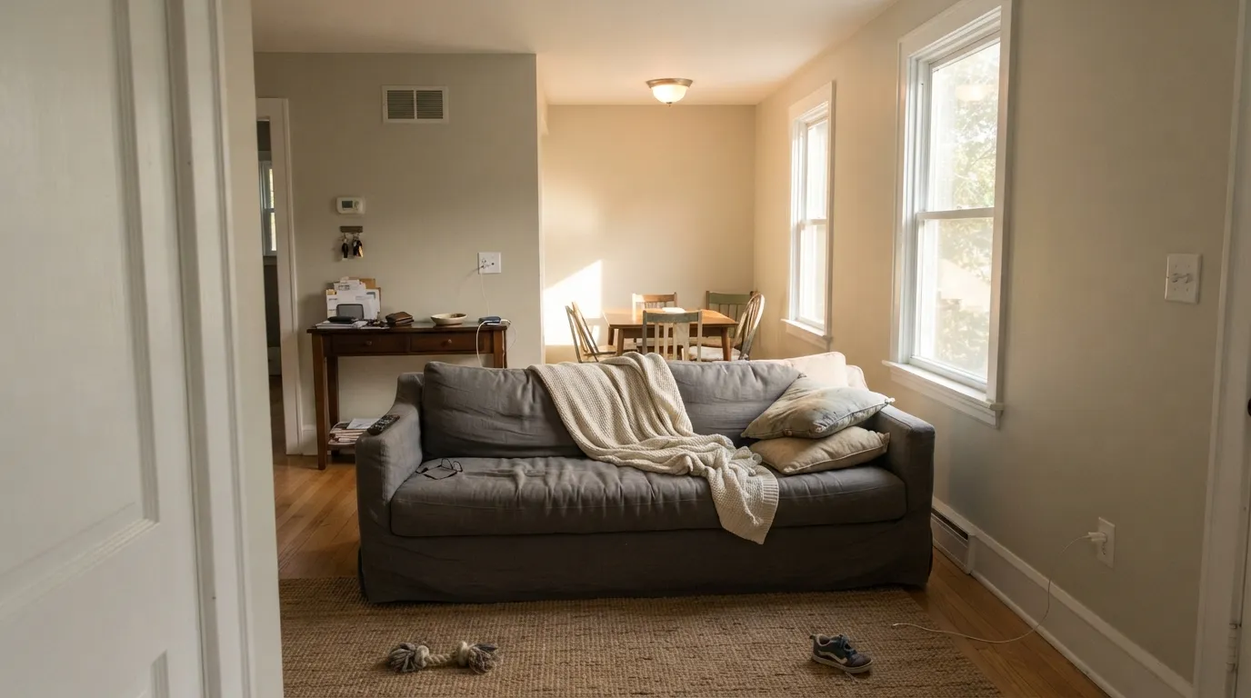
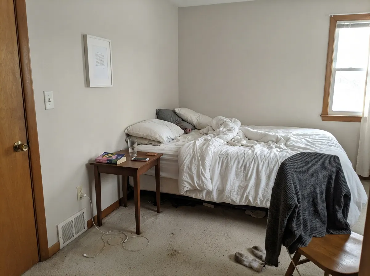
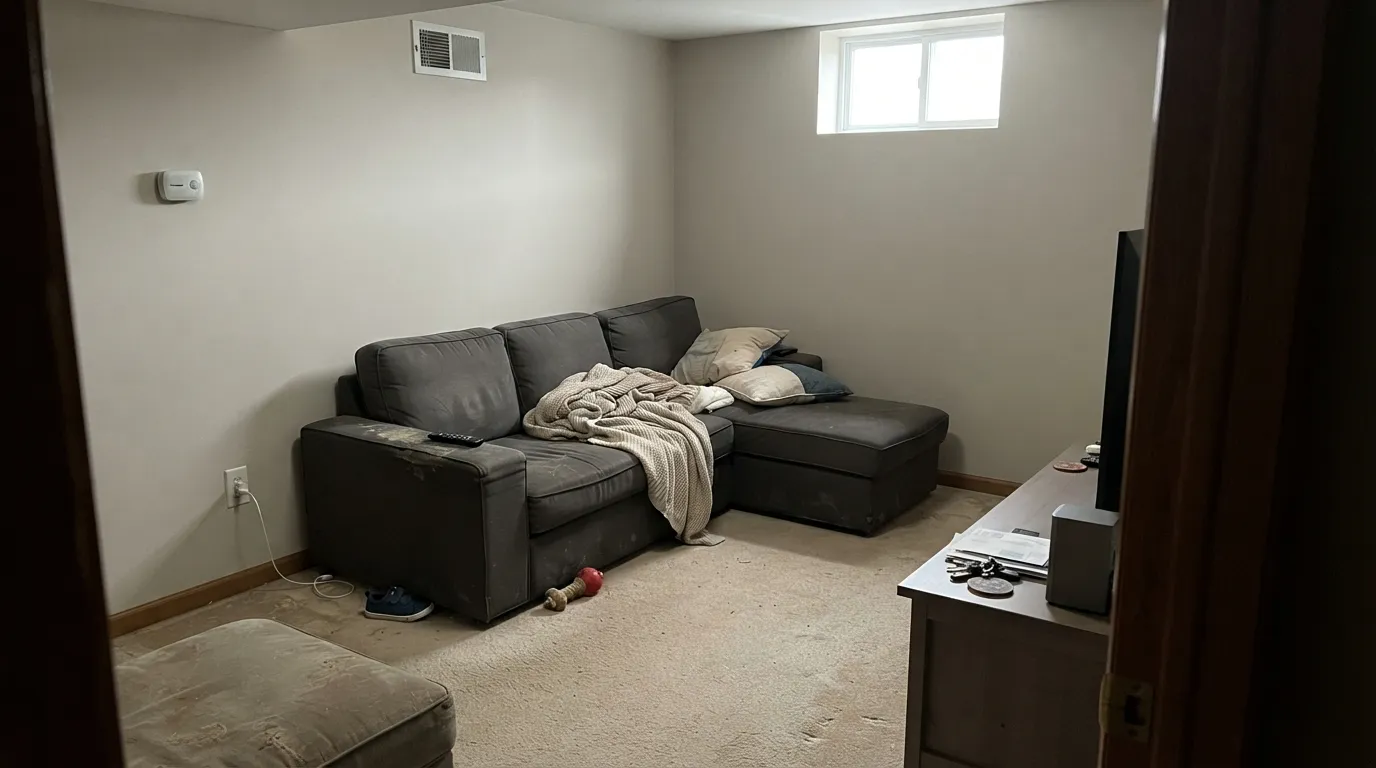
With weak, cool light the warm base drops out and what is left reads murky — flat gray with a khaki cast in the corners. Basements, north-facing dens and windowless hallways all show it. If the room is genuinely dark, go lighter and cleaner: Classic Gray OC-23 at LRV 74 keeps its softness without going muddy.
Sea Salt carries so little pigment that it takes its cue from its neighbors. Against warm builder oak or a tan tile floor the wall stops looking warm and starts looking plain gray, which is not what anyone sampled for. If the floor is that warm and you want the walls to keep up, Edgecomb Gray HC-173 has more definite warmth and holds its ground.
Room by Room
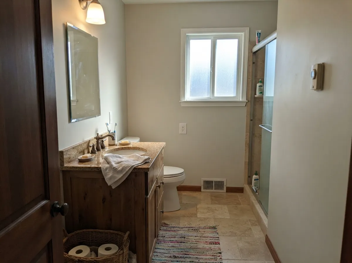
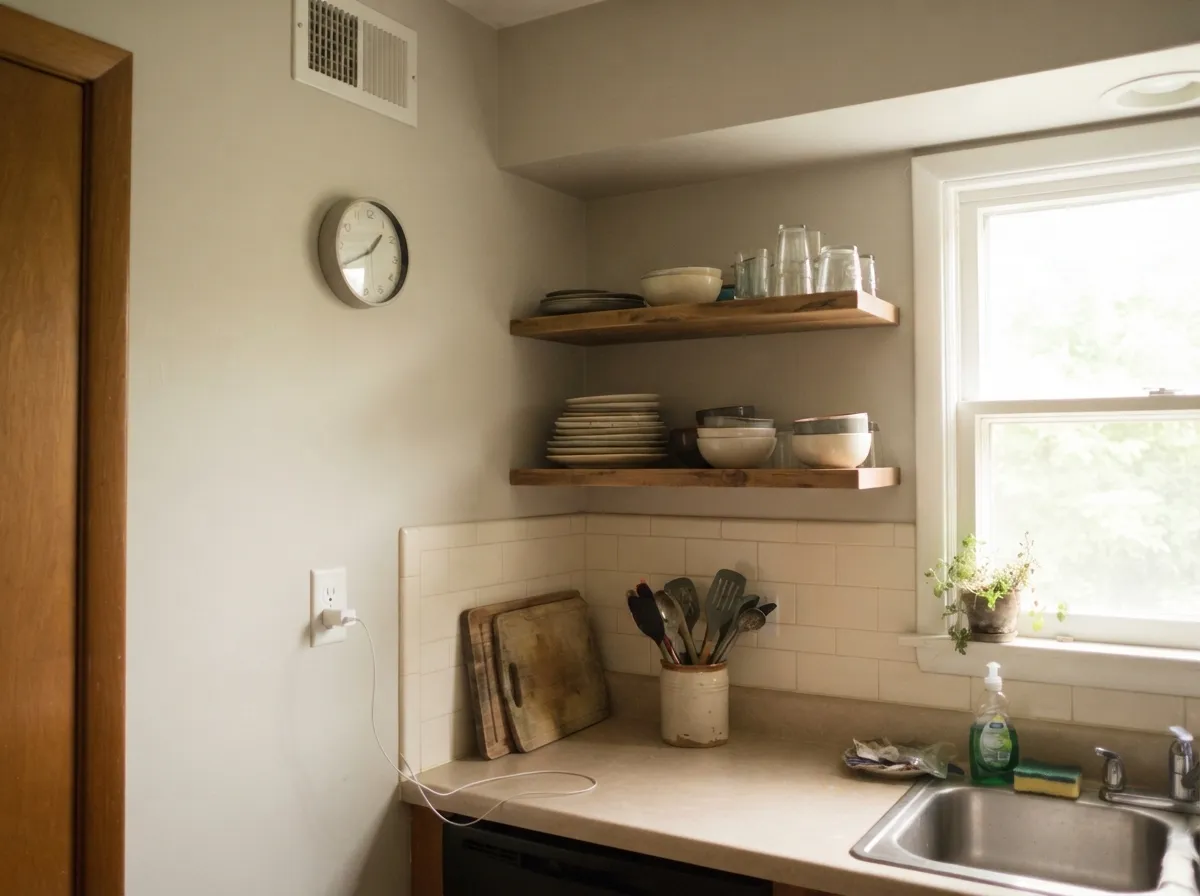
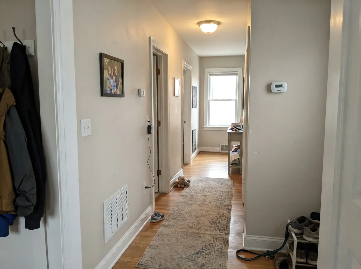
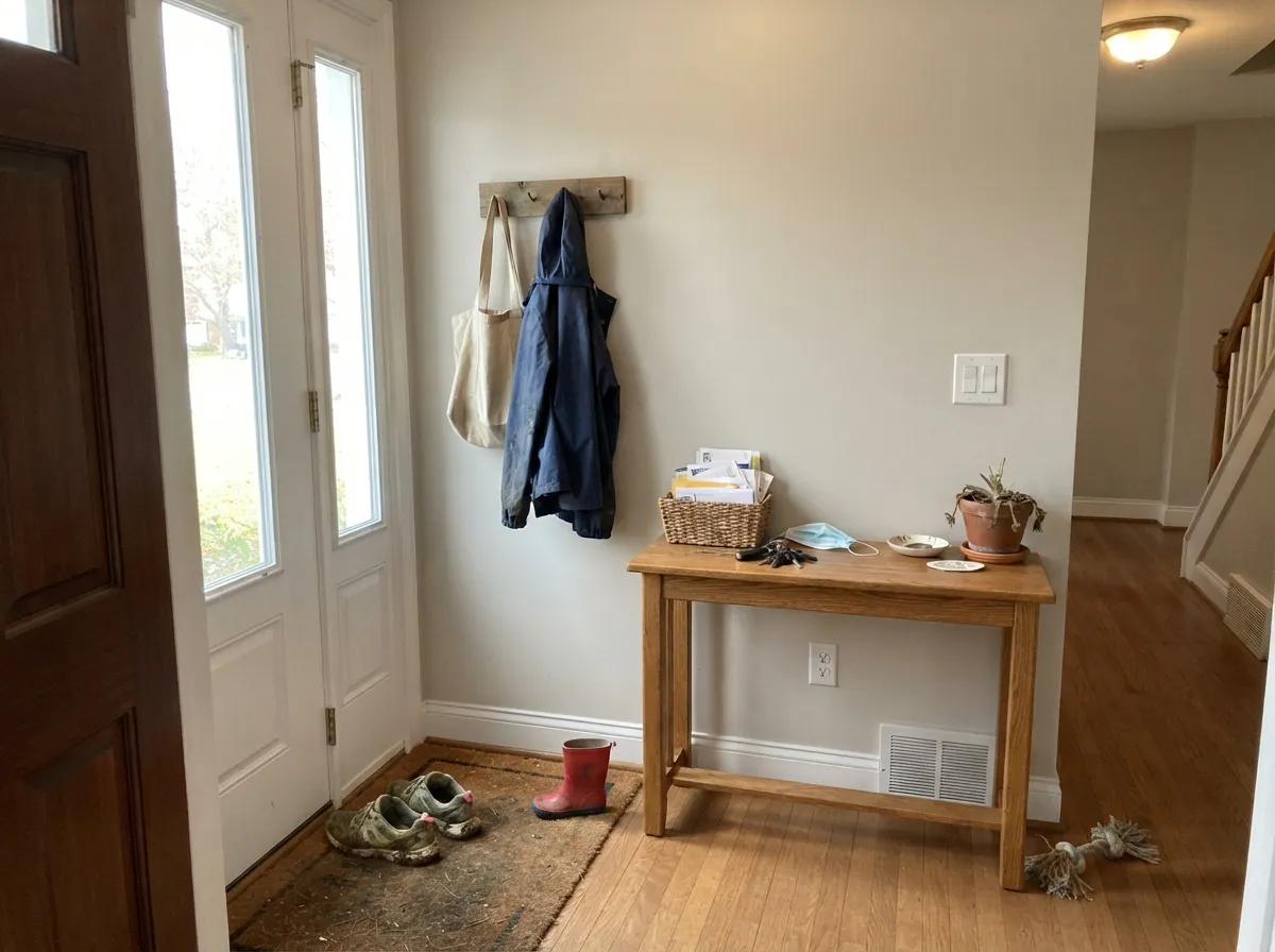
Your Light Is the Risk
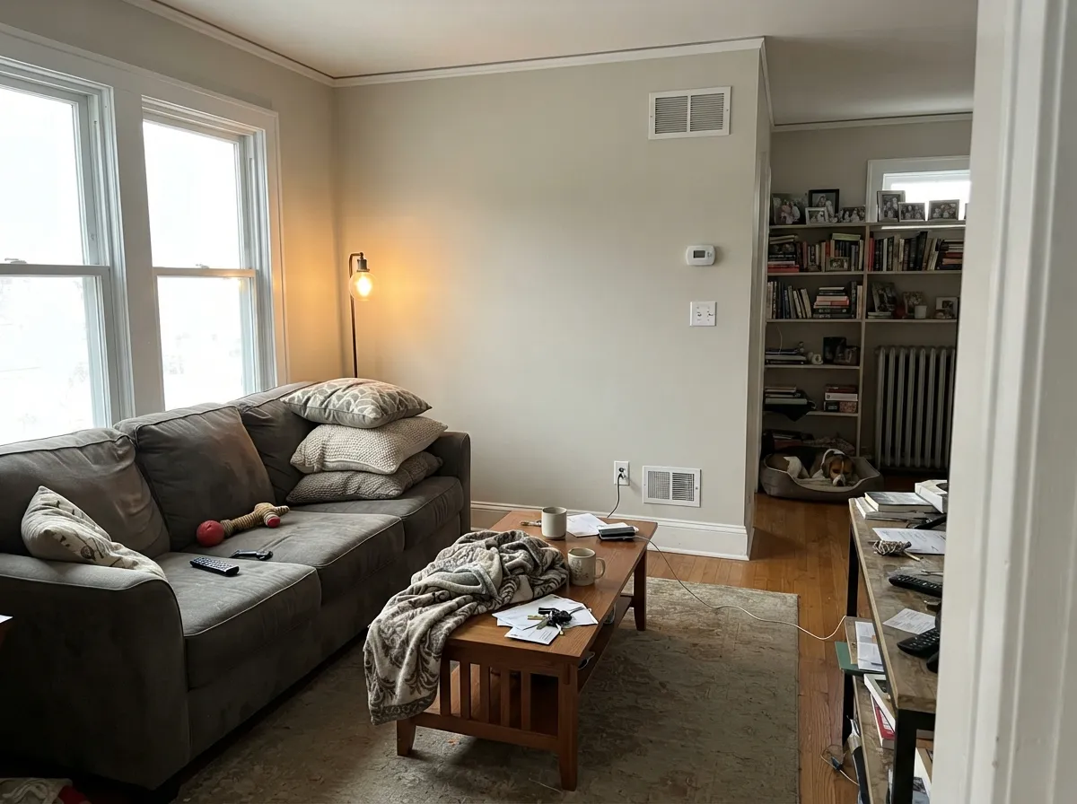
The warmth comes forward and it reads soft and sandy all day. No yellow flash.
Cool daylight cancels the warm base and leaves a quiet gray. Fine in a warm room, dreary in a bare one.
2700K lamps push it toward beige and cozy. 4000K LEDs strip it back to gray — swap bulbs, not paint.
Against tan tile or orange oak it reads gray; against a cool gray floor it reads warm. Sample it over the actual floor.
Most complaints about Sea Salt are a light mismatch. Upload a photo of your actual room and see it on your walls — then ask for the same wall in north light or evening lamps before you buy a single sample.
Need It From Another Brand?
Any paint counter can custom-tint Benjamin Moore CSP-95 directly. If you would rather stay in one brand's own deck, these are the closest stock matches, measured as ΔE2000. Under 2 is a difference you will not see on the wall.
| Brand | Closest color | ΔE | LRV | |
|---|---|---|---|---|
| Sherwin-Williams | Modern GraySW 7632 · Sherwin-Williams | 1.7 | 62 | Color page → |
| Behr | Clay BeigeUL190-10 · Behr | 0.5 | 63 | Color page → |
| Valspar | Secluded BeachV146-1 · Valspar | 0.8 | 62.4 | Color page → |
| PPG / Glidden | Cool ConcretePPG1023-2 · PPG / Glidden | 1.9 | 63 | Color page → |
| Glidden | River RockPPG18-02 · Glidden | 3.8 | 62 | Color page → |
| Dutch Boy | Warmed Silver440-1DB · Dutch Boy | 1.8 | 63 | Color page → |
Similar Benjamin Moore Colors
The nearest shades to Sea Salt within Benjamin Moore's own range, ranked by perceptual color distance — useful when you want the same look a touch lighter, darker, or warmer.
WCAG 2.1: AA is 4.5 : 1 for normal text, 3 : 1 for large text, AAA is 7 : 1.
Sea Salt vs the Colors You're Also Considering
Every Sea Salt sample board has the same rivals on it. The numbers show the real lightness gap — then it comes down to which risk you would rather live with.
Pick this if you want a warm neutral, not a color.
Sherwin-Williams SW 6204 · LRV 63Sea SaltPick this if you pictured the pale spa green — this is the one you meant.
Pick this for the quieter, less beige version of the same idea.
Benjamin Moore HC-173 · LRV 63Edgecomb GrayPick this when your floors are warm and the walls must keep up.
Within Benjamin Moore, Penthouse CSP-35 at #D4D0C3 and LRV 63 is the nearest match, a fraction cooler. Picket Fence CSP-370 at #D5D0C7 and LRV 63 is grayer again. Collingwood 859 and OC-28 both sit at #D3CEC4 and LRV 62, marginally deeper and very close in character, while Abalone 2108-60 at LRV 62 leans cooler. Skipping Stone CSP-155 at #D5CFBF and LRV 63 is the most yellow of the group.
Across brands, Portola Paints Figueroa at deltaE 0.24, Behr Clay Beige UL190-10 at 0.54, Dunn-Edwards Muslin DE6227 at 0.6, Valspar Secluded Beach V146-1 at 0.77 and Rodda Smoky CA032 at 0.79 are all the same color for practical purposes. Farrow and Ball Shaded White No. 201 at deltaE 1.22 and Sherwin-Williams Modern Gray SW 7632 at 1.74 are visually identical in normal room light. Magnolia Home Stoneware Pieces JG-55 at 2.51 is very close but worth sampling, and Glidden River Rock PPG18-02 at 3.79 is close but visibly different side by side.
Sea Salt Coordinating Colors
Sea Salt is a background color, so the partners that work are the ones that give it something to sit against. It needs a clearly lighter trim white above it and at least one genuinely dark note below it — with nothing but soft neutrals around it, a room in Sea Salt reads unfinished rather than calm.
Stay in the warm half of the deck. Cool blue-grays make Sea Salt look dingy by comparison, while warm whites, taupes and deep navies all let it do its quiet job. These are the pairings that come up again and again:
The Two Sea Salts, and How to Order the Right One
This is the single most useful paragraph on the page. There are two famous paint colors named Sea Salt and they look nothing alike. Sherwin-Williams Sea Salt SW 6204 is the one most people picture: a cool, muted green with a blue lean, sold as a coastal spa color, and it is what nearly every online photo captioned "Sea Salt walls" actually shows. Benjamin Moore Sea Salt CSP-95 is a warm greige. Same name, opposite families.
Two practical rules. Order by code, always — say "CSP-95" at the counter, not "Sea Salt," because the color desk will hear the name and may reach for a match of the Sherwin-Williams color. And if the green is what you actually wanted but you would rather stay in the Benjamin Moore deck, Healing Aloe 1562 is the gentle pale green, Quiet Moments 1563 is the soft blue-green, and Palladian Blue HC-144 is the fuller, more confident coastal version.
Sea Salt on Cabinets and Built-Ins
On cabinets Sea Salt behaves like a painted neutral rather than a color, which is either exactly right or a waste of a paint job depending on the room. On a bathroom vanity, a mudroom bench, laundry uppers or a run of office built-ins it looks soft and deliberate, and it hides fingerprints better than a white would. Use a satin urethane cabinet enamel and expect two coats over a properly primed door.
Where it disappoints is a full kitchen. Against white quartz and a bright backsplash, a whole wall of Sea Salt doors can read as primer someone forgot to finish — the color is simply too close to a warm white to look intentional at that scale. If you want painted kitchen cabinets in this family, put White Dove OC-17 on the perimeter and give the island a real color like Kendall Charcoal HC-166, then keep Sea Salt on the walls where it does its best work.
Three Ready Palettes Built on Sea Salt
A color is never alone on the wall. These are complete combinations in the 60-30-10 pattern, with the reason each one holds together. Every one opens in the visualizer.
White Dove shares Sea Salt's warmth, so the trim reads crisp rather than icy and the twenty-point LRV gap does all the separating. The navy door gives the scheme its one dark anchor without adding a second wall color.
Try this palette in your roomPashmina is the same warm family roughly twenty points deeper, so the accent wall adds weight without introducing a new undertone to argue with. Chantilly Lace keeps the ceiling clean and stops the room from drifting all-beige.
Try this palette in your roomSea Salt is too close to a warm white to carry cabinets, so it takes the 60 percent wall role and lets White Dove do the joinery. Kendall Charcoal supplies the ten percent of dark that keeps a warm kitchen from going soft.
Try this palette in your roomSea Salt FAQ
Is Benjamin Moore Sea Salt the same as Sherwin-Williams Sea Salt?
No, and they are not even close. Sherwin-Williams Sea Salt SW 6204 is a cool muted green with blue in it. Benjamin Moore Sea Salt CSP-95 is a warm greige at #D4CFC3. Order by the code, not the name, or you will get the wrong one.
Why does Sea Salt look different in every room I sample it in?
Because it is a Color Stories color. Benjamin Moore builds that line with more tints than a standard neutral so it responds strongly to light, and at 17 percent saturation there is not much pigment holding it steady. Tape big samples on two walls with different light before you commit.
Sea Salt or Edgecomb Gray?
Edgecomb Gray HC-173 has the more definite warmth, so it wins in rooms with tan floors or heavy oak. Sea Salt is the quieter, more gray-leaning of the two and stays calmer against white kitchens and cool stone. If you are torn, sample both above your actual floor — the floor decides this.
Can I paint kitchen cabinets Sea Salt?
You can, but it is not where it shines. On a full kitchen it can look like unfinished primer beside bright quartz. It is much better on a smaller run of joinery — a bathroom vanity, a laundry wall of cabinets, a mudroom bench — in a satin cabinet enamel.
Will Sea Salt look muddy in a basement?
In a basement with only small windows, yes, it can. Weak cool light takes the warmth out and the corners go khaki gray. If the space has good lighting you can save it with 2700K bulbs, but a lighter color like Classic Gray OC-23 is the safer choice down there.
Can I use Sea Salt on the outside of my house?
Benjamin Moore lists CSP-95 as an interior color, so there is no exterior product to buy. A store can hand-match the formula into an exterior line, but the layered Color Stories mix will not behave the same in full sun. For siding, Edgecomb Gray HC-173 gets you the same look with a proper exterior paint behind it.
Does Sea Salt work with orange-toned oak floors?
It works, but it changes. Beside strong orange oak the wall reads noticeably grayer and cooler than the chip did, which some people love and some find flat. Add a warm rug and brass hardware and it settles; if you want the walls to match the floor's warmth instead, go to Edgecomb Gray HC-173.
Have you painted with Sea Salt?
Rate it — one tap helps the next reader decide.
Ask a Question