Cedar Key
Benjamin Moore's most overlooked driftwood taupe, reviewed honestly: the coastal name, the violet flash it shares with two more famous greiges, and where it actually earns its keep.

Jessica has spec'd whites and neutrals for more than 300 rooms and keeps a sample wall of painted drawdowns in her studio. Every color review is checked against real reader rooms in the comments and re-tested when a formula changes. About the testing process →
- 1Mindful Gray48
- 2Revere Pewter55
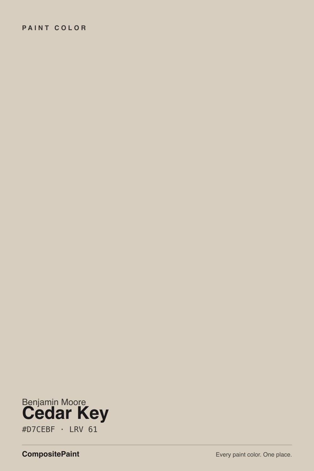
- 3Cedar Key61
- 4Pale Oak69
- 5Shoji White74
The Fast Verdict
Cedar Key is a warm, grayed taupe named for the fishing village on Florida's Gulf coast, and Benjamin Moore's own copy calls it "a crisp, confident neutral that conjures driftwood washed ashore" — which is accurate. At LRV 61 it sits almost exactly between two of the deck's best-known greiges, Revere Pewter (LRV 56) and Edgecomb Gray (LRV 63), and colorimetrically it is nearly identical to Balboa Mist and Eider White — both proven, both documented to flash violet in cool light. Cedar Key has almost no public track record of its own; it is a Classics-collection color nobody talks about. Treat this review as the honest extrapolation it is: same family, same behavior, no reputation to hide behind.
Coastal or cottage rooms with real daylight · a whole-house handoff next to warmer greiges · anyone who wants a driftwood taupe without the search-volume markup of Balboa Mist · cabinets and vanities under warm counters
You want a color with an actual online track record · your room runs dim and north-facing · you were hoping for a true, gray-not-taupe neutral · your fixtures are cool chrome and cool white quartz
- Genuinely warm driftwood taupe that lives up to its own name in good light
- Sits in the same proven tonal range as Revere Pewter and Edgecomb Gray
- Under-the-radar number — a driftwood look without the trend markup
- Flexible mid LRV (61) works on walls, cabinets, or vanities
- Handles off cleanly next to warmer, better-known greiges room to room
- Almost no public track record — you are largely sampling on faith
- Colorimetrically close to two colors with a documented cool-light violet flash
- Reads dingy next to a stark, cool-toned trim white
- Not a true gray — buyers hoping for gray will see taupe
What Color Is Cedar Key, Really?
A warm, grayed taupe-neutral — Benjamin Moore's own description, "driftwood washed ashore," is doing real work here, not just marketing. Driftwood is warm wood that salt air and sun have bleached and grayed at the same time, and that is exactly Cedar Key's structure: enough warmth to avoid reading as a cold gray, enough gray to keep it from reading as beige. It lives in Benjamin Moore's Classics® Color Collection, sku 982, which is the deck's long shelf of workhorse neutrals that never get a Color of the Year push and mostly get picked by painters who already know the number.
At LRV 61 it sits almost exactly between two much more famous BM greiges: Revere Pewter, one point deeper at LRV 56, and Edgecomb Gray, one shade lighter at LRV 63. If you have already seen either of those on a hundred Pinterest boards, you have effectively already seen Cedar Key — it is the same tonal neighborhood under a name that gets a fraction of the searches.
Undertone in one line: warm taupe-greige, and here is the honest technical case for caution. Cedar Key's formula sits within a hair of two colors this site has already reviewed and photographed — Balboa Mist and Eider White — and both carry the same documented weakness: beautiful in good light, mauve or violet the moment the light turns cool. Cedar Key has not built its own public complaint record, but color science does not care about search volume. Sample it the same way you would sample either of those two.
Where It Shines
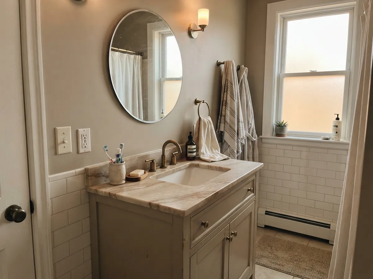
Give it real daylight and this is a genuinely likeable neutral. In a south- or east-facing coastal or cottage room, the warmth in Cedar Key comes forward and it reads exactly like its name — bleached, weathered, driftwood-warm rather than gray-cold. It is at its best doing quiet work: a whole-house wall color that hands off cleanly to warmer greiges in the next room, or a cabinet and vanity color under warm stone, brass, and linen. Because it is a lesser-known number, it also has a practical upside — a painter working from a Cedar Key can quote it without a client second-guessing it against a hundred online photos, good or bad.
Where It Fails
Nobody has left a pile of one-star reviews for Cedar Key, because almost nobody has reviewed it at all. That silence is itself the story: this is a color riding into your house on a colorimetric match to two better-known cousins, and their failure patterns are the most honest prediction available for how Cedar Key will actually behave.
Cedar Key's formula is close enough to Balboa Mist and Eider White that the same weakness almost certainly travels with it: warm light keeps it grounded and taupe, but flat north daylight or an overcast sky pulls out a violet or lilac-gray cast. If your room is dim and north-facing, sample big before you commit a whole wall to it.
This is the honest limitation of an under-the-radar color: there is almost no owner photo, forum thread, or design-blog writeup of Cedar Key to check your expectations against before you buy. If you need to see a hundred other people's rooms before trusting a can of paint, pick Balboa Mist or Edgecomb Gray instead — same neighborhood, real documentation.
Every warm taupe-greige in this family reads dingier than it is when the trim next to it is a stark, blue-leaning white. Pair Cedar Key with a warm trim white — Seapearl or White Dove, not a cool bright white — or the wall will look muddy by contrast rather than by its own fault.
Room by Room
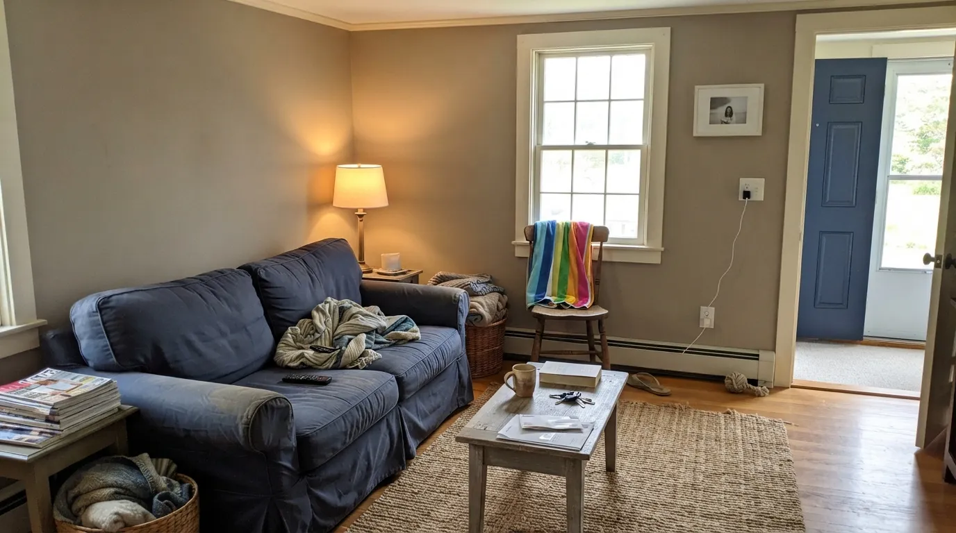
In a south- or east-facing room with any warmth in the light, Cedar Key reads calm and coastal rather than muddy. Eggshell on the walls; keep the trim warm, not stark white.
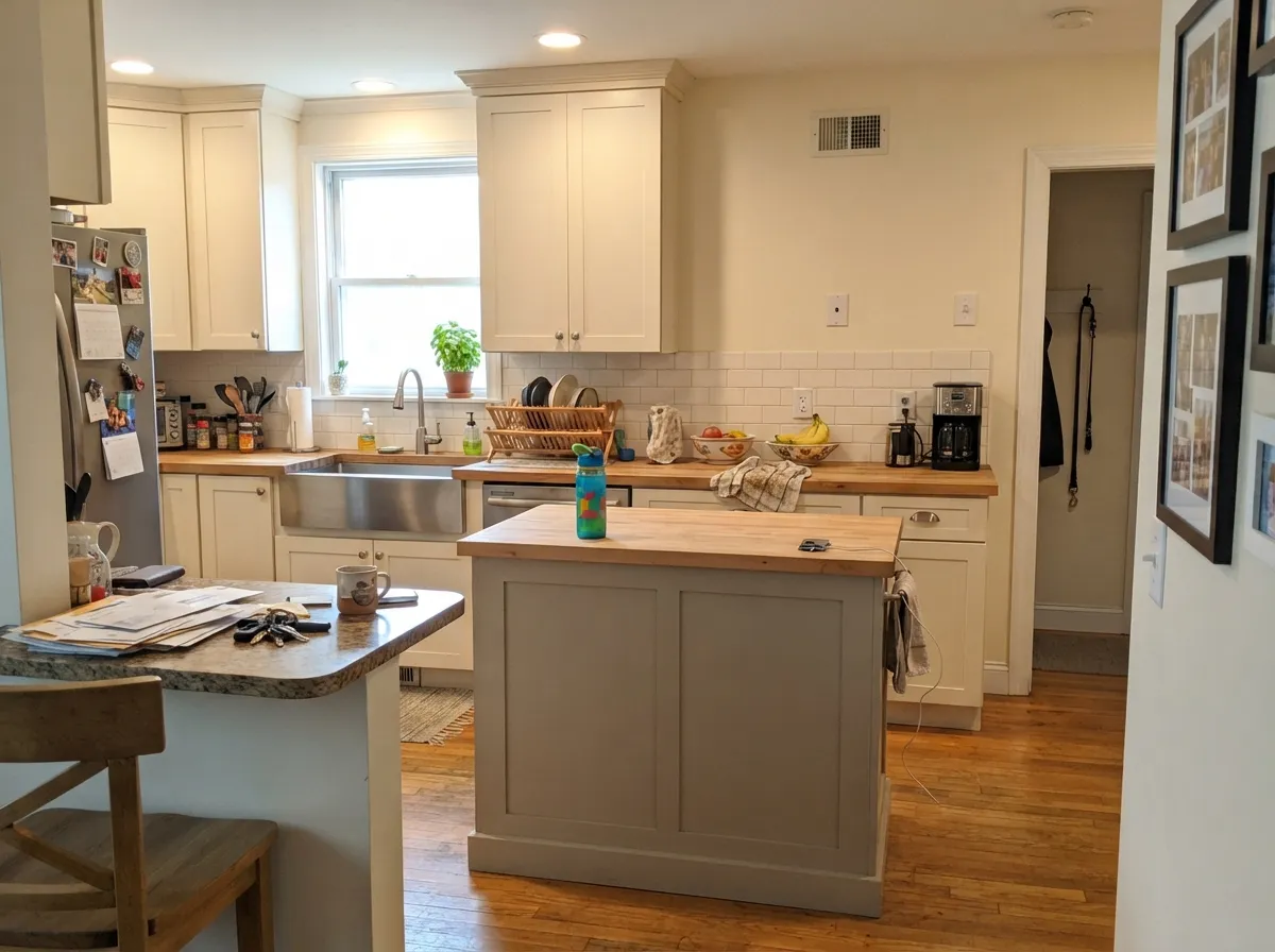
Under warm counters and brass hardware it reads as a genuine driftwood taupe. Satin on cabinets and islands; pair with a lighter warm white on the walls so the cabinet color has somewhere to land.
Under 2700K lamplight it settles into a soft, grounded taupe. If the bedroom is dim and north-facing, this is the room most likely to show the violet drift — test with the lamps on before deciding.
With warm stone or wood vanities it is a strong, understated choice. With cool gray quartz or blue-white tile and no natural light, expect the same lilac-gray flash its colorimetric cousins are known for.
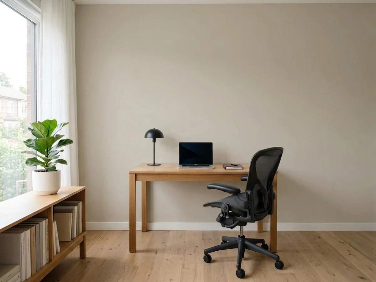
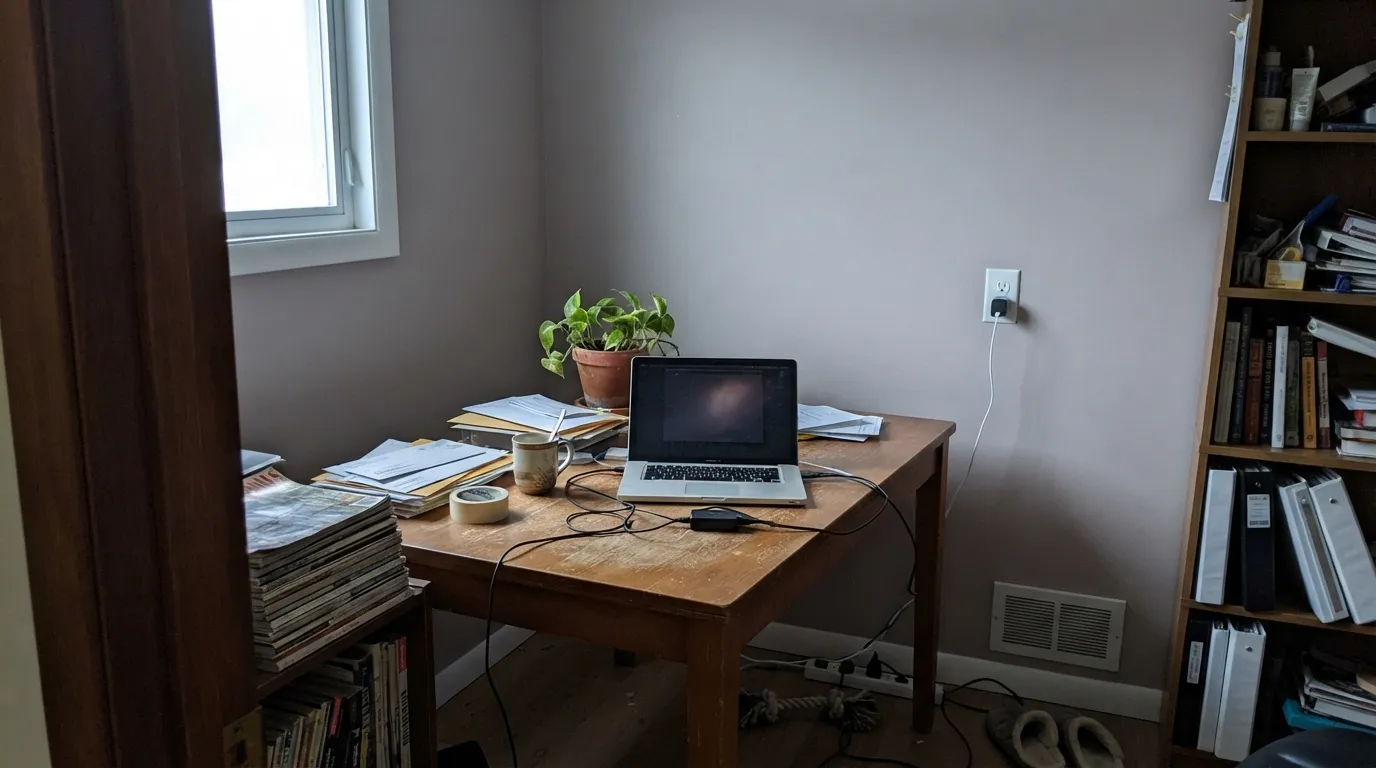
In a room with real daylight it stays out of the way of bookshelves and wood furniture without disappearing into beige. It is not a color that makes a statement, which for a workspace is usually the point.
The driftwood name and warm-taupe body suggest it would work well on coastal or cottage siding with white or navy trim, in the same territory as Revere Pewter exteriors. There is not enough real-world exterior use documented to call this a proven pick — sample a large board and view it at different times of day before committing a whole house.
Your Light Is the Risk
Warm light keeps the driftwood taupe grounded and true to the paint chip. This is the light to sample it in first.
Cool flat daylight is where its colorimetric cousins Balboa Mist and Eider White both flash violet or lilac-gray. Expect the same here until proven otherwise.
Warmer and more visibly taupe during the sun hours, quieter and more neutral once direct light passes.
2700K warm bulbs hold the driftwood warmth after dark. Cool white LEDs are the fastest way to invite the lilac cast in — swap the bulb before you swap the paint.
Most complaints about Cedar Key are a light mismatch. Upload a photo of your actual room and see it on your walls — then ask for the same wall in north light or evening lamps before you buy a single sample.
Need It From Another Brand?
Any paint counter can custom-tint Benjamin Moore 982 directly. If you would rather stay in one brand's own deck, these are the closest stock matches, measured as ΔE2000. Under 2 is a difference you will not see on the wall.
| Brand | Closest color | ΔE | LRV | |
|---|---|---|---|---|
| Sherwin-Williams | AccoladeSW 9516 · Sherwin-Williams | 1.0 | 62 | Color page → |
| Behr | Aged BeigePPU7-09 · Behr | 0.6 | 63 | Color page → |
| Valspar | Gentle Shadows8005-5A · Valspar | 1.0 | 64 | Color page → |
| PPG / Glidden | Crushed SilkPPG1024-3 · PPG / Glidden | 0.4 | 62 | Color page → |
| Glidden | Crushed SilkPPG1024-3 · Glidden | 0.9 | 63 | Color page → |
| Dutch Boy | Existence420-1DB · Dutch Boy | 1.3 | 63 | Color page → |
Similar Benjamin Moore Colors
The nearest shades to Cedar Key within Benjamin Moore's own range, ranked by perceptual color distance — useful when you want the same look a touch lighter, darker, or warmer.
WCAG 2.1: AA is 4.5 : 1 for normal text, 3 : 1 for large text, AAA is 7 : 1.
Cedar Key vs the Colors You're Also Considering
Every Cedar Key sample board has the same rivals on it. The numbers show the real lightness gap — then it comes down to which risk you would rather live with.
Pick this for a slightly deeper, more grounded read that holds its taupe a beat longer before cool light pulls the violet forward.
Benjamin Moore OC-27 · LRV 70Balboa MistPick this for the exact same driftwood-taupe hex with a proven review history and two extra points of LRV — go here if "no track record" is your dealbreaker.
Pick this for the more coastal, weathered-wood cast — Edgecomb Gray leans toward classic greige, Cedar Key leans toward driftwood.
Benjamin Moore HC-173 · LRV 63Edgecomb GrayPick this if you want the deck's most trusted warm greige — same tonal territory, decades of documented use behind it.
Pick this for a lighter, airier neutral that keeps the warmth without Revere Pewter's extra depth.
Benjamin Moore HC-172 · LRV 56Revere PewterPick this for a deeper, moodier greige with the biggest track record in the family and its own well-known green risk.
Pick this for the actual body of color — Seapearl is close to a white, Cedar Key is the wall that gives a coastal room its taupe backbone.
Benjamin Moore 961 · LRV 76SeapearlPick this for the lighter, warm off-white Benjamin Moore itself pairs with Cedar Key — use it for trim or a room that needs more brightness.
Inside the brand, Skipping Stone CSP-155 and Sea Salt CSP-95 at LRV 63 are two points lighter and pull slightly cooler than Cedar Key at LRV 61. In a north room that small shift is enough to make them look gray where Cedar Key stays warm. Clay Beige OC-11 shares the exact hex, so treat it as the same color under another name.
Across brands, PPG and Glidden Crushed Silk PPG1024-3 at LRV 62 has a deltaE of 0.43 and Behr Aged Beige PPU7-09 at LRV 63 sits at 0.56, so both are true matches. Sherwin-Williams Accolade SW 9516 at LRV 62 and Valspar Gentle Shadows 8005-5A at LRV 64 come in near a deltaE of 1, visually identical in normal room light. Farrow and Ball Shaded White No. 201 at LRV 63 is 1.51 away, still visually identical on a wall. Magnolia Home Stoneware Pieces JG-55 at LRV 63 is 4.3 away, close but visibly different side by side.
Cedar Key Coordinating Colors
Because Cedar Key is a warm taupe-greige, the coordinating rule is the same one that governs every color in this family: stay warm, avoid cool blue-white and cool gray. Benjamin Moore's own site pairs it with Seapearl; the rest of this list follows the same logic — warm whites for trim, tonal greiges for room-to-room handoffs, and one grounded dark for contrast.
Why You Haven't Heard Of Cedar Key
Cedar Key, Florida is a real place: a small barrier-island fishing village on the Gulf coast known for weathered docks, oyster shacks, and driftwood the tide leaves on the sand — exactly the image Benjamin Moore's own copy is reaching for. But the paint named after it has stayed quiet. It carries no Color of the Year designation, sits in the Classics® collection rather than a trend palette, and turns up almost nowhere in design blogs, Houzz threads, or Reddit paint discussions — a genuine search came back essentially empty.
That obscurity is not a red flag; it is simply the honest situation. Colorimetrically, Cedar Key is close enough to Balboa Mist and Eider White that it is reasonable to expect the same real-world behavior — warm and taupe in good light, prone to a violet or lilac cast in cool light — without yet having its own pile of owner photos to confirm it. If you want the driftwood-taupe look with documentation behind it, Balboa Mist is the safer bet. If you want the same look at a lower search-volume price with a painter who can quote it without a client comparing it to a hundred internet photos, Cedar Key is a reasonable, honestly under-tested choice.
Cedar Key With Wood Tones and Floors
As a warm-based taupe-greige, Cedar Key is naturally forgiving of warm wood. Walnut, white oak, and even honey oak generally sit comfortably against it, because the color's own warmth meets the floor's warmth rather than fighting it — a real advantage over cooler grays, which tend to fight honey-toned wood.
The pairing to sample carefully is cool: gray-washed flooring, gray-toned LVP, or cool gray quartz counters. Those materials pull warm taupes toward their cooler, more violet side, which is the same mechanism behind the cool-light flash described above. If your fixed materials already lean cool, test a large sample against them before committing a whole room to Cedar Key.
Three Ready Palettes Built on Cedar Key
A color is never alone on the wall. These are complete combinations in the 60-30-10 pattern, with the reason each one holds together. Every one opens in the visualizer.
Warm driftwood taupe, a warm off-white trim, and a navy door is the classic coastal-cottage formula — and keeping the whole scheme on the warm side of the fence is exactly what keeps Cedar Key's violet-flash risk from ever showing up.
Try this palette in your roomCedar Key and Edgecomb Gray sit two LRV points apart and share the same warm-taupe base, so the handoff between rooms is nearly invisible — a useful move if one room already wears the more famous color and the next room wants a quieter twin.
Try this palette in your roomSeapearl keeps the room bright and warm, the Cedar Key island carries the driftwood taupe at working height where it is easiest to sample and replace, and Kendall Charcoal gives one grounded dark note without ever going cold.
Try this palette in your roomCedar Key FAQ
Is Cedar Key warm or cool?
Warm — a grayed, driftwood-style taupe. It is built to sit between beige and gray without tipping fully into either, which is exactly what Benjamin Moore's own "driftwood washed ashore" description promises.
Is Cedar Key the same color as Balboa Mist or Revere Pewter?
Not identical, but close. Cedar Key's LRV 61 sits almost exactly between Revere Pewter (LRV 56) and Edgecomb Gray (LRV 63), and its formula is colorimetrically near-identical to Balboa Mist (LRV 70). Think of it as the same family of warm taupe-greige under a much quieter name.
Will Cedar Key look pink or purple on my walls?
It can, in cool or dim light. Its closest colorimetric matches in the deck — Balboa Mist and Eider White — are both documented to flash violet or mauve under flat north daylight or cool LED bulbs. Sample it in your actual room before committing, especially if the room is north-facing.
What trim white goes with Cedar Key?
A warm white — Seapearl or White Dove — not a stark, cool bright white. A cool-toned trim makes any warm taupe in this family look dingy by contrast, which is the most common styling mistake in the whole greige category.
Is Cedar Key a popular Benjamin Moore color?
Honestly, no — and that is worth saying plainly. It is a Classics-collection number with almost no design-blog coverage, no Color of the Year history, and very few documented real-room photos online. That makes it a low-key, low-competition choice, but also means you are largely trusting the paint chip and the deck data rather than a crowd of other owners' results.
Does Cedar Key work with wood floors?
Warm wood — walnut, white oak, even honey oak — generally works, since Cedar Key is a warm-based neutral rather than a true gray. The real risk pairing is cool, gray-washed flooring or gray quartz counters, which can pull the color toward the same lilac-gray drift its cooler-lit rooms already risk.
Have you painted with Cedar Key?
Rate it — one tap helps the next reader decide.
Ask a Question