Norwegian Blue
The dusty mid-tone blue-green people sample for islands, reviewed honestly: the light where it turns velvety slate, the rooms it closes in, and what to pick instead.

Jessica has spec'd whites and neutrals for more than 300 rooms and keeps a sample wall of painted drawdowns in her studio. Every color review is checked against real reader rooms in the comments and re-tested when a formula changes. About the testing process →
- 1Salamander6
- 2Hidden Gem14
- 3Norwegian Blue24
- 4Van Courtland Blue31
- 5Wythe Blue48
The Fast Verdict
Norwegian Blue is a dusty mid-tone blue-green grayed down so far it can pass for slate — until daylight hits four walls and the teal lean shows. Under evening lamps and in small rooms it goes velvety and storm-colored; in a dim north room with no lamps it just goes gray. If you want a kitchen island or a moody powder room that still has blue in it, this is the color — just never buy it hoping for a true gray, and never roll it on all four walls of a dark living room.
Kitchen islands and cabinets · moody powder rooms · accent walls · lamplit bedrooms that should feel like dusk · anyone who wants dusty blue-green that can pass as slate
You actually want gray · your floors are honey oak or golden builder beige · the room is dim north with no lamps · you need a light, airy living room · you wanted a clear saturated blue
- Dusty blue-green that can pass as slate — color without a theme
- Island and cabinet color that looks custom at Home Depot prices
- Powder rooms and small lamplit rooms turn velvety, not heavy
- Deep enough (LRV 24) to hold its color in bright rooms
- Pairs cleanly with crisp whites, pale oak, walnut, nickel, and brass
- Not gray — buyers expecting gray see dusty teal by the second sunny wall
- Four walls in a dim room go flat slate and make the space feel smaller
- Fights honey oak, golden beige, and cream-yellow trim
- Shifts hard from daylight teal to evening slate — sample at both hours
What Color Is Norwegian Blue, Really?
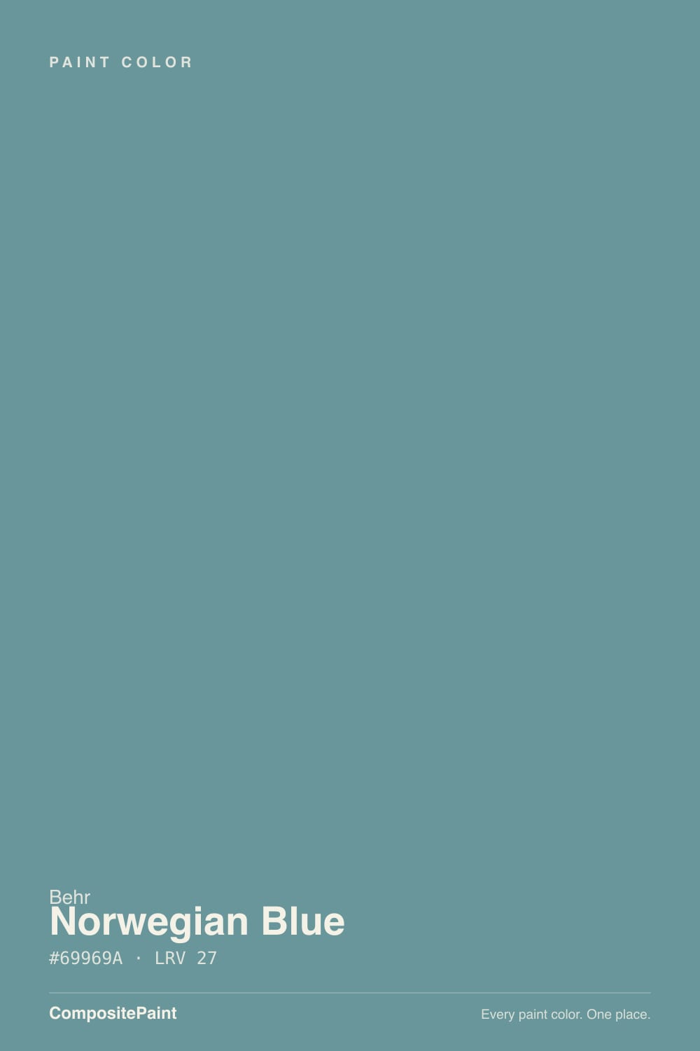
A dusty blue-gray with a green lean — and the green is the whole trick. Straight gray-blues go steely and a little dead on a wall; the extra green in Norwegian Blue pulls it toward teal, so it lands as dusty blue-green instead of office slate. Behr files it in the blue family as a gray-blue. The hex tells on it: more green than red, blue on top, low chroma. That is why the chip looks like a quiet gray-blue in the store and why a south wall can flash a muted teal the chip never promised.
At LRV 24 it is a genuine mid-to-deep tone. That depth is what makes it usable on an island and risky on a big field: a paler blue-gray washes out to fog; this one holds its dusty color in full daylight and then sinks toward charcoal-slate after dark. Plan for the wall to read a step deeper than the chip, more blue-green in bright light, and more gray in low light. Owners who film it keep saying the same thing — it shifts a lot. Sample on the actual surface at noon and at 8pm before you buy the gallons.
Undertone in one line: blue-gray first, a whisper of green second — never purple, never navy. If your sample reads flat slate, the light is low or cool; if it reads dusty teal, that is daylight doing it. Both versions are the same paint being honest about the room.
Where It Shines
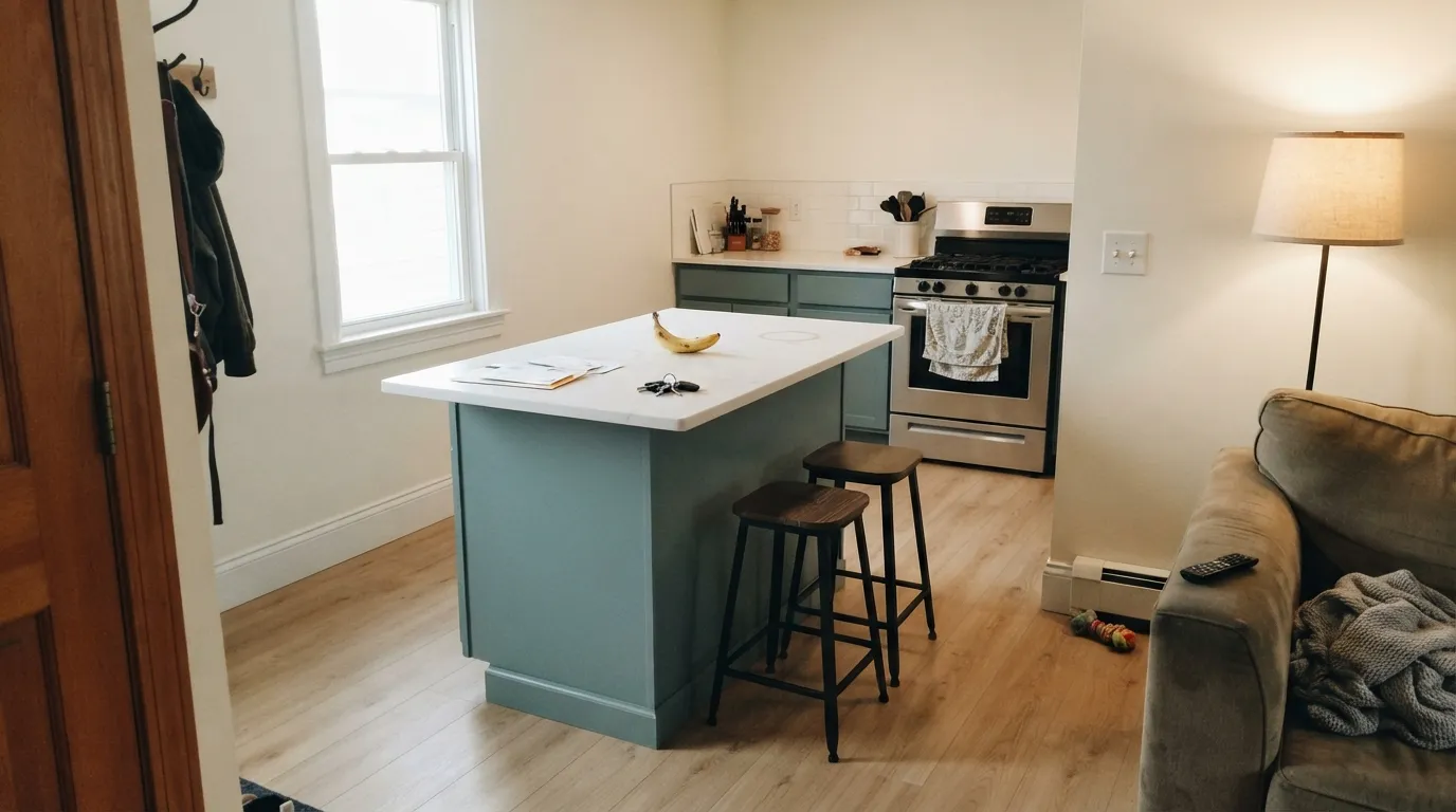
This color is built for a contained job, not a whole-house backdrop. On a kitchen island or a run of cabinets under Polar Bear walls it looks custom — deep enough to read as a decision, grayed enough that it does not go nautical. Its other home is the small, lamplit room: a powder room, a vanity, a headboard wall, where LRV 24 turns velvety instead of heavy. Give it crisp white trim, pale oak or walnut, nickel or unlacquered brass, and it looks like it was always there.
Where It Fails
Almost every regret story about Norwegian Blue follows one of three scripts, and all three are predictable before the first coat. None of them are the paint's fault — but if your room matches one, this is not your color, and sampling bigger will only confirm it.
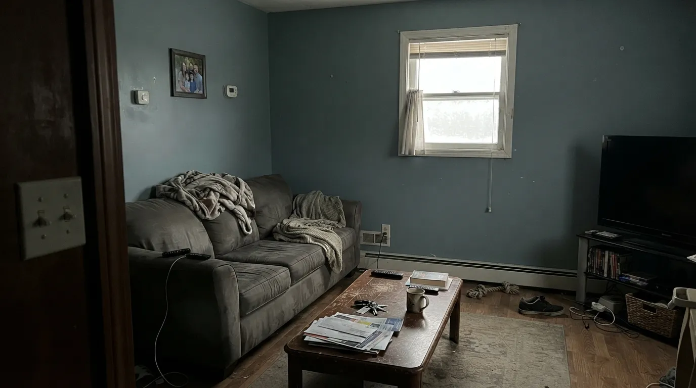
At LRV 24 the color already keeps most of the light that hits it. In a north living room, a basement, or any space running on one small window, the dusty blue-green drains out and you are left with a flat, slightly dirty slate — smaller, dingier, and not the storm-sky you sampled under store lights. Designers who like this color still warn against four walls unless you are going dark on purpose. If the room cannot spend daylight, put it on an island or a door, not on the field.
On the chip it passes for a moody cool gray. On a sunlit wall the green-blue is unmistakable — depth multiplies undertone. If your goal is gray with a little personality, this is too much personality; look at Storm Cloud for a true blue-gray at the same depth, or Dovetail if you wanted warmth instead of teal.
Yellow-orange sits across the wheel from this blue-green. Honey-oak floors, golden builder beige, and a creamy off-white trim all push the wall cooler and greener while the wood goes more orange. Both sides lose. Pale white oak, walnut, gray-washed floors, and a crisp white (Polar Bear or Ultra Pure White on trim) are the company it was mixed for. Cream makes the blue look dingier, not softer.
Room by Room
This is the use that keeps showing up in real kitchens: satin Norwegian Blue on the island or the lower cabinets, Polar Bear or Ultra Pure White on the walls and uppers. Deep enough to look custom, grayed enough that it does not fight white quartz. Brass or chrome both work. A full kitchen of this on every box is a bolder bet — fine in a bright room, heavy over honey oak.
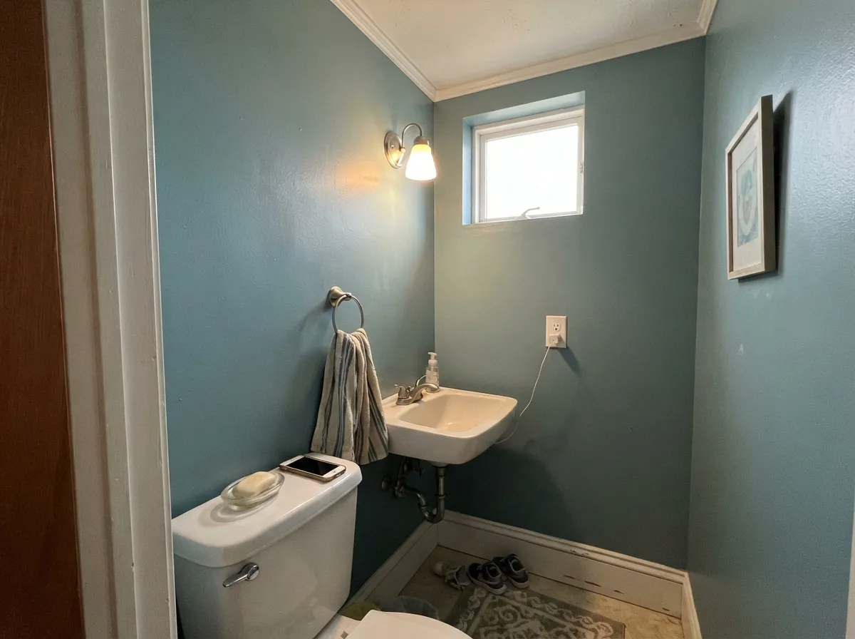
Small rooms take LRV 24 well because you never see a long wall of it. Drench all four walls, keep the ceiling Ultra Pure White, and the little room reads considered instead of leftover. Matte or eggshell on the walls; satin on a vanity if you want one darker note. Warm 2700K bulbs are part of the paint job — they keep the slate from going dead.
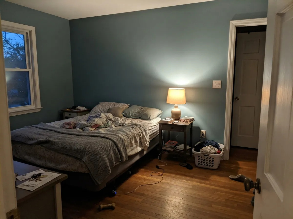
A closed, lamplit bedroom is the interior-wall version of the island: dusty blue-green by day, velvet slate at night. Matte finish hides texture and deepens the color; Polar Bear trim keeps the edges crisp. Skip it if the bedroom faces north and stays dim — you will get gray walls and a smaller room, not a restful one.
White subway, chrome or brushed nickel, a real window: the dusty blue-green reads intentional, not dingy. Satin on the walls for steam. Cool gray tile is fine; cream tile and honey vanity wood argue. Sample above the actual tile before you commit. A windowless bath needs strong warm lamps or a lighter blue-gray.
On one wall behind a sofa, with lamps, it can look expensive. On all four walls of an open main floor it has to negotiate with kitchen wood, greige adjacent rooms, and whatever daylight actually arrives — and at LRV 24 it will close the space. If you love it here, keep it on the fireplace wall or the built-ins.
Full sun washes the dusty teal toward a flatter gray-blue, which can look intentional on a shaded front door against white or pale-gray siding. A whole elevation of LRV 24 blue-green is a bigger commitment than the interior jobs, and north walls will read a full step darker and slatier than the south. Sample the shady side of the house before you roll.
Your Light Is the Risk
Generous sun pulls the green-blue forward and the walls go dusty teal-slate, not dead gray. This is the light where the color earns the blue in its name — sample here first.
Cool gray daylight kills the teal and leaves a flat, slightly dirty slate. Fine if you half-wanted gray; disappointing if you wanted blue, and heavy if the room is already short on light.
Bright midday reads softer and slightly grayer. As the sun drops, the color deepens and the green-blue comes back, then sinks toward charcoal-slate at dusk. Same paint, two honest reads — owners keep saying it shifts a lot, and they are right.
2700K bulbs wake a dusty teal and keep the walls velvety. Cool 4000K LEDs push it toward steely, slightly dingy gray-blue. Swap the bulbs before you blame the paint — warm lamps are part of this color.
Most complaints about Norwegian Blue are a light mismatch. Upload a photo of your actual room and see it on your walls — then ask for the same wall in north light or evening lamps before you buy a single sample.
Need It From Another Brand?
Any paint counter can custom-tint Behr N470-5 directly. If you would rather stay in one brand's own deck, these are the closest stock matches, measured as ΔE2000. Under 2 is a difference you will not see on the wall.
| Brand | Closest color | ΔE | LRV | |
|---|---|---|---|---|
| Sherwin-Williams | Storm CloudSW 6249 · Sherwin-Williams | 3.6 | 23 | Color page → |
| Benjamin Moore | Templeton GrayHC-161 · Benjamin Moore | 3.3 | 24 | Color page → |
| Valspar | Sharkfin4007-2A · Valspar | 1.9 | 23.6 | Color page → |
| PPG / Glidden | Garrison GrayPPG1039-5 · PPG / Glidden | 2.1 | 23 | Color page → |
| Glidden | Slate Ridge70BG 23/065 · Glidden | 2.4 | 23 | Color page → |
| Dutch Boy | Felted Blue430-5DB · Dutch Boy | 1.2 | 23 | Color page → |
Similar Behr Colors
The nearest shades to Norwegian Blue within Behr's own range, ranked by perceptual color distance — useful when you want the same look a touch lighter, darker, or warmer.
WCAG 2.1: AA is 4.5 : 1 for normal text, 3 : 1 for large text, AAA is 7 : 1.
Norwegian Blue vs the Colors You're Also Considering
Every Norwegian Blue sample board has the same rivals on it. The numbers show the real lightness gap — then it comes down to which risk you would rather live with.
Pick this when you want that idea a step deeper and a hair greener, and you are already at Home Depot.
Benjamin Moore HC-145 · LRV 31Van Courtland BluePick this if you want the historic BM slate-blue — a step lighter, same gray-until-the-light-says-otherwise trick, and it is already a known quantity.
Pick this when the dusty green-blue is the point, not an accident on a gray.
Sherwin-Williams SW 6249 · LRV 24Storm CloudPick this if you want a genuine blue-gray at the same depth with less teal — it works hardest on a door, not a wall.
Within Behr, the differences among the near neighbors are mostly about which side of teal they favor. Vintage Teal MQ6-33 at #619498 and LRV 26 is bluer and slightly more saturated. Nature Retreat 730F-5 at #6D948E and LRV 26 is the clearest green of the set, and Blue Clay T15-16 at #6B9194 and LRV 26 is the most muted.
Across brands the matches are tight. Glidden Island Turquoise 90GG 29/164 at LRV 29 has a deltaE of 1.64, Valspar Ship Shape V102-5 at LRV 26.8 is 1.69, and PPG Wright Echo Blue FLLW741 at LRV 29 is 1.88, so all three are visually identical in normal room light. Dutch Boy Gulf Coast Green 332-5DB at LRV 26 is deltaE 2.71 and Sherwin-Williams Peacock Plume SW 20 at LRV 27 is 3.17, both very close but worth sampling first.
Benjamin Moore Hemlock 719 at LRV 28 is deltaE 3.47 and reads slightly softer and grayer. Clare Keep It Teal PNT100-MD-75 at LRV 27 is deltaE 4.82 and clearly greener, so it is close but visibly different side by side.
Norwegian Blue Coordinating Colors
The rule for coordinating with Norwegian Blue: crisp whites, lighter dusty blue-grays, and one darker gray or navy — and keep everything yellow at arm's length. It pairs with Polar Bear far better than with cream, loves pale oak and walnut, and layers with cooler cousins on the same side of the deck. These are the partners that keep showing up in rooms that work:
Not Famous, Just Useful: Islands, Powder Rooms, and the Slate Trick
Norwegian Blue is not a Color of the Year and it has no viral kitchen attached to its name. It sits in the Behr blue deck as a gray-blue, and homeowners keep pulling it for the same two jobs: a kitchen island that should look custom without going navy, and a powder room that should feel finished after one weekend. The reason is the depth. At LRV 24 it is dark enough to read as a decision on a box or a small wall, and grayed enough that it does not shout coastal.
The slate trick is also why people get surprised. In low light it behaves like a cool gray; in daylight the dusty green-blue comes forward. That is a feature in a powder room you use at night and a problem in a dim living room you hoped would stay blue. If you cannot confirm a famous room that made this color, that is because there isn't one — just a lot of islands and small rooms where it quietly works.
Norwegian Blue With Wood Tones and Floors
This decision gets made at the floor, not the paint store. Pale white oak, gray-washed oak, and walnut are the color's best friends — the cool or red-brown depth makes the dusty teal read smoky and deliberate. Espresso and ebonized wood go more formal, which suits a dining room or a powder room. White or light-gray quartz on a kitchen island is easy.
The one honest no is golden: honey oak floors, orange-stained trim, yellow-beige carpet. Yellow-orange sits opposite this blue-green on the wheel, so each side exaggerates the other — the floor reads more orange, the walls read more teal, and no amount of coats fixes geometry. If the golden floor is staying, put a large rug between it and this paint, or keep Norwegian Blue on a cabinet box that does not sit on the oak.
Metals are the easy part: unlacquered brass, antique bronze, polished nickel, and matte black all work. Creamy gold hardware is the only finish that leans too yellow against it.
Three Ready Palettes Built on Norwegian Blue
A color is never alone on the wall. These are complete combinations in the 60-30-10 pattern, with the reason each one holds together. Every one opens in the visualizer.
This is the job the color was mixed for. Polar Bear is Behr's everyday white — crisp enough to keep the island looking blue-green instead of dingy, without the gallery glare of a cooler bright white on the walls. Ultra Pure White on ceiling and trim is unbeatable in that role and stops the mid-tone from closing the room in.
Try this palette in your roomSmall rooms take the depth. Ultra Pure White overhead keeps LRV 24 from turning the powder room into a cave; Kendall Charcoal on the door is the best-behaved dark gray for one hard edge so the slate-blue reads deliberate. Brass or nickel hardware, 2700K bulbs, done.
Try this palette in your roomTwo depths of the same dusty blue-gray family, separated by a clean white. Teton Blue is the lighter storm-sky cousin — close enough that a hallway does not feel like a color change, light enough that you do not drench the whole floor in LRV 24. Polar Bear trim keeps both from going dingy.
Try this palette in your roomNorwegian Blue FAQ
Is Norwegian Blue blue or gray?
Both, depending on the light — and that is the point. In low light it reads slate; in daylight the dusty blue-green is unmistakable. On four sunny walls nobody will call it gray. If gray is what you actually want, this is the wrong color; that mismatch is behind most of the bad surprises.
What trim white goes with Norwegian Blue?
A crisp white, not a cream. Polar Bear on trim and Ultra Pure White on the ceiling are the Behr-native defaults; a stark cooler white also works because this wall color is cool. Warm creams (Swiss Coffee territory) make the dusty teal look dingy next to the yellow edge. Semi-gloss on the trim, matte or eggshell on the walls.
Is it good for kitchen cabinets?
Yes — that is its best interior job. Satin on an island or the lower cabinets under white walls looks custom. A whole kitchen of Norwegian Blue boxes is a stronger commitment and needs real daylight; over honey-oak floors it fights. Use a satin urethane-fortified cabinet enamel either way.
Does Norwegian Blue work with oak floors?
Depends entirely on the oak. Pale white oak, gray-washed oak, and walnut are excellent. Golden honey oak is the one genuine clash: yellow-orange sits opposite this blue-green, so the floor goes more orange and the walls go more teal. A large rug helps, but with wall-to-wall honey tones pick a different color.
Can I paint a whole room this color?
Only if you want dark and moody, and only if the room has daylight or you commit to lamps. At LRV 24, four walls of a dim living room will feel smaller and slatier than the chip. Powder rooms, closed bedrooms, and offices with a window can take it. Large open rooms should keep it on an island, a vanity, or one wall.
Does it have green undertones?
A whisper, yes — that is what separates it from a straight gray-blue. You will see dusty teal in south and west light and almost none of it after dark. If green is your dealbreaker, look at Storm Cloud. If you like the dusty teal, this is the feature, not a defect.
Have you painted with Norwegian Blue?
Rate it — one tap helps the next reader decide.
Ask a Question