Juniper Ash
The blue-green-gray Behr sells across five different product lines, reviewed honestly: the cabinets and doors it was built for, the dim rooms that swallow it whole, and what to pick instead.

Jessica has spec'd whites and neutrals for more than 300 rooms and keeps a sample wall of painted drawdowns in her studio. Every color review is checked against real reader rooms in the comments and re-tested when a formula changes. About the testing process →
- 1Salamander6
- 2Hidden Gem14
- 3Juniper Ash23
- 4Van Courtland Blue31
- 5Wythe Blue48
The Fast Verdict
Juniper Ash is what happens when Behr splits the difference between slate blue, sage green and charcoal gray, and lands somewhere genuinely interesting instead of muddy. At LRV 23 it is deep enough to read as a real color, not a tint — which is exactly why Behr sells it across five different lines built for cabinets, doors and trim rather than as a default wall shade. Give it daylight and it settles into a moody blue-green that flatters brass and dark wood; starve it of light and it goes nearly black.
Kitchen cabinets and islands · front doors and exterior trim · powder room and bathroom vanities · a home office or den with real daylight
You actually want a true gray · your room is small, north-facing and lamp-free · you're painting a whole open-plan main floor in one color · your floors are honey-orange oak
- A genuine blue-green-gray with real color, not mud or generic "greige"
- Sold across five separate Behr lines built for cabinets, doors and trim — real trade demand, not a marketing color
- LRV 23 holds its color in bright rooms where paler colors would bleach out
- Flatters brass hardware, walnut and warm wood on cabinets and vanities
- Reads as a confident, current front-door color without going full black or navy
- Goes flat, near-black in dim or north-facing rooms
- Not a true gray — buyers expecting a neutral get blue-green
- Fights honey oak, golden trim and orange-leaning wood
- Too moody and light-dependent for a whole-house wall color
What Color Is Juniper Ash, Really?
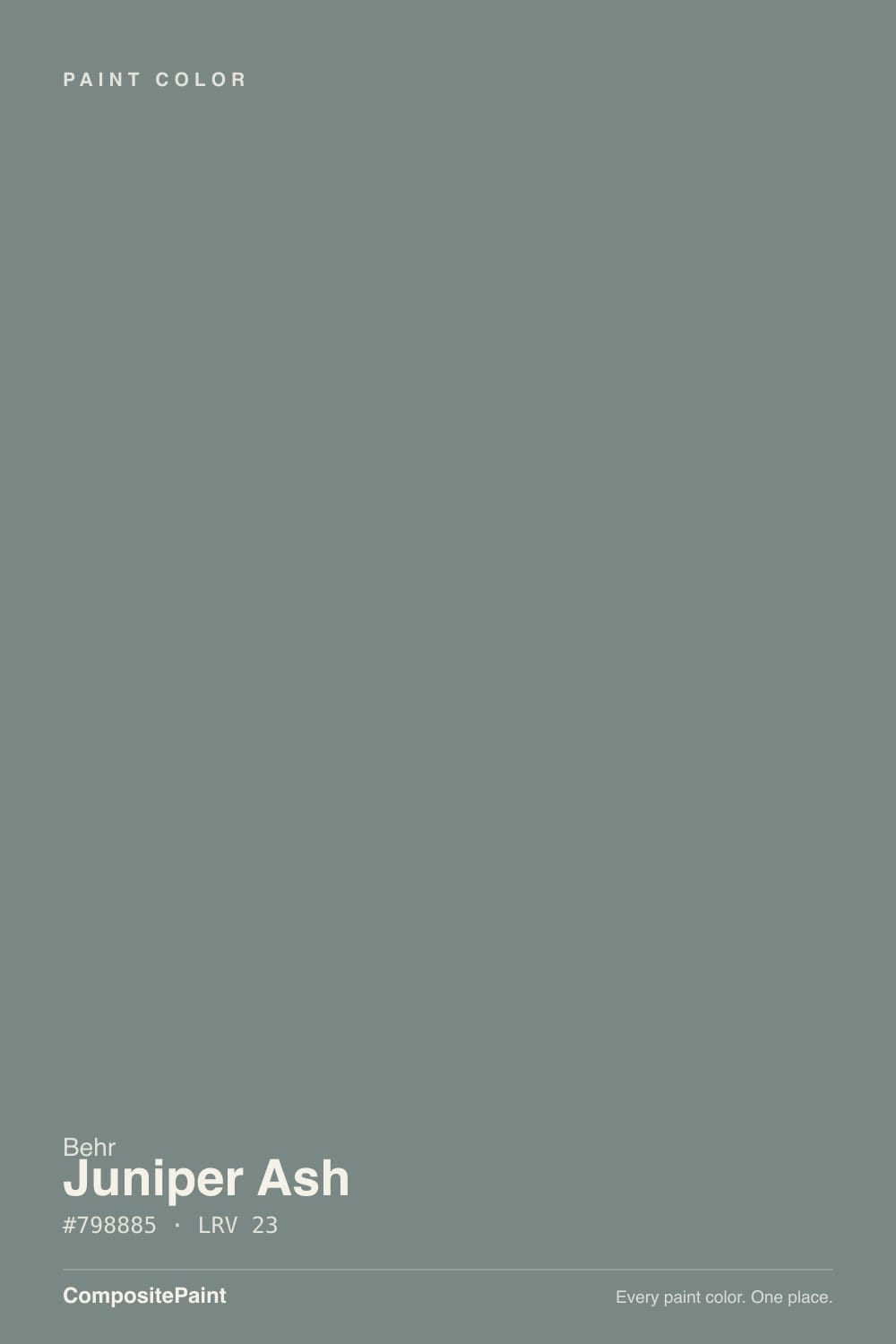
A deep, grayed-down blend of blue and green with almost no warmth in it — Behr itself describes the color as "a well-matched balance of deep blue and mid-green, with dark gray grounding this shade." That three-way tug is the whole personality: in some light it reads distinctly blue-slate, in other light the green surfaces and it leans toward a smoky juniper. It never fully commits to either, which is why designers reach for it on a single surface rather than a full room — it gives a kitchen or a front door one confident color statement without forcing the rest of the house to match a specific hue.
At LRV 23 it sits solidly in medium-dark territory — noticeably deeper than a greige like Agreeable Gray (LRV 60) and closer in weight to a true statement color. That depth is the tradeoff: it holds its blue-green character in bright rooms where paler colors would bleach out, but it also has almost no reserve of light to fall back on when the room goes dim. A cabinet or a door can afford that; four walls in a windowless room usually cannot.
Undertone in one line: blue and green in roughly equal measure, cooled further by gray — never brown, never warm. If your sample reads flat charcoal with no color at all, that is a dim-room problem, not the paint; if it reads distinctly teal or slate on different walls, that is simply the color responding honestly to whichever light source is stronger in that spot.
Where It Shines
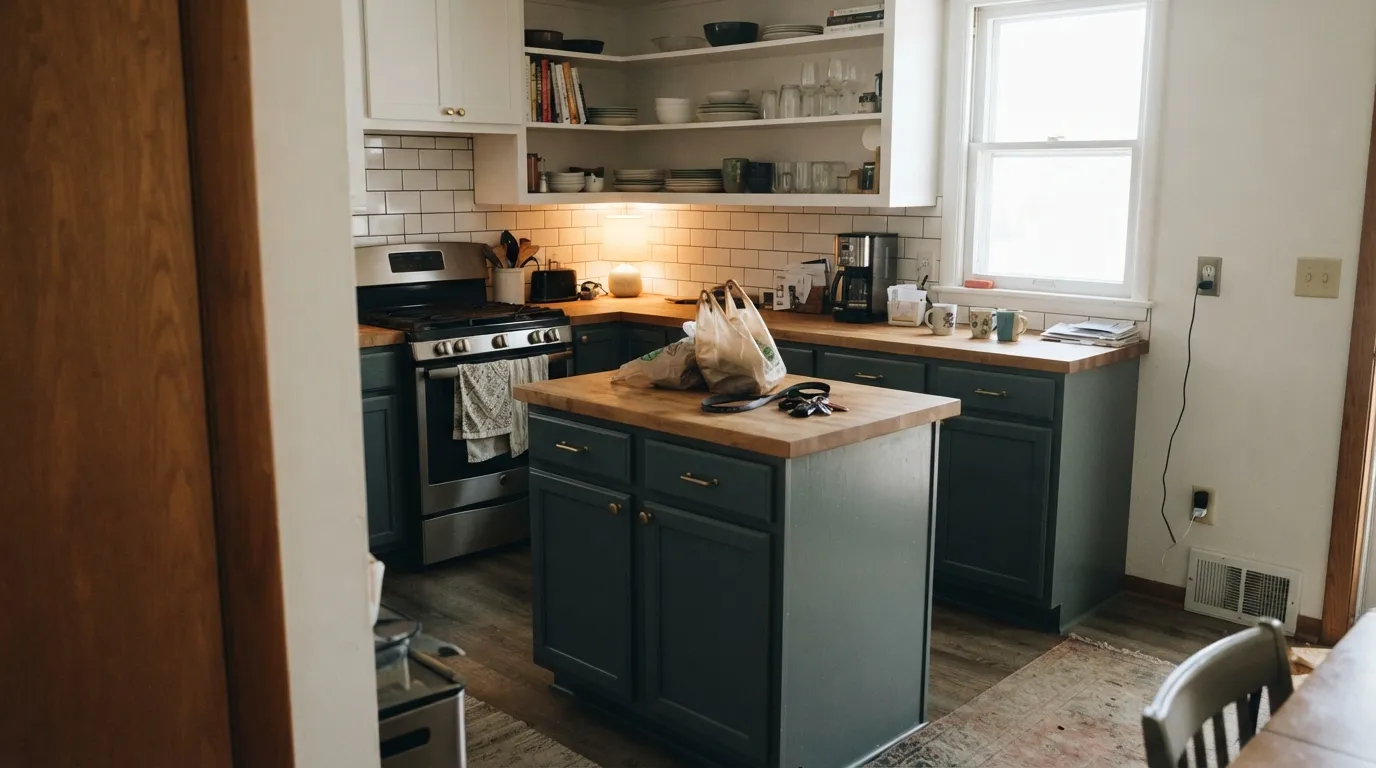
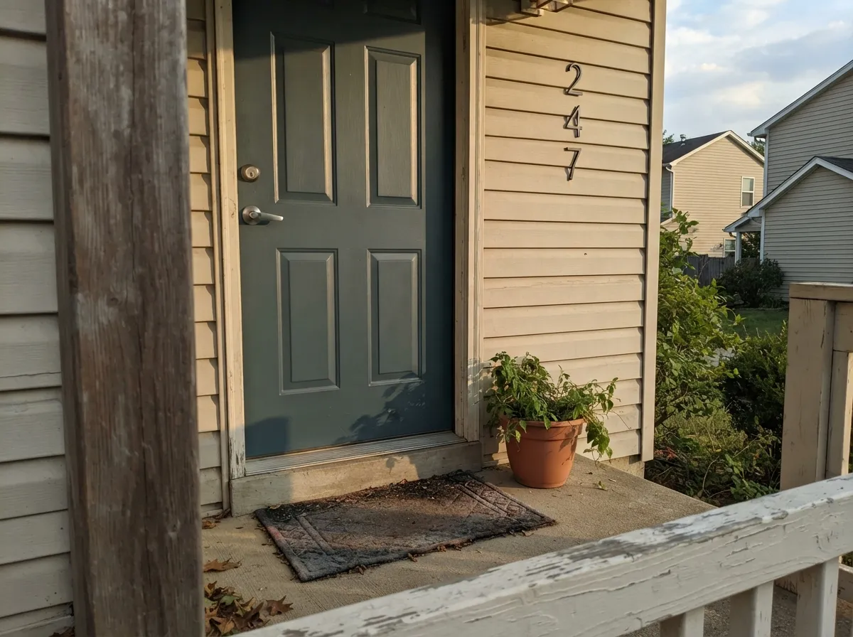
Juniper Ash earns its keep as a surface color, and Behr's own catalog says so louder than most reviews could: it is sold in the Dynasty one-coat-hide line, the Premium Plus low-odor interior AND exterior lines, the Ultra flat and semi-gloss exterior lines, a dedicated Premium interior/exterior cabinet-door-trim formula, and even a 5-gallon Behr Pro contractor size. Five separate product lines built around one color is a real signal of trade demand, not marketing spin. On a kitchen island or a full run of cabinets — the kind of in-frame shaker kitchen showing up on design boards paired with oak worktops — it reads as a confident, current blue that photographs beautifully against warm wood and brass. On a front door under real daylight it does the same job: one saturated, slightly unusual color that reads intentional rather than random.
Where It Fails
Almost every disappointing Juniper Ash story starts with the same setup: the room the color went into did not have the light budget for it. None of these are the paint failing — they are the same three predictable situations repeating, and all three are visible before you open the can.
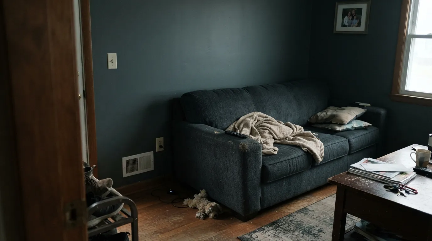
At LRV 23 the color has very little light in reserve. Take away real daylight and warm lamps and it stops reading as blue-green entirely, sinking toward a flat near-black charcoal. Readers who wanted a moody accent get a wall that just looks unlit. Fix it with real daylight, warm bulbs, or keep this color off four full walls in that room.
The name says "Ash," and in weak light it can pass for a smoky gray-charcoal on the chip. On a real cabinet run or a full door in daylight, the blue and green are unmistakable — this is a color, not a neutral. If gray with almost no personality is the goal, this is the wrong can; look at a true gray instead and let this one stay a specialty pick.
Blue sits opposite orange on the wheel, so orange-leaning honey oak cabinetry, trim or flooring fights this color directly — the wood reads more orange, the paint reads flatter and grayer, and neither side wins. Juniper Ash wants walnut, espresso, pale white oak or a neutral floor between it and anything golden.
Room by Room
The job Behr built five product lines for. Satin or semi-gloss cabinet enamel wipes clean, flatters brass hardware and warm wood counters, and reads as a deliberate design choice rather than an accent-wall experiment. Full walls of it in a windowless kitchen is the one version to skip.
In real daylight it is a strong, current front-door color that separates a house from the usual black or navy default. Semi-gloss for durability. Pair with a light-to-mid siding color so the door reads as a statement, not a shadow.
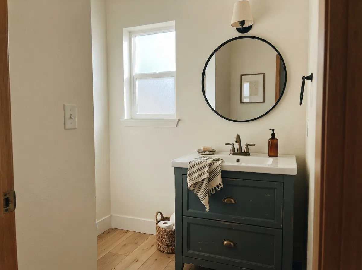
A small room takes the depth well, and a Juniper Ash vanity under cream walls with brass hardware reads custom without repainting the whole bathroom. Satin cabinet-grade enamel, same as the kitchen.
A closed room that gets genuine window light through the day handles this color beautifully — walnut shelving and leather chairs are natural company. Skip it in a windowless interior office; the color needs something to reflect.
A full living room of Juniper Ash is a real commitment: south or west light keeps it looking like a color, anything dimmer and it drifts toward flat charcoal. Safer as an accent wall or trim than as the room's dominant surface.
This is a specialty color, not a background one. Its depth and shifting undertone are exactly what make it work on one surface and exactly what make it exhausting spread across an entire floor plan.
Your Light Is the Risk
Strong direct light keeps both the blue and the green visible at once — the truest read of the color, and the light it was made to be seen in.
With little natural light and no lamps, LRV 23 has almost nothing left to give — the color sinks to a flat near-black charcoal. Sample here before committing four walls.
Cooler and more blue-slate in morning east light, greener and warmer as afternoon west light comes in. The shift is real but gentle, not a different color.
2700K warm bulbs pull the green forward and soften the color toward juniper; cool white LEDs flatten it back toward slate-charcoal. Cabinets under warm under-cabinet lighting look their best.
Most complaints about Juniper Ash are a light mismatch. Upload a photo of your actual room and see it on your walls — then ask for the same wall in north light or evening lamps before you buy a single sample.
Need It From Another Brand?
Any paint counter can custom-tint Behr PPU12-16 directly. If you would rather stay in one brand's own deck, these are the closest stock matches, measured as ΔE2000. Under 2 is a difference you will not see on the wall.
| Brand | Closest color | ΔE | LRV | |
|---|---|---|---|---|
| Sherwin-Williams | PortsmouthSW 9644 · Sherwin-Williams | 1.6 | 22 | Color page → |
| Benjamin Moore | Templeton GrayHC-161 · Benjamin Moore | 1.7 | 24 | Color page → |
| Valspar | Beguile5002-2A · Valspar | 2.3 | 24 | Color page → |
| PPG / Glidden | Rough RidePPG1036-5 · PPG / Glidden | 2.2 | 23 | Color page → |
| Glidden | ThunderboltPPG10-06 · Glidden | 1.6 | 23 | Color page → |
| Dutch Boy | Felted Blue430-5DB · Dutch Boy | 4.0 | 23 | Color page → |
Similar Behr Colors
The nearest shades to Juniper Ash within Behr's own range, ranked by perceptual color distance — useful when you want the same look a touch lighter, darker, or warmer.
WCAG 2.1: AA is 4.5 : 1 for normal text, 3 : 1 for large text, AAA is 7 : 1.
Juniper Ash vs the Colors You're Also Considering
Every Juniper Ash sample board has the same rivals on it. The numbers show the real lightness gap — then it comes down to which risk you would rather live with.
Pick this for the extra dose of green — Storm Cloud stays gray-blue, Juniper Ash visibly shifts toward juniper in warm light.
Sherwin-Williams SW 6249 · LRV 24Storm CloudPick this if your painter works in Sherwin-Williams — nearly the same depth and blue-gray lean, and the same door-not-a-wall personality.
Pick this when you want the lighter, more room-safe version — Hidden Gem needs even more daylight to avoid reading black.
Behr N430-6A · LRV 14Hidden GemPick this for a deeper, darker green-blue in the same Behr family — a bigger commitment, less light-dependent day to night.
Within Behr the group is tight. Gray Pepper BNC-25 (#758782, LRV 23) and Echo Park MQ6-10 (#738582, LRV 22) are near-twins, a shade deeper and marginally greener. Slate Gray 6695 (#838684, LRV 24) is lighter and more neutral, with the teal mostly gone, and Legendary Gray PPU26-03 (#7F8384, LRV 22) is the plainest gray of the set. If you want the blue-green to be more obvious, Polaris Blue PPU13-06 (#6F8A8D, LRV 23) and Leisure Time PPF-46 (#758C8F, LRV 25) push clearly toward blue.
Across brands, Sherwin-Williams Portsmouth SW 9644 (LRV 22), Glidden Thunderbolt PPG10-06 (LRV 23), and Benjamin Moore Templeton Gray HC-161 (LRV 24) are visually identical in normal room light. Dunn-Edwards Shadow Effect DET597 (LRV 24) and Valspar Beguile 5002-2A (LRV 24) are very close, so sample first. Farrow and Ball De Nimes No. 299 (LRV 21) and Dutch Boy Felted Blue 430-5DB (LRV 23) are close but visibly different side by side, De Nimes reading bluer and deeper.
Juniper Ash Coordinating Colors
The rule for coordinating with Juniper Ash: warm whites and creams to soften the cool cabinet or door, near-black hardware for contrast, and cautious steps toward gold or orange. It pairs naturally with brass, walnut and matte black, and it plays well with paler members of its own blue-gray family when you want a whole-room version without the full depth. These are the partners that keep showing up in real rooms:
Why Behr Sells This Color in Five Different Lines
Most Behr colors live in a handful of product lines. Juniper Ash is stocked in the Dynasty one-coat-hide interior line, the Premium Plus low-odor line for both interior AND exterior walls, the Ultra line in both flat and semi-gloss exterior finishes, a dedicated Premium interior/exterior cabinet-door-trim enamel, and even a 5-gallon Behr Pro contractor size. That spread only happens when a color has real, sustained demand across both DIY walls and trade cabinet-and-door work — it is not a trend color riding one viral moment.
The Houzz project galleries back that up with real rooms: an in-frame shaker kitchen finished in Juniper Ash against oak worktops is exactly the kind of application the color's product-line spread predicts — a cabinet and trim color first, a wall color only when the room can afford the depth.
Juniper Ash With Wood Tones and Floors
Cool colors and warm wood usually need a little care, and this pairing is no exception. Walnut, espresso and pale white oak are the safe, flattering choices — the darker or more neutral the wood, the more sophisticated the combination reads. A mid-tone, honey-leaning oak is still workable if the floor is muted rather than orange.
The one real no is bright, orange-leaning honey oak — the classic builder-grade floor from the 1990s and 2000s. Blue and orange sit directly across the color wheel from each other, so each side amplifies the other's worst tendency: the floor looks more orange, the cabinets or door look flatter and grayer. A large rug or a stain refresh closes that gap; without one, this color and that floor will always be arguing.
Three Ready Palettes Built on Juniper Ash
A color is never alone on the wall. These are complete combinations in the 60-30-10 pattern, with the reason each one holds together. Every one opens in the visualizer.
White Dove's warmth keeps the room from feeling cold next to a cool cabinet color, and Wrought Iron hardware gives the eye one dark, near-black note so the blue-green doesn't have to fight for attention on its own.
Try this palette in your roomA pale siding and crisp white trim give the door nothing to compete with, so the depth of Juniper Ash carries the whole facade as one confident statement instead of getting lost against a busier palette.
Try this palette in your roomCream walls keep a small room from feeling closed in, the vanity carries the color, and near-black hardware gives the scheme one crisp anchor note — the classic small-room formula for a color that reads as a real design choice, not an accident.
Try this palette in your roomJuniper Ash FAQ
Is Juniper Ash blue or green?
Both, deliberately — Behr describes it as a balance of deep blue and mid-green grounded by gray. In cooler light it leans blue-slate; in warmer light the green surfaces. It never fully settles into either, which is exactly why it works as a cabinet or door color rather than trying to be a simple gray.
Is it a good kitchen cabinet color?
Yes — this is the job Behr built the color for. It ships in a dedicated interior/exterior cabinet, door and trim formula plus a one-coat-hide Dynasty version, and real kitchens (in-frame shaker cabinetry against oak worktops, for example) use it exactly this way. Satin or semi-gloss cabinet enamel is the right finish.
What wall color goes with Juniper Ash cabinets?
A warm off-white or cream — White Dove or Swiss Coffee — keeps the room from feeling cold next to a cool cabinet color. A stark bright white works too, but the warm option is more forgiving in a kitchen without much natural light.
Will it look too dark in a dim room?
Yes, and this is the most common regret. At LRV 23 the color depends on real daylight or warm lamps to show its blue-green character; take that away and it reads as a flat, unlit near-black. Test a large sample in the actual room, not just near a window.
Can I use it on a front door?
It is one of the better current alternatives to the usual black or navy front door. Behr sells it in exterior semi-gloss and flat exterior lines specifically for this. In real daylight it reads as a confident, slightly unusual color; pair it with a lighter siding so the door doesn't disappear against a dark facade.
Does it work with honey oak floors or trim?
This is the one genuine clash. Blue sits opposite orange on the color wheel, so golden honey-oak floors or trim fight the paint directly — both sides end up looking worse. It pairs far better with walnut, espresso, pale white oak, or a neutral floor between the two.
Have you painted with Juniper Ash?
Rate it — one tap helps the next reader decide.
Ask a Question