Rock Bottom
The near-black Sherwin-Williams files under Green, reviewed honestly: the light that turns it mossy, the light that flattens it to nothing, and what to pick instead.

Jessica has spec'd whites and neutrals for more than 300 rooms and keeps a sample wall of painted drawdowns in her studio. Every color review is checked against real reader rooms in the comments and re-tested when a formula changes. About the testing process →
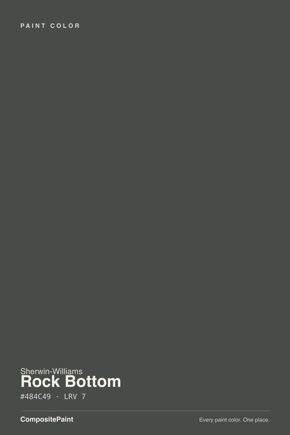
- 1Cordovan Brown0
- 2Rock Bottom7
The Fast Verdict
Rock Bottom looks like just another near-black on the chip. On a wall in real light it isn't: Sherwin-Williams files it under Green, not Black, and the reason shows up the moment direct sun hits it — a deep, mossy cast surfaces inside what you expected to be flat charcoal. That movement is the entire appeal. It's a genuine chameleon at LRV 7, which makes it more interesting than Tricorn Black or Iron Ore in the right light, and a flat black blob in the wrong one.
Kitchen islands and cabinets with a real window nearby · exterior siding that catches morning or afternoon sun · home offices and built-ins you want to feel bold, not boring · anyone who finds true black (Tricorn) a little cold and flat
The room runs on one small window or none at all · you want a neutral black with zero color drift, full stop · your counters, tile and hardware are all cool-toned · you're painting a room you actually sleep in and want it to feel light and airy
- A genuine near-black that visibly shifts through gray, green and charcoal in real light
- Reads softer and less stark than a true neutral black like Tricorn or Iron Ore
- Excellent on cabinets, islands and built-ins with warm wood and brass
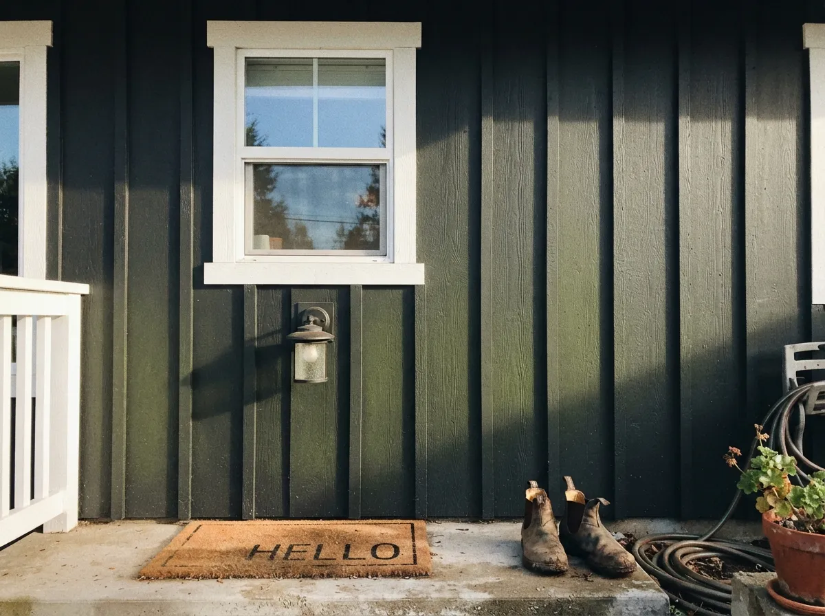
- Exterior siding gets real dimension instead of a flat black silhouette
- Deep enough (LRV 7) to hide scuffs and read consistently in strong light
- Buyers expecting neutral black see green by the second wall
- Needs real direct light to show any color at all — flat light kills the effect
- Fights cool-toned stone, tile and chrome finishes
- Three to four coats over white drywall without a tinted primer
What Color Is Rock Bottom, Really?
Sherwin-Williams files Rock Bottom under its Green family, not Black or Gray, and that one filing decision explains almost everything about how the color behaves. On a small chip it reads like any other near-black. On a wall, in real daylight, the green comes forward — a deep, mossy, almost forest-floor cast that separates it from flat, neutral blacks like Tricorn Black or Iron Ore. It's a genuine chameleon, not a marketing word for one: the same wall can look charcoal-gray at noon and distinctly green by late afternoon.
At LRV 7 it sits in true near-black territory, reflecting almost none of the light that hits it — the same range as Tricorn Black (LRV 3) and Iron Ore (LRV 6). That depth is exactly why the green needs real light to show up: without direct sun on the wall, there isn't enough reflected light to carry any undertone anywhere, and the color reads as an undifferentiated black shape instead of the mossy near-black it's supposed to be. Give it morning or afternoon side light and the green surfaces on its own; put it under flat overhead light or a small north window and it collapses back toward plain charcoal-black. Expect three to four coats over white drywall, or two over a gray-tinted deep-base primer — LRV 7 does not cover in one pass.
Undertone in one line: green first, gray second, true black only in low light. If your sample reads flat charcoal with zero green, that's a dim or north-facing room talking, not a different can. If it reads warm brown instead, you're thinking of Urbane Bronze, not this.
Where It Shines
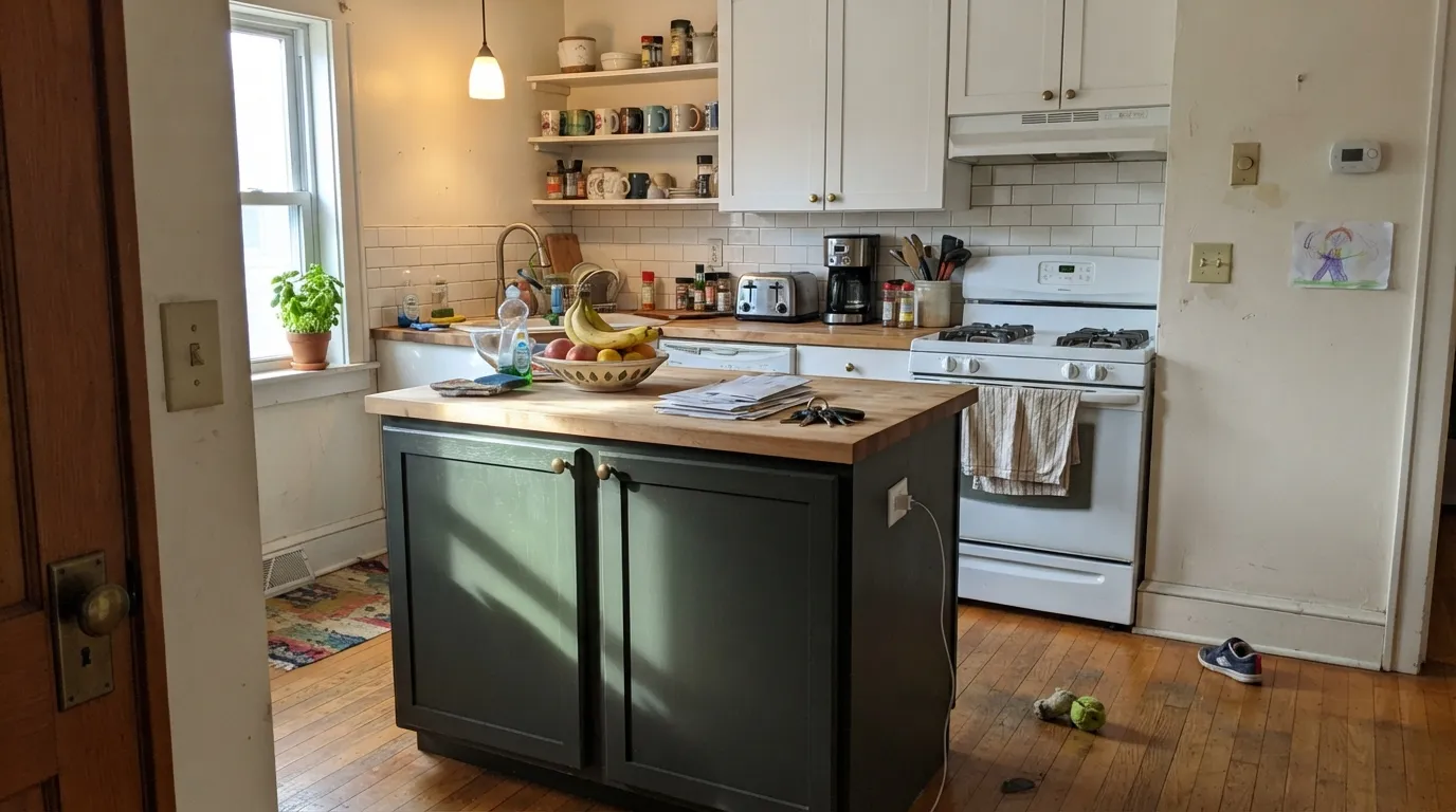
Rock Bottom earns its keep anywhere it gets real, direct light to work with: a kitchen island under a window, exterior siding that catches morning or afternoon sun, a home office with south-facing glass. In that light it does something flat black can't — it shifts, subtly, through gray, green and charcoal over the course of a day, which is the whole reason to pick it over Tricorn Black or Iron Ore. It's also a genuinely good near-black for people who find true black harsh: the green softens the contrast just enough to feel considered instead of stark, especially against warm wood, brass and cream.

Where It Fails
Almost every disappointed story about Rock Bottom traces back to one of three situations, and all three are predictable before the first coat. None of them are the paint's fault — but if your room matches one, this is not your near-black, and a bigger sample will only confirm it.
On the fan deck it can pass for a plain black. The first time real sun hits it, the mossy green shows up and stays. If you specifically wanted a neutral black with zero color drift — the way Tricorn Black or Iron Ore behave — this will feel like the wrong can, even though it's exactly the one you bought.
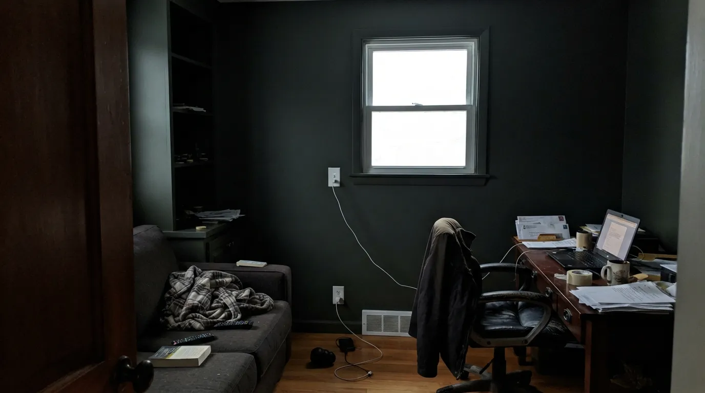
At LRV 7 there's almost no light bouncing back to begin with. Take away direct sun and there isn't enough reflected light left to carry the green anywhere — the whole point of this color disappears, and it just reads as an undefined black shape. Pick a color that doesn't need real light to earn its keep, or add real light before you paint.
Cool white quartz, brushed nickel, blue-gray tile — surround the green undertone with cold materials and it starts to look like a mistake instead of a mood. This color wants warm company: brass, walnut, cream, unlacquered metal. Cool finishes make the green look muddy rather than deliberate.
Room by Room
Islands and full cabinet runs are where Rock Bottom does its best work, especially under a window that throws real morning or afternoon light across the doors. Brass or unlacquered-brass pulls and butcher block let the green read as intentional. Satin cabinet enamel; expect four coats or a deep-base primer first.
A south- or west-facing elevation shows the full chameleon effect: mossy in the afternoon, charcoal by dusk. A shaded north elevation of the same house will read almost entirely black — walk the whole exterior with a sample before committing to all four sides.
Built-ins and a single accent wall in a sunlit room read bold and deliberate rather than heavy. Pair with warm wood shelving and brass task lighting. Eggshell holds up to bumped chair backs better than matte.
A satin Rock Bottom vanity under a warm-veined stone top and brass fixtures is a small, contained way to use the color without betting a whole room on it. Cool gray marble fights the green — see it in person before buying the stone.
Beautiful behind a fireplace or built-ins in a room with real daylight; riskier as the sole dark note in an open floor plan, where adjoining rooms and their light have to cooperate too. A lighter chameleon cousin like Oyster Bay in a connecting room keeps the mood without matching exactly.
LRV 7 on four walls with no direct sun reads heavy rather than restful, and most bedrooms don't get the kind of raking daylight this color needs to show its color. A single headboard wall in a bright room can work; whole-room commitment is a harder sell than in a sunlit kitchen or office.
Your Light Is the Risk
Side light hitting the wall pulls the mossy green forward — the chameleon effect at its most obvious. This is the light the color is worth buying for.
With no direct light to reflect, the green never surfaces. The wall reads as an undefined black shape with no depth or personality left.
Overhead midday sun and dusk pull it toward plain charcoal-black; morning and afternoon side light pull it distinctly green. Same wall, two different colors.
2700K lamps deepen it toward a warm black-brown at night. Cool LEDs sharpen the green into something colder and more graphic — pick your bulb on purpose.
Most complaints about Rock Bottom are a light mismatch. Upload a photo of your actual room and see it on your walls — then ask for the same wall in north light or evening lamps before you buy a single sample.
Need It From Another Brand?
Any paint counter can custom-tint Sherwin-Williams SW 7062 directly. If you would rather stay in one brand's own deck, these are the closest stock matches, measured as ΔE2000. Under 2 is a difference you will not see on the wall.
| Brand | Closest color | ΔE | LRV | |
|---|---|---|---|---|
| Behr | AstronomicalN450-7 · Behr | 1.3 | 7 | Color page → |
| Benjamin Moore | Deep River1582 · Benjamin Moore | 1.0 | 8 | Color page → |
| Valspar | Model TV140-6 · Valspar | 1.7 | 6.9 | Color page → |
| Glidden | Enchanted Forest Green30GY 07/051 · Glidden | 2.3 | 7 | Color page → |
| Dutch Boy | Shaded Forest427-7DB · Dutch Boy | 4.3 | 7 | Color page → |
| HGTV Home by Sherwin-Williams | Rock BottomHGSW 1501 · HGTV Home by Sherwin-Williams | 0.0 | 7 | Color page → |
Similar Sherwin-Williams Colors
The nearest shades to Rock Bottom within Sherwin-Williams's own range, ranked by perceptual color distance — useful when you want the same look a touch lighter, darker, or warmer.
WCAG 2.1: AA is 4.5 : 1 for normal text, 3 : 1 for large text, AAA is 7 : 1.
Rock Bottom vs the Colors You're Also Considering
Every Rock Bottom sample board has the same rivals on it. The numbers show the real lightness gap — then it comes down to which risk you would rather live with.
Pick this if flat, unmoving black feels boring — the whole point of Rock Bottom is that it doesn't sit still.
Sherwin-Williams SW 7069 · LRV 6Iron OrePick this if you want a true neutral near-black with no green lean — Iron Ore holds steady through the day where Rock Bottom moves.
Pick this for a near-black with real personality that shifts with the sun instead of staying flat.
Sherwin-Williams SW 6258 · LRV 3Tricorn BlackPick this if you want zero undertone drama — Tricorn Black reads black in every light, full stop, no chameleon act.
Pick this for the cooler, more urban charcoal mood — Rock Bottom stays legibly colored where Urbane Bronze can slide into plain black in a dim room.
Sherwin-Williams SW 7048 · LRV 8Urbane BronzePick this for a warmer, cozier dark that leans brown instead of green — a softer fit with honey wood tones.
Inside the line, Olympic Range SW 7750 shares the same LRV of 7, but its hex #424C44 holds more green, so it reads as a dark green rather than a black. Black Fox SW 7020, also LRV 7, goes the other way with #4F4842, a warm brown-black. Cyberspace SW 7076 at LRV 6 is the blue-leaning alternative. Rock Bottom sits between all of these as the most neutral of the group.
Across brands, HGTV Home Rock Bottom HGSW 1501 carries the identical hex and a deltaE of 0, so it is the same color under a different label. Magnolia Home Cottage Grove JG-161 at 0.81 and Benjamin Moore Deep River 1582 at 1.03 are effectively the same on a wall. Farrow and Ball Studio Green No. 93 at 1.59 and Valspar Model T V140-6 at 1.74 are visually identical in normal room light. Behr Forest Floor PPF-55 at 2.19 is very close, so sample first, and Dutch Boy Shaded Forest 427-7DB at 4.34 is close but visibly different side by side.
Rock Bottom Coordinating Colors
The rule for coordinating with Rock Bottom: warm whites, brass, walnut, and one true-black or lighter-chameleon note — and keep cool-toned stone and chrome at arm's length. These are the partners that keep the green reading as deliberate instead of accidental:
Why a Near-Black Files Under Green
Most near-black paints in every brand's deck get filed under Gray or, at LRV 3-to-6, simply Black — a decision that mostly comes down to whether the undertone shows itself outside of direct light. Rock Bottom's green is strong enough that Sherwin-Williams puts it in the Green family instead, alongside colors many shades lighter. That filing is the most honest description of the paint available: it is a green pushed dark enough to pass for black in the wrong light, not a black with a green tint.
That distinction matters at the paint counter. Someone who wants a neutral near-black with zero color drift — matching hardware finishes, matching an adjacent true black — should look at Iron Ore or Tricorn Black instead. Rock Bottom is for the buyer who wants the near-black look with something happening underneath it, and who has a room with enough real light to let that happen.
Rock Bottom With Wood Tones and Metals
Warm wood is the easy pairing: walnut, butcher block, aged leather and rattan all sit comfortably against the green-black because the warmth in the wood balances the coolness that near-black depth can otherwise carry. Pale, cool-toned woods and gray-washed floors are a tougher match — they don't offer the green anything warm to react against, and the pairing can read a little flat.
Metals follow the same logic. Unlacquered brass, aged bronze and matte black all look intentional against Rock Bottom; polished chrome and bright nickel are the coldest match and tend to make the green look slightly off rather than moody. If your fixtures are already chrome, plan to swap them or accept a cooler, more graphic result than the color's warmest photos show.
Three Ready Palettes Built on Rock Bottom
A color is never alone on the wall. These are complete combinations in the 60-30-10 pattern, with the reason each one holds together. Every one opens in the visualizer.
A warm white wall keeps the room bright enough to feed the island real light, which is exactly what Rock Bottom needs to show its green instead of going flat. Tricorn Black window frames give one true-black note so the near-black island doesn't have to fight for attention.
Try this palette in your roomTwo depths of the same chameleon green-gray family — deep on the siding, lighter on the shutters — read as deliberate rather than mismatched, and crisp Pure White trim keeps the whole facade from going murky in shade.
Try this palette in your roomWhite Dove trim keeps the near-black wall from reading like a hole in a bright room, and carrying the lighter Oyster Bay into the next room continues the mood without demanding the same commitment everywhere.
Try this palette in your roomRock Bottom FAQ
Is Rock Bottom black or green?
Both, depending on the light — and Sherwin-Williams itself files it under the Green family, not Black. In flat or dim light it can look like a plain near-black; hit it with real morning or afternoon sun and a mossy green surfaces clearly. If you want a color with zero color drift, this isn't it — Iron Ore or Tricorn Black are the neutral options.
Does it work on kitchen cabinets?
Very well, especially islands and full runs near a window. The green reads as intentional against brass hardware and butcher block or warm stone. Use a satin cabinet enamel and plan on a gray-tinted primer or three to four coats — LRV 7 needs real coverage.
What white pairs best with Rock Bottom?
A warm white — Greek Villa or Pure White both keep enough brightness in the room to feed the near-black real light, which is what it needs to look green instead of flat. A stark, cool-leaning white can push the pairing colder than the wall wants to be.
Is it too dark for a small room?
Depends entirely on the light, not the square footage. A small sunlit room with a real window can carry Rock Bottom on all four walls and look intentional; a small windowless room or one with a single north window will just read as a black box with none of the color's personality left.
How many coats does it need?
Three to four coats over plain white drywall, or two coats over a gray or black-tinted deep-base primer. Ask for the deep base at the paint counter — it is built for exactly this kind of near-black coverage.
Does Rock Bottom work on exteriors?
Yes, and it's one of the more interesting near-black siding choices for that reason: a south- or west-facing wall shows real mossy movement through the day instead of sitting flat like a plain black. A shaded north side of the same house will read almost entirely black — walk the full exterior with a large sample before painting all four elevations.
Have you painted with Rock Bottom?
Rate it — one tap helps the next reader decide.
Ask a Question