Oyster Bay
The coastal gray-green everyone loves on Instagram, reviewed honestly: the blue surprise nobody warns you about, and the rooms where it turns on you.

Jessica has spec'd whites and neutrals for more than 300 rooms and keeps a sample wall of painted drawdowns in her studio. Every color review is checked against real reader rooms in the comments and re-tested when a formula changes. About the testing process →
- 1Kendall Charcoal15
- 2Retreat21
- 3Oyster Bay44
- 4Upward57
- 5Sea Salt63
The Fast Verdict
Oyster Bay is the muted coastal gray-green people fall in love with on a chip and then argue with on a wall. In good daylight it is genuinely lovely — soft sage, quiet, expensive-looking next to wood and brass.
But it carries a slate-blue thread that the chip hides, and in flat or cool light that blue takes over. Sample it big, on two walls, and look at it at night before you buy five gallons.
Bedrooms and baths with real daylight · kitchen islands and lower cabinets · bath vanities with wood and brass · house exteriors with white trim
Your room faces north and stays dim · your trim and floors are beige or tan · you want a small room to feel bigger · you specifically want a warm sage
- Reads as a real color while still behaving like a neutral
- Flatters oak, walnut, brass, and aged bronze
- Low-risk on islands, lower cabinets, and vanities
- Very predictable outdoors — full sun keeps it green
- Deep enough to feel finished without darkening a room
- Goes clearly blue in north light and on cloudy days
- The chip looks gray; four walls look green or blue
- LRV 44 closes in small, windowless rooms
- Fights beige trim, tan tile, and honey-tan floors
What Color Is Oyster Bay, Really?
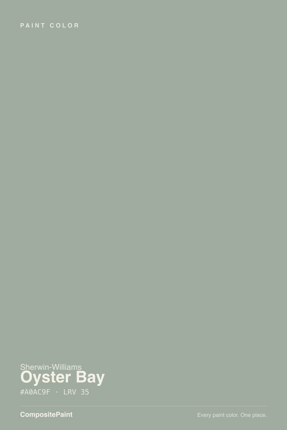
Sherwin-Williams files Oyster Bay under gray, the internet sells it as sage, and the walls of real houses often show a third thing entirely: slate blue. All three are true. The color is built as a green with almost all the color drained out, so there is very little pigment holding it steady, and whatever your room supplies — cool daylight, warm bulbs, a beige floor — decides which side comes forward. That instability is the single most important fact about this color, and it is the reason it collects both rave reviews and "I thought they mixed it wrong" posts.
At LRV 44 it is a true mid-tone, and that surprises people who shop it next to the lighter coastal colors. Sea Salt SW 6204 sits at LRV 63 — nearly twice the light bouncing back. Put them side by side and Oyster Bay looks like the grown-up, moodier version: it gives a room depth and a real color decision instead of a tint. It will not open up a dark hallway or make a small bath feel airy. It is a color you choose because you want the walls to have presence.
Undertone in one line: cool gray-green with a slate-blue thread — never warm, never yellow. If your sample reads sage in the afternoon and blue on a cloudy morning, the paint is not defective. That is Oyster Bay being Oyster Bay.
Where It Shines
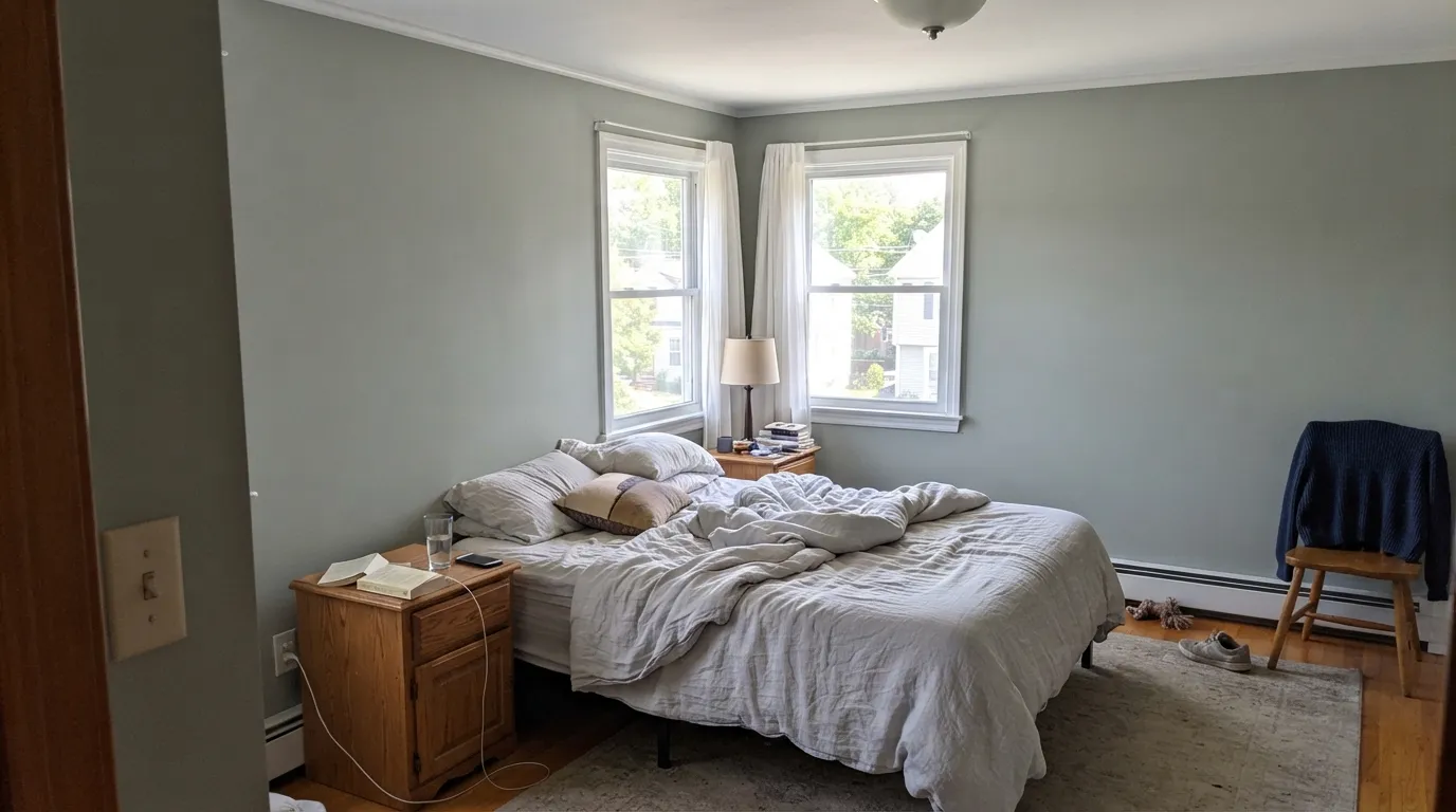
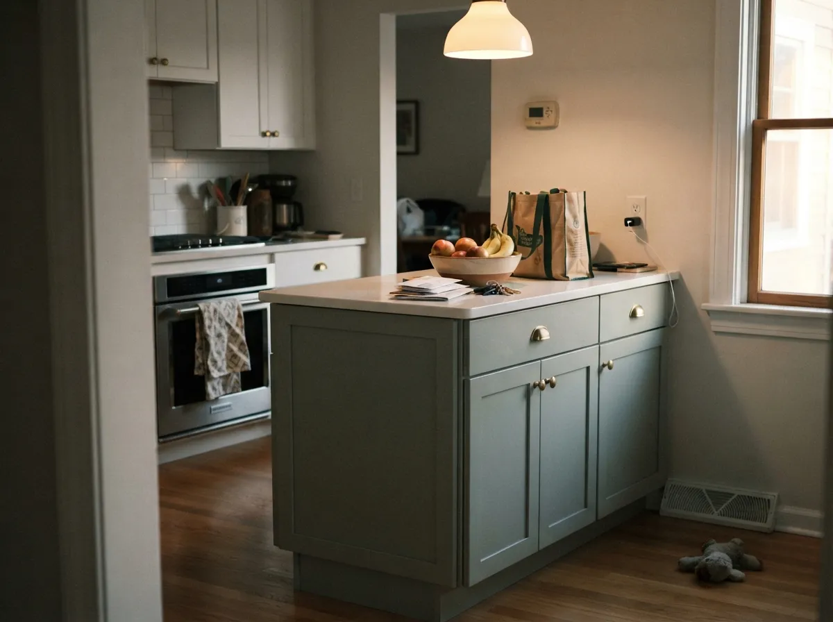
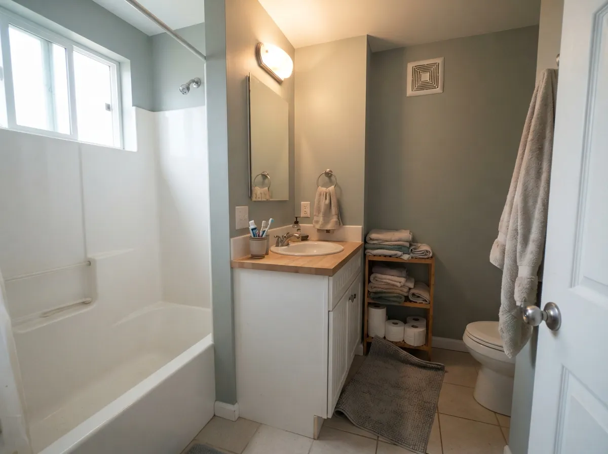
Give it real daylight and warm materials — oak, walnut, brass, wood counters — and it earns every bit of its popularity. Bedrooms and bathrooms are where readers report the fewest regrets, and a kitchen island or a run of lower cabinets is where it does the most work for the least risk.
Where It Fails
The unhappy stories about Oyster Bay are not random. Three situations produce almost all of them, and all three are visible on a sample board before you spend a weekend rolling walls.
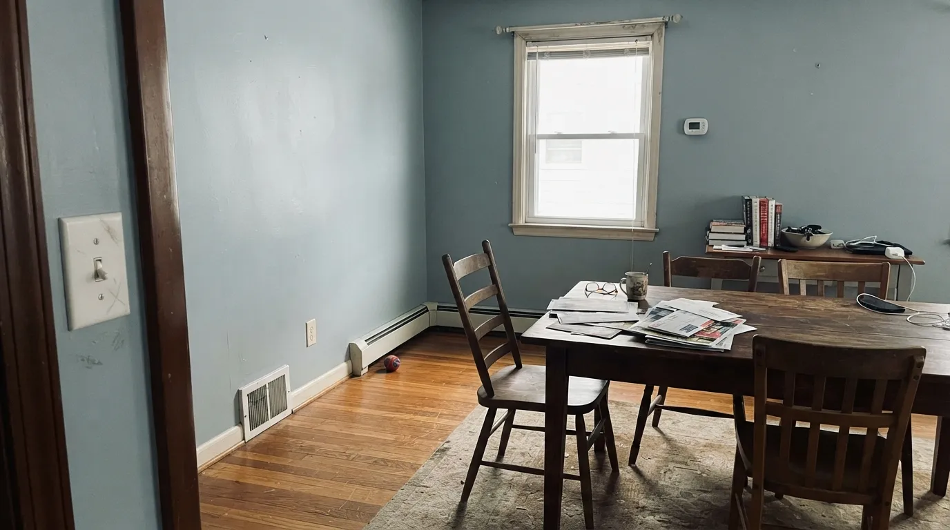
This is the number-one complaint, and it is always the same story: the chip looked gray-green, the finished dining room looked blue enough that people assume the store made a mistake. North light is cool and flat, and with this little pigment the slate-blue side is all that survives. If you want sage in a north room, pick a green with warmth built in — Willow Tree SW 7741 or Clary Sage SW 6178 — and stop fighting the light.
One of the most-repeated regret posts is a whole-house Oyster Bay plan that fell apart because the trim was a beige white and the floors were deep tan. The warm floor pushes the wall cooler by contrast, and the blue jumps out. Either switch the trim to a clean white like Alabaster SW 7008, or pick a green that agrees with beige — Clary Sage SW 6178 does.
LRV 44 absorbs more light than it returns. In a windowless powder room or a basement office it stops reading calm and starts reading closed-in. For the same coastal feeling with air in it, use Sea Salt SW 6204 at LRV 63, or keep Oyster Bay for the vanity only and put Sea Salt on the walls.
Room by Room
With daylight and warm 2700K lamps it settles into a quiet sage that reads restful rather than gray. Eggshell on walls, Alabaster SW 7008 on trim and ceiling. Skip it if the bedroom is north-facing and you only see it at night.
This is the lowest-risk way to use the color, because the counters and perimeter keep the room bright. Satin finish; pair with Alabaster SW 7008 or Pure White SW 7005 uppers, warm white quartz, and brass or aged bronze hardware.
On a vanity with a wood top or on all four walls of a daylit bath it does the spa thing convincingly. Satin for moisture. In a windowless powder room it goes heavy and blue — use Sea Salt SW 6204 there instead.
It looks fantastic in dining rooms with south or west light and dark wood furniture. Dining rooms are also where the blue complaints cluster, because so many of them face north and get used after dark. Test a two-foot board on the actual wall, day and night.
Mid-tone walls cut screen glare and photograph well on calls. Eggshell, with white trim to keep an edge on it. Warm wood shelving keeps the green side forward; all-white furniture pushes it blue.
Full sun holds the green and the color stops wandering, which makes exteriors more predictable than interiors. Body in Oyster Bay, trim in Extra White SW 7006, door in Naval SW 6244 or Urbane Bronze SW 7048.
Your Light Is the Risk
Cool, flat daylight strips the green out and the slate blue takes over. Test a big board first.
Warm sun lifts the green into a soft sage and holds it there all day. This is the color people photographed.
2700K lamps make it sage and cozy. 4000K LEDs turn it gray-blue and cold. Swap bulbs, not paint.
Warm floors and beige trim exaggerate its cool side. In sun it reads green; in flat light it reads blue.
Most complaints about Oyster Bay are a light mismatch. Upload a photo of your actual room and see it on your walls — then ask for the same wall in north light or evening lamps before you buy a single sample.
Need It From Another Brand?
Any paint counter can custom-tint Sherwin-Williams SW 6206 directly. If you would rather stay in one brand's own deck, these are the closest stock matches, measured as ΔE2000. Under 2 is a difference you will not see on the wall.
| Brand | Closest color | ΔE | LRV | |
|---|---|---|---|---|
| Behr | Silver TinselUL200-7 · Behr | 4.1 | 45 | Color page → |
| Benjamin Moore | Fieldstone1558 · Benjamin Moore | 2.4 | 43 | Color page → |
| Valspar | Silver MossT686 · Valspar | 1.1 | 46.2 | Color page → |
| Glidden | Loden Frost Green10GY 42/088 · Glidden | 2.3 | 42 | Color page → |
| Dutch Boy | Woodsy Gray425-3DB · Dutch Boy | 0.7 | 43 | Color page → |
| HGTV Home by Sherwin-Williams | Magnetic GrayHGSW 1506 · HGTV Home by Sherwin-Williams | 2.4 | 46 | Color page → |
Similar Sherwin-Williams Colors
The nearest shades to Oyster Bay within Sherwin-Williams's own range, ranked by perceptual color distance — useful when you want the same look a touch lighter, darker, or warmer.
WCAG 2.1: AA is 4.5 : 1 for normal text, 3 : 1 for large text, AAA is 7 : 1.
Oyster Bay vs the Colors You're Also Considering
Every Oyster Bay sample board has the same rivals on it. The numbers show the real lightness gap — then it comes down to which risk you would rather live with.
Pick this when you want depth and a wall with real presence.
Sherwin-Williams SW 6204 · LRV 63Sea SaltPick this for small or dark rooms — nearly twice the light comes back.
Pick this for the cooler, more coastal, more modern read.
Sherwin-Williams SW 6205 · LRV 47Comfort GrayPick this for a softer, grayer green that stays calmer in mixed light.
Halcyon Green SW 6213 (#9BAAA2, LRV 39) is the closest neighbor in the line. It is a few points lighter and its hex carries a touch more blue, so it reads slightly cooler. Willow Tree SW 7741 (#AAAD9C, LRV 41) goes the other way, adding yellow and lightness until it looks more like a warm sage than a gray-green. Unusual Gray SW 7059 (#A3A7A0, LRV 38) is the most neutral of the group, with the green nearly gone, and Frosted Fern SW 9648 (#A7A796, LRV 38) leans yellow-olive.
Across brands, Behr Green Balsam PPU11-15 (LRV 39, deltaE 0.4) and Valspar Sigh of Relief V098-3 (LRV 40, deltaE 0.45) are matches you would not pick apart on a wall. Benjamin Moore Flora AF-470 (LRV 40, deltaE 1.26) is visually identical in normal room light. Farrow and Ball Pond Green No. G7 (LRV 41, deltaE 2.21) is very close but worth sampling first.
Oyster Bay Coordinating Colors
The rule with Oyster Bay is to give it warmth to lean on and a clean white to sit against. Warm greiges, oak, brass, and bronze all pull the green forward and keep the blue in check; cool grays, beige-leaning whites, and blue-gray tile do the opposite. These are the partners that show up again and again in rooms where the color actually worked:
Oyster Bay on Cabinets and Vanities
Cabinets are where this color is at its most forgiving, and it is worth understanding why. On a wall you are looking at a large flat plane in whatever light the room gives you, so every shift shows. On an island or a vanity the color is broken up by counters, hardware, and reflected light from the white surfaces around it, and your eye stops tracking the drift. People who regret Oyster Bay on walls almost never regret it on cabinets.
The pairing rules are simple. Warm white counters, oak or walnut, and brass or aged bronze hardware all keep the green side in front. Cool gray quartz and chrome do the opposite and make the doors read blue-gray. Use a urethane-fortified cabinet enamel in satin — it wipes clean around handles and it is the sheen that makes a mid-tone green look intentional instead of chalky. If the kitchen is small, keep the color on the lowers and the island and leave the uppers white.
Oyster Bay Outside the House
Everything that makes Oyster Bay nervous indoors calms down outdoors. Direct sun is warm and abundant, so the green stays in charge and the slate-blue side rarely appears. At LRV 44 it also holds up well on a full facade — light enough to keep a house from looking heavy, deep enough that the siding reads as a color choice rather than a faded neutral.
Trim decides the character. Extra White SW 7006 gives the crisp coastal look and makes the green read clean. A softer white like Alabaster SW 7008 goes more traditional and slightly warmer. For the door, Naval SW 6244 is the classic seaside answer and Urbane Bronze SW 7048 the quieter modern one; Iron Ore SW 7069 shutters give the strongest contrast. One thing to check before you order: walk the shaded north side of the house with a sample, because that elevation will read a full step cooler and bluer than the sunny side all year.
Three Ready Palettes Built on Oyster Bay
A color is never alone on the wall. These are complete combinations in the 60-30-10 pattern, with the reason each one holds together. Every one opens in the visualizer.
Alabaster is warm enough to pull the green forward and clean enough to keep the walls from looking murky, which is exactly the balance Oyster Bay needs. Urbane Bronze supplies the one dark note so the room reads designed instead of washed out.
Try this palette in your roomKeeping the green on the lower half and the white up top means the kitchen stays bright while the color does the interesting work. Accessible Beige warms the room enough that Oyster Bay stays green instead of drifting blue.
Try this palette in your roomFull sun locks the green in place, so the outside is where this color is most predictable, and a crisp white trim gives it the hard edge it needs at that scale. Naval is deep enough to anchor the front of the house without arguing with the green.
Try this palette in your roomOyster Bay FAQ
Why does Oyster Bay look blue on my wall?
Because there is a slate-blue thread in it that a small chip cannot show. Cool north light, cloudy days, and 4000K LED bulbs all strip out the green and leave the blue exposed. It is the most common surprise with this color and it is not a mixing error. Warm 2700K bulbs and warm wood in the room will pull the green back.
Is Oyster Bay too dark for a small bathroom?
In a bath with a window, no — it turns cozy and spa-like. In a windowless powder room, yes, LRV 44 will make it feel closed in. If the room has no daylight, put Sea Salt SW 6204 on the walls and save Oyster Bay for the vanity.
Oyster Bay or Sea Salt?
Sea Salt at LRV 63 is the lighter, airier, safer one and it is the right pick for small rooms and dim rooms. Oyster Bay is roughly half as reflective, so it gives you an actual color decision and a room with mood. If you have good daylight and want the walls to be noticed, take Oyster Bay.
What trim white goes with Oyster Bay?
Alabaster SW 7008 is the pairing that shows up most in finished rooms, and it works because it is warm enough to keep the green side alive. Pure White SW 7005 gives a slightly crisper edge and makes the color read more distinctly green. Avoid a beige-leaning white — that is the combination that makes Oyster Bay look blue.
Does Oyster Bay work on kitchen cabinets?
It is one of the best uses for it. On an island or a run of lowers it adds color without weight, and it sits well with warm white counters, oak floors, and brass or bronze pulls. Use a urethane-fortified cabinet enamel in satin. Keep the uppers or the perimeter light so the kitchen does not go dim.
Will Oyster Bay go with oak floors and beige tile?
Oak is fine — the warm wood pulls the green forward and the pairing is one of the reasons people like this color. Beige tile is the risk, because the two are on opposite sides of the temperature line and the wall will look blue by comparison. Hold a large board against the tile in the room's worst light before you decide.
Does Oyster Bay work on a house exterior?
Yes, and it is more reliable outside than inside. Direct sun keeps the green in front, so the color stops wandering the way it does indoors. Pair the body with Extra White SW 7006 trim and a Naval SW 6244 or Urbane Bronze SW 7048 door, and check the shaded north side of the house before committing.
Have you painted with Oyster Bay?
Rate it — one tap helps the next reader decide.
Ask a Question