Charcoal Blue
Behr's blue-gray for doors, vanities and shutters, reviewed honestly: where the blue shows, the light that swallows it, and what to pick instead.

Jessica has spec'd whites and neutrals for more than 300 rooms and keeps a sample wall of painted drawdowns in her studio. Every color review is checked against real reader rooms in the comments and re-tested when a formula changes. About the testing process →
- 1Hale Navy8
- 2Waterloo13
- 3Charcoal Blue19
- 4Williamsburg Wedgwood Blue28
- 5Resolute Blue40
The Fast Verdict
Charcoal Blue is exactly what the name promises: half charcoal, half blue, with neither side winning outright. Behr sells it in its own cabinet, door and trim enamel line as much as its wall paint, and that is the right way to think about it — a hardworking surface color first, a wall color second. Give it real light and it reads as a confident blue-gray; starve it of light and the charcoal side takes over completely.
Bathroom vanities · kitchen islands and accent cabinets · front doors, shutters and porch ceilings · an interior door or built-in bookcase in a room with real daylight
You want a wall color for a dim, lamp-less room · you want an unmistakable navy, not a grayed slate blue · you're pairing it with all-chrome fixtures under cool LEDs · you want a color that reads the same at every hour
- Genuine charcoal-blue depth that reads sophisticated, not like a kid's-room navy
- Sold in Behr's own cabinet, door and trim enamel line, so it is built for hardworking surfaces
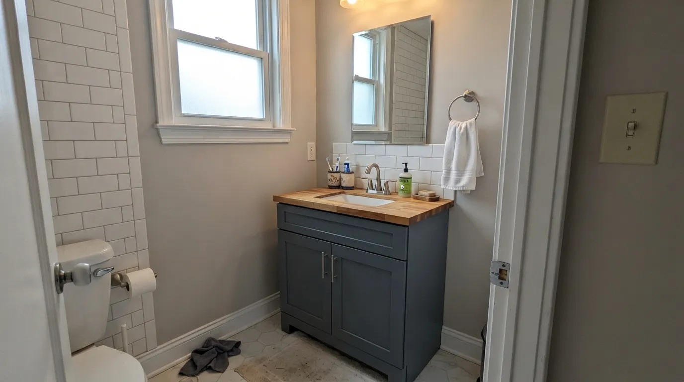
- Excellent on bathroom vanities against white tile and warm metals
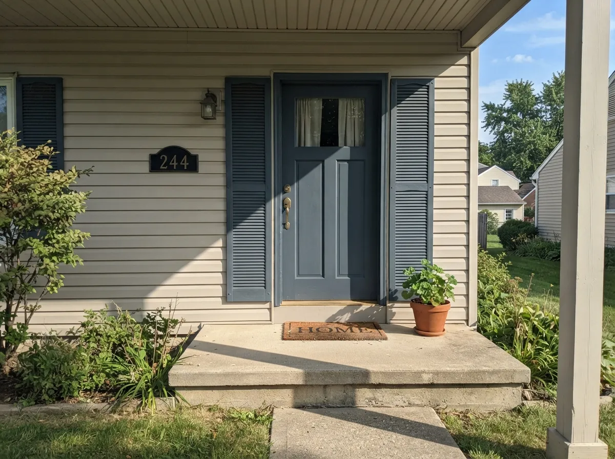
- A dependable shutter, front-door and porch-ceiling color that holds its blue in full sun
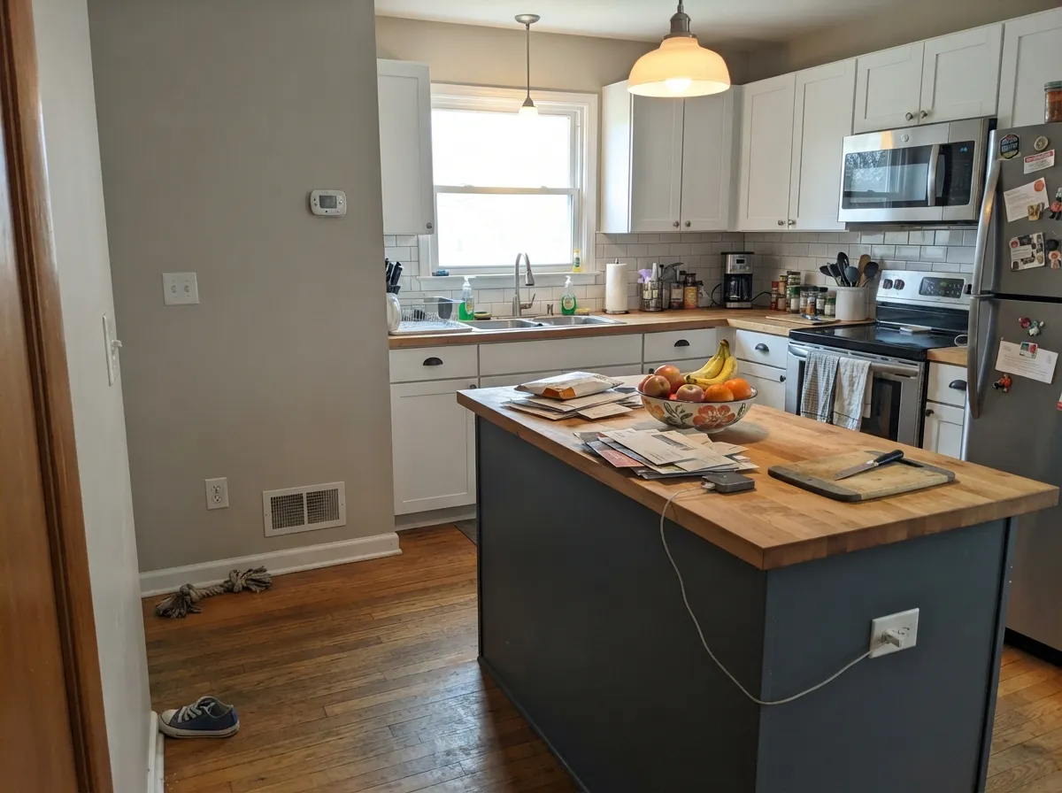
- Deep enough (LRV 19) to anchor a kitchen island without looking washed out
- On four dim walls it can swallow the light and read closer to black than blue
- Cool LEDs and low light push it toward flat battleship gray, losing the blue entirely
- Not a true navy — buyers expecting saturated blue see gray first
- The enamel formula runs thick; brush marks show if you don't feather it out immediately
What Color Is Charcoal Blue, Really?
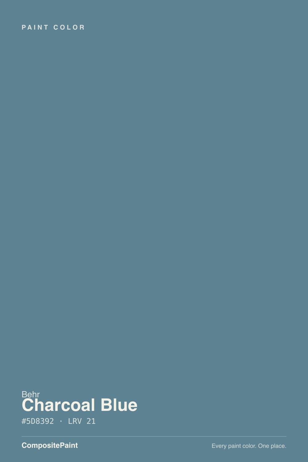
A medium-dark blue-gray built on a charcoal base with a real, cool blue running through it — not a gray with a blue name, and not a blue trying to pass as neutral. Behr sells N490-5 across its Premium cabinet, door and trim enamel line as much as its standard wall paint, which tells you how the brand itself expects people to use it: on surfaces that get touched and seen up close, more often than on four open walls.
At LRV 19 it sits in the medium-dark range — deep enough to anchor a room without going near-black. That depth is why it holds its color: a paler blue-gray like Sherwin-Williams Smoky Blue (LRV 15, close in family but darker in the SW deck) fades into the background in daylight, while Charcoal Blue keeps enough weight to read as a real color choice rather than a compromise. It still depends on light to decide which half wins — bright rooms let the blue lead, dim rooms let the charcoal take over.
Undertone in one line: charcoal-gray first, cool blue close behind — never green, never purple. If your sample reads almost black, that is low light doing its job, not a bad can of paint; give it a window or a warm lamp before you judge it.
Where It Shines
It is built for surfaces, not open walls, and that is where it earns its keep. On a bathroom vanity against white subway tile and brushed nickel or brass it does the spa-bathroom job better than most true navies, because the gray keeps it from feeling like a nursery blue. Outside, it is a dependable shutter, front-door and porch-ceiling color that holds its blue in full sun far better than it holds anything in shade — the classic light-colored-house, dark-blue-accent combination.
Where It Fails
Almost every disappointed review of Charcoal Blue traces back to one of three setups, and all three are predictable before the first coat. None of them are a bad can of paint — but if your plan matches one of these, this is not the color for that job.
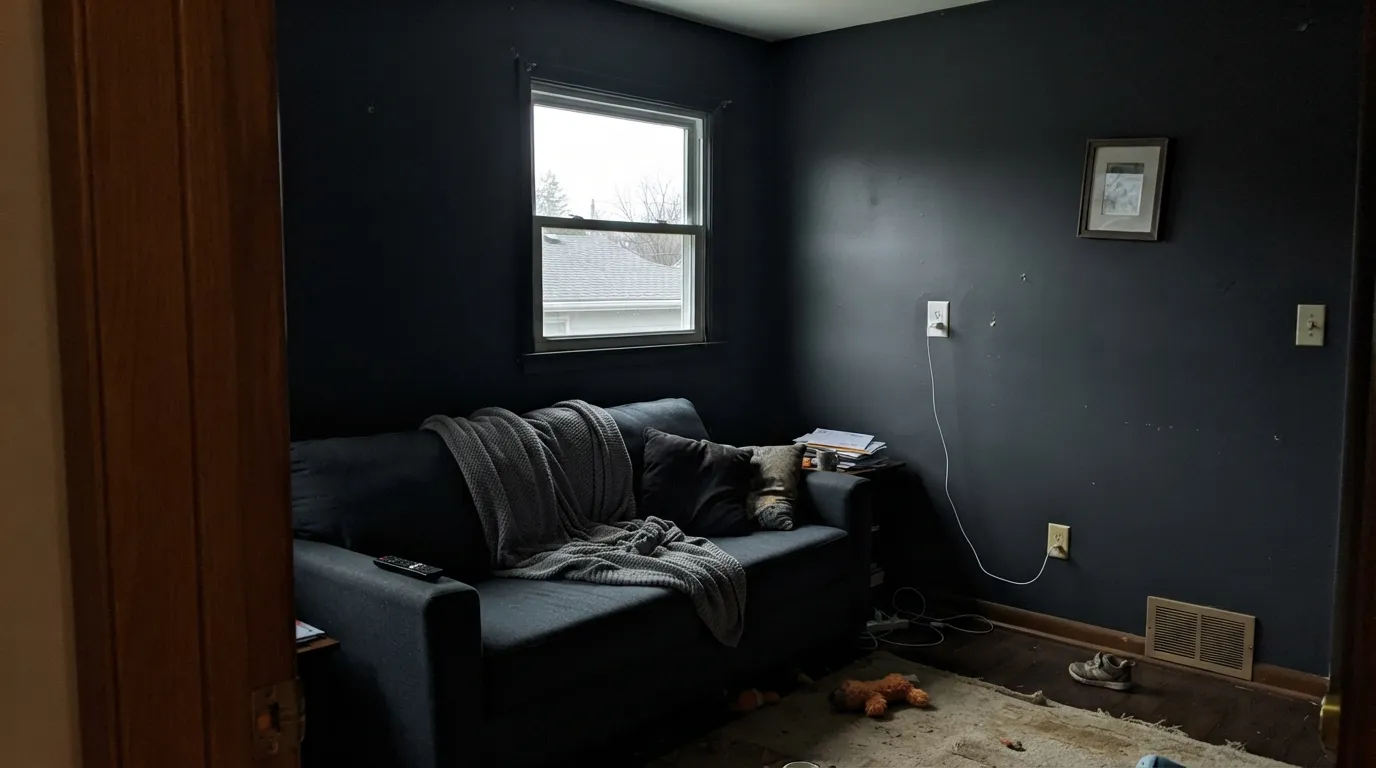
At LRV 19, covering an entire wall run in a room with weak daylight and no lamps swallows most of the remaining light. Owners who tried it as a full wall color in a north-facing den report a paint that reads flat charcoal-black, not blue. Save it for a surface — a vanity, an island, a door — and let a lighter neutral carry the walls.
The charcoal base is doing more work than the blue. If you want a color that unmistakably reads blue in every light, this is a step too gray — look at Sherwin-Williams Naval instead and accept its much lower LRV 4 as the price of that certainty.
Chrome faucets, glass shower doors and cool-white LEDs all push the color toward flat battleship gray, and the blue disappears. Warm the room up — brushed nickel or brass, 2700K bulbs — and the blue comes back.
Room by Room
Against white subway tile, brushed nickel or brass, and a wood or marble counter, it is a genuine spa-bathroom color that avoids reading childish or nautical. Satin cabinet enamel; skip it on the walls unless the room gets real daylight.
One island or a run of lower cabinets in Charcoal Blue against white perimeter cabinets is a dependable, non-trendy two-tone kitchen. A whole kitchen of it is a bigger bet — sample it under your actual light before committing every cabinet.
Full sun keeps the blue honest all day, which is why it shows up so often on front doors and shutters against light-colored siding. The same house's shaded porch ceiling will read noticeably grayer than the sun-hit shutters — expect the shift, don't fight it.
A single door or a built-in bookcase in a hallway with a window reads as a deliberate design choice. In a windowless interior hallway it goes muddy — that is a case for a lighter color or better lighting, not this paint.
One wall, not the whole room, and only with a window feeding it direct or bright indirect light. Pair with cream or white trim so the wall reads as color, not as a shadow.
A headboard wall or a reading nook works well under warm lamps at night. A full bedroom in a dim, north-facing room is the setup most likely to disappoint — see the fails section above.
Your Light Is the Risk
Give it a window across the room and the blue steps forward — on a vanity or island it reads as a confident blue-gray, not black.
Cover four walls in a room with weak daylight and it sinks toward near-black. As a full wall color in a dark room it reads flat charcoal, not blue.
On a front door, shutters, or porch ceiling, direct sun keeps the blue honest all day; the shaded side of the same house reads noticeably grayer.
Warm 2700K bulbs pull it toward soft charcoal-blue; cool white LEDs flatten it toward plain gray. Warm bulbs keep the blue alive after dark.
Most complaints about Charcoal Blue are a light mismatch. Upload a photo of your actual room and see it on your walls — then ask for the same wall in north light or evening lamps before you buy a single sample.
Need It From Another Brand?
Any paint counter can custom-tint Behr N490-5 directly. If you would rather stay in one brand's own deck, these are the closest stock matches, measured as ΔE2000. Under 2 is a difference you will not see on the wall.
| Brand | Closest color | ΔE | LRV | |
|---|---|---|---|---|
| Sherwin-Williams | Foggy DaySW 6235 · Sherwin-Williams | 3.1 | 20 | Color page → |
| Benjamin Moore | Black Pepper2130-40 · Benjamin Moore | 1.0 | 21 | Color page → |
| Valspar | Deep Channel8006-8E · Valspar | 0.9 | 18 | Color page → |
| PPG / Glidden | Favorite FlannelPPG10-19 · PPG / Glidden | 2.8 | 18 | Color page → |
| Glidden | French Grey70BG 19/071 · Glidden | 1.0 | 19 | Color page → |
| Dutch Boy | Aged Denim431-4DB · Dutch Boy | 4.2 | 19 | Color page → |
Similar Behr Colors
The nearest shades to Charcoal Blue within Behr's own range, ranked by perceptual color distance — useful when you want the same look a touch lighter, darker, or warmer.
WCAG 2.1: AA is 4.5 : 1 for normal text, 3 : 1 for large text, AAA is 7 : 1.
Charcoal Blue vs the Colors You're Also Considering
Every Charcoal Blue sample board has the same rivals on it. The numbers show the real lightness gap — then it comes down to which risk you would rather live with.
Pick this for more visible blue and a full step darker — Charcoal Blue commits harder to the color.
Behr N480-5 · LRV 22Adirondack BluePick this if you want it a notch lighter and quieter — Adirondack Blue is Behr's other slate-blue workhorse for cabinets and doors.
Pick this for the Behr version at a slightly higher LRV, with a bit more blue showing through in daylight.
Sherwin-Williams SW 7604 · LRV 15Smoky BluePick this if your painter works in Sherwin-Williams — the same dependable blue-gray, a touch darker and quieter.
Inside Behr, Smokey Blue 540F-5 shares the LRV of 21 but its hex, #528590, holds more green, so it reads as a clearer teal. Liquid Mercury N510-5 at LRV 20, hex #657F8B, is the grayer, quieter version if the teal feels like too much. Cotton Denim HDC-FL14-11 at LRV 19 is a step darker and slightly moodier.
Across brands, Benjamin Moore Lakeside Cabin 1658 at LRV 23 is a deltaE of 1.64 from Charcoal Blue, and Valspar Brookside 4008-6A at LRV 21.7 is 1.88. Both are visually identical in normal room light. Glidden Granite Falls PPG1152-5 at LRV 21 sits at 2.48, so it is very close but worth sampling first.
Sherwin-Williams Stratford Blue SW 2864 at LRV 22 is 4.05 away and reads more clearly teal, while Dunn-Edwards Seal Pup DE5816 at LRV 21 is 3.92 and leans more blue. Both are close but visibly different side by side.
Charcoal Blue Coordinating Colors
The rule for coordinating with Charcoal Blue is simple: stay cool and stay crisp. Warm, heavily yellow creams fight its charcoal-blue base, while clean whites, true near-blacks, and its own lighter Behr sibling all sit comfortably next to it. These are the partners that keep showing up in rooms that work:
Charcoal Blue on Exteriors
This is one of the color's most common real-world jobs: shutters, front doors, and porch ceilings against a lighter-colored house. Behr sells it in exterior-rated flat and satin enamel finishes for exactly this use, and the reason it works is the same reason it fails indoors in the dark — it needs light to show the blue. Full outdoor sun does that job reliably all day.
What changes the read is exposure, not the paint. A sun-hit front door on the south or west side of the house reads as a confident blue-gray; the same color on a shaded, north-facing porch ceiling or under a deep overhang reads a full step grayer and darker. Walk the house at different times of day with a sample before committing every shutter.
Charcoal Blue With Wood Tones and Metals
Metal finish matters more with this color than with most. Brushed nickel and unlacquered or antique brass both warm it up and keep the blue visible; polished chrome and cool stainless push it toward flat gray, especially under cool LED lighting. If your bathroom or kitchen is already all-chrome, budget for a hardware swap or accept the grayer read.
Wood behaves more forgivingly. Natural oak, walnut and butcher block all sit well against it — the wood's warmth balances the paint's cool base without a fight. It does not need a particular wood tone to work, which is part of why it shows up so often on vanities and kitchen islands regardless of the surrounding cabinetry.
Three Ready Palettes Built on Charcoal Blue
A color is never alone on the wall. These are complete combinations in the 60-30-10 pattern, with the reason each one holds together. Every one opens in the visualizer.
Pure White keeps the small room bright while the vanity carries the color; Iron Ore on a mirror frame or light fixture gives the scheme one grounding dark note. Brushed nickel or brass hardware finishes the spa look.
Try this palette in your roomA light body with white trim is the safest exterior base in any deck; Charcoal Blue on the shutters and door is the one confident dark note, and full sun keeps it reading blue instead of black.
Try this palette in your roomSilver Drop's greige walls stay neutral enough not to fight the cool island, while white perimeter cabinets keep the kitchen bright. Brass or warm wood hardware ties the whole room together.
Try this palette in your roomCharcoal Blue FAQ
Is Charcoal Blue more blue or more gray?
Genuinely both, and which one you see depends on the light. In bright or indirect daylight the blue leads; in a dim room or under cool LEDs the charcoal base takes over and it reads as plain dark gray. At LRV 19 it has enough depth to hold either read convincingly.
Is it good for kitchen cabinets, or just doors?
Both, but in different doses. An island or a run of accent cabinets against a white perimeter is a dependable two-tone kitchen. A whole kitchen in Charcoal Blue is a bigger commitment — sample it under your actual light before painting every cabinet.
What white goes with Charcoal Blue?
A crisp, cool-neutral white like Sherwin-Williams Pure White or Behr Polar Bear — not a heavily warm cream, which fights the cool undertone. On trim and walls, stick to whites without a strong yellow lean.
Can I use it on a bathroom vanity?
Yes — this is arguably its best job. Behr sells N490-5 in its own cabinet, door and trim enamel specifically for surfaces like this. Pair it with white tile and brushed nickel or brass for the classic spa-bathroom look.
Does it work as a front door or shutter color?
Yes, and it is one of the more common uses for this exact color. Full sun keeps the blue visible all day against light-colored siding; the same house's shaded porch ceiling or north wall will read noticeably grayer, so judge each surface separately.
Will it look black at night?
Under cool light with no lamps, it can read close to black. Warm 2700K bulbs keep it readable as a blue-gray after dark — treat the bulb choice as part of the paint job, not an afterthought.
Have you painted with Charcoal Blue?
Rate it — one tap helps the next reader decide.
Ask a Question