Ocean Swell
Behr's quiet coastal blue-gray, reviewed honestly: where it earns its keep on cabinets and doors, the light that flattens it, and the color it's almost identical to.

Jessica has spec'd whites and neutrals for more than 300 rooms and keeps a sample wall of painted drawdowns in her studio. Every color review is checked against real reader rooms in the comments and re-tested when a formula changes. About the testing process →
- 1Black Fox7
- 2Pewter Green12
- 3Ocean Swell19
- 4Stardew43
- 5Quietude48
The Fast Verdict
Ocean Swell is a genuine mid-depth blue-gray dressed up in a coastal name it didn't need. Under real daylight it reads clean and confidently blue; under warm lamps it settles into a quiet gray. It was never a Color of the Year and nobody's viral kitchen is named after it — but on a cabinet, a door, or a run of exterior trim it is a dependable, well-behaved color that does the job every time you ask it to.
Kitchen islands and cabinets · exterior siding, shutters, and front doors · a den or office wall with real daylight · anyone who wants a coastal blue-gray without the coastal cliché
You want an unambiguous, no-undertone gray · your room stays dim with no warm lamps · your floors and trim lean honey-orange · you need a color nobody else's paint line already has
- A genuine mid-depth blue-gray that holds its color instead of washing out
- Sold in cabinet-grade enamel and exterior masonry finishes — genuinely multi-surface
- Reads clean and confident against white trim, brass, and warm wood
- Restrained enough to avoid a loud, dated coastal cliché
- Nearly identical to a pricier designer pick (Benjamin Moore Wolf Gray) at Behr's price point
- No real design-press moment — you're on your own for inspiration photos
- Visibly shifts from clean-blue in daylight to soft-gray under warm bulbs
- Whole dim rooms turn flat and heavy rather than moody
- Fights honey oak and other orange-leaning warm wood
What Color Is Ocean Swell, Really?
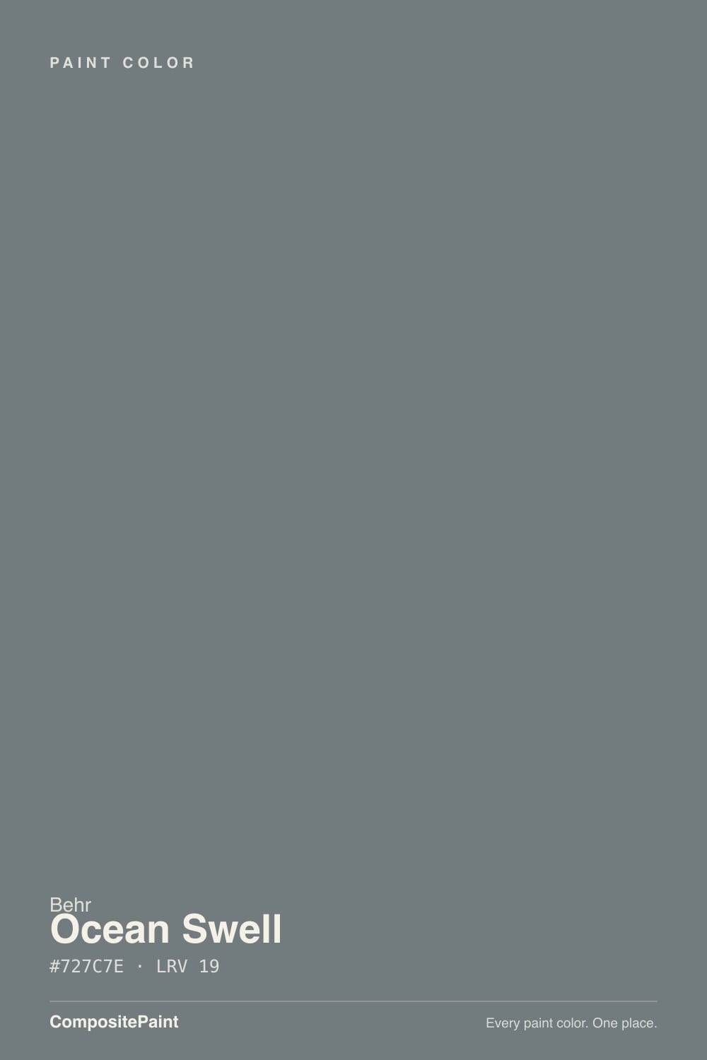
Behr markets Ocean Swell as one entry in its coastal-neutral lineup, sold alongside colors like Watery and Misty Coast, with a name built around waves and cloudy skies. Strip the marketing away and what's actually mixed in the can is a muted, medium blue-gray: a gray base with a faint, cool green-blue cast underneath, kept deliberately restrained rather than saturated. It has never been a Behr Color of the Year and doesn't turn up on many designer roundups — this is a workhorse, not a headline color, and that isn't a knock. It is also sold as a satin and semi-gloss cabinet-door enamel and as a flat exterior masonry/stucco finish, which tells you more about how Behr expects it to be used than the tagline does: doors, cabinets, and siding, not necessarily whole rooms of walls.
At LRV 19 it is a genuine mid-depth color — deep enough to read as an actual blue-gray, not a tinted white. It holds its color instead of washing out, and it visibly shifts with the light: under bright daylight it reads cleaner and noticeably bluer, while under warm 2700K bulbs the blue recedes and it settles into a softer, quieter gray. Neither read is wrong — it's the same paint reacting honestly to two different light sources — but it's worth deciding which one you actually want before committing a whole exterior or a full kitchen island to it.
Undertone in one line: gray first, cool blue-green second, restrained rather than showy — not a saturated 'coastal' teal. One fact worth knowing before you buy: Ocean Swell's hex (#727C7E, LRV 19) lands almost exactly on top of Benjamin Moore Wolf Gray (#727C83, LRV 21) — different brand, different name, practically the same paint. If your painter already carries a Benjamin Moore account, that's a real, usable substitute, not just a coincidence.
Where It Shines
It earns its keep on surfaces, not whole rooms: a kitchen island, a front door, a run of exterior trim, a bathroom vanity. In cabinet-grade satin or semi-gloss enamel it wipes clean and doesn't show water spots the way a flat wall color would, and on an exterior wrapped in white trim it reads as a quiet, confident blue-gray instead of a loud coastal cliché. Give it brass hardware, white oak or walnut, and a white perimeter, and it looks like a deliberate designer choice even though almost nobody is talking about it online.
Where It Fails
The complaints about Ocean Swell aren't really about the paint failing — they're about buyers expecting one thing (usually "gray") and getting a color with a genuine undertone, or asking a mid-depth color to do a whole dim room's work alone. All three patterns below are predictable before you open the can.
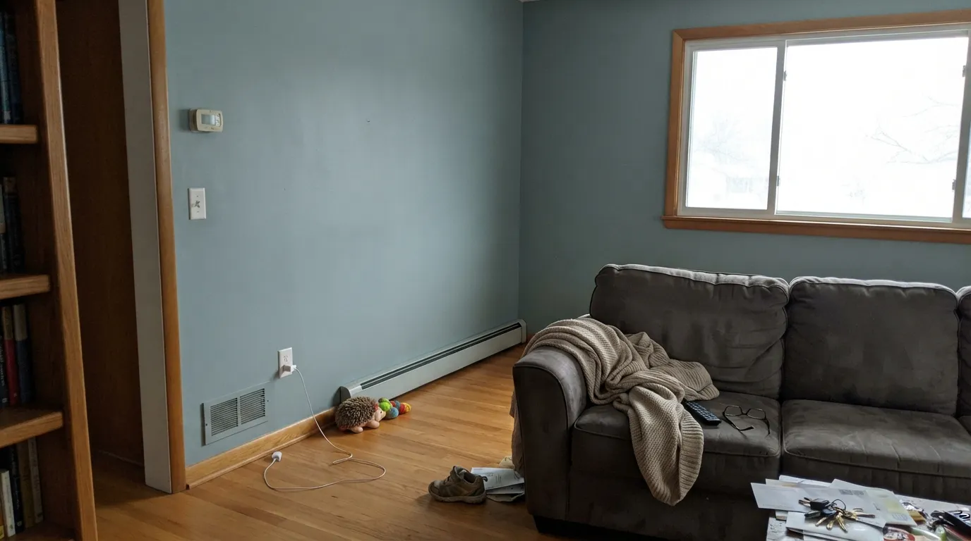
Blue and orange sit opposite each other on the color wheel, and honey oak floors or orange-toned trim are squarely on the warm side. Next to Ocean Swell, the wood looks more orange than it did before, and the paint looks flatter and grayer than it did on the chip. Walnut, espresso, or pale white oak are the safe partners; golden oak needs a rug or a different color.
At LRV 19, four walls of Ocean Swell in a room that never gets real light stops reading as a moody blue-gray and starts reading as plain heavy and dim — closer to a dead gray than the coastal color on the chip. It's built to shine on a single surface — a door, an island, a run of trim — in a lit space, not to carry a whole cave of a room by itself.
Behr calls the undertone restrained, and compared to a true teal it is — but on a real wall, especially in bright daylight, the blue-green is visible enough that buyers who wanted "just gray" notice it. If you truly want zero undertone, this isn't that color; if a faint cool cast is fine, it reads as a sophisticated gray most of the time.
Room by Room
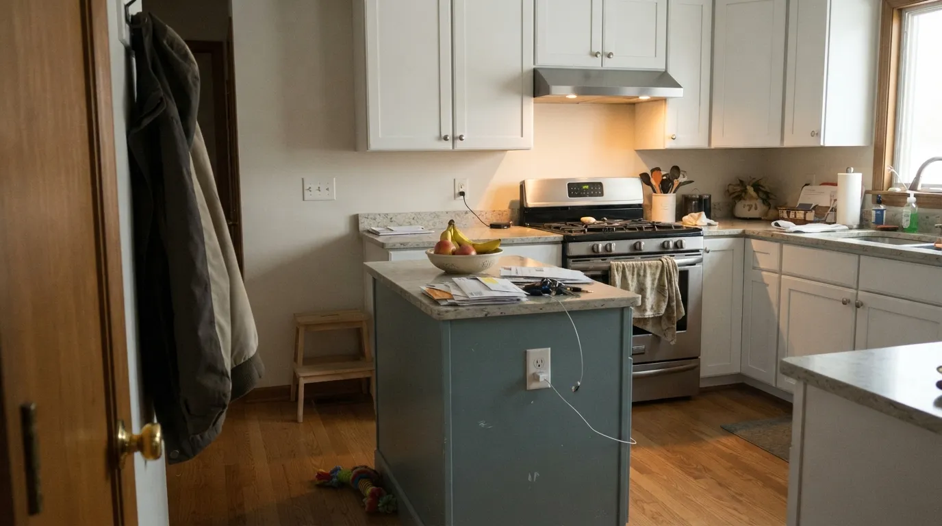
This is what Behr built the color's enamel finishes for. Satin or semi-gloss over a white perimeter, with brass or matte black pulls, is the single most reliable use of Ocean Swell — durable, wipeable, and genuinely handsome next to warm wood counters.
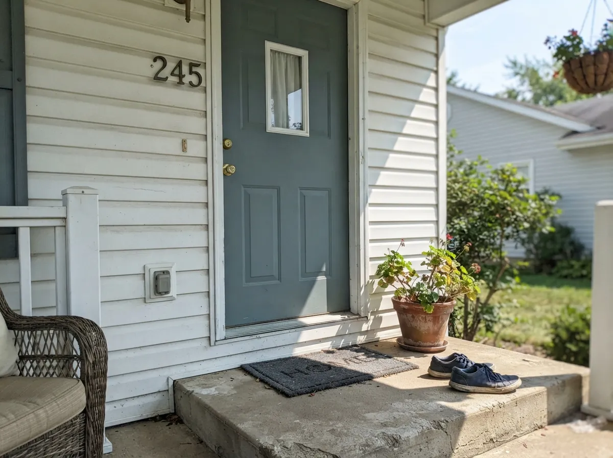
Full sun pushes it cleaner and bluer than it reads indoors, and against white trim it makes a quiet, confident curb-appeal color that doesn't shout "coastal." It's also sold in a masonry and stucco exterior finish, so brick and stucco homes have a direct path to the same color.
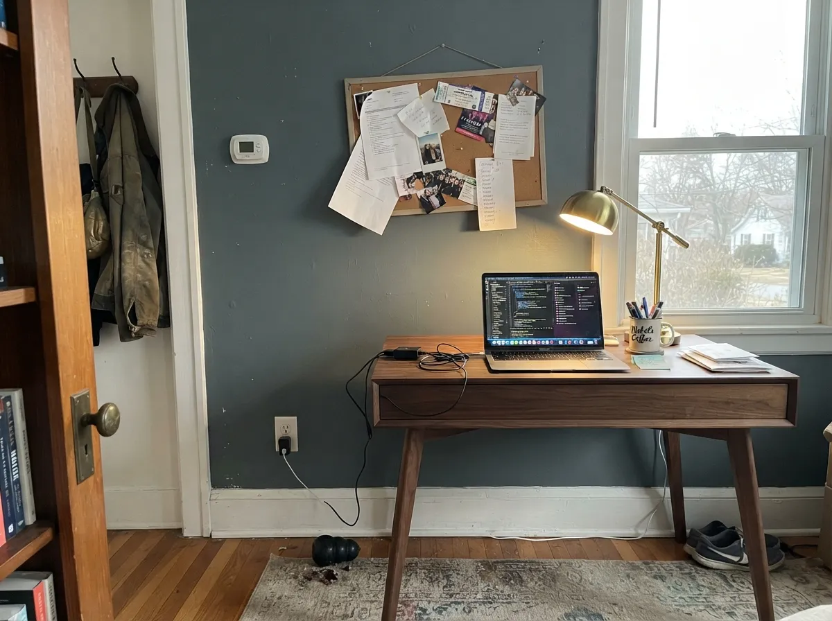
In a room that gets honest daylight it reads as a calm, focused blue-gray; walnut shelving and a brass lamp are its natural company. Skip it if the room only has a small north window and no lamps on.
Satin Ocean Swell on a vanity under a white or light-stone top is an easy, contained way to use the color without repainting a whole bathroom, and it pairs cleanly with brushed nickel or matte black fixtures.
At this depth, four walls is a real commitment, not a safe default. It needs genuine daylight or warm lamps to avoid going flat; test a large sample and look at it at both midday and after dark before buying the gallons.
At LRV 19 it has enough depth to read intentional against white siding without the full commitment of a navy garage door, and it's an easy match for a coastal-neutral exterior scheme that's already using it on the front door.
Your Light Is the Risk
Direct or strong indirect daylight is where the blue-green comes forward and it reads cleanest — the version closest to the "ocean" name.
Without real light the color goes flat and heavy rather than moody. Test it in your actual room before painting a full wall.
It cools and brightens under midday sun, then quietly settles toward gray as the light drops in the afternoon — a gentle shift, not a dramatic one.
Warm 2700K bulbs pull the blue back and leave a soft, quiet gray at night; cool white LEDs keep the blue-green more visible but can read flatter. Pick the bulb based on which read you want after dark.
Most complaints about Ocean Swell are a light mismatch. Upload a photo of your actual room and see it on your walls — then ask for the same wall in north light or evening lamps before you buy a single sample.
Need It From Another Brand?
Any paint counter can custom-tint Behr PPU25-19 directly. If you would rather stay in one brand's own deck, these are the closest stock matches, measured as ΔE2000. Under 2 is a difference you will not see on the wall.
| Brand | Closest color | ΔE | LRV | |
|---|---|---|---|---|
| Sherwin-Williams | Foggy DaySW 6235 · Sherwin-Williams | 0.6 | 20 | Color page → |
| Benjamin Moore | Steep Cliff Gray2122-20 · Benjamin Moore | 2.0 | 21 | Color page → |
| Valspar | Elephant Gray4006-2A · Valspar | 2.8 | 18.9 | Color page → |
| PPG / Glidden | PhantomPPG1036-6 · PPG / Glidden | 1.6 | 19 | Color page → |
| Glidden | PhantomPPG1036-6 · Glidden | 1.3 | 18 | Color page → |
| Dunn-Edwards | RhinocerosDE6327 · Dunn-Edwards | 1.1 | 18 | Color page → |
Similar Behr Colors
The nearest shades to Ocean Swell within Behr's own range, ranked by perceptual color distance — useful when you want the same look a touch lighter, darker, or warmer.
WCAG 2.1: AA is 4.5 : 1 for normal text, 3 : 1 for large text, AAA is 7 : 1.
Ocean Swell vs the Colors You're Also Considering
Every Ocean Swell sample board has the same rivals on it. The numbers show the real lightness gap — then it comes down to which risk you would rather live with.
Pick this if you're committed to Behr's product line, pricing, or a Home Depot supply chain.
Benjamin Moore 2127-40 · LRV 21Wolf GrayPick this if you're already buying Benjamin Moore — the hex is close enough that most eyes won't tell the two apart.
Pick this for more depth and a clearer blue-green — Storm Cloud reads closer to plain gray.
Sherwin-Williams SW 6249 · LRV 24Storm CloudPick this for a lighter blue-gray that Sherwin-Williams itself leans on more for doors and trim than full walls.
Inside Behr, Complex Gray N140-5 at LRV 18 is the neutral version of the same darkness. Its hex, #76777A, has almost no green in it, so it reads as a straight gray where Ocean Swell reads cooler and slightly sea-toned. Deep Shale PPF-38 at LRV 20 goes the other way with a clear blue lift, and Stormy Gray BXC-58 at LRV 21 is the most colorful of the group, noticeably bluer and less gray.
Across brands, Sherwin-Williams Foggy Day SW 6235 at LRV 20 has a deltaE of 0.58 from Ocean Swell, which makes it the same color for practical purposes. Dunn-Edwards Rhinoceros DE6327 at LRV 18 and Benjamin Moore Steep Cliff Gray 2122-20 at LRV 21 are visually identical in normal room light at deltaE 1.11 and 1.99.
Farrow and Ball Barrow Blue No. G8 at LRV 19 is very close at deltaE 2.4, but it leans a little bluer, so sample it first.
Ocean Swell Coordinating Colors
The rule for coordinating with Ocean Swell is simple: keep whites clean rather than creamy, keep wood tones on the walnut-to-white-oak side rather than the honey side, and use one near-black for contrast instead of a second color. These are the partners that keep showing up in rooms that work:
A Quiet Coastal Neutral, Not a Headline Color
Ocean Swell has never been a Behr Color of the Year, and it isn't the color anyone's viral kitchen renovation is named after. It sits in Behr's coastal-neutral lineup alongside colors like Watery and Misty Coast — paints built to be sold as a mood ("a choppy day on the waves") rather than to headline a marketing campaign. That's a fair trade: it means the color has to earn its use on its own merits, room by room, instead of riding a trend cycle.
The honest comparison is Sherwin-Williams Foggy Day (SW 6235), which sits close enough in hue and value that most people won't tell the two apart on a wall, and Benjamin Moore Wolf Gray, which is close enough in raw hex value to be a functional twin. None of that makes Ocean Swell less useful — it just means you're not buying exclusivity. You're buying a dependable, mid-depth blue-gray that happens to carry Behr's name, and Behr's cabinet-enamel and exterior-masonry formulas along with it — genuinely useful if you're already shopping that aisle.
Ocean Swell With Wood Tones and Floors
Cooler and darker wood makes this color's best case: walnut, espresso, and dark-stained oak all sit comfortably next to Ocean Swell because neither side is fighting the other's temperature. Pale, gray-washed white oak is equally safe — two cool neutrals rarely clash.
Honey and golden oak are the one real no. Because blue and orange sit opposite each other on the color wheel, each side pushes the other toward its extreme: the floor reads more orange, the wall reads flatter and grayer than the chip promised. A large rug can buy some room, but if the whole floor is golden oak and staying that way, this color works better contained to a door, an island, or a vanity than spread across every wall in the room.
Three Ready Palettes Built on Ocean Swell
A color is never alone on the wall. These are complete combinations in the 60-30-10 pattern, with the reason each one holds together. Every one opens in the visualizer.
Polar Bear keeps the room bright and lets the island carry the color; Cracked Pepper on a single door adds one deliberate near-black note so the kitchen reads planned, not accidental.
Try this palette in your roomA warm white body keeps the house approachable, the door supplies the single saturated note, and near-black shutters ground the composition without a full navy commitment.
Try this palette in your roomTwo depths of the same blue-gray family read as a deliberate tonal scheme rather than a mismatch; Polar Bear trim keeps the room from feeling like a cave, which matters at this LRV.
Try this palette in your roomOcean Swell FAQ
Is Ocean Swell blue or gray?
Both, honestly — it's built on a gray base with a genuine cool blue-green undertone underneath. In bright daylight the blue-green is visible; under warm lamp light it settles toward a quiet gray. If you want a color with zero undertone, this isn't it; if a faint cool cast is fine, it reads as a sophisticated gray most of the time.
Does Ocean Swell work on kitchen cabinets?
Yes — Behr sells it specifically as a satin and semi-gloss interior/exterior cabinet-door enamel, and it's genuinely one of its best uses. It wipes clean, hides fingerprints better than a pale color would, and looks calm and expensive against a white perimeter and brass hardware.
Can I use Ocean Swell outside?
Yes, and it's a strong exterior choice. It's also sold as a flat exterior masonry and stucco finish, and full sun reads it cleaner and bluer than it does indoors. Pair it with white or light trim; a shaded north-facing elevation will read noticeably more gray than the sunny side.
What white goes with Ocean Swell?
A clean, slightly cool-leaning white keeps the pairing crisp — Behr Polar Bear or Silky White both work as trim or perimeter cabinets. A very warm, creamy white can make Ocean Swell's cool undertone look muddy by comparison.
Is Ocean Swell basically the same as another brand's color?
Very close to one, yes: Benjamin Moore Wolf Gray (#727C83, LRV 21) is nearly an exact hex match for Ocean Swell (#727C7E, LRV 19). Small batch variation between any two cans means you should still sample both before painting, but if your painter only stocks one brand, either color gets you the same result.
Does it work with honey oak floors?
Not well. Blue and orange are wheel opposites, so honey oak makes Ocean Swell look grayer and duller while the paint makes the floor look more orange — both sides lose. It's a strong match for walnut, espresso, or pale white oak; with golden oak staying, keep the color to a door or an island and put a rug between it and the wood.
Have you painted with Ocean Swell?
Rate it — one tap helps the next reader decide.
Ask a Question