Williamsburg Wedgwood Blue
P&L's dusty Prussian-and-gray restoration blue, reviewed honestly: the colonial rooms where it still earns the pottery name, the pale Wedgewood Gray people confuse it with, and when to walk away.

Jessica has spec'd whites and neutrals for more than 300 rooms and keeps a sample wall of painted drawdowns in her studio. Every color review is checked against real reader rooms in the comments and re-tested when a formula changes. About the testing process →
- 1Hale Navy8
- 2Waterloo13
- 3Williamsburg Wedgwood Blue28
- 4Resolute Blue40
- 5Lost in the 80s51
The Fast Verdict
Williamsburg Wedgwood Blue is jasperware on a wall: a grayed Prussian blue at real mid-depth, not the pale coastal wash the similar names keep selling. Pratt & Lambert filed it in the Williamsburg collection — the historic palette developed with Colonial Williamsburg historians — and it still behaves like a restoration color. Beautiful in a dining room or study with cream trim, brass, and walnut; heavy and muddy in a dim room with no lamps. If you wanted Benjamin Moore Wedgewood Gray, this is not that paint. If you wanted the dusty blue on an 18th-century pitcher, it is.
Dining rooms and studies in traditional houses · powder rooms · cream trim, brass, and walnut · anyone who actually wants the pottery blue, not a pale gray
You meant Benjamin Moore Wedgewood Gray · the room is dim and you will not add lamps · your floors are honey oak · you want a light airy blue
- Real dusty blue, not a gray pretending to have a personality
- Williamsburg-collection pedigree — mixed for restoration work, not a trend cycle
- Dining rooms and studies feel finished with one color decision
- Deep enough (LRV 28) to hold its color in daylight
- Classic with cream trim, brass, walnut, and mahogany
- Constantly confused with Benjamin Moore Wedgewood Gray — a different, much paler color
- Goes muddy-slate in dim rooms without lamps
- Fights honey oak, orange stain, and yellow-beige carpet
- Too colonial and too deep for a pale coastal brief
What Color Is Williamsburg Wedgwood Blue, Really?
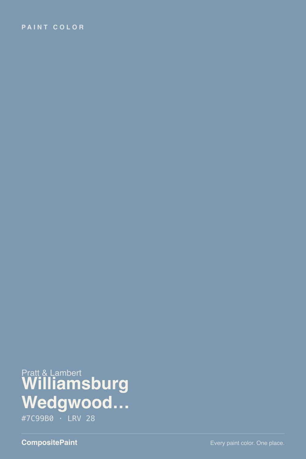
Named for Josiah Wedgwood's jasperware — the dusty medium blue with white relief that defined English pottery. Pratt & Lambert mixed it as a hybrid: a hint of Prussian blue, the 18th-century pigment Colonial Williamsburg restorations actually found, over a gray base, so it reads as a real blue that has been lived in, not a clean sky. It is the opposite of a pale coastal teal-gray, and it is not green the way Wythe Blue and Palladian Blue are.
At LRV 28 it is a genuine mid-to-deep tone. That depth is the whole point of the pottery name and the whole surprise on the wall. The chip looks politely dusty; four walls look like a slate-blue room. Plan for it to read a step deeper and more clearly blue than the fan deck — every muted mid-blue does this, and it is the number-one shock when someone thought they were buying a gray.
Undertone in one line: cool dusty blue first, gray second — never green, never navy. If your sample goes steely, the light is cold and dim; if it goes softer and more pottery-like, that is warm lamps doing the jasperware trick. Both versions are the same paint being honest about the room.
Where It Shines
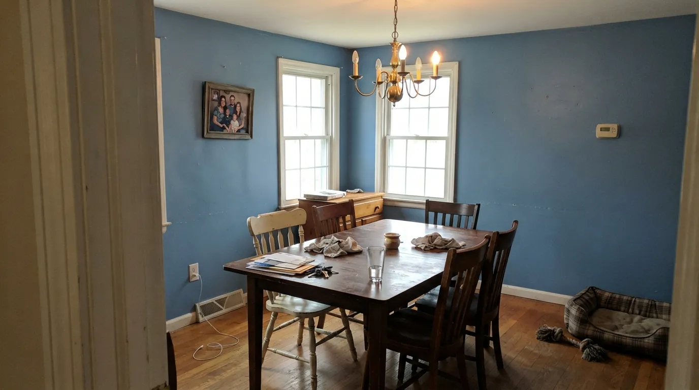
Give it cream trim, walnut, brass, and a room you use at dinner or at a desk. Dining rooms are its home turf — the historic Williamsburg use case — and a small study or powder room takes the depth without asking the whole house to go colonial. Under 2700K lamps the gray comes forward and the blue goes velvety, like the pottery. Eggshell, not high gloss: gloss makes mid-blues look like enamel toys.
Where It Fails
Almost every mismatch with this color is a naming problem or a light problem, and both are visible before you buy the gallon. None of them are the paint's fault — but if your room matches one, this is not your blue, and a bigger sample will only confirm it.
Benjamin Moore Wedgewood Gray (HC-146, LRV 50) is a pale coastal blue-gray that goes flat without daylight. This is LRV 28 and clearly blue. Search confusion between Wedgwood (pottery, Pratt & Lambert, no extra e) and Wedgewood (Benjamin Moore, with an e) is how people end up with a restoration dining-room blue when they wanted a beachy living-room gray. Sample both on the same wall before you commit.
LRV 28 without light is a slate cave. North bedrooms and interior dining rooms that only get leftover hallway light go muddy gray-blue, and the pottery color disappears. Warm lamps are part of this paint job. If you refuse lamps, pick a color twenty LRV points lighter — Boothbay Gray or Wedgewood Gray, not another mid-depth slate.
Orange-yellow sits across the wheel from this blue. Golden builder oak, orange-stained trim, and yellow-beige carpet all punch the walls bluer and the floor oranger. Walnut, mahogany, painted floors, and pale white oak are the company it was mixed for. A large rug helps; it does not fix wall-to-wall honey tones.
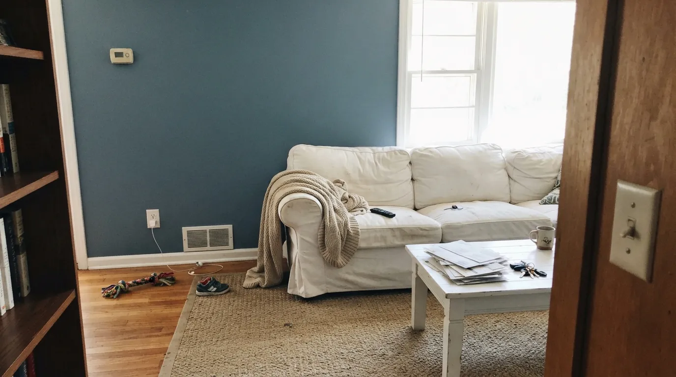
Room by Room
The restoration use case. Cream or White Dove trim, a walnut table, brass, a rug that is not gold. Eggshell walls. This is where LRV 28 feels intentional instead of heavy, and evening lamps turn it into the pottery color the name promised.
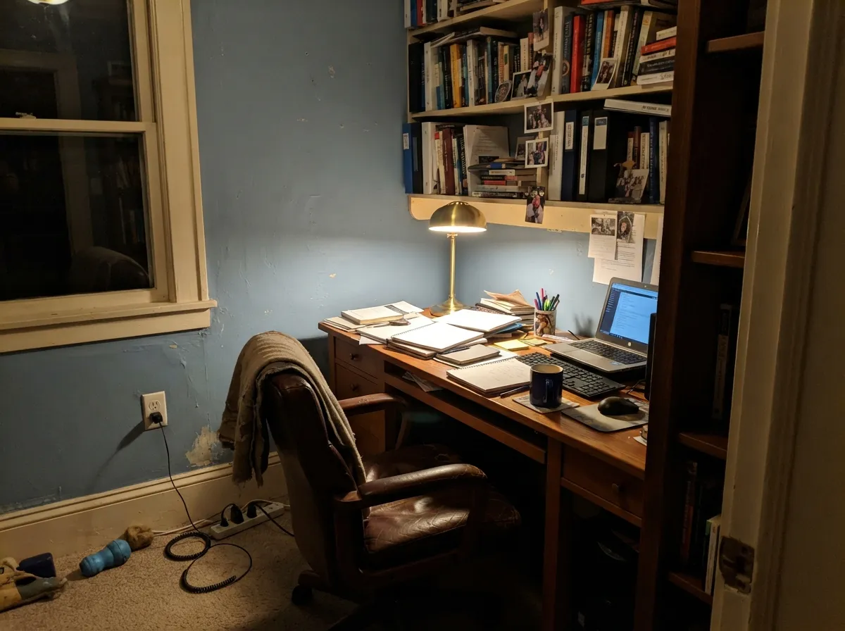
Low-to-medium light plus a desk lamp is this color's natural habitat. Bookshelves, leather, and a warm bulb keep it dusty rather than steely. Eggshell for scuff resistance where chairs hit the wall.
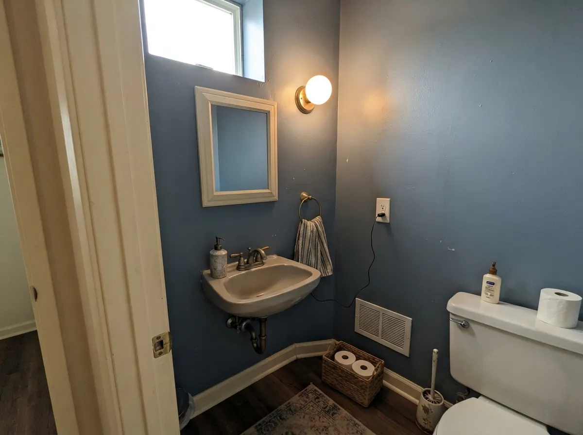
Four walls in a powder room is the move when you like the color and do not want a colonial dining room. Satin on a vanity under stone and brass pulls is a weekend project that reads custom. Small rooms take mid-depth blue well.
Calm if the room has a real window and 2700K bulbs. Matte finish. Too cave-like in a north bedroom with one small window and cool LEDs — go paler (Boothbay Gray at LRV 43, or Wedgewood Gray at LRV 50) if the room stays dim.
Closed traditional living rooms with cream trim: yes. Open plans next to a white kitchen: the blue will look like a themed parlor. Pale Oak or Edgecomb Gray next door is a warmer handoff than a cool gray, and White Dove trim should run through both rooms.
Colonial shutters on a cream or White Dove house are the historic look, in satin. Full south sun will gray the blue toward dusty steel; north and shaded elevations keep the pottery color. Whole-house siding at LRV 28 is a strong, period-specific bet — sample on the sunny side and the shady side before you commit.
Your Light Is the Risk
A real window, not a cave: the Prussian blue shows, the gray keeps it dusty, and it looks like the pottery. This is the light that makes the name true.
The blue collapses into heavy gray-slate and the corners go cave. LRV 28 needs light. If the room cannot provide it, this is the wrong depth.
Morning is the bluest, clearest read. West afternoon warms and dusts it toward gray-blue. Sample the same board at 9am and 4pm before you decide you like both versions.
2700K bulbs pull the gray forward and give the jasperware softness — the look you actually want at night. Cool 4000K LEDs keep it steely and a little institutional. Swap the bulbs before you repaint.
Most complaints about Williamsburg Wedgwood Blue are a light mismatch. Upload a photo of your actual room and see it on your walls — then ask for the same wall in north light or evening lamps before you buy a single sample.
Need It From Another Brand?
Any paint counter can custom-tint Pratt & Lambert CW-30 directly. If you would rather stay in one brand's own deck, these are the closest stock matches, measured as ΔE2000. Under 2 is a difference you will not see on the wall.
| Brand | Closest color | ΔE | LRV | |
|---|---|---|---|---|
| Sherwin-Williams | Dyer's WoadSW 9071 · Sherwin-Williams | 0.3 | 30 | Color page → |
| Behr | MysteryMQ5-51 · Behr | 2.9 | 30 | Color page → |
| Benjamin Moore | Labrador Blue1670 · Benjamin Moore | 3.8 | 33 | Color page → |
| Valspar | Blue MarbleV110-5 · Valspar | 2.0 | 29.9 | Color page → |
| PPG / Glidden | Walden PondPPG1159-4 · PPG / Glidden | 1.8 | 31 | Color page → |
| Glidden | Walden PondPPG1159-4 · Glidden | 1.6 | 31 | Color page → |
Contrast and Legibility
WCAG 2.1: AA is 4.5 : 1 for normal text, 3 : 1 for large text, AAA is 7 : 1.
Williamsburg Wedgwood Blue vs the Colors You're Also Considering
Every Williamsburg Wedgwood Blue sample board has the same rivals on it. The numbers show the real lightness gap — then it comes down to which risk you would rather live with.
Pick this when you actually want a mid-depth pottery blue, not a living-room gray with a blue whisper.
Benjamin Moore HC-146 · LRV 50Wedgewood GrayPick this if you wanted the pale coastal blue-gray — twenty-two LRV points lighter, flatter without daylight, and the color most people think this name points to.
Pick this when the blue should be obvious on the wall, not a maybe.
Benjamin Moore HC-145 · LRV 31Van Courtland BluePick this if you want the same mid-depth slate family with more gray and less Prussian blue — it reads gray until the light says otherwise.
The closest in-collection relatives are lighter blue-grays. Wedgewood (32-8, LRV 41) shares the same family but is noticeably paler and grayer; at 41 LRV it reflects far more light and reads as an airy, quiet blue-gray suited to a whole open space or a small room, where CW-30 at LRV 28 would feel more saturated and enclosing. Choose Wedgewood when you want the hint of blue without commitment, and Williamsburg Wedgwood Blue when you want the color to register clearly.
Iceland (32-15, LRV 41) is another light option, a touch greener and cooler than Wedgewood. It works well as a bathroom or trim-adjacent tone. Against it, CW-30 looks distinctly deeper and truer blue.
Across other brands there are near-identical matches, such as Sherwin-Williams Dyer's Woad (SW 9071), but those are covered separately.
Williamsburg Wedgwood Blue Coordinating Colors
The rule for coordinating with this blue: cream whites, historic taupes, and one darker navy or near-black — and keep yellow-orange wood at arm's length. It was mixed to sit with other Williamsburg-collection colors, not with icy gallery whites. These are the partners that keep showing up in rooms that work:
Wedgwood, Wedgewood, and Why the Names Keep Colliding
Three different paints share almost the same name, and they are not interchangeable. Josiah Wedgwood's pottery is spelled without the extra e; Pratt & Lambert kept that spelling on Williamsburg Wedgwood Blue (CW-30, LRV 28). Benjamin Moore's Wedgewood Gray (HC-146, LRV 50) added the e and made a much paler coastal blue-gray. Pratt & Lambert also sells a separate Wedgewood (32-8, LRV 41), a lighter bathroom blue-gray that is not this restoration color either.
The Williamsburg collection itself has a paper trail: Colonial Williamsburg Foundation historians built the palette from pigments recovered in the restoration — Prussian blue among them — and licensed it first to Martin Senour, then to Pratt & Lambert, later to Benjamin Moore. Pratt & Lambert does not name a Color of the Year; this blue never needed one. It is a heritage SKU, not a trend SKU. Buy it because you want the pottery color in a dining room, not because a search result mixed up the vowels.
Williamsburg Wedgwood Blue With Wood Tones and Floors
This decision gets made at the floor, not the paint store. Walnut, mahogany, cherry, and espresso are the color's best friends — the red-brown depth makes the dusty blue read intentional, the way dark wood furniture looks against jasperware. Pale white oak and painted floors are safe and give a lighter Colonial-revival cast. Cream carpet is fine.
The one honest no is golden: honey oak floors, orange-stained trim, yellow-beige carpet. Orange sits opposite this blue on the wheel, so each side exaggerates the other — the floor reads more orange, the walls read more blue, and no amount of coats fixes geometry. If the golden floor is staying, put a large rug between it and this paint, or choose a greige and keep the traditional mood without the fight.
Metals are the easy part: unlacquered brass, antique bronze, and pewter all sit in the Williamsburg vocabulary; polished chrome is the one that leans cold and modern against it.
Three Ready Palettes Built on Williamsburg Wedgwood Blue
A color is never alone on the wall. These are complete combinations in the 60-30-10 pattern, with the reason each one holds together. Every one opens in the visualizer.
Cream-warm White Dove is the jasperware relief: it keeps the blue dusty instead of navy. Hale Navy supplies one darker note so the scheme reads deliberate rather than themed. Brass hardware and a walnut table finish the restoration argument.
Try this palette in your roomTwo Williamsburg-collection neighbors: the taupe and the blue were mixed to sit in the same historic house. Swiss Coffee is the creamier trim white, which is the right call in a lamplit study — White Dove is quieter, Swiss Coffee is more pottery.
Try this palette in your roomA small room can take the full depth. Cloud White is a warm trim white, so the edges stay soft instead of gallery-crisp; Wrought Iron gives one near-black note so the blue does not float. Brass faucet, white towels, done.
Try this palette in your roomWilliamsburg Wedgwood Blue FAQ
Is Williamsburg Wedgwood Blue the same as Benjamin Moore Wedgewood Gray?
No. Different brands, different spellings, different depths. Benjamin Moore Wedgewood Gray (HC-146) is a pale coastal blue-gray at LRV 50. This Pratt & Lambert color is a mid-depth dusty blue at LRV 28. The names collide in search results constantly; they do not collide on a wall. If you want the pale one, buy the Benjamin Moore.
Is it more blue or more gray?
Blue — dusty, grayed, but unmistakably blue on four walls. In dim light it can pass for slate, and under warm lamps it goes softer, like jasperware, but nobody walking in will call it gray. If gray is what you actually want, this is the wrong color; that mismatch is behind most of the bad surprises.
What trim white goes with Williamsburg Wedgwood Blue?
A warm, soft white — White Dove is the default, Swiss Coffee if you want the cream-and-pottery look, Cloud White if the room already runs warm. A stark bright white (Chantilly Lace territory) makes the walls read dingy next to the crisp edge. Semi-gloss on the trim, eggshell or matte on the walls.
Does it work with oak floors?
Depends entirely on the oak. Walnut, mahogany, espresso, and pale unstained white oak are excellent. Golden honey oak is the genuine clash: orange-yellow sits opposite this blue, so the floor goes more orange and the walls go more blue. A large rug helps, but with wall-to-wall honey tones pick a different color.
Is it too dark for a living room?
In a closed traditional living room with real windows and lamps, no — LRV 28 is mood, not a cave. In an open plan next to a white kitchen, or in a north room with one window and no lamps, yes. That is a light-and-layout question, not a paint-quality question. Sample a big board and live with it at night before you roll four walls.
Can I use it on cabinets or shutters?
Yes, in doses. Satin on a dining-room buffet, a powder vanity, or colonial shutters on a cream house is the historic move. A whole kitchen of mid-depth dusty-blue cabinets is a strong period commitment, and satin urethane-fortified enamel is non-negotiable either way. Sample shutters on both the sunny and shady elevations — south sun grays it.
Have you painted with Williamsburg Wedgwood Blue?
Rate it — one tap helps the next reader decide.
Ask a Question