Williamsburg Stone
The Colonial Williamsburg taupe, reviewed honestly: the rooms where it reads like limestone, the light that turns it khaki, and what to pick instead.

Jessica has spec'd whites and neutrals for more than 300 rooms and keeps a sample wall of painted drawdowns in her studio. Every color review is checked against real reader rooms in the comments and re-tested when a formula changes. About the testing process →
- 1Anonymous20
- 2Felted Wool28
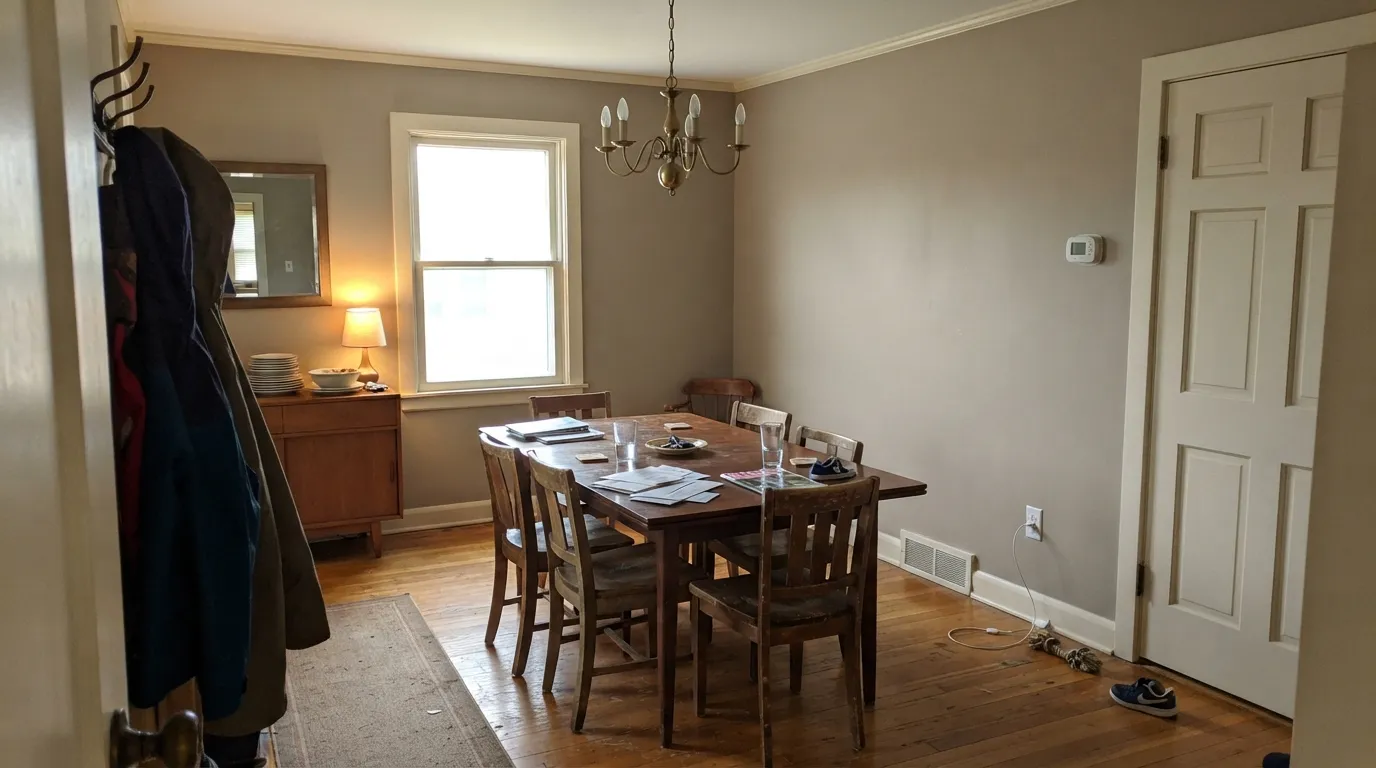
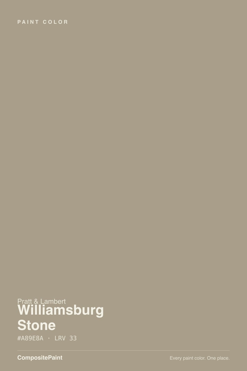
- 3Williamsburg Stone33
- 4Revere Pewter55
- 5Agreeable Gray60
The Fast Verdict
Williamsburg Stone is a mid-depth brown-gold taupe from Pratt & Lambert's Colonial Williamsburg lineup, closer to weathered limestone than to the pale greiges people sample next to it. At LRV 33 it is a real wall color, not a backdrop. Warm daylight makes it look like 18th-century plaster; a dim north room turns it khaki and a little dirty. Buy it for wood, traditional rooms, and actual sun — not because the name sounds like a safe whole-house neutral.
Dining rooms, studies, and traditional living rooms · bedrooms that should feel settled, not pale · oak, walnut, and brass · historic or colonial houses with real daylight
You wanted a light greige · the room faces north and stays dim · your furniture is cool gray · you need one pale color to run the whole house
- Reads like limestone and old plaster, not like a 2010s greige
- Deep enough (LRV 33) to hold color in bright south rooms
- Flatters oak, walnut, brass, cream linen, and traditional millwork
- Dining rooms and studies look finished with one color decision
- Historic Williamsburg pedigree without needing a themed room
- Much darker and browner than the pale greiges people compare it to
- North light and cool LEDs turn it khaki-dingy
- Fights cool gray furniture, gray floors, and blue-gray marble
- Too deep and too brown to run as a whole-house backdrop
What Color Is Williamsburg Stone, Really?
A warm mid-tone taupe with more brown and gold in it than gray. Pratt & Lambert files it as CW-25 in the Williamsburg collection, mixed to echo the tan distemper paints used in 18th-century wallpapers at Colonial Williamsburg. That origin is the useful fact: this is a stone-and-plaster color, not a 2010s greige with a historic name taped on. On the chip it can pass for a quiet taupe. On four walls it is clearly a colored room — soft brown, a little golden, closer to limestone than to oatmeal.
At LRV 33 it sits well below the pale neutrals people compare it to. Pale Oak (LRV 69) and Accessible Beige (LRV 58) are backdrops; Williamsburg Stone is a garment. That depth is the point in a dining room or study, and the trap in a hallway or a north bedroom. Plan for the wall to read a step darker and browner than the strip — every mid taupe does this, and at this LRV the jump is obvious by the second coat.
Undertone in one line: warm brown first, a red-orange gold second — not purple, not green. If the sample goes khaki-gray, the light is cool; if it goes honey-brown, that is west sun or 2700K bulbs doing their job. Both reads are the same paint telling the truth about the room.
Where It Shines
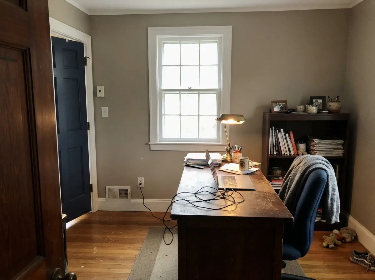
Give it warm daylight, real wood, and millwork and it looks as if the plaster was always this color. Dining rooms and studies are the natural home: eggshell walls, White Dove trim, walnut or oak, brass, linen. The mid depth holds in bright south light instead of washing to beige, then settles into a quieter brown after dark. It is one of the few taupes that actually reads like stone instead of like a faded greige.
Where It Fails
Almost every regret about Williamsburg Stone is a depth or light mistake, and both are visible on a big sample before you hire the painter. None of them are the formula's fault — but if your room matches one, this is not your taupe, and a second gallon will not change it.
On a fan deck, next to Pale Oak or Revere Pewter, it looks like a slightly deeper cousin. On the wall it is a mid-brown stone at LRV 33 — roughly half as light as those greiges. If the goal was a whole-house backdrop that still feels pale, you will call it dark and dingy by day two. Sample a 24-inch board in the actual room, or pick Accessible Beige and stay in the light-neutral lane.
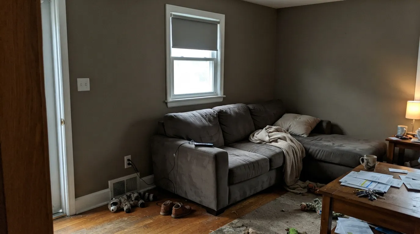
Cool daylight strips the gold and leaves a flat khaki that readers of every mid taupe describe as dirty dishwater. Williamsburg Stone needs either sun or warm bulbs; a dim north living room with recessed 4000K cans is the worst-case photo. If you will not add lamps, pick a lighter warm greige that can survive gray light.
This paint is brown-gold. Gray sectionals, cool oak-gray floors, and Carrara-type marble push it toward muddy yellow-brown while the furnishings go colder. Both sides lose. It wants walnut, medium oak, cream upholstery, and warm stone — not the gray-on-gray kit from a 2018 remodel.
Room by Room
This is the color the collection was built for: a closed or semi-closed dining room with wood, a chandelier, and evening use. Matte or eggshell keeps it stony instead of shiny. White Dove trim in semi-gloss; the LRV gap (85 versus 33) is the contrast historic rooms expect.
South or west light plus oak or walnut and it reads expensive and settled. Open plans are harder: at LRV 33 it will not disappear next to a white kitchen. Hand off to Pale Oak in the adjacent space if you need a lighter connected wall.
Mid-depth taupe on bookcases or walls makes a workroom feel finished without going navy-dark. Eggshell for scuff resistance. Hale Navy on the door or a single bookcase wall is the colonial pairing, as long as the room has a window.
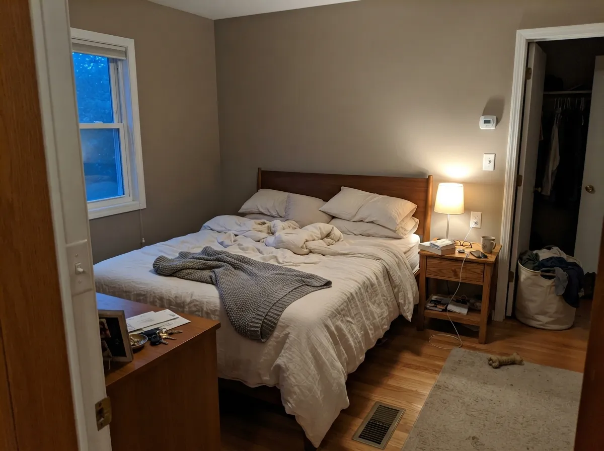
Restful at night under 2700K lamps; heavier than most people paint a bedroom. Fine in a master with decent windows and cream bedding. Skip it in a small north bedroom — the khaki-dingy version shows up first thing in the morning.
Satin on an island or a china hutch under creamier walls is the low-risk move. A full kitchen at LRV 33 needs strong light and warm counters; on cool quartz it argues. Not a whole-house cabinet color unless you are committed to brown.
A daylit entry with wood floors can take it; a windowless foyer will go cave-brown. Outdoors it can work as a colonial body color in shade, but full sun will bleach it toward dusty khaki — sample a siding board for a week before you commit the street view.
Your Light Is the Risk
Warm sun keeps the gold alive and the brown in the stone range — limestone, not mud. This is the light that makes the historic read convincing.
Cool gray daylight cancels the red-orange gold and leaves flat khaki. The wall looks dirty rather than stony. Test here before you buy a gallon.
Cooler and a little grayer in morning east light, then distinctly browner and more golden as west sun comes around. Same paint, two honest versions.
2700K bulbs pull the gold forward and the room goes cozy-brown. Cool white LEDs strip the warmth and leave drab khaki-gray — swap bulbs before you repaint.
Most complaints about Williamsburg Stone are a light mismatch. Upload a photo of your actual room and see it on your walls — then ask for the same wall in north light or evening lamps before you buy a single sample.
Need It From Another Brand?
Any paint counter can custom-tint Pratt & Lambert CW-25 directly. If you would rather stay in one brand's own deck, these are the closest stock matches, measured as ΔE2000. Under 2 is a difference you will not see on the wall.
| Brand | Closest color | ΔE | LRV | |
|---|---|---|---|---|
| Sherwin-Williams | Studio TaupeSW 7549 · Sherwin-Williams | 3.2 | 34 | Color page → |
| Behr | Fossil StonePMD-57 · Behr | 1.7 | 34 | Color page → |
| Benjamin Moore | TurretCC-604 · Benjamin Moore | 1.4 | 35 | Color page → |
| Valspar | Sage the Day8004-25D · Valspar | 1.5 | 34 | Color page → |
| PPG / Glidden | Stonehenge GreigePPG1024-5 · PPG / Glidden | 2.0 | 34 | Color page → |
| Glidden | Stonehenge GreigePPG1024-5 · Glidden | 1.7 | 34 | Color page → |
Contrast and Legibility
WCAG 2.1: AA is 4.5 : 1 for normal text, 3 : 1 for large text, AAA is 7 : 1.
Williamsburg Stone vs the Colors You're Also Considering
Every Williamsburg Stone sample board has the same rivals on it. The numbers show the real lightness gap — then it comes down to which risk you would rather live with.
Pick this when you want the stone to read brown-gold and historic, not greige.
Benjamin Moore AF-100 · LRV 44PashminaPick this if you want a greige with real depth that still sits a step lighter and less brown — it needs real light, the same as this one.
Pick this when beige at LRV 58 would disappear and you want the wall to look like stone.
Sherwin-Williams SW 7036 · LRV 58Accessible BeigePick this if you actually wanted a light whole-house warm neutral — safer, paler, and less of a color until the light goes cool.
Pick this when Revere Pewter feels too gray and you wanted brown stone instead of greige.
Benjamin Moore HC-172 · LRV 56Revere PewterPick this if you want the famous greige — lighter, grayer, and more of a backdrop, with its own well-known risk in the wrong light.
Pick this when Pale Oak is too pale and you want the dining room or study to actually recede into stone.
Benjamin Moore OC-20 · LRV 69Pale OakPick this for the same warm-oak family as a light whole-house wall — beautiful in good light, and a safe handoff into the next room.
Pratt & Lambert does not list a near-twin to Williamsburg Stone, but a few colors in its own palette sit close enough to weigh against it. Sterling (32-13), LRV 38, is a lighter, grayer taupe. It carries less gold and reads cooler and more contemporary, so choose it if Williamsburg Stone feels too warm or too dark for your light.
Sage (26-5), LRV 35, is roughly the same depth but tips green rather than red-brown. Where Williamsburg Stone feels earthy and traditional, Sage feels fresher and more botanical. Use Sage in rooms where you want a hint of color; use Williamsburg Stone where you want a true grounded neutral.
Tundra (32-6), LRV 56, is essentially a much lighter cousin. If you like the family but want the room to feel airier, Tundra keeps the warm-neutral character while bouncing far more light.
What To Pair With It
Keep the company warm and a little old: medium oak or walnut floors, cream linen, unlacquered brass, pewter, and a white that is not icy. White Dove on trim is the default; Swiss Coffee if you want the millwork a hair creamier. For a dark note, Hale Navy on a door or Wrought Iron on metal — both are near-black enough to ground LRV 33 without introducing a second mid-tone.
The adjoining-room problem is real. If the next space has to stay light, Pale Oak is the closest warm-oak handoff in the BM deck. Accessible Beige works if the painter is already in Sherwin-Williams. Do not park Revere Pewter next to it unless you have sampled both on the shared wall — the greige will make this one look brown, and this one will make the greige look gray.
The Williamsburg Collection, Not A Trend Color
CW-25 sits in Pratt & Lambert's Colonial Williamsburg range, a set of colors documented from 18th-century Williamsburg finishes rather than from a marketing calendar. Pratt & Lambert has no Color of the Year program, and this taupe was never meant to cycle with greige fashion. The reference is tan distemper used in period wallpapers — a dry, mineral, slightly faded tan — which is why the live wall looks more like plaster than like a modern beige.
That pedigree is also why the online review trail is thin compared with Agreeable Gray. Restoration painters and traditional designers know it; open-plan new-builds rarely sample it. Honest obscurity is useful: you will not find a hundred Reddit living rooms in this exact SKU, so you have to trust a large sample in your own light. If you came here hoping for a viral room, this is the wrong taupe. If you came here because the house is old and the wood is real, it is often the right one.
Floors, Wood, And Stone
Walnut, cherry, and medium oak are the easy yes. White oak with a warm or natural finish still works; white oak that has been gray-washed or cerused will push the walls toward yellow-khaki. Honey oak, which fights purple taupes, is less of a disaster here because the paint is already gold-brown — the floor and wall can land in the same family instead of complement-clashing.
Tile and counters: cream, taupe, and warm limestone love it. Cool gray porcelain and blue-gray marble do not. If the kitchen already has gray-veined white stone, keep Williamsburg Stone out of that room and use it in the dining room instead. Rugs in ivory, rust, or faded blue sit well; a cool gray rug will make the walls look muddy.
Three Ready Palettes Built on Williamsburg Stone
A color is never alone on the wall. These are complete combinations in the 60-30-10 pattern, with the reason each one holds together. Every one opens in the visualizer.
Stone walls, a safe warm white on the millwork, and one navy note is the Williamsburg kit that still looks current. White Dove matters — a stark bright trim white would make the walls look dirty by comparison. Hale Navy only if the room has a window; it needs light.
Try this palette in your roomMatte stone walls, a slightly creamier white on the trim, and a soft near-black on the metal keeps the bedroom from going theme-park colonial. Swiss Coffee can go a little warm in late sun — if that cream bothers you, swap the trim to White Dove.
Try this palette in your roomThe open-plan problem is depth: LRV 33 next to a white kitchen looks like a cave. Pale Oak is the lighter warm-oak cousin, so the house still feels like one family. Same White Dove trim in both rooms hides the handoff.
Try this palette in your roomWilliamsburg Stone FAQ
is williamsburg stone gray or beige?
Neither, cleanly. It is a warm brown-gold taupe. In cool light it can flash khaki-gray; in warm light it goes clearly brown. If you need it to stay gray, look at Revere Pewter or Repose Gray instead.
what are the undertones?
Warm brown with a red-orange gold — not the purple-pink taupe family, and not a green greige. Cool bulbs and north light are what make people report khaki or dingy gray.
can i use it through the whole house?
Not as a pale backdrop. At LRV 33 it will feel like a painted color in every room, and hallways without windows go heavy. Use it in the dining room, study, or living room and hand off to Pale Oak or Accessible Beige for the rest.
what white should i pair on trim?
White Dove (LRV 85) is the safest warm white with it. Swiss Coffee (LRV 82) is creamier and can go a little warm in strong sun. Avoid a stark bright trim white — it will make the stone look dirty.
does it work in a north-facing room?
Only if you add warm 2700K lamps and accept a flatter khaki read by day. In a dim north room with cool LEDs it is a common regret. Sample on the darkest wall and look at it at 8am and at night.
is this the same as benjamin moore williamsburg stone?
CW-25 is the Williamsburg-collection number for this name. This review is the Pratt & Lambert version in our deck (hex #A89E8A, LRV 33). Always sample the brand and base you will actually buy — collection names travel.
Have you painted with Williamsburg Stone?
Rate it — one tap helps the next reader decide.
Ask a Question