
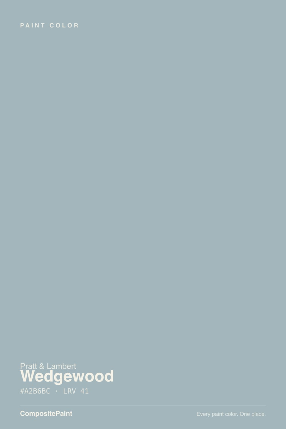
Color spec
| Brand | Pratt & Lambert |
| Name | Wedgewood |
| SKU | 32-8 |
| Hex | #A2B6BC |
| RGB | 162, 182, 188 |
| HSL | 194°, 16%, 69% |
| LRV | 41 |
| Undertone | cool blue-green tone |
| Sheens | bath walls satin or eggshell · trim semi-gloss · vanities satin |
| Family | Gray |
Wedgewood is Pratt & Lambert's cool blue-gray at LRV 41: blue first, a drop of aqua second, gray enough to look serious on a chip. On bathroom walls it reads like spa water; in cool north light or under daylight LEDs it can flash almost pool-blue. Specifiers keep putting it in baths because the depth holds against white tile and nickel without washing out. Do not buy it because you googled Wedgewood Gray — that is Benjamin Moore HC-146, a lighter, greener color.
What Color Is Wedgewood, Really?
Pratt & Lambert Wedgewood 32-8 is a muted blue-gray, not a teal and not a true gray. The hex leans blue over green — R162 G182 B188 — so the color sits on the blue side of the spa family that includes Palladian Blue and Sea Salt. It is also not Benjamin Moore Wedgewood Gray HC-146. Same nickname, different color: the BM Historic is lighter (LRV 50) and greener, filed as a teal. P&L's is deeper and bluer. If you arrived from an HC-146 search, stop and sample this as its own paint.
At LRV 41 it is a genuine mid-tone. That is the bathroom trick: pale spa colors wash to dirty white in a bright tile room, and dark blue-grays go cave-like in a 5-by-8 bath. Wedgewood holds a visible blue-gray against white subway and marble without stealing the light. Plan for four walls to read a step deeper and a step bluer than the chip — every muted blue does this, and it is the number-one surprise when someone thought they were buying gray.
Undertone in one line: blue first, a whisper of aqua second — never beige. In cool north light and under 4000K daylight bulbs the aqua comes forward and it can read almost pool-water. In warm lamps or a dimmer room it settles back toward dusty gray-blue. Both versions are the same paint being honest about the light. Pratt & Lambert has no Color of the Year machine and this is not a viral color; it shows up in spec books, not on Instagram.
Where It Shines
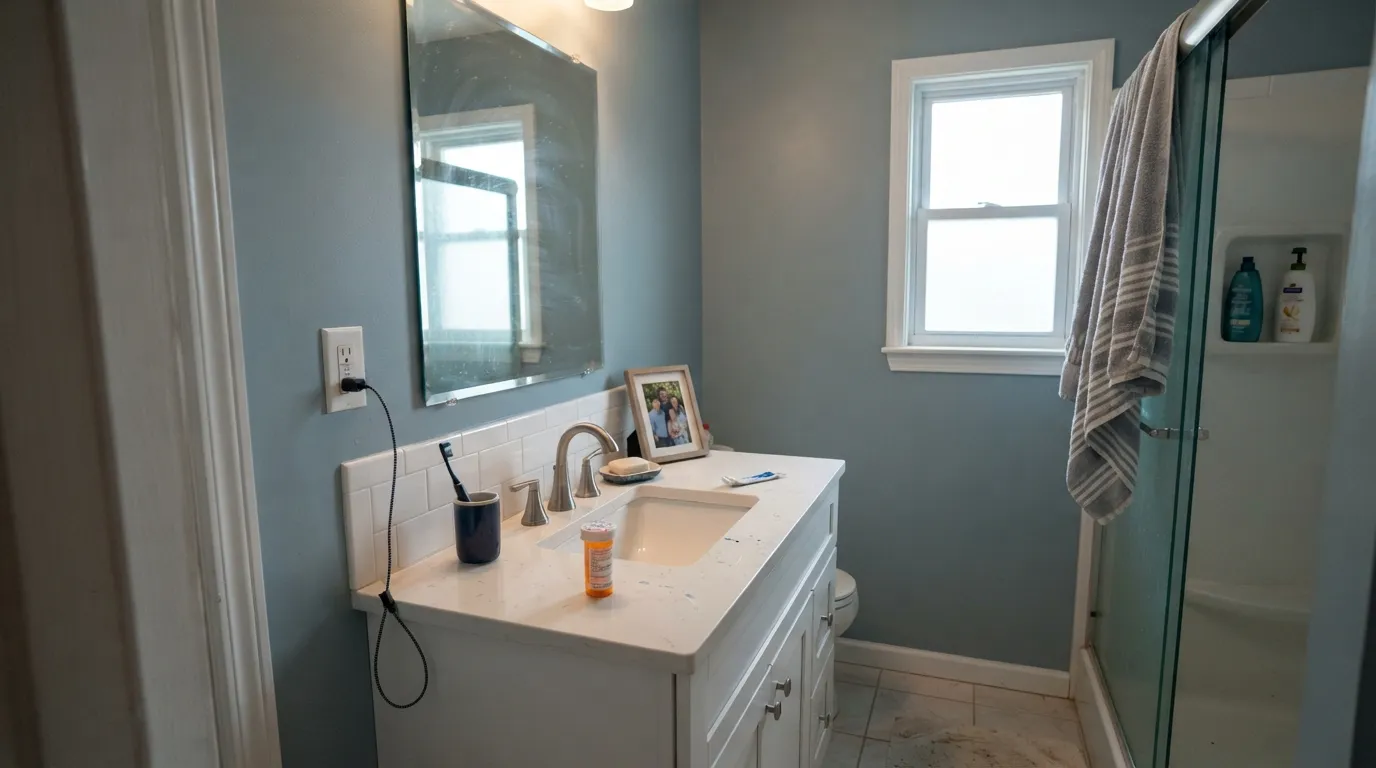
This color is built for wet rooms with real daylight and white or pale stone. Against subway tile, polished nickel, and a white-quartz top it looks like a specifier chose it on purpose — calm, cool, and a little watery, without tipping into 1990s powder-blue. Its second home is the small commitment: a powder room drenched on all four walls, or a vanity painted satin under cream-white walls, where the blue-gray reads custom instead of themed. Give it white linen, pale marble, unlacquered-nickel or chrome, and it behaves.
Where It Fails — the Honest Part
Almost every regret with Wedgewood follows one of three scripts, and all three are visible before the first coat. None of them are the paint's fault — but if your room matches one, this is not your color, and a bigger sample will only confirm it.
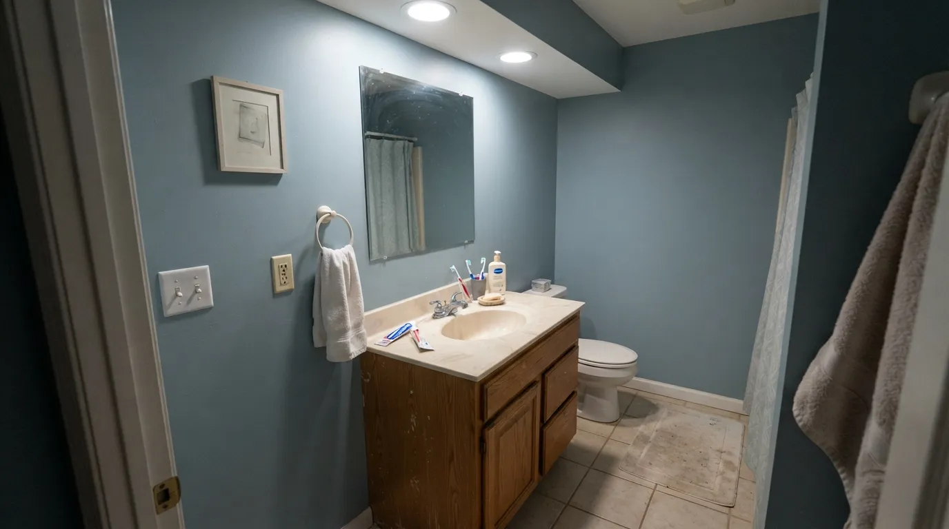
You wanted gray. On the chip it passes for a cool gray. On four bathroom walls the blue is unmistakable — depth multiplies undertone. If the goal was gray with a hint of color, this is too much color. Benjamin Moore Boothbay Gray (LRV 43) is the cousin people mistake for gray; Wedgewood will not make that mistake for you.
Cool north light and daylight LEDs. North light and 4000K-plus bulbs pull the aqua forward until the walls look faintly chlorinated — the dentist-office read. Warm 2700K to 3000K bulbs are part of this paint job. If the bath is interior, windowless, and you refuse to swap the recs, pick a color that does not depend on the light staying kind.
Honey oak and beige tile. Yellow-beige is this blue-gray's complement. Honey-oak vanities, almond tub surrounds, and builder-beige floor tile all push Wedgewood toward pool-blue while the wood goes more orange. Both sides lose. It wants white oak, painted wood, marble, or a gray-veined porcelain — not golden oak and not 1990s almond.
Room by Room
Bathroom — its best room
This is the room the color is for. Satin or eggshell on the walls, semi-gloss on the trim, white tile and a nickel faucet. Daylight from a window keeps it spa-blue-gray instead of aqua. Designer White 33-1 on the trim is the in-family edge; a stark blue-white also works if you want the walls to look cooler.
Powder room — drench it
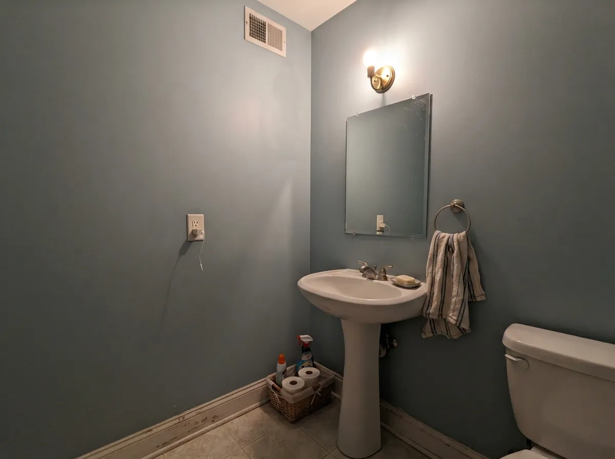
Small rooms take mid-depth color well. All four walls in Wedgewood, a white or marble sink, one warm sconce, and it reads like a hotel powder instead of a leftover half-bath. Skip the beige wallpaper border energy — no honey gold, no cream-on-cream.
Bedroom — cool and restful
A north- or east-facing bedroom that should feel like water can wear this, in matte, with White Dove trim and warm lamps. It will not cozy up the way a greige does; it stays cool on purpose. If you want the room to feel warmer after dark, this is the wrong family.
Vanities and cabinets — the designer move
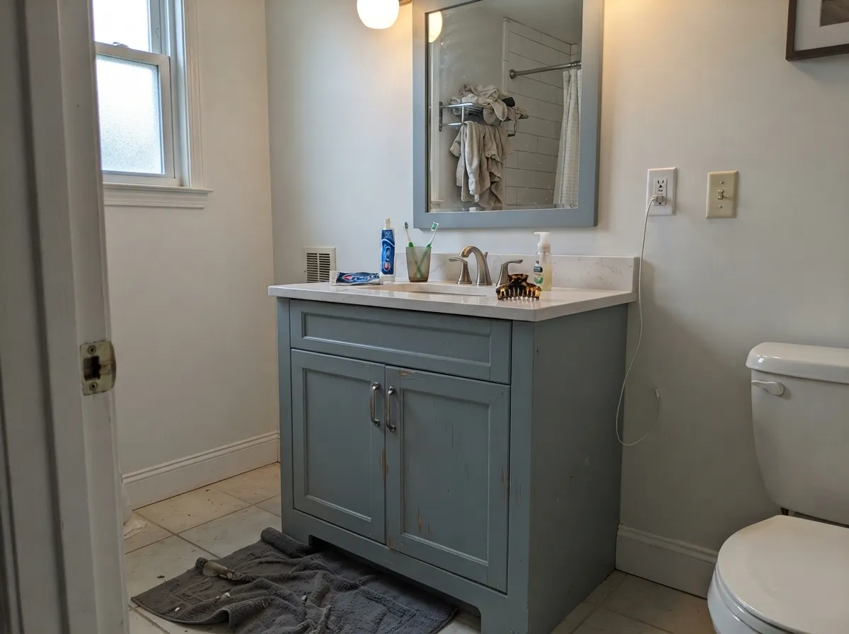
Satin Wedgewood on a bath vanity under Designer White or White Dove walls is the high-payoff weekend job. A whole kitchen of this blue-gray is a 1990s callback unless the floors, counters, and hardware are all cool; most kitchens should leave it on the island or the hutch, not the perimeter.
Living room — usually a no
LRV 41 of visible blue is a lot of color for a main floor. In an open plan it will fight warm wood, cream sofas, and whatever greige the kitchen is wearing. A closed, north-facing sitting room with white oak and linen can carry it; the default living room cannot.
Exterior — no
Full sun grays a muted blue and the aqua reads like faded siding from the street. It is an interior bath color. Do not put it on clapboard, shutters, or a front door hoping for coastal — BM Wedgewood Gray already struggles outside without real daylight, and this one is darker.
The Scorecard
What it gets right
- +Mid-depth (LRV 41) that holds against white tile instead of washing out
- +Blue-gray that stays blue — not the greener teal of BM Wedgewood Gray
- +Bathroom and powder-room workhorse with nickel, marble, and subway
- +Satin vanities look custom without painting the whole house
- +Quiet trade color — no Color of the Year timestamp to outrun
Where it struggles
- −Not gray — buyers who wanted gray see blue by the second wall
- −Cool north light and daylight LEDs flash aqua, almost chlorinated
- −Fights honey oak, almond fixtures, and beige builder tile
- −Too much color for a whole-house neutral, and P&L is harder to sample than SW or BM
Light by Light
Most complaints about Wedgewood are a light mismatch. Upload a photo of your actual room and see it on your walls — then ask for the same wall in north light or evening lamps before you buy a single sample.
TEST IT IN YOUR LIGHT →Wedgewood vs the Colors You're Also Considering
Every Wedgewood sample board has the same rivals on it. The numbers show the real lightness gap — then it comes down to which risk you would rather live with.
Pratt & Lambert does not list a close in-brand twin, but a few related colors help place it. Iceland (32-15) is the nearest neighbor: at hex A6BAC0 and LRV 41 it is almost the same soft blue-gray, just a hair grayer and less green. If you want the same depth with a touch less color, Iceland is the safer, quieter pick; choose Wedgewood when you want the blue-green to read.
Williamsburg Wedgwood Blue (CW-30) at LRV 28 is the deeper, more saturated version. It reads as a real slate blue, not a blue-gray, so use it for contrast, cabinets, or a moody accent rather than as a whole-room wall substitute.
For a lighter alternative, Light Grey (32-12) at LRV 58 keeps a cool cast but bounces much more light, better for small or dim bathrooms where LRV 41 feels too deep.
Need It From Another Brand?
Any paint counter can custom-tint Pratt & Lambert 32-8 directly — but if you would rather stay in one brand's own deck, these are the closest stock matches:
Wedgewood Coordinating Colors
The rule for coordinating with Wedgewood: bright or softly warm whites, other cool spa tones, and metals that stay silver — and keep gold-cream and honey wood at arm's length. These are the partners that keep a bath looking spec'd instead of themed:
This Is Not Benjamin Moore Wedgewood Gray
Search 'Wedgewood paint' and the internet hands you Benjamin Moore HC-146 — the Historic coastal blue-gray, LRV 50, family teal, the one that goes flat without real daylight. Pratt & Lambert 32-8 is a different chip in a different deck. It is darker, bluer, less green, and almost invisible online. If you can find a dozen homeowner photos of P&L Wedgewood, you are looking at trade work, not a trend cycle. That is not a slight: bathrooms get spec'd by people who already know the deck.
Keep the names straight because the undertones do not match. HC-146 is the greener, more famous cousin. 32-8 is the one that belongs on a bath wall when you want blue-gray to stay on the blue side. Sample both on the same board in the actual room; the names will not save you.
Wedgewood With Tile, Wood, and Metals
This decision gets made at the tile, not the paint store. White subway, honed marble, pale gray porcelain, and gray-veined quartz are the color's best friends — they let the blue-gray read watery and deliberate. Chrome, polished nickel, and unlacquered nickel all work; aged brass can work if the rest of the room stays cool. Polished yellow brass plus beige tile is how it time-stamps itself.
Wood: pale white oak and painted vanities are safe. Walnut is possible in a powder room if you want contrast. The honest no is golden honey oak and orange-stained trim — each side exaggerates the other, and no extra coat fixes the wheel. Pratt & Lambert Antique White (LRV 78) is the in-family cream to skip here: it is gold and traditional, and it will make Wedgewood look chlorinated next to it.
Floors in a bath are easier than in a kitchen: white or gray tile, or a pale wood-look porcelain. Builder-beige vinyl and almond tub surrounds are the same fight as honey oak. If those are staying, this is the wrong blue.
Three Ready Palettes Built on Wedgewood
A color is never alone on the wall — these are complete combinations in the 60-30-10 pattern, with the reason each one holds together.
Same-depth blue-grays layered against a bright in-family white is how a bath looks spec'd instead of themed. Designer White keeps the edge clean; Boothbay on the vanity is the quieter gray-blue so the walls can stay the color. Nickel hardware and white tile finish the argument.
TRY THIS PALETTE →Sea Salt is the airy, light-dependent spa cousin; Wedgewood is the deeper bath that still belongs to the same water family. Shared Designer White trim makes the handoff look like one house getting quieter, not a color change at the jamb.
TRY THIS PALETTE →White Dove is the safest warm white in the BM deck, soft enough that a blue-gray vanity does not look icy. Palladian Blue — greener, paler — is the optional second cool note if you want tile or a cabinet to echo the water without matching the vanity.
TRY THIS PALETTE →Accessibility (WCAG contrast)
WCAG 2.1: AA = 4.5:1 normal text · AA Large = 3:1 large text · AAA = 7:1 normal text.
The Questions Everyone Asks
Is Pratt & Lambert Wedgewood the same as Benjamin Moore Wedgewood Gray?
No. BM Wedgewood Gray HC-146 is a lighter coastal blue-gray (LRV 50) with a green-teal lean, and it goes flat without real daylight. P&L Wedgewood 32-8 is deeper (LRV 41) and bluer. Same nickname, different paint — sample both if the name is what brought you here.
Is Wedgewood gray or blue?
Blue — quietly, but on four walls nobody will call it gray. In warm lamps it can pass for a dusty cool gray; in north light it flashes aqua. If gray is what you actually want, Boothbay Gray is the closer cousin.
What trim white goes with Wedgewood?
Designer White 33-1 is the in-family trim — bright enough (LRV 89) to keep the blue-gray looking clean. White Dove works if the rest of the house is already on it; it is a safer warm white than a creamy antique. Pratt & Lambert Antique White is too gold and will push this paint toward pool-blue.
Is it good for a bathroom?
It is the room it is for. Satin or eggshell, white or gray-veined tile, nickel or chrome, and a window if you have one. Warm the bulbs to 2700K–3000K so the aqua stays in check. Honey-oak vanities and beige tile are the dealbreakers.
Does Wedgewood work with oak floors or vanities?
Pale white oak and painted wood are fine. Golden honey oak is the clash: yellow-orange sits opposite this blue-gray, so the wood goes more orange and the walls go more aqua. A painted vanity solves a bath; a large rug is the only patch for a honey-oak floor, and it is a patch.
Will it look dated — like a 1990s blue bathroom?
Saturated powder-blue with almond fixtures dated itself. Wedgewood is grayed down far enough to sit with current spa colors (Sea Salt, Palladian Blue), but the 1990s read comes back the second you pair it with beige tile, honey oak, and polished brass. The paint is not the timestamp — the neighbors are.
Will It Work in YOUR Room?
No page can promise how Wedgewood behaves in your light. Upload a photo and see it on your own walls in seconds — before you spend a cent on samples.
TRY WEDGEWOOD ON YOUR ROOM →
Ask a Question