Designer White
Pratt & Lambert's default architectural white, reviewed honestly: where the cream stays quiet, the rooms that pull green, and when to pick a different white.

Jessica has spec'd whites and neutrals for more than 300 rooms and keeps a sample wall of painted drawdowns in her studio. Every color review is checked against real reader rooms in the comments and re-tested when a formula changes. About the testing process →
- 1Classic Gray74
- 2Alabaster82
- 3Designer White89
- 4Ultra Pure White97
The Fast Verdict
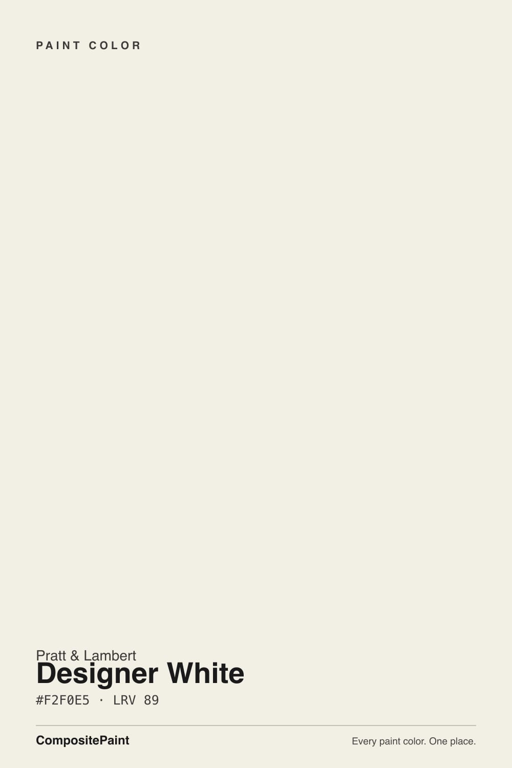
Designer White is the off-white Pratt & Lambert has been putting on contract documents for decades — high-LRV, low-chroma, creamy without turning cottage, with a whisper of green that keeps it from reading as builder-stark. At LRV 89 it is brighter than White Dove and calmer than Simply White. Use it on whole-house walls, trim, and ceilings when you want one white that behaves. Skip it if you wanted gallery-crisp or a true cream.
Whole-house walls + trim in real daylight · ceilings and millwork on a spec sheet · kitchens with warm wood and brass · anyone whose painter already works in Pratt & Lambert
You want a gallery-crisp white · the room faces north and stays dim · your counters are cool grey marble · you need more cream than this (go Antique White)
- Quiet architectural white — creamy without going yellow
- LRV 89 is bright enough for whole-house walls, trim, and ceilings
- The P&L catalog default for millwork, so in-family palettes are easy
- Flatters oak, walnut, brass, and warm stone
- One-color rooms (walls + trim + ceiling) work with only a sheen change
- Not a true bright white — cream and a hint of green show next to cooler whites
- Cool grey marble and cool LEDs pull a dingy green-grey
- Goes flat in dim north-facing rooms
- Harder to buy than BM or Sherwin — P&L is still a trade brand
What Color Is Designer White, Really?
A very light off-white with low chroma and a soft, slightly warm cast — cream first, a hint of green second. That green is the whole architectural trick. Most creamy whites are built on yellow oxide and tip butter the moment afternoon sun hits them; Designer White carries just enough cream to feel finished, then mutes it so the wall does not go cottage-yellow. Next to a pure bright white it looks faintly creamy and a touch soft. On its own, in decent daylight, it simply reads as white.
At LRV 89 it sits at the top of the usable-white range: brighter than White Dove (LRV 85) and Alabaster (LRV 82), a hair under Simply White and Chantilly Lace (both LRV 90). That gap is the useful part. It bounces enough light to run a whole house, including hallways and ceilings, but it still has a body a primer-white does not. Pratt & Lambert's own color cards treat it as the default trim: walls in a greige or cream, millwork in 33-1. Architects have used it the same way — and as the wall color — for years because it does not fight wood, stone, or a second wall color.
Undertone in one line: warm cream with a whisper of green — never pink, never icy. If your sample looks yellow, you are seeing it next to a cooler white or under west sun. If it looks green-grey, your light is cold, your lawn is bouncing, or the stone is grey. Both versions are the same paint being honest about the room.
Where It Shines
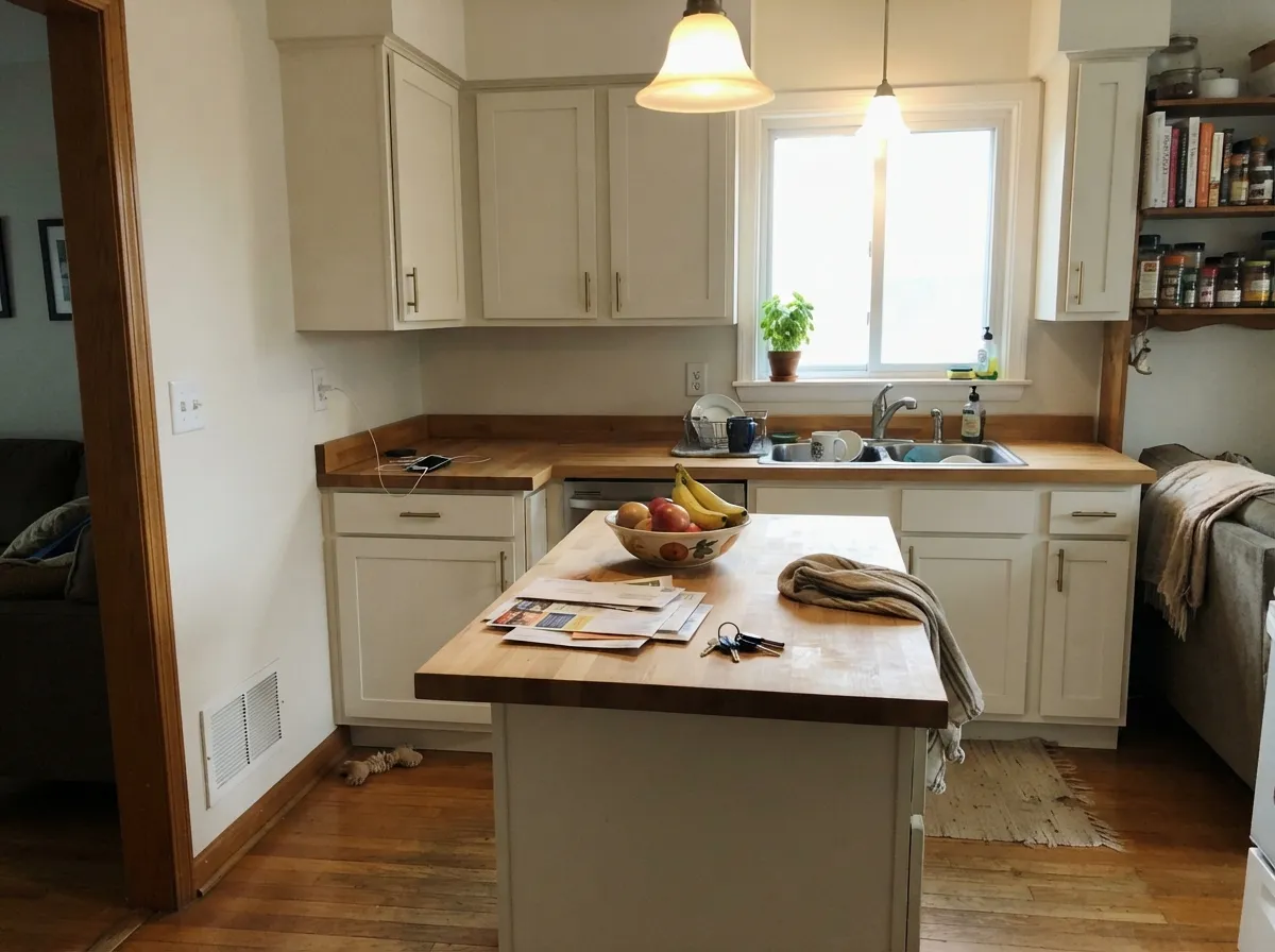
Give it real daylight and keep the company warm, and Designer White is nearly invisible in the best way — the room feels finished, not painted. The one-color job — walls, trim, and ceiling all in 33-1 with only sheen changes — is the spec-sheet move because the color is quiet enough to carry a whole floor. Its second home is millwork: on doors, casings, and ceilings against a warmer wall it frames without going plastic-bright. Kitchens with oak, walnut, brass, and warm quartz are a natural fit; satin on cabinets hides knuckle marks a starker white would broadcast.
Where It Fails
Almost every regret story about Designer White follows one of three scripts, and all three are predictable before the first coat. None of them are the paint's fault — but if your room matches one, this is not your white, and sampling bigger will only confirm it.
On the chip it passes for white. On four walls, next to a cooler trim white or a white appliance, the cream (and that hint of green) is unmistakable. If the goal is gallery-crisp, this is too soft; Chantilly Lace is the cold-blooded version. If you just wanted a little more cream, White Dove has more body and less green.
Carrara-type stone and 4000K bulbs sit at the opposite temperature and pull the green-grey base forward. Readers describe a faintly dingy, almost celadon cast — not the clean white they sampled in the store. With cool stone, pick a cooler white. With this paint, warm the bulbs first; 2700K is part of the job.
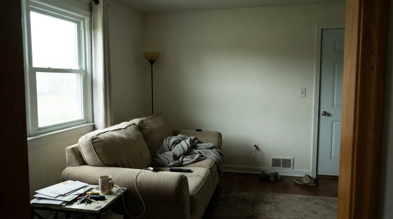
North light is cool and grey — it strips the cream and leaves the green-grey exposed. The walls go flat and slightly dirty. The color did not fail; the light did. Step to a creamier white (Antique White, or Swiss Coffee if you are in Benjamin Moore) or commit to warm lamps. Do not expect 33-1 to glow in a room that never sees sun.
Room by Room
This is why the color exists on a spec sheet. Semi-gloss Designer White millwork under a warmer wall — Antique White, a greige, a sage — reads as classic painted woodwork, not plastic-bright. Flat on the ceiling keeps the plane quiet. The one-color house (walls eggshell, trim semi-gloss, ceiling flat) is the cleanest version of the same idea.
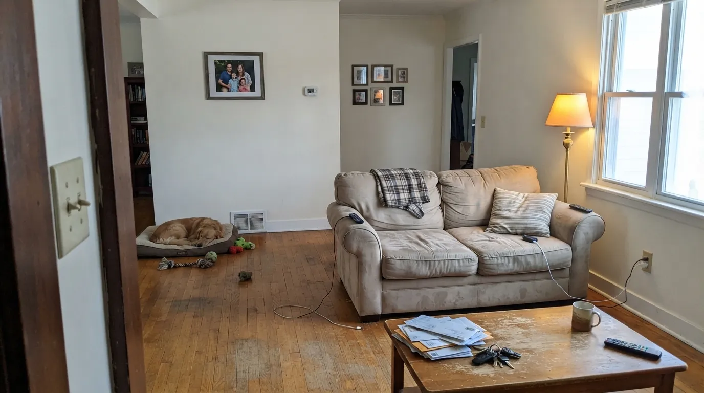
South or east light keeps the cream soft and the green asleep. Wood furniture, linen, and warm metal look deliberate against it. Eggshell on the walls; same color on trim in semi-gloss. In a closed north living room it goes dull — sample there before you roll the whole floor.
Satin Designer White cabinets flatter oak, walnut, brass, and butcher block, and at LRV 89 they still hide scuffs better than a starker white. Warm-flecked quartz and creamy marble are easy company. Cool grey counters argue and push the green. If the painter is already in Pratt & Lambert, this is the cabinet white they will reach for.
Under 2700K bulbs it turns gently creamy at night without going yellow. Morning east light is flattering. If the bedroom faces north and stays dim, the green-grey will show by afternoon — Swiss Coffee or Antique White will hold warmth better there.
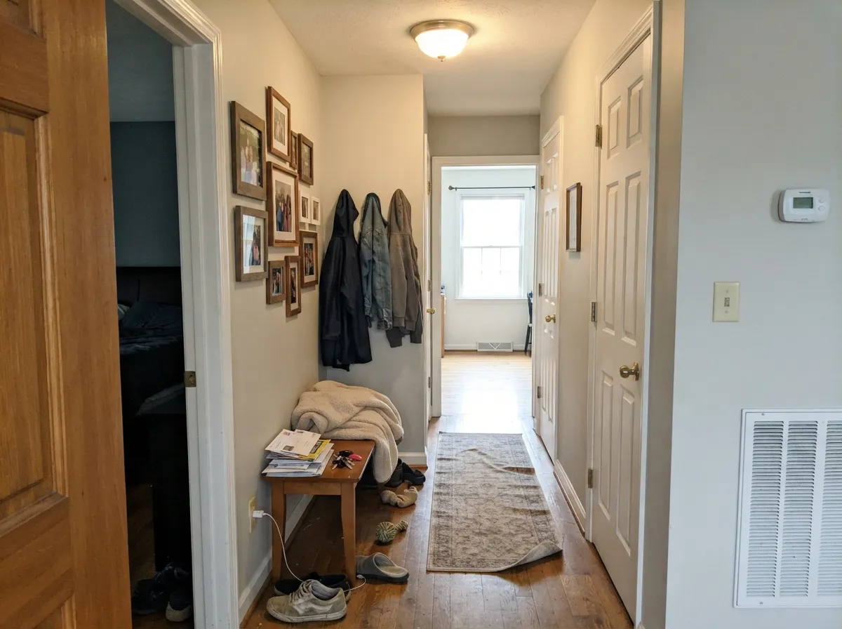
Hallways are where a spec white earns its keep. Designer White carries from room to room without throwing a new undertone every time the floor changes. Keep sheens consistent and do not suddenly switch to a brighter trim white at the front door — that is how the walls start looking unwashed.
Bath: warm stone, wood vanity, brass — yes. Cool grey tile or blue-grey marble — no; the green comes out. Exterior: full sun reads it brighter and cleaner than indoors, and with charcoal or navy trim it is a quiet traditional white. The shaded north wall will read a step creamier — walk the sample around the house before you commit.
Your Light Is the Risk
The cream stays quiet and the green stays asleep. Rooms feel finished, not yellow. This is the light the color was specified for.
Cool grey daylight strips the cream and leaves a faintly green, dingy white. Test a big sample on the actual north wall before you buy gallons.
East mornings are clean and soft. West afternoon sun warms the cream; it is a shift, not a new color. Most people like both versions.
2700K lamps: creamier, cozier, still white. Cool white LEDs: the green-grey base shows and the walls look slightly dirty — swap bulbs, not paint.
Most complaints about Designer White are a light mismatch. Upload a photo of your actual room and see it on your walls — then ask for the same wall in north light or evening lamps before you buy a single sample.
Need It From Another Brand?
Any paint counter can custom-tint Pratt & Lambert 33-1 directly. If you would rather stay in one brand's own deck, these are the closest stock matches, measured as ΔE2000. Under 2 is a difference you will not see on the wall.
| Brand | Closest color | ΔE | LRV | |
|---|---|---|---|---|
| Sherwin-Williams | WhitetailSW 7103 · Sherwin-Williams | 1.5 | 86 | Color page → |
| Behr | Nude W-f-210W-F-210 · Behr | 0.4 | 87 | Color page → |
| Benjamin Moore | Cloud White967 · Benjamin Moore | 0.5 | 85 | Color page → |
| Valspar | Wedding CakeV151 · Valspar | 1.1 | 86.5 | Color page → |
| PPG / Glidden | Crumb CookiePPG18-01 · PPG / Glidden | 0.5 | 87 | Color page → |
| Glidden | Crumb CookiePPG18-01 · Glidden | 0.4 | 87 | Color page → |
Contrast and Legibility
WCAG 2.1: AA is 4.5 : 1 for normal text, 3 : 1 for large text, AAA is 7 : 1.
Designer White vs the Colors You're Also Considering
Every Designer White sample board has the same rivals on it. The numbers show the real lightness gap — then it comes down to which risk you would rather live with.
Pick this if you want the brighter, more architectural version of the same calm, and your painter is already in Pratt & Lambert.
Benjamin Moore PM-19 · LRV 85White DovePick this if you want more body and a safer warm white — it is creamier, greyer, and more forgiving in mixed light.
Pick this if you want that same pale family as a whole-house wall color, not just millwork.
Sherwin-Williams SW 7006 · LRV 86Extra WhitePick this if your painter works in Sherwin-Williams and you need a sharp trim white — Extra White is the trim specialist, and the riskier wall color.
Pick this for calm — Simply White is the brilliant one with the predictable yellow weakness; Designer White stays quieter.
Benjamin Moore OC-117 · LRV 90Simply WhitePick this for a brighter, louder kitchen white that still leans warm — it accepts strong sun with a yellow flash.
Pratt & Lambert has several light neutrals close enough to Designer White to be worth comparing. Antique White (1-1) sits at LRV 78, notably deeper and more clearly beige. Used side by side, Designer White reads as the true white and Antique White as the soft, warm neutral. Choose Designer White when you want brightness; choose Antique White when you want a bit more color and coziness on the wall.
Off-White (11-1) at LRV 80 and Silver Lining (32-1) at LRV 80 are also deeper and a touch more saturated than Designer White's 89. In a bright room with lots of trim, Designer White will hold its clean look while these lean visibly creamier or greiger.
The practical rule: Designer White is the lightest, cleanest option of the group. Step down to one of these when a pure-white wall feels too plain for the space.
Designer White Coordinating Colors
Stay on the warm side of the fence. Designer White flatters creams, warm greiges, muted sages, deep navies, and oxide reds — and it argues with icy blues, cool greys, and blue-grey stone. These are the partners that keep showing up next to it on spec sheets and in real houses:
Why Architects Keep Specifying 33-1
Pratt & Lambert has never run a Color of the Year campaign around Designer White, and it does not have a consumer cult the way White Dove does. What it has is catalog gravity. P&L's whites-and-neutrals cards put 33-1 next to Ancestral and Silver Lining as the clean backdrop; interior color cards pair it as trim under greige walls. That is how a trade white becomes a default: it is the chip the specifier already has in the drawer.
You can see the same habit in published houses. Acre Architects' New Brunswick vacation house, covered in Architectural Record in 2019, used Pratt & Lambert Designer White with cedar cladding and a Benjamin Moore black. Traditional Home's May 2014 designer showhouse put 33-1 on the walls. Susan Wadden, then P&L's color marketing manager, painted her own 100-year-old house with Designer White trim. None of that is viral fame. It is the quieter record of a spec white doing spec-white work — and the reason a painter who already buys Pratt & Lambert will not switch brands just to get a different off-white.
Designer White With Wood Tones and Floors
Warm wood loves it. Oak — red, white, or honey — walnut, butcher block, and cedar all sit comfortably against Designer White because the cream meets their warmth halfway and the green is too quiet to fight the grain. The Acre house pairing with milled western cedar is the outdoor version of the same idea. If your floors are orange-leaning builder oak, this is one of the whites that softens the orange instead of amplifying it.
The flooring that needs a sample first is cool grey LVP or grey-washed wood. Grey floors pull the cream and the green into relief, and the wall can read slightly yellow-green against them. It is not always a dealbreaker — a warm rug and 2700K lamps fix it in most rooms — but test a big board above the actual floor before you paint the whole house.
Three Ready Palettes Built on Designer White
A color is never alone on the wall. These are complete combinations in the 60-30-10 pattern, with the reason each one holds together. Every one opens in the visualizer.
One white at two sheens is the contract-document move: small houses read bigger and hallways flow. Hale Navy on the door is the single dark note the scheme needs, and it has enough light-demand of its own to stay navy, not black.
Try this palette in your roomAntique White is the gold, traditional cream; Designer White is cleaner and brighter, so it frames those walls without competing. Brick Red on the door is a P&L oxide red built for exactly this job — one saturated note, not a wall color.
Try this palette in your roomAgreeable Gray is the greige that stays safe until the light goes cool; Designer White millwork and cabinets keep the handoff clean instead of builder-stark. Kendall Charcoal grounds an island or exterior trim without the dim-room mud a softer gray can pick up.
Try this palette in your roomDesigner White FAQ
Is Designer White warm or cool?
Warm — the quiet kind. Cream first, a whisper of green second. In south light it reads as a finished white; in cold light the green-grey shows. It is never icy, and it is never cottage-yellow unless you park it next to a cooler white.
Is it good for kitchen cabinets?
Yes, if the stone is warm. Satin Designer White flatters oak, walnut, and brass, and at LRV 89 it hides scuffs better than a starker white. Cool grey quartz or Carrara-type marble will pull the green. Use a urethane-fortified cabinet enamel.
What trim color goes with Designer White walls?
Designer White itself, in semi-gloss. A brighter or cooler trim white makes the walls look creamy and slightly dirty — the most common pairing mistake with this color. If you want contrast, go darker (a greige or charcoal), never brighter.
How many coats does it take?
Two over any light existing color. Going over a dark or saturated wall, prime first with a grey-tinted primer — three finish coats of a white over red or navy is the expensive way to learn this.
Does it work on exteriors?
Yes, as siding or as trim. Full sun reads it brighter and cleaner than the interior, and charcoal or navy millwork gives it a quiet traditional contrast. The north wall will look a step creamier than the south — walk a sample around the house. Avoid pairing it with cool blue-grey accents, which make the cream look yellowed.
How does it compare to White Dove?
Same job, different body. White Dove (LRV 85) is the creamier, greyer, safer warm white. Designer White (LRV 89) is brighter and a touch greener — more architectural, less cottage. If your painter is in Pratt & Lambert, stay here. If you want the most forgiving warm white in mixed light, White Dove still wins.
Have you painted with Designer White?
Rate it — one tap helps the next reader decide.
Ask a Question