Brick Red
The Pratt & Lambert red built to match real masonry, reviewed honestly: where it reads like weathered brick, the rooms too dim for it, and what to use it for instead.

Jessica has spec'd whites and neutrals for more than 300 rooms and keeps a sample wall of painted drawdowns in her studio. Every color review is checked against real reader rooms in the comments and re-tested when a formula changes. About the testing process →
- 1Redwood0
- 2Brick Red5
- 3Million Dollar Red13
- 4Cinnamon Slate19
The Fast Verdict
Brick Red 20-9 is not a cheerful red. It is an iron-oxide red-brown pulled straight from the pigment that makes real brick red, sitting at LRV 5 — deeper than almost every other red in a major paint deck. On a front door or a set of shutters against pale siding it reads like the house was always brick, or should have been. On four walls in a room with weak light it reads almost black. This is a color for a single object, not a room, and it rewards you exactly as much as your light does.
Front doors and shutters on brick, stone, or pale siding · exterior trim that needs to look like real masonry · powder rooms and small accent walls with good light · anyone who wants a genuine brick-oxide red, not a bright cherry
You want a cheerful, clear red · your room is dim, small-windowed, or north-facing · you're painting a whole wall lit only by overhead cans · you need it in stock at a home center this weekend
- Reads as genuine iron-oxide brick, not a costume red
- Semi-gloss on a front door looks custom against cream or white siding
- Deep enough to hide weathering and dirt on an exterior door
- P&L's numbered-deck accuracy makes it a dependable brick-match for trim and repairs
- A small dose — door, vanity, one wall — reads expensive without repainting a room
- At LRV 5 it goes nearly black without strong, direct light
- Too brown and muted for anyone picturing a bright, cheerful red
- Not stocked at big-box home centers — needs a Pratt & Lambert / Valspar dealer and a special order
- On full walls in average room light it can read more like a stain than a color
What Color Is Brick Red, Really?
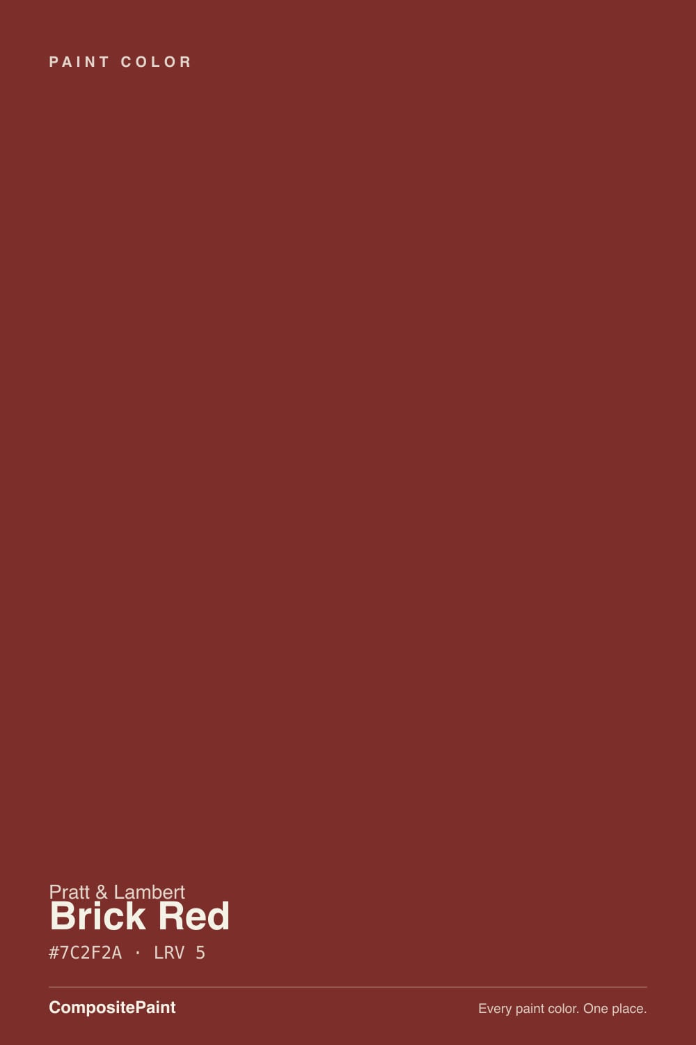
A warm, muted red built on the same iron-oxide pigment family that gives fired brick its color — which is exactly the point of the name. It is not a candy-apple or lacquer red; the base leans brown and slightly orange rather than pink or blue, so it reads as weathered masonry rather than a saturated craft-store red. That warmth is real, but at LRV 5 it is fighting a losing battle with any light it doesn't get: this is one of the darkest reds you'll find in a national deck, several shades deeper than Benjamin Moore's Cottage Red or Million Dollar Red.
Pratt & Lambert built its name on exactly this kind of color — a numbered, professional-grade deck that architects, decorators, and restoration painters trusted to match real materials precisely, long before either was a design trend. The company dates to 1849 in Buffalo, and colors like Brick Red 20-9 come from that trade catalog tradition rather than a modern marketing collection. P&L is no longer sold as a stand-alone retail line; it now lives inside Sherwin-Williams's Valspar business, so this is a special-order, ask-by-SKU color at a dealer counter, not a shelf-stock gallon.
Undertone in one line: warm iron-oxide red-brown, leaning slightly orange, never blue and never pink. If your sample reads almost black, that is LRV 5 doing exactly what LRV 5 does in low light — not the paint failing.
Where It Shines
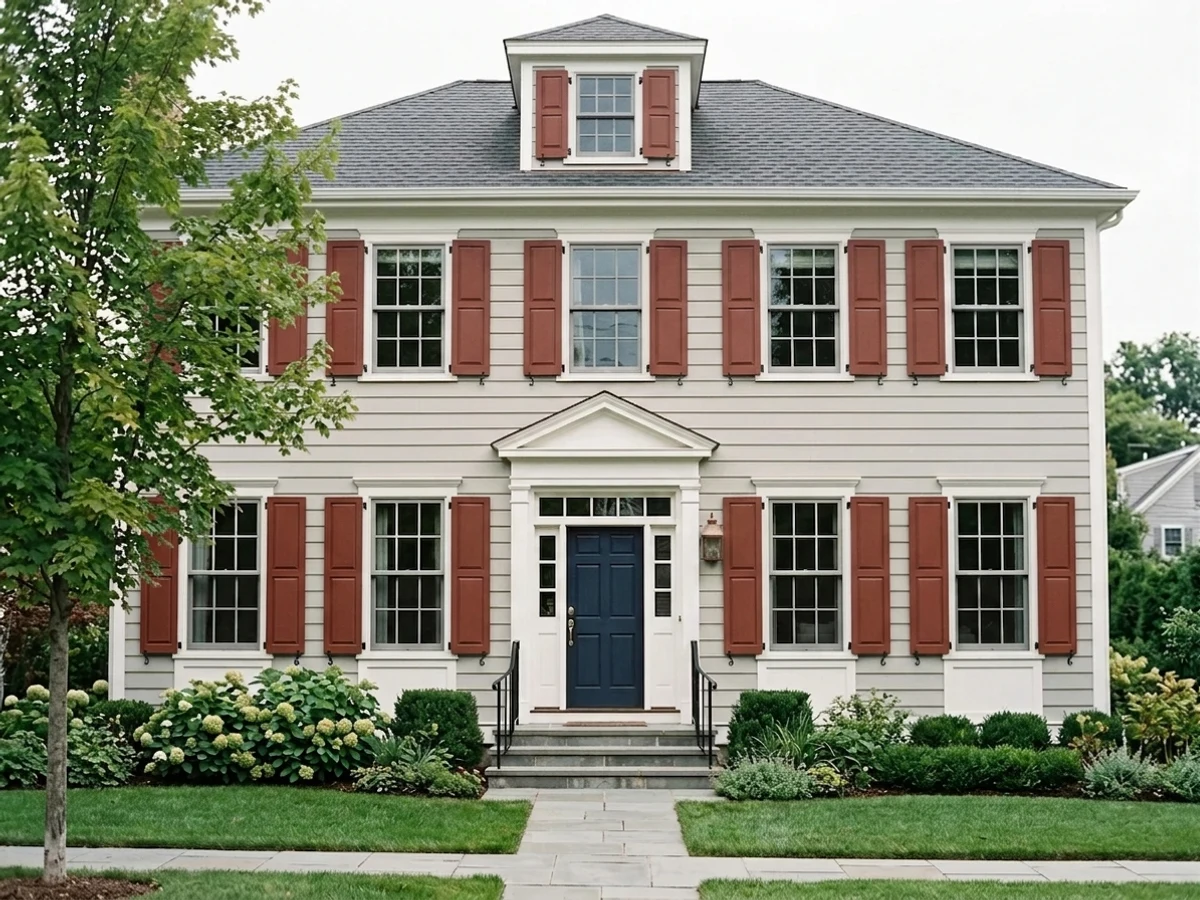
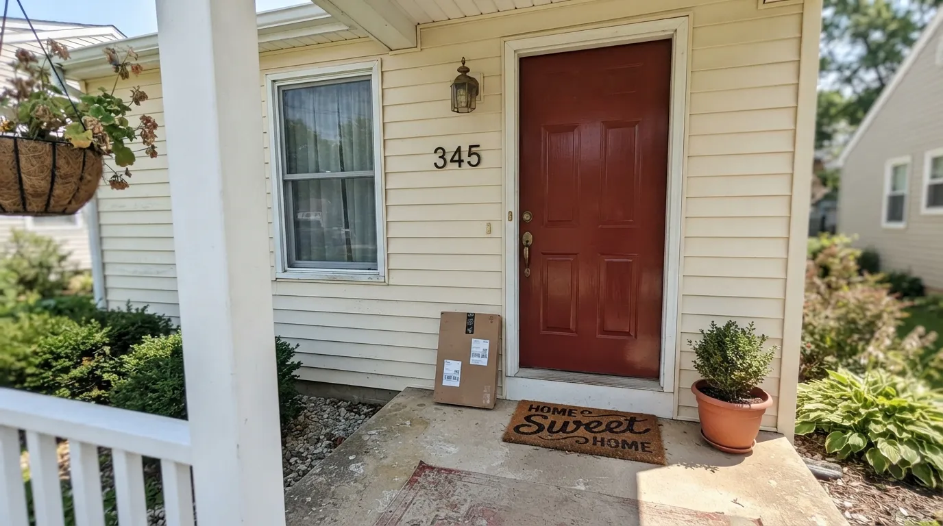
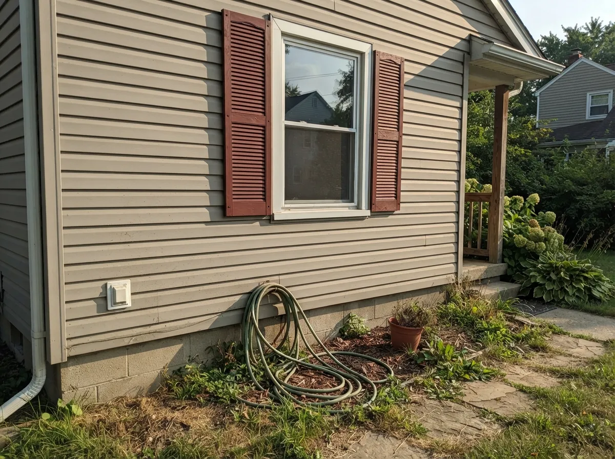
Give it a single object and real light and it does exactly what it was built to do. On a front door against cream or white siding, in full sun, the iron oxide comes forward and the door reads like it was cut from real brick — the effect designers reach for on a plain-sided house that wants one confident, material-looking accent. Shutters do the same job at scale: painted trim that visually claims kinship with the brick foundation, chimney, or walkway instead of looking like an unrelated paint color parked next to masonry.
Where It Fails
Almost every disappointing outcome with Brick Red 20-9 comes from asking it to do a job it wasn't built for, and all three are predictable before the first coat. None of them are the paint's fault — this color was engineered to match a material, not to brighten a room.
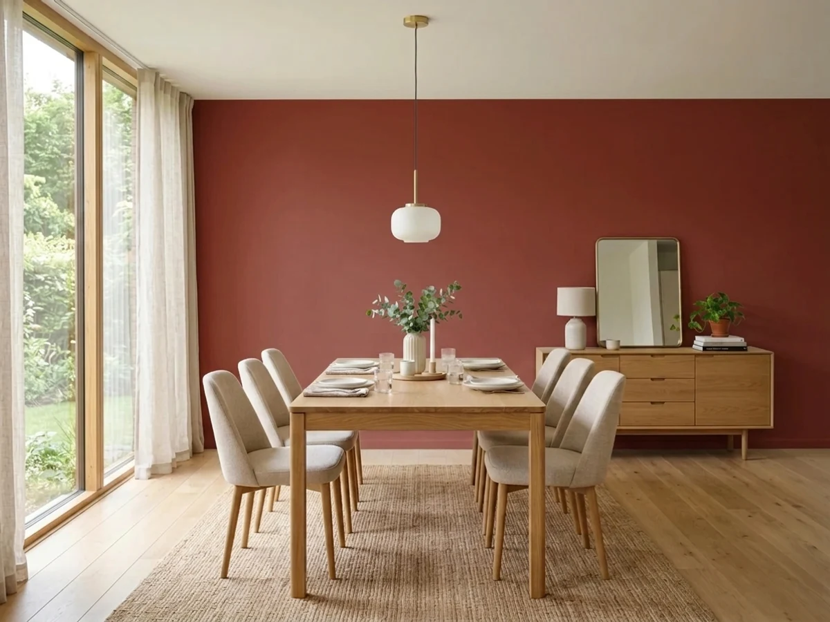
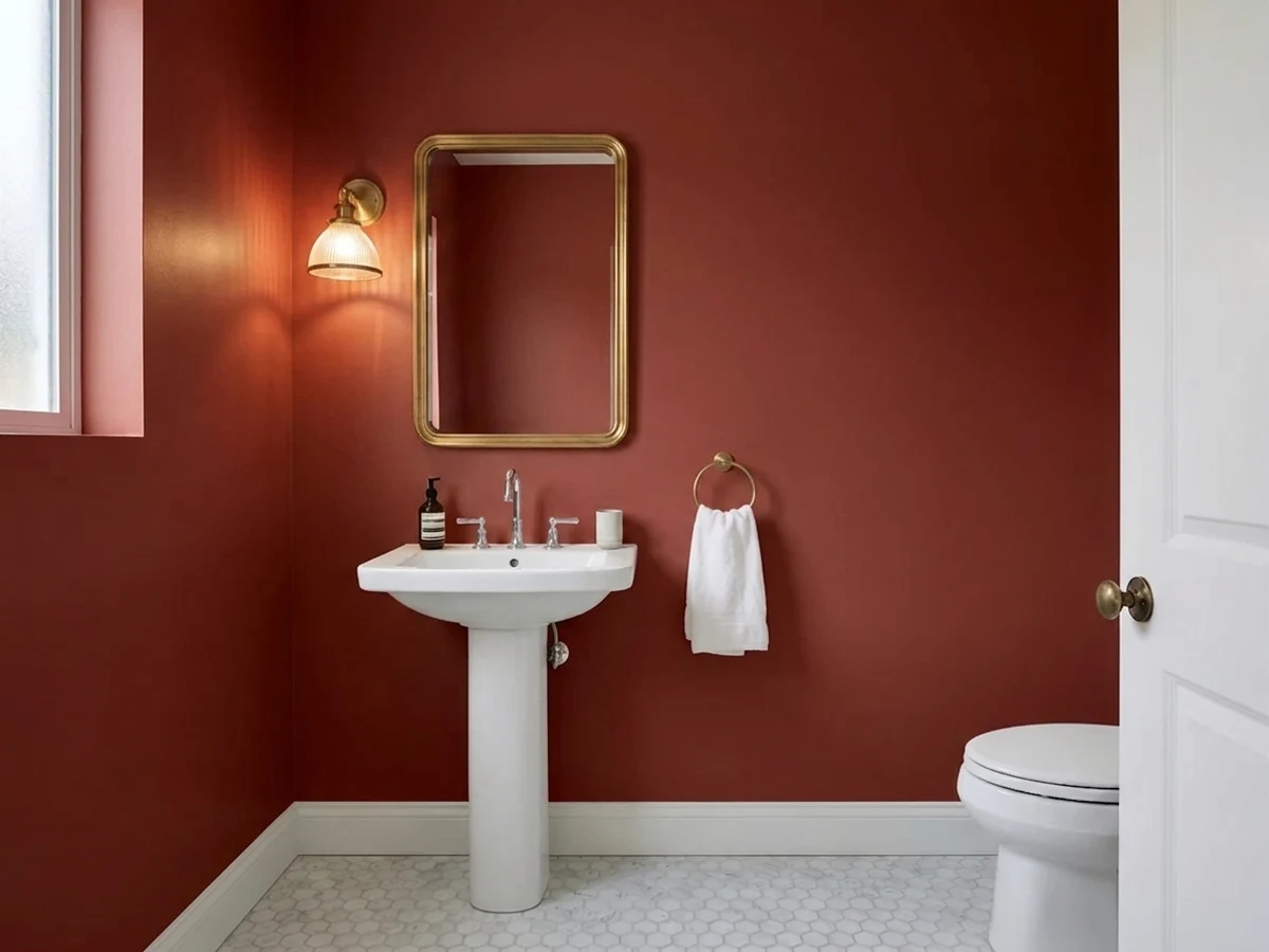
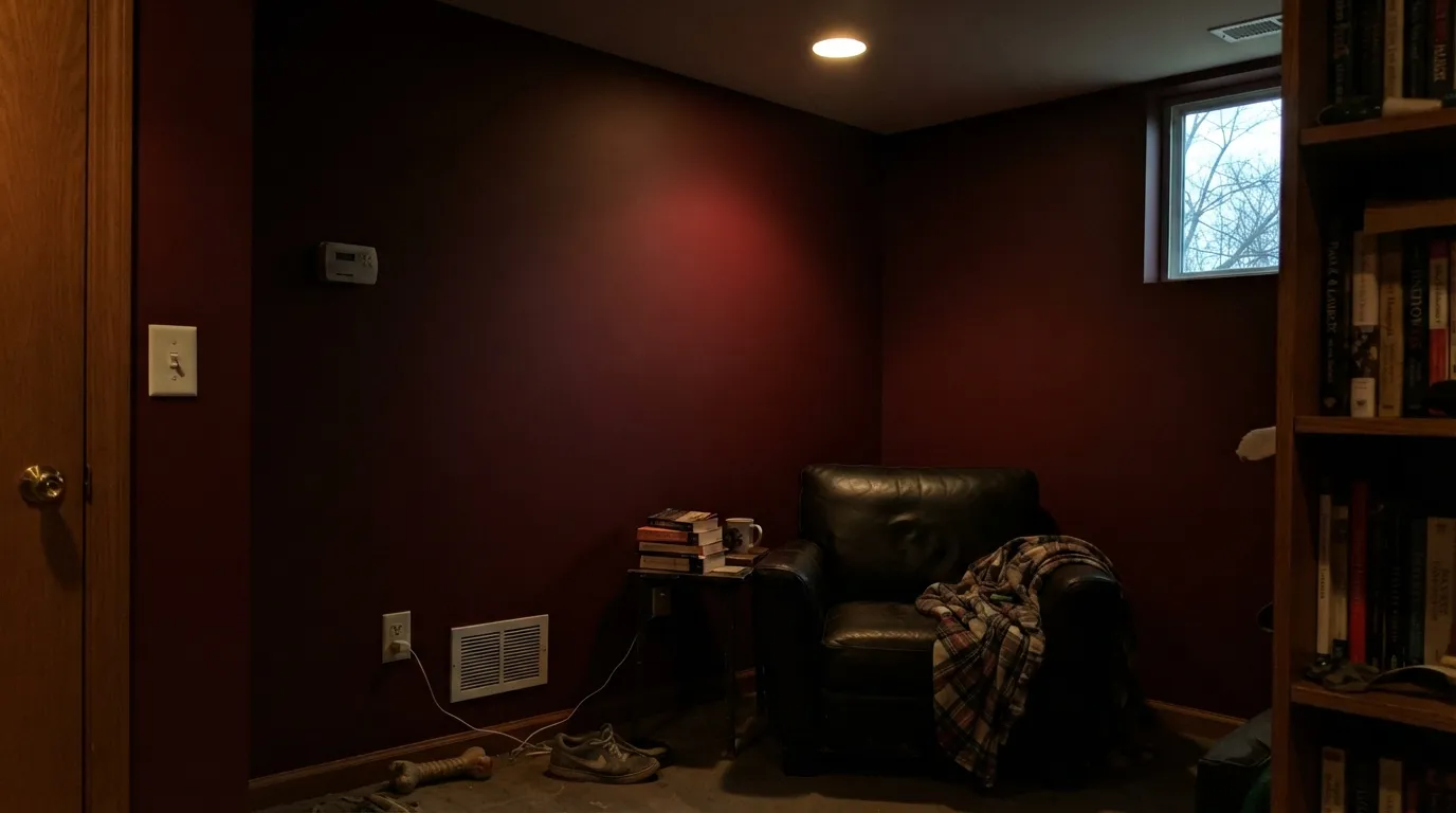
At LRV 5 there isn't much light left to reflect. Put it on four walls in a room that only gets overhead cans or weak north light and it reads as a near-black wall, not a red one. Reserve it for a door, a vanity, or a wall that gets real daylight or warm lamps close by.
This is an oxide red, not a cherry or a lacquer red — the brown in it is permanent, not a lighting trick. If you pictured something closer to a fire-engine or a clear tomato red, you'll be underwhelmed. Sherwin-Williams Red Tomato is the color you actually wanted.
Pair it with a stark cool white and light it with 4000K+ LEDs and the warmth gets squeezed out; readers who've done this describe the red going muddy and brownish rather than rich. Warm 2700K bulbs and a warm-white trim keep the oxide tone honest.
Room by Room
Semi-gloss, full sun, pale or brick siding: this is the color's natural habitat. It reads as a material match to real brick or stone foundations rather than a decorative paint choice sitting next to them.
Same logic as the door, at scale. Works especially well on houses with real brick chimneys, foundations, or walkways it can visually agree with. Satin holds up to weather better than a flatter sheen.
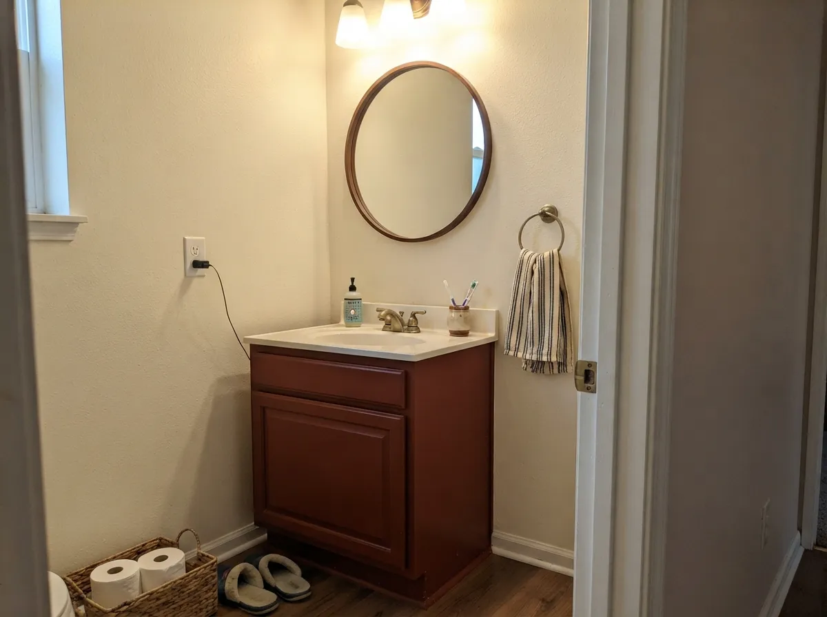
A small room takes a deep color well, and Brick Red 20-9 on a vanity or all four powder-room walls with a good fixture overhead reads custom and warm, not cave-like. Skip it in a powder room with only a single dim sconce.
Under warm lamplight and candles it goes rich and velvety, the way a good dark dining color should. It needs the room to actually be lit at dinner — daytime, with weak light, it recedes to near-black.
LRV 5 is a lot of color to live with on a full room's walls day-round. Most rooms don't have the consistent, strong light this depth needs; treat it as an accent, not a whole-room commitment.
It's built to be the trim that matches the masonry, not the masonry-sized field color itself. Full sun keeps it honest and rich; on a full facade the depth becomes heavy fast. Keep it to the door, shutters, and small trim runs.
Your Light Is the Risk
This is the light it was engineered for. The iron oxide comes forward and it reads like real weathered brick — a door or shutters glow instead of going flat.
LRV 5 leaves almost nothing to reflect. Overhead cans or a shaded room read the color as near-black, not red. Test it exactly where it will live before committing a whole wall.
Flat gray daylight mutes it toward a dark chocolate-brown; low golden-hour sun pulls the red back out. Exteriors see the biggest daily swing.
2700K lamps keep the oxide warmth alive and rich. Cool 4000K+ LEDs squeeze it toward muddy brown — swap the bulb before you swap the paint.
Most complaints about Brick Red are a light mismatch. Upload a photo of your actual room and see it on your walls — then ask for the same wall in north light or evening lamps before you buy a single sample.
Need It From Another Brand?
Any paint counter can custom-tint Pratt & Lambert 20-9 directly. If you would rather stay in one brand's own deck, these are the closest stock matches, measured as ΔE2000. Under 2 is a difference you will not see on the wall.
| Brand | Closest color | ΔE | LRV | |
|---|---|---|---|---|
| Sherwin-Williams | FireweedSW 6328 · Sherwin-Williams | 2.1 | 7 | Color page → |
| Benjamin Moore | Country RedwoodHC-183 · Benjamin Moore | 2.1 | 8 | Color page → |
| Valspar | Wine CaskT513 · Valspar | 3.0 | 7.3 | Color page → |
| Dutch Boy | Red Farmhouse305-7DB · Dutch Boy | 2.1 | 7 | Color page → |
| HGTV Home by Sherwin-Williams | FireweedHGSW 2061 · HGTV Home by Sherwin-Williams | 2.1 | 7 | Color page → |
| C2 Paint | DivaC2-519 · C2 Paint | 3.7 | 7 | Color page → |
Contrast and Legibility
WCAG 2.1: AA is 4.5 : 1 for normal text, 3 : 1 for large text, AAA is 7 : 1.
Brick Red vs the Colors You're Also Considering
Every Brick Red sample board has the same rivals on it. The numbers show the real lightness gap — then it comes down to which risk you would rather live with.
Pick this for the deepest, truest brick-oxide match — Cottage Red leans more brown-barn, this leans more masonry-red.
Benjamin Moore HC-184 · LRV 11Cottage RedPick this for a lighter, browner barn red — Cottage Red sits two LRV steps up and reads less black in shade.
Pick this for doors and exteriors — Million Dollar Red is an interior lacquer color and goes flat in daylight; this one was built for the sun.
Benjamin Moore 2003-10 · LRV 8Million Dollar RedPick this for a glossy, indoor lacquer red built for one lamplit statement room, not an exterior.
Pratt & Lambert does not offer a near-identical red in this deck, so the closest comparisons are its deep browns. Mahogany (21-10) is the nearest, with the same LRV of 5 and a very similar depth, but it is officially a brown. In practice Mahogany reads as a red-leaning brown, a bit earthier and less obviously red than Brick Red. Choose Brick Red when you want the color to clearly say red, and Mahogany when you want that same darkness but calmer and more woody.
Cocoa (23-11) is a truer brown at LRV 7, warmer and lighter, without Brick Red's saturation. Next to Brick Red it looks like coffee against fired clay.
The practical rule: all three are dark and warm, but Brick Red is the only one that keeps a real red identity in daylight, so pick it when the red itself is the point rather than just a dark warm backdrop.
Brick Red 20-9 Coordinating Colors
The rule for coordinating with Brick Red 20-9: warm whites and warm greiges on the field, near-black or true black for the frame, and nothing cool-blue anywhere near it. It was built to sit next to real masonry, so it pairs best with materials and colors that share that warmth.
Brick Red 20-9 on Exteriors
Outside is where this color makes the most sense, because it was formulated to visually agree with real fired brick rather than compete with it. Full sun keeps the iron oxide honest and rich; the shaded side of a house will read noticeably darker and browner, so walk the whole exterior with a sample before deciding on a door or shutter color.
The pairing matters more than the light. Cream or white siding gives it room to be the one confident accent. Warm greige siding lets it blend into a brick-and-stone material palette instead of standing apart from it. What to avoid: cool blue-white siding or trim, which pulls against the warmth and makes the red look slightly off rather than intentional.
Finding This Color Today
Pratt & Lambert dates to 1849 in Buffalo, New York, and built its reputation on exactly this kind of color: a numbered, professional-grade deck that architects and restoration painters trusted to match real materials precisely. Colors like 20-9 come out of that trade-catalog tradition, not a modern seasonal collection — which is part of why it's harder to find than a Behr or Sherwin-Williams number.
The brand today lives inside Sherwin-Williams's Valspar business rather than as a stand-alone retail line, so don't expect to find it pre-mixed on a shelf. It's still fully mixable — ask for Pratt & Lambert Brick Red by name and SKU at a dealer that carries the line, and plan for a special-order tint rather than a same-day gallon.
Three Ready Palettes Built on Brick Red
A color is never alone on the wall. These are complete combinations in the 60-30-10 pattern, with the reason each one holds together. Every one opens in the visualizer.
Cream siding lets the iron-oxide red act as the one confident, material-looking accent; near-black shutters frame the door instead of competing with it. This is the combination the color was engineered for.
Try this palette in your roomA warm greige body lets the red read as an intentional brick-match instead of a clash, and crisp white trim keeps the whole thing from going heavy. Works especially well on a house with real brick foundations or a chimney.
Try this palette in your roomCream keeps a small room from feeling like a cave while the vanity carries all the color; charcoal hardware and frame tie in without pushing all the way to black. Needs a real fixture overhead — this is not a candle-only powder room.
Try this palette in your roomBrick Red FAQ
Is Brick Red 20-9 a true red or more of a brown?
It's built on iron-oxide pigment, the same family that colors real brick — so it's genuinely red, but with a permanent brown-orange lean rather than a pink or blue one. It will never look like a fire-engine or cherry red; that muted, masonry warmth is the entire point of the color.
Will it look black in a dim room?
Close to it. LRV 5 is very deep — there's almost no reflectance for a dim room to work with. Reserve it for spots that get real daylight, direct sun, or a strong fixture, and test a large sample in the actual spot before committing a whole wall.
Where do I buy Pratt & Lambert paint now?
P&L is no longer a shelf-stock retail line; it's part of Sherwin-Williams's Valspar business today. Ask for it by name and SKU (20-9) at a dealer that carries Pratt & Lambert or Valspar's professional line — expect a special-order tint, not something sitting on a home-center shelf.
Is this a wall color or a trim color?
Trim, mostly — doors, shutters, a vanity, one accent wall in strong light. At this depth it's a much better fit for a single object than for four walls in an average room.
What goes with Brick Red 20-9 on an exterior?
Cream and warm white siding let it read as an intentional accent; warm greige works too. Near-black shutters or trim frame it without competing. Avoid pairing it with a cool, blue-leaning white — it fights the warmth instead of setting it off.
Does it work as a front door color on a brick house?
Yes — better than on most houses, in fact, since it was built to visually agree with real brick rather than clash with it. It's the closest thing to painting the door the color of the house's own material.
Have you painted with Brick Red?
Rate it — one tap helps the next reader decide.
Ask a Question