Sunset Orange
A Behr color named for orange sunsets that is, in real life, a deep muted brick-red — reviewed honestly: where it earns its keep as an accent, and the one expectation that trips people up.

Jessica has spec'd whites and neutrals for more than 300 rooms and keeps a sample wall of painted drawdowns in her studio. Every color review is checked against real reader rooms in the comments and re-tested when a formula changes. About the testing process →
- 1Rookwood Dark Red3
- 2Rumors8
- 3Sunset Orange17
- 4Inferno22
- 5Rejuvenate30
The Fast Verdict
Sunset Orange is not orange. Run the actual numbers — R169 G91 B85 — and you get a deep, grayed-down brick-red with barely any yellow in it, which is exactly why our own color library files it under Red, not Orange. Behr has kept it quietly in rotation across five different paint lines (Marquee, Dynasty, Premium Plus, Ultra, PRO) for years without ever pushing it as a star color, and that steady, unglamorous availability is the real story: this is a dependable terracotta-adjacent accent, not a headline color, and it does its best work in small, deliberate doses.
A front door or small accent wall that wants one confident, grounded note · a kitchen island or lower-cabinet run · exterior shutters and trim on a white or cream house · anyone who wants the warmth of a rust or brick red without the cartoon-orange energy the name implies
You pictured a true bright, saturated orange · you want it across four full walls in an average-lit room · your room runs on cool-white LEDs with no warm lamps to balance them · you already have orange-toned wood trim or flooring it would have to compete with
- A genuinely deep, warm brick-red — more sophisticated in person than the "orange" name suggests
- Holds its saturation in real daylight instead of washing out
- Works as a confident, low-commitment accent: door, island, one wall
- Available across nearly every Behr line (interior, exterior, and Pro), so sheen and formula choice is flexible
- Pairs easily with warm white and black or charcoal trim for an intentional, not-too-matchy look
- The name overpromises — buyers picturing bright orange get a muted brick-red instead
- LRV 17 with a warm-red base is too deep and heavy for four walls in most average-lit rooms
- Goes muddy and brownish under cool north light or cool-white LEDs
- Very little public review history to lean on — you are testing it fresh, not following a well-worn crowd
What Color Is Sunset Orange, Really?
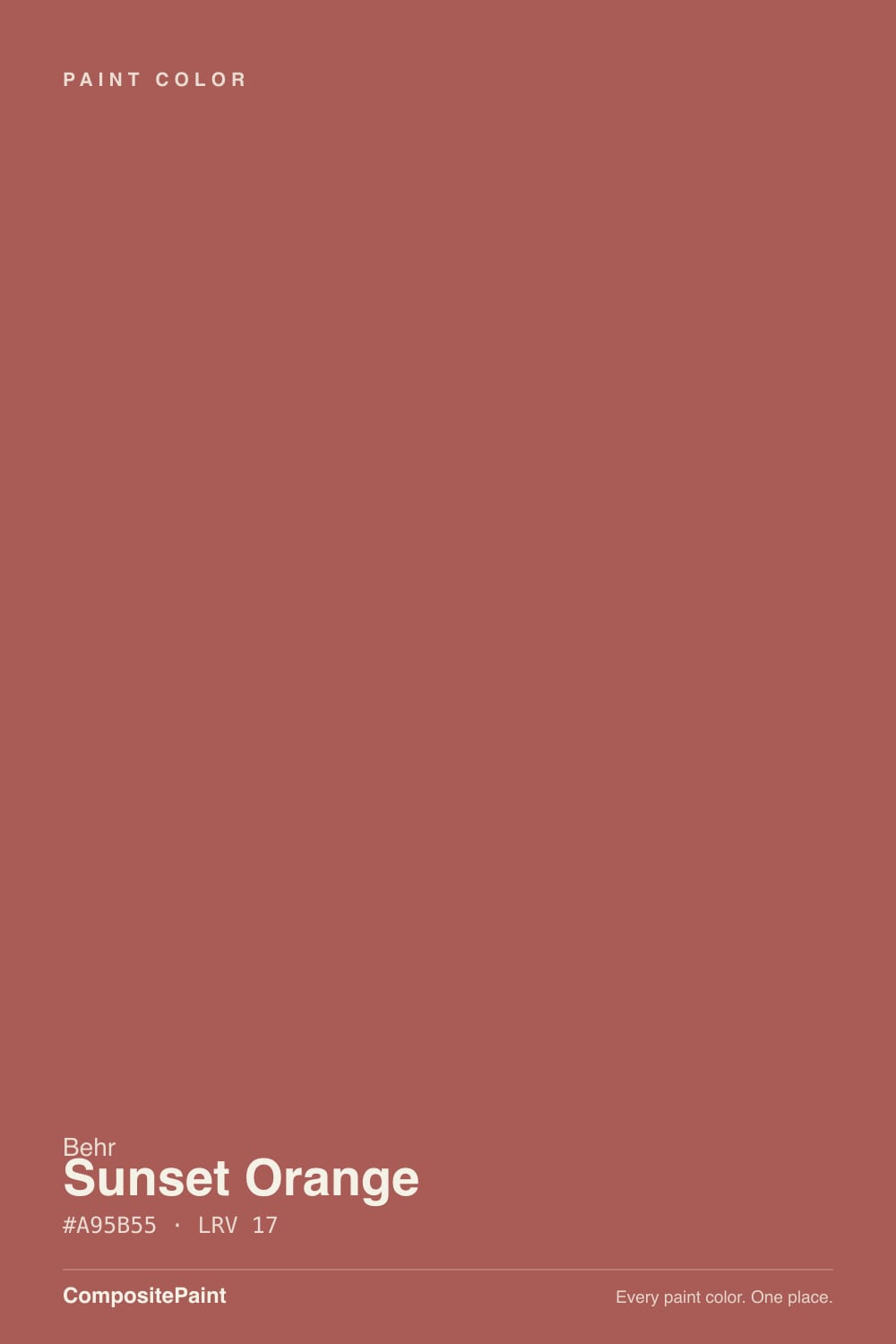
Start with the name problem, because it is the whole story: "Sunset Orange" promises a bright, saturated orange, and the paint does not deliver one. The actual RGB — 169, 91, 85 — has green and blue sitting only six points apart, which is the fingerprint of a muted, grayed-down red, not an orange (a true orange needs green sitting well above blue). Behr's own retail listings put it a shade lighter, around RGB 172, 100, 78, but even that reading is still a dusty brick-red, not a traffic-cone orange. Our own site catalogs it under the Red family for the same reason — one look at a real swatch settles the argument the name starts.
At LRV 17 it is a genuinely deep color, deeper than most colors marketed as terracotta (Sherwin-Williams Cavern Clay sits at LRV 24, Redend Point at 27). That depth is what makes it read more like an aged brick or a burnt-sienna clay pot than a fresh-cut pumpkin. It holds its saturation well in direct daylight — it does not wash out the way pale corals do — but in shade or under flat light it sinks toward a warm, muddy brown, losing the glow that makes the name make sense at all.
Undertone in one line: warm brick-red with a burnt-sienna cast, never a clean orange and never pink. If a screen or a printed chip shows it brighter and more orange than this, trust the deck numbers over the pixel — sRGB swatches routinely render muted reds a step more saturated than the can does on a wall.
Where It Shines
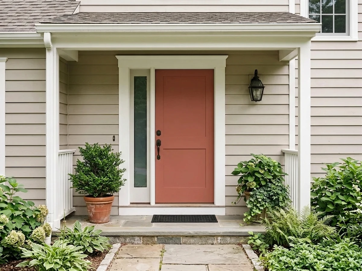
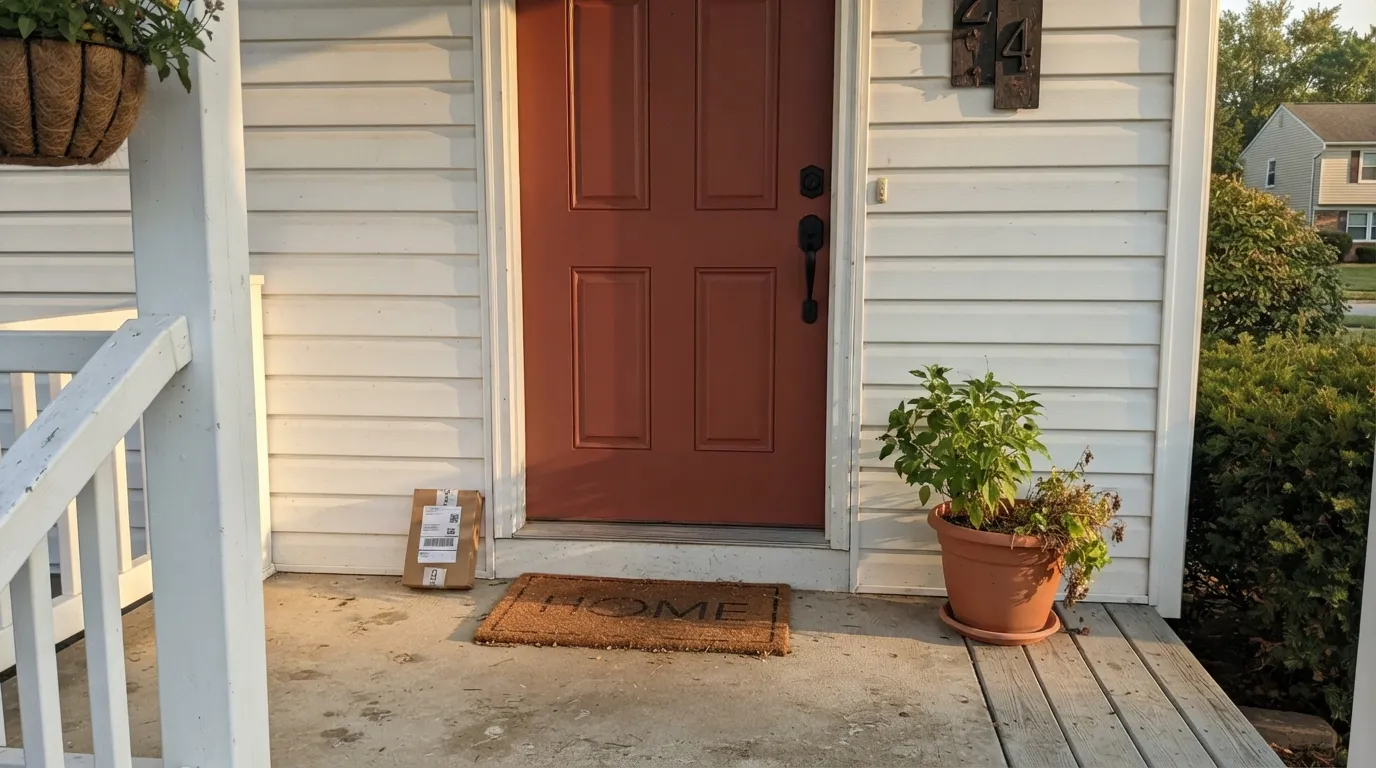
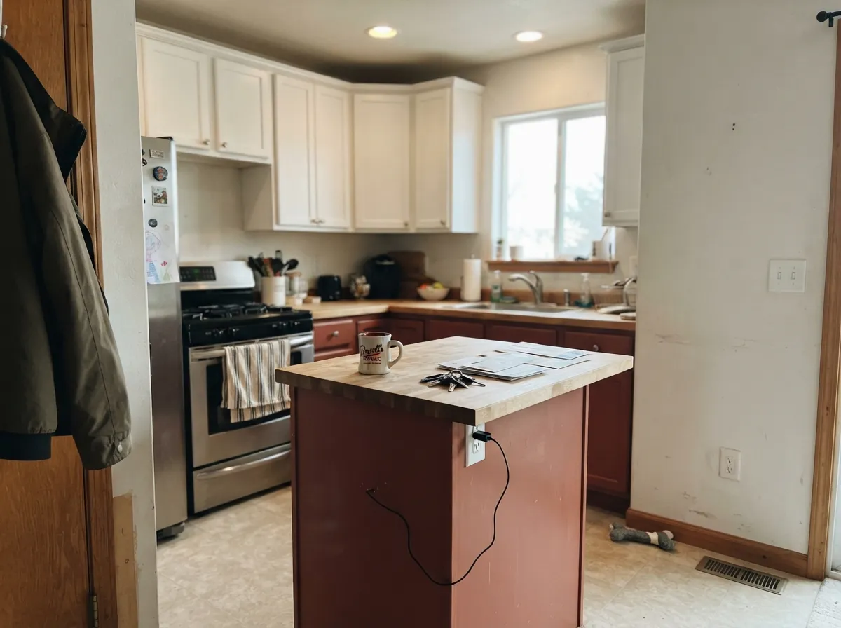
This is a color built for a small, deliberate commitment, and in that role it is genuinely good. A single front door in full or partial sun turns it into the warm, grounded first impression a plain white or beige house is often missing. On a kitchen island or a run of lower cabinets it reads like a considered design choice rather than a phase. Outdoors on shutters and trim against white or cream siding, it does the classic warm-accent job without tipping into novelty-orange territory — because, again, it never really was orange to begin with.
Where It Fails
Sunset Orange does not have a loud public track record — Behr has never marketed it as a headline color, and it has not collected the pile of five-star or one-star stories that a Color of the Year does. That absence is itself useful information: this is a quiet, competent workhorse, not a risky trend bet. The real regret stories that do turn up trace back to one of three predictable mismatches, all rooted in the physics of a deep, muted warm color rather than any flaw in the paint.
If the mental picture was a Halloween-pumpkin or traffic-cone orange, this will read disappointingly subdued on the wall. It is a grayed-down brick-red first and an orange only in the name on the lid. Order a physical sample before you commit to a whole door or wall — screens exaggerate its brightness.
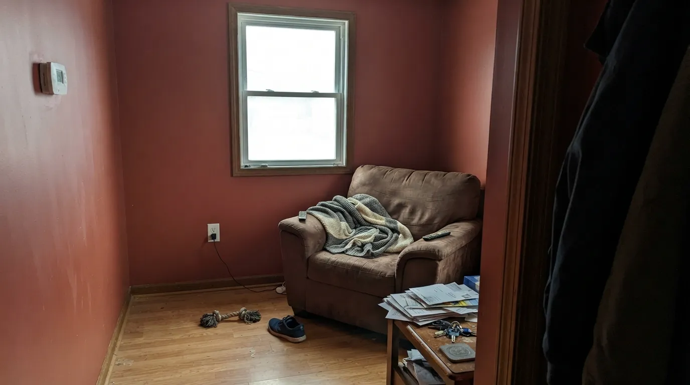
At LRV 17 with a warm red base, a full room in this color absorbs a lot of light and can feel heavy or cave-like, especially with normal ceiling height and a single window. It was never designed to be a whole-room color — treat it the way you would a genuine terracotta or brick red, as an accent, a door, or one wall at most.
Cool light strips the warmth out of any red and leaves a flatter, muddier, more brownish version behind. This color depends on warm light to look like its name at all — pair it with 2700K bulbs indoors, and expect a north-facing exterior wall to read noticeably duller than a south- or west-facing one.
Room by Room
Semi-gloss on a door in any real daylight is where this color makes its case: warm, grounded, and confident without reading like a costume. Pairs cleanly with white or cream siding and black hardware.
One bold surface against white uppers reads intentional. A full kitchen of this color over honey-oak floors would fight itself — keep the floors neutral or dark if you go this route. Satin cabinet enamel for durability.
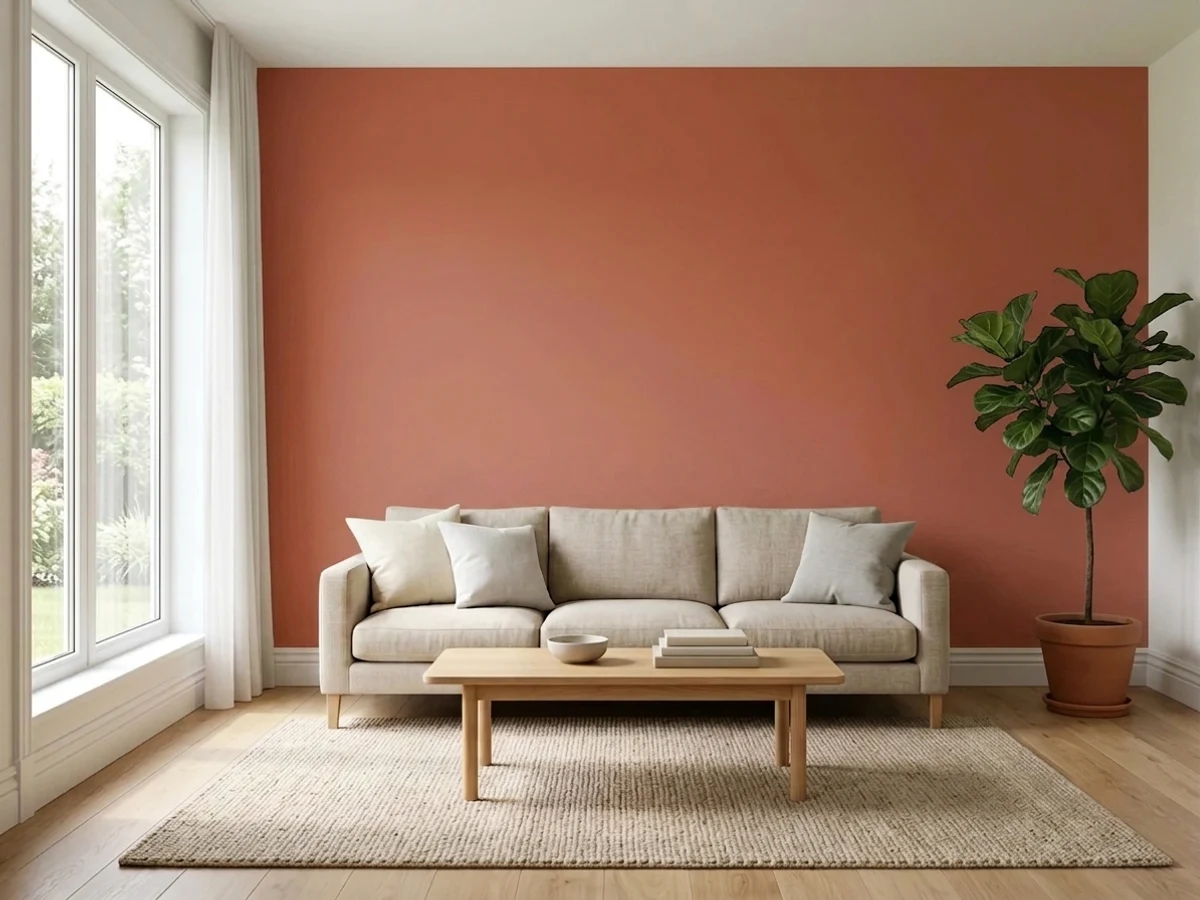
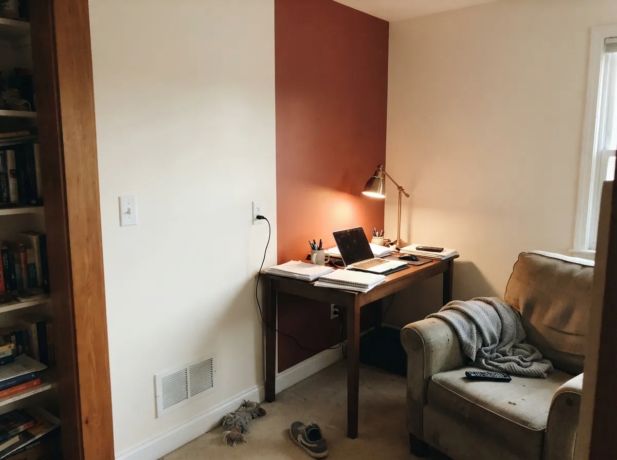
Behind a bookshelf or a headboard-style feature wall, with the other three walls in a warm white, it adds real depth without swallowing the room. Eggshell hides roller texture better than flat at this depth.
Too intense and too warm-dark for four walls if you want to sleep in a calm room, but a single headboard wall under warm lamp light can feel genuinely cozy rather than aggressive.
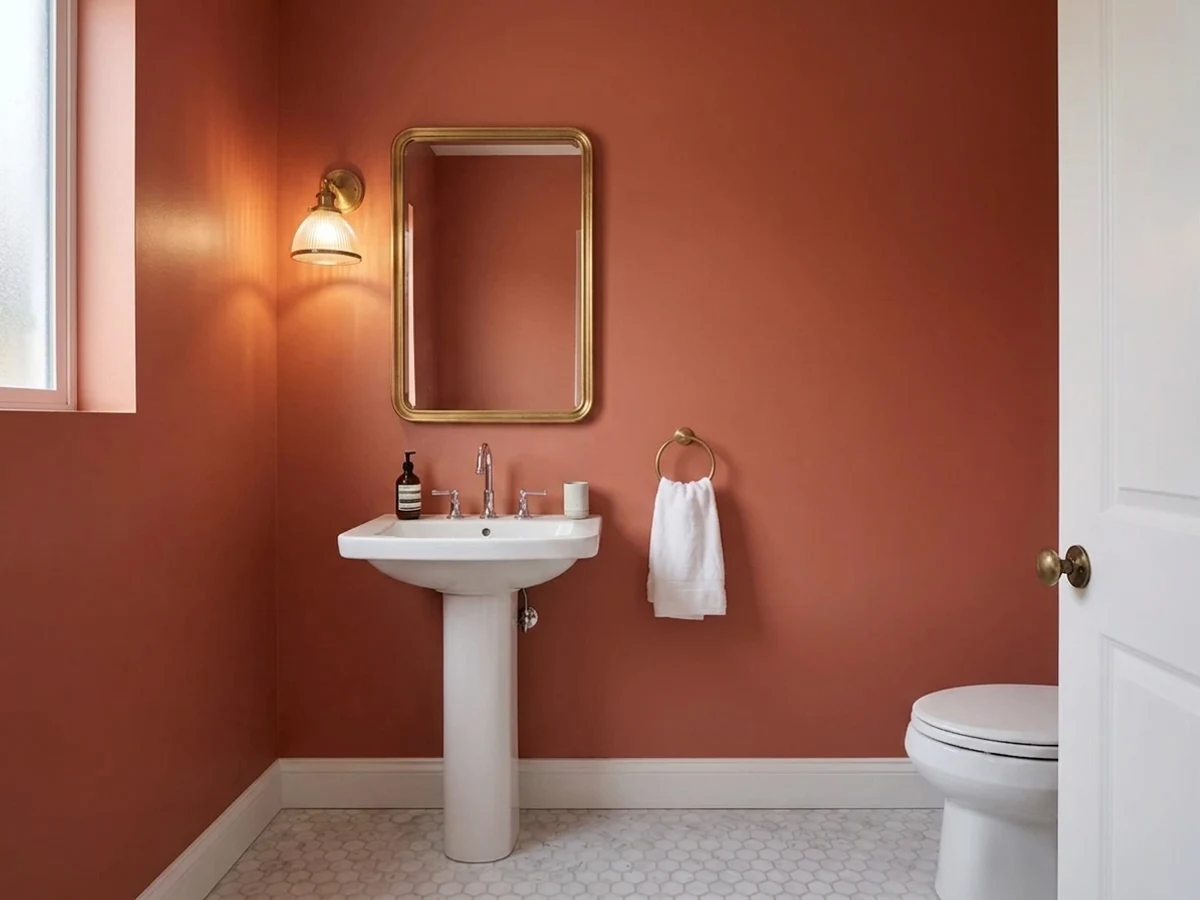
Small rooms take deep, saturated color well, and this is a good candidate: enough drama for a room you pass through, without the commitment of a full living space.
Its natural home. On white, cream, or light-gray siding it reads as a deliberate warm accent; on a house that already has orange-toned brick or wood, sample it side by side first, since two different warm reds rarely agree.
Your Light Is the Risk
West or south daylight brings out the burnt-sienna glow the name promises. This is the light to sample it in before deciding.
Cool, flat light drains the warmth and leaves a duller, muddier brown-red behind. A north-facing door will always read a step darker than a south-facing one.
Cooler and more subdued in early daylight, noticeably warmer and richer as the sun moves west through the afternoon.
2700K warm bulbs deepen it toward a rich brick or oxblood glow. Cool LEDs flatten it back toward plain muddy brown — swap the bulb before you blame the paint.
Most complaints about Sunset Orange are a light mismatch. Upload a photo of your actual room and see it on your walls — then ask for the same wall in north light or evening lamps before you buy a single sample.
Need It From Another Brand?
Any paint counter can custom-tint Behr BXC-39 directly. If you would rather stay in one brand's own deck, these are the closest stock matches, measured as ΔE2000. Under 2 is a difference you will not see on the wall.
| Brand | Closest color | ΔE | LRV | |
|---|---|---|---|---|
| Sherwin-Williams | FoxySW 6333 · Sherwin-Williams | 2.0 | 17 | Color page → |
| Benjamin Moore | Warm Sienna1203 · Benjamin Moore | 2.3 | 17 | Color page → |
| Valspar | CalienteM104 · Valspar | 3.6 | 16 | Color page → |
| PPG / Glidden | Berry PickingPPG18-32_1 · PPG / Glidden | 2.2 | 16 | Color page → |
| Glidden | Berry PickingPPG18-32 · Glidden | 2.2 | 17 | Color page → |
| Dutch Boy | Red Rainboot205-6DB · Dutch Boy | 2.9 | 15 | Color page → |
Similar Behr Colors
The nearest shades to Sunset Orange within Behr's own range, ranked by perceptual color distance — useful when you want the same look a touch lighter, darker, or warmer.
WCAG 2.1: AA is 4.5 : 1 for normal text, 3 : 1 for large text, AAA is 7 : 1.
Sunset Orange vs the Colors You're Also Considering
Every Sunset Orange sample board has the same rivals on it. The numbers show the real lightness gap — then it comes down to which risk you would rather live with.
Pick this if you want it deeper, redder, and less dependent on perfect light to read as intentional.
Sherwin-Williams SW 7701 · LRV 24Cavern ClayPick this if you want a lighter, more classically "terracotta-orange" glow that shows more clearly in good light.
Pick this for real saturation and depth — Redend Point is a much softer, quieter color by comparison.
Sherwin-Williams SW 9081 · LRV 27Redend PointPick this for a paler, pinker clay tone that is a smaller commitment and easier to live with on more surfaces.
Pick this for real warmth and red — Cinnamon Slate is cooler and greyer once you put them side by side.
Benjamin Moore 2113-40 · LRV 19Cinnamon SlatePick this for the same depth with the red dialed back toward mauve-brown — safer if "orange" makes you nervous at all.
Pick this if warmth is the whole point — Hidden Gem has its own real failure modes, just none of them involve looking too orange.
Behr N430-6A · LRV 14Hidden GemPick this if you want the same bold-accent-door move at a similar depth, just swung all the way cool into green-blue instead of warm red.
Inside the Behr deck, Prairie Poppy (T12-1) at LRV 18 is the closest relative and reads a touch lighter and pinker. Tibetan Orange (PPU2-14) at LRV 16 and Airbrushed Copper (BIC-45) at LRV 16 both carry more orange, so they look more like true terracotta. Cajun Red (PPU2-15) at LRV 16 and Volcanic (ECC-62-3) at LRV 15 are darker and browner, better when you want the color to recede.
Across brands, C2 Paint Head Over Heels (C2-525) at LRV 17 is the nearest at a deltaE of 1.55, visually identical in normal room light. Sherwin-Williams Foxy (SW 6333) at LRV 17 and Benjamin Moore Warm Sienna (1203) at LRV 17 land in the low twos, very close but worth sampling first.
Farther out, Dunn-Edwards Santa Fe Sunset (DET458) at LRV 16 and Valspar Caliente (M104) at LRV 16 are close but visibly different side by side, both leaning more orange than Sunset Orange does.
Sunset Orange Coordinating Colors
The rule for coordinating with Sunset Orange is the same rule that governs any deep brick-red: warm whites over stark ones, near-black or charcoal for contrast rather than true black, and cool blues or greens only in small, deliberate doses as a genuine complement. These are the partners that keep it looking intentional rather than accidental:
The Name-Versus-Reality Story
There is no Color of the Year story here, no viral renovation, no designer-blog moment to report — and that absence is itself worth being straight about. Sunset Orange is one of roughly 3,000 colors in Behr's standing catalog, quietly available across the Marquee, Dynasty, Premium Plus, Ultra, and PRO lines for years without ever being pushed as a headline color. That is a real category of good paint color: the reliable, unglamorous option a paint-store mixing machine can produce on demand, used mostly by people who already know they want a deep brick-red accent and go looking for one.
The one thing worth flagging plainly: the name sets the wrong expectation. "Sunset Orange" reads as a bright, saturated color, and the paint itself — by the numbers, and by every retail swatch we cross-checked — is a muted brick-red with a burnt-sienna cast and almost no true orange in it. If you are shopping by name alone, order the physical sample. It will not look like what the name promises on a screen.
Sunset Orange With Wood Tones and Metals
Dark, cool-toned woods are the safest partners: walnut, ebonized oak, and black-stained trim all let the red read as the only warm note in the room. Matte black and aged or unlacquered brass hardware both work well against it — polished chrome is the one metal finish that looks slightly cold and mismatched next to a color this warm.
The wood to watch is anything already orange-leaning — honey oak, cherry, or red-toned cedar. Two different warm reds sitting next to each other rarely agree; they tend to fight over which one is the "real" warm tone in the room instead of reading as a coordinated pair. If that wood is staying put, keep Sunset Orange to a single contained surface (a door, an island) rather than letting it run across open sightlines with the wood.
Three Ready Palettes Built on Sunset Orange
A color is never alone on the wall. These are complete combinations in the 60-30-10 pattern, with the reason each one holds together. Every one opens in the visualizer.
A warm white body keeps the house looking crisp and current rather than dated-orange; the near-black shutters give the door a dark frame to sit inside so the red reads as a deliberate accent, not the whole statement.
Try this palette in your roomA soft warm white on three walls keeps the room from feeling closed in, so the fourth wall can carry all the color. The charcoal furniture piece gives the eye a second dark, grounded note instead of leaving the accent wall to do all the work alone.
Try this palette in your roomTwo Behr whites on the walls and uppers keep the undertones from arguing with each other, leaving the island free to carry the only saturated color in the room — a classic low-risk way to try a bold cabinet color without repainting everything.
Try this palette in your roomSunset Orange FAQ
Is Sunset Orange actually orange?
Not really. The RGB numbers (169, 91, 85 in our deck) describe a muted, grayed-down brick-red with almost no yellow in it — the fingerprint of a true orange is green sitting well above blue, and here they are only six points apart. Our own site files it under the Red family, not Orange, for exactly this reason. Order a real sample before assuming it will look like the name.
How dark is it — will a room feel like a cave?
At LRV 17 it is a genuinely deep color, close in depth to Sherwin-Williams Cavern Clay (LRV 24) but noticeably darker. On four walls in an average room with one window, yes, it can feel heavy. That is exactly why it is reviewed here as an accent color — a door, an island, one wall — rather than a whole-room paint.
Is it a good front door color?
Yes, arguably its best use. Semi-gloss on a door in real daylight brings out the warm brick-red glow, and it pairs cleanly with white, cream, or light-gray siding and black hardware. It reads darker on a north-facing door than a south- or west-facing one — sample it on the actual door before ordering a gallon.
Can I use it on kitchen cabinets or an island?
Yes, in doses. An island or a run of lower cabinets against white uppers is a confident, contained way to use it. A full kitchen in this color over honey-oak flooring is a harder sell — keep the floor neutral or dark if you commit to the whole run.
What white goes with Sunset Orange?
A warm white, not a stark one — White Dove, Alabaster, or Behr's own Blank Canvas and Polar Bear all sit comfortably next to it without fighting its undertone. A cool, blue-leaning white will make the red look muddier by comparison.
Does it fade outdoors?
It is sold across Behr's Marquee, Ultra, Premium Plus, and PRO exterior lines, all formulated with UV-resistant pigments and primer built in, so ordinary fading resistance should be in line with any other Behr exterior color at this depth. As with any deep saturated color, full south-facing sun exposure over many years will fade it faster than a shaded elevation — expect touch-ups on a west- or south-facing door sooner than a north-facing one.
Have you painted with Sunset Orange?
Rate it — one tap helps the next reader decide.
Ask a Question