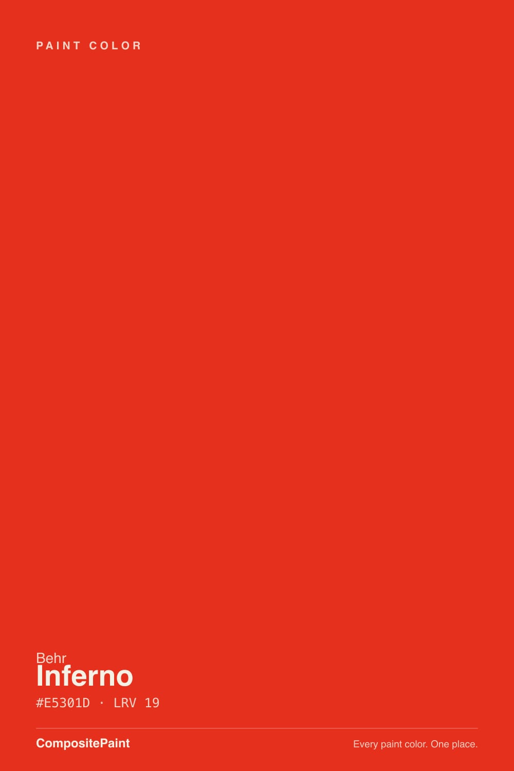
Inferno
Behr's expert-picked hot orange-red for a front door, reviewed honestly: the light where it glows, the light where it turns muddy brick, and what to pick instead.

Jessica has spec'd whites and neutrals for more than 300 rooms and keeps a sample wall of painted drawdowns in her studio. Every color review is checked against real reader rooms in the comments and re-tested when a formula changes. About the testing process →
- 1Rumors8
- 2Sunset Orange17
- 3Inferno22
- 4Rejuvenate30
- 5Tangerine Dream36
The Fast Verdict
Inferno is Behr's own experts pointing at the boldest door color in the deck and saying: this one, if you're going to commit. At LRV 19 it sits noticeably brighter and livelier than the typical near-black "true red" front door color — this is a genuine hot red-orange, closer to a traffic cone than a barn door, with real energy in daylight.
The catch is exactly what the name promises: it is orange as much as it is red, and buyers picturing a crisp, cool Christmas-red door instead get a warmer, glowing ember. Sample it on the actual door before you buy a gallon.
A front door or garage door that wants maximum energy · one accent wall in a room built to take it · house numbers, mailboxes and small exterior details · buyers who already know they want a hot orange-red, not a cool blue-red
You want a cool, blue-leaning red with no orange · your entry sits in constant shade or deep overhang · you're picturing this on more than one wall or the whole exterior · you won't commit to two full coats
- Genuinely reads as a hot, glowing red-orange in real daylight — not a muddy costume color
- LRV 19 keeps it lively and legible; it never sinks to near-black the way most "true red" door colors do
- Sold across Behr's interior/exterior Premium Plus and Marquee exterior lines, so the sheen matches the job
- The orange lean reads warm and welcoming under porch light rather than harsh or cold
- One of Behr's own expert-endorsed bold picks — a deliberately curated statement color, not an odd outlier
- Not a cool, blue-leaning red — the top source of buyer's remorse when expectations don't match
- Needs real direct light or it sinks toward flat, muddy brick-red
- Real owners report coverage that needed more than one coat, especially over a different base color
- Too intense for more than one wall, one door, or one accent — not built for a whole room or exterior
What Color Is Inferno, Really?
A deep-base red-orange with unusually high chroma for a door color — Behr sells P190-7 across both its interior/exterior Premium Plus satin enamel line and its Marquee exterior flat paint-and-primer, which tells you plainly how people actually buy it: as the one loud, deliberate surface on an otherwise calm house, not as a wall color for four sides of a room. It is one of the colors Behr's own experts put forward as an endorsed bold pick, not an obscure deep-base accident — this is a curated "go ahead and be brave" red, aimed squarely at doors.
The orange is not a footnote here, it is the character. Independent color references describe it as a precise, saturated red-orange, and the undertone reads as genuine warmth rather than a muted brick or terracotta — Inferno is closer to a glowing ember or a stoplight than to a dusty Southwest clay. At LRV 19 it also sits well above most "true red" door colors (which usually run LRV 6–10), so it never sinks to near-black the way a deep crimson does; it stays lively and legible even in flatter light, right up until the light disappears altogether.
Undertone in one line: red with a hot, unmistakable orange running underneath it — never a cool blue-red, never a quiet muted brick. If your sample looks brownish and subdued, that is shade or overcast light doing its work; if it looks almost coral-orange under a porch bulb, that is direct sun or a warm bulb showing you exactly what this color was built to do.
Where It Shines
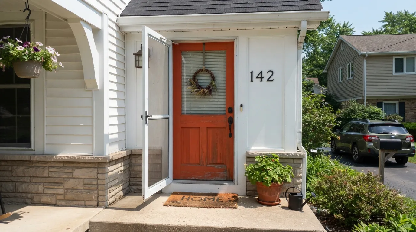
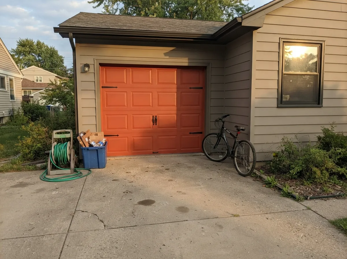
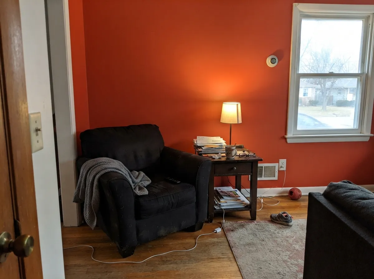
Give it real, direct daylight on a contained surface and it delivers precisely what the name promises. A front door in full or strong partial sun reads as a confident, glowing red-orange — warm, welcoming and unmistakably deliberate, not garish. Its second home is anything functional and exterior: a garage door, house numbers, a mailbox, a set of shutters, anywhere a small dose of maximum saturation reads as a design choice rather than an accident. Indoors, one accent wall in a den, office or entry that gets good light can carry the same energy in a smaller room.
Where It Fails
Almost every disappointed review of Inferno traces back to one of three predictable situations, and none of them are really the paint's fault — they're a mismatch between what the buyer pictured and what a hot, saturated red-orange actually does on a real surface.
This is the single biggest source of buyer's remorse with a color like this. Inferno is built around an orange undercurrent, not a crisp blue-red — on the chip it reads as "bold, exciting red," but on a full door it is unmistakably orange-leaning. If you pictured a classic, cool Christmas-red door, sample this one in person first; you likely want Benjamin Moore Caliente or Sherwin-Williams Heartthrob instead.
Without direct light, the orange that makes this color exciting drains out and it sinks toward a flat, muddy brick-red. Porches under deep overhangs or entries that face north will disappoint — this is a color that needs the sun to do its actual job, not a stand-in for a red that works everywhere.
Real owner reviews on this exact color report coverage that didn't fully satisfy on the first pass, and Behr's own community forums have longstanding threads about coverage inconsistency on saturated deep-base colors generally. Budget two full coats minimum, prime first if the surface underneath is bright white or a very different saturated color, and don't judge the color off a single thin coat.
Room by Room
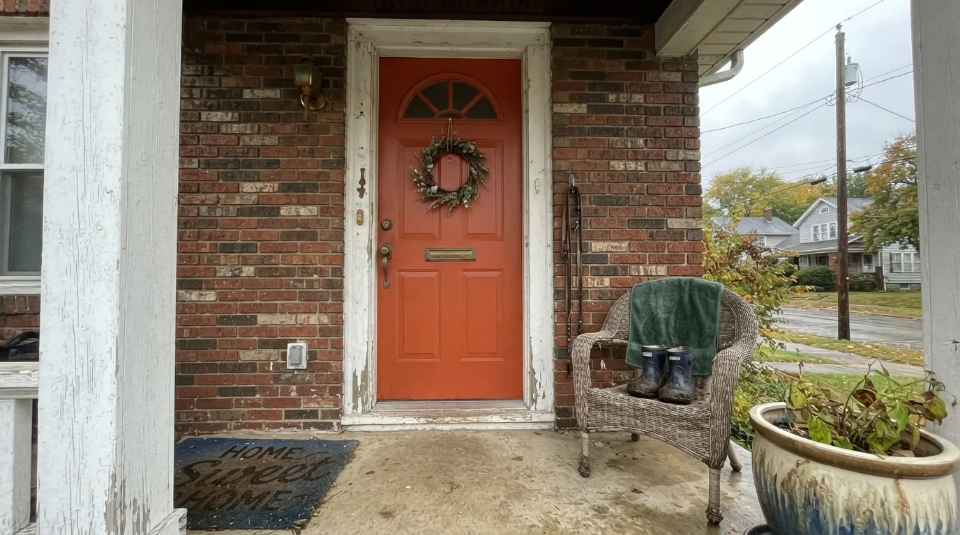
This is what the color is for. Semi-gloss over a properly primed door, warm 2700K porch-light bulbs at night, and it reads confident and glowing rather than aggressive. Test the actual sample on the actual door in the actual light before committing — a covered porch reads noticeably darker and browner than an open, sun-hit entry.
A garage door is the largest single surface most people will ever paint this color, and larger surfaces read bolder and more orange than a small chip ever suggests. Tape a full sample board to the door and look at it across a whole day before you commit — what looks right on a paint stick can read like a stoplight across an 18-foot door.
Small, deliberate doses are exactly where a color this saturated earns its keep. A painted mailbox, shutters against a neutral facade, or fresh house numbers with this as the backer color all read as intentional style rather than a whole-house commitment.
One wall in a den, office or entry that gets real daylight works — treat it like a piece of art, not a background. Pair it with a warm off-white on the surrounding walls and keep furniture and trim neutral. Four walls of this color is a genuinely different, far more intense experience than a sample suggests.
On a single wall, a bookshelf back panel or a piece of furniture, the energy reads as fun rather than overwhelming for a play space. Keep the rest of the room in a soft neutral so the color has room to be the exciting part, not the whole story.
It is too saturated and too dominant to live as a main wall color or a house body color. Keep it to the door, the garage, the shutters or one accent — nothing in how Behr markets or sells this color suggests it was ever meant to cover four sides of anything.
Your Light Is the Risk
Full or strong partial sun is where it earns its name — a genuinely hot, glowing red-orange with real energy. Sample it in this light before deciding.
Without direct light the orange drains out and it sinks toward a flat, muddy brick-red. A covered porch or north-facing entry will disappoint.
Cooler morning light keeps it closer to a straight red; warm afternoon and golden-hour sun pull the orange forward and it visibly glows.
Warm 2700K bulbs deepen it into a rich ember glow. Cool white LED security floodlights flatten it and can push it toward an odd coral cast — swap the bulb before you swap the paint.
Most complaints about Inferno are a light mismatch. Upload a photo of your actual room and see it on your walls — then ask for the same wall in north light or evening lamps before you buy a single sample.
Need It From Another Brand?
Any paint counter can custom-tint Behr P190-7 directly. If you would rather stay in one brand's own deck, these are the closest stock matches, measured as ΔE2000. Under 2 is a difference you will not see on the wall.
| Brand | Closest color | ΔE | LRV | |
|---|---|---|---|---|
| Sherwin-Williams | Energetic OrangeSW 6880 · Sherwin-Williams | 0.8 | 22 | Color page → |
| Benjamin Moore | Piñata007 · Benjamin Moore | 3.4 | 20 | Color page → |
| Valspar | Autumn Blaze2002-1A · Valspar | 4.0 | 24.2 | Color page → |
| PPG / Glidden | Candy CornPPG17-16 · PPG / Glidden | 4.7 | 24 | Color page → |
| Glidden | Skyrocket Red30YR 20/595 · Glidden | 4.3 | 20 | Color page → |
| Dutch Boy | Troublemaker109-7DB · Dutch Boy | 4.0 | 24 | Color page → |
Similar Behr Colors
The nearest shades to Inferno within Behr's own range, ranked by perceptual color distance — useful when you want the same look a touch lighter, darker, or warmer.
WCAG 2.1: AA is 4.5 : 1 for normal text, 3 : 1 for large text, AAA is 7 : 1.
Inferno vs the Colors You're Also Considering
Every Inferno sample board has the same rivals on it. The numbers show the real lightness gap — then it comes down to which risk you would rather live with.
Pick this for the slightly more saturated, more red-forward version of the same idea.
Benjamin Moore 2170-10 · LRV 19Fireball OrangePick this if your painter works in Benjamin Moore — it sits at the same LRV with an almost identical hot red-orange energy.
Pick this for more brightness and a stronger orange lean — Inferno sits lighter and hotter on the door.
Behr P170-7 · LRV 16100 MphPick this for Behr's other racing-red door color — darker, a touch less orange, closer to a classic racing red.
Inferno Coordinating Colors
The rule with a color this saturated is restraint everywhere else: quiet whites, warm greiges and near-blacks let Inferno be the one loud note instead of fighting for attention. These are the partners that keep a hot red-orange looking deliberate rather than accidental:
Inferno's Own Story: One of Behr's Expertly Picked Bold Doors
Inferno is not an obscure deep-base color that got named after the fact — it is one of the colors Behr's own experts hold up as an endorsed bold pick, the deliberate answer for a shopper who says "I want the boldest door color you'll actually stand behind." That curation matters: it is not a wildcard mixed color that happens to be intense, it is a purpose-built statement color with Behr's own name attached to the recommendation.
How Behr actually sells it backs that up. The same P190-7 formula shows up in the interior/exterior Premium Plus satin enamel line and in the Marquee exterior flat paint-and-primer — two different products aimed at two different jobs, both pointing at the same use case: a door or a small exterior surface, not a wall of a living room or a whole house.
Inferno on Exterior Surfaces
Outside is where this color is built to live, and where the fine print matters most. In real sun it reads exactly as advertised — bold, warm, unmistakably deliberate — but budget for the coverage math: two coats minimum, and a tinted primer coat if the surface underneath is bright white or a very different saturated color you're covering. Skipping that step is the most common reason a first attempt looks patchy or uneven, and it matches real owner feedback on this specific color.
The other honest exterior fact is fade. Deep, saturated red-oranges take more of a beating from UV than a neutral does — the same pigments that make this color this vivid are the ones that break down fastest in direct south or west sun. Used the way it is meant to be used — a door, a garage, shutters, house numbers — that upkeep is a small, worthwhile trade. Used as a whole-house color, the maintenance case gets much harder to defend.
Three Ready Palettes Built on Inferno
A color is never alone on the wall. These are complete combinations in the 60-30-10 pattern, with the reason each one holds together. Every one opens in the visualizer.
A calm white body lets the door do all the talking, and a soft near-black on shutters and fixtures keeps Inferno from having to compete with a second bold color. Classic, resale-friendly, and it reads well in any light.
Try this palette in your roomA warm, quiet greige body is the exact neutral backdrop that lets a garage door this saturated read as a deliberate design choice instead of a mistake — crisp white trim keeps the edges clean and stops the red-orange from bleeding visually into the siding.
Try this palette in your roomA no-opinion white keeps the room from feeling loud everywhere, a soft green-gray on built-ins gives the eye a calm place to land, and one accent wall lets Inferno do exactly what it does best — a single bold surface, not a whole room's worth of intensity.
Try this palette in your roomInferno FAQ
Is Inferno more red or orange?
Both, honestly — it is a genuine red-orange with the orange running hot and unmistakable underneath. It is not a cool, blue-leaning red; if you pictured a classic crisp Christmas-red door, sample it in person before buying a gallon.
What sheen should I use on a front door?
Semi-gloss for the door itself — it wipes clean and gives the color a rich, lacquered look. Behr sells this color in both an interior/exterior satin enamel and an exterior flat paint-and-primer, so match the finish to the surface you're painting.
Does it work as a whole exterior or whole-room color?
No. At LRV 19 with this much saturation it is built to be one deliberate surface — a door, a garage, shutters, one accent wall — not a body color or a wall-to-wall room color. Used that way it reads as a mistake, not a design choice.
How many coats does it need?
Plan on two full coats minimum. Real owner feedback on this exact color describes coverage that wasn't fully satisfying after one pass, which lines up with how deep-base saturated colors generally behave. Prime first if you're covering a bright white or a very different color underneath.
Will a red-orange front door fade in full sun?
Some, over time — deep, saturated reds and oranges are the color family most prone to UV fading and chalking on any brand, not a defect specific to this paint. A south- or west-facing door will likely need a fresh coat sooner than a neutral-colored one nearby.
What white or trim color goes with Inferno?
A clean white like Behr White keeps the whole entry feeling crisp rather than competing for warmth. A near-black like Wrought Iron or Tricorn Black on shutters and fixtures gives the eye a second, quieter anchor so the door stays the one loud note.
Have you painted with Inferno?
Rate it — one tap helps the next reader decide.
Ask a Question