Fireball Orange
Benjamin Moore's charged red-orange, reviewed honestly: the one wall where it is brilliant, the rooms it cooks, and how many coats it really takes.

Jessica has spec'd whites and neutrals for more than 300 rooms and keeps a sample wall of painted drawdowns in her studio. Every color review is checked against real reader rooms in the comments and re-tested when a formula changes. About the testing process →
- 1Burnt Cinnamon9
- 2Rookwood Terra Cotta14
- 3Fireball Orange19
- 4Caramelized35
- 5Venetian Plaster42
The Fast Verdict
Fireball Orange is not a friendly pumpkin. Benjamin Moore calls it a charged orange-red, and the red half is the part people miss: on a wall it lands closer to hot brick and chili than to tangerine. Used the way it wants to be used — one wall in a playroom, the back of a bookcase, a dining room that only gets used after dark — it is one of the most alive colors in the deck. Wrap a whole room in it and the same color turns the air orange, bounces onto the ceiling and everyone's face, and gets old by month three.
One wall in a playroom or kids' zone · dining rooms used mostly after dark · small bold rooms — powder room, laundry, a mudroom nook · the back of open shelving, cubbies and interior doors · anyone who already tried a safe color and got bored
You want the entire room orange · your floors are honey oak or orange-brown · the room is dim and north-facing · it doubles as a nap or sleep room · you repaint rarely and want zero regret risk
- Genuinely energizing — the rare wall color kids notice and name
- One accent wall changes an entire room for the price of a gallon
- Deep enough (LRV 19) to look chosen, never like a builder highlight
- Blue-green is directly opposite it, so teal, navy and deep green schemes assemble themselves
- Turns small, ignored rooms — laundry, powder room, a nook — into the best room in the house
- Hides poorly: gray-tinted primer plus three coats is the realistic plan
- Throws orange light onto ceilings, trim and faces at wall scale
- Fights honey oak and orange-brown wood — same hue, no contrast
- Fades faster in direct sun than earth-tone colors, inside and out
What Color Is Fireball Orange, Really?
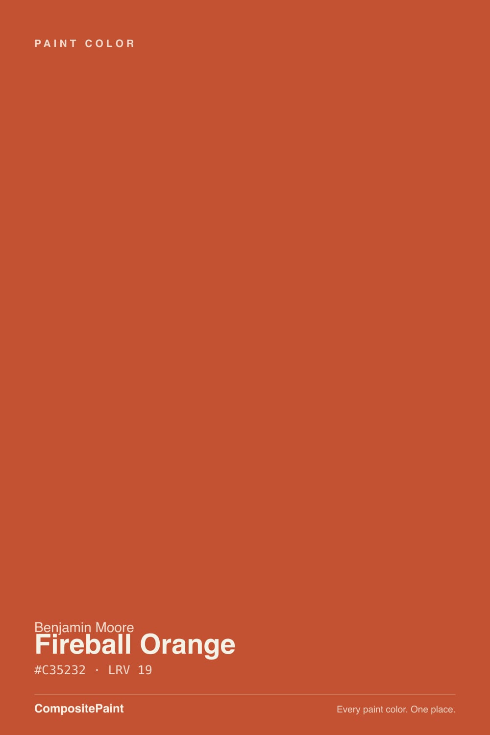
A fully saturated red-orange from Benjamin Moore's Color Preview collection — the saturated deck, not the muted historical one. Its RGB sits at 195/82/50, which puts it only about a dozen degrees around the color wheel from pure red, and that is exactly what you see on the wall: heat with a red core, not the yellow-orange of a pumpkin or an apricot. On a two-inch chip it can pass for a cheerful tangerine. Rolled out at wall scale it reads hotter, redder and considerably more serious than the chip promised.
At LRV 19 it is genuinely deep, and deep plus fully saturated is a specific kind of color to live with. It absorbs most of the light that hits it instead of returning it, so a room loses brightness fast, and what does bounce back comes back orange — onto the ceiling, onto white trim returns, onto skin. That is not a defect, it is physics, and it is the single thing to plan for. A white ceiling above a Fireball Orange wall will look faintly peach by late afternoon.
Undertone in one line: red first, orange second, no brown and no yellow anywhere in it. If your sample looks brown and dull, the room does not have enough light; if it looks almost neon for an hour, that is west sun. The grayed-down terracottas people compare it to — Cavern Clay and its relatives — have clay and gray mixed in. Fireball Orange has none. Full chroma is the whole appeal and the whole risk.
Where It Shines
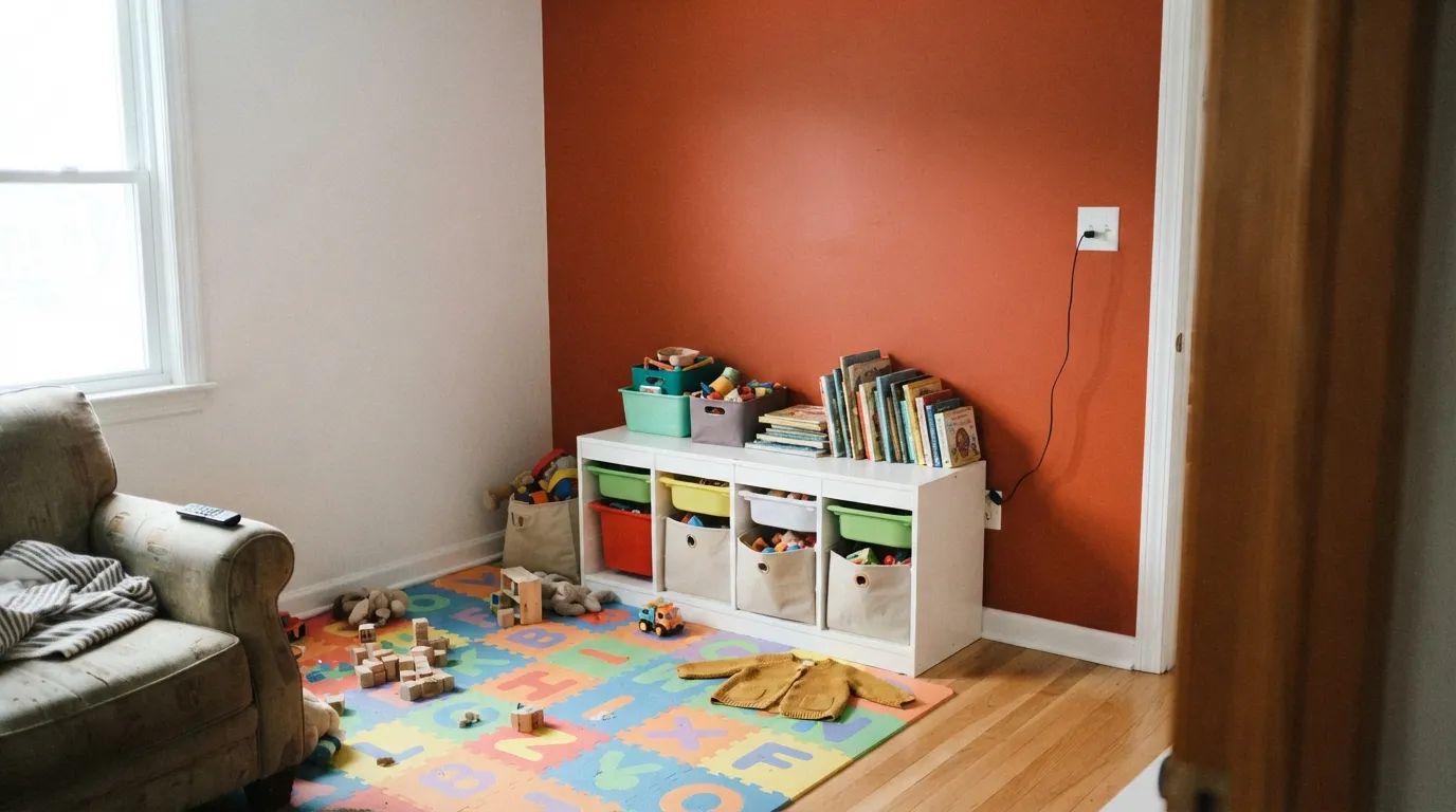
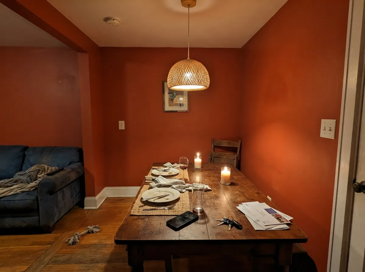
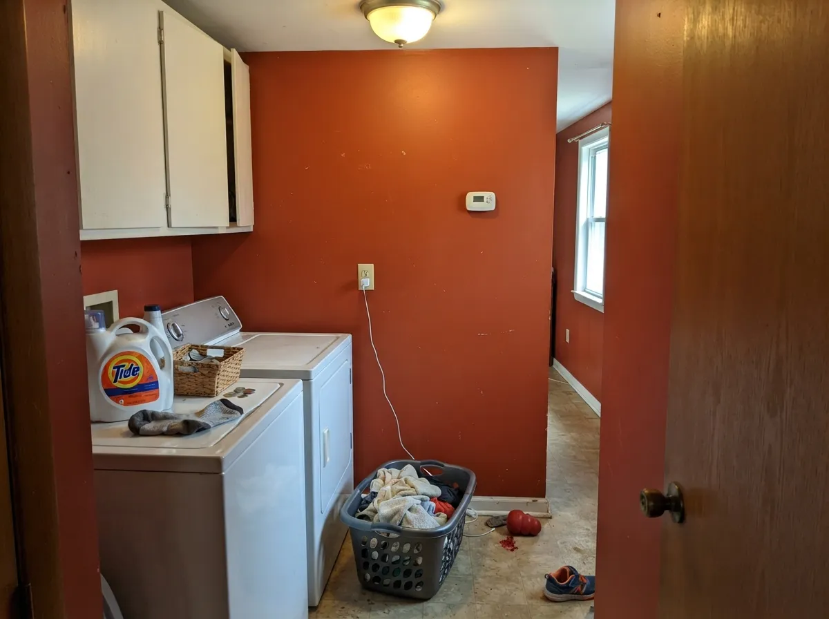
This color is a specialist, and its specialty is the single charged surface. One playroom wall behind the toy shelves, the inside back of a bookcase, a set of cubbies, an interior door, a laundry room nobody expects to be interesting — in a dose, it does something no neutral can: it makes a room feel switched on. Its other real home is the dining room used after dark, where warm bulbs and candles pull the red forward and the walls go glowing and appetite-warm. Give it crisp white trim, blue-green or deep navy company, and black metal, and it looks intentional instead of loud.
Where It Fails
Nearly every bad Fireball Orange story is one of three, and all three are predictable before you open the can. The color is not misbehaving in any of them — it is doing exactly what a saturated LRV 19 red-orange does. If your room matches one of these, sampling a bigger square will only confirm it faster.
In a dose it is energy; wrapped around a room it becomes weather. The space reads smaller and warmer than it is, the ceiling picks up a peach cast, faces go ruddy in photos, and the color you loved for a week starts to feel like it is shouting at you. The fix is free if you do it first: one wall, or a nook, or the back of the shelving — and keep the other three quiet.
This is the clash nobody predicts, because both sides are the same hue. Golden oak floors, orange-stained trim, 1990s cabinets and Fireball Orange are all sitting in the same slice of the wheel, so there is no contrast in color, only in depth — the wall wins and the floor drops to a muddy dirty-yellow. It needs cool company underneath: pale white oak, walnut, gray LVP, dark tile, or a large rug covering the argument.
Bright oranges and reds are built on organic pigments that are physically more transparent than the iron oxides in a beige, and painters rate them the toughest colors to get flat. Rolled straight over white you will look at a streaky, patchy coat two and assume you bought bad paint. Use a gray-tinted primer, budget three coats, and expect touch-ups to flash — with a deep base you re-roll the whole wall, corner to corner, not the spot.
Room by Room
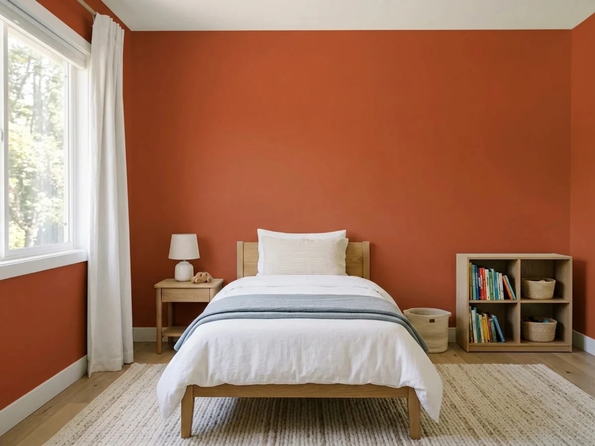
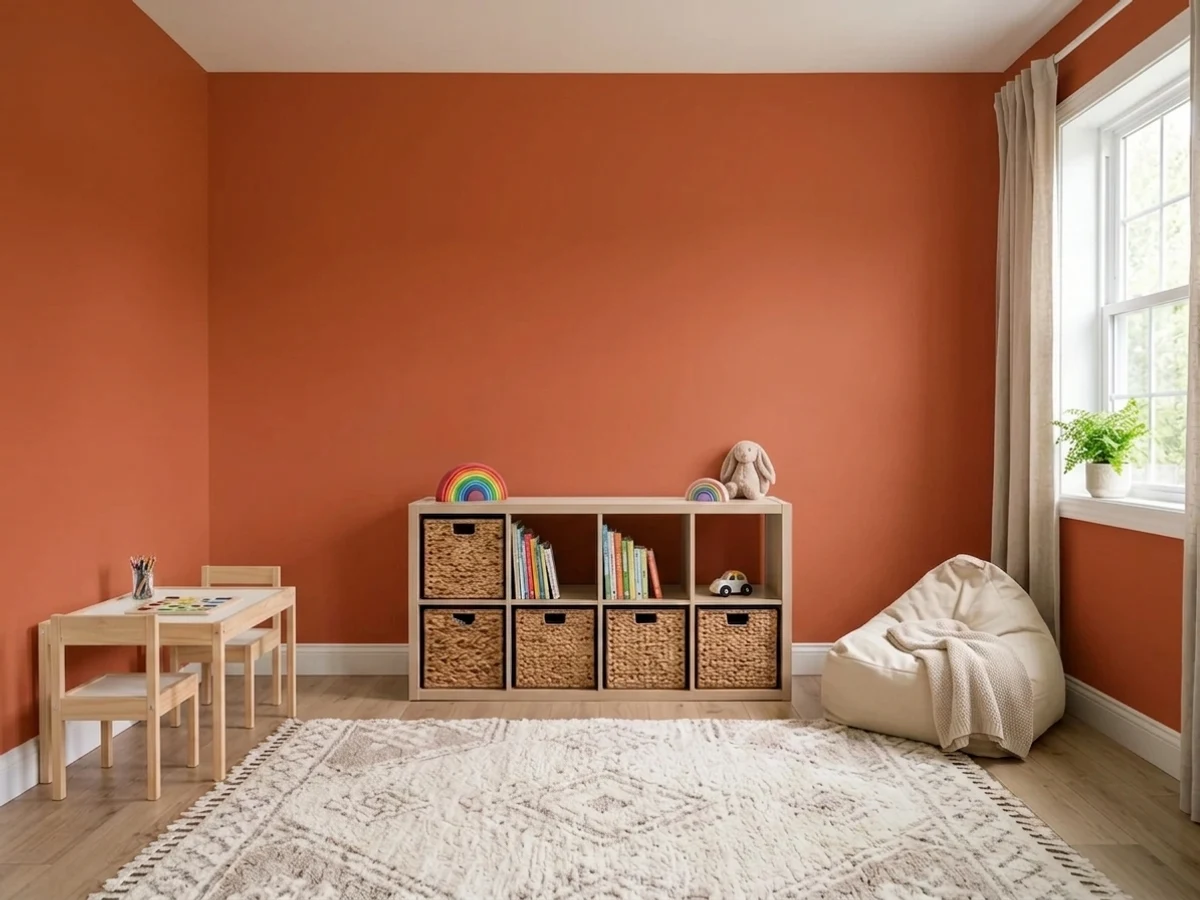
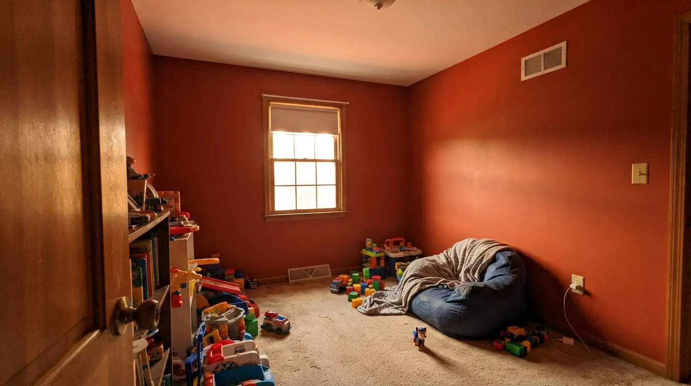
This is the room the color was made for. Put it on the wall the toy shelves and art hang against and leave the other three white: the room gets its energy from one surface, and the loud color is behind the mess instead of competing with it. Use satin or a scrubbable eggshell at kid height — this is the sheen decision that decides whether crayon comes off. Blue-green bins and cubbies balance it; see the palette below.
Orange is the color the child-development advice actually likes for social, active spaces, and older kids pick it themselves. But a room that also has to produce sleep should not be wrapped in it. One wall behind the bed or the desk, a painted door, a headboard-height block — that is the dose. For a nursery or a room where naps still matter, skip it entirely and use a soft peach instead.
Deep red-orange in a room used at night, under warm bulbs and candles, is a genuinely old and genuinely good idea: it flatters food, it makes a small dining room feel like a restaurant booth, and the daylight harshness never gets a chance to show. Eggshell walls, a warm white ceiling, one near-black note for structure. The catch is open plans — this color does not hand off gently to a kitchen.
Two coats' worth of wall area, a door that stays closed, and no expectation of calm: rooms like these are where a color this hot costs almost nothing to try. A laundry room in Fireball Orange with white cabinets is cheerful in a way no greige can manage, and a powder room drenched in it reads deliberate rather than accidental because the whole little box commits.
It can work on a fireplace wall or a single end wall in a room with real daylight, black metal and mid-century wood. What it cannot do is share an open main floor politely — everything visible from that wall has to be chosen around it, and adjacent-room colors that looked fine on the fan deck start to look accidental. If you are not willing to redecorate around it, put it somewhere smaller.
Bright orange doors look great, but the pigments that make a color this clean are organic, and organic pigments are the first thing UV breaks down — bright reds and oranges fade noticeably faster in full sun than the iron-oxide earth tones. On a shaded or north-facing porch it holds up reasonably; on a south-facing door in direct sun, treat a repaint as a maintenance item every few years, or choose a rust-toned earth color instead.
Your Light Is the Risk
Strong, even sun is the only light where this color looks lit from inside rather than heavy. The red core stays clean and the wall reads like flame instead of brick. Sample here first.
Cool, weak light drains the orange and leaves a dark, brownish brick red with none of the charge you paid for. In a dim north room it just looks like a heavy dark wall.
Cool morning light keeps it on the red side, then late west sun flares it almost fluorescent for an hour and pushes orange light onto everything nearby. The daily swing is bigger than most colors.
At 2700K it deepens toward a glowing rust and gets cozy — the dining room case. Cool 4000K LEDs strip the warmth and leave it hard and slightly plastic; if your room runs on daylight-white bulbs, change them before you judge the paint.
Most complaints about Fireball Orange are a light mismatch. Upload a photo of your actual room and see it on your walls — then ask for the same wall in north light or evening lamps before you buy a single sample.
Need It From Another Brand?
Any paint counter can custom-tint Benjamin Moore 2170-10 directly. If you would rather stay in one brand's own deck, these are the closest stock matches, measured as ΔE2000. Under 2 is a difference you will not see on the wall.
| Brand | Closest color | ΔE | LRV | |
|---|---|---|---|---|
| Sherwin-Williams | Raucous OrangeSW 6883 · Sherwin-Williams | 1.5 | 18 | Color page → |
| Behr | KoiUL120-18 · Behr | 1.4 | 18 | Color page → |
| Valspar | Terra Cotta Red2004-3A · Valspar | 3.4 | 17.1 | Color page → |
| PPG / Glidden | Cinnamon StonePPG1193-7 · PPG / Glidden | 2.2 | 19 | Color page → |
| Glidden | Orange VermillionPPG1194-7 · Glidden | 2.1 | 17 | Color page → |
| Dutch Boy | Jack O' Lantern108-7DB · Dutch Boy | 1.5 | 18 | Color page → |
Similar Benjamin Moore Colors
The nearest shades to Fireball Orange within Benjamin Moore's own range, ranked by perceptual color distance — useful when you want the same look a touch lighter, darker, or warmer.
WCAG 2.1: AA is 4.5 : 1 for normal text, 3 : 1 for large text, AAA is 7 : 1.
Fireball Orange vs the Colors You're Also Considering
Every Fireball Orange sample board has the same rivals on it. The numbers show the real lightness gap — then it comes down to which risk you would rather live with.
Pick this when you want the red edge and the graphic punch; Fireball is the cleaner, hotter of the two.
Sherwin-Williams SW 6635 · LRV 22Determined OrangePick this if you want the same heat with a little more brown mixed in — it reads closer to a hot terracotta and is easier to tolerate on more than one wall.
Pick this when muted is not the point and you actually want the room to raise its voice.
Sherwin-Williams SW 7701 · LRV 24Cavern ClayPick this for the grown-up desert version — the same warmth with gray and clay mixed in, safe on all four walls.
Fireball Orange Coordinating Colors
The rule for coordinating with a color this saturated: give it one cool partner, one clean white and one dark anchor, and stop there. Blue-green is directly opposite orange on the wheel, which is why teal and navy calm it instead of fighting it, and why deep green — Benjamin Moore's own suggested partner for this color — looks so settled beside it. These are the partners that keep showing up in rooms that work:
Painting Orange: Primer, Coats and Touch-Ups
The application is a bigger part of this color's reputation than the color is. Clean bright oranges and reds are built on organic pigments that are inherently more transparent than the iron oxides doing the work in a beige or a greige, which is why paint companies list them among the poor-hiding colors and why pros quote extra coats for them. Coat two over a white wall looks patchy and thin, and a lot of one-star reviews are really reviews of a two-coat job.
Do it in this order and it goes smoothly: gray-tinted primer first, then two to three finish coats, cutting in and rolling each coat wet-to-wet so the sheen stays even. Deep-base paints burnish where hands and chair backs rub, so use satin rather than flat anywhere at kid height, and keep a labeled jar of the finish coat — touch-ups on a saturated deep color almost always flash, and the honest repair is re-rolling the wall from corner to corner.
Sample bigger than you think, too. A chip of this color underrepresents it badly; a peel-and-stick square or two-foot poster board moved between the brightest and dimmest corners over a full day will show you the west-sun flare and the dim-corner brick that the fan deck never mentions.
Orange in a Playroom: How Much Is Too Much
The child-development advice on orange is consistently positive — it is linked with sociability, confidence and cooperative play, which is why it turns up in classrooms and play spaces far more than in bedrooms. The caution attached to it is always about dose, not about the hue: designers who work on kids' spaces recommend using a strong orange as an accent against calm surroundings rather than as the envelope, precisely because a room that has to hold naps, homework and quiet time cannot be at full volume all day.
In practice that means one wall — usually the one the shelving, art or chalkboard lives against, so the color is behind the activity rather than surrounding it. The other reliable moves are the back panel of a bookcase or reading nook, a run of cubbies, an interior door, or a block of color below a chair rail with white above it, which keeps the loud color at kid height and the upper half of the room bright.
Two practical notes. Sheen matters more here than anywhere else in the house: at kid height, use satin so crayon and sticky fingers wash off instead of polishing a dull spot into the wall. And accept that this is a color children outgrow — the reason to keep it to one wall is not only visual, it is that one wall is a Saturday and a single gallon when the eight-year-old decides orange is for babies.
Three Ready Palettes Built on Fireball Orange
A color is never alone on the wall. These are complete combinations in the 60-30-10 pattern, with the reason each one holds together. Every one opens in the visualizer.
Blue-green sits directly opposite orange on the wheel, so Aegean Teal balances the heat instead of competing with it — and it is calm enough to go on the surfaces kids actually touch. Chantilly Lace keeps the remaining walls bright and graphic; a warm white here would make the orange look dusty by comparison.
Try this palette in your roomThis is the one room where drenching the walls is defensible, because you use it at night. White Dove softens the ceiling line so the orange does not hit a hard white edge, and one near-black note gives the scheme structure — without it, a room this saturated reads like a single unbroken block of color.
Try this palette in your roomThe dose strategy, written down. A warm greige main floor gives the orange something to be a surprise against, and because Edgecomb Gray leans warm the two never look like they came from different houses. Every hit of Fireball Orange here is one gallon and one weekend to undo.
Try this palette in your roomFireball Orange FAQ
Is Fireball Orange too intense for a kids' room?
On one wall, no — on all four, usually yes. Orange is the color the child-development advice actually likes for social, active play, and kids respond to it. What gets people in trouble is coverage, not the color: a full room of LRV 19 saturated orange is a lot of stimulation in a space that may also need to produce naps. One accent wall, a set of cubbies, or the wall behind the art and shelving gives you all of the energy and none of the regret.
How many coats does it take?
Realistically three, over a gray-tinted primer. Bright oranges and reds use organic pigments that are more transparent than the pigments in ordinary neutrals, which is why painters rank them the hardest colors to get flat. Skipping the primer does not save a step, it adds a coat. Touch-ups on a deep color like this flash badly too, so plan to re-roll a full wall, corner to corner, rather than dabbing a spot.
What trim white goes with Fireball Orange?
Chantilly Lace if you want it graphic and modern — the clean white makes the orange look deliberate. White Dove if you want the edges softer and the room warmer, which suits a dining room. Simply White, one of Benjamin Moore's own pairing suggestions for this color, also works, though it is the warmest of the three and reads a shade creamier next to this much heat.
Will it make my room look smaller?
Yes, if it is on every wall. At LRV 19 it returns very little light, and what it does return comes back orange, so the room reads darker, warmer and tighter, and the ceiling picks up a faint peach cast. On a single wall the opposite happens — the wall advances, the room gains depth, and the white walls beside it look brighter than they did before.
What colors go with Fireball Orange?
Its opposite on the color wheel is blue-green, so teal, navy and deep forest green are the natural partners — Benjamin Moore's own suggested combination pairs this color with a brilliant white and a deep green, and it is good advice. Black metal, walnut and pale white oak all support it. The things to keep away from it are honey oak, orange-brown wood and yellow-beige, which sit too close to the same hue to give any contrast.
Can I use it on a front door or outside?
On a covered or north-facing door, yes. In direct southern sun, know what you are signing up for: the organic pigments behind clean bright oranges break down under UV faster than iron-oxide earth tones, so expect visible fading years before a navy or a charcoal would need attention. If the door bakes all afternoon and you want it to stay put, pick a rust or terracotta instead.
Have you painted with Fireball Orange?
Rate it — one tap helps the next reader decide.
Ask a Question