Rookwood Terra Cotta
The historic Cincinnati-pottery terracotta reviewed honestly: where it glows like real clay, the light that turns it to mud, and what to pick instead.

Jessica has spec'd whites and neutrals for more than 300 rooms and keeps a sample wall of painted drawdowns in her studio. Every color review is checked against real reader rooms in the comments and re-tested when a formula changes. About the testing process →
- 1Burnt Cinnamon9
- 2Rookwood Terra Cotta14
- 3Caramelized35
- 4Venetian Plaster42
The Fast Verdict
Rookwood Terra Cotta is not a trend orange with a cute name — it is part of Sherwin-Williams' Rookwood Collection, named for the real Rookwood Pottery in Cincinnati, whose matte architectural tile glazed buildings across the country a century ago. The color carries that lineage: a deep, muted clay-red with brown and orange undertones sitting under an olive masstone, so it reads like fired terracotta tile, not a bright citrus orange. At LRV 14 it is a genuinely dark, saturated color, which is exactly why it works best in doses — a door, an island, one accent wall — rather than as the only color in a room.
Front doors and Craftsman-style exteriors · kitchen islands and cabinets · dining room or den accent walls in a room with real daylight · restoring a real bungalow, not chasing a viral color
The room has little daylight and no warm lamps · you want a bright, vivid orange rather than an aged clay tone · your counters or tile are cool white marble or icy gray quartz · you were planning to paint all four walls of a small room
- A real historic color — part of SW's Rookwood Collection, named for the actual Rookwood Pottery of Cincinnati
- Holds true clay-red color in strong daylight, unlike paler terracottas that wash out by noon
- Flatters warm wood, leather, brass and matte black iron
- Reads confident and grounded on a front door or Craftsman exterior
- Dark enough (LRV 14) to work as one bold, deliberate accent without needing four walls
- The olive-brown base can read as plain muddy brown in dim or north-facing light
- Too heavy for all four walls of a small room without a real window or white trim break
- Fights cool white marble, icy gray quartz and blue-leaning tile
- Its craftsman/historic association reads dated to buyers who want a bright, current orange
What Color Is Rookwood Terra Cotta, Really?
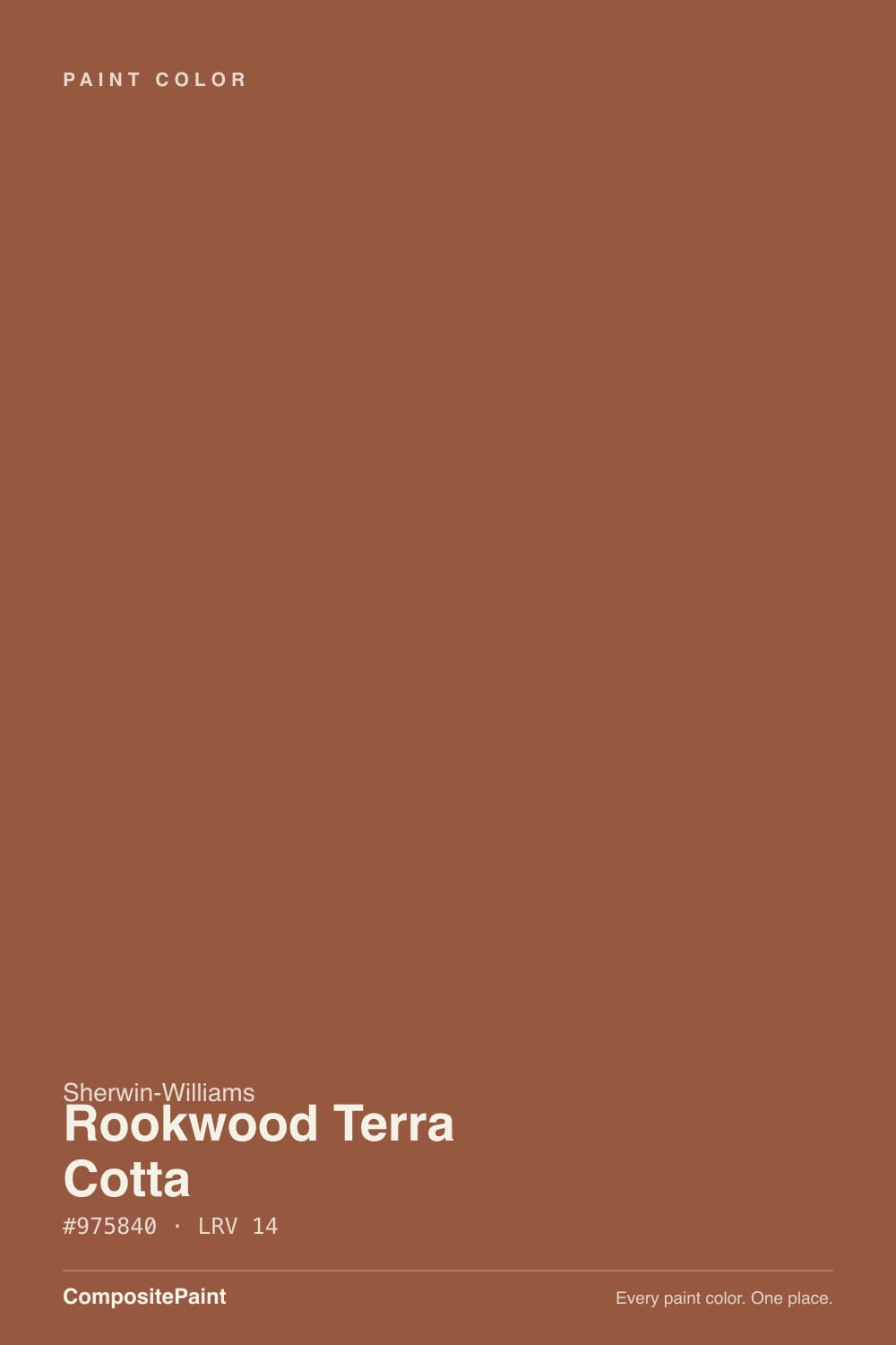
A deep, muted terracotta — orange and brown undertones sitting under an olive masstone, which is the technical way of saying it never reads as a clean, bright orange. It is closer to fired clay tile or aged brick than to a citrus paint chip. Sherwin-Williams files it in its historic Rookwood Collection, one of two lines (with Roycroft) built around the real color palette of Arts & Crafts architecture from the early 1900s, and the name is not marketing invention: Rookwood Pottery, founded in Cincinnati in 1880, made the glazed architectural tile that gave the collection its colors. This is a color with an actual paper trail, not a trend chip renamed for the moment.
At LRV 14 it reflects very little light, so it behaves like a genuinely dark, saturated color rather than a mid-tone orange. That depth is the whole personality: in strong daylight the reddish-clay warmth comes forward and it looks like sun-baked terracotta; in dim or artificial light the olive-brown base takes over and it can read closer to plain brown. Because it holds real color even in bright sun — unlike paler terracottas that wash out — it earns its keep as an exterior and front-door color where most oranges look chalky by midday.
Undertone in one line: orange-red first, with a brown-olive base underneath — never pink, never a clean warm red. If your sample looks flat and muddy on the wall, that is a light problem, not an undertone surprise; this color needs real daylight or warm lamps to show its clay-red side.
Where It Shines
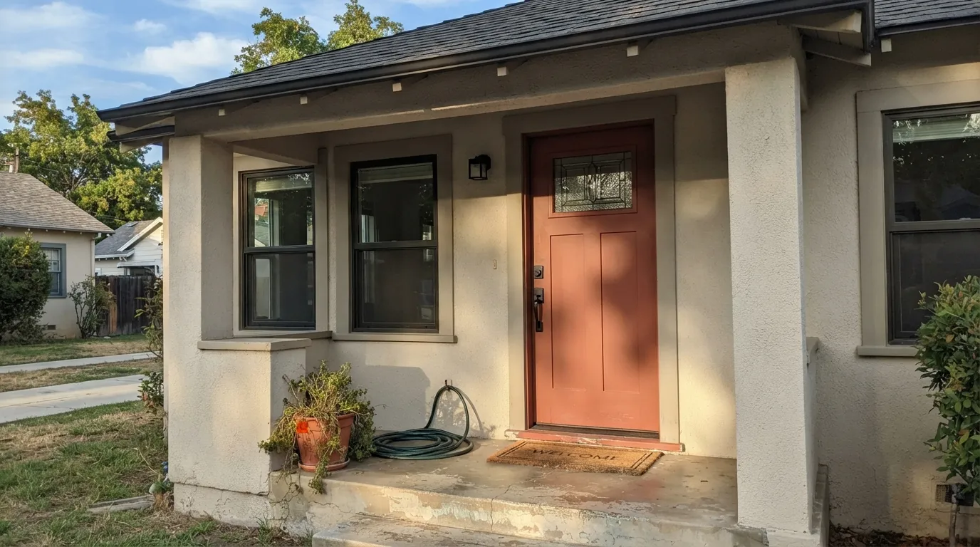
Give it real daylight, warm wood, leather, brass or matte black iron, and it looks exactly like what it is: fired clay tile on a real building. It is at its best in small, confident doses — a front door, a kitchen island, one accent wall in an already-warm room — where the depth reads as intentional design rather than a color that swallowed the space. Its historic pedigree also means it has decades of proven use on Craftsman bungalows and Southwest stucco homes, so it never looks like a fad picked off a trend board.
Where It Fails
Almost every disappointed review of Rookwood Terra Cotta comes from one of three predictable situations, and none of them are the paint's fault. The color is honest about what it needs — light and restraint — and when a room doesn't offer either, the same paint that looks like glazed terracotta in one house looks like plain brown in another.
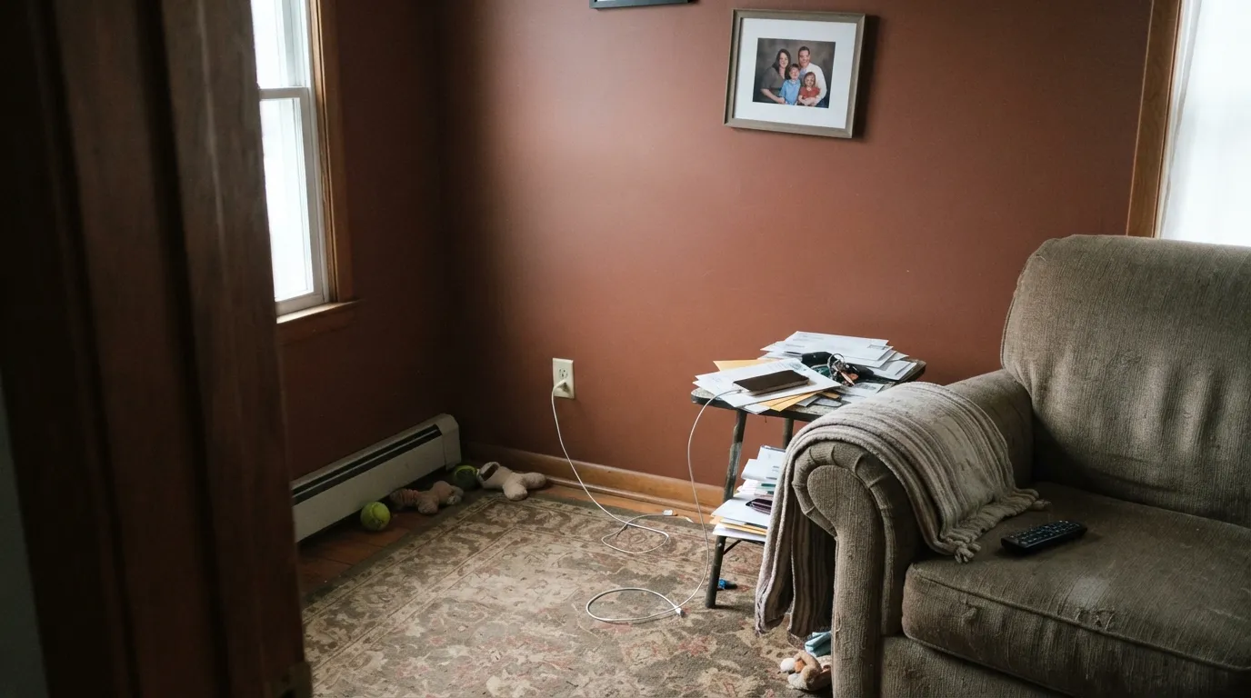
Cool, dim daylight kills the reddish-clay warmth and exposes the olive-brown base underneath. Readers who bought it expecting terracotta report a flat, muddy brown instead. Add real south or west light, or commit to warm 2700K bulbs — the color needs one or the other.
At LRV 14 this is a genuinely dark, heavy color, and a small enclosed room with no break — no white trim, no window wall — can feel like standing inside a clay pot. It was built as an accent and a door color first; use it that way unless the room is large or has a lot of natural light.
The warm orange-red undertone fights cold, blue-leaning stone — the two temperatures argue instead of complementing each other. It pairs best with warm butcher block, brass, unlacquered iron or a deliberately graphic black-and-terracotta scheme, not with cool white counters chosen for a different color story.
Room by Room
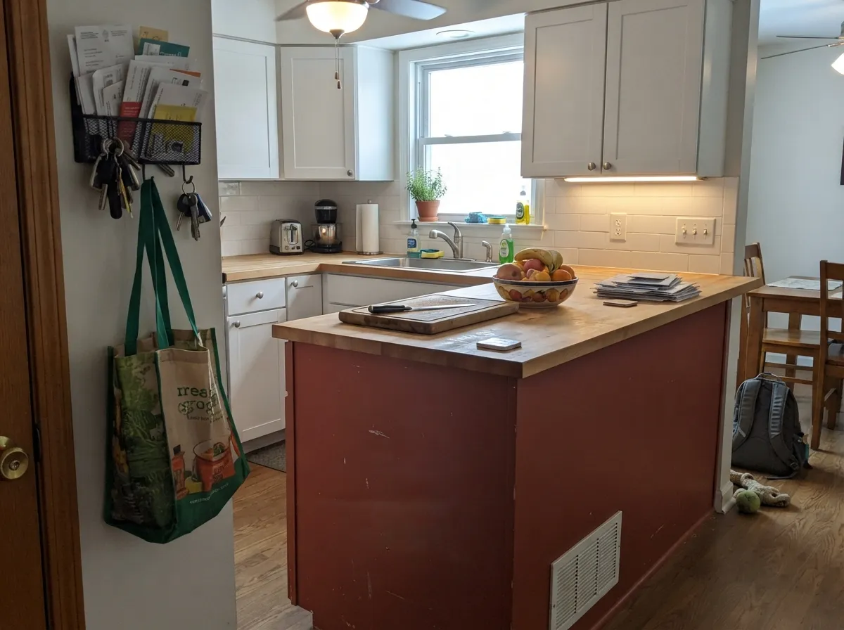
On an island or lower cabinets, paired with white or butcher-block counters and black or brass hardware, it reads rustic-modern and intentional. Satin cabinet enamel wipes clean and holds up to daily use.
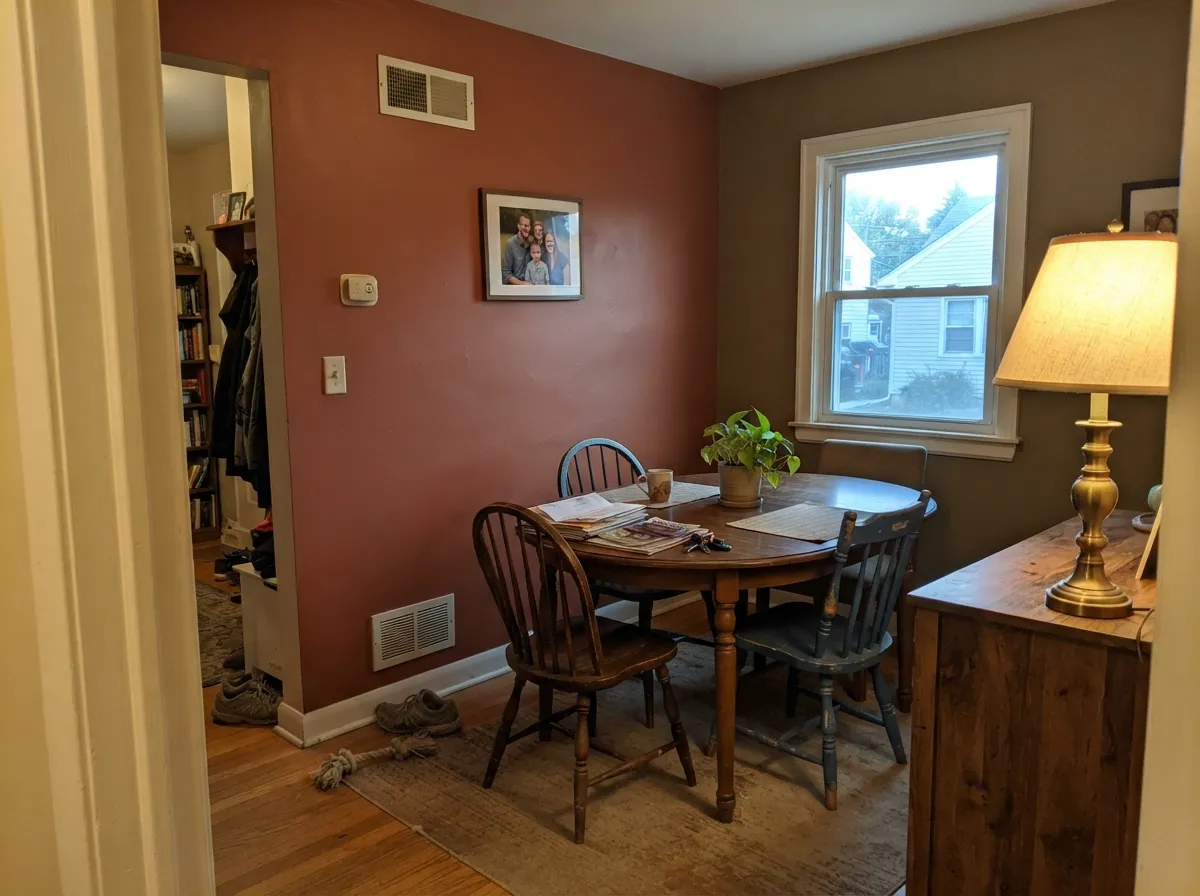
Enclosed dining rooms handle deep, saturated color well because they are used at the hours this color loves most: evening, lamplight, candles. Dover White trim keeps the room from feeling closed in.
This is what the Rookwood Collection was built for: Craftsman bungalows, stucco Southwest homes, brick exteriors. A door or full-body stucco application with black or dark bronze trim reads confident and grounded, not trendy.
One wall or a fireplace surround with cream trim, leather and warm wood works beautifully. Four walls in a room with average light can feel cave-like without a large window to balance it.
Best as a single accent wall behind the headboard in a room that gets real daylight, paired with warm lamps at night. Skip it on all four walls of a dim, north-facing bedroom.
Small, often windowless bathrooms with cool white tile and bright vanity lighting fight this color's warmth more than they flatter it. It can work with a warm wood vanity, brass fixtures and real daylight, but that is the exception, not the rule.
Your Light Is the Risk
The reddish-clay warmth comes forward and it looks like fired terracotta tile — the color it was built to be.
The olive-brown base takes over and the clay-red warmth disappears, leaving a flat, muddy brown. Test before committing.
It glows deep red-orange at sunrise or sunset and settles into a quieter clay-brown through the middle of the day.
2700K warm bulbs deepen the clay-red glow at night. Cool white LEDs flatten it toward drab brown — swap bulbs, not paint.
Most complaints about Rookwood Terra Cotta are a light mismatch. Upload a photo of your actual room and see it on your walls — then ask for the same wall in north light or evening lamps before you buy a single sample.
Need It From Another Brand?
Any paint counter can custom-tint Sherwin-Williams SW 2803 directly. If you would rather stay in one brand's own deck, these are the closest stock matches, measured as ΔE2000. Under 2 is a difference you will not see on the wall.
| Brand | Closest color | ΔE | LRV | |
|---|---|---|---|---|
| Behr | Kalahari SunsetMQ1-25 · Behr | 3.3 | 14 | Color page → |
| Benjamin Moore | Warmed CognacAF-235 · Benjamin Moore | 3.1 | 15 | Color page → |
| Valspar | Sienna Red3011-7 · Valspar | 2.9 | 14 | Color page → |
| PPG / Glidden | Spiced CiderPPG1068-7 · PPG / Glidden | 2.7 | 14 | Color page → |
| Glidden | Spiced CiderPPG1068-7 · Glidden | 2.5 | 14 | Color page → |
| Dutch Boy | Backroads Clay310-7DB · Dutch Boy | 1.4 | 14 | Color page → |
Similar Sherwin-Williams Colors
The nearest shades to Rookwood Terra Cotta within Sherwin-Williams's own range, ranked by perceptual color distance — useful when you want the same look a touch lighter, darker, or warmer.
WCAG 2.1: AA is 4.5 : 1 for normal text, 3 : 1 for large text, AAA is 7 : 1.
Rookwood Terra Cotta vs the Colors You're Also Considering
Every Rookwood Terra Cotta sample board has the same rivals on it. The numbers show the real lightness gap — then it comes down to which risk you would rather live with.
Pick this for a color that holds its clay-red identity even without perfect light — deeper and more dependable.
Sherwin-Williams SW 7701 · LRV 24Cavern ClayPick this for a lighter, more orange-pink terracotta that needs strong daylight to really glow.
Pick this for the deeper, historic read — less sunbaked-trend orange, more aged brick and pottery glaze.
Sherwin-Williams SW 6340 · LRV 26Baked ClayPick this for the same terracotta family, two shades lighter and brighter — an easier whole-wall color.
Within Sherwin-Williams the differences are mostly about how much orange is left in. Pennywise SW 6349 at LRV 15, hex #A2583A, is brighter and clearly more orange. Carmel SW 2921 at LRV 15, hex #915F3D, is browner and calmer. Bold Brick SW 6327 at LRV 15 shifts toward a truer brick red, and Sierra Redwood SW 7598 at LRV 12 is deeper and more subdued.
Across brands, the closest match is Dutch Boy Backroads Clay 310-7DB at LRV 14 with a deltaE of 1.42, which is visually identical in normal room light. Glidden Spiced Cider PPG1068-7 at 2.47, C2 Roasted Tomato C2-583 at 2.72, Valspar Sienna Red 3011-7 at 2.89, Benjamin Moore Warmed Cognac AF-235 at 3.06, and Behr Kalahari Sunset MQ1-25 at 3.26 are all very close, so sample before ordering a gallon. Farrow and Ball Singed Red No. G15 at 4.31 is close but visibly different side by side, reading pinker.
Rookwood Terra Cotta Coordinating Colors
The rule for coordinating with Rookwood Terra Cotta: warm neutrals and warm whites to give it room to breathe, and either matte black or another member of the clay family to keep it grounded. It fights cool white and icy gray, so steer partners toward warm undertones or a deliberately graphic black contrast.
The Rookwood Collection: A Real Pottery, Not a Trend Name
Rookwood Terra Cotta is not a paint-marketing invention — it is named for Rookwood Pottery, a real ceramics company founded in Cincinnati in 1880 that became famous for glazed architectural tile used on buildings across the country during the Arts & Crafts era. Sherwin-Williams built its Rookwood historic color collection (alongside the related Roycroft collection) around that real tile and pottery palette, which is why these colors show up so consistently on genuine Craftsman bungalows, not just on trend boards.
That history is also why the color behaves the way it does: it was formulated to echo fired clay and glazed tile, which is a deeper, more muted, more olive-brown proposition than a modern bright-orange paint chip. Buyers expecting a punchy citrus orange are comparing it to the wrong category of color.
Rookwood Terra Cotta on Exteriors
This is the color's proven home. On stucco, brick or siding, it reads as confident and grounded rather than trendy, and it holds its clay-red color in strong sun better than paler terracottas that chalk out by midday. The most common modern pairing is Rookwood Terra Cotta on the walls or door with black trim on windows, fascia and garage doors — a look rooted in Southwest and Craftsman vernacular architecture that reads bold without feeling like a passing trend.
A softer, more traditional exterior pairing uses a warm off-white or beige trim instead of black, which keeps the overall look closer to a century-old bungalow than a modern remodel. Either way, walk the house at different times of day before committing full-body exterior paint — the shaded side will read noticeably browner than the side that gets afternoon sun.
Three Ready Palettes Built on Rookwood Terra Cotta
A color is never alone on the wall. These are complete combinations in the 60-30-10 pattern, with the reason each one holds together. Every one opens in the visualizer.
A quiet earthy body color lets the door carry all the warmth, and black trim on the windows and fascia gives the whole facade the confident, graphic Southwest-craftsman look this color was built for.
Try this palette in your roomDover White's creamy perimeter keeps the kitchen bright enough to carry a dark island without the room feeling closed in, and black hardware gives the terracotta a crisp, deliberate edge instead of a rustic-by-accident one.
Try this palette in your roomBungalow Beige is a dependable warm neutral from the same warm-toned family, so the deep terracotta accent has something to hand off to instead of fighting the walls; Dover White trim keeps the whole room from reading heavy.
Try this palette in your roomRookwood Terra Cotta FAQ
Is Rookwood Terra Cotta orange or brown?
Officially it is filed in Sherwin-Williams' orange family, and the undertone is orange-red first. But an olive-brown masstone sits underneath it, so in anything but strong daylight it reads closer to a muted, aged clay-brown than a bright orange. That is the whole character of the color, not a flaw.
Is LRV 14 too dark for walls?
It is genuinely dark and saturated, so it works best as an accent — a door, an island, one wall — rather than all four walls of a small room. In a larger space with real daylight, a full-room application can work, but sample it big before committing.
What trim color goes with Rookwood Terra Cotta?
Dover White or another warm off-white for a classic, softer Craftsman look. For a more graphic Southwest-style contrast, black or dark bronze trim on windows, fascia and garage doors reads bold and confident — a pairing Sherwin-Williams itself shows in its exterior collections.
Does it work well on a front door?
Yes — this is its most classic, proven use. It is part of the historic Rookwood Collection, built around Craftsman and Arts & Crafts architecture, and a terracotta door has been a dependable choice for that style for decades.
What's the difference between Rookwood Terra Cotta and Cavern Clay?
Cavern Clay (LRV 24) is lighter and more orange-pink, and it needs strong daylight to look its best — in flatter light it can dull down. Rookwood Terra Cotta (LRV 14) is deeper and holds its clay-red identity more consistently, at the cost of needing real light to avoid reading muddy brown.
Does it work with white or gray kitchen counters?
Warm white or butcher-block counters are the easy pairing. Cool, blue-leaning gray quartz or white marble can fight the warmth unless the rest of the kitchen leans into a deliberate warm-versus-cool contrast — test a large sample against your actual counter before committing to cabinets or an island.
Have you painted with Rookwood Terra Cotta?
Rate it — one tap helps the next reader decide.
Ask a Question