Baked Clay
The true adobe clay in Sherwin-Williams' orange lineup, reviewed honestly: the light where it glows like sunbaked terracotta, the light where it goes muddy, and what to pick instead.

Jessica has spec'd whites and neutrals for more than 300 rooms and keeps a sample wall of painted drawdowns in her studio. Every color review is checked against real reader rooms in the comments and re-tested when a formula changes. About the testing process →
- 1Rookwood Terra Cotta14
- 2Rusty Gate19
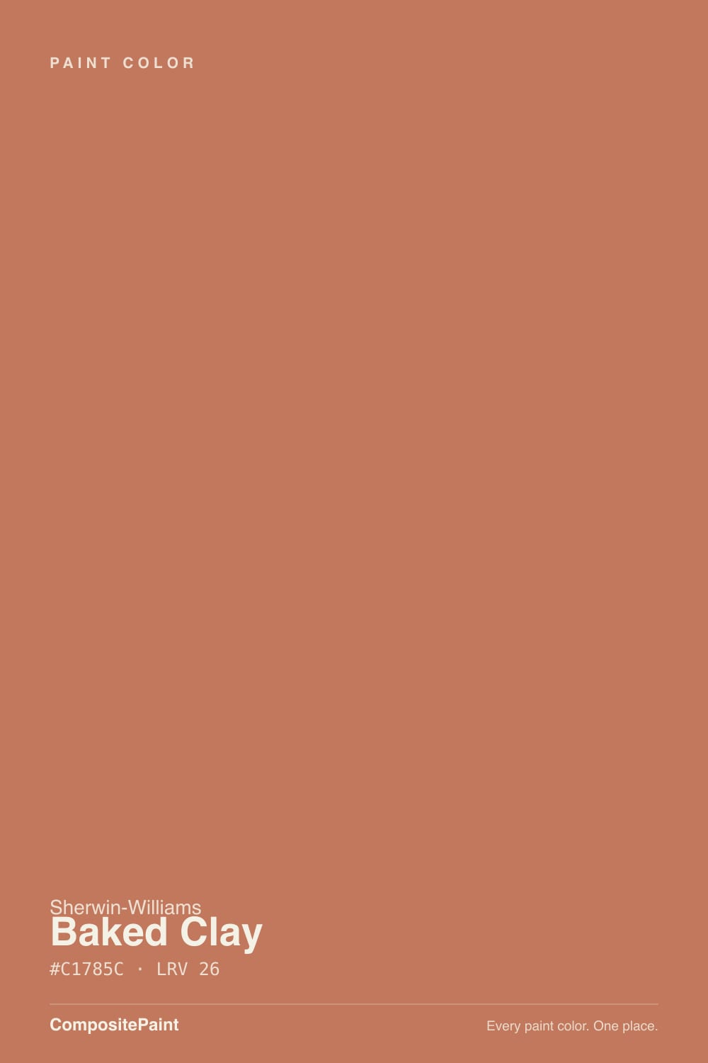
- 3Baked Clay26
- 4Caramelized35
- 5Venetian Plaster42
The Fast Verdict
Baked Clay is what terracotta looks like before a design trend gets hold of it: a real, saturated red-orange clay with a dusty brown backbone, not a grayed-out filter and not a pink drift. In full sun on a front door or a stucco wall it reads exactly like sunbaked adobe. Bring it indoors onto four walls in ordinary light and that same saturation can turn heavy fast — this is an accent color wearing a whole-color name.
Front doors and shutters · south- and west-facing exteriors and stucco · dining rooms and kitchen islands with warm wood and brass · anyone who wants real clay-orange, not the softened trend version
Whole-room walls in a dim, north-facing space · a resale-neutral goal · a kitchen built around cool white, chrome, and gray marble · you actually want the quieter, browner Cavern Clay look
- A real, saturated adobe-clay orange — not a muted trend filter, not a pink drift
- Glows on front doors and south- or west-facing exteriors in full sun
- Warm wood, brass, and rattan all look deliberate next to it
- Reads clearly orange without tipping pink the way Redend Point can
- Deep enough at LRV 26 to work as a confident accent without swallowing a small room
- Goes flat and muddy in dim, north-facing, or overcast light
- Too saturated for most buyers as a whole-room, four-wall color
- Fights cool white trim and gray-toned floors or tile
- Less resale-safe than the deck's neutral greiges and whites
What Color Is Baked Clay, Really?
A medium-depth clay orange with an unmistakable red-orange base, tempered by a dusty brown that keeps it from reading like a pumpkin. At hex #C1785C and LRV 26, it sits squarely in the medium range — enough light reflectance to avoid feeling like a dark accent color, enough saturation that it never disappears into neutral territory. This is Sherwin-Williams filing it on its own expert orange shortlist, and the reason is simple: most "terracotta" paints these days are muted down for easy living, and Baked Clay is not one of them.
Put it next to its two closest deck relatives and the difference is exact. Cavern Clay (SW 7701, LRV 24) is the browner, more ash-filtered version of the same idea — the terracotta that only glows in the right light, per its own review. Redend Point (SW 9081, LRV 27) drifts lighter and pinker, the clay-pink that split the internet when it became a Color of the Year. Baked Clay sits between them on paper but reads more purely orange than either — less muted than Cavern Clay, less pink than Redend Point.
Undertone in one line: red-orange first, dusty brown second — never yellow like a pumpkin, never pink like a blush terracotta. If your sample reads flat brick-red with no warmth, that is a dim or cool-lit room, not the paint; give it real daylight before judging it.
Where It Shines
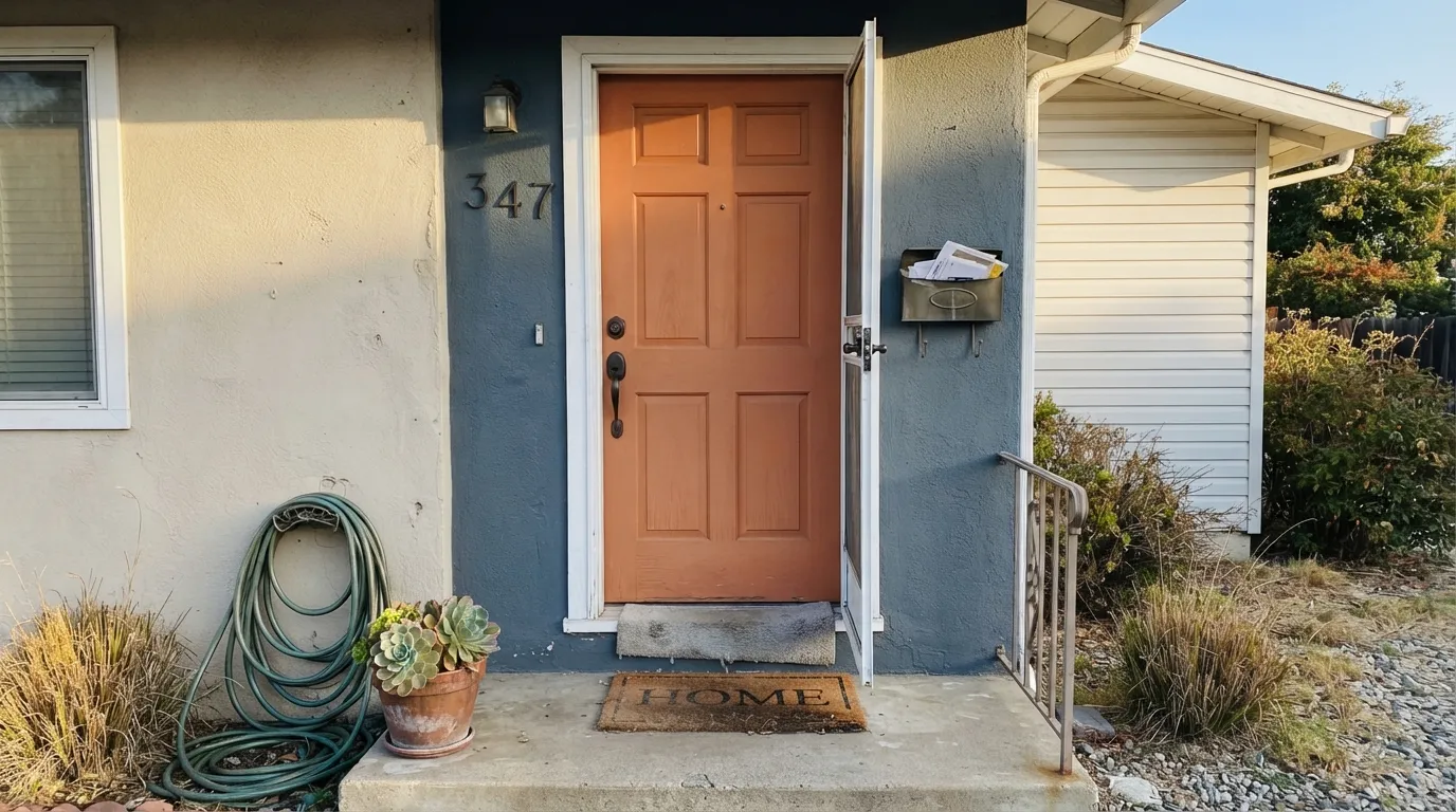
Full sun is where this color earns its name. On a front door, a stucco wall, or any south- or west-facing exterior, Baked Clay reads exactly like sunbaked adobe clay — warm, saturated, and unmistakably Southwestern or Mediterranean without leaning costume-y. It is built for architecture that wants real color outside, not a muted accent that reads brown from the curb.
Where It Fails
Almost every regret story with Baked Clay comes from one of three mismatches, and all three are predictable before the first coat. None of them are the paint's fault — but if your situation matches one, this is not your color, or at least not at full-room scale.
Cavern Clay runs its terracotta through an ash filter that keeps it easygoing in almost any light. Baked Clay skips that filter — it is more saturated and more purely orange. If the mood board photo you're chasing looks dusty and brown-leaning, that photo is probably Cavern Clay, not this color.
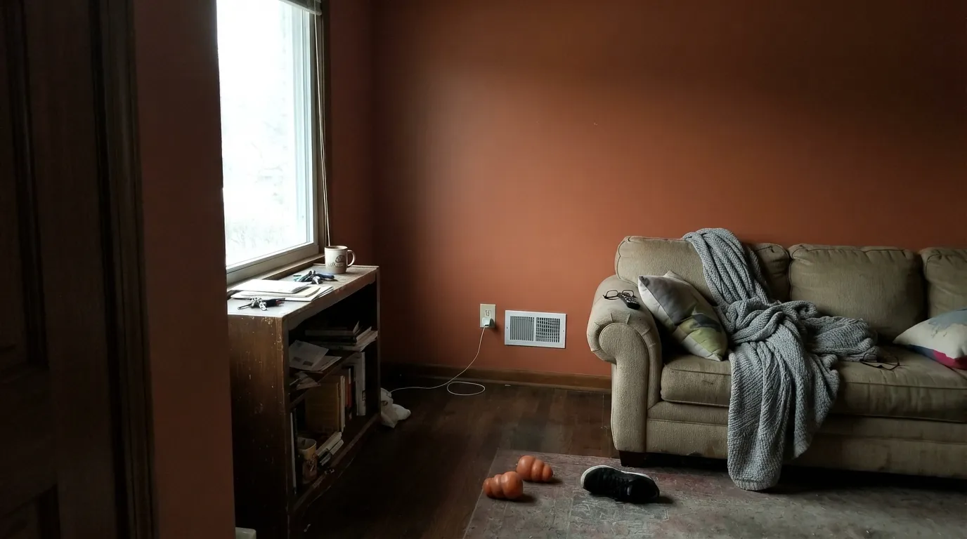
Cool, low light strips the sunbaked warmth out and leaves a flat, muddy brick-red with none of the glow that makes the color worth choosing. This is an outdoor-and-full-sun color first; four walls in a dim room is the hardest job you can give it.
A stark, blue-leaning white trim or icy gray tile fights the warmth and can push the whole look toward dated 1990s Southwestern instead of current adobe. Pair it with a warm white like Alabaster, not a cool white, and keep the floors and stone on the warm side.
Room by Room
In full daylight it is close to unbeatable: a genuine clay orange against Pure White or Alabaster siding, or set off by black or Iron Ore trim. Semi-gloss for durability and wipe-down.
South- and west-facing Mediterranean or Southwestern-style houses take to it as a full field color; on a Colonial or a shaded north elevation it can look like it wandered in from another neighborhood. Satin exterior finish.
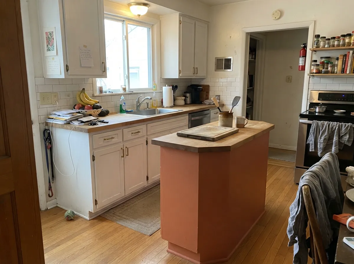
Under white or Alabaster cabinets, on an island or a single pantry door, it looks intentional and warm next to brass hardware and butcher block. A full kitchen of Baked Clay cabinetry is a much bigger bet.
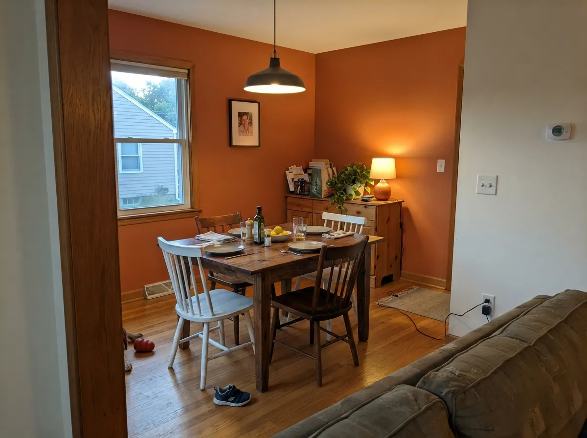
One accent wall behind a walnut table, with cream linens and brass light fixtures, gives a room genuine warmth without a four-wall commitment. Eggshell for durability where chairs bump the wall.
A single wall can anchor a room beautifully; all four walls in anything less than strong daylight risks the flat, heavy look described in the fails section. Test a large sample before committing to the whole room.
A powder room or a vanity in Baked Clay under warm stone and brass reads custom and confident. Skip it with cool gray tile or chrome — the color needs warm partners, not cold ones.
Your Light Is the Risk
This is the light the color was made for: it glows like sunbaked adobe, especially on exteriors and front doors.
Cool, low light drains the warmth and leaves a flat, muddy brick-red. Sample it in your actual room before painting more than an accent.
Cooler and more brown in early light, then it warms and brightens toward true clay-orange as the sun moves around to the west.
Warm 2700K bulbs deepen it toward a rich rust at night. Cool white LEDs flatten it and can pull it toward a dull brownish red — swap the bulbs, not the paint.
Most complaints about Baked Clay are a light mismatch. Upload a photo of your actual room and see it on your walls — then ask for the same wall in north light or evening lamps before you buy a single sample.
Need It From Another Brand?
Any paint counter can custom-tint Sherwin-Williams SW 6340 directly. If you would rather stay in one brand's own deck, these are the closest stock matches, measured as ΔE2000. Under 2 is a difference you will not see on the wall.
| Brand | Closest color | ΔE | LRV | |
|---|---|---|---|---|
| Behr | Warm Terra CottaPMD-11 · Behr | 1.1 | 25 | Color page → |
| Benjamin Moore | Coral BellsCSP-1135 · Benjamin Moore | 2.2 | 26 | Color page → |
| Valspar | Clove Bud2004-5B · Valspar | 2.8 | 26.2 | Color page → |
| PPG / Glidden | Brown ClayPPG1199-6 · PPG / Glidden | 3.2 | 27 | Color page → |
| Glidden | Amber Coast50YR 23/365 · Glidden | 1.3 | 23 | Color page → |
| Dutch Boy | Fallen Leaf208-5DB · Dutch Boy | 0.0 | 26 | Color page → |
Similar Sherwin-Williams Colors
The nearest shades to Baked Clay within Sherwin-Williams's own range, ranked by perceptual color distance — useful when you want the same look a touch lighter, darker, or warmer.
WCAG 2.1: AA is 4.5 : 1 for normal text, 3 : 1 for large text, AAA is 7 : 1.
Baked Clay vs the Colors You're Also Considering
Every Baked Clay sample board has the same rivals on it. The numbers show the real lightness gap — then it comes down to which risk you would rather live with.
Pick this when you want the more saturated, more purely orange version of the same clay family.
Sherwin-Williams SW 7701 · LRV 24Cavern ClayPick this for a browner, more muted terracotta that stays easygoing in more lighting situations.
Pick this for real, unambiguous orange — Baked Clay never drifts toward pink the way Redend Point can.
Sherwin-Williams SW 9081 · LRV 27Redend PointPick this for a lighter shade that leans pink and reads more like a warm neutral in daylight.
Baked Clay Coordinating Colors
The rule for coordinating with Baked Clay: warm whites, deep near-blacks, and one true green if you want a complementary pop. It fights cool whites and gray-toned neutrals, and it looks best next to colors confident enough to hold their own rather than disappear into it. These are the partners that keep showing up in rooms and exteriors that work:
Baked Clay and the Terracotta Trend
Terracotta has had a real design moment over the past few years, and Sherwin-Williams has two of the colors most credited with driving it: Cavern Clay, the muted southwestern favorite, and Redend Point, the color that became Sherwin-Williams' 2023 Color of the Year and immediately turned into one of the internet's most-argued-about paints — beloved by some, called "ugly" by others, which its own review sums up as splitting the internet in half.
Baked Clay sits quietly next to both of them on Sherwin-Williams' own expert orange shortlist, without either color's viral moment. That is arguably the honest selling point: it is a real adobe clay tone, more saturated than Cavern Clay and less pink than Redend Point, chosen for what it looks like on a wall rather than for a Color of the Year headline. If the trend colors feel like they are trying to make a statement about being trendy, Baked Clay just reads like clay.
Baked Clay With Wood Tones and Metal Finishes
Warm wood is the natural partner here: walnut, cedar, and rustic reclaimed wood all deepen the color's sunbaked read rather than fighting it. Pale, cool-toned wood — Scandinavian white oak, gray-washed floors — sits at the opposite temperature and can make the orange look isolated instead of grounded; a warm rug or a wood accent piece helps bridge the gap.
Metals split cleanly by temperature: unlacquered brass, aged bronze, and matte black all read as intentional next to Baked Clay, the way they do with any true terracotta. Polished chrome and cool brushed nickel are the exceptions — they pull toward cold and make the warm clay look like it is arguing with its own hardware.
Three Ready Palettes Built on Baked Clay
A color is never alone on the wall. These are complete combinations in the 60-30-10 pattern, with the reason each one holds together. Every one opens in the visualizer.
Crisp white siding gives Baked Clay a clean field to glow against in full sun, and Iron Ore supplies one confident dark note so the door reads designed, not random.
Try this palette in your roomAlabaster keeps the kitchen bright and warm-neutral so the island can carry the color; Urbane Bronze on a single door gives the room a second grounded note without competing with the clay.
Try this palette in your roomGreen sits opposite orange on the wheel, so a muted sage like Evergreen Fog calms Baked Clay instead of fighting it — a classic complementary pairing that reads sophisticated, not costume-y.
Try this palette in your roomBaked Clay FAQ
Is Baked Clay more orange or more terracotta?
Genuinely orange with a terracotta character — it has a real red-orange base tempered by dusty brown, not the grayed-down muted look most terracotta paints go for. If you want the softer, more filtered version, look at Cavern Clay instead.
How does Baked Clay compare to Cavern Clay?
Cavern Clay is browner and more muted, at LRV 24 versus Baked Clay's LRV 26 — Cavern Clay is the color that stays easygoing in more rooms. Baked Clay is more saturated and reads more purely orange, which makes it the bolder choice for a front door or exterior.
Is it good for a front door?
Yes — this is close to its best use. In real daylight it reads as genuine sunbaked clay, and it pairs cleanly with white, black, or bronze trim. Semi-gloss finish for durability.
Can I paint a whole room in Baked Clay?
You can, but treat it like a decision, not a default. It needs real daylight to avoid going flat and muddy; a bright, south- or west-facing room can carry it on all four walls, but a dim north room cannot. When in doubt, start with one accent wall.
What trim white goes with Baked Clay?
A warm white — Alabaster or Pure White — not a stark, cool-leaning white. Cold white trim fights the clay's warmth and can push the whole look toward dated instead of current.
Does it work on stucco or exterior siding?
Yes, especially on south- or west-facing Southwestern or Mediterranean-style houses, where it reads as a confident, authentic adobe field color. On a shaded north elevation or a house with a different architectural style, it can look out of place — walk the exterior in daylight before committing to full coverage.
Have you painted with Baked Clay?
Rate it — one tap helps the next reader decide.
Ask a Question