Redend Point
SW's most divisive Color of the Year, reviewed honestly: the light that turns it blush-pink, the light that turns it clay-brown, and who actually loves it three years in.

Jessica has spec'd whites and neutrals for more than 300 rooms and keeps a sample wall of painted drawdowns in her studio. Every color review is checked against real reader rooms in the comments and re-tested when a formula changes. About the testing process →
- 1Turkish Coffee5
- 2Porpoise13
- 3Redend Point30
The Fast Verdict
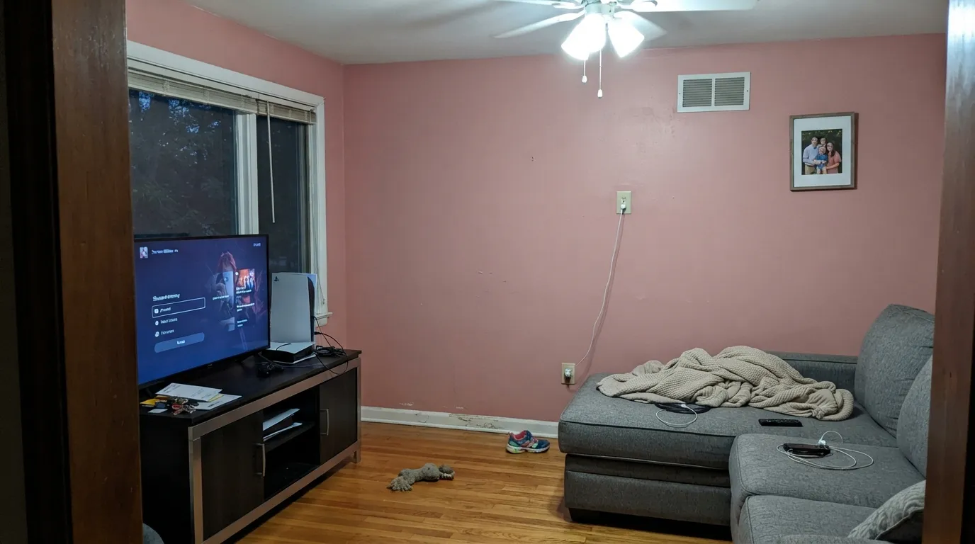
Redend Point is a rosy clay-beige that Sherwin-Williams picked as its 2023 Color of the Year, and the internet has never fully agreed on what color it actually is — beige, terracotta, mauve, or "wet Band-Aid," depending on who you ask and what light hit their wall that day. It genuinely is a chameleon: warm blush-clay in daylight, distinctly pink under cool bulbs or north sky. If earthy, quiet warmth is what you want and you can commit to warm light, it delivers. If you're hoping the pink won't show, it will.
North- or east-facing rooms that need warmth · accent walls, fireplaces, bathrooms · southwestern or organic-modern schemes with terracotta and rattan · anyone who wants a color with more personality than greige but isn't ready for full clay
You truly dislike pink in any form · you're painting a busy kitchen full of clashing finishes · your room runs cool LED bulbs with no daylight to balance it · you want a color everyone in the house agrees on immediately
- Genuine earthy character — more interesting than a standard warm greige
- Balances beautifully in cool north/east light, unlike most warm neutrals
- LRV 30 holds its color without washing out to baby-pink
- Reads intentional and expensive in small, enclosed rooms
- Pairs naturally with the organic-modern / southwestern trend it helped popularize
- Genuinely polarizing — the most-argued SW Color of the Year in recent memory
- Reads distinctly pink under cool LED bulbs or flat overcast light
- Fights cool, mismatched kitchen finishes (stainless, cool quartz, chrome)
- Full sun on an exterior body can push it toward blush-pink rather than clay
What Color Is Redend Point, Really?
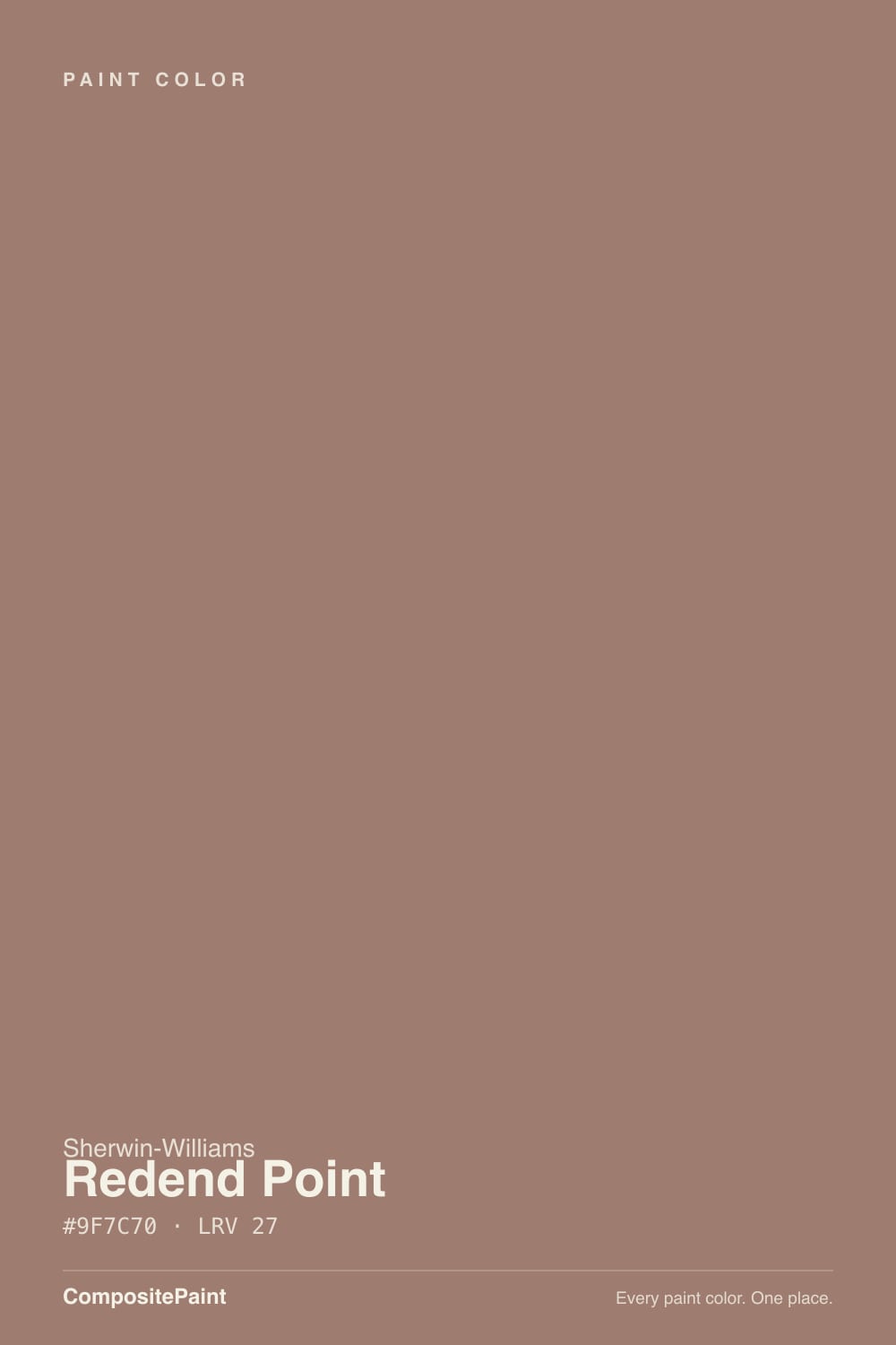
A medium clay-beige built on red, brown and a touch of blue — Sherwin-Williams' own description — which is exactly why nobody can agree what to call it. Look at it under warm light and it reads terracotta-beige, grounded and earthy, almost a lighter cousin of adobe. Look at it under cool light and the red steps forward and it reads distinctly rosy-mauve. Both readings are correct; that instability is the entire personality of the color, and it is also why it became the most argued-about Color of the Year Sherwin-Williams has picked in years.
At LRV 30 it sits solidly in the medium-depth range — not a pale blush, not a deep clay. That depth is doing real work: a paler pink-beige would wash out and read as "dusty rose" the moment it hit a wall, but Redend Point holds enough pigment to stay grounded and earthy in good light. The tradeoff is the same one every medium clay-toned color makes — it needs light to behave, and it will not fake warmth in a room that has none.
Undertone in one line: red-brown first, with the red winning in cool light and the brown winning in warm light. If your sample reads calamine-pink, your room is running cool bulbs or north sky with no direct sun; if it reads warm terracotta, that's the color doing what Sherwin-Williams intended.
Where It Shines
This is a north-and-east-light color, which is unusual — most warm neutrals need south sun to stay warm, but Redend Point actually calms down and reads more balanced clay-beige in cooler daylight, because the cool sky offsets the pink instead of amplifying it the way it does on paler pinks. Its other strength is doing the earthy, organic-modern look — terracotta tile, rattan, black iron, warm wood — without committing to a full clay or rust wall. In a small room (powder bath, accent wall, fireplace surround) it reads intentional and a little unexpected instead of "is that pink or beige."
Where It Fails
Nearly every negative Redend Point story — and there are a lot of them, because it was a genuinely controversial Color of the Year — traces back to one of three things. None of them mean the paint is defective; they mean the room or the expectation was wrong for this specific color.
Sherwin-Williams marketed this as an earthy neutral, and in the right light it is. But the red undertone is real and assertive, not a subtle whisper — under cool bulbs or flat overcast sky it reads unmistakably rosy-mauve, and reviewers have compared it to a wet Band-Aid and calamine lotion. If your mental image was "warm greige," sample it before you commit; this is a color with an opinion, not a background neutral.
The comparison shows up constantly in reviews: rose-and-hunter-green, mauve-and-brass, the exact palette a lot of people repainted out of in the 2000s. Redend Point is grayed down and clay-based enough that it isn't a repeat of that trend, but in the wrong light — flat, cool, no wood or greenery to ground it — it can flash the same note. Pair it with genuinely warm materials (terracotta, walnut, black iron, not brass-and-hunter-green) to keep it reading current.
Sherwin-Williams itself suggested Redend Point cabinets, and plenty of designers pushed back — the color is hard to reconcile with stainless, cool-white quartz, and mixed metal hardware all at once. It wants a kitchen that's already decided on a warm, earthy direction. Thrown into a kitchen full of cool, clashing finishes, it just adds one more disagreement to the room.
Room by Room
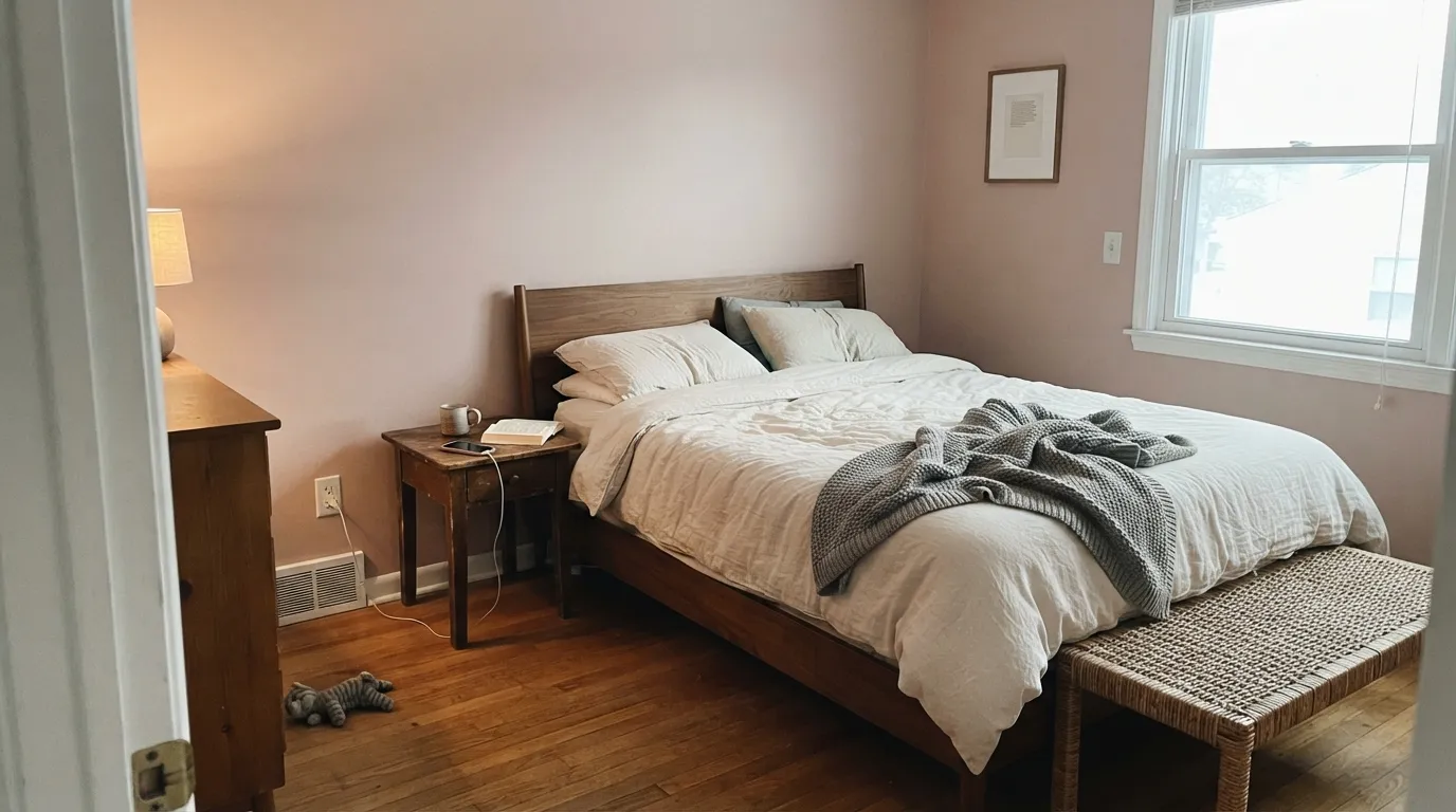
One of its best rooms. Cool north light keeps the color balanced rather than pink, and warm lamps at night bring the clay-brown side forward. Matte finish, and keep bedding in cream or warm white rather than cool grey.
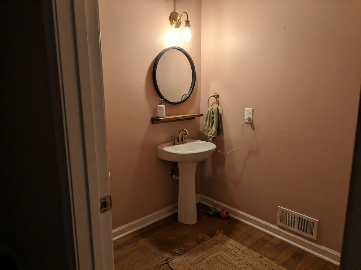
Small, enclosed rooms are where reviewers love this color most — it reads jewel-box and earthy rather than pink. Works especially well against black fixtures, brass, and a warm white vanity. Eggshell or satin for moisture resistance.
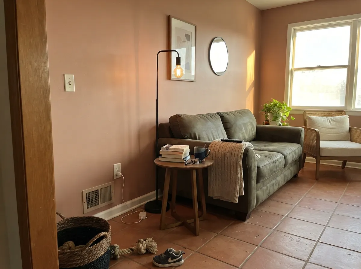
Beautiful with terracotta, rattan, walnut and black iron in an organic-modern or southwestern scheme. In a room full of cool grey furniture and chrome, it will fight everything in sight — check your existing pieces before painting the walls.
On a single wall, a hutch, or an island it's charming and unexpected. On every cabinet in a kitchen with stainless appliances and cool countertops, it's the single most-argued application of this color — sample big before committing the whole room.
Evening entertaining is this color's best-case scenario: warm bulbs, candlelight, and Redend Point turns rich and clay-toned rather than pink. Pair with a walnut table and black or brass fixtures.
As a body color it reads more blush-pink in full, direct sun than it does indoors — some owners love the effect, others find it reads more Pepto than clay. It works best as a trim, door, or shutter color against a warm white or stucco-toned body, where it reads as an accent rather than the whole house committing to pink.
Your Light Is the Risk
Counterintuitively its best light — the cool sky offsets the red and keeps it a balanced clay-beige instead of tipping pink.
The single most common complaint. Cool white light strips the brown and leaves rosy-mauve behind. Swap to 2700K bulbs before blaming the paint.
Full sun brings the warm clay-brown forward strongly — flattering indoors, but on an exterior body it can read more blush-pink than expected.
2700K bulbs and candlelight pull it toward rich terracotta-clay — its most-loved look, and the reason it photographs so well at dusk.
Most complaints about Redend Point are a light mismatch. Upload a photo of your actual room and see it on your walls — then ask for the same wall in north light or evening lamps before you buy a single sample.
Need It From Another Brand?
Any paint counter can custom-tint Sherwin-Williams SW 9081 directly. If you would rather stay in one brand's own deck, these are the closest stock matches, measured as ΔE2000. Under 2 is a difference you will not see on the wall.
| Brand | Closest color | ΔE | LRV | |
|---|---|---|---|---|
| Behr | Brandied PearsBIC-16 · Behr | 2.0 | 30 | Color page → |
| Benjamin Moore | Serengeti Sand2164-40 · Benjamin Moore | 3.9 | 30 | Color page → |
| Valspar | Western Ridge1008-9C · Valspar | 2.7 | 29 | Color page → |
| PPG / Glidden | CocolocoPPG1079-5 · PPG / Glidden | 3.9 | 30 | Color page → |
| Glidden | CocolocoPPG1079-5 · Glidden | 3.5 | 30 | Color page → |
| Dutch Boy | Oarsman412-5DB · Dutch Boy | 3.0 | 30 | Color page → |
Similar Sherwin-Williams Colors
The nearest shades to Redend Point within Sherwin-Williams's own range, ranked by perceptual color distance — useful when you want the same look a touch lighter, darker, or warmer.
WCAG 2.1: AA is 4.5 : 1 for normal text, 3 : 1 for large text, AAA is 7 : 1.
Redend Point vs the Colors You're Also Considering
Every Redend Point sample board has the same rivals on it. The numbers show the real lightness gap — then it comes down to which risk you would rather live with.
Pick this for the softer, beige-forward version with more range across a whole house.
Sherwin-Williams SW 7701 · LRV 24Cavern ClayPick this if you hate the pink outright — Cavern Clay is a true burnt-orange terracotta with no rose flash in any light.
Pick this for the lighter, more earthy-warm version that leans clay over purple.
Benjamin Moore 2113-40 · LRV 19Cinnamon SlatePick this for a deeper, more muted mauve-taupe that never reads clay-orange — the 2025 Color of the Year covers similar ground with less controversy.
Moroccan Spice SW 6060 at LRV 22 is darker and swings further orange, so it reads as spice rather than clay. Mocha SW 6067 at LRV 21 drops most of the pink and behaves like a straight warm brown. Dusted Truffle SW 9083 at LRV 25 is the closest sibling in feel but grayer, which makes it the safer pick if you are worried about pink showing up.
Across brands the matches are unusually tight. Benjamin Moore Autumn Brown 2099-40 at LRV 24 measures a color difference of 0.56, close enough to treat as the same color in practice. Behr Cocoa Nutmeg S190-5 at LRV 23 comes in at 1.8, visually identical in normal room light. Valspar Forest Trail 1005-9C at LRV 23.4 measures 2.84, very close but worth sampling first. Dunn-Edwards Wood Lake DE6075 at LRV 24 measures 4.01, close but visibly different side by side.
Redend Point Coordinating Colors
The rule for coordinating with Redend Point: warm and earthy wins, cool and stark loses. It wants terracotta, black iron, walnut, and creamy whites — not chrome, cool grey stone, or bright builder-white. These are the partners that keep it reading clay-beige instead of accidental pink:
The Story: Sherwin-Williams' Most-Argued Color of the Year
Sherwin-Williams named Redend Point its 2023 Color of the Year, describing it as a soft, earthy neutral inspired by natural clay and desert landscapes. The reaction split almost immediately. Design blogs praised its warmth and versatility; social media compared it to a wet Band-Aid, calamine lotion, and — less kindly — the color scheme of a retirement home lobby. The prior year's pick, Evergreen Fog, had been a broad crowd-pleaser; Redend Point asked people to accept a visibly pink note in a "neutral," and a real share of them said no.
Three years on, the color has settled into a smaller, more devoted niche rather than becoming a whole-house default the way Evergreen Fog or Agreeable Gray did. It shows up most often as an accent wall, a powder room, or a nod to the organic-modern and southwestern trends it helped popularize — terracotta tile, rattan, black iron. That's arguably the honest use case: a strong, specific color that a subset of rooms and a subset of taste genuinely loves, not a safe neutral for everyone.
Redend Point With Wood Tones and Floors
Warm, matte wood is this color's best friend — walnut, white oak with a warm cast, and rattan or cane furniture all pull the clay-brown side forward and keep the pink in check. It's also a natural with terracotta tile and unlacquered brass or black iron hardware, which is why it shows up so often in southwestern and organic-modern rooms.
The floors that fight it are cool grey LVP, grey-washed wood, or anything with a blue undertone — against those, the red in Redend Point gets pushed forward by contrast and the pink reading gets stronger, not weaker. Honey-orange builder oak is a more neutral pairing than you'd expect, since both colors share a warm base, but test a large sample against your actual floor before committing a whole room.
Three Ready Palettes Built on Redend Point
A color is never alone on the wall. These are complete combinations in the 60-30-10 pattern, with the reason each one holds together. Every one opens in the visualizer.
Redend Point as a single accent wall lets the clay-pink read as a deliberate warm note rather than the whole room's identity. Neutral Ground keeps the rest of the space quiet and warm-toned so nothing fights it, and Wrought Iron supplies the grounding dark the earthy palette needs.
Try this palette in your roomSmall, enclosed rooms are where reviewers consistently love this color — Redend Point wraps all four walls and reads jewel-box rather than pink. Greek Villa keeps the trim soft instead of stark-white, and Iron Ore hardware gives the room one confident dark note.
Try this palette in your roomUsed as a door and shutter color rather than the whole body, Redend Point gets to be the accent it does best without betting the entire exterior on how it reads in full sun. Iron Ore trim keeps the contrast crisp against a warm stucco-toned body.
Try this palette in your roomRedend Point FAQ
Is Redend Point pink or beige?
Both, depending on the light — that's the whole controversy. Under warm daylight and lamplight it reads as an earthy clay-beige; under cool LED bulbs or flat north sky it reads distinctly rosy-pink. Sherwin-Williams calls it a soft neutral; a large share of reviewers call it pink. Sample it in your actual room before deciding which one you'll live with.
Why was Redend Point such a controversial Color of the Year?
Because pink is polarizing and this one doesn't hide it. Social media reactions in 2023 ranged from calling it fresh and earthy to comparing it to a wet Band-Aid or calamine lotion. Unlike a crowd-pleasing pick like Evergreen Fog the year before, Redend Point asked people to accept visible pink in their neutral palette, and opinions split hard.
Does it work in a north-facing room?
Better than most warm neutrals, actually. Cool north sky offsets the red undertone instead of amplifying it, so the color tends to read more balanced clay-beige than it does in flat, cool artificial light. It's one of the few warm colors that doesn't need direct sun to behave.
Should I use it on kitchen cabinets?
Sherwin-Williams has shown it on cabinets, but plenty of designers push back — it's genuinely hard to coordinate with stainless steel, cool-white quartz, and mixed hardware finishes all at once. It works best in a kitchen that has already committed to a warm, earthy direction. An island or hutch is a safer bet than the whole run of cabinets.
What white trim goes with Redend Point?
A soft, creamy white rather than a stark bright one — Greek Villa or Alabaster keep the pairing warm instead of making the walls read pinker by contrast. A cool bright white will bring out more of the pink than you want.
Is Redend Point going to look dated?
It carries real risk of dating faster than a plain greige, and reviewers openly compare it to 90s rose-and-mauve trends in the wrong light. It avoids repeating that mistake by staying grayed-down and clay-based rather than true dusty rose, but if trend risk worries you, treat it as an accent-wall or small-room color rather than a whole-house commitment.
Have you painted with Redend Point?
Rate it — one tap helps the next reader decide.
Ask a Question