Turkish Coffee
The deep coffee brown that reads near-black without real light, reviewed honestly: where it earns its keep on front doors and cabinets, and the rooms where it just disappears.

Jessica has spec'd whites and neutrals for more than 300 rooms and keeps a sample wall of painted drawdowns in her studio. Every color review is checked against real reader rooms in the comments and re-tested when a formula changes. About the testing process →
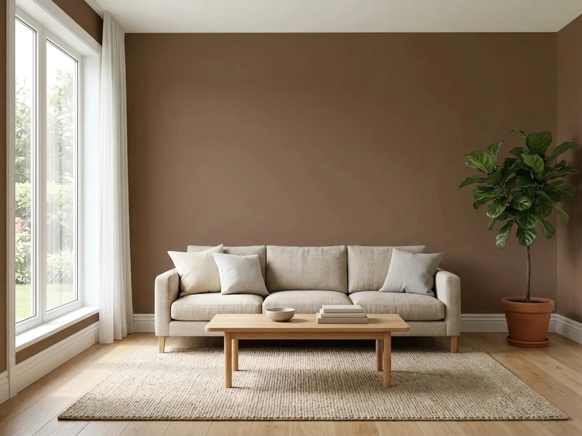
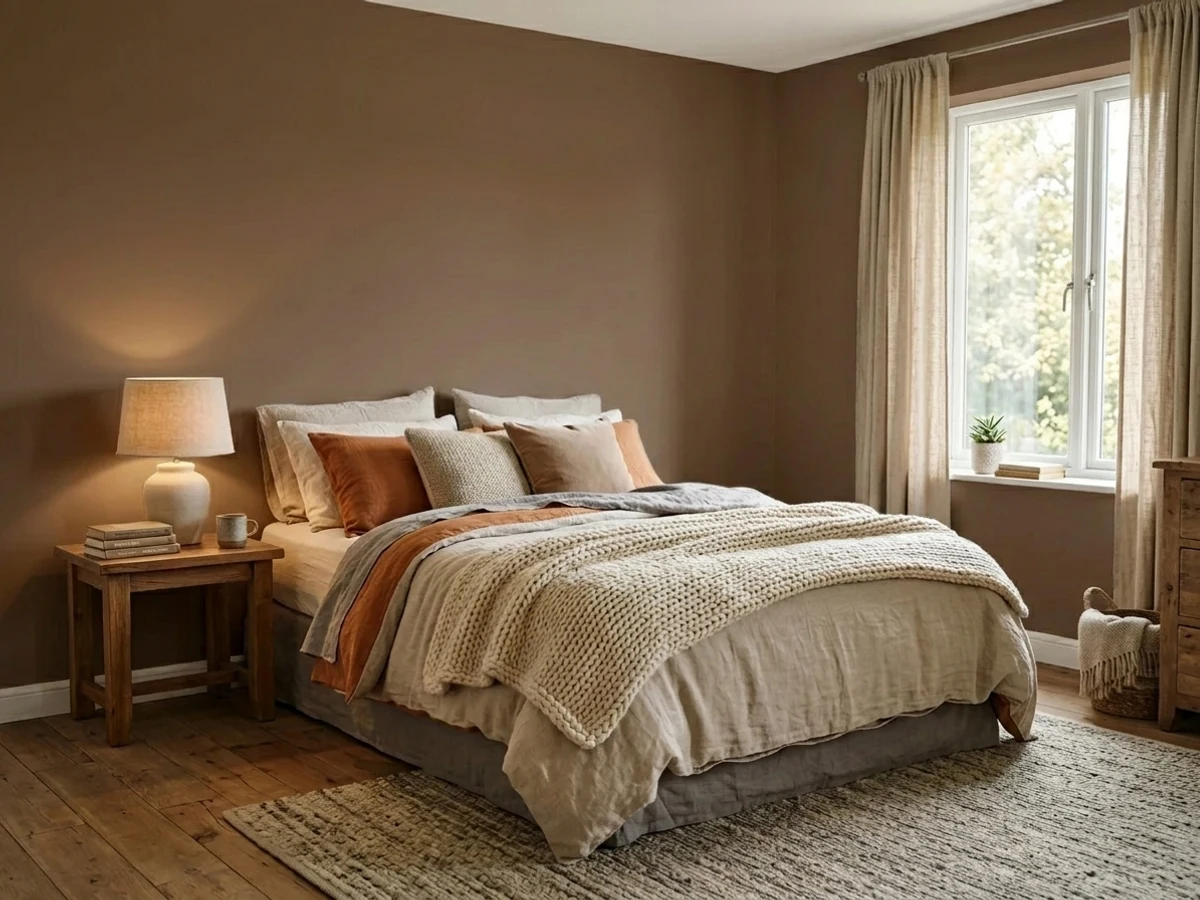
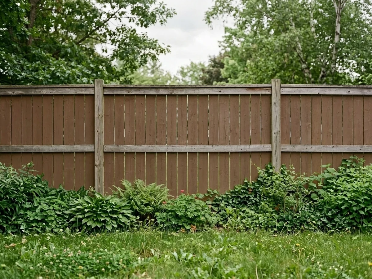
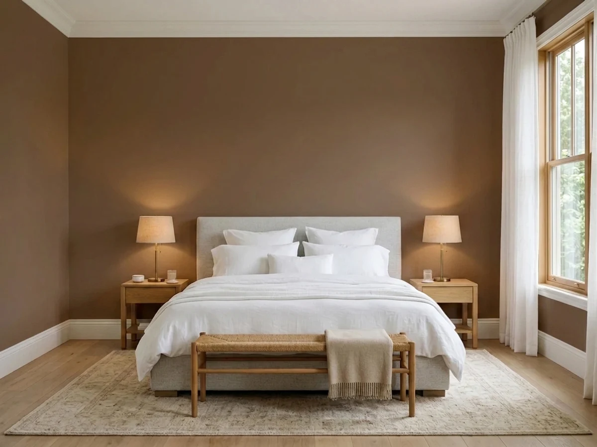
- 1Mahogany0
- 2Turkish Coffee5
- 3Porpoise13
- 4Cavern Clay20
The Fast Verdict
Turkish Coffee is exactly what the name says: the color of strong brewed coffee, dark enough to sit one step above true black on the LRV chart. Give it a front door, a kitchen island, or a lamplit den and it glows warm and rich. Give it a windowless hallway and it just goes black on you — no drama, no undertone surprise, just physics. Sherwin-Williams quietly files it as a Neutral, which tells you more about how safe it plays with other colors than about what color it actually is.
Front doors · kitchen islands and lower cabinets · dens and home offices with warm lamps · anyone who wants a rich brown without committing to true black
Your room has no real daylight · you want the wall to read brown even in shade · you're painting a small windowless space head to toe · your summers are brutal and you're covering the whole exterior body
- A genuinely warm coffee brown, not another gray pretending to be moody
- Front doors and cabinets read expensive with almost no upkeep worry
- Hides everyday dirt, fingerprints and scuffs better than lighter colors
- Deep enough to stand in for true black without buying actual black
- No trend expiration date — a Timeless Color pick, not a Color-of-the-Year flash
- LRV 5 means it goes near-black in any room without real daylight
- Whole rooms without big windows can feel like a cave, not a coffee shop
- Full exterior body in hot, sunny climates needs a siding-material check first
- Swatches and photos often show more visible brown than the wall delivers in shade
What Color Is Turkish Coffee, Really?
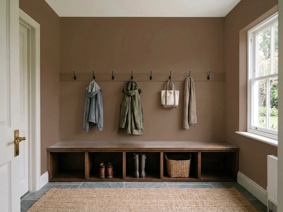
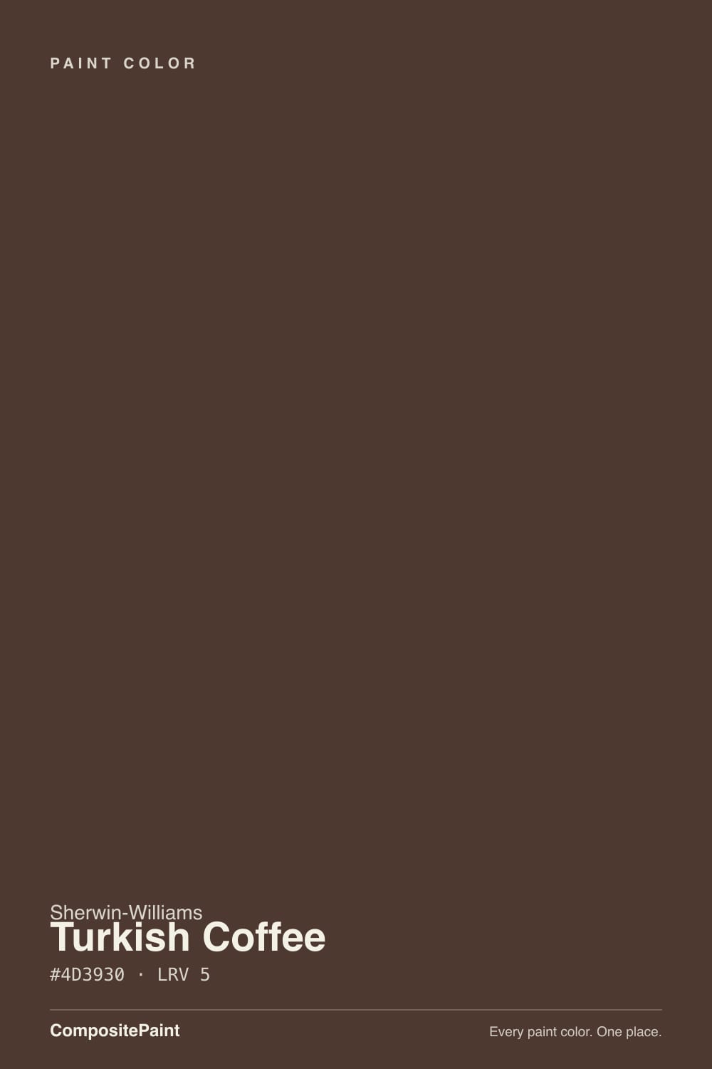
A warm coffee brown with a soft red-bronze cast — the RGB leans red first, green second, blue a distant third, which is exactly why it never drifts cool or purple the way some dark browns do. Think brewed coffee or wet espresso grounds, not chocolate and not walnut. It is a literal name for once: hold the chip next to an actual cup of coffee and the match is close.
At LRV 5, Turkish Coffee sits near the very bottom of the deck, one notch above true blacks like Tricorn Black (LRV 3) and Black Magic (LRV 3). That depth is the whole story. In good light it is unmistakably brown; in a dim corner or a north room with no lamps, it reads as flat near-black — indistinguishable from charcoal at a glance. Sherwin-Williams itself files it under "Neutral" on the color-family site, which is a stretch for a color this saturated, but it explains why designers reach for it as a stand-in for black without the starkness.
Undertone in one line: warm brown first, a whisper of red-bronze second — never gray, never purple, never orange. This is not a trend color chasing a Color of the Year moment; it lives in Sherwin-Williams' Timeless Color collection, which is the company's own way of saying it has been reliably selling on doors and cabinets for years without needing a marketing push.
Where It Shines
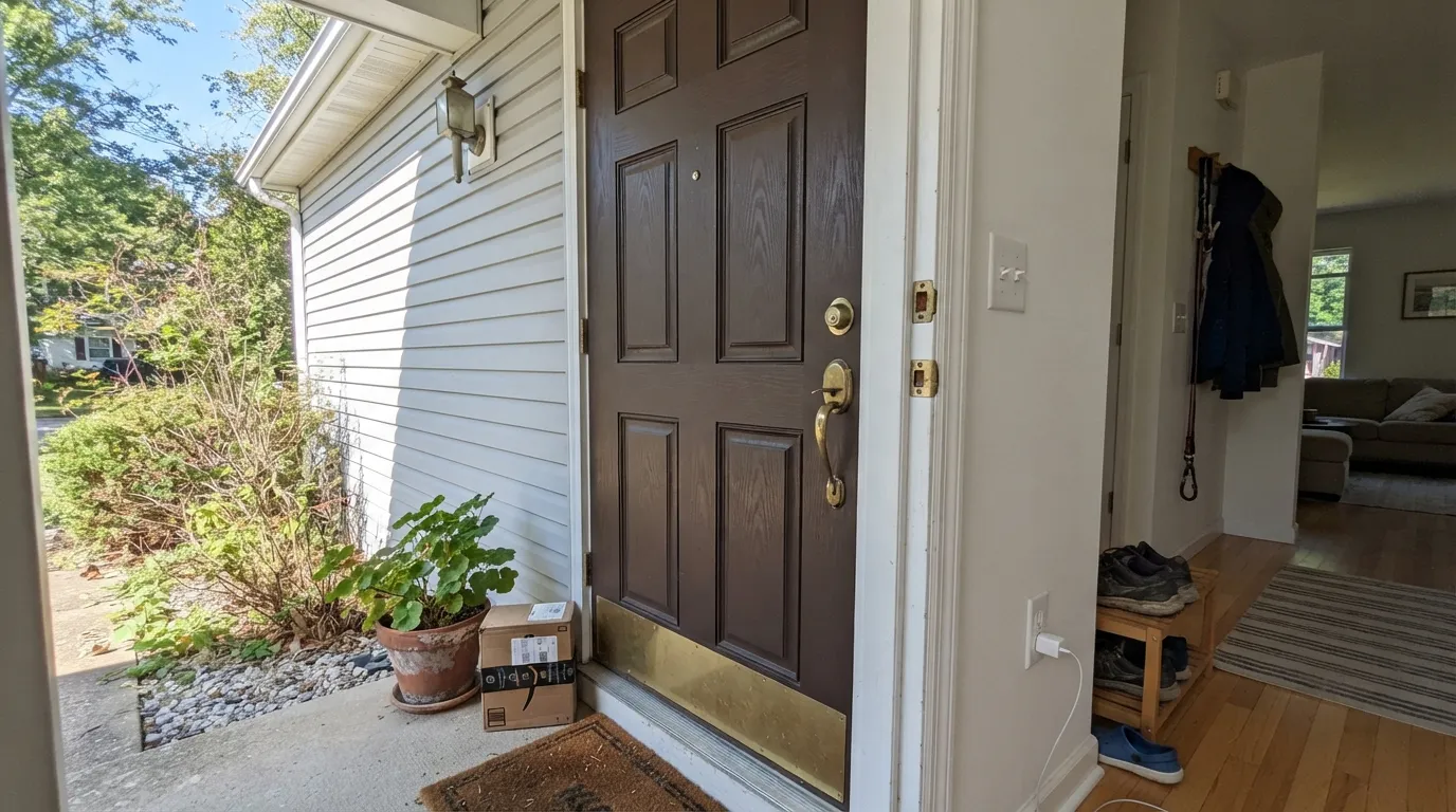
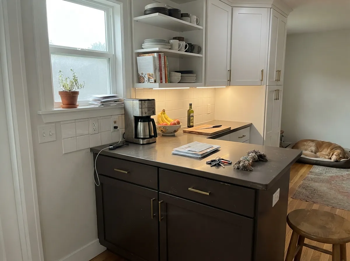
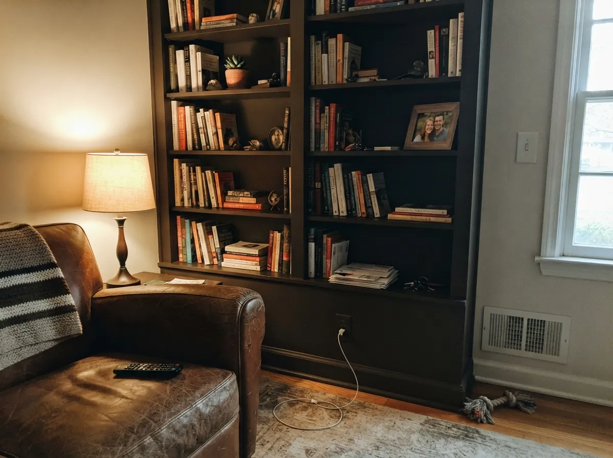
Give it a surface that actually catches light and it earns every bit of its reputation. Front doors are its signature job — full sun or bright porch light lets the coffee-brown warmth read clearly, and the color hides everyday grime (fingerprints, weather streaks, dog-nose marks) far better than anything lighter. Kitchen islands and lower cabinets are its second home: paired with white uppers and brass or matte-black hardware, it is the two-tone kitchen look that keeps showing up on Pinterest and TikTok renovation clips. In a den or home office with a warm lamp on at night, it turns genuinely velvety.
Where It Fails
Almost every disappointed review of Turkish Coffee comes down to one thing: not enough light reaching the wall. None of these are the paint misbehaving — an LRV 5 color is supposed to eat light, that is what dark means — but if your room matches one of these, sample it in your actual space before you commit a whole gallon.
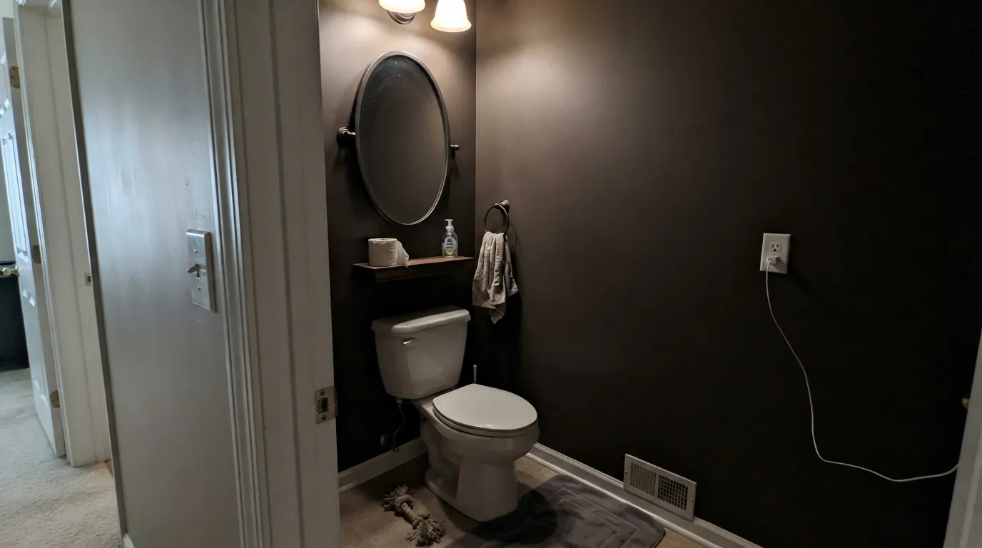
Windowless powder rooms, interior hallways, basement dens — anywhere the sun never directly reaches goes flat, cave-like near-black. The color did not fail; there was nothing for it to reflect. Turn on every lamp before you judge the sample, and if the room genuinely has no light source, pick something with a higher LRV instead.
In shade or under a single overhead bulb, Turkish Coffee reads as close to true black as makes no difference — most people can't tell it apart from Tricorn Black in a dim photo. If the point was showing off a rich coffee color, not just a dark accent, test the sample right where the strongest light in the room actually lands, not in the darkest corner.
Dark exterior colors absorb more heat than light ones, and on vinyl siding specifically that can mean warping in intense sun — this is a material-science issue, not a Turkish Coffee issue, but it applies here at full strength. Ask your painter whether your siding is rated for dark colors before covering the whole house; the door alone carries none of this risk.
Room by Room
Weather-forgiving, grime-hiding, and it works with almost any siding color from white to greige to brick. Semi-gloss, and brass or matte-black hardware both look expensive against it.
Paired with white uppers (Alabaster is the classic match), it is the two-tone kitchen everyone is renovating toward right now. Satin cabinet enamel; brass pulls glow, black pulls stay quiet.
Floor-to-ceiling in a bright room with big windows, it is dramatic and expensive-looking. In an average builder-grade room with one small window, it can feel like painting yourself into a cave. Check the light before you commit to four walls.
Genuinely velvety at night under warm bulbs. Pair with cream or white bedding and walnut furniture so the room has somewhere for the eye to land besides the dark wall.
Built-ins and bookcases in Turkish Coffee read like custom millwork against brass lamp light and stacked books. Forgiving of scuffs and fingerprints, which matters on anything people touch daily.
Gorgeous in cooler climates paired with white or cream trim. In hot, sun-heavy regions, confirm your siding material can handle a dark full-body color before committing beyond the door.
Your Light Is the Risk
Full sun on a door or strong daylight on an island lets the coffee-brown warmth actually show — this is the light the color was named for.
Without a direct light source it drops to near-black, hard to tell apart from a true black at a glance. Fine if that was the plan; disappointing if you paid for "brown."
Cooler and more restrained in morning light, richer and more bronze as the sun swings around in the afternoon. By evening it settles back toward near-black.
2700K lamps pull the coffee warmth forward and the wall goes velvety. Cool white LEDs flatten it toward flat charcoal — keep the bulbs warm, not the paint.
Most complaints about Turkish Coffee are a light mismatch. Upload a photo of your actual room and see it on your walls — then ask for the same wall in north light or evening lamps before you buy a single sample.
Need It From Another Brand?
Any paint counter can custom-tint Sherwin-Williams SW 6076 directly. If you would rather stay in one brand's own deck, these are the closest stock matches, measured as ΔE2000. Under 2 is a difference you will not see on the wall.
| Brand | Closest color | ΔE | LRV | |
|---|---|---|---|---|
| Behr | Chocolate CocoS-G-760 · Behr | 0.8 | 5 | Color page → |
| Benjamin Moore | Tudor BrownHC-185 · Benjamin Moore | 0.7 | 6 | Color page → |
| Valspar | RootstockM107 · Valspar | 2.7 | 4.8 | Color page → |
| Dutch Boy | Parkwood404-7DB · Dutch Boy | 0.0 | 5 | Color page → |
| HGTV Home by Sherwin-Williams | Turkish CoffeeHGSW 2491 · HGTV Home by Sherwin-Williams | 0.0 | 5 | Color page → |
| Farrow & Ball | ColaNO. 9918 · Farrow & Ball | 4.7 | 6 | Color page → |
Similar Sherwin-Williams Colors
The nearest shades to Turkish Coffee within Sherwin-Williams's own range, ranked by perceptual color distance — useful when you want the same look a touch lighter, darker, or warmer.
WCAG 2.1: AA is 4.5 : 1 for normal text, 3 : 1 for large text, AAA is 7 : 1.
Turkish Coffee vs the Colors You're Also Considering
Every Turkish Coffee sample board has the same rivals on it. The numbers show the real lightness gap — then it comes down to which risk you would rather live with.
Pick this when you want the brown to actually announce itself instead of just being implied.
Benjamin Moore AF-180 · LRV 5WengePick this if you want it even quieter and less brown-forward — Wenge reads as a true near-black cabinet color, not a coffee brown trying to show through.
Pick this for more depth and drama — Turkish Coffee commits further toward black in the same low light.
Sherwin-Williams SW 7041 · LRV 7Van Dyke BrownPick this for a slightly lighter, more forgiving version — Van Dyke Brown holds onto its brown a beat longer in dim rooms before it drops toward black.
Pick this for the deeper, moodier option — Sable stays lighter and more clearly a warm brown, never a black stand-in.
Sherwin-Williams SW 6083 · LRV 8SablePick this for a warmer, redder-orange brown that keeps its color even in so-so light — Sable never drops all the way to near-black.
Pick this for warmth — Iron Ore is cooler and grayer; Turkish Coffee keeps a coffee-brown soul even when the light is low.
Sherwin-Williams SW 7069 · LRV 6Iron OrePick this if you actually want a true black-gray, not a color that's secretly brown underneath — Iron Ore commits to gray-black cleanly in any light.
Turkish Coffee Coordinating Colors
The pairing rule is simple because the color does the heavy lifting on its own: give it a genuinely bright, warm partner so the room has somewhere to breathe, and let it carry the depth alone. It plays well with crisp exterior whites, warm interior whites, and other browns a few shades lighter — these are the partners that show up again and again:
Filed As "Neutral," Not a Trend Color
Turkish Coffee has no Color of the Year moment, no viral design-press launch — it lives in Sherwin-Williams' Timeless Color collection, the company's own label for colors that sell steadily year after year without a marketing campaign behind them. Its actual fame is quieter: a steady front-door pick, a recurring choice in kitchen-renovation clips, the color painters reach for when a client wants "almost black, but warm."
Sherwin-Williams also files it under the site's "Neutral" color family, which is a stretch for a hue this saturated — the same quirk shows up with Sable (SW 6083), which the company files as "Orange" despite reading as a plain warm brown. Take the family labels as a hint about how a color pairs, not as a literal description of what it looks like on the wall.
Turkish Coffee With Wood Tones and Floors
It is dark enough that it rarely clashes with a wood floor — oak, walnut, pine, even the more orange builder-grade woods all sit fine under it, since Turkish Coffee is too deep to compete with a floor's undertone the way a mid-tone wall color would. The real risk is not the floor; it's stacking too much brown on brown. Walnut furniture against Turkish Coffee walls with a walnut floor underneath can flatten into one dark mass with no depth.
The fix is contrast, not a different floor: a pale rug, white or cream trim, brass hardware, or a single lighter wood piece breaks up the brown-on-brown and lets the color read as intentional depth instead of a dark hole in the room.
Three Ready Palettes Built on Turkish Coffee
A color is never alone on the wall. These are complete combinations in the 60-30-10 pattern, with the reason each one holds together. Every one opens in the visualizer.
A crisp white body lets the coffee-brown door read fully in any light instead of getting swallowed by shade, and Iron Ore shutters echo the depth without turning the facade into two competing darks.
Try this palette in your roomAlabaster keeps the uppers glowing so the room stays bright overall, the island carries all the drama at eye level, and Smokey Taupe on the walls bridges the two without fighting either one.
Try this palette in your roomTwo depths of brown, tonally layered, keep the room from reading as one flat block of dark; White Dove trim gives the eye a warm resting place so the walls read rich instead of cave-like.
Try this palette in your roomTurkish Coffee FAQ
Is Turkish Coffee a brown or a black?
Brown — but only when light actually reaches it. At LRV 5 it sits just above true blacks like Tricorn Black, so in shade or a dim room it reads as near-black. Sherwin-Williams even files it under "Neutral" on their site, which says more about how easy it is to pair than about the actual color.
What trim color goes with Turkish Coffee?
For a front door, a crisp exterior white like Pure White or Extra White gives it the contrast to read clearly from the street. For interior walls, a warm white like White Dove keeps the room from feeling like one dark block — avoid the coolest, starkest whites, which can make the brown look muddy by comparison.
Is it good for a front door?
It's the color's best use. It hides weather streaks and fingerprints better than lighter colors, works with almost any siding tone, and doesn't fade visually the way brighter colors can. Semi-gloss, and pair with brass or matte-black hardware.
Can I use it on kitchen cabinets?
Yes, and it's a popular choice — island or lower cabinets in Turkish Coffee under white uppers is a common two-tone kitchen look. A whole kitchen of cabinets in this color works only if the room has real natural light; otherwise it can feel heavy.
Will it look black in my room?
Possibly, and that's not a defect — it's how an LRV 5 color behaves without direct light. Test your sample right where the room's strongest light source hits, not in a shadowed corner, before deciding it's "too black."
Does it work on a full exterior body, not just the door?
It can, especially in cooler climates paired with a light trim color. In hot, sun-heavy regions, dark colors absorb more heat, and on certain siding materials (vinyl in particular) that can matter — ask your painter whether your siding is rated for a dark full-body color before committing beyond the door.
Have you painted with Turkish Coffee?
Rate it — one tap helps the next reader decide.
Ask a Question