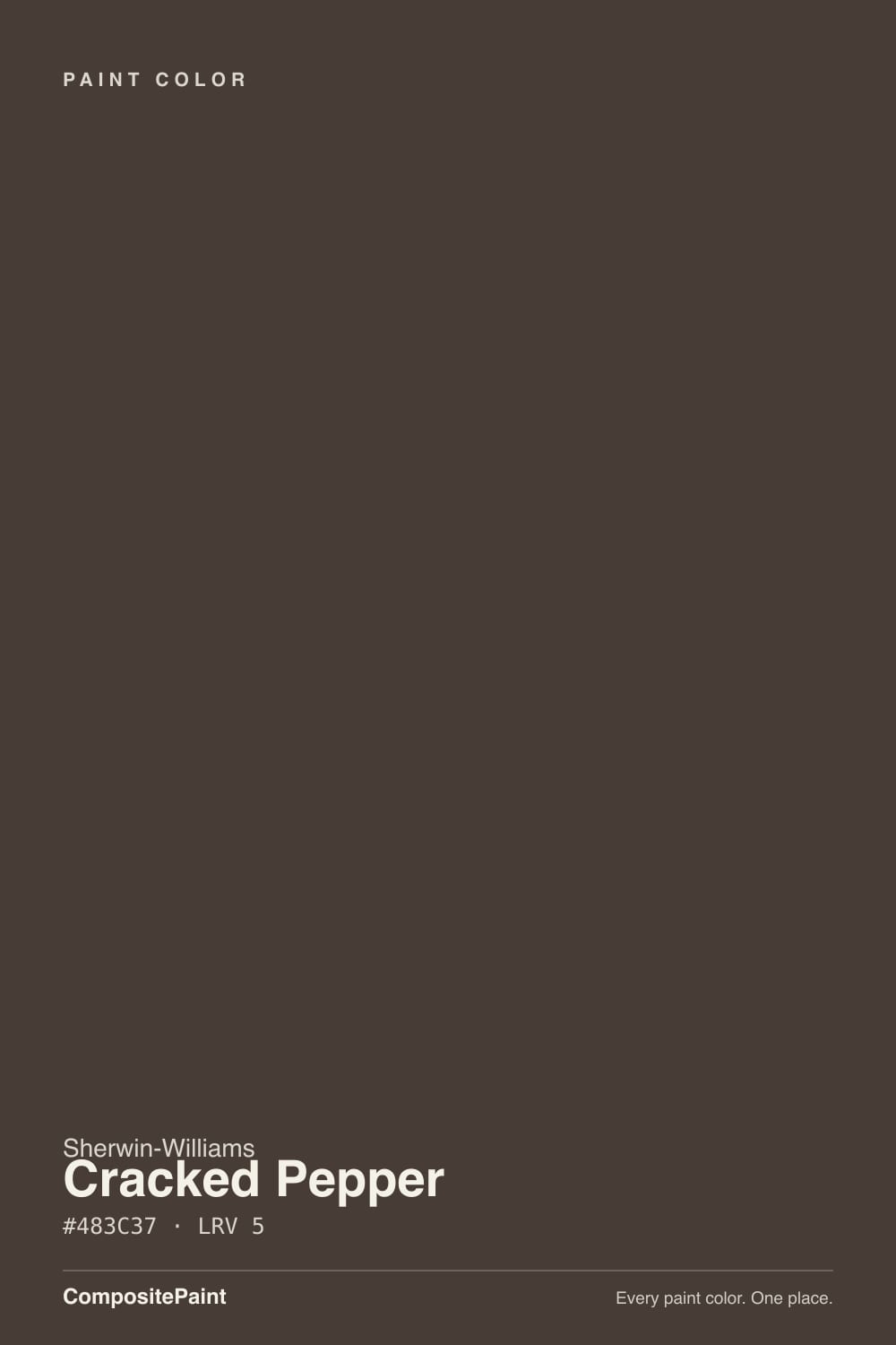
Cracked Pepper
A warm, peppery near-black reviewed honestly: the light it needs, the famous color it keeps getting mistaken for, and what to pick instead.

Jessica has spec'd whites and neutrals for more than 300 rooms and keeps a sample wall of painted drawdowns in her studio. Every color review is checked against real reader rooms in the comments and re-tested when a formula changes. About the testing process →

- 1Mahogany0
- 2Cracked Pepper5
- 3Porpoise13
- 4Cavern Clay20
The Fast Verdict
Cracked Pepper is Sherwin-Williams's own quiet near-black, and it shares its name with a much more famous paint: Behr's 2024 Color of the Year. They are not the same color. This one leans brown, not blue — closer to fresh-ground pepper or dark espresso grounds than gunmetal. At LRV 5 it needs real light to prove that warmth; starve it of daylight and, like every color this dark, it just reads as a void.
Kitchen islands and cabinets in a room with real daylight · front doors and shutters against a light-colored house · built-in bookcases and paneled home offices · anyone who wants a near-black with brown warmth instead of blue-gray coolness
You actually want Behr's famous Color of the Year — that is a different paint at a different store · your room has one small window and no lamp plan · you're painting all four walls with no second light source · you want a true cool black — Tricorn Black or Iron Ore is the color you mean
- A genuine near-black with warm brown depth instead of blue-gray coolness
- Excellent on kitchen islands against stainless steel and light counters
- A confident, weatherproof front-door and shutter color on a light house
- Flatters walnut, brass, and leather on built-ins and paneled rooms
- Small, warm-lit rooms (powder rooms, nooks) take it beautifully
- LRV 5 leaves almost no margin for a room without real light
- Shares its name with Behr's far more famous 2024 Color of the Year — easy to buy the wrong one
- Online descriptions of its undertone contradict each other; trust a home sample, not a search result
- Too dark for most whole-room wall applications without a real light plan
What Color Is Cracked Pepper, Really?
A deep, warm near-black — brown before it is anything else. Read the hex directly and the story is simple: more red than green, more green than blue, the classic signature of a warm charcoal-brown rather than a cool blue-black. Sherwin-Williams files it in its Neutral family, not the blue or gray families, and the coordinating palette the brand itself pairs it with — a rustic terracotta, a soft beige, a muted olive — only makes sense next to a warm base color. That is a useful anchor, because the independent color blogs covering this shade disagree wildly with each other: some call it cool and blue-leaning, others call it charcoal-brown with olive flashes on a sunny day. The paint itself, and Sherwin-Williams's own family placement, side with brown.
At LRV 5 this is genuinely deep — darker than most "dark gray" paints, in the same near-black tier as Tricorn Black and Sherwin-Williams's own Iron Ore. That depth is both the appeal and the catch. On a cabinet door or a front door it reads rich and grounded rather than flat, because there is enough brown warmth in the mix to catch light instead of just absorbing it. On four walls with no other light source, the same depth just becomes darkness — LRV 5 does not leave much room to be wrong about the room's light plan.
The name is the one thing to get right before you buy. Behr also sells a color called Cracked Pepper (PPU18-01), and it was Behr's 2024 Color of the Year — a genuinely famous paint with its own marketing campaign, sold exclusively at Home Depot. It is a close but distinct color: a hair lighter and cooler in person, and a different brand's formula entirely. If a friend recommended "Cracked Pepper" and raved about a 2024 launch, they almost certainly mean the Behr one, not this Sherwin-Williams color. Bring the exact brand and SKU — SW 9580 — to the counter.
Where It Shines
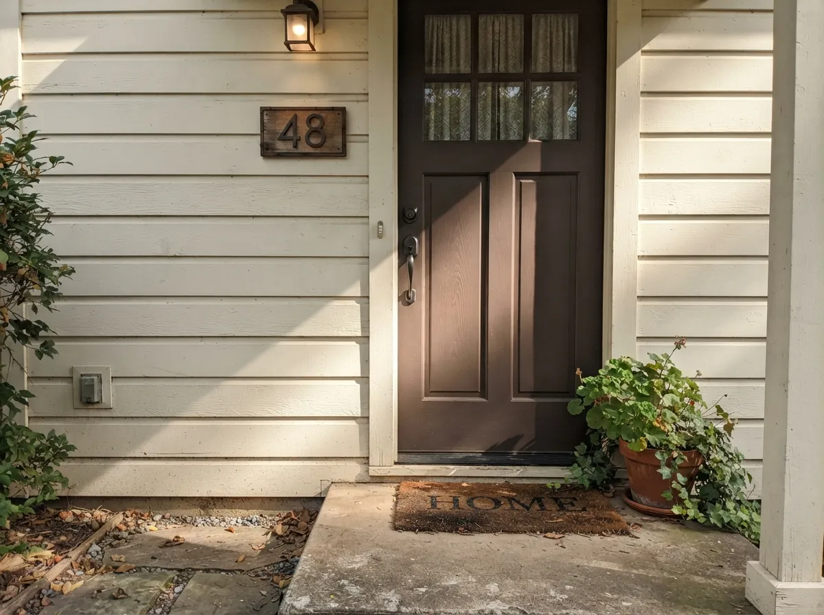
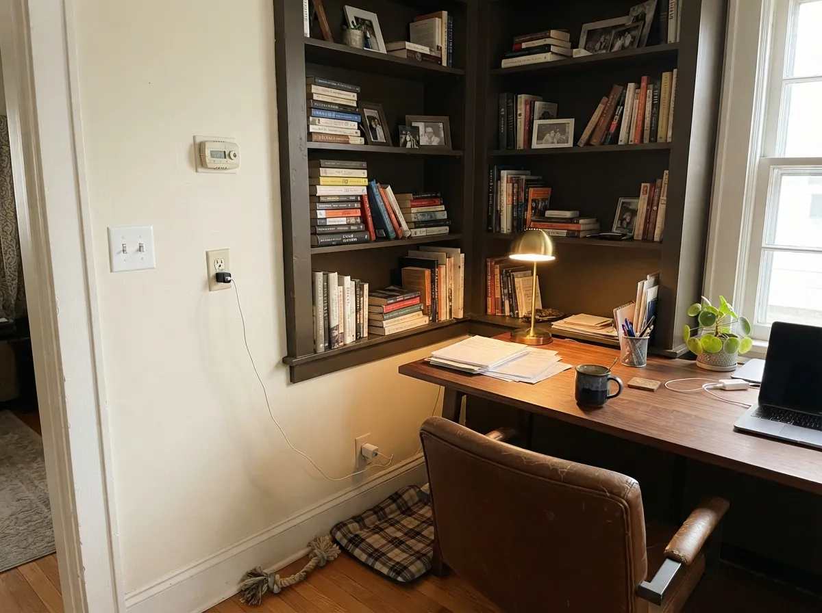
This is a color for surfaces, not blank rooms — give it a kitchen island under real daylight, a front door on a light-colored house, or a built-in bookcase with a lamp nearby, and the brown warmth comes forward instead of just reading as an absence. Against stainless steel and light quartz or marble counters it does exactly what a near-black island is supposed to do: ground the room without going cold. On a front door with a pale or warm-white body color, it reads as a deliberate modern-farmhouse statement rather than simply "the dark door." Built-ins and paneled walls are its other natural home — with brass hardware and walnut shelving, the brown in the paint meets the wood halfway instead of fighting it.
Where It Fails
Almost every regret story that fits this color follows one of three scripts, and none of them are really about the paint. If your plan matches one of these, this is not your color — or at least not for the surface you had in mind.
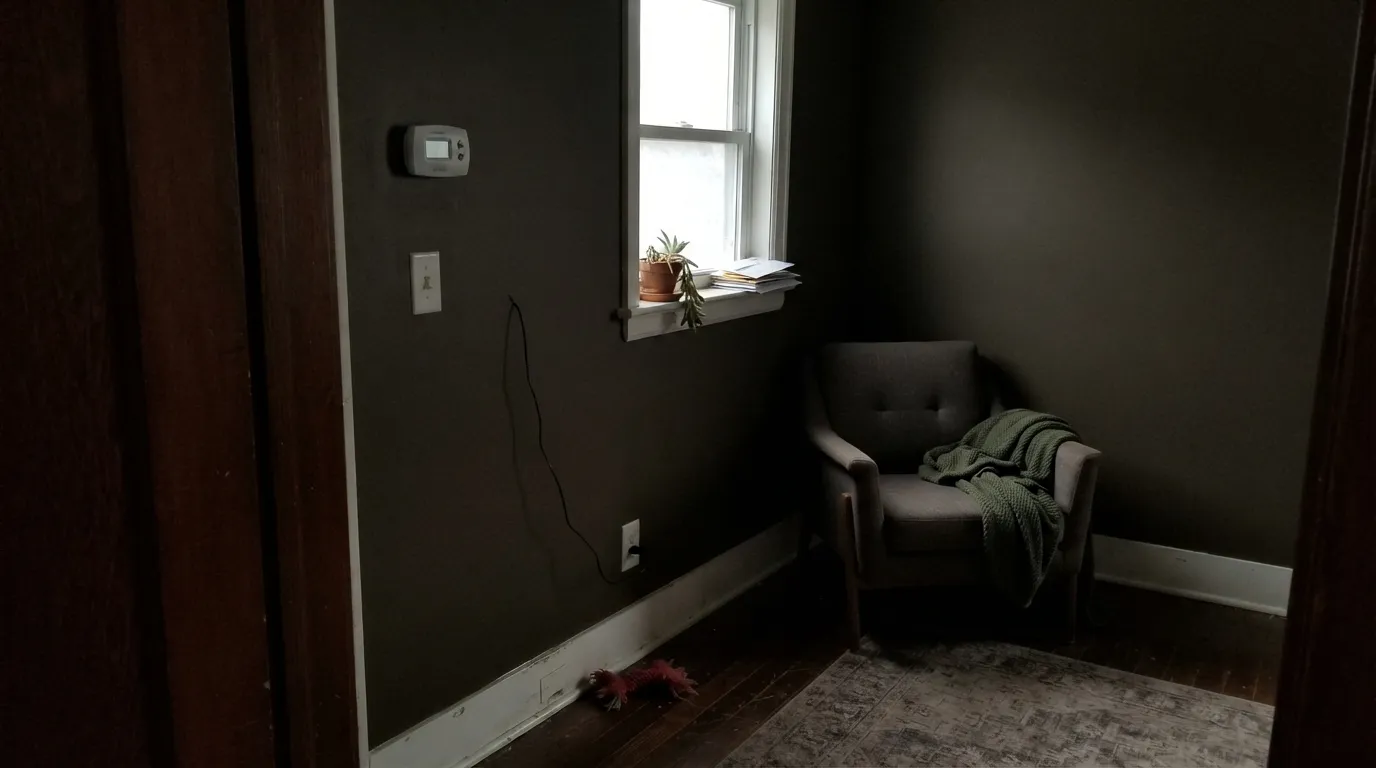
At LRV 5 this paint gives back almost nothing. On an island or a door, other light in the room carries it. On all four walls of a small room with one window and no lamps, it just goes dark and closes the space in — the exact complaint that follows every near-black paint into small bedrooms and hallways. Test it on the actual wall, at the actual time of day, before committing to all four.
Behr's Cracked Pepper was a genuine 2024 Color of the Year with national press coverage; this Sherwin-Williams color quietly shares the name and nothing else — different brand, different formula, a visibly cooler and slightly lighter result from Behr. Readers who fell in love with photos of "Cracked Pepper" online and then bought this one at a Sherwin-Williams store sometimes get a warmer, browner result than they expected. Check the brand and SKU, not just the name, before you buy either one.
Search this color and you will find it called blue-leaning in one place and olive-brown in the next — often on the same page. The paint itself is a warm charcoal-brown; if your in-store swatch reads cool or bluish, that is almost always fluorescent store lighting doing what fluorescent lighting does to every dark neutral, not the color's real character. Sample it at home under your own bulbs before trusting either version of the internet.
Room by Room
With stainless appliances and light quartz, marble, or butcher block, this reads rich rather than heavy. Satin cabinet enamel wipes clean and softens fingerprints on lower cabinets far better than a stark black would.
Against a white, cream, or light-greige exterior it reads as a confident, warm near-black rather than a flat void. Semi-gloss holds up to weather and gives the brown undertone something to catch.
Bookcases, paneled walls, or a study nook with a desk lamp nearby are exactly the low-light-but-not-no-light situation this color wants. Walnut shelving and brass pulls flatter it; satin for durability where books slide in and out.
Small rooms take deep color well, and a powder room with even one window or a good sconce turns this into a jewel-box effect. Skip it in a fully interior powder room with no natural light at all.
One wall in a bright room reads as a deliberate, grounded statement. The same wall in a dim room reads as a hole in the space. This is the room where the light test matters most.
Four walls at LRV 5 need more than one light source to avoid feeling like a cave — a bright south-facing room with layered lamps can pull it off, but most homes should keep this color to accents, doors, and cabinetry instead.
Your Light Is the Risk
A kitchen with real morning or midday light lets the brown warmth show instead of flattening to a plain void. This is the light it was built for.
Without a second light source, the depth stops being rich and starts being a dark hole in the wall. Test on the actual wall before painting all four.
Full sun on an exterior door reads it as a lighter, browner charcoal; as the light drops toward evening it deepens toward true black.
Warm bulbs bring the brown forward, like dark coffee grounds. Cool LEDs flatten it toward a colder charcoal — pick the bulb before you blame the paint.
Most complaints about Cracked Pepper are a light mismatch. Upload a photo of your actual room and see it on your walls — then ask for the same wall in north light or evening lamps before you buy a single sample.
Need It From Another Brand?
Any paint counter can custom-tint Sherwin-Williams SW 9580 directly. If you would rather stay in one brand's own deck, these are the closest stock matches, measured as ΔE2000. Under 2 is a difference you will not see on the wall.
| Brand | Closest color | ΔE | LRV | |
|---|---|---|---|---|
| Behr | Thick Chocolate750B-7 · Behr | 3.7 | 5 | Color page → |
| Benjamin Moore | Black Bean Soup2130-10 · Benjamin Moore | 1.8 | 6 | Color page → |
| Valspar | Dark ChocolateM257 · Valspar | 2.4 | 5 | Color page → |
| Glidden | Western Charcoal50YR 06/041 · Glidden | 2.9 | 6 | Color page → |
| Dutch Boy | Ebony Sky438-6DB · Dutch Boy | 3.9 | 5 | Color page → |
| HGTV Home by Sherwin-Williams | Fertile SoilHGSW 3421 · HGTV Home by Sherwin-Williams | 4.3 | 5 | Color page → |
Similar Sherwin-Williams Colors
The nearest shades to Cracked Pepper within Sherwin-Williams's own range, ranked by perceptual color distance — useful when you want the same look a touch lighter, darker, or warmer.
WCAG 2.1: AA is 4.5 : 1 for normal text, 3 : 1 for large text, AAA is 7 : 1.
Cracked Pepper vs the Colors You're Also Considering
Every Cracked Pepper sample board has the same rivals on it. The numbers show the real lightness gap — then it comes down to which risk you would rather live with.
Pick this if you've already committed to Sherwin-Williams and want the same peppery near-black — warmer and browner than its more famous namesake.
Behr PPU18-01 · LRV 5Cracked PepperPick this if you actually wanted Behr's 2024 Color of the Year — a cooler, slightly lighter charcoal sold only at Home Depot.
Pick this for a warmer, browner near-black that sits a shade softer next to oak floors and brass hardware.
Sherwin-Williams SW 7069 · LRV 6Iron OrePick this for the cooler, truer near-black — the color most whole-house-black projects actually reach for.
Pick this when Urbane Bronze feels like it's dodging the decision — this is the version that actually goes black in normal light.
Sherwin-Williams SW 7048 · LRV 8Urbane BronzePick this for the same warm-brown family two shades lighter — less commitment, still reads dark from across the room.
Pick this for full commitment — Peppercorn flatters more rooms, Cracked Pepper makes the stronger, riskier statement.
Sherwin-Williams SW 7674 · LRV 11PeppercornPick this for a dark gray that still bounces some light back — six points of LRV is the difference between a wall and a void in a dim room.
Inside the Sherwin-Williams deck the near-blacks cluster tightly at LRV 5. Clove SW 9605 at #453E39 is a hair greener and less red. Dark Clove SW 9183 at #4C3D31 and Turkish Coffee SW 6076 at #4D3930 both carry more yellow-brown, so they read as dark brown before they read as black. Armory SW 9600 at #413D3C and Darkroom SW 7083 at #443E40 go the other way, cooler and closer to graphite. Cracked Pepper sits between those two camps.
Across brands, Benjamin Moore Black Bean Soup 2130-10 at LRV 6 is a deltaE of 1.77, close enough to be visually identical in normal room light. Farrow and Ball Cola No. 9918 at LRV 6 is 2.03, and Behr Chocolate Therapy N150-7 at LRV 5 is 2.66, so both are very close but worth sampling first. Dunn-Edwards Bistre Pigment DEBN13 at 3.63 and Dutch Boy Ebony Sky 438-6DB at 3.86 are close but visibly different side by side.
Cracked Pepper Coordinating Colors
The rule for coordinating with this color is the same as for any warm near-black: give it a light, warm partner to sit against, and keep any other dark accent on the cooler side so it doesn't compete. These are the partners that keep the warmth doing the work:
Two Paints Named Cracked Pepper
Name collisions happen constantly in paint decks, and this is one of the more consequential ones. Behr named its 2024 Color of the Year Cracked Pepper (PPU18-01) — a nationally marketed launch with press coverage, in-store displays, and a description leaning toward a cooler, softer blue-gray black. Sherwin-Williams's SW 9580, also called Cracked Pepper, is an older, quieter entry in the deck with no Color of the Year campaign behind it and no direct relationship to Behr's launch.
The two are close in depth — both sit around LRV 5 — but they are not interchangeable, and painters who order by name alone risk getting the wrong brand's can delivered. If a photo or a friend's recommendation for "Cracked Pepper" traces back to 2024 press coverage, that is almost certainly the Behr color. If you're standing in a Sherwin-Williams store, this is the one you'll find, and it is worth buying on its own merits rather than as a stand-in for the famous one.
Cracked Pepper With Wood Tones and Metal Hardware
Warm woods are the easy pairing: walnut, white oak, and butcher block all sit comfortably against this color because the brown in the paint meets the brown in the wood rather than fighting it. Espresso and other near-black wood stains work too, layering depth rather than competing for it.
Metals split more clearly than with most neutrals. Unlacquered brass and warm gold hardware are the classic match, catching light against the dark satin finish exactly the way they do against any other near-black. Matte black hardware works but reads as nearly the same value, so the door or drawer front does more of the visual work than the pull does. Polished chrome and cool nickel are the pairing to think twice about — they read colder against this warm a black than they would against a true blue-black like Iron Ore or Tricorn Black.
Three Ready Palettes Built on Cracked Pepper
A color is never alone on the wall. These are complete combinations in the 60-30-10 pattern, with the reason each one holds together. Every one opens in the visualizer.
The classic two-tone move: a warm soft white on the perimeter cabinets and walls, the near-black reserved for the island where it reads as a deliberate anchor instead of an accident. Extra White on trim keeps the edges crisp without pushing Alabaster toward looking dingy.
Try this palette in your roomA warm white body gives the door room to read as a warm, confident near-black rather than a flat cut-out. Iron Ore on the gutters and window trim is close in depth but cooler, so the door still reads as the one warm, deliberate accent on the facade.
Try this palette in your roomCream walls give the near-black built-ins room to breathe and a lamp somewhere to bounce off; the brown-leaning Taupe on the desk and door trim keeps every dark note in the same warm family instead of fighting for attention.
Try this palette in your roomCracked Pepper FAQ
Is Sherwin-Williams Cracked Pepper the same as Behr's Color of the Year?
No. Behr's Cracked Pepper (PPU18-01) was Behr's 2024 Color of the Year, sold at Home Depot, and reads a hair lighter and cooler in person. This is Sherwin-Williams's own SW 9580 — a different formula, warmer and browner. Same name, two different paints; bring the brand and SKU to the counter, not just the name.
Is it warm or cool?
Warm. The undertone reads as brown before anything else — closer to dark espresso or fresh-ground pepper than to a blue-black or gunmetal. Online descriptions of this color disagree with each other, often because store fluorescent lighting cools down every dark neutral it touches; trust a sample taken home over a search result.
Is it good for kitchen cabinets or an island?
Yes, especially as the contrast color on an island under real daylight, against stainless steel and light counters. A full kitchen of this color needs more thought — pair it with a light perimeter so the room keeps some brightness.
Can I use it on a front door or exterior?
Yes, and it is one of its best jobs — against a light or warm-white body color it reads as a confident, weatherproof near-black. Semi-gloss holds up outdoors and gives the brown undertone something to catch.
How dark is LRV 5, really?
Very dark — in the same near-black tier as Sherwin-Williams's own Iron Ore (LRV 6) and Tricorn Black (LRV 3). At that depth the paint reflects almost no light back, so the room's other light sources are doing most of the work; test it on your actual wall before committing to all four.
What wall color goes with Cracked Pepper trim or built-ins?
A warm soft white or cream — Alabaster or Swiss Coffee both keep the handoff gentle. A stark, cool white makes the near-black look like a cutout rather than a considered accent; keep the surrounding color on the warm side.
Have you painted with Cracked Pepper?
Rate it — one tap helps the next reader decide.
Ask a Question