Neutral Ground
The light warm beige people buy when they want warmth without making a decision — reviewed honestly, including the one hour of the day it goes gold.

Jessica has spec'd whites and neutrals for more than 300 rooms and keeps a sample wall of painted drawdowns in her studio. Every color review is checked against real reader rooms in the comments and re-tested when a formula changes. About the testing process →
- 1Revere Pewter55
- 2Agreeable Gray60
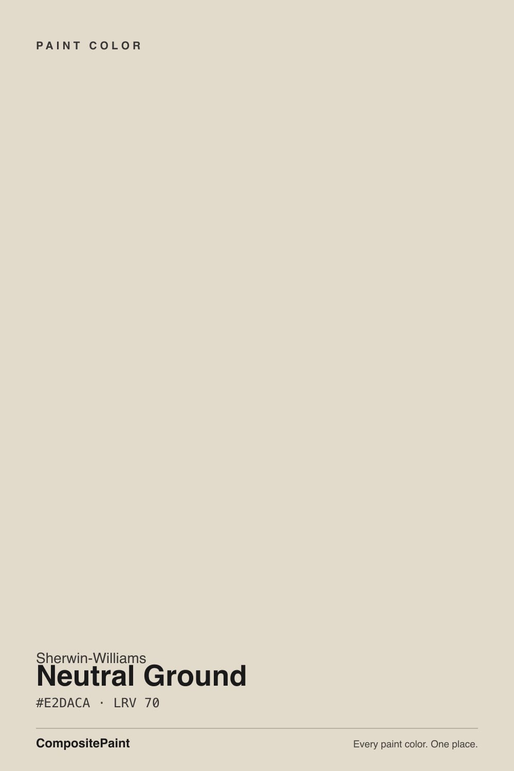
- 3Neutral Ground70
- 4Pearly White77
- 5Dover White83
The Fast Verdict
Neutral Ground is the color you pick when the floors, stone and wood are already warm and you just want the walls to agree with them. At LRV 70 it stays light without pretending to be white, and it holds up in north light where most warm beiges go dull.
The catch is in the name: this is a beige, not a neutral, and in late-afternoon west sun or under 2700K bulbs the yellow-tan comes forward hard. Get the trim white right and it is a genuinely easy whole-house color; get it wrong and the walls look dirty.
Whole-house walls over oak, travertine or warm brick · open plans that need warmth without a color decision · north-facing rooms that feel cold · cabinets and millwork you want soft rather than bright
Your floors and counters are cool grey · your trim is a cold white like Extra White · you actually want an off-white, not a beige · a west window floods the room every afternoon
- Warm enough to flatter oak, travertine and brick without ever going orange
- LRV 70 keeps a room light while still reading as a color, not another white
- Genuinely whole-house safe — flows through open plans and hallways
- Holds its warmth in north light, where most warm beiges go dull
- Soft, lived-in finish on cabinets; hides handprints better than a bright white
- Flashes gold in late-afternoon west sun and under 2700K bulbs
- Reads dirty next to a cool bright white like Extra White SW 7006
- Fights cool grey floors, grey quartz and chrome — the tan lean shows
- The name promises neutral; on a full wall it is plainly beige
What Color Is Neutral Ground, Really?
It is a warm beige, and the name is the least accurate thing about it. The hue sits at 40 degrees — red-orange territory — at around 29 percent saturation, which is real color for something this light. On a 2-inch chip it passes for an off-white. On four walls it is a soft yellow-tan, and by the second coat nobody in the house is calling it neutral.
LRV 70 means it returns about seventy percent of the light that lands on it: light, but not white. Stand it next to Alabaster SW 7008 at LRV 82 and the twelve-point gap is obvious — Alabaster still reads as a white, Neutral Ground clearly reads as a color. Go the other direction and Accessible Beige SW 7036 at LRV 58 is a full step deeper and greyer. Neutral Ground sits in the useful middle: bright enough to carry a dim room, deep enough that white trim has something to cut against.
Undertone in one line: warm yellow-tan on a red-orange base — never green, never grey. If it looks pink on your wall, that is a red-toned floor or a west window bouncing into it, not the paint.
Where It Shines
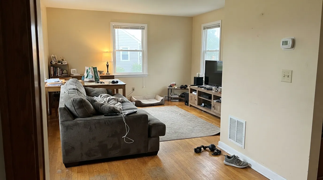
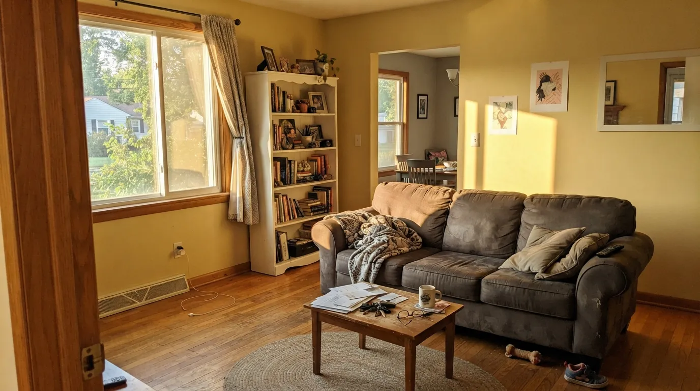
Give it warm fixed finishes — oak, travertine, brick, brass — and ordinary daylight, and it does exactly the job it is bought for: warmth with no decision attached. These are the rooms where it earns its whole-house reputation.
Where It Fails
Almost every bad Neutral Ground story comes down to three situations, and all three are about what sits next to it rather than what is in the can. If your room matches one, a different color saves you two weekends and a second gallon.
Low gold sun lands on a gold-based color and the two stack up. For an hour or two the walls flash properly yellow, and anyone who sampled at noon never saw it coming. If the afternoon light is strong, use Egret White SW 7570 instead — same LRV 70, noticeably less yellow in it.
Against a cool bright white like Extra White SW 7006, the walls stop reading warm and start reading dirty. This is the single most common complaint and it is a pairing mistake, not a paint fault. Keep the trim white warm and about ten to twelve points lighter — Pure White SW 7005 for crisp, Alabaster SW 7008 for soft.
Grey LVP, grey-washed oak and cool quartz sit at the opposite temperature, so they push the tan forward and the walls can read peachy beside them. In a genuinely cool scheme, stop fighting it and go greige: Agreeable Gray SW 7029, or Repose Gray SW 7015 if the room needs to stay cooler still.
Room by Room
With oak floors, leather or a warm rug it settles in immediately and stops competing with the furniture. Eggshell on the walls, Pure White SW 7005 on trim in semi-gloss. Check it once at 4 p.m. before you commit if the windows face west.
This is where the whole-house reputation comes from: it carries from kitchen to dining to hall without ever clashing with a different room's finishes. Eggshell throughout. Add one dark note somewhere — Urbane Bronze SW 7048 on a door or console — so the flow does not turn into blandness.
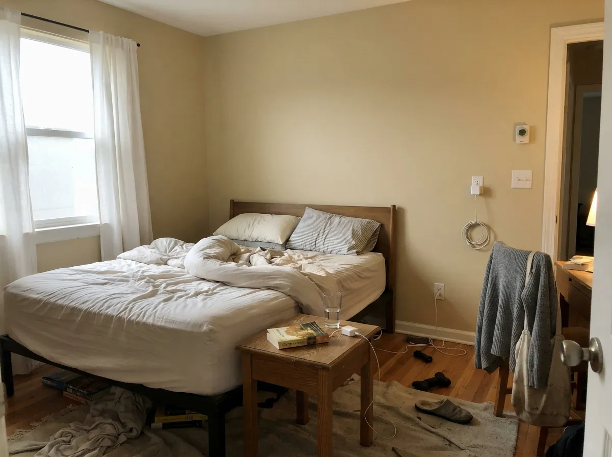
Under 2700K lamps it turns cozy and distinctly gold; at 3000K it stays the color you chose. Eggshell walls, and one muted color note like Evergreen Fog SW 9130 on the headboard wall keeps it from reading like a rental.
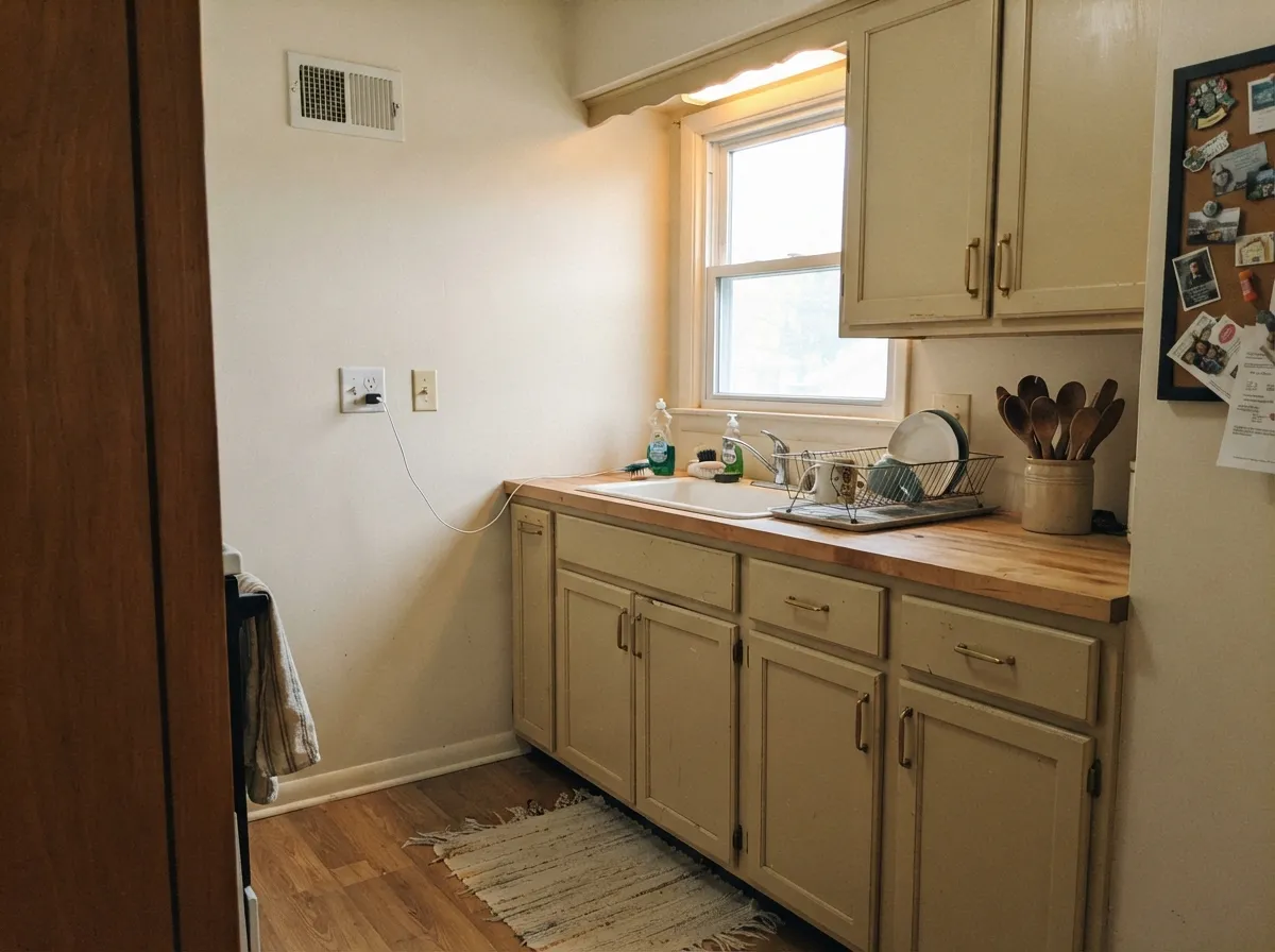
Perfect against butcher block, warm granite, travertine or a creamy quartz. Against a cool white-and-grey-veined quartz it looks yellowed, and no sheen fixes that. Satin or eggshell so splashes wipe off.
On cabinets it gives a lived-in, older-house finish instead of a showroom one, and it hides knuckle marks far better than a bright white. Satin, in a urethane-fortified cabinet paint. Pair with brass or oil-rubbed bronze hardware, not chrome.
Full sun reads it lighter and cleaner than it looks inside, which suits stucco, stone and warm brick. Give it dark shutters and trim — Iron Ore SW 7069 or Urbane Bronze SW 7048 — because on its own across a whole facade it can go flat.
Your Light Is the Risk
Cool daylight mutes the gold and it reads as a calm, warm greige. Its strongest room.
All-day sun pulls the tan forward — light beige, not off-white. Most people like it.
Gold sun on a gold-based color. Walls flash yellow for an hour or two.
2700K bulbs deepen the yellow-tan. Move to 3000K and it behaves again.
Most complaints about Neutral Ground are a light mismatch. Upload a photo of your actual room and see it on your walls — then ask for the same wall in north light or evening lamps before you buy a single sample.
Need It From Another Brand?
Any paint counter can custom-tint Sherwin-Williams SW 7568 directly. If you would rather stay in one brand's own deck, these are the closest stock matches, measured as ΔE2000. Under 2 is a difference you will not see on the wall.
| Brand | Closest color | ΔE | LRV | |
|---|---|---|---|---|
| Behr | Varnished IvoryMQ3-40 · Behr | 0.5 | 71 | Color page → |
| Benjamin Moore | SonnetAF-55 · Benjamin Moore | 0.9 | 70 | Color page → |
| Valspar | Gossamer Green8004-23A · Valspar | 1.0 | 71 | Color page → |
| PPG / Glidden | Antique WhitePPG1024-2 · PPG / Glidden | 0.8 | 70 | Color page → |
| Glidden | Scotch MistPPG14-07 · Glidden | 1.4 | 71 | Color page → |
| Dutch Boy | Dust Flats414-1DB · Dutch Boy | 1.3 | 72 | Color page → |
Similar Sherwin-Williams Colors
The nearest shades to Neutral Ground within Sherwin-Williams's own range, ranked by perceptual color distance — useful when you want the same look a touch lighter, darker, or warmer.
WCAG 2.1: AA is 4.5 : 1 for normal text, 3 : 1 for large text, AAA is 7 : 1.
Neutral Ground vs the Colors You're Also Considering
Every Neutral Ground sample board has the same rivals on it. The numbers show the real lightness gap — then it comes down to which risk you would rather live with.
Pick this if you want the beige to stay light and quiet on the wall.
Sherwin-Williams SW 7036 · LRV 58Accessible BeigePick this if you want the beige to actually show — twelve points deeper and greyer.
Pick this if you want color on the wall rather than one more white.
Sherwin-Williams SW 7008 · LRV 82AlabasterPick this for an airy warm off-white, and as the trim white above it.
White Sesame SW 9586 at LRV 71 is the closest neighbor, one point lighter at #E3DBCD and a hair less golden. Warm Winter SW 9506 shares the LRV of 70 but goes further toward gold at #E1D9C6, so it is the choice when you want more obvious warmth. Oat Milk SW 9501, also at LRV 70, is the quieter option at #DEDACD, with less red in it.
Bauhaus Buff SW 7552 and Divine White SW 6105 both sit at LRV 72, slightly lighter and slightly creamier, and Egret White SW 7570 at LRV 70 is the least yellow of the group at #DFD9CF. If Neutral Ground feels too tan, Egret White is the first place to look.
Across brands, Behr Varnished Ivory MQ3-40, Farrow and Ball Clunch No. 2009, and Benjamin Moore Sonnet AF-55 are effectively the same color, and Valspar Gossamer Green 8004-23A is visually identical in normal room light despite the name.
Neutral Ground Coordinating Colors
The rule with Neutral Ground is simple: keep the whole scheme on the warm side of the line. It sits happily with warm whites, deeper beiges, muted greens, navy and bronze, and it argues with cool greys, icy whites and blue-grey stone. These are the partners that come up again and again in real houses:
The Neutral Ground Ladder — Lighter and Darker
Most people who sample Neutral Ground are really asking one of two questions: is there a version of this that is lighter, or one that has more to say? The ladder answers both without leaving the same warm family, which matters when the rest of the house is already painted.
Going up, Greek Villa SW 7551 and Alabaster SW 7008 are the two steps that keep the warmth but read as whites, and both make sensible trim above Neutral Ground walls. Going down, Accessible Beige SW 7036 is the obvious next stop and Balanced Beige SW 7037 is deeper again, greyer, and good for a den or a lower cabinet run. Kilim Beige SW 6106 is the warmer, more golden version of the same idea if you want the beige to be unmistakable.
Neutral Ground With Wood Floors, Tile and Stone
This is the question that decides the whole project. Honey oak, hickory, walnut, cork, travertine, limestone and warm brick all sit comfortably against Neutral Ground because the wall meets them at the same temperature — it is one of the few light colors that calms builder-orange oak instead of amplifying it.
The finishes that need a real sample board are cool grey LVP, grey-washed engineered wood and white quartz with grey veining. Beside them the tan in the wall comes forward and the room can read peachy, especially in the afternoon. It is not always fatal — a warm rug, wood furniture and brass fixtures pull it back — but tape a large sample directly above the actual floor and look at it twice before you open the second gallon.
Three Ready Palettes Built on Neutral Ground
A color is never alone on the wall. These are complete combinations in the 60-30-10 pattern, with the reason each one holds together. Every one opens in the visualizer.
Pure White is bright enough to draw a clean line against LRV 70 walls but still carries a trace of warmth, so the trim reads crisp instead of cold. Urbane Bronze is the single dark note the scheme needs to stop feeling like a builder package.
Try this palette in your roomAlabaster shares the same warm base, so the wall-to-cabinet handoff is soft and the walls never look dirty next to the doors. Iron Ore grounds the room at the 10 percent slot and gives brass hardware something to sit against.
Try this palette in your roomEvergreen Fog is muted enough to read restful at 30 percent rather than decorated, and its grey-green sits comfortably against a yellow-tan wall. Greek Villa keeps the trim warm and fourteen points lighter, which is separation you can see without contrast that shouts.
Try this palette in your roomNeutral Ground FAQ
Does Neutral Ground look yellow?
Sometimes, and it depends on the hour. In north light and under 3000K bulbs it reads as a soft warm greige. In late-afternoon west sun or under 2700K lamps the gold comes forward and people do call it yellow. Sample a large board and look at it at 4 p.m. and again at night before you buy the gallons.
Neutral Ground or Accessible Beige?
Same family, twelve LRV points apart. Neutral Ground at 70 keeps a room light and reads almost like a warm white from across the room; Accessible Beige at 58 is a step deeper and greyer, so the beige is obvious. Choose Neutral Ground for dim rooms and small spaces, Accessible Beige when you want the color to show and the room already has plenty of daylight.
Does it work with white kitchen cabinets?
Only with warm whites. Against Alabaster SW 7008, Greek Villa SW 7551 or Pure White SW 7005 doors it looks intentional. Against a cool bright white like Extra White SW 7006 the walls look dingy, and that pairing is behind most of the complaints about this color.
Can Neutral Ground look pink?
It can flash slightly peachy, and the numbers explain why: the hue sits at 40 degrees, on the red-orange side. What triggers it is usually red-toned oak floors, terracotta tile or low west sun bouncing into the wall. On its own, in daylight, it reads yellow-tan rather than pink.
Is Neutral Ground too dark for a small room?
No. At LRV 70 it returns most of the light in the room, and its warmth stops a small dim space from feeling cold. It will look clearly deeper than a white ceiling, so either paint the ceiling a soft white like Greek Villa SW 7551 or accept the contrast as a feature.
Is it a good whole-house color?
Yes, and that is its main job. It flows from room to room without clashing because it has no strong second undertone to fight with different floors and stone. Keep one trim white throughout and change sheen, not color, between walls and woodwork.
How many coats does it take?
Two over any existing light color. Going over a deep beige, red or navy, prime first with a tinted primer — otherwise you are buying a third finish coat to hide the old wall. Roll a full test board rather than judging from a chip; at this lightness, chips lie.
Have you painted with Neutral Ground?
Rate it — one tap helps the next reader decide.
Ask a Question