Rusty Gate
The rusted-iron red-brown reviewed honestly: where it earns the farmhouse look, the light that turns it muddy, and what to pick instead.

Jessica has spec'd whites and neutrals for more than 300 rooms and keeps a sample wall of painted drawdowns in her studio. Every color review is checked against real reader rooms in the comments and re-tested when a formula changes. About the testing process →
- 1Burnt Cinnamon9
- 2Rookwood Terra Cotta14
- 3Rusty Gate19
- 4Caramelized35
- 5Venetian Plaster42
The Fast Verdict
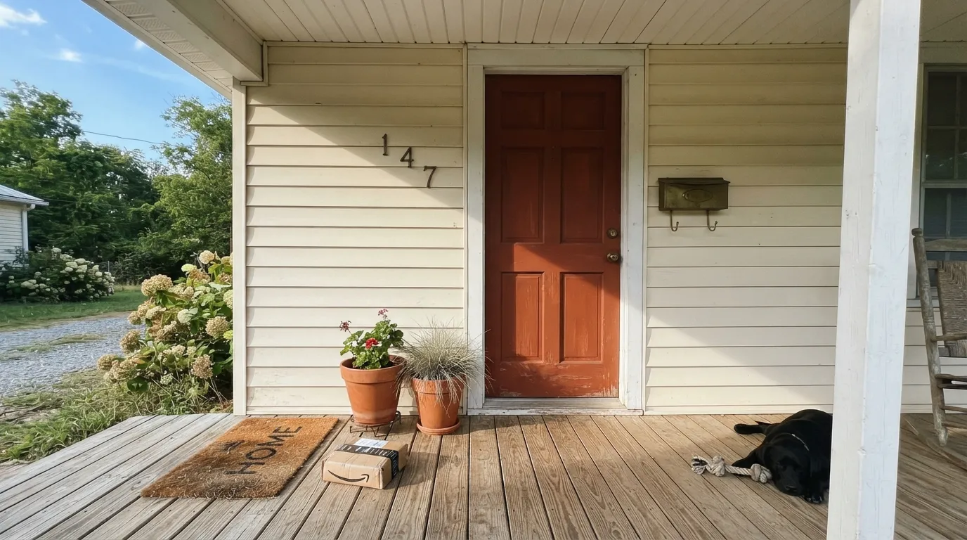
Rusty Gate is Behr's answer to weathered, oxidized iron — a red-brown with enough orange left in it to read as rust, not just brown. In direct sun on a door or a gate it looks exactly like its name: a patinaed metal surface that's been outside for decades. Pull it indoors onto four walls and it turns into something heavier and darker than most buyers expect. This is a door-and-accent color first, a wall color a distant second.
Front doors · gates and shutters · garage doors · kitchen islands and cabinets · one accent wall in a sunlit room
You want it on all four walls of a bedroom or living room · your room runs shaded or north-facing · your house already has orange-red brick · you're chasing a soft, muted rust rather than a saturated one
- The most convincing "weathered rust" red-brown in the Behr deck
- Sold across nearly every Behr product line — real demand for doors, exteriors, cabinets
- Glows in full sun on doors, gates, shutters, and garage doors
- Anchors a kitchen island without needing a full room commitment
- Reads as a deliberate, custom accent against white or cream siding
- Too dark and saturated for most buyers' idea of a full wall color
- Goes flat and muddy without direct sun
- Can clash or blur against true red-orange brick
- Easy to underestimate how close to near-black it reads at LRV 19
What Color Is Rusty Gate, Really?
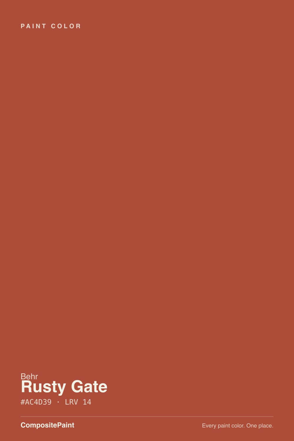
A deep, warm rust-brown with red pushed forward and just enough orange left to keep it from reading as plain brown. Behr built its M-series around exactly this kind of reference color — named for the thing it's supposed to resemble, in this case an old iron gate gone orange-red with oxidation — and Rusty Gate earns the name. It isn't a trend color chasing a moment; it's sold across nearly every Behr product line, from wall paint to exterior masonry to cabinet-and-trim enamel, which is the tell that real buyers keep specifying it for doors, shutters, and metal hardware, not just walls.
At LRV 19 this is a genuinely dark, saturated color — closer in depth to a near-black than to the mid-tone terracottas it gets compared to. That depth is what makes it convincing as rust: pale versions of this hue read as dusty clay, but Rusty Gate holds enough darkness to look like real oxidized metal. The tradeoff is that a full room of it behaves like a deep, moody color, not a warm accent — plan for it the way you'd plan for a near-black, not a mid-tone red.
Undertone in one line: red first, orange second, no brown pretending to be neutral. If your sample reads flat brown with no life in it, that's shade or cool light draining the orange — not the paint changing character.
Where It Shines
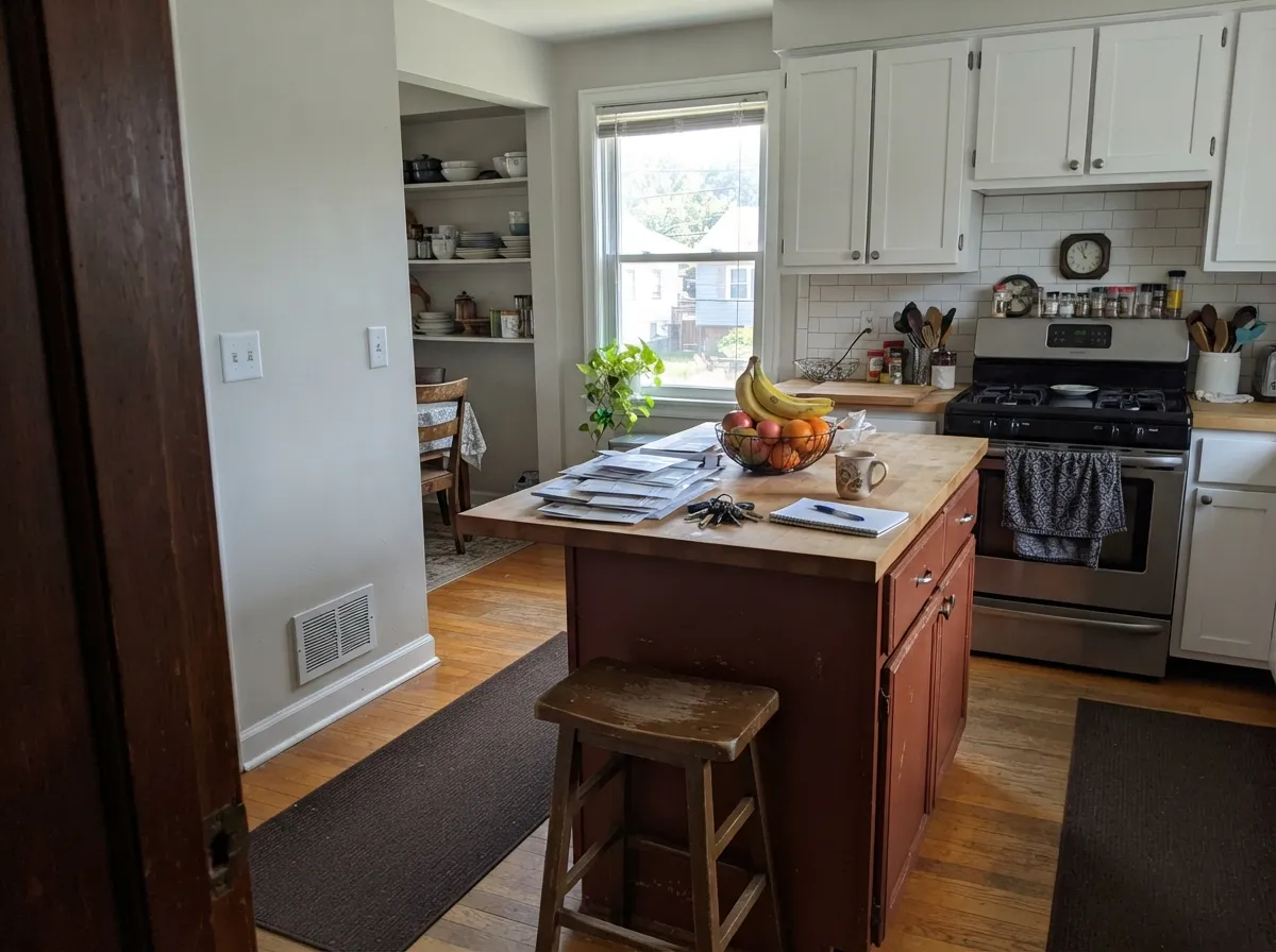
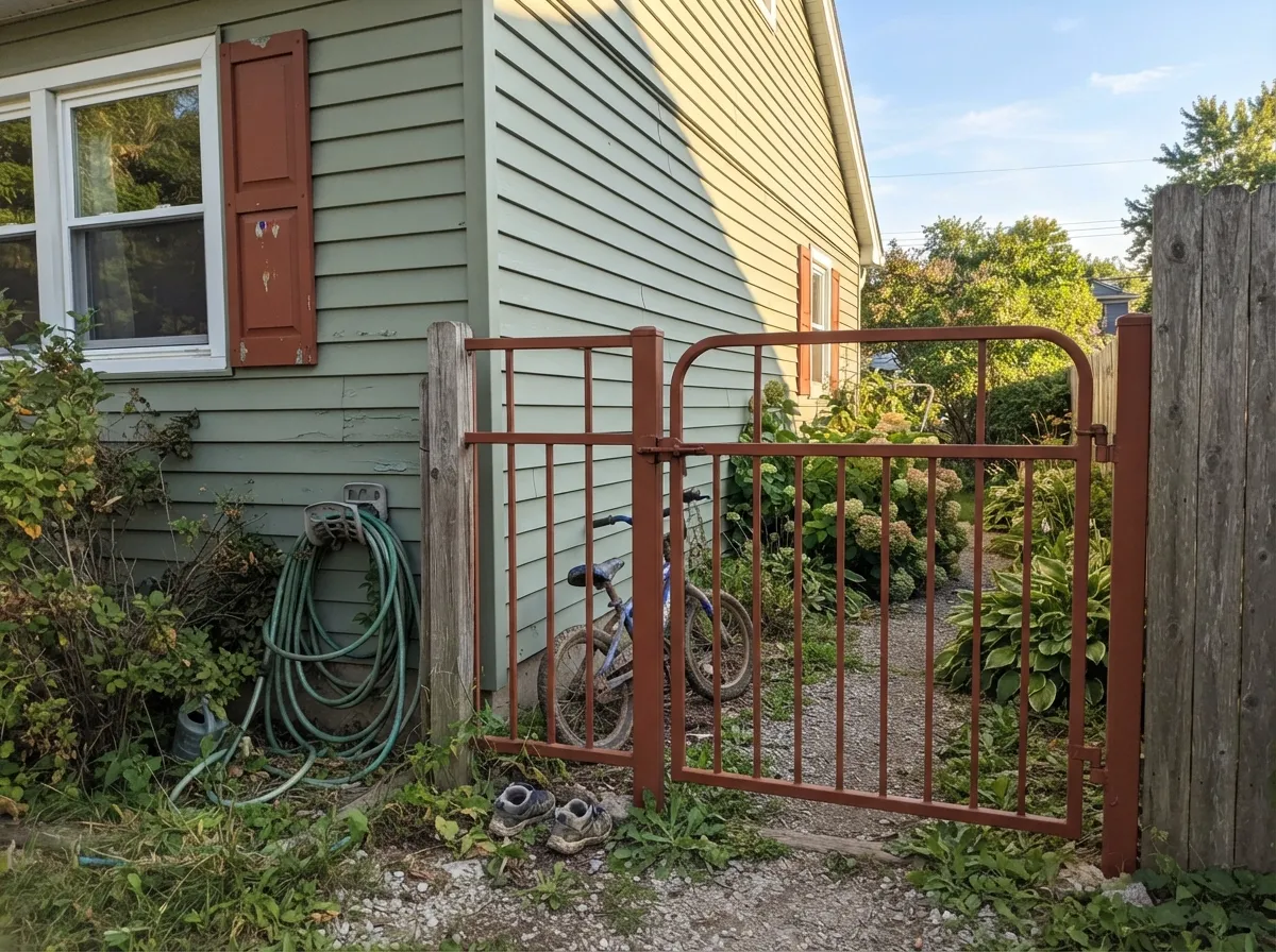
Give it full sun and a metal or wood surface and it is close to unbeatable. A front door, a wrought-iron-style gate, a garage door, or exterior shutters in direct light show off exactly the weathered-copper glow the name promises, and the color reads intentional and custom rather than accidental. Indoors, its best job is a kitchen island or a run of lower cabinets under white uppers — enough saturation to anchor the room without covering every wall in a color this dark.
Where It Fails
Almost every disappointed review of Rusty Gate traces back to one of three setups, and all three are predictable before the first coat goes on. None of them are the paint's fault — but if your project matches one of these, sample a full board in your actual light before you commit a whole surface to it.
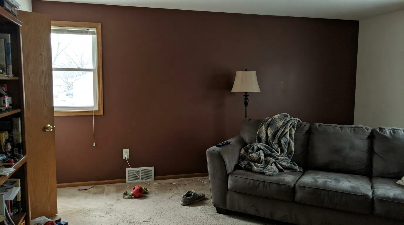
At LRV 19, Rusty Gate on four walls reads closer to a near-black than a warm red-brown, especially once furniture and shadow are added. Readers who picked it hoping for a cozy terracotta room report a space that feels smaller and darker than the paint chip suggested. Use it on a door, an island, or one wall with real daylight — not the whole room.
Without direct sun the orange drops out and the color goes flat, muddy brown — the exact opposite of the vivid rust in the online photos. If the surface you're painting doesn't get real light for part of the day, this color will not hold its personality there.
Because Rusty Gate carries its own strong red-orange note, it can compete with — rather than complement — a house that already has orange-red brick. On plain siding or a lighter, more neutral brick it reads as a deliberate accent; against warm brick it can blur into the facade or clash with it. Test the pairing in daylight before painting a door or shutters.
Room by Room
One wall, real daylight, and it works as a grounding, saturated color behind a sofa or fireplace. All four walls is where the complaints start — the room reads dark and heavy rather than warm.
An island or a run of lower cabinets under white or cream uppers is the classic move: enough color to anchor the room, contained enough not to overwhelm it. Satin cabinet enamel wipes clean and holds up to daily handling.
As a single accent wall behind the headboard in a sunlit room it can feel rich and cocooning. As the wall color for all four walls, most buyers find it darker and moodier at night than they planned for.
A small vanity in Rusty Gate under a light-colored wall reads custom and expensive, the same logic as the kitchen island. A full powder room in this color needs a very bright fixture and warm bulbs to avoid feeling like a cave.
This is the job Rusty Gate was built for. Semi-gloss on a door in real daylight gives the weathered-iron look the name promises, and it reads as a deliberate design choice against white, cream, or greige siding.
Shutters, a metal gate, or a garage door in full sun are where the color performs closest to its marketing photos. It's sold as an exterior masonry and stain-blocking paint specifically because homeowners use it this way — on trim and accents, not full facades.
Your Light Is the Risk
The orange comes forward and the surface reads like real oxidized metal — the look every listing photo is selling. Best on south-facing doors and gates.
The red-orange drains out and what's left is a flat, muddy brown with none of the rust character. Sample on the actual surface, in the actual light, before committing.
Morning and evening low sun intensifies the red; midday light flattens it toward plain brown. Expect it to look like two different colors over the course of a day.
Warm 2700K bulbs deepen it into a cozy near-black brown at night. Cool white LEDs flatten it toward dull, muddy clay — keep the bulbs warm if you want the rust to survive after dark.
Most complaints about Rusty Gate are a light mismatch. Upload a photo of your actual room and see it on your walls — then ask for the same wall in north light or evening lamps before you buy a single sample.
Need It From Another Brand?
Any paint counter can custom-tint Behr M200-7 directly. If you would rather stay in one brand's own deck, these are the closest stock matches, measured as ΔE2000. Under 2 is a difference you will not see on the wall.
| Brand | Closest color | ΔE | LRV | |
|---|---|---|---|---|
| Sherwin-Williams | Red CentSW 6341 · Sherwin-Williams | 1.4 | 19 | Color page → |
| Benjamin Moore | Rust2175-30 · Benjamin Moore | 2.4 | 19 | Color page → |
| Valspar | Sienna SkyT524 · Valspar | 2.4 | 20.7 | Color page → |
| Glidden | Old Copper Kettle60YR 19/432 · Glidden | 2.6 | 19 | Color page → |
| Dutch Boy | Solar Fire312-7DB · Dutch Boy | 3.9 | 18 | Color page → |
| HGTV Home by Sherwin-Williams | Terracotta PotHGSW 2093 · HGTV Home by Sherwin-Williams | 1.4 | 20 | Color page → |
Similar Behr Colors
The nearest shades to Rusty Gate within Behr's own range, ranked by perceptual color distance — useful when you want the same look a touch lighter, darker, or warmer.
WCAG 2.1: AA is 4.5 : 1 for normal text, 3 : 1 for large text, AAA is 7 : 1.
Rusty Gate vs the Colors You're Also Considering
Every Rusty Gate sample board has the same rivals on it. The numbers show the real lightness gap — then it comes down to which risk you would rather live with.
Pick this for the darker, more weathered, more clearly "rust" version of the same family.
Behr BXC-39 · LRV 17Sunset OrangePick this for a lighter, more clearly red-orange version from the same brand — less brown, more brick.
Pick this when you want real depth and a metal-like finish, not a pastel clay.
Sherwin-Williams SW 7701 · LRV 24Cavern ClayPick this for a lighter, softer terracotta that reads more clay than iron — easier to live with on a whole wall.
Rusty Gate Coordinating Colors
The rule for coordinating with Rusty Gate is simple: keep the neighbors quiet. It wants a light, warm-neutral partner to sit against — cream siding, a soft greige, or a warm white — and a near-black to sharpen the contrast on trim or hardware. A muted sage or olive green is its best colored partner; it sits nearly opposite on the wheel, so the two read as a deliberate pairing instead of a clash. These are the partners that keep showing up in real projects:
Why Rusty Gate Is Sold Everywhere but Talked About Nowhere
Rusty Gate doesn't have a Color of the Year moment or a viral TikTok behind it, but Behr carries it across nearly every product line it sells — interior wall paint, exterior masonry paint, stain-blocking exterior primer, and cabinet-and-door enamel. That spread is a better signal of real demand than any trend list: contractors and homeowners keep specifying this exact number for doors, gates, and shutters because it does one job — looking like oxidized iron — better than the more famous terracottas around it.
That also explains why it reads differently than its trendier cousins. Colors built for a moment tend to sit lighter and softer so they photograph well in a bright, styled room. Rusty Gate was built to be looked at outdoors, on a door or a piece of metal, which is why it holds its saturation at a depth (LRV 19) that surprises buyers who only ever saw it on a screen.
Rusty Gate With Wood Tones and Metals
Weathered and reclaimed wood are its natural company — gray-washed cedar, aged barnwood, and rough-sawn trim all read as if they belong on the same building as this color. Freshly milled, orange-toned pine or new cedar competes with it instead, since both are warm and both want attention.
Metal hardware is where the color's name pays off: matte black, aged bronze, and hand-forged iron finishes all look like they could have come from the same weathered gate the color is named for. Polished brass and chrome read too clean and modern next to it — save those for a lighter accent color instead.
Three Ready Palettes Built on Rusty Gate
A color is never alone on the wall. These are complete combinations in the 60-30-10 pattern, with the reason each one holds together. Every one opens in the visualizer.
Warm cream siding keeps the palette light enough to let the door do the work; the near-black shutters give the rust one dark neighbor so the whole facade reads deliberate, not accidental. All three are Behr, so a painter can match everything off one deck.
Try this palette in your roomAlabaster keeps the room bright enough that the island doesn't read cave-dark; Iron Ore on hardware and a pendant fixture ties the near-black note back to the island without adding a second big color decision.
Try this palette in your roomRust and sage sit almost opposite each other on the wheel, so the door and shutters pop instead of blending into the siding. White Dove trim keeps the contrast from feeling harsh and gives the eye a resting point between the two saturated colors.
Try this palette in your roomRusty Gate FAQ
Is Rusty Gate more orange or more brown?
Both, depending on the light. In direct sun the red-orange is unmistakable and it looks like real oxidized metal. In shade or under cool light the orange drops out and it settles into a flatter, plainer brown. It never reads as a neutral — there's always red in it.
Is it a good front door color?
It's arguably the color's best job. Semi-gloss on a door in real daylight gives the weathered-iron look it's known for, and it pairs cleanly with white, cream, or greige siding. This is the use case the color was built around.
Can I paint a whole room in Rusty Gate?
You can, but go in expecting a dark, saturated room, not a warm accent color. At LRV 19 four walls of this reads much closer to near-black than the swatch suggests. Most buyers who love it use it on one wall, a door, or cabinetry instead.
What color goes with Rusty Gate on a house exterior?
Light, quiet neutrals do the most for it: warm off-whites like Behr Swiss Coffee, greiges, or a muted sage. Avoid pairing it with siding or brick that's already orange-red — two competing warm colors fight instead of complementing each other.
How is it different from Behr Sunset Orange?
Sunset Orange is lighter (LRV 17) and reads more clearly brick-red. Rusty Gate is darker (LRV 19) and leans further into brown, which is what gives it the weathered, oxidized-metal look instead of a cleaner brick look.
Does it work on kitchen cabinets?
Yes, especially as an island or a lower-cabinet color under white or cream uppers. It's sold in Behr's cabinet-and-trim enamel line specifically because homeowners use it this way. A satin, urethane-fortified finish holds up to daily use.
Have you painted with Rusty Gate?
Rate it — one tap helps the next reader decide.
Ask a Question