Maple Glaze
Behr's caramel-brown reviewed honestly: the cabinets and doors it was built for, the cool light that turns it muddy, and the cabinet-enamel quirk real owners keep flagging.

Jessica has spec'd whites and neutrals for more than 300 rooms and keeps a sample wall of painted drawdowns in her studio. Every color review is checked against real reader rooms in the comments and re-tested when a formula changes. About the testing process →
- 1Burnt Cinnamon9
- 2Rookwood Terra Cotta14
- 3Maple Glaze19
- 4Caramelized35
- 5Venetian Plaster42
The Fast Verdict
Maple Glaze is Behr's answer to a paint-store terracotta: a mid-depth brown with a real orange pulse, built explicitly for cabinets, doors, and trim as much as for walls. In warm light it reads like maple syrup catching the sun — rich, glowing, food-warm. In flat or cool light that orange drains out fast and leaves a plain, slightly muddy brown. It is a color for doses — an island, a door, a dining wainscot — not a whole open floor plan.
Kitchen islands and cabinets · front doors and entryways · dining rooms that want caramel-plus-pastel warmth · anyone repainting dated maple or honey-oak cabinets who wants the wood-tone look without the actual wood
Your room only gets cool, north-facing light · you want it across four full walls of a large room · you're rolling the cabinet enamel without extending your working time · you want a color with a long real-world track record
- A real orange-caramel pulse — not a flat, generic terra cotta
- Sold across wall, cabinet/door/trim enamel, and exterior formulas — one color, built for every surface it actually gets used on
- Behr's own Color of the Month pick, with real styling behind it (midcentury dining, caramel-plus-pastel)
- LRV 19 gives it enough depth to read like a real stain on cabinets and doors
- Reads like genuine maple or honey-oak wood tone without repainting actual cabinetry
- Cool or overcast light drains the orange and leaves a plain, muddy brown
- The cabinet enamel gets tacky and does not self-level for some painters — a technique-dependent finish, not a quick roll-on
- Across four full walls it reads heavy, not warm
- Thinner real-world track record than paint-store terracotta classics like Cavern Clay
What Color Is Maple Glaze, Really?
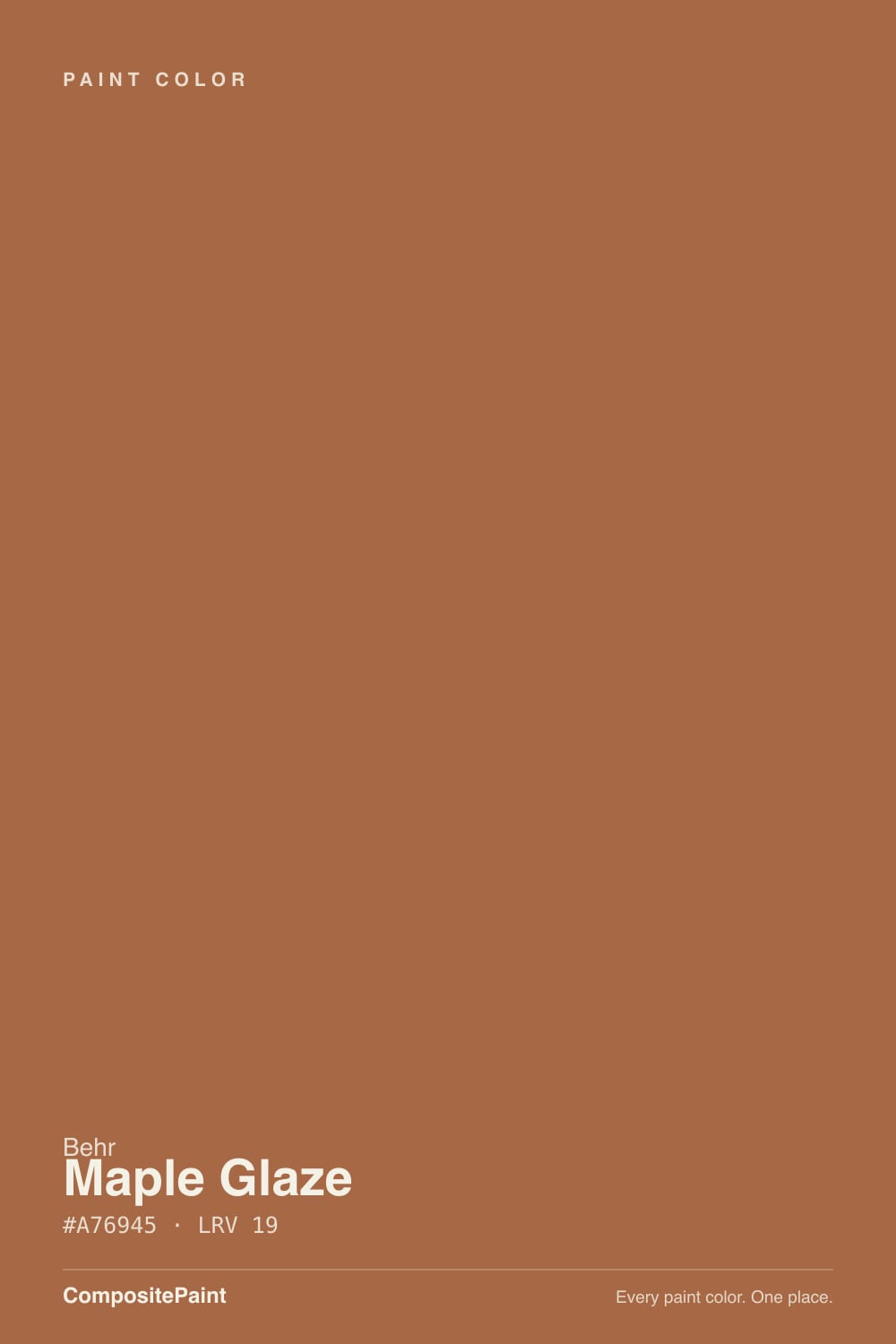
A warm caramel-brown with a genuine orange pulse — Behr's own description leans on golden and beige undertones layered over a brown base, which is why it reads less like a flat terracotta and more like the color of maple syrup catching light. It has been a Behr Color of the Month pick, framed for "gathering areas" — kitchens and dining rooms where you want a color that feels food-warm rather than decorative. That framing is accurate to how it actually behaves: it wants company, wood, brass, not four bare walls.
At LRV 19 it is a genuine mid-depth color, noticeably darker than the paler caramels in the deck (Sherwin-Williams Caramelized sits at LRV 35 by comparison) and close in depth to Behr's own Terra Cotta Urn. Behr sells it across an unusually wide range of formulations for one color — standard wall paint, Premium Plus flat exterior, Dynasty semi-gloss exterior, and a dedicated Premium interior/exterior cabinet, door & trim enamel — which tells you where the brand expects it to actually get used: as much on cabinets and doors as on drywall.
Undertone in one line: orange leads, brown grounds it, no red flash and no yellow spike. If your sample looks flat and plain brown, that's cool or overcast light pulling the orange out; if it looks like it's glowing, that's warm afternoon sun or a 2700K bulb doing exactly what this color was built for.
Where It Shines
Give it warm light and a job with edges — a cabinet run, an island, a door — and it earns the Color of the Month billing. Behr's own styling pairs it with bright pastels in a midcentury-leaning dining room, and that combination is the color at its best: caramel doing the grounding work while a lighter color gets to be playful. It is also a genuinely good match for real maple or honey-oak cabinetry that has gone dated — Maple Glaze gives back a warm wood-tone read without the actual wood.
Where It Fails
Almost every complaint about Maple Glaze comes from one of three places — the wrong light, the wrong technique, or too much wall. None of them are surprising once you know the color, but they are predictable enough that this review can tell you before you buy the gallon.
This is a warm-light color. Under north-facing daylight or on a gray afternoon, the orange pulse fades and what is left reads as a fairly ordinary flat brown — not bad, just not the caramel glow the name promises. Test your sample at the actual time of day you will be in the room.
Home Depot reviewers report the Premium cabinet, door & trim enamel version gets tacky fast and does not self-level the way a good enamel should, with some wanting to thin it even though the can says not to. This is a brushable, technique-dependent finish — budget for a quality mini roller or sprayer and do not rush the recoat window.
At LRV 19, a full room of Maple Glaze reads less like a warm accent and more like a brown box, especially with anything but bright light. It was built to be a dose — cabinets, a door, a wainscot — not the paint for every wall in a large open room.
Room by Room
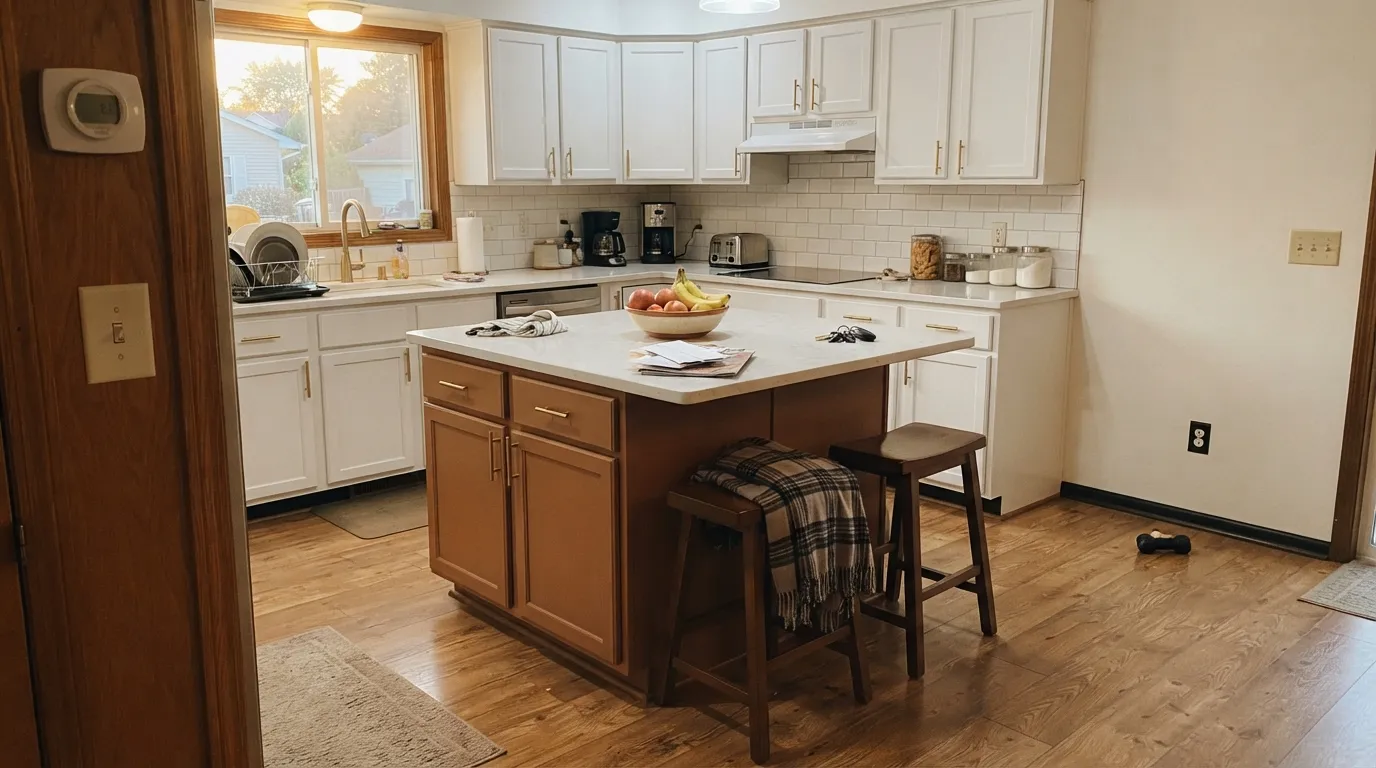
This is the surface Behr actually built the enamel for. Against white perimeter cabinets and brass hardware it reads like a warm, expensive stain rather than paint. Use the dedicated cabinet/door/trim enamel, not the wall formula, and give it real cure time before loading the drawers.
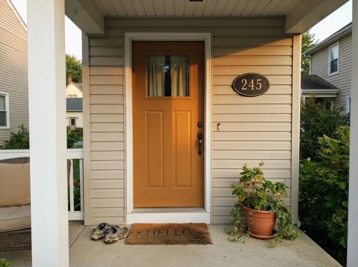
One door's worth of Maple Glaze against a light-neutral house body is the modern-classic warm-door move, the same job Behr's own Terra Cotta Urn does. A covered or shaded entry holds the color longer than a door in constant direct sun — use the exterior semi-gloss enamel formula.
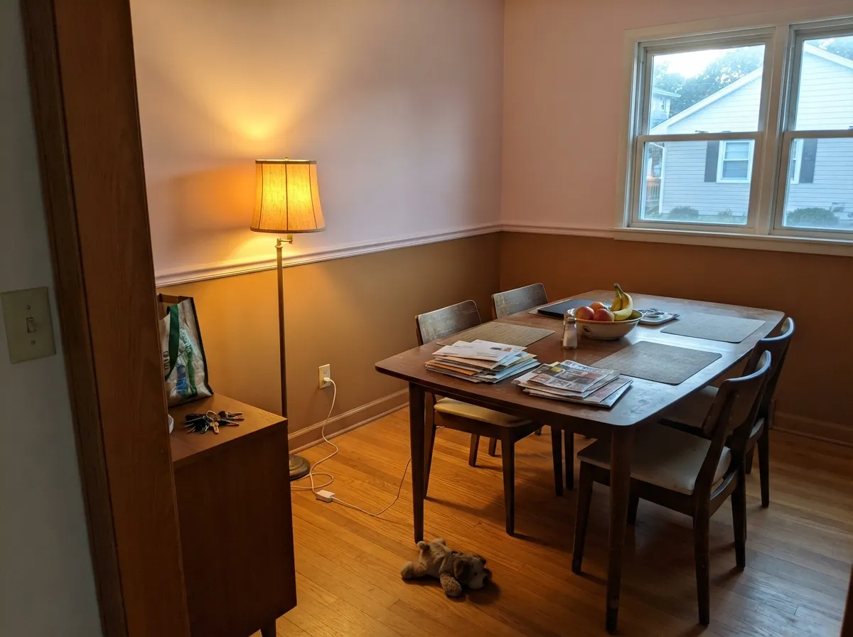
Behr's own styling for this color pairs the caramel with bright pastels in a midcentury-leaning dining room, and it works: a wainscot or lower wall in Maple Glaze under a pale pastel upper wall reads collected, not matchy. Warm lamplight at dinner hour is this room's best asset.
A single vanity or a small powder room takes the color's depth well without the whole-room heaviness problem. Satin or semi-gloss on the vanity, warm bulbs overhead, and it reads custom rather than dated.
Beautiful on a fireplace surround, a single accent wall, or built-ins near walnut and leather. A full room of it, especially without strong daylight, tips toward flat brown faster than the chip suggests.
Shutters, a garage door, or window trim against a light or gray body house give Maple Glaze the frame it needs to read warm instead of just dark. Full siding coverage is the one job this color was not built for.
Your Light Is the Risk
Direct or indirect warm sun brings the orange forward and the color reads like glowing maple syrup — the effect the name promises.
Overcast or north daylight strips the orange out fast, leaving a plain, slightly muddy brown. Sample here before committing to cabinets.
Warmest and most orange at the sun-facing hours, quieter and browner the rest of the day — a real, visible shift most owners notice.
2700K bulbs amplify the caramel glow at night. Cool LEDs flatten it toward plain brown — swap the bulb before you swap the paint.
Most complaints about Maple Glaze are a light mismatch. Upload a photo of your actual room and see it on your walls — then ask for the same wall in north light or evening lamps before you buy a single sample.
Need It From Another Brand?
Any paint counter can custom-tint Behr PPU3-16 directly. If you would rather stay in one brand's own deck, these are the closest stock matches, measured as ΔE2000. Under 2 is a difference you will not see on the wall.
| Brand | Closest color | ΔE | LRV | |
|---|---|---|---|---|
| Sherwin-Williams | BrandywineSW 7710 · Sherwin-Williams | 1.3 | 19 | Color page → |
| Benjamin Moore | MasadaAF-220 · Benjamin Moore | 2.1 | 19 | Color page → |
| Valspar | BorneoM124 · Valspar | 2.5 | 17.1 | Color page → |
| PPG / Glidden | Ginger SpicePPG1070-6 · PPG / Glidden | 2.1 | 20 | Color page → |
| Glidden | ChaparralPPG16-22 · Glidden | 2.9 | 19 | Color page → |
| Dutch Boy | Solar Fire312-7DB · Dutch Boy | 0.9 | 18 | Color page → |
Similar Behr Colors
The nearest shades to Maple Glaze within Behr's own range, ranked by perceptual color distance — useful when you want the same look a touch lighter, darker, or warmer.
WCAG 2.1: AA is 4.5 : 1 for normal text, 3 : 1 for large text, AAA is 7 : 1.
Maple Glaze vs the Colors You're Also Considering
Every Maple Glaze sample board has the same rivals on it. The numbers show the real lightness gap — then it comes down to which risk you would rather live with.
Pick this if you want the deeper, browner version, or you're already committed to Behr's cabinet enamel line.
Sherwin-Williams SW 7701 · LRV 24Cavern ClayPick this if you want the paint-store classic with the longer real-world track record — the two colors behave almost identically in light.
Pick this for cabinets and kitchens, where the extra brown and orange pulse of Maple Glaze reads more like real wood.
Behr PPU2-12 · LRV 21Terra Cotta UrnPick this for the front door specifically — it's Behr's other warm-light terracotta and slightly redder than Maple Glaze.
Maple Glaze Coordinating Colors
The rule for coordinating with Maple Glaze is simple: keep the whites warm and let one dark, near-black note do the contrast work. It pairs naturally with creamy whites, brass, and walnut, and — per Behr's own styling — a bright pastel for a midcentury-leaning room. Cool grays and blue-whites are the one thing that consistently fights it.
Behr's Caramel-and-Pastel Dining Room
Behr picked Maple Glaze as a Color of the Month and styled it specifically in a midcentury-leaning dining room, paired with bright pastels for what the brand describes as a mix of newness and nostalgic appeal. It is a useful real-world data point: this is a color the brand itself treats as a supporting player next to something lighter and more playful, not a color meant to carry a room alone.
That framing matches how it actually performs. On its own, across four walls, the caramel can read heavy; paired with a pale pastel and a warm white trim, it does the grounding work a busy pattern or a bright accent color needs.
Maple Glaze With Wood Tones and Cabinets
This is the color's real job, and the pairing question matters more than usual because it is often used to replace wood, not sit next to it. On honey oak or natural maple cabinetry that has gone dated, Maple Glaze gives back a warm wood-toned read without stripping and restaining — the color was arguably built for exactly that renovation.
Where it sits next to real wood — a walnut floor, a butcher-block counter, leather barstools — keep the wood on the cooler or darker side of the color; two competing warm-orange tones in the same room start to argue instead of complementing each other. White or pale stone counters are the safer, more forgiving partner.
Three Ready Palettes Built on Maple Glaze
A color is never alone on the wall. These are complete combinations in the 60-30-10 pattern, with the reason each one holds together. Every one opens in the visualizer.
A caramel island against a warm off-white perimeter keeps the kitchen from feeling like a brown box, and black hardware or pendants supply the one dark note that makes the caramel read intentional rather than accidental.
Try this palette in your roomA light neutral body and near-black shutters give the door room to be the one warm, glowing note on the facade — the classic warm-door play, just swapping black for caramel.
Try this palette in your roomBehr itself pairs this caramel with a bright pastel for a midcentury dining room — First Light's pale pink is the gentlest version of that pairing, and White Dove trim keeps the whole scheme from feeling saturated.
Try this palette in your roomMaple Glaze FAQ
is Maple Glaze orange or brown?
Both — Behr files it in the orange family, but on the wall it reads as a warm caramel-brown. The orange is real and shows up in warm light; in cool or overcast light it settles into a fairly ordinary brown.
is Maple Glaze a wall paint or just a cabinet color?
Both. Behr sells it as a standard wall paint, as a dedicated Premium interior/exterior cabinet, door & trim enamel, and in exterior lines like Premium Plus and Dynasty. Pick the enamel formula for cabinets and doors — it is built for the cleanability and abuse that wall paint is not.
what white goes with Maple Glaze?
A warm white — Behr's own Swiss Coffee or a similar creamy off-white keeps the pairing from feeling cold. A stark, blue-white will fight the caramel and make it look muddier than it is.
does Maple Glaze work on a front door?
Yes — it is one of its natural jobs. Pair it with a light or gray house body and use the exterior semi-gloss enamel formula. A shaded or covered entry holds its color longer than a door in constant direct sun.
why does the cabinet enamel feel tacky when I roll it on?
Real owner reviews describe this exact problem — the enamel can get tacky fast and resist leveling, even though the can says not to thin it. Work in smaller sections, use a quality mini roller or foam brush, and do not rush between coats.
will Maple Glaze look muddy in a dim room?
It can. This is a warm-light color — without real daylight or warm lamps, the orange fades and what is left is a plain brown some readers call muddy. If your room is consistently dim, this probably is not the color, or plan on warm 2700K bulbs doing real work.
Have you painted with Maple Glaze?
Rate it — one tap helps the next reader decide.
Ask a Question