Terra Cotta Urn
The desert terracotta Behr keeps pushing for front doors and exteriors, reviewed honestly: the light that makes it glow, the finish that ruins it, and what to pick instead.

Jessica has spec'd whites and neutrals for more than 300 rooms and keeps a sample wall of painted drawdowns in her studio. Every color review is checked against real reader rooms in the comments and re-tested when a formula changes. About the testing process →
- 1Turkish Coffee5
- 2Porpoise13
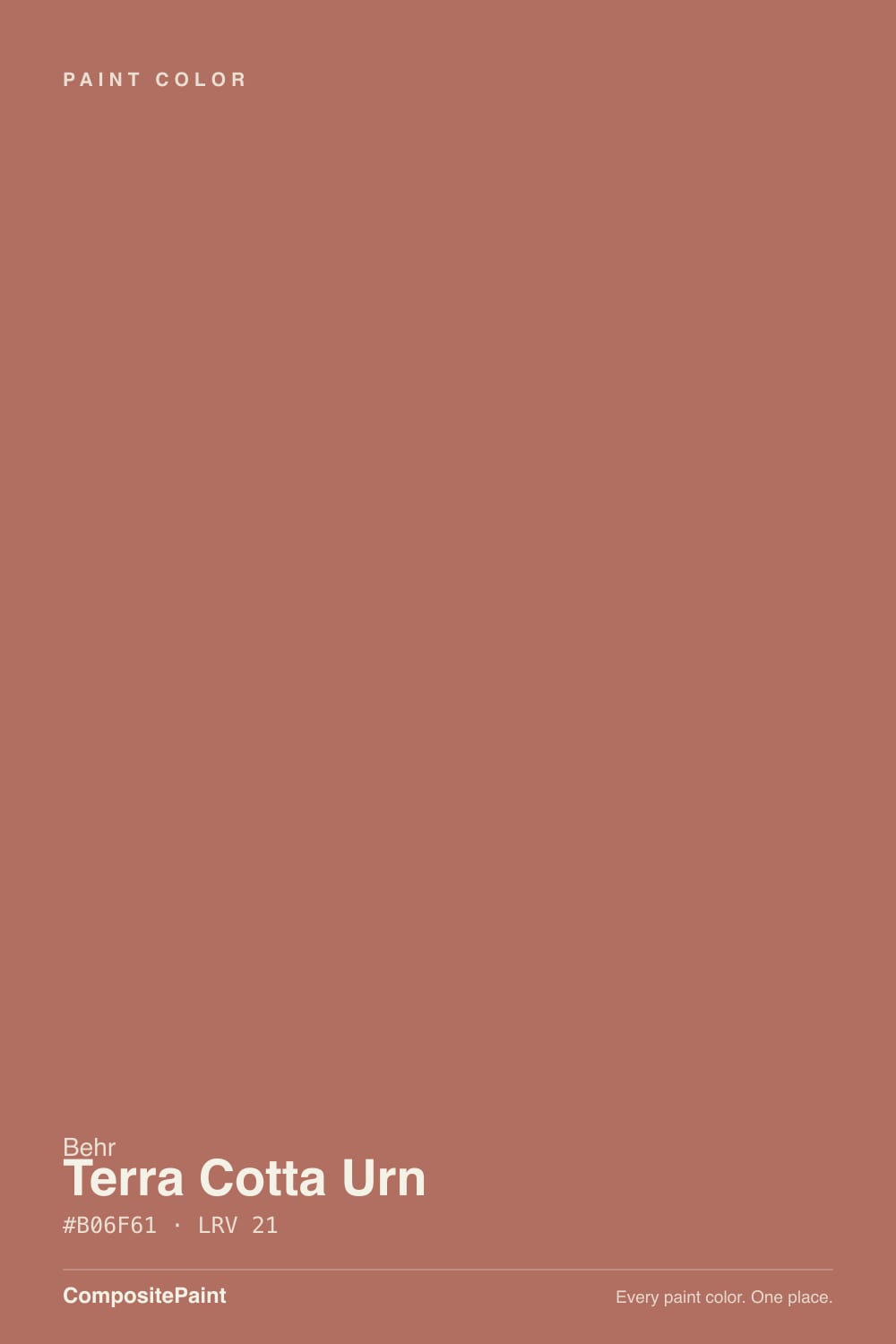
- 3Terra Cotta Urn21
- 4Redend Point30
The Fast Verdict
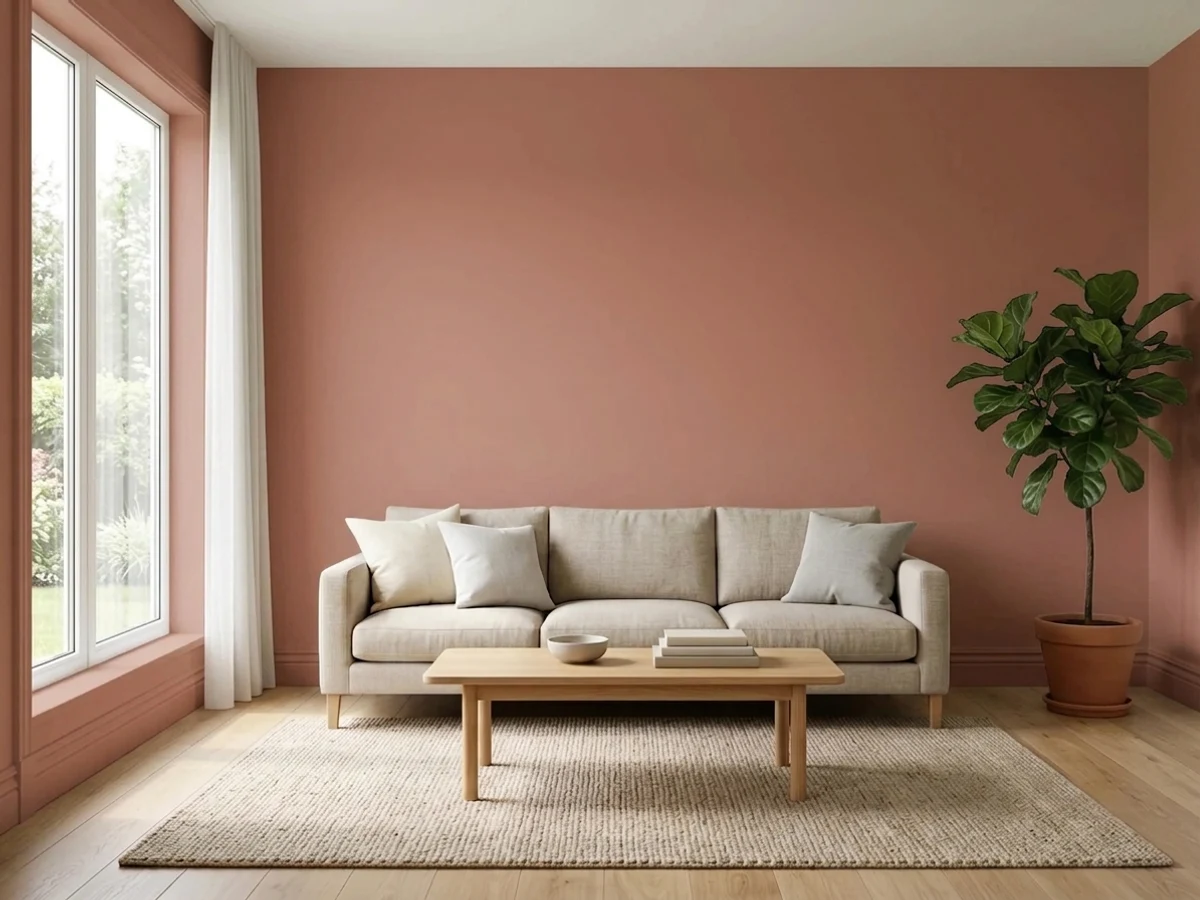
Terra Cotta Urn is sun-baked clay, not fire-engine red — a muted red-orange with enough brown mixed in that it reads earthy instead of loud. Full sun and a real finish (never flat) and it glows like a Spanish Revival front door should. Cut the light or the sheen and it collapses into flat, muddy brick-mud fast. This is a color that rewards a little homework and punishes shortcuts.
Front doors and exteriors on Mediterranean, Spanish Revival, or desert-style homes · dining rooms and accent walls you want to color-drench · kitchen islands and bath vanities with white oak and brass · anyone who wants terracotta without tipping into candy orange
Your only daylight is a dim north window and you skip lamps · your trim or floors are cherry or mahogany · you were planning flat sheen on the walls · you want something universally safe, not a statement
- Earthy terracotta without tipping into candy orange or fire-engine red
- One of the better desert / Mediterranean front-door and exterior colors in either deck
- Color-drenched small rooms (dining rooms, powder rooms) look custom, not gimmicky
- Holds its depth in real daylight instead of washing out at LRV 21
- Flatters white oak, brass, black iron, travertine — the current warm-material palette
- Goes flat, muddy dry-brown in cool north light or under cool LED bulbs
- Flat sheen on walls can look like unfinished dirt — eggshell minimum
- Fights cherry, mahogany, and other red-stained wood
- Too active for most people's idea of a restful whole-bedroom color
What Color Is Terra Cotta Urn, Really?
A heavily muted red-orange anchored by brown — the red is tempered hard enough that it never reads as a primary color, closer to sun-baked clay pottery than to brick-red or pumpkin-orange. Behr files it in the brown family for exactly that reason: the orange is real, but the brown does the steering. It is not a Color of the Year pick or a design-blog obsession; Behr has simply kept featuring it in its own 2026 exterior and "desert palette" guides, positioning it as the go-to earth tone for Mediterranean and Spanish Revival homes. That is a quieter kind of fame than a COTY badge — a workhorse color a brand keeps recommending because it does its job.
At LRV 21 it is a genuine mid-deep color, not a pastel terracotta. Put it beside Sherwin-Williams Cavern Clay (LRV 24) and Terra Cotta Urn immediately reads darker and browner — Cavern Clay leans brighter and more orange, Terra Cotta Urn sits a step closer to fired clay. That depth is the whole point: in real daylight it holds its color instead of washing out, and after dark it sinks toward a deep, warm brick-brown rather than staying orange.
Undertone in one line: muted red-orange with a brown anchor — never candy orange, never fire-engine red. If your sample reads flat and dirt-brown, that is cool light or a flat sheen talking, not the paint's real color.
Where It Shines
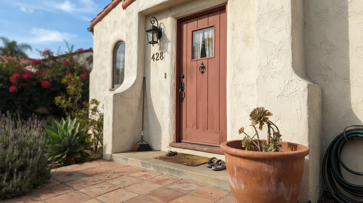
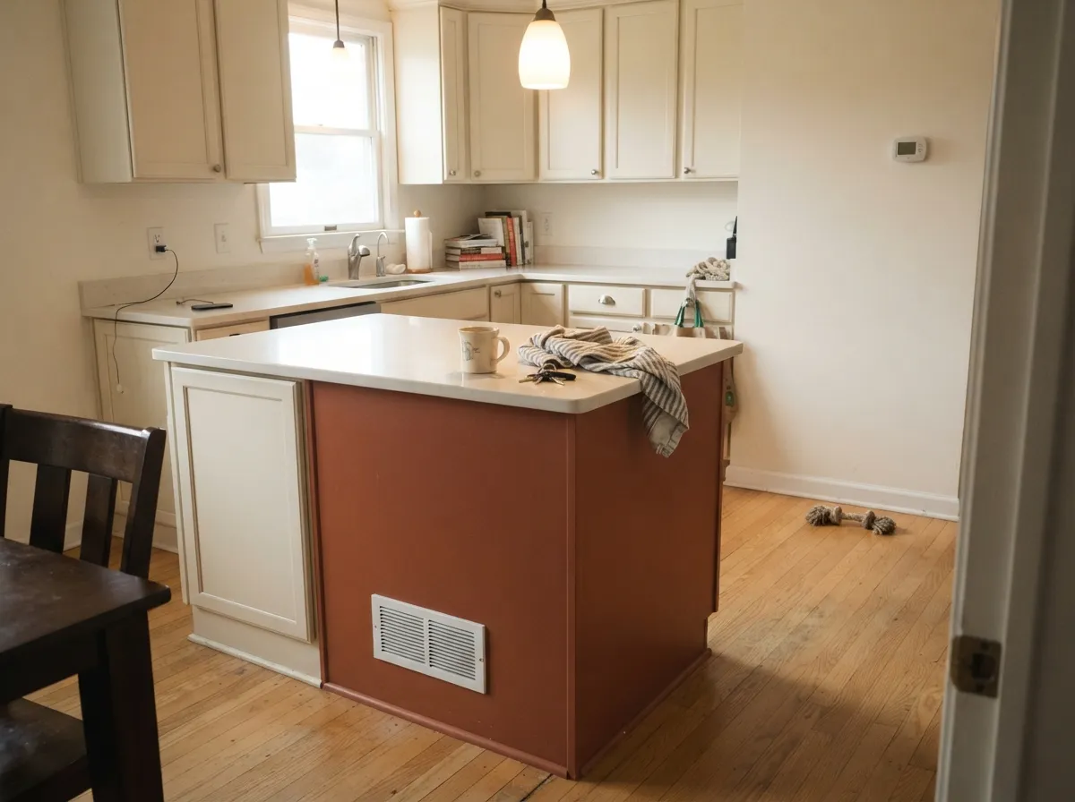
Give it full sun and it is one of the better front-door and exterior colors in either brand's deck: on stucco, on a wood door, next to travertine or creamy render, it reads like it was quarried, not mixed. Indoors its best trick is color-drenching a small room — walls, trim, and ceiling all in Terra Cotta Urn turns a dining room or powder room into a jewel box instead of a loud accent wall. In doses — an island, a vanity, a mudroom built-in — it adds warmth without asking the whole house to commit.
Where It Fails
Almost every disappointed story with Terra Cotta Urn comes from one of three avoidable mistakes, and all three are visible before you buy the gallon. None of them are the paint failing — but if your plan matches one of these, sample bigger before you commit.
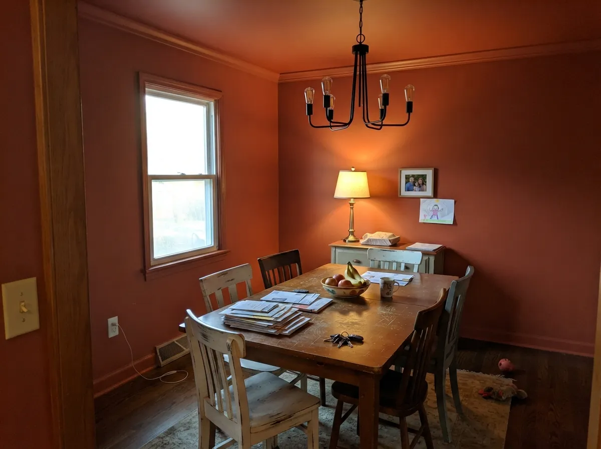
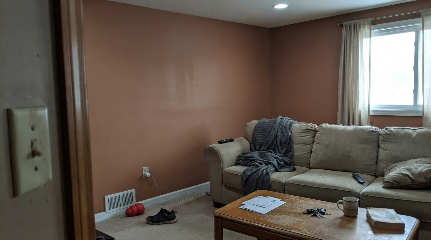
North-facing rooms and 4000K+ LED bulbs pull the red-orange out and leave a flat, muddy brown behind — readers describe it as looking like plain dirt. The color did not fail; the light did. Warm 2700–3000K bulbs and some real daylight are part of buying this color, not optional extras.
Flat finish kills the depth this color depends on and can genuinely look like unfinished dry earth on a wall. Eggshell is the floor for interior walls; satin or semi-gloss on cabinets, trim, and exterior doors is where the color actually looks intentional.
Two competing red undertones in the same room fight instead of blending — the wood looks orange, the wall looks pink, and neither reads as deliberate. White oak, walnut, and pale or gray-washed floors are the safe partners; save red-toned wood for a different color.
Room by Room
Full outdoor sun is this color's natural habitat: on a wood or fiberglass door, or as a full exterior body on a stucco or Spanish Revival home, it reads rich and intentional rather than dated. Satin sheen, and expect the north side of the house to read noticeably browner than the sunny side — walk the sample around before committing.
Walls, trim, and ceiling all in Terra Cotta Urn at eggshell turns a dining room into a warm, enclosed jewel box, especially under a warm-bulb chandelier. This is the room the color was built for indoors.
On an island or a run of lower cabinets under white oak counters and brass hardware, it reads earthy and current without overwhelming a bright, minimal kitchen. A full kitchen of it is a bold bet; most reviewers who love it kept it to one piece of cabinetry.
Small rooms take deep color well, and a satin Terra Cotta Urn vanity under a marble or travertine top with brass fixtures looks custom for a weekend's work. Four walls drenched works too if the room gets any daylight at all.
Genuinely handsome with real daylight, white oak floors, and matte black or unlacquered brass fixtures. In a dim, north-facing living room with cool bulbs it goes flat fast — test the actual wall, not just a chip, before committing to a full accent wall.
Too warm and active for most people's idea of restful on four full walls, but a headboard wall or a single door in this color under warm lamplight is cozy rather than loud. Keep bedding and floors on the pale, neutral side so the color has room to be the statement.
Your Light Is the Risk
On an exterior wall or front door, direct sun reads it warm, rich, and clay-like — the reason Behr keeps featuring it for desert and Mediterranean homes.
Cool, indirect daylight pulls the red out and leaves a flat, muddy brown. Sample the actual wall before you commit to a dim room.
Vivid and warm at the sun hours, quieter and browner the rest of the day. The swing is real — most people who choose this color want that drama.
2700–3000K bulbs make it glow fiery and warm at night. Cool 4000K+ LEDs flatten it toward mud — the single most common fix a bad review is missing.
Most complaints about Terra Cotta Urn are a light mismatch. Upload a photo of your actual room and see it on your walls — then ask for the same wall in north light or evening lamps before you buy a single sample.
Need It From Another Brand?
Any paint counter can custom-tint Behr PPU2-12 directly. If you would rather stay in one brand's own deck, these are the closest stock matches, measured as ΔE2000. Under 2 is a difference you will not see on the wall.
| Brand | Closest color | ΔE | LRV | |
|---|---|---|---|---|
| Sherwin-Williams | Rojo DustSW 9006 · Sherwin-Williams | 1.8 | 23 | Color page → |
| Benjamin Moore | Canyon RockCSP-1120 · Benjamin Moore | 1.5 | 21 | Color page → |
| Valspar | Florentine Clay2003-5B · Valspar | 3.3 | 21.3 | Color page → |
| PPG / Glidden | AmarettoPPG1066-6 · PPG / Glidden | 1.7 | 21 | Color page → |
| Glidden | Burnt Clay30YR 20/313 · Glidden | 0.9 | 20 | Color page → |
| Dutch Boy | Aged Clay305-5DB · Dutch Boy | 1.8 | 21 | Color page → |
Similar Behr Colors
The nearest shades to Terra Cotta Urn within Behr's own range, ranked by perceptual color distance — useful when you want the same look a touch lighter, darker, or warmer.
WCAG 2.1: AA is 4.5 : 1 for normal text, 3 : 1 for large text, AAA is 7 : 1.
Terra Cotta Urn vs the Colors You're Also Considering
Every Terra Cotta Urn sample board has the same rivals on it. The numbers show the real lightness gap — then it comes down to which risk you would rather live with.
Pick this for the deeper, browner, more grounded version — less orange, more fired clay.
Sherwin-Williams SW 7701 · LRV 24Cavern ClayPick this for a brighter, more orange-leaning terracotta that reads louder in the same full sun.
Pick this when you want unmistakable terracotta, not a clay-pink that could pass for beige.
Sherwin-Williams SW 9081 · LRV 27Redend PointPick this for the lighter, pinker clay version that reads softer and less committed.
New England Brick PPF-20 is the closest Behr neighbor, at hex #AD7065 and the same LRV of 21. It is a shade browner and less orange, so it reads more like old brick and less like a pot. Scene Stealer MQ1-22 at LRV 20 goes further in that direction, cooler and a little pinker.
Across brands, Glidden Burnt Clay 30YR 20/313 at #B26D5F and LRV 20 measures a deltaE of 0.87, which is a true match for practical purposes. Farrow & Ball Loggia No. 232 at LRV 21 and Benjamin Moore Canyon Rock CSP-1120 at LRV 21 both land under a deltaE of 1.5, so they look identical in normal room light.
Step further out and the differences show. Valspar Florentine Clay 2003-5B at deltaE 3.34 is very close but worth sampling first. Dunn-Edwards Arizona Clay DET454 at LRV 22 and deltaE 4.81 is close but visibly different side by side, reading browner and more tan.
Terra Cotta Urn Coordinating Colors
The rule for coordinating with Terra Cotta Urn: warm whites, near-blacks, and natural materials — keep cool-blue whites and red-stained wood at arm's length. It pairs best with cream and warm off-whites, unlacquered brass, matte black iron, and pale or gray-washed wood. These are the partners that keep showing up in rooms and exteriors that work:
Terra Cotta Urn on Exteriors
This is where the color does its most consistent work. Behr has repeatedly featured Terra Cotta Urn in its own exterior and "desert palette" marketing, pointing it at Mediterranean, Spanish Revival, and modern desert-inspired homes — the architecture where a clay-red body against stucco or creamy render reads intentional instead of dated. It behaves the way most deep exterior colors do: full sun on the south and west elevations reads brighter and more orange than the shaded north side, which settles into a browner, quieter version of the same color. Walk the whole house with a large sample before ordering paint.
Pairings matter more outside than in. A warm off-white trim (Blank Canvas, Swiss Coffee) keeps the body from feeling heavy; a near-black accent on shutters or the door (Cracked Pepper, Wrought Iron) gives the facade one crisp line. Skip cool-blue whites and bright silver-tone hardware — both fight the warmth this color depends on.
Terra Cotta Urn With Wood Tones and Metals
White oak and walnut are the color's best friends — their cool-to-neutral undertones don't compete with the paint's red, so the room reads warm and deliberate rather than busy. Pale or gray-washed floors are equally safe and give a more Scandinavian-desert cast to the same base color.
The one honest no is cherry, mahogany, or any strongly red-stained wood: two red undertones in the same room fight instead of blending, and the result reads muddy on both sides rather than rich. Honey and medium red oak are usually fine, since their undertone leans more orange than red.
Metals are the easy part of this pairing: unlacquered brass and matte or oil-rubbed black iron both flatter it. Polished chrome and bright nickel are the only finishes that read cold and slightly out of place next to this much warmth.
Three Ready Palettes Built on Terra Cotta Urn
A color is never alone on the wall. These are complete combinations in the 60-30-10 pattern, with the reason each one holds together. Every one opens in the visualizer.
This is close to Behr's own suggested exterior lineup: a warm off-white trim keeps the clay body from feeling heavy, and a near-black accent gives the facade one crisp, modern line — the Spanish Revival formula that shows up in Behr's own desert-palette guides.
Try this palette in your roomOne color at one sheen on every plane removes the edges a lighter trim would create, so the room reads as an enclosed jewel box instead of a wall with an accent. Wrought Iron on the metalwork is the single dark note the scheme needs; a warm-bulb chandelier does the rest.
Try this palette in your roomSwiss Coffee keeps the perimeter bright so white oak and brass can do their job, and one earthy island in Terra Cotta Urn is enough color to feel current without repainting every cabinet. Iron Ore on the black hardware and pendants pulls the whole room together.
Try this palette in your roomTerra Cotta Urn FAQ
Is Terra Cotta Urn orange, red, or brown?
All three, muted into one — Behr files it as brown, but the undertone is a heavily grayed red-orange, closer to fired clay pottery than to pumpkin orange or brick red. In full sun the orange comes forward; in cool or dim light the brown takes over.
Does it work on a front door?
Yes — this is one of its best jobs. Behr itself markets it heavily for exteriors and front doors on Mediterranean and Spanish Revival homes. Use satin or semi-gloss, and expect it to read brighter and more orange in direct sun than it does on the paper chip.
What trim white goes with Terra Cotta Urn?
A warm off-white — Behr Swiss Coffee, Behr Blank Canvas, or Benjamin Moore White Dove all work. A stark, cool-blue white will make the terracotta look muddy by comparison; keep the trim on the warm side.
Does it work with cherry or red oak floors?
Cherry and mahogany are the real no — two competing red undertones fight and both sides lose. Red oak in the honey-to-medium range is usually fine since its undertone is more orange than red. White oak, walnut, and pale or gray-washed floors are the safest, most flattering partners.
What sheen should I use?
Eggshell is the floor for interior walls — flat sheen can genuinely look like dry, unfinished dirt at this depth of color. Satin or semi-gloss on cabinets, doors, trim, and the exterior body is where it reads intentional rather than chalky.
Is this color going to look dated in a few years?
It carries the usual risk of any strong earth tone, but it is not a fad-red the way a saturated trend-orange would be — Behr has kept it in active rotation for years and is still building 2026 exterior and desert-palette campaigns around it. Muted, grayed-down terracottas age more like a warm neutral than an accent color.
Have you painted with Terra Cotta Urn?
Rate it — one tap helps the next reader decide.
Ask a Question