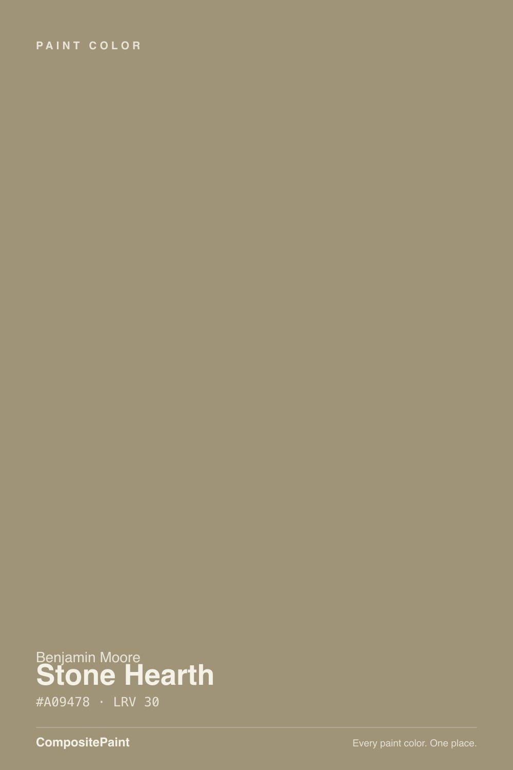
Stone Hearth
A warm greige with a split personality, reviewed honestly: the light that keeps it beige, the light that turns it gray, and the exact kitchen-cabinet mistake that catches buyers off guard.

Jessica has spec'd whites and neutrals for more than 300 rooms and keeps a sample wall of painted drawdowns in her studio. Every color review is checked against real reader rooms in the comments and re-tested when a formula changes. About the testing process →
- 1Anonymous20
- 2Dorian Gray39
- 3Stone Hearth48
- 4Agreeable Gray60
- 5Pale Oak69
The Fast Verdict
Stone Hearth is Benjamin Moore's answer to "I want a warm gray, but not beige" — and the honest twist is that it is beige, at least some of the time. At LRV 48 it sits squarely mid-tone, mixing red, orange and gray in a way that reads as a soft taupe-beige in warm daylight and drifts toward a cooler, dustier greige in flatter light. It is a genuinely good color from BM's Designer Classics line, not a trend chaser — but buy it expecting a chameleon, not a fixed gray, or you risk ending up like the Houzz shopper who took the chip home for cabinets and watched it turn "blondish beige."
Living rooms, dining rooms and entryways with real daylight · kitchen cabinets under bright, warm light · exterior siding on stone- or brick-adjacent homes · anyone who wants an earthy neutral, not a true gray
You need a fixed, reliably gray-gray · your kitchen runs on dim or cool-toned light · you're pairing it with stark icy-white counters or trim · you can't sample a large swatch before committing
- Genuinely versatile warm-to-cool swing — reads beige in warm light, greige in cool light
- A real Designer Classics color with decades of use, not a trend that will date fast
- One of BM's better exterior neutrals — holds up against stone, brick and wood
- Mid LRV 48 keeps rooms from feeling either washed-out or heavy
- Coordinates easily with warm wood, brass and natural stone
- Buyers hunting for a fixed warm gray often get beige instead — the #1 complaint
- Goes flat, dusty and taupe in dim north-facing rooms
- Clashes with stark, icy-white trim or countertops
- Needs a big sample check in your actual light — small chips mislead more than usual
What Color Is Stone Hearth, Really?
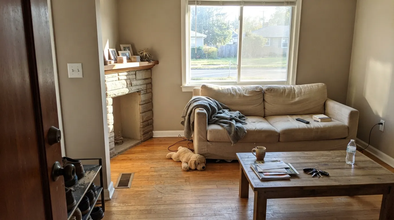
Stone Hearth is a warm neutral built on a three-way mix of red, orange and gray — Benjamin Moore's own description calls it a "stony neutral" with "a hint of warmth," and that hint does more work than the name lets on. It comes from the Designer Classics collection, BM's curated set of decades-tested colors, not a Color-of-the-Year contender chasing a trend, which is part of why it keeps showing up in kitchens and stone-adjacent exteriors year after year.
At LRV 48 it sits dead-center on the light scale — not a pale greige, not a deep taupe, just a genuine mid-tone. That middle position is exactly why it swings: put it in strong south or west light and the red-orange comes forward, reading as a soft, sunny beige. Put it in a north-facing or overcast room and the gray takes over, pulling it toward a cooler, dustier taupe. Both are the same paint being honest about two different rooms — but it means you cannot judge Stone Hearth from a single quick sample check.
Undertone in one line: warm brown-beige first, with a gray current running underneath — never a green cast. If your chip looks like a clean warm gray in the store, expect it to lean noticeably more beige once it's on a real wall; if it reads flat and taupe instead, that is cooler light doing its job, not a defect in the paint.
Where It Shines
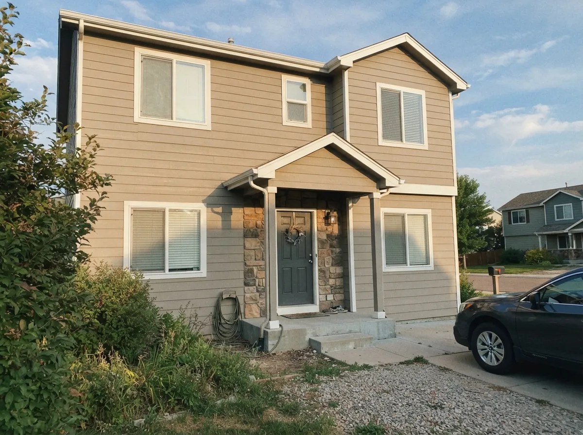
Give it real daylight — south or west exposure, or a bright kitchen with good task lighting — and Stone Hearth earns its Designer Classics spot: warm without tipping orange, neutral enough to sit next to stone, wood or white cabinetry without a fight. It is a favorite exterior color for exactly this reason, holding its earthy calm against brick, stone accents and natural siding in full sun.
Where It Fails
Nearly every complaint about Stone Hearth comes down to one of three things, and all three are predictable before the first coat goes on. None of them are the paint failing — they are the paint being a genuine chameleon in conditions that don't suit chameleons.
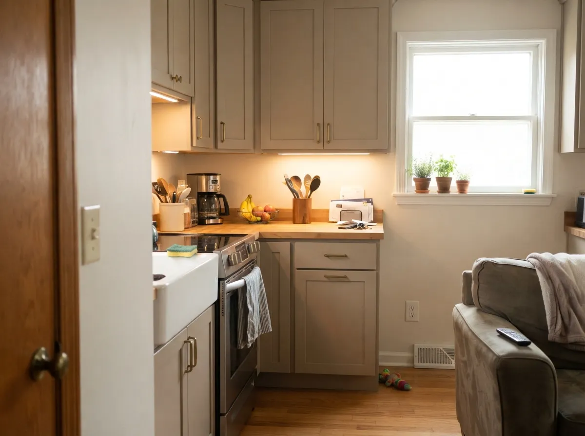
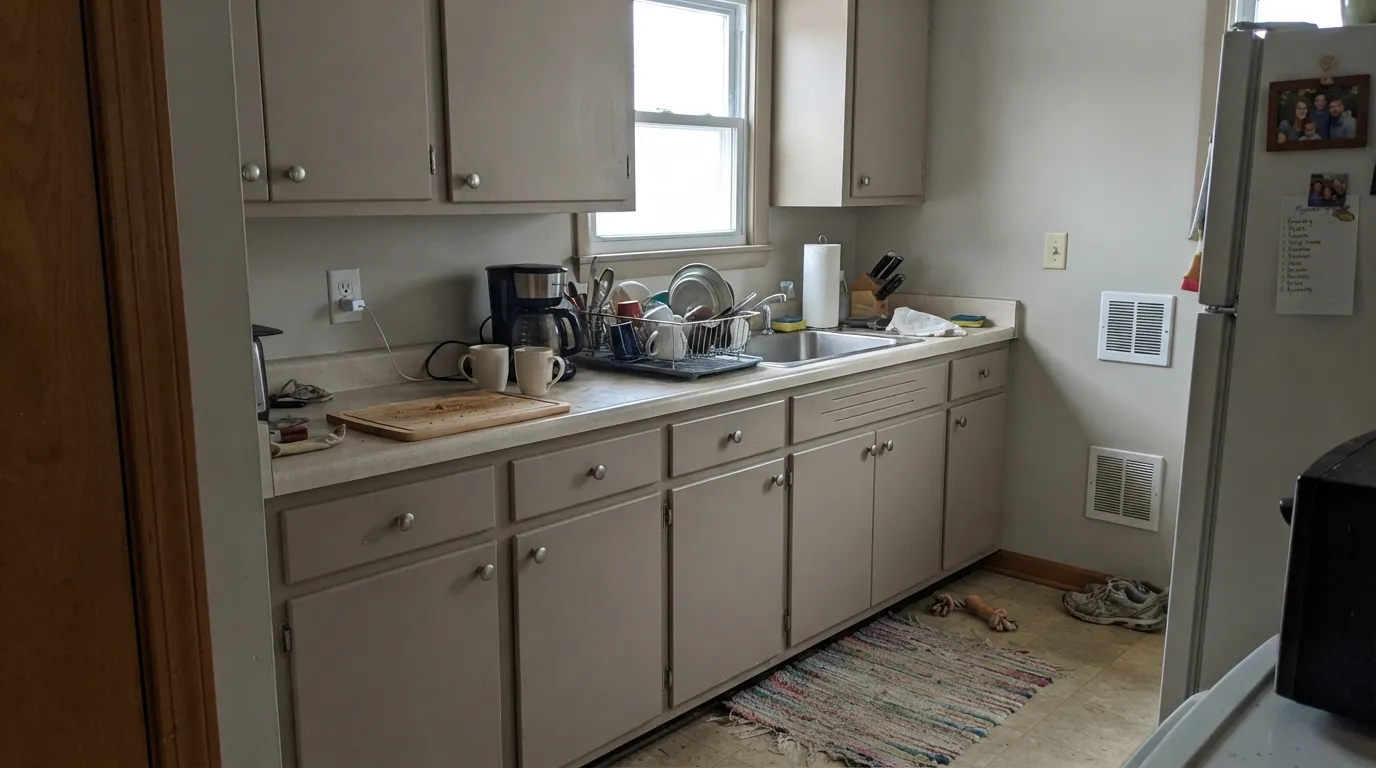
This is the single most common regret, and there's a real Houzz thread about it: a shopper picked Stone Hearth off the chip expecting a warm gray, brought it home, and watched it read "blondish beige" instead. The chip isn't lying — under the wrong light the red-orange undertone wins, and gray-hunters feel cheated. If gray is the non-negotiable, sample a large swatch in your actual kitchen light before cabinets get committed.
Flip side of the same coin: in flat, cool north light the warmth drains out and Stone Hearth goes dusty, taupe-gray and a little lifeless — closer to mushroom than the earthy warmth the name promises. Not a paint flaw; it is what every warm mid-tone neutral does without direct light to work with.
Push Stone Hearth against a stark, cool white and the contrast reads as mismatched rather than crisp — the warm greige looks muddier than it is. Softer, warmer whites like White Dove read as a coordinated pair instead of a fight; a crisp white like Chantilly Lace can still work, but keep it to trim, not walls.
Room by Room
With any real window light it is a calm, grounded backdrop for wood furniture, stone accents and warm metals. Eggshell on the walls; keep trim in a soft, not stark, white.
Under bright, warm task lighting it reads as the earthy warm-gray people go searching for. In a dim or north-facing kitchen, budget for it leaning noticeably beige — sample directly under your own cabinet lighting before committing. Satin finish for wipeability.
Evening entertaining light — lamps, a chandelier, mostly warm bulbs — plays to its strength: the red-orange comes forward and the room feels rich rather than plainly beige.
A forgiving, welcoming neutral for the first room guests see, especially alongside a stone or brick threshold or a wood front door.
Full sun reads it warm and stony without going orange, and it holds up well next to natural stone, brick and wood-tone accents. Pair it with a deeper trim like Chelsea Gray for contrast.
Fine in a bright, south-facing bedroom; in a dim or north-facing one it can read flat and a little dreary rather than cozy. If your bedroom runs dark, a lighter warm greige like Edgecomb Gray is the safer bet.
Your Light Is the Risk
Warm sun brings the red-orange forward and Stone Hearth reads like a soft, sunny stone — its best and most reliable look.
Cool, flat daylight drains the warmth and leaves a dusty, taupe-gray version that reads closer to mushroom than earth tone. Sample here first if this is your exposure.
Warmer and beige-forward at sunrise or sunset hours, quieter and grayer through midday. The swing is real — most owners find it interesting rather than annoying.
2700K warm bulbs push it further into beige-brown; cool white LEDs flatten it toward gray. Pick bulb temperature to match which version of Stone Hearth you actually want.
Most complaints about Stone Hearth are a light mismatch. Upload a photo of your actual room and see it on your walls — then ask for the same wall in north light or evening lamps before you buy a single sample.
Need It From Another Brand?
Any paint counter can custom-tint Benjamin Moore 984 directly. If you would rather stay in one brand's own deck, these are the closest stock matches, measured as ΔE2000. Under 2 is a difference you will not see on the wall.
| Brand | Closest color | ΔE | LRV | |
|---|---|---|---|---|
| Sherwin-Williams | Jogging PathSW 7638 · Sherwin-Williams | 1.6 | 49 | Color page → |
| Behr | Wilderness GrayHDC-FL13-10 · Behr | 1.5 | 50 | Color page → |
| Valspar | Ask Me Anything8006-2D · Valspar | 2.4 | 50 | Color page → |
| PPG / Glidden | Rocky RoadPPG1000-2 · PPG / Glidden | 1.7 | 49 | Color page → |
| Glidden | Rocky RoadPPG1000-2 · Glidden | 1.3 | 50 | Color page → |
| Dutch Boy | Weathered Stone421-2DB · Dutch Boy | 1.6 | 51 | Color page → |
Similar Benjamin Moore Colors
The nearest shades to Stone Hearth within Benjamin Moore's own range, ranked by perceptual color distance — useful when you want the same look a touch lighter, darker, or warmer.
WCAG 2.1: AA is 4.5 : 1 for normal text, 3 : 1 for large text, AAA is 7 : 1.
Stone Hearth vs the Colors You're Also Considering
Every Stone Hearth sample board has the same rivals on it. The numbers show the real lightness gap — then it comes down to which risk you would rather live with.
Pick this when you want the color's full earthy warmth, not the lighter, toned-down cousin.
Benjamin Moore HC-172 · LRV 56Revere PewterPick this if you want the same warm-neutral family with less beige risk and a bit more light — Revere Pewter reads gray more reliably.
Pick this for the lighter, more chameleon version that can go either warm or cool depending on the room.
Benjamin Moore AF-100 · LRV 44PashminaPick this for more depth and less ambiguity — Pashmina commits to greige-brown instead of swinging toward beige.
Pick this for the Benjamin Moore version with a longer, better-documented track record on exteriors.
Sherwin-Williams SW 7030 · LRV 47Anew GrayPick this if your painter works in Sherwin-Williams — nearly the same LRV and undertone story, a warm mid-tone with its own lighting swing.
Within Benjamin Moore, At Home with Nature 1518 at #A29675 and LRV 30 is nearly the same color with a hair more yellow. Alexandria Beige HC-77 at #A3927C and LRV 29 is slightly pinker and less green. Nordic Gray CC-576 at #9E9079 and LRV 29 is a touch darker and grayer. Bed of Ferns 1511 and CC-632 at #999275 and LRV 28 lean the most green of the group. Beige Gray ES-51 at #A2947F is the outlier, since at LRV 41 it reads as a different color on a wall.
Across brands, Behr Caraway PMD-37 at deltaE 1.58, Dunn-Edwards Weather Board DE6222 at 1.72 and Diamond Vogel Whipcord 0338 at 1.74 are all visually identical to Stone Hearth in normal room light. Glidden Gristmill PPG1026-5 at 2.04, Sherwin-Williams San Antonio Sage SW 7731 at 2.66 and Valspar Brussels Sprouts 8004-22E at 2.75 are very close but worth sampling first. Farrow and Ball Green Stone No. 12 at 3.42 and Magnolia Home Countryside JG-52 at 4.36 are close but visibly different side by side, both pushing further toward green.
Stone Hearth Coordinating Colors
Stone Hearth's rule is simple: stay warm and stay soft. It coordinates with warm whites rather than stark ones, deepens well into charcoal-greiges for contrast, and sits comfortably next to other members of BM's warm-neutral family without competing for attention. These are the partners that show up again and again:
A Designer Classics Color, Not a Trend
Stone Hearth doesn't have a viral moment behind it — no Color of the Year campaign, no HGTV catchphrase. It lives in Benjamin Moore's Designer Classics collection, a curated set of colors chosen for staying power rather than a seasonal push, and that history shows in how it gets used: kitchen cabinets, whole-house exteriors, entryways — the workhorse rooms, not the accent-wall trend pieces.
That history also explains the double catalog number. You'll see it listed as both CC-490 and 984 depending on the retailer or region; both point to the exact same formula, hex and LRV. If a fan deck or a contractor quotes one number and your paint store stocks the other, you're not getting a different color.
Stone Hearth With Wood Tones and Stone
This is where Stone Hearth does its best work. Its mixed red-orange-gray base means it doesn't fight warm wood tones — oak, walnut, cedar — the way a purer gray can, and it sits naturally next to real stone and brick, which is exactly the material palette its name promises.
The floor and counter combination to watch is cool gray stone or cool white quartz: push Stone Hearth next to something icy and the pairing reads as a mismatch rather than a considered contrast. Warm-veined quartz, butcher block, and natural stone with any brown or gold in it are the safer bets.
Three Ready Palettes Built on Stone Hearth
A color is never alone on the wall. These are complete combinations in the 60-30-10 pattern, with the reason each one holds together. Every one opens in the visualizer.
White Dove is soft enough not to fight Stone Hearth's warmth, and Chelsea Gray gives the scheme one deep, grounding note without introducing a new undertone family — all three read as one considered warm-neutral house.
Try this palette in your roomA crisp, neutral white on the walls gives Stone Hearth cabinets the bright light they need to read gray-leaning instead of beige, and Wrought Iron supplies the one dark note the kitchen needs.
Try this palette in your roomThis is Stone Hearth's best job: a warm, stony body color with a deep charcoal-greige for shutters and trim and a near-black door for contrast — a scheme built for real stone or brick accents, not a painted-only house.
Try this palette in your roomStone Hearth FAQ
Is Stone Hearth warm or cool?
Warm, with a gray current underneath. In strong daylight the red-orange wins and it reads as a soft beige; in flatter or north light the gray takes over and it reads cooler, closer to taupe. It is never a fixed, single-temperature color — that swing is the whole personality.
Is Stone Hearth a good kitchen cabinet color?
Yes, but only with real light. Under bright, warm task lighting it's the earthy warm-gray people go looking for. In a dim or north-facing kitchen, expect it to lean more beige than the chip suggested — this is the single most common regret with this color, so sample a large swatch directly under your cabinet lighting first.
What trim white goes with Stone Hearth?
A soft warm white like White Dove is the safe default — it won't fight the beige-taupe swing. A crisper white like Chantilly Lace works too, especially in a kitchen, but keep it in smaller doses (trim, not walls) so the contrast reads clean rather than jarring.
Does Stone Hearth work on exteriors?
It's one of its best jobs. Full sun brings out the warm, stony read without pushing orange, and it holds up beautifully against real stone, brick and wood-tone garage doors or accents. Pair it with a deeper charcoal-greige like Chelsea Gray for shutters and trim.
Will it look too beige in a north-facing room?
It usually goes the opposite way — north light typically cools Stone Hearth toward a flat, dusty taupe-gray rather than beige. If your room is dim and north-facing, expect the quieter gray side of this color, not the warm beige side people usually picture.
Is Stone Hearth the same color as Stone Hearth 984?
Yes — CC-490 and 984 are two catalog numbers for the identical Benjamin Moore color, used in different regional or collection listings. The formula, hex and LRV are the same either way.
Have you painted with Stone Hearth?
Rate it — one tap helps the next reader decide.
Ask a Question