Jogging Path
The greige with a green streak, reviewed honestly: where it reads earthy and grounded, the light that makes it flash odd, and what to pick instead.

Jessica has spec'd whites and neutrals for more than 300 rooms and keeps a sample wall of painted drawdowns in her studio. Every color review is checked against real reader rooms in the comments and re-tested when a formula changes. About the testing process →
- 1Dorian Gray39
- 2Pashmina44
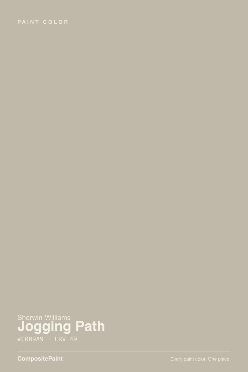
- 3Jogging Path49
- 4Agreeable Gray60
- 5Pale Oak69
The Fast Verdict
Jogging Path is a taupe-gray that colorists keep independently landing on the same word for: green. Not a loud green — a muted olive cast riding under a warm greige field, the kind of undertone that reads as "earthy and grounded" in good light and "is this gray or is this green?" in bad light. At LRV 49 it is a genuine mid-depth wall color, not a background off-white, and it rewards a room with real daylight or warm bulbs to work with.
Living rooms and dens with real daylight · sage, walnut, and aged-brass pairings · anyone moving down the SW 7636–7638 family from Oyster White or Origami White · a greige that reads more grounded than the usual gray
Your room is dim and north-facing with no lamp plan · your trim runs a stark, cool white · you want a color everyone already recognizes on Pinterest · you're chasing a true, green-free gray
- A genuinely grounded, earthy greige — not another beige, not another plain gray
- Warms into a soft, cocoon-like taupe under evening lamp light
- Shares its family with two colors this site already trusts — Origami White and Oyster White — for an easy whole-house ladder
- Deep enough (LRV 49) to hold real color in a bright room instead of washing out
- Pairs naturally with sage, walnut, and aged brass without feeling matchy
- The green undertone shows clearly in north light or beside a true cool gray
- Needs real daylight or warm bulbs — goes flat and muddy in a dim room
- A stark, cool white trim exposes the green instead of softening it
- Far less famous than Agreeable Gray or Repose Gray, so there are fewer real-room photos to sample against
What Color Is Jogging Path, Really?
Jogging Path is a warm taupe-gray built around a real, verifiable green undertone — not a marketing adjective. Independent colorists describe it, in their own words, as "a muted green-gray with a noticeable earthy cast, like weathered foliage mixed with a little stone," "taupe-gray tones with a subtle green undertone," and "a muted gray tone with a light green undertone." Three separate sources, the same read: this is a greige with olive riding underneath it, not a plain warm gray.
It also has a family this site already knows. Sherwin-Williams numbered it right between two colors already reviewed here: Origami White (SW 7636, LRV 80) and Oyster White (SW 7637, LRV 72). Walk that ladder and the resemblance is obvious — same warm-neutral base, each number a step deeper — and Jogging Path is where the ladder finally leaves "off-white" behind and becomes a real, opinionated wall color. If you sampled one of its lighter siblings and assumed this was just a slightly deeper version of the same easy off-white, it isn't; LRV 49 is a genuine commitment.
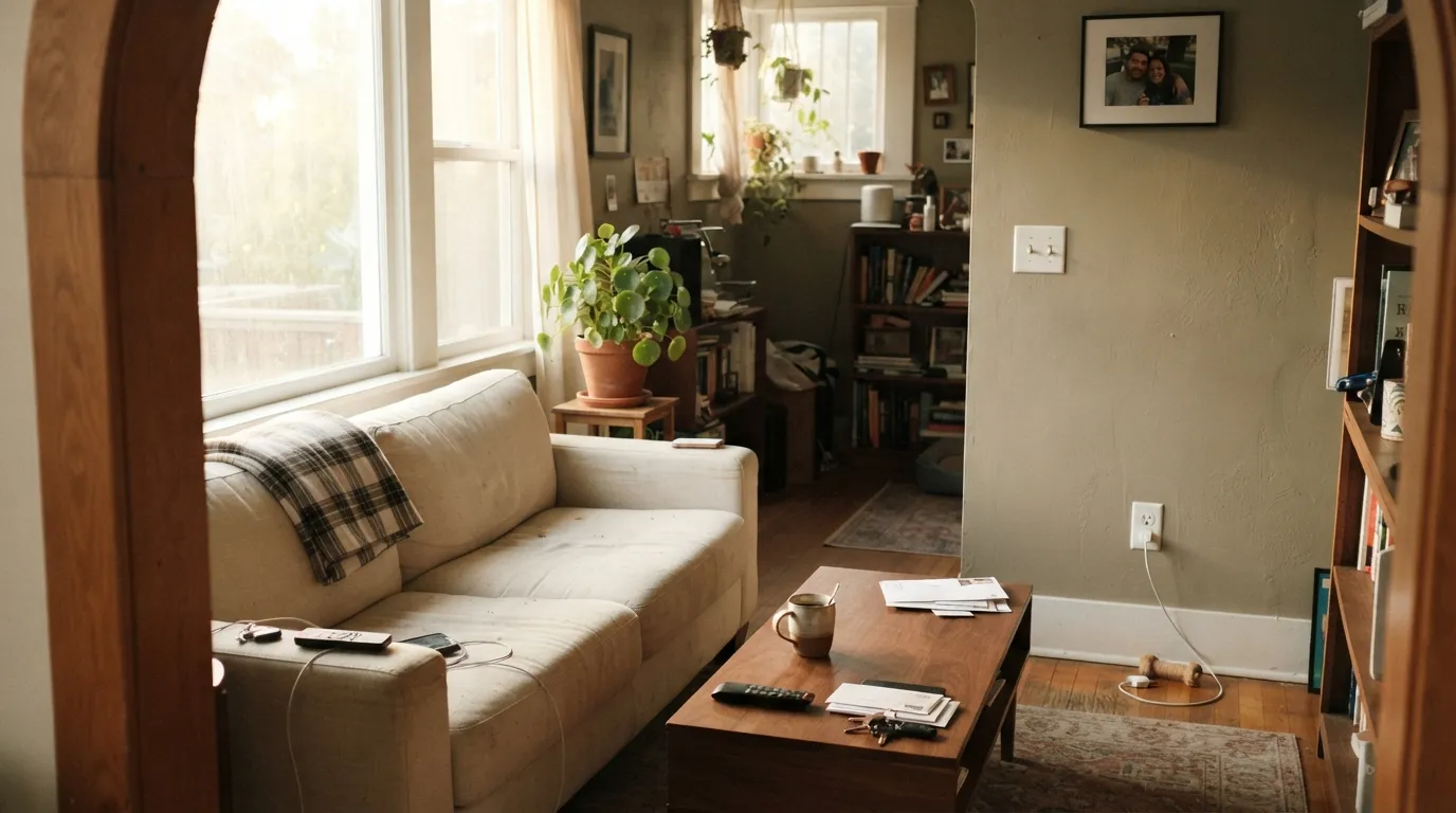
Undertone in one line: warm taupe-gray with a green cast, never blue, never pink. In warm afternoon sun the green mutes into a soft, cocoon-like taupe; in cool north light or beside a true blue-gray, the same green comes forward and can read murky. That is the color behaving consistently — it is the light and the neighbors that change.
Where It Shines
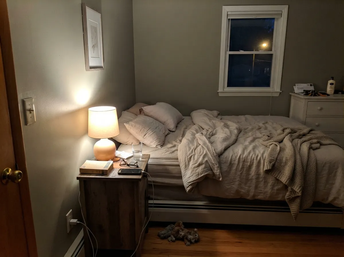
Give it real daylight — south or west exposure, or a bright open room — and Jogging Path settles into a grounded, sophisticated neutral that reads as intentional rather than indecisive. It is at its best next to the materials that share its palette: walnut, aged brass, sage or olive accents, warm stone. Under evening lamplight it goes further still, muting into a cozy, almost cocoon-like taupe that flatters a bedroom or den built for evenings rather than open-plan daylight.
Where It Fails
Almost every complaint about Jogging Path traces back to the same source: the green undertone meeting the wrong light or the wrong neighbor. None of these are the paint's fault — but if your room matches one, sample big before committing four walls.
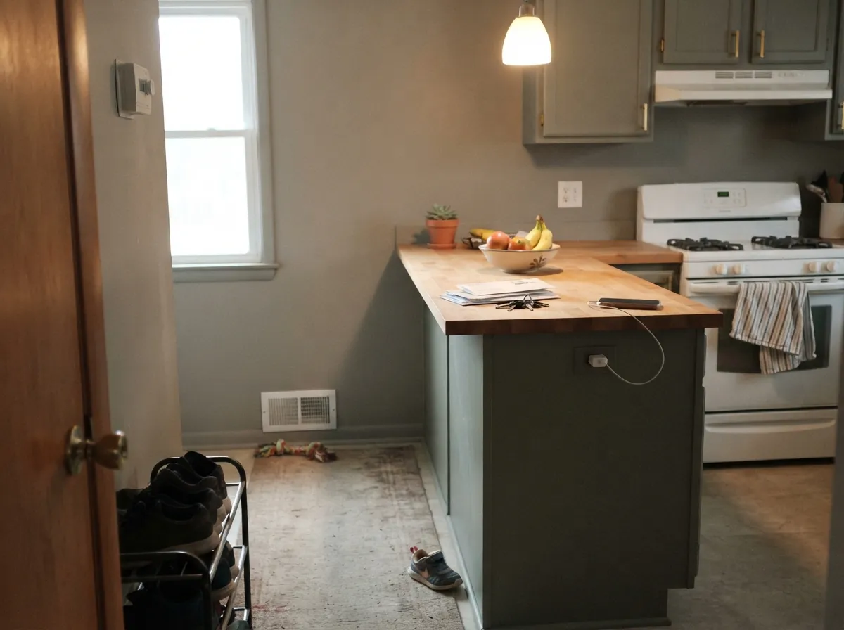
Every source that reviews this color independently flags the same shift: north light pushes it cooler, and the green comes forward in a way that reads muddy instead of earthy. It is not broken — it is a mid-depth color asked to work without real light. Test a large sample on the actual wall before you commit, and plan on warm 2700K bulbs if the room stays dim.
Set beside a cold, blue-leaning white or a genuinely neutral gray, Jogging Path's green suddenly looks like an accident rather than a feature — the "is this gray or is this green" complaint every one of these colorists mentions. The fix is trim from the same warm family, not a brighter white.
If Origami White or Oyster White is what sold you, remember Jogging Path is the deepest step in that family, not a slightly richer version of the same background color. On four walls at LRV 49 it is a real decision. Sample it alone before assuming it will behave like its lighter siblings.
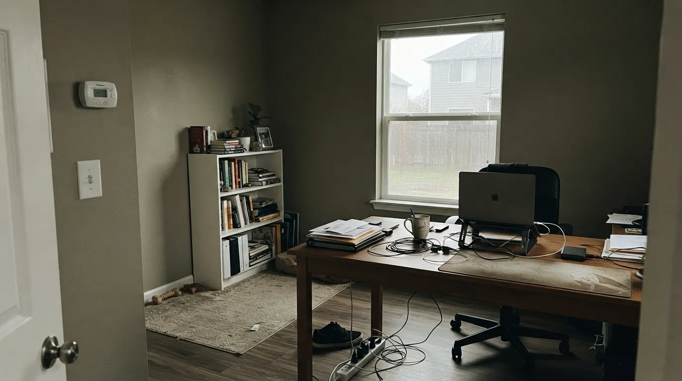
Room by Room
West or south exposure lets the warm side win; walnut furniture, a sage-green plant or throw, and aged brass hardware all read as deliberate company rather than accident. Eggshell for durability.
Under warm lamp light it switches into a soft, cocoon-like taupe that owners describe as genuinely restful. Matte finish, 2700K bulbs, cream or oatmeal bedding rather than stark white.
Pairs cleanly with creamy counters, slate floors, or a dark walnut island; also works as a grounded backdrop for sage-green cabinetry like Evergreen Fog without matching it exactly. A full kitchen of Jogging Path walls needs strong light to avoid feeling heavy.
Sources consistently place it well in bathrooms with brass fixtures and natural stone. A window or a strong vanity light matters more here than in most rooms — bathrooms are frequently the dimmest room in the house.
Use Origami White for trim and ceiling, Oyster White in the brightest adjoining room, and Jogging Path for the room that needs real weight — a den, a study, a stairwell landing. Because all three share the same warm base, the handoff between rooms feels like the house getting quieter, not changing colors.
In full sun it reads as a soft, earthy neutral that plays well with white or dark trim. The same weakness carries outside as in: a shaded, north-facing elevation risks the same cool, muddy read a dim interior room gets. Sample it on the actual wall, in the actual exposure, before committing a whole house.
Your Light Is the Risk
Direct sun brings a soft yellow-green veil over the taupe base and the color reads warm, grounded, and deliberate — its best case.
Cool daylight pushes the gray forward and the green reads murky instead of earthy. Sample big here before you commit.
South-facing rooms see it warmer and lighter at midday, deeper and cooler by evening — a real shift, not a flaw, but expect it.
Warm 2700K bulbs mute the green into a cozy taupe. Cool LEDs sharpen the gray and the green fights it — swap the bulbs before you swap the paint.
Most complaints about Jogging Path are a light mismatch. Upload a photo of your actual room and see it on your walls — then ask for the same wall in north light or evening lamps before you buy a single sample.
Need It From Another Brand?
Any paint counter can custom-tint Sherwin-Williams SW 7638 directly. If you would rather stay in one brand's own deck, these are the closest stock matches, measured as ΔE2000. Under 2 is a difference you will not see on the wall.
| Brand | Closest color | ΔE | LRV | |
|---|---|---|---|---|
| Behr | Wilderness GrayHDC-FL13-10 · Behr | 0.5 | 50 | Color page → |
| Benjamin Moore | Senora Gray1530 · Benjamin Moore | 1.5 | 48 | Color page → |
| Valspar | Counterpoint8005-5C · Valspar | 2.0 | 47 | Color page → |
| PPG / Glidden | Rocky RoadPPG1000-2 · PPG / Glidden | 2.4 | 49 | Color page → |
| Glidden | Rocky RoadPPG1000-2 · Glidden | 1.6 | 50 | Color page → |
| Dutch Boy | Cliff Face422-3DB · Dutch Boy | 2.5 | 49 | Color page → |
Similar Sherwin-Williams Colors
The nearest shades to Jogging Path within Sherwin-Williams's own range, ranked by perceptual color distance — useful when you want the same look a touch lighter, darker, or warmer.
WCAG 2.1: AA is 4.5 : 1 for normal text, 3 : 1 for large text, AAA is 7 : 1.
Jogging Path vs the Colors You're Also Considering
Every Jogging Path sample board has the same rivals on it. The numbers show the real lightness gap — then it comes down to which risk you would rather live with.
Pick this when you want that same earthy weight but with a real, visible olive undertone rather than a plain greige.
Sherwin-Williams SW 7016 · LRV 48Mindful GrayPick this for almost identical depth without the green flash — though it reads deeper than its name suggests, so sample it big too.
Pick this for the lighter, easier-to-live-with version of the same warm-neutral family.
Sherwin-Williams SW 7017 · LRV 39Dorian GrayPick this for a full step deeper and heavier — a stronger, moodier greige for a room with light to spare.
Techno Gray SW 6170 at LRV 49 is the closest neighbor in the line, with a hex of #BFB9AA against Jogging Path's #C0B9A9. Those values sit almost on top of each other, so choose between them on chip availability rather than on any real difference you will see.
Loggia SW 7506 at LRV 48 goes warmer at #C4B7A5 and reads more clearly tan. Peace of Mind SW 9510 at LRV 49 adds yellow at #C4B9A3. Soft Sage SW 9647 at LRV 50 tips green at #BCBCAE, which is the biggest character change in the group. Anew Gray SW 7030 and Analytical Gray SW 7051, both LRV 47, sit slightly darker and a shade grayer.
Across brands, Behr Wilderness Gray HDC-FL13-10 at LRV 50 is a deltaE of 0.53 away, effectively the same color. Benjamin Moore Senora Gray 1530 at LRV 48 is 1.54 away, visually identical in normal room light. Valspar Counterpoint 8005-5C at LRV 47 is 2.01 away and Farrow and Ball Roasted Macadamia No. CB2 at LRV 50 is 2.59 away, both very close but worth sampling first.
Jogging Path Coordinating Colors
The rule for coordinating with Jogging Path: stay warm, and either lean into the green or stay well away from true cool gray. It pairs cleanly with its own lighter siblings, with genuine sage and olive greens, and with warm darks for contrast. These are the partners that keep showing up together:
The SW 7636–7638 Family: Jogging Path's Siblings
Sherwin-Williams doesn't number its neutrals randomly. Origami White (SW 7636, LRV 80), Oyster White (SW 7637, LRV 72), and Jogging Path (SW 7638, LRV 49) sit back-to-back in the deck, and the family resemblance is not a coincidence — they share the same warm taupe-gray base, stepping down in reflectance while keeping the same undertone character.
That makes the trio genuinely useful for a whole house: pick trim from the lightest member, walls from the middle one in your brightest rooms, and save Jogging Path for the room that actually needs weight — a den, a stairwell, a reading nook. Because the base never changes, the transition between rooms reads as the light dimming, not the color changing, which is the exact effect a one-color-family house is trying to achieve.
Jogging Path With Wood Tones and Floors
Warm wood is the easy pairing: walnut, aged oak, and weathered stone all sit comfortably against the taupe base and let the green undertone read as earthy rather than odd. Slate flooring and creamy stone counters were both flagged independently as strong company for this color, which tracks — cool-toned but not stark materials give the green somewhere honest to land.
The floor to be careful with is anything true gray or cool-toned LVP. Pushed against a genuinely cool floor, Jogging Path's green can start to look like a mismatch rather than a feature — the same clash it has with a stark cool-white trim. If your floors are cool gray, sample a large piece of Jogging Path directly above them before committing a whole room.
Three Ready Palettes Built on Jogging Path
A color is never alone on the wall. These are complete combinations in the 60-30-10 pattern, with the reason each one holds together. Every one opens in the visualizer.
Alabaster's warm white doesn't fight the green the way a stark white would, and Urbane Bronze gives the room one true dark note so the greige reads as a deliberate choice, not a question of gray-or-green.
Try this palette in your roomAll three share the same warm-neutral base and were numbered together by Sherwin-Williams, so moving from the lightest to the deepest through a house feels like the light dimming naturally, not the color changing.
Try this palette in your roomThe green whisper in Jogging Path echoes Evergreen Fog's sage without matching it, so the kitchen reads curated rather than color-matched; Alabaster overhead keeps the room from tipping heavy.
Try this palette in your roomJogging Path FAQ
Is Jogging Path gray, green, or beige?
All three, honestly — it is a warm taupe-gray with a real green undertone underneath. In good light it reads as an earthy, grounded neutral; in cool north light or beside a true gray, the green comes forward and it can read a little odd. That inconsistency, not the color itself, is behind most of the mixed reactions.
What's the difference between Jogging Path, Oyster White, and Origami White?
They are siblings — Sherwin-Williams numbered them together (SW 7636, 7637, 7638) and they share the same warm-neutral base. Origami White (LRV 80) and Oyster White (LRV 72) are both light, off-white leaning colors; Jogging Path (LRV 49) is the deepest of the three and the first one that reads as real wall color rather than a background off-white.
What trim goes best with Jogging Path?
A warm white, not a cool one — Alabaster is the safe match. A stark, blue-leaning white makes the green undertone look like a mistake instead of a feature. If you want contrast rather than a soft handoff, a warm dark like Urbane Bronze works on doors or built-ins.
Does it work in a north-facing room?
It is a real risk. North light is exactly the condition every independent review of this color flags as its weak point — the green comes forward and the wall can read murky. Sample a large piece on the actual wall, and plan on warm 2700K bulbs if you go ahead anyway.
Is it good for exteriors?
Only with real sun. In full daylight it reads as a soft, earthy neutral; on a shaded or north-facing elevation, expect the same cool, muddy shift interior rooms get. Test it on the actual wall in the actual exposure before committing a whole house.
Does it clash with true gray or green colors nearby?
A true, cool gray next door is the one pairing to avoid — it makes Jogging Path's green look accidental rather than intentional. A genuine green like Evergreen Fog, on the other hand, pairs well precisely because Jogging Path already carries a whisper of the same undertone.
Have you painted with Jogging Path?
Rate it — one tap helps the next reader decide.
Ask a Question