Rust
The color that actually looks like its name, reviewed honestly: where the burnt-orange glow earns its keep, the light that turns it to mud, and what to pick instead.

Jessica has spec'd whites and neutrals for more than 300 rooms and keeps a sample wall of painted drawdowns in her studio. Every color review is checked against real reader rooms in the comments and re-tested when a formula changes. About the testing process →
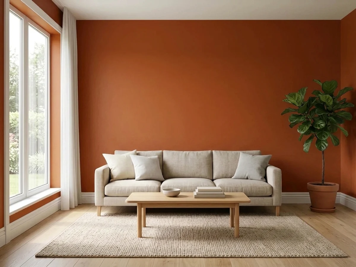
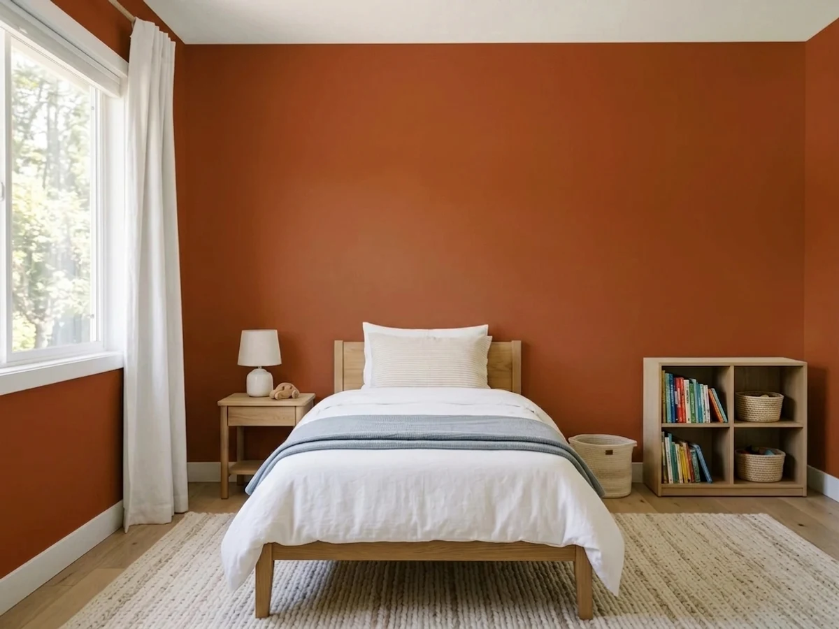
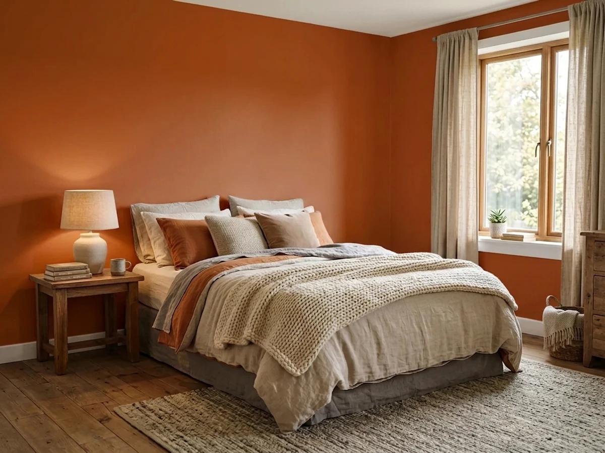
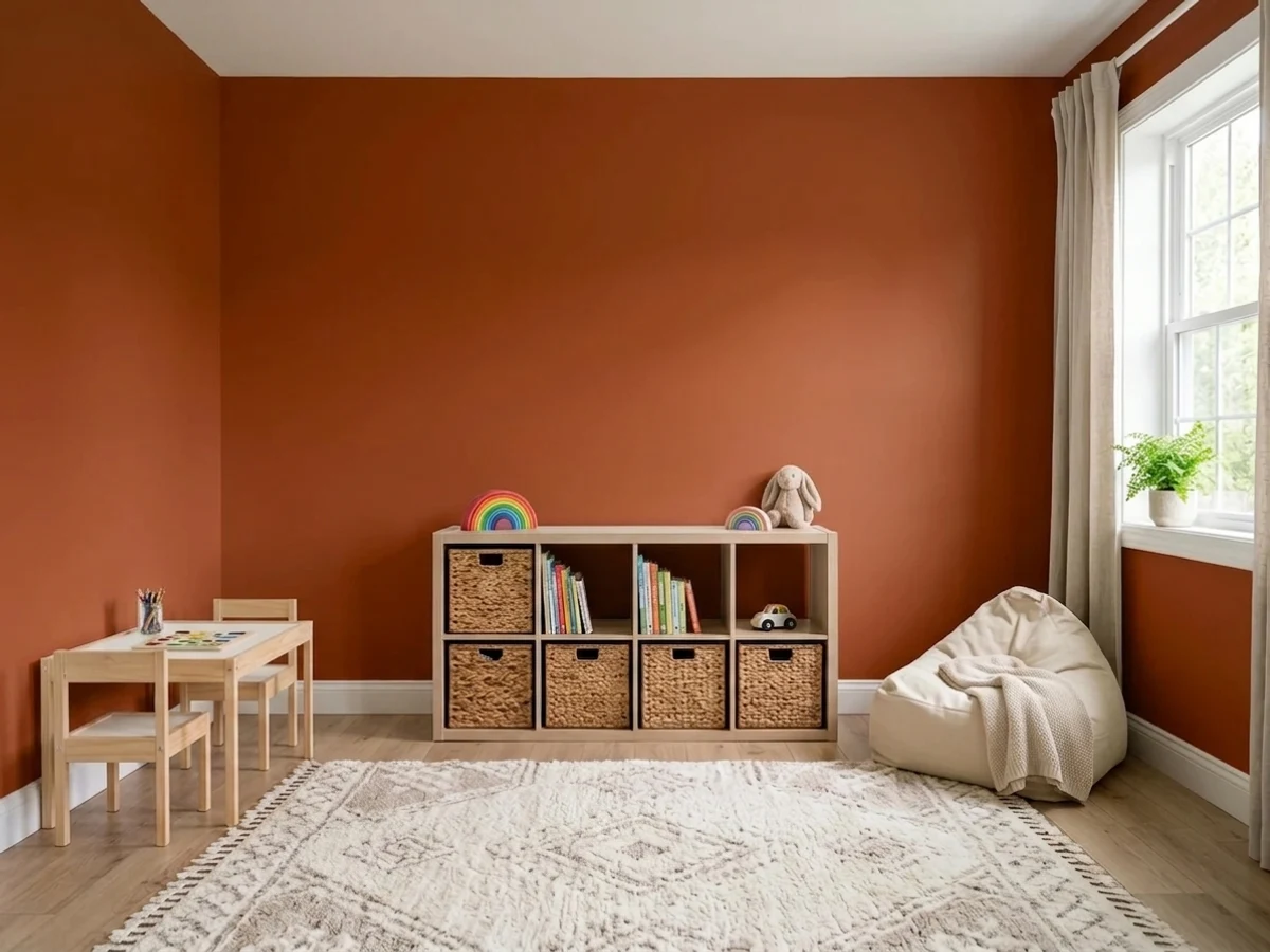
- 1Burnt Cinnamon9
- 2Rookwood Terra Cotta14
- 3Rust19
- 4Caramelized35
- 5Venetian Plaster42
The Fast Verdict
Rust is Benjamin Moore's most literal color name in the deck: a burnt orange-brown pulled straight from oxidized metal, with real red running under it instead of the yellow most "terracotta" paints lean on. It was never built to be a whole-house neutral, and it doesn't pretend to be one — as a front door, one accent wall, or a kitchen island next to brass, it looks warm and deliberate. Spread across four walls in flat light, the same color can slide toward muddy brick fast.
One accent wall in a dining room or den · front doors and shutters that want real warmth, not brick-red · kitchen islands and cabinets with brass hardware and butcher block · rooms that get real afternoon or west sun and can lean into it
You want it on all four walls of a small room · your room only gets flat north daylight and you won't add lamps · your brick, stone, or floor already leans pink · you actually want the softer, more muted clay of Adobe Dust or Cavern Clay
- An honestly saturated rust-orange with real red depth — not a washed-out "safe" clay
- Reads as a genuine, deliberate color choice on a front door
- Glows next to brass, walnut and black iron on kitchen islands and cabinets
- Deep enough (LRV 19) to hold its color in bright, sunny rooms
- Rides the current terracotta revival without copying the two colors that started it
- Goes dull and muddy in flat north light with no warm lamps
- Reads heavy and dated across all four walls of a small room
- Fights pink-toned brick and rosy natural stone instead of blending
- A genuinely bold commitment — no quiet, half-measure version of this color exists
What Color Is Rust, Really?
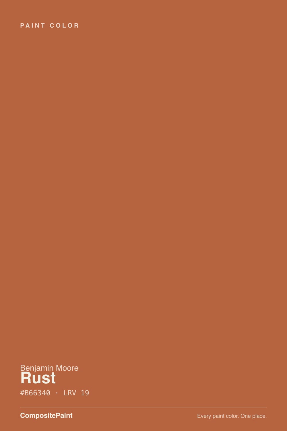
A dark, saturated orange-brown that earns its name honestly. Most paints called "rust" or "terracotta" are really a yellow-orange clay with the name borrowed for marketing; Benjamin Moore's Rust is built on real red, and that red is the whole story. It reads less like baked clay and more like oxidized iron — a barn roof, an old anchor chain, a copper pot left outside a season too long. It sits in the Color Preview collection, BM's bolder, more saturated lineup, not the soft-neutral Classics wall.
At LRV 19 it is a genuinely deep color — deeper than most of the terracotta-family paints people compare it to, including its own lighter sibling Adobe Dust (LRV 34). That depth is what keeps it from reading as a pastel clay: on a big wall it holds real orange-brown weight instead of washing out, and in low light it sinks toward a dark, warm brown before it ever looks gray. The trade-off is the same depth makes north-facing rooms work against it — there's no pale reserve of light to fall back on.
Undertone in one line: red first, orange second, brown holding both down — never yellow, never pink. If your sample reads flat brick-red, that's strong warm light doing exactly what this paint does in strong warm light; if it reads dull and muddy, that's cool or dim light stripping the red back out. Both are the same paint being honest about your room, not a bad batch.
Where It Shines
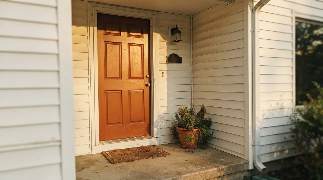
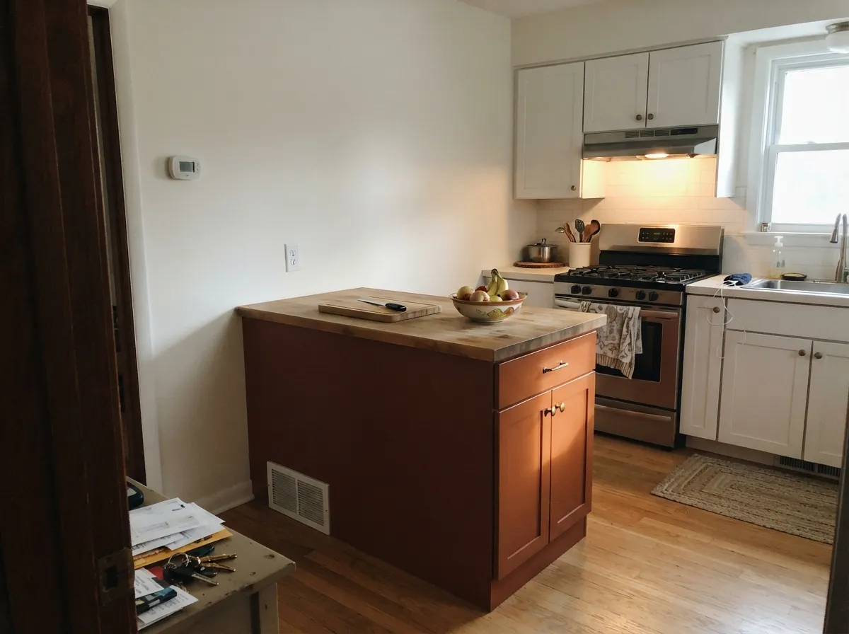
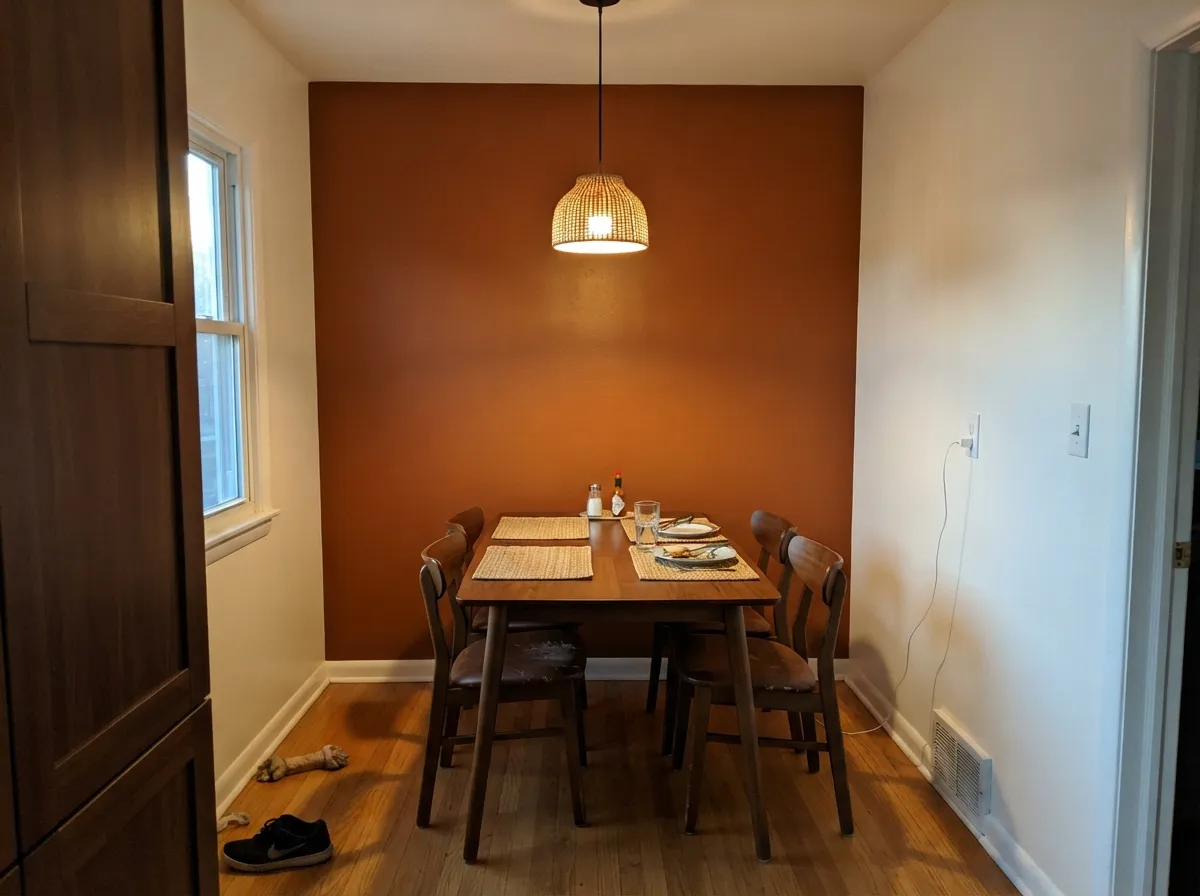
Give it a job with edges — a door, an island, one wall — and real light, and Rust is one of the more satisfying bold colors in the BM deck. Afternoon and west sun light it up close to the color of a fired-clay pot; against walnut, black iron and brass it reads expensive rather than loud. Its best home might be the front door: it is dark enough to read as a real color choice from the street, red enough to feel warm rather than aggressive, and it holds up under weather the way a true oxide-based color should.
Where It Fails
Almost every disappointed review of Rust comes from one of three predictable setups, and none of them are the paint's fault — they're the paint doing what a deep, saturated color always does when the room doesn't cooperate.
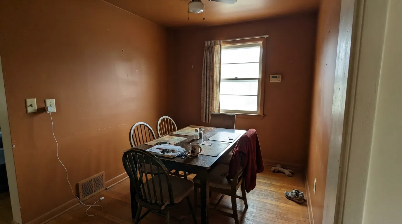
Rust wrapped floor to ceiling in a small space with no white or black anchor reads like a 2005 Tuscan-restaurant dining room — heavy, closed-in, and dated fast. It is built to be a strong accent, not a whole-room wash. Keep at least trim, ceiling, or one wall neutral so the color has somewhere to stop.
Cool, dim daylight pulls the red back out of Rust and leaves a dull, muddy brown that reads more like dirt than like fired clay. Readers who loved the sample by a south window report it going flat and lifeless in a north room. Warm 2700K lamps fix more of this than repainting does.
Rust's red undertone fights pink brick and rosy natural stone instead of blending with it — both sides end up looking slightly wrong, not complementary. It wants gray or warm buff stone, walnut or weathered wood, and black iron, not anything already leaning pink.
Room by Room
A dining room only sees candlelight and evening use most of the time, exactly the warm, low light Rust wants. One accent wall behind a walnut table, with the rest of the room in a warm white, is the classic version of this color and it still works.
Rust on a door reads as a genuine color statement rather than a novelty. Pair it with white or warm greige siding and black or bronze hardware; avoid it against pink-toned brick, which fights the red instead of grounding it.
On an island or a run of cabinets, with brass pulls and a pale countertop, Rust looks custom and warm without swallowing the room. A full kitchen of Rust cabinets against honey-oak floors is a much bolder, riskier bet.
Low, afternoon-facing light and leather or walnut furniture flatter this color the way they flatter a study meant to feel closed-in and warm rather than bright and airy.
A single wall, ideally the one that catches west or afternoon sun, works. Four walls of Rust in an open-plan living room fights with whatever the adjoining kitchen or hallway is wearing and reads heavy in a space meant to feel open.
It can work as a headboard-wall accent under warm lamps, but as a full bedroom color it runs the risk of feeling more like a den than a place to relax, and it does nothing for you if the room is north-facing and lamp-free.
Your Light Is the Risk
Direct late-day light hits it like sun on oxidized metal — the color at its most alive. This is the light the name promises.
Cool, flat daylight drains the red and leaves a dull, muddy brown. Test a real sample here before committing a whole wall.
Steady and clearly orange-brown at midday, deepening toward brown-red as the light softens in the evening. The most predictable exposure for this color.
2700K bulbs keep the red glowing after dark. Cool white LEDs flatten it toward a dull clay-brown — swap the bulbs before you swap the paint.
Most complaints about Rust are a light mismatch. Upload a photo of your actual room and see it on your walls — then ask for the same wall in north light or evening lamps before you buy a single sample.
Need It From Another Brand?
Any paint counter can custom-tint Benjamin Moore 2175-30 directly. If you would rather stay in one brand's own deck, these are the closest stock matches, measured as ΔE2000. Under 2 is a difference you will not see on the wall.
| Brand | Closest color | ΔE | LRV | |
|---|---|---|---|---|
| Sherwin-Williams | Husky OrangeSW 6636 · Sherwin-Williams | 1.3 | 19 | Color page → |
| Behr | Pumpkin DrizzleHDC-FL15-01 · Behr | 1.7 | 21 | Color page → |
| Valspar | Autumn Ivy8002-12E · Valspar | 2.2 | 21 | Color page → |
| PPG / Glidden | MincemeatPPG1200-7 · PPG / Glidden | 4.7 | 21 | Color page → |
| Glidden | Old Copper Kettle60YR 19/432 · Glidden | 1.5 | 19 | Color page → |
| Dutch Boy | Sun-Baked208-6DB · Dutch Boy | 2.9 | 18 | Color page → |
Similar Benjamin Moore Colors
The nearest shades to Rust within Benjamin Moore's own range, ranked by perceptual color distance — useful when you want the same look a touch lighter, darker, or warmer.
WCAG 2.1: AA is 4.5 : 1 for normal text, 3 : 1 for large text, AAA is 7 : 1.
Rust vs the Colors You're Also Considering
Every Rust sample board has the same rivals on it. The numbers show the real lightness gap — then it comes down to which risk you would rather live with.
Pick this for real depth and a more red, less peachy version of the same warm-earth idea.
Sherwin-Williams SW 7701 · LRV 24Cavern ClayPick this for a lighter, softer terracotta that leans more orange than red and needs the same strong light to glow.
Pick this when you want unambiguous rust, not a color people will argue is actually pink.
Sherwin-Williams SW 9081 · LRV 27Redend PointPick this if you want the softer, pinker clay that reads more like dusty rose than burnt orange.
Rust Coordinating Colors
The rule for coordinating with Rust: warm whites and neutrals to give it room to breathe, near-blacks and true grays for contrast, and nothing else already trying to be the accent color. It pairs cleanly with brass, walnut and black iron, and it wants its neighbors calm, not competing:
The Terracotta Revival: Where Rust Fits
Warm earth tones spent years off the radar while gray and greige dominated, and they came back through a handful of colors: Sherwin-Williams' Cavern Clay (Color of the Year 2019) and Redend Point (Color of the Year 2023) are the two names most people already know. Rust has quietly been sitting in Benjamin Moore's Color Preview collection through all of it — not marketed as a trend color, just a genuinely saturated rust that happens to fit exactly where the trend landed.
What separates it from its more famous cousins is how literal it is. Cavern Clay leans peachier, Redend Point leans pinker; Rust is the one that actually looks like the metal it's named for. If the terracotta trend eventually cools, a color this honestly rust-colored is less likely to read as "that 2020s paint" than the softer, trendier versions of the same idea — it was never chasing the moment.
Rust With Wood Tones and Metal
Walnut, weathered gray wood and black iron are Rust's best company — the cooler, darker tones let the red in the paint stay the warmest thing in the room instead of competing with it. Brass and unlacquered bronze hardware are the other reliable win; both metals share enough warmth with the paint to feel matched rather than mismatched.
Cherry and other red-toned woods are the one pairing to test carefully — two warm reds in the same room can read as clashing rather than layered, especially in strong light. Honey oak floors are workable in small doses (an island, a door) but risky across a full room painted Rust, since both the floor and the walls are competing for the same warm-orange attention.
Three Ready Palettes Built on Rust
A color is never alone on the wall. These are complete combinations in the 60-30-10 pattern, with the reason each one holds together. Every one opens in the visualizer.
A warm white house gives Rust the neutral field it needs to read as a real color rather than a clash; Kendall Charcoal shutters add the one dark note that keeps the whole front elevation from feeling like two competing warm colors.
Try this palette in your roomWhite Dove keeps the room from feeling closed-in while the wall carries all the color; near-black Wenge on built-ins gives the eye a resting point so the rust reads intentional, not overwhelming.
Try this palette in your roomWhite Dove perimeter cabinets keep the kitchen light and functional while the Rust island does the color work; Chelsea Gray on a bench or stools ties the warm and neutral halves of the room together without adding a third loud color.
Try this palette in your roomRust FAQ
Is Rust more orange, brown, or red?
All three, in that order of visibility — but the underlying undertone is red, not yellow, which is what separates it from most "terracotta" paints. In warm light it reads clearly orange-red; in dim or cool light the brown takes over and it can look almost chocolate.
Is it a good front door color?
Yes — it's one of the more dependable jobs for this color. It reads as a deliberate, warm choice from the street, holds up visually in weather the way an oxide-based color should, and pairs cleanly with white or warm greige siding. Skip it against pink-toned brick.
Can I use Rust on kitchen cabinets?
Yes, especially on an island or a single run rather than the whole kitchen. With brass hardware and a pale countertop it looks custom and warm. A full kitchen in Rust over honey-oak floors is a much bigger bet — sample it big before committing.
What white trim goes with Rust walls?
A warm white — White Dove or Swiss Coffee — softens the transition better than a stark cool white, which can make the rust look almost neon by contrast. Keep trim semi-gloss so it reads as a deliberate frame, not an accident.
How many coats does Rust need?
Two coats over most existing colors, with a tinted primer if you're going over a much lighter wall — deep, saturated colors like this one show lap marks and thin patches more than a mid-tone would if you skip priming.
Will Rust look dated, like early-2000s Tuscan paint?
Only if it's used the way that trend used it — sponged, glazed, and wall-to-wall in a small room. Used flat, on one wall, a door, or cabinetry, and paired with black iron or brass instead of gold, it reads current, part of the same terracotta revival behind colors like Cavern Clay and Redend Point.
Have you painted with Rust?
Rate it — one tap helps the next reader decide.
Ask a Question